It is often said that good design is about attention to detail. Kerning is a great example of this. As a technique to enhance the clarity, consistency, and legibility of text, kerning is a mainstay option for the UI designer.

Kerning refers to the space between two letters inside a word. During kerning, unbalanced-looking gaps and optical issues created by awkward pairings are eliminated through adjustment.
And some letters are harder to kern than others. At the core of kerning is learning to remember the most troublesome pairings. Capitals can be especially tricky. For instance, letters with arms and cross strokes like F, L, and T and letters with slanting anatomy such as A, W, and V (in fact, “AV” is often the logo for kerning because its awkwardness is almost a cliché).
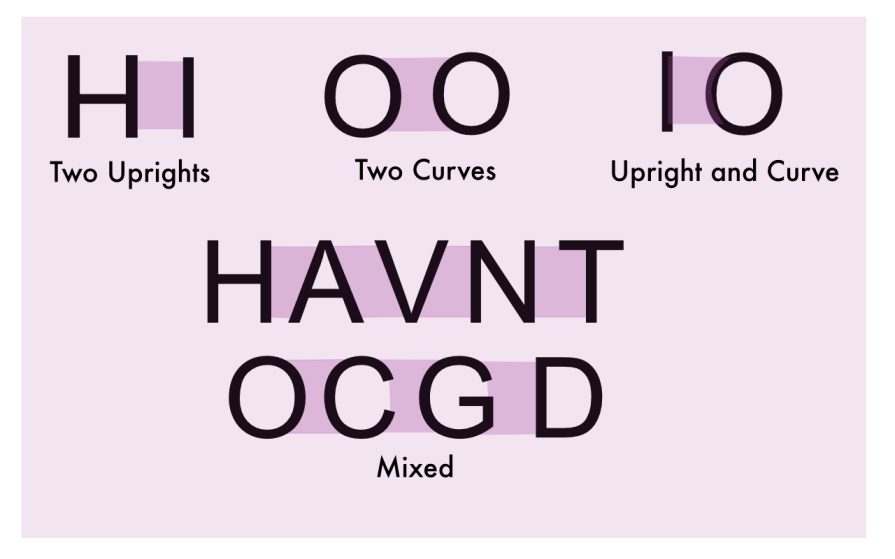
See how kerning enhances the readability of user interface elements? This ensures a smooth and enjoyable UX. One learns kerning by appreciating negative space and training the eye to identify problematic gaps.
Proper kerning improves text’s overall readability and legibility, which is crucial for user experience. Since kerning eliminates awkward spaces between letter pairs, readers have a smoother reading flow.
Plus, well-kerned text reduces eye strain and cognitive load, allowing users to process information more easily. By ensuring consistent spacing, kerning prevents distracting gaps or overlaps that could impede comprehension.
Kerning also affects the usability of various UI components. It enhances the readability of buttons, menus, and labels, enabling a smooth and enjoyable user experience. Well-kerned text in navigation elements helps users quickly scan and locate information. Proper kerning improves visual impact and effectiveness in headlines and banners.
Moreover, kerning contributes to the aesthetic quality of the text, which impacts how users perceive the design. Properly kerned text conveys a sense of professionalism, enhancing the credibility of the content.
In logo design, kerning is especially critical for creating a unique, visually balanced, and professional appearance. Bad kerning can completely change the meaning of a word or a sentence.
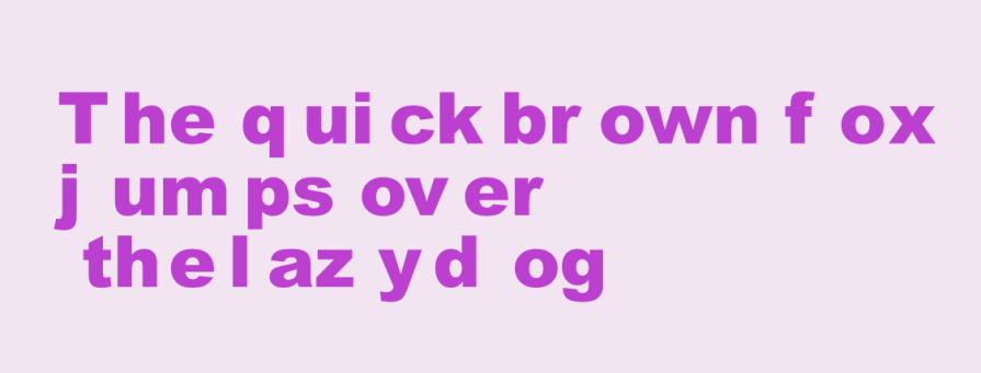
Typography must prioritize readability while also being visually appealing. And legibility is always the primary objective.
Furthermore, designers must balance ornamentation with accessibility needs to ensure the text remains legible. Typography should achieve an optimal balance between form and function and deliver the best possible user experience.
Kerning is used to adjust the contrast between text and background. If the letters are too close together, it flattens the image and reduces cognition. And the text should also be easily readable at various sizes and across different devices.
Choosing the correct elements — the right typeface, weight, or color — can often be crucial for success.

Kerning is a complementary set of negative space adjustment techniques in typography. It is different from tracking (which adjusts the space between all letters in equal increments) or leading (line spacing). These adjustments work together to eliminate a cluttered environment.
So overall, proper spacing, using techniques like leading, tracking, and kerning, enhances both readability and aesthetic quality.
It is not uncommon to defer to default spacing without realizing that the text has not been optimized to be read properly. Common mistakes include over-kerning (overly tight spacing that reduces legibility), inconsistent kerning (uneven spacing between the same pairs of letters or words that alter their meaning), bad kerning, and forgetting to kern altogether!
But by using the following tips, you can avoid or minimize these mistakes:
One should not just accept what a design app offers as a default but treat it as a first draft requiring a few more edits.
Kerning requires asking a lot of questions:
One should never be afraid to ask these types of questions.
A big advantage of using system fonts or those published by a well-recognized type foundry is that they have built-in kerning (metric kerning), which saves you from many headaches down the line. Increasingly, design apps have automatic features for spacing text, and by using a professionally designed typeface, the full benefit of such tools can be utilized.
As kerning is difficult, a font downloaded for free from an amateur designer may not have good in-built kerning.
As mentioned, when kerning pairs are built into the typefaces, this is called metric kerning.
The font designer has already optimized the space between specific letter pairs. If the font you are using is well-designed, as Ellen Lupton suggests, you can use metric kerning and leave it alone, especially for the body copy. It is often a mistake to mess with small text. At smaller text sizes, subtle kerning adjustments become less noticeable, so focus on overall readability.
If a font does not have built-in kerning by pairs, the optical kerning feature can help fix it.
Optical kerning refers to a patented spacing algorithm that guesses the width and kerning of every character based on their shapes.
Large sizes, such as headlines and logotypes, often need some extra attention in the form of manual adjustments. Trust your eye and adjust until the appearance of even spacing overall is created.
Generally, metric kerning is your best choice. It is what the type designer intended. Sometimes, optical kerning may look better. Try toggling between the two before manually adjusting.
Always test your text at different sizes and resolutions to ensure it looks good in various contexts. Kerning often needs to change with font size. What works for headlines may not be suitable for body text.
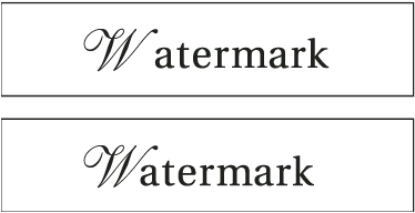
Different typeface styles, like serif or san serif, require unique kerning approaches tailored to the style itself. Script or cursive fonts typically can require tighter kerning to maintain a flowing, connected appearance. Heavier font weights usually need more kerning space than lighter weights of the same typeface.
A visually balanced composition with harmonious typefaces (selected to suit the design’s objective) makes the overall design more appealing and sophisticated to users.
For smaller screens, increase kerning slightly to improve legibility. On mobile devices, tighter spacing can make text harder to read. Decrease kerning for larger displays, as more screen real estate allows for tighter letter spacing without sacrificing readability.
As mentioned above, ideally, use high-quality fonts with built-in kerning rather than others, as this will make managing scaling easier.
Kerning plays a role in maintaining consistency across different screen sizes and devices.
It helps ensure that text remains legible and visually appealing on various display sizes, from desktop monitors to mobile screens. Consistent kerning contributes to a cohesive visual experience across different parts of an application or website.
In addition, kerning can impact accessibility for users with visual impairments. Appropriate letter spacing can make text more readable for users with certain visual conditions.
The final step in optimizing mobile typography is to test and refine it on different devices and scenarios.
Check how typography looks and performs on various screen sizes, resolutions, orientations, browsers, and platforms. Tools like Chrome DevTools, Responsive Design Mode, or BrowserStack can be used for this.
You should also test your mobile typography with different users, preferably from your target audience, and get their feedback on its readability, attractiveness, and accessibility.
As letter spacing is a fundamental design technique, all major design apps have features that facilitate these adjustments.
Although the apps differ in functionality, a consistent design approach ensures that designers can create visually appealing and readable typography regardless of the app or design platform used.
Generally, kerning can be adjusted by bringing up the text menu option and placing your insertion point (the vertical blinking bar that shows you’re typing) between two letters. Some apps measure space in milli-ems (1/1000th of the font’s point size), while others measure it in points or px.
In Adobe XD, there are two broad ways to control text width.
Reinforcing the idea of using a professionally designed typeface, it is best to use a compatible Open Type/Adobe Font in this environment to take advantage of the Auto Width function. Kerning and tracking are folded into one function under the Character Spacing tool.
As mentioned, it is best to leave body type to automatic features unless absolutely necessary. If necessary, logo or display type adjustment is better done in other family apps (such as Adobe Illustrator) and imported. Space in Adobe XD is measured in milli-ems.
In Sketch, there are automatic features that can be used with Open Type formats, too.
Manual kerning can be done by first highlighting your text and heading over to the Inspector. After placing the insertion point between two letters, head to the menu. Select Text > Kern and choose whether you want to tighten or loosen the space between those letters.
Alternatively, you can also hold ⌃⌥ and switch between T to Tighten and L to Loosen. This system uses the macOS coordinate system’s points for measurement.
Figma offers automatic adjustment, but it differs from the above environments because it uses a percentage-based system for adjusting letter spacing (another approach to assist scaling).
You can click between letters and adjust the spacing using the letter spacing percentage for manual adjustments in specific letter pairs. Figma should scale this letter spacing proportionally.
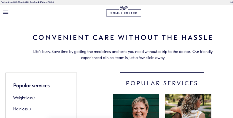
The Boots Online Doctor website applies this idea to good effect. As a product advertising medical services, cleanliness, and functionality are obviously of great value to the brand. The website’s titles have widely spaced letters, while columns are also kept apart to create a good contrast between background and text.
This brand uses kerning to create an image of trustworthiness and hygiene.
Butter is an app for facilitating highly collaborative sessions like workshops, training sessions, boot camps, courses, events, interactive webinars, social events, or any other session where you need to keep people energized and productive.

Here, kerning, the color yellow, and the Futura–based font are used to create an image of engagement and functionality. With wide spacing and a clutter-free environment, the website emphasizes the value of smoothness.
Omio is a global multi-mode search engine for all major forms of transport. The app compares and combines various transport modes.
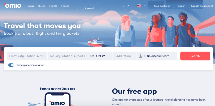
Like the above-mentioned examples, this brand projects reliability and functionality. Good spacing practices help drive this image through the platform’s interface.
A poem in Lao Tzu’s Tao Te Ching (Chapter 11) contains one of the most beautiful explanations of the value of negative space:
“Thirty spokes share the wheel’s hub;
It is the center hole that makes it useful.
Shape clay into a vessel;
It is the space within that makes it useful.
Cut doors and windows for a room;
It is the holes which make it useful.
Therefore profit comes from what is there;
Usefulness from what is not there.”
Kerning may seem trivial, but the spacing between letters significantly impacts how a word is read. Incorrect kerning can mess up meaning and communication, while good kerning can elevate a product.
A nicely spaced interface signals to a user that the product values clarity and legibility, while a sloppily done one has the opposite effect.
By paying attention to kerning, designers can significantly improve the overall usability and user experience of their digital products. Proper kerning enhances readability, creates visual harmony, and contributes to a more professional and polished appearance, which positively impacts the user’s interaction with the interface.
As the above case studies have shown, good spacing practices, like kerning, can help underscore a brand image of trustworthiness, functionality, smoothness, and hygiene.
By considering factors like consistency across scale and platform, you can create typography that maintains its intended visual rhythm and legibility across various screen sizes. Good kerning can be the subtle difference between an average and an elevated product.
LogRocket's Galileo AI watches sessions and understands user feedback for you, automating the most time-intensive parts of your job and giving you more time to focus on great design.
See how design choices, interactions, and issues affect your users — get a demo of LogRocket today.

Design engineering has always lived between design and code. But with AI tools turning prompts into interfaces and code into editable canvases, that bridge is becoming a new way of building.
A three-week mobile banking project taught me that the “proper” UX process is not always realistic. Sometimes, the better approach is to work with what you know, identify what you still need to learn, and make the strongest decision possible under real constraints.
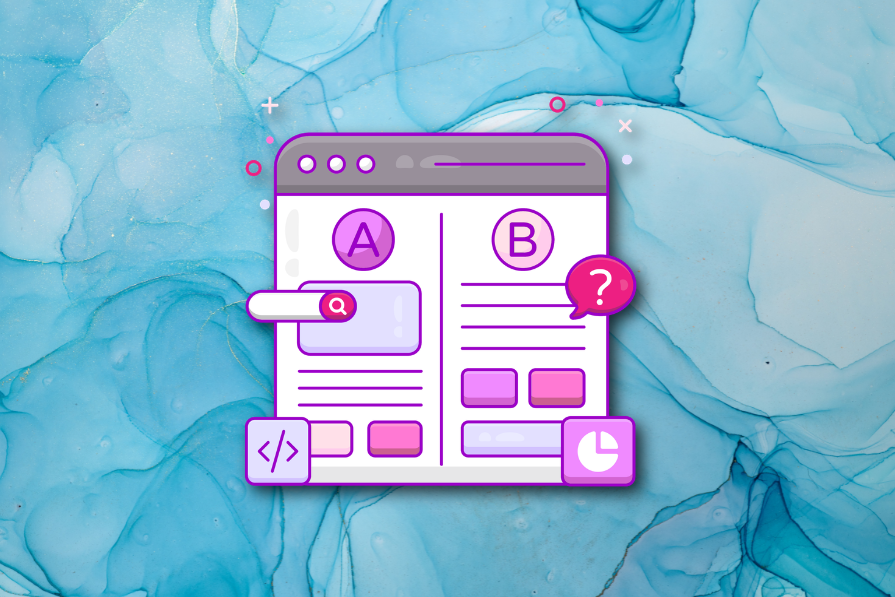
A/B testing compares two versions of a design to see which performs better with real users. Here’s how UX teams can use it to test hypotheses, measure outcomes, and make smarter product decisions.
This case study shows how one ad experience redesign increased total ad exposure while lowering perceived friction, proving that timing and context can matter more than raw interruption.