Typography is all around us. Everywhere you look, you’ll find typography being used to draw our attention. So, as designers, if our designs are to stand out, we need to make their written content unique and aesthetically pleasing.
One way to achieve this is by using a typography scale. In case you’re not familiar with typographic scaling, don’t worry. This article is all about typographic scaling. We will look at what it is, the types of typography scales, and even provide a quick tutorial on creating your own typography scale in Figma.
So, if you’re ready to bring harmony to your designs with typographic scaling, let’s get started.
A typographic scale is to a typographer what a musical scale is to a musician. It is a system used to create harmony among the different font sizes, line heights, and text spacing in a project.
Because it is a scale, it uses the scaling property “rf,” where “f” is a size in the scale and “r” is the ratio of the scale.
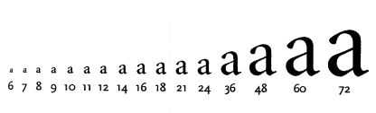
To establish a typography scale, start with a base font size (typically between 14px and 16 px). Then, scale it up by consistently multiplying the font size by a fixed ratio “r.” This approach keeps all the font sizes related and in harmony:
Now that we’ve covered what a typographic scale is, let’s look at some common types.
Typographic scales are categorized based on the type ratio “r” used to define them. There are different ratios available. Each one has been tried and tested over the years and proven to create harmonious text variations.
Some of the most common type scale ratios are:
Each type scale ratio will result in a different level of contrast between the font sizes in your typographic scale. Therefore, it is important to choose a type ratio based on the contrast level you want between the different font sizes in your project.
Now, let’s look at the different levels of contrast available.
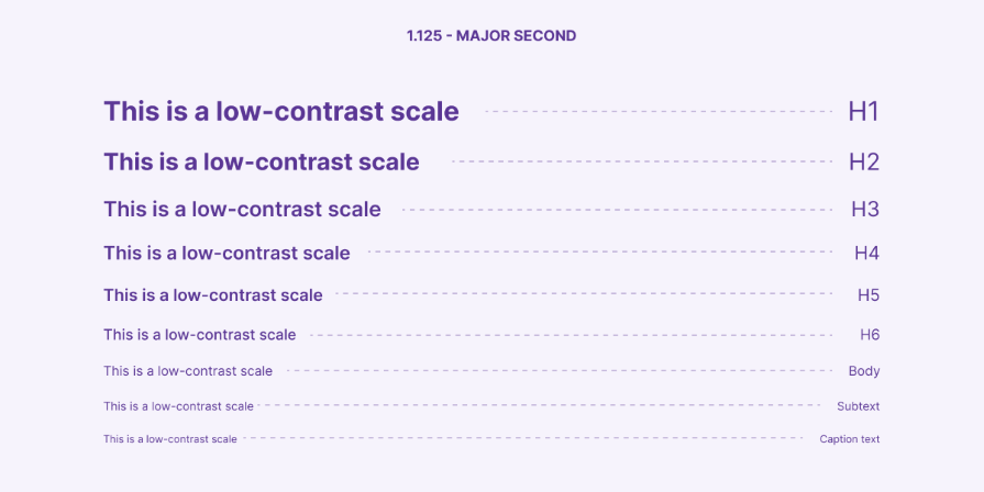
When you need to maintain minimal, often barely noticeable difference in the font sizes between elements, use low-contrast scales such as minor second and major second. This contrast level is best suited for designs that need a clean, minimalistic appearance, such as blogs or product packaging:
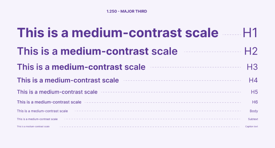
When you need a balanced blend of differentiation between the font sizes in a project, consider using medium-contrast scale ratios such as minor third, major third, and perfect fourth. As this contrast level is versatile, it is suitable for various projects such as websites, brochures, etc.:
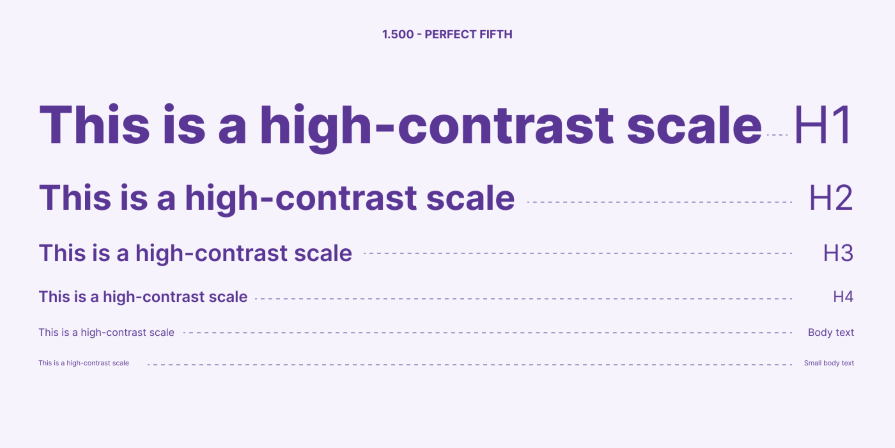
When you need a decent amount of contrast between the font sizes in your project, turn to high-contrast scale ratios such as augmented fourth, perfect fifth, and Golden Ratio. This contrast level is ideal for designs that need to emphasize specific elements, such as posters or web headers:
As you might have already deduced, your choice of contrast level should depend on the impact level you want to achieve and the platform you’re designing for.
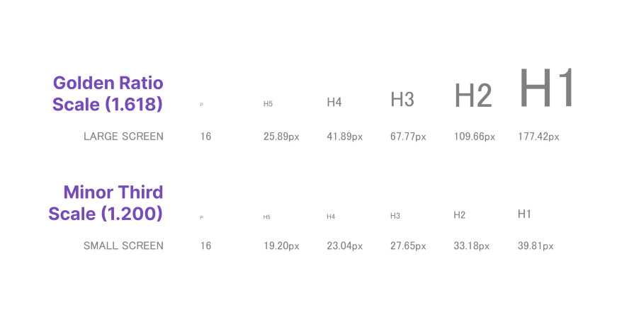
However, more often than not, users will view your designs across multiple platforms. Therefore, you need to ensure that your text remains readable and aesthetically pleasing on all screen sizes. A responsive type scale comes in handy for this.
This approach to typography ensures that text elements on a website or app adapt and look good across various screen sizes and devices. To achieve this, we can either combine two type ratios or have multiple type scales for different screen sizes:
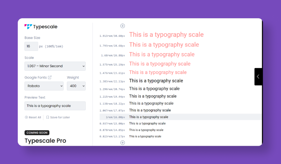
If you need a quick way to generate a typographic scale, a tool like Typescale can be helpful. It is a modular type scale generator created by Jeremy Church that does the heavy lifting by creating a type scale for your designs.
Simply specify your base size and choose a type ratio. Typescale will generate a scale based on your choices:
But if you want to get hands-on and take charge of all the design details, here’s how to create your very own typography scale in Figma.
You can create your own custom typography scale in Figma by following a few easy steps.
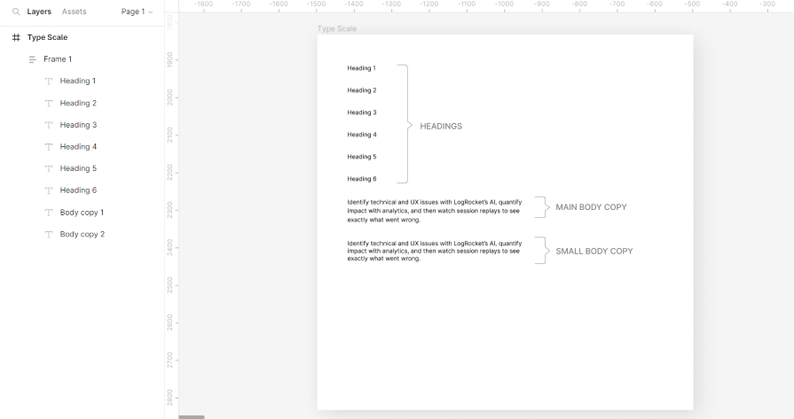
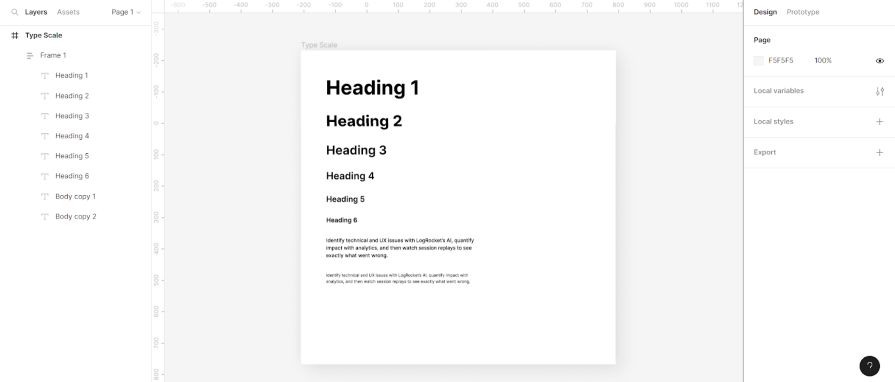
Open your Figma project. Create a frame with eight text elements (six for headings and two for body text). Adjust the font size of these elements to your desired base (e.g., 16px).
This font size will be the main body copy. You’ll scale up (or down) from here to define other text levels:
Decide on the type ratio you want to scale with. For this example, we’ll be using the major third (1.250).
Select the main body copy and multiply the line height by 1.250. Leave the font size at 16px:
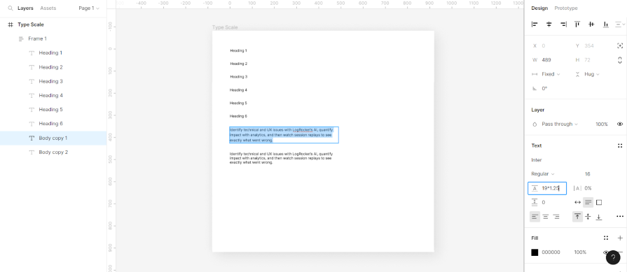
Next, select the small body copy and divide the font size by 1.250 (16/1.25). This will give you 12.8 px. Round up to the nearest whole number — 13px. Then multiply the line height by 1.25 or choose your own common multiplier:
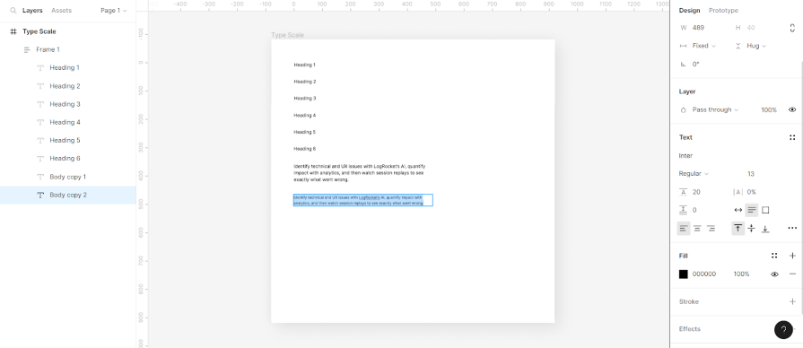
Once you have the paragraph text properties sorted, move on to the headings.
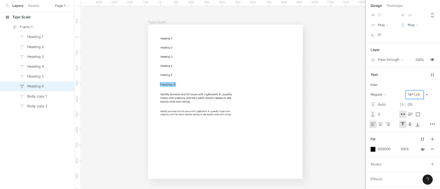
Select the sixth level heading (Heading 6) and multiply the font size by your type ratio (16*1.25 in this case):
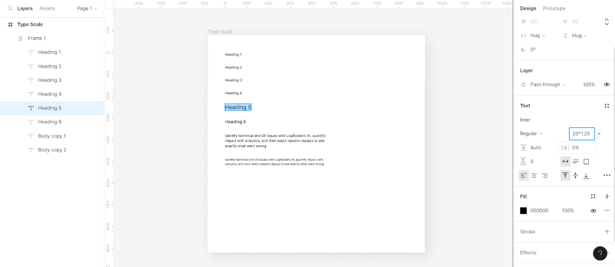
Next, copy the Heading 6 text property and apply to it Heading 5. Multiply this new heading by 1.250:
Repeat this process for all the other heading levels ensuring that each level is 1.25x the preceding font size. You’ll have something that looks like this:
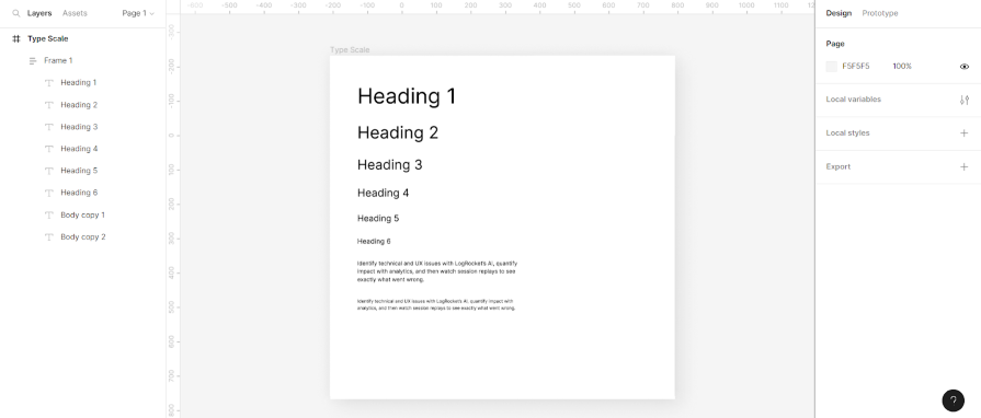
Finally, change the font weight of the first two headings to bold and headings 3, 4, 5, and 6 to semi-bold. Keep the main body text at medium and the small body text at regular:
As you may have already noticed, well-implemented typographic scaling can significantly improve the readability and aesthetics of your design projects. And the good news is that creating your own typographic scale isn’t exactly rocket science.
By following the steps outlined in this article, you can create a harmonious system that brings balance to the text elements in your design. So be sure to bookmark this article and turn to it the next time you have a design project that could use some awesome typography.

LogRocket's Galileo AI watches sessions and understands user feedback for you, automating the most time-intensive parts of your job and giving you more time to focus on great design.
See how design choices, interactions, and issues affect your users — get a demo of LogRocket today.
Multimodal UX goes beyond designing for screens. Learn how context-aware systems, progressive modality, failover modes, and accessibility-first design create better digital product experiences.
Learn how context-aware mode prioritization and seamless transitions improve multimodal UX and reduce mode confusion.

Research is becoming more democratized, product cycles are accelerating, and AI is transforming synthesis and ResearchOps. Here are the three trends shaping UX research in 2026.

Voice support is not the same as multimodal UX. Here’s how to design systems with true mode continuity and context-aware interactions.

 Learn more →
