Any company, big or small, new or old, will at some point introduce something new to their products for their potential or existing customers to access and use. But anyone who’s done this knows that change often comes with resistance. Some users simply dislike anything new. Others feel their expectations weren’t met, or they think the update doesn’t match their preferences.
Despite the initial risks of something going wrong and not working as needed or being unappealing overall, you must keep in mind that resistance to change is not just about the product’s performance. It’s often about the user’s experience and the psychology behind how people react to change.
YouTube, for example, continually updates its UI to help people discover content more easily or personalize their feeds. But users often respond with frustration, downvoting new features or airing complaints. It’s not that the updates are inherently bad. It’s that users are thrown off by change.
So, what can you do? As product designers and managers, it’s essential to prepare for this resistance and approach it thoughtfully. Let’s look at how to do that.
One common reason users reject a new feature is that they don’t understand why the change was made. Sometimes, even users who were dissatisfied with the older version still push back against a fix.
That disconnect often comes from unmet expectations or from launching something that doesn’t feel useful to the user.
So, at this point, if you have ever considered proposing a change to the tool or service that you monetize, you must become the source of confidence that customers can rely on and believe that the change was inevitable yourself before anyone else.
To sell the idea of a change, you must understand exactly why the change was needed in the first place. If there is a tool that no one uses and you rework it, ensure that customers are aware of this.
It is not the same as admitting a mistake, as some think. Recognizing your shortcomings and addressing them takes courage, and this action earns the loyalty of customers. When users know that your company will do anything to make customers feel welcome and enhance their experience with the product, these customers will be more likely to stick with the company that listens to them.
The bottom line is that you need to be on the same page with your audience and proactively enhance their experience, which will be one of the most valuable reasons to implement a change.
However, sometimes a change means something totally new is introduced for the customers to use. In this case, you must answer the question, “Why does anyone need it?”
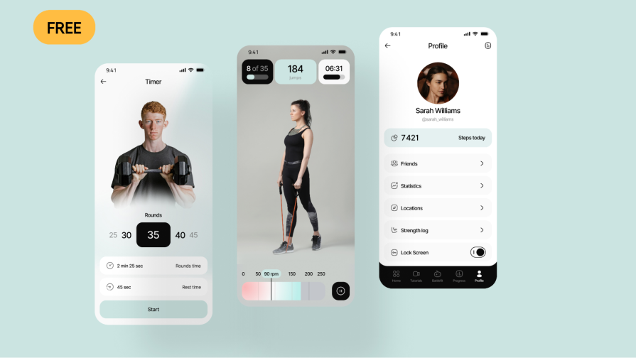
For example, you design a fitness application that allows customers to use various features to track their daily activities and calorie intake. However, you have decided to add a new feature to track rest patterns in your app.
While all of your loyal customers have only used previous features, the new one might meet some resistance from customers who may ignore or even oppose it. However, if you integrate the new feature correctly and demonstrate in your other tools that some analysis might benefit from considering the rest patterns, customers will likely enjoy the new feature and will also recommend it to others, increasing exposure to a new audience.
Here is how the communication of such a tool was done in a real case by Promatics:
Once you’ve explained the “why,” it’s time to focus on the “how.” How does this update make your users’ lives better?
While the idea might sound simple, it is the job of the entire team to integrate the change in a way that customers understand and accept it, which is not an easy task.
If we return to the fitness app example, one great tactic is to integrate references to the new feature throughout your product. This way, customers will be more likely to try something new and understand how it impacts other features:
However, that is not the only thing that is needed. You must also focus on UX design to ensure the integration looks appealing, which will increase the likelihood that customers will like the tutorial, for example.
Moreover, the presentation of the feature must take place in a location where customers can easily see it. While the so-called tutorial might be the way to go, you should never overlook other options, such as conference presentations, email communications, and even blog posts, to reach a wider audience with the news.
It is not a secret that some customers may prefer one way to consume information over others. At times, when the forced tutorial might work for some, others may skip it without paying attention to anything, and it is your job to use as many ways as it is possible to grasp your customers’ attention so they will not be left out wondering about some new flashy button appearing on their screen.
That being said, your communication must always explain how the product benefits from a change in details, showcasing at least some performance metrics or new data that can be obtained exclusively with the new feature. Additionally, if your product relies on paid subscriptions or if the new feature must be purchased before use, ensure that a demo version or free trial is available, allowing customers to explore what the tool is about.
When you’re ready to launch, think about who is sharing the news — not just what is being shared.
One of the methods that is stuck in my mind as a success story was the communication of the new update through the social media pages of highly regarded Microsoft CEO Satya Nadella, who showed short videos on how the Copilot tool worked and further explained casually why some things that Copilot introduces are the way they are, who needs them, and also uses personal comments to build trust. Such communication appealed well to the audience (and me specifically) and felt much more audience-oriented and friendly.
There are always ways to do the same with other opinion leaders in your sphere. However, you should never skip communicating the needed information with your company’s representatives. The more employees speak about it, the greater the reach and the clearer the picture of how big and friendly your company is. It creates a sense of family, where each member is genuinely proud to share something they’ve cooked together, and customers love that.
Microsoft was aware of this, and alongside Satya Nadella, Jared Spataro, and other opinion leaders, many other company employees shared their personal experiences with the product.
When changing a product or introducing something new to it, each company creates a visual disturbance for customers who operate within the product’s environment. Such small changes catch the eye, and a lot of conservative people hate it when something changes.
Many people report that new things simply annoy them because they are something they do not want to see. I personally experienced this when it came to one of my workplaces, where every employee in the department had to use Grammarly.
I’ve seen this firsthand. At one of my previous workplaces, we used Grammarly across the department. I’ve personally used it for nearly a decade. Every time there’s a big update, it messes with my muscle memory. So I’d always hit “Back to old version” just to keep moving. Many of my coworkers felt the same. Even if they didn’t love the old version, they were used to it.
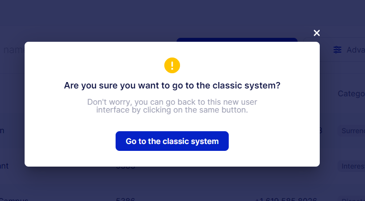
That’s why offering a way to revert is powerful. It gives users a sense of control. It prevents them from feeling cornered. And it can reduce backlash on social media, support tickets, and bad press. A temporary rollback option lets users adjust at their own pace — and gives you valuable feedback for refining the experience. Here is how companies usually integrate something like this:
As the company responsible for the update integration, you will likely engage with testers of your new product. Testers will likely attempt to identify and prevent any potential problems with the product and provide their initial feedback on how the new product performs.
However, when it comes to UX design, you may never know how your target audience, which usually differs from your testers’ tastes, reacts to the change. That is why companies typically engage with focus groups and third-party reviews to gauge how potential clients might react to new products or services.
When it comes to the launch date, ensure that your product is thoroughly tested in a field setting with as many users as possible. The first day of the launch is typically accompanied by a high level of readiness among technical departments to respond to any issues and resolve them as quickly as possible. And that means the more data you have, the more things will be fixed on the first day, while everyone in your company is in front of their screens to ensure the launch happens smoothly.
That is the perfect opportunity not only to fix as many mistakes as productively as possible but also to minimize the negative emotions associated with the update. When users find something they don’t like, but it is fixed within the first 24 hours, they are likely to experience positive emotions as a result.
That being said, you must engage as many customers to test your product as soon as possible, but that is a tricky part. Sometimes, having a “back to old version button, having a lot of services or tools available, or even the lack of resources or need to integrate a new update so it is applied everywhere within your product might mean the customer might not even try your new feature in the nearest future, which is detrimental to the success of your product.
You must try to persuade those people to try the new product, regardless, for the sake of the company’s success. The more problems are identified and addressed promptly, the more money you will earn in the long run.
That is why the idea of “paying” the customers to test the product is usually justifiable. But paying directly is never an option. If you have something you can offer within your product, such as credits or discounts on other products, you may use that as a potential way to thank your customers for testing the service and providing feedback.
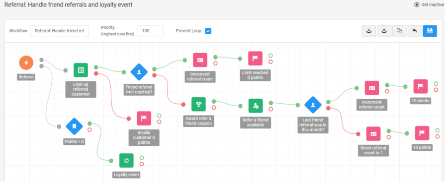
For example, you can integrate a referral system to assign points that can be spent for some discounts on your products:
Additionally, you may need to pay for posts in certain publications to increase the exposure of your product and enhance the likelihood that people will try it. You will also use ads to achieve the same goal.
Any company must understand – the more money you spend on making the product great, the more money you will receive as a return. You must spend in order to perfect what you did because if you don’t, the more money you spend on something people dislike, the more money you burn into ash with zero returns.
While this strategy and tips from my experience might not look convincing to all, Meta was using this strategy on a larger scale when they launched Instagram Threads. I had to go through multiple tool launches to gather this knowledge, and I was positively impressed by how they applied the same strategy I had come up with on a larger scale:
Needless to say, all the media publications were writing about them, which included not just natural curiosity publications but also paid guest posts. They invested heavily in being vocal, using all the available microphones at every major event. If Meta and their approach don’t convince you that the approach is effective, I don’t know what else will.
To sum it up, there are a few things that you must remember:
At the end of the day, change is hard — but it’s worth it. With the right strategy, you can turn resistance into adoption and feedback into loyalty.
This is based on my experience with multiple product launches, and I hope it helps you implement your next change with more clarity and less chaos.

LogRocket's Galileo AI watches sessions and understands user feedback for you, automating the most time-intensive parts of your job and giving you more time to focus on great design.
See how design choices, interactions, and issues affect your users — get a demo of LogRocket today.
Learn how context-aware mode prioritization and seamless transitions improve multimodal UX and reduce mode confusion.

Research is becoming more democratized, product cycles are accelerating, and AI is transforming synthesis and ResearchOps. Here are the three trends shaping UX research in 2026.
Voice support is not the same as multimodal UX. Here’s how to design systems with true mode continuity and context-aware interactions.

AI tools can generate beautiful UI concepts in minutes, but most teams struggle to integrate those outputs into real design systems. This guide explores why AI drifts toward generic patterns and how to build governed workflows that keep speed without sacrificing brand consistency.


