In UI/UX design, grouping is a way to arrange multiple visual elements based on visual characteristics to reduce user cognitive load. So, UI/UX designers typically group similar UI elements or element collections based on various design principles to offer users productive, friendly, intuitive human-computer interaction.

And to create effective interface designs, UI/UX designers should use effective, optimal principles for grouping similar elements or segments based on proven human psychological facts.
Gestalt psychology, founded by Max Wertheimer and two other German psychologists, introduced a set of grouping principles. These laws are based on a study that explores how the human brain processes visual patterns and complex visual entities. Almost all modern software UIs optimally adhere to these Gestalt grouping laws for creating intuitive, highly user-friendly software UI interactions.
In this article, I’ll explore Gestalt laws of grouping with simple visual layouts and examples and discuss their importance in UI/UX design. I’ll also examine several case studies highlighting the effective, practical usage of Gestalt grouping laws.
Gestalt psychology doesn’t solely explore grouping visual entities. It is a broad study of human visual perception and complex pattern recognition that introduces many design concepts for creating human-friendly visual entities, such as brand logos, signs, posters, etc. Gestalt psychology also implements several principles we can use as standard, proven design laws for effectively grouping software UI elements.
The following Gestalt laws help UI/UX designers group UI elements effectively:
The law of similarity states that visual entities with similar characteristics like size, shape, and color are perceived as groups in mind. The human brain will perceive visual entities as a complete object or a group even if items with similar characteristics are not visually connected.

For example, once you look at the above image, you will identify three columns since the visual elements in each column share common visual characteristics, even if they don’t have visual connections drawn.
Here are some scenarios where UI/UX designers use the law of similarity to improve software UIs:
Designers can also properly use the inverse of the law of similarity to differentiate or highlight several special elements from other similar elements.
Here are some example scenarios where designers break the law of similarity to implement intuitive, user-friendly interfaces:
Major visual characteristics used with this principle, such as size, shape, and color, have different grouping powers. So, you can override grouping based on the following grouping power order:
For example, you can use similar colors to override shape-based grouping.
The law of proximity describes that closer visual entities are perceived as similar groups in mind. The human brain identifies closer visual entities as complete objects or groups, even if each entity doesn’t share common characteristics.

For example, if you look at the above image, you’ll identify two visual groups, even if each group contains items with different shapes.
Here are some scenarios where UI/UX designers use the law of proximity to improve software UIs:
While using the law of proximity, designers should properly select the required spacing, as invalid proximity can cause bad designs. Here are a few examples of them:
Also, using extra proximity also reduces the quality of designs, so identifying the optimal proximity is a must before the design-handoff process.
The law of closure states that the human brain fills the gaps and recognizes a complete object or group, even if several visual segments are missing.
The law of closure is the reason behind perceiving real-world object shapes from clouds, water, and other natural or man-made surfaces — our brains try to complete gaps and construct objects we already saw.
For effective grouping, we can use this law by creating completely visually separating groups by partially separating them with visual segments — our brains will fill in the missing grouping boundaries and form a group.

For example, the above image creates a group by partially drawing a rectangular shape around several elements.
Here are several scenarios where UI/UX designers use the law of closure for effective grouping:
The law of continuity describes visual entities that follow the same flow or follow a line or curve are perceived as connected and similar elements. The human brain typically urges to follow ordered, continuous elements and skip other unrelated, disconnected entities.
Designers can use this law by arranging similar and related elements on a continuous line for effective grouping.

For example, the above image’s circular shapes form a group by a continuous flow, even if the group goes closer to other shapes. Designers can use colors or styles to change the flow of continuity.
Here are several scenarios where UI/UX designers effectively group elements using the law of continuity:
We can also break the continuity to separate the whole continuous flow into two or more groups:
The law of connectedness states that visually connected elements are perceived as similar or related ones. The human brain perceives connections between visual entities and identifies all connected elements as one isolated entity from other disconnected elements.
For example, we treat the key and the key tag as a single object rather than two separate objects since both objects are connected.

The above image shows how visual connections group four similar shapes into two groups.
UI/UX designers use the law of connectedness for grouping in the following example scenarios:
The human brain naturally relaxes when the eyes perceive simple, organized visual elements. For example, despite the noise, we all feel more relaxed while walking near the beach than on a busy market street. However, the brain has to process more visual signals when we see complex visual entities.
Gestalt grouping principles help us organize elements in a more human-friendly manner, so users had to understand the Gestalt-grouped elements with less cognitive load.
If a UI fails to follow required Gestalt grouping principles, users may fail to interpret the intended grouping properly. As a result, users either misinterpret the grouping or will have to think further to understand the actual grouping created by the designer.
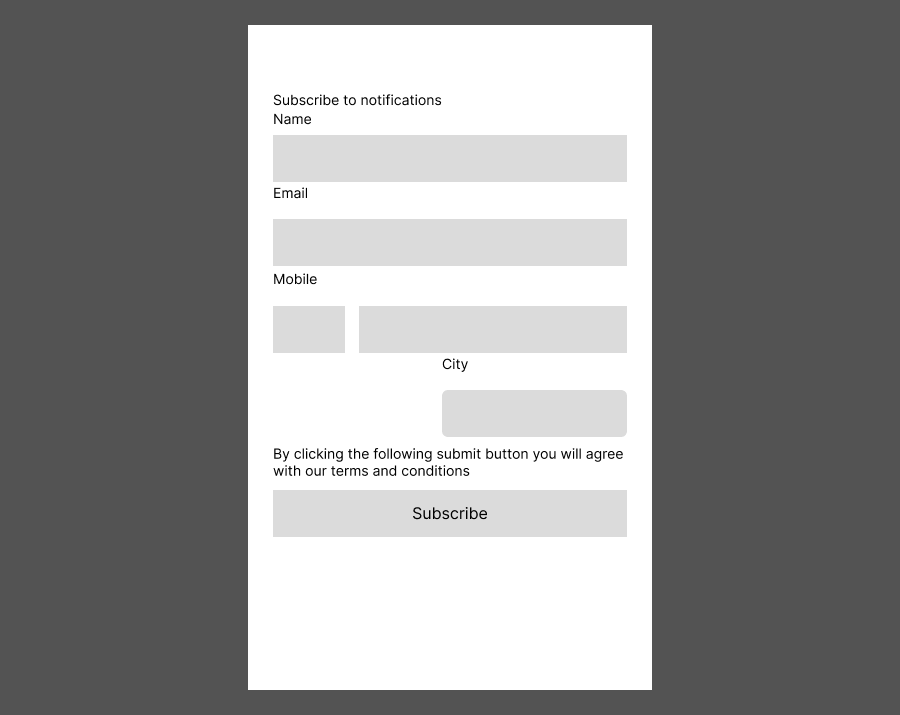
Look at the following form that doesn’t adhere to Gestalt grouping principles properly:

The above form has the following issues with visual perception:
Let’s apply Gestalt grouping laws to improve this form. Here, we can make the following modifications to solve the above issues:
Here is the improved subscription form after the UI/UX improvements:

Now that we know the theoretical aspects of Gestalt grouping principles and have discussed some practical examples, let’s explore the practical aspect by carefully examining the interfaces of a website and a mobile app.
Medium is a leading publication website that lets authors compose and publish articles for a large audience. Its minimal UI design effectively adheres to Gestalt principles.
Its minimal navigation bar uses the law of proximity and the law of similarity by using equal spacing between navigation items and sharing the same text style, as shown in the following preview:

As you noticed, the navigation menu empowers the law of continuity by adding a shading effect for the first and last menu items and arrow icon signifiers.
Medium creates a visual rectangle around each article list item by arranging them in a rectangular shape using the law of closure to create article item groups. Article item thumbnails are aligned vertically, adhering to the law of continuity. It breaks the law of connectedness using an article item separator to empower the law of proximity:

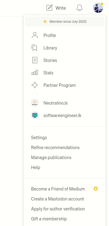
Medium groups the user menu items using proper spacing, similar styles, and alignment, adhering to all Gestalt grouping principles:

As you noticed, it breaks the law of continuity by using a low-contrast separator to avoid unwanted eye-catching highlights. Even though logos are typically different, Medium tries to make them similar by making them circular, adhering to the law of similarity.
Uber is a multinational transportation service provider app. It follows a minimal app design and group elements, effectively using Gestalt laws to offer a productive user experience for everyone.
The home screen’s action cards draw a visual rectangle based on the sub-element arrangement using the law of closure and proper spacing to group action cards properly. Image thumbnails also use similar image effects and color palettes by maintaining the law of similarity, as shown in the following preview:

Also, each list title is rendered closer to the list and away from the previous list, adhering to the law of proximity.
In the services screen, Uber uses the law of similarity and the law of proximity to list available services effectively based on their popularity and frequency of use:

Uber uses the same style for all service categories — adhering to the law of similarity — but highlights the primary services using large category cards. As you can see, the first three services use somewhat larger cards than the rest. In the food delivery section, the design carefully chooses visually similar icons and styles for category cards.
The bottom primary app menu also effectively uses every Gestalt principle by using similar icon designs and text styles with proper spacing.
Uber’s map uses the law of connectedness by connecting the start and destination of the journey with an animated path that goes across the street map:

Look at the alignment of prices. The design uses the right alignment for monetary values, adhering to the law of continuity so that users can compare prices easily. Similar to the previous screen, this screen also uses the law of proximity well to group each transportation option.
As you noticed, the action button section breaks the continuity of Uber options by its top border and solid background, properly separating the action area from the list.
Moreover, the icons for each transportation option are carefully designed with the same color scheme to maintain the law of similarity.
This article explored how Gestalt grouping laws help us create high-quality, usable UIs that reduce user cognitive load. We examined the practical usage of Gestalt principles using two popular software systems interfaces.
If designers don’t properly group elements based on Gestalt principles, users may misinterpret the grouping and jump to false conclusions that prevent or delay achieving their interaction goals. Improper use of Gestalt principles may also lead to user confusion and frustration.
As experienced UI/UX designers, we should optimally apply Gestalt principles to relevant visual entities, focusing on user understanding and productivity. Testing several versions of Gestalt-grouped designs is undoubtedly a better way to identify the most suitable grouping technique for a specific design segment.
Gestalt grouping laws are not only a design technique for effective UI element grouping. They also help designers create human-friendly, self-explanatory logs, posters, signs, and any visual entity.
LogRocket's Galileo AI watches sessions and understands user feedback for you, automating the most time-intensive parts of your job and giving you more time to focus on great design.
See how design choices, interactions, and issues affect your users — get a demo of LogRocket today.

As products evolve into ecosystems, navigation becomes a system-level challenge. This article explores how to align structure, context, and user journeys to create seamless movement across tools without confusion.

Figma’s AI features have exploded in 2026 — from text generation and image editing to full UI drafts and code handoff. But speed isn’t the same as quality. This guide breaks down every major feature, what it’s good at, and where human judgment still does the heavy lifting.

Zero UI works well for screenless, voice-first experiences, but most digital products still require visual interaction. Here’s why multimodal UX offers a more scalable foundation for the future of design.

Multimodal UX goes beyond designing for screens. Learn how context-aware systems, progressive modality, failover modes, and accessibility-first design create better digital product experiences.