Throughout history, design trends have emerged and faded away. We’ve seen minimalist Swiss Style in the 1950s and 1960s, groovy design in the 1970s characterized by freeform typography and bold colors, followed by the early beginnings of the digital revolution in the 1980s, which brought a futuristic cyberpunk aesthetic.
Fast forward to the early 21st century: flat design made its way into digital design as yet another trend that took the world by storm. In this article, we’ll dive into the history of flat design, some of its telltale components, the benefits and drawbacks of the design trend, and its relevance in the design world today. Should we still use flat design, or is it time for a new design trend to take over?
Before the flat design movement was popularized by tech giants like Apple and Microsoft, its predecessor was skeuomorphism, which was characterized by introducing users to new concepts using familiar objects. The use of affordances in skeuomorphism helped users understand what actions or features were possible, such as deleting files by clicking on a trash can icon:
Skeuomorphism also relied heavily on 3D design to make things look realistic, but it eventually became too cluttered and outdated. With the rise of mobile devices, apps were becoming more popular, which meant that they needed to be more responsive and load quickly. Skeuomorphism just wasn’t optimized for these needs.
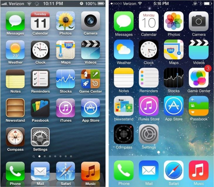
In 2013, Apple revealed the iOS 7 interface, which was the first iPhone to adopt a flat design look. It offered a lighter feel, opting for thinner typography and less visual clutter.
At this time, users were already familiar with interacting with digital interfaces, so the industry felt less of a need to rely on the physical world. After Apple showcased its use of flat design, it was quickly adopted by companies like Microsoft and Google, which led to the movement that is still used in designs today:
Flat design is characterized by its minimalistic approach, removing the 3D elements from skeuomorphism, such as textures, shadows, and gradients.
It leverages solid, bright colors and strokes to capture users’ attention, as seen in iOS 7. Instead of the dull colors that skeuomorphism might have used, flat design is much more vibrant. A good flat design lends itself to having a clear visual hierarchy by applying more dominant colors to important elements.
In addition, flat design leans toward using bold sans-serif typography, emphasizing readability and scalability on smaller screens. This also makes flat design highly responsive, as it’s optimized for use on all types of screens:
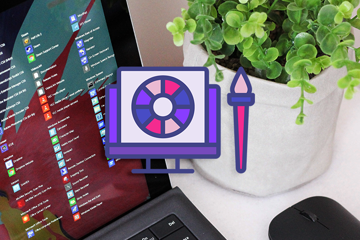
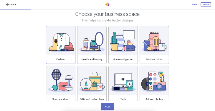
Flat design also uses geometric shapes and elements in iconography, which introduces balance and simplicity in a cluttered digital interface. As mobile apps became more popular, the need for app icons to scale at different sizes while being recognizable made flat design an effective solution:
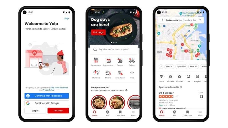
Simple illustrations are popular in flat design interfaces to add visual interest and help communicate ideas. An outline style or geometric style allows the user to focus on the content, rather than be distracted by the illustrations.
In terms of usability, flat design benefits from simplified interfaces. It incorporates design principles such as minimalism, visual hierarchy, and bold typography to make user interfaces easier to navigate and understand.
By removing a lot of the visual noise that skeuomorphism introduced, users can comprehend designs more quickly and develop familiarity with common design patterns:
Now let’s talk about the drawbacks of flat design. Although flat design solves the clutteredness of other design trends, it has its disadvantages as well.
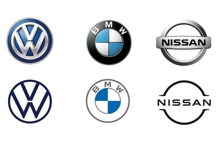
A common critique of flat design is that it is boring. Have you seen the trend of logo redesigns from the early 2000s to now? The new logos are often criticized for lacking the same distinctive character as their predecessors.
In pursuit of enhancing user experience, flat design falls short by removing the creativity and uniqueness from many interfaces. This is evident in many popular brand rehauls that have updated their logos to match the flat design aesthetic:
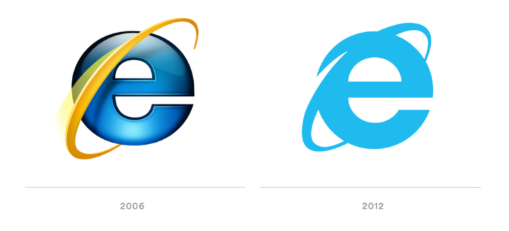
Often, companies remove what made the brand unique in the first place in the flat design version, creating a dull and bland effect. Icons start to look the same and nothing stands out anymore.
This might be okay for well-established brands that already have a following, but new brands risk falling into the trap of going unnoticed due to bland design:
As designers started to realize the drawbacks of flat design, the trend evolved to bring it back to life. By incorporating subtleties and details back into the design, semi-flat design, or flat design 2.0, was born.
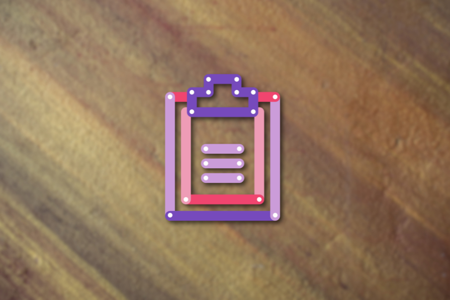
Semi-flat design takes flat design and fuses it with skeuomorphic characteristics, such as drop shadows, gradients, and even animations. These elements were missing from flat design, and they add visual interest and spark to designs.
It also brings back the 3D element to a design, creating an illusion of depth, but maintaining a flat design look and feel. This strikes a solid balance between the minimalism of flat design and the usability aspect of skeuomorphism:
Both design trends have their use cases, so it’s important to understand when they would be most effective. Flat design thrives in offering simple and intuitive interfaces.
Complex applications can benefit from flat design because it can help users understand how to complete tasks without overwhelming them. With all the complex online services that modern apps offer, flat design can help a broad user base understand what’s being communicated.
Infographics or how-to manuals work effectively when designed in a flat style because they help visually communicate instructions without including any distracting element.
Additionally, logos and app icons can benefit from flat design, although they shouldn’t fall into the trap of removing unique or defining characteristics. Logos and icons are used for branding, so if the strength of your brand comes from a distinguishing element, such as Coca-Cola’s wavy wordmark, then don’t ruin your brand by removing such elements in the name of “simple design”:
Semi-flat design is effective in contexts where realism or complexity helps to sell a story or convey details. Examples such as character design, product packaging, or social media images can benefit from semi-flat design, as they often include details that are needed to create engaging visuals.
The flat design trend has made a significant impact on the design industry and is still relevant today because it has influenced how modern applications and websites look and feel. It also played a role in setting standards for responsive web design, as it emphasized usability and readability of content on all screen sizes.
Flat design has the potential to be a timeless movement, but like all design trends, the industry will find a way to evolve as user needs and technology continue to change.
Some might argue that flat design is losing its appeal, with the rise of other design trends, like glassmorphism and neubrutalism.
This might just be the way all trends evolve, similar to fashion. People get bored of one trend and become excited by the new, shiny object. Old trends get brought back to life with a new, refreshing twist.
I’d still recommend flat design for certain use cases, such as complex applications or responsive web design. A minimalist, flat approach to design may risk becoming stale or boring, but at least it’s rooted in strong design principles, such as hierarchy, balance, typography, and whitespace.
But if you want your brand to stand out from a sea of other flat designs, try incorporating elements of semi-flat or other trends to see what works. Experiment with a newer trend, like glassmorphism, or combine elements of different design trends to create your own unique style.
As long as usability and visual appeal are the focus of the design, flat design remains an effective approach. The key is to adopt a design style that aligns with the project’s goals and user needs, putting good user experience at the forefront — that is, after all, how semi-flat design was born.
Header image source: IconScout

LogRocket's Galileo AI watches sessions and understands user feedback for you, automating the most time-intensive parts of your job and giving you more time to focus on great design.
See how design choices, interactions, and issues affect your users — get a demo of LogRocket today.

Learn what makes a great login screen through real-world examples and UX best practices for creating secure, accessible, and low-friction authentication flows.

Skeuomorphism helped define early digital interfaces by mimicking real-world objects to make technology more intuitive. Learn how it compares with flat design and neumorphism, why it declined, and where it still has a place in modern UX.
Memos don’t have to be complicated. Just keep them clear, concise, and focused on actionable items. More on that in this blog.

AI has made polished, confident content easy to generate, but that does not make it trustworthy. This article explains how UX teams can design stronger quality signals using source transparency, validation, confidence communication, and reputation.


