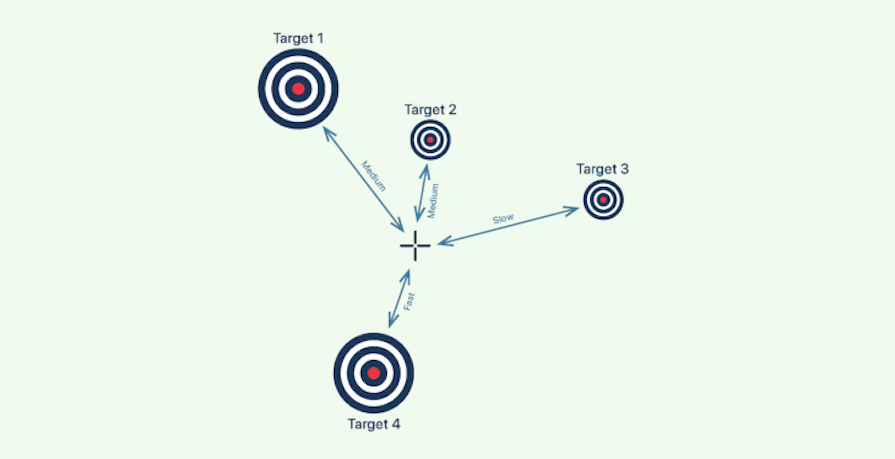
Fitts’ law, or Fitts’s law, explains that the greater the distance between a pointer and a target, the longer it takes for the pointer to reach the target. However, the size of the target has a direct impact on the time required.

In other words, a closer target is faster and easier to approach, while larger targets are faster and easier to reach.
Psychologist Paul Fitts established this law of human-computer interaction in 1954 to clearly describe the relationship between a pointer and a target in terms of distance, size, and speed:
Editor’s note: This article was updated by Neil Nkoyock on 5 March 2025 to update examples, demonstrate additional uses and misuses of Fitts’ law in UX design, answer common questions about Fitts’ law, and more.
Fitts’ law helps us design interfaces that are easier to use. Imagine you were standing in a field looking at these two targets:
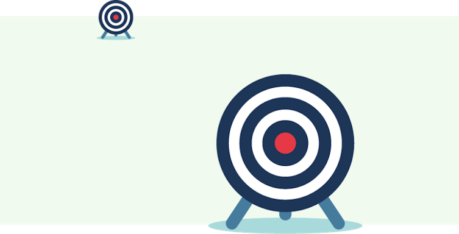
Which target would be easier to hit with a small rock? If you’re not an expert marksman, I’m guessing your answer is the bigger one in front.
Now, look at the following image. Use your mouse (or your thumb if you’re reading this on your smartphone) to point to the center of each circle:
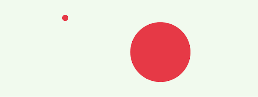
If I’m correct, it took you milliseconds to point at the larger circle, and it was more difficult to point at the smaller circle.
It’s not a huge leap to conclude that in a user interface, the mistake rate increases when the goal is small and distant and decreases when the target is large and close. So, any interactive components related to a user’s task should be large, close, and quickly accessible.
In general, you can apply Fitts’ law to UI design in three simple parts:
Let’s take a closer look at how we can follow Fitts’ law to minimize interaction costs and improve UX.
The prime pixel is where the pointer first appears when a user lands on a page or interacts with a target. By extension, the prime pixel is also the point from which your user will take their next action.
Let’s take a look at a small example that best demonstrates the prime pixel:
The dropdown menu that appears when a user clicks on the Help button is adjacent to the icon. This informs the user of the resultant possibilities for the action performed.
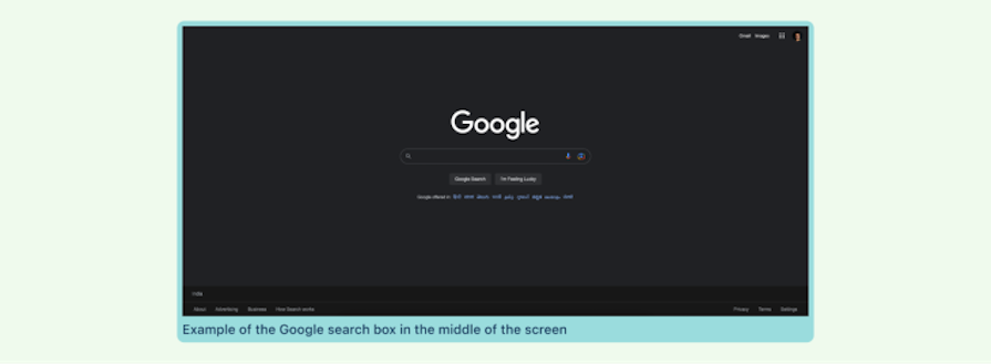
Generally speaking, from the perspective of a designer, the prime pixel is the one in the middle of the screen, until such time as it is acted upon and it shifts. This pattern may be observed in Google’s search box. When you visit Google for information, the search box is located in the center, allowing you to conveniently type and search for the desired information:
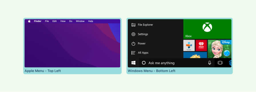
If the prime pixel is, by default, the one in the middle of the screen, the four pixels at the corner of the screen are the farthest points from the prime pixel. These are also known as magic pixels and they serve as a boundary beyond which the cursor can not move.
As a consequence of their distance from the prime pixels, magic pixels are considered the least useful location for anything important or any interactive elements in a design. However, Windows and Apple products have found a creative way to use magic pixels practically.
The user needs significantly less precision to find magic pixels with the pointer. They can simply hurl the mouse toward the corners and the pointer will be restricted by the screen boundaries. This is one of the reasons why you have Windows and Apple menus in the corners, as well as why you can set up “hot corners” on Mac devices as shortcuts, where moving your mouse to one corner starts an action:
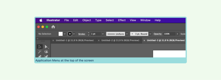
Similarly, the top and bottom margins are more accessible. The top and bottom are not as easily reached, but they still provide quicker access than a single point in the middle of the screen. This is also why Apple’s application menu is located at the top of the screen:
Nothing kills UX more than an interrupted user flow. Placing related information and actions close to each other helps organize them in a structured, intuitive way that enhances usability. Applying Fitts’ law here is all about laying information out logically.
For example, let’s take a form. When filling out information, the layout often goes from top to bottom, with the final target — usually a Save button or Continue button — at the bottom. This ensures that the user needs the least amount of effort to move on to the next target:
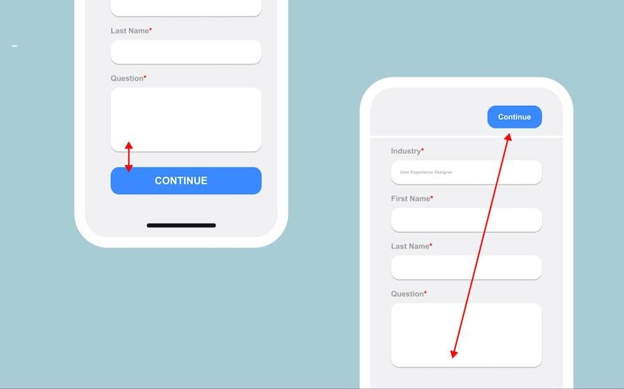
However, if this target were to instead be placed at the top, the awkward placement would instead interrupt the user flow and require more effort from the user.
When developing a user interface, it’s essential to consider the element’s size and distance to the nearest and most often used interaction. The size and distance of a button to its nearest interactive element are among the most prominent design guidelines for buttons.
This might seem to counter the last recommendation we discussed. It’s still true that keeping related elements closer together can help minimize pointer movement. But on the other hand, grouping them too closely can cause visual clutter — or worse, a user might mistakenly click on the wrong target.
This consideration is especially important for high-risk interactive elements such as the delete action that you don’t want the user to activate by accident. These should usually be placed away from most frequently used interactive elements.
In the image below, the Delete button is located next to Download and Edit buttons:
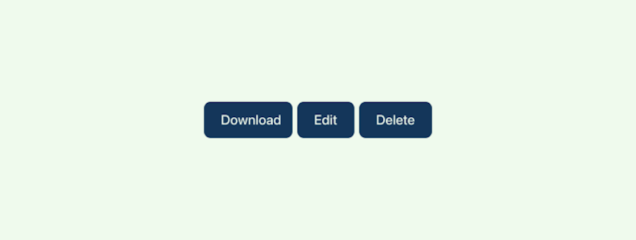
Since Delete is inherently destructive, it must always be placed away from the most frequently used buttons. Spacing it farther out or making it visually distinct (like by changing the button color) can help mitigate the potential issue of crowding targets like this.
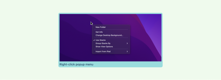
Pop-up menus are a terrific way to reduce the time and distance between the pointer and the menu items. Right-click dropdown menus are the most frequent type of pop-up menu that spares the user time searching for their settings:
Padding and margins are familiar concepts in UX design. Properly padding and aligning target labels (i.e., buttons, navigation links, form fields) is an application of Fitts’ law that sometimes gets overlooked simply because it’s practically second nature for seasons designers.
Properly leveraging Fitts’ law in this case means expanding the label’s clickable area beyond the immediate borders of the text. Increasing the size of the target reduces the precision needed to click on it:
Moreover, targets must be properly labeled in order to optimize visibility. Since they act as visual cues, using contrast and bold typography can properly draw the user’s focus on to the target and reduce cognitive effort.
In mobile UI, the cursors are your fingers. Fingers are thicker and less accurate than the mouse pointer. Therefore, it is essential for mobile interface touch targets to be larger.
For example, consider a CTA button that occupies the majority of the horizontal screen width on a mobile device:

Because of its size and location, the button at the bottom of the screen is easily accessible when a person interacts with a mobile device using only their thumb.
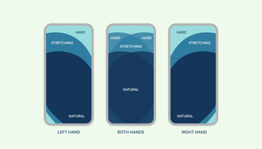
In contrast, it becomes challenging when the most interacted elements are positioned beyond our natural thumb range and the user must use both hands to reach them. Keeping this in mind, designers must always position desired targets within this range:
When applying Fitts’ law, it is important to understand the primary goal of the screen, what it was intended to accomplish, and how we can make that goal easy for the user to achieve.
To better illustrate examples of Fitts’ law, I’ve prepared more examples. These apps are my personal favorites and I use them on a daily basis; I have made them intentionally bad for the educational purpose of this article.
In the below snapshot, the user’s primary action is to finalize their cart and complete the purchase by paying:
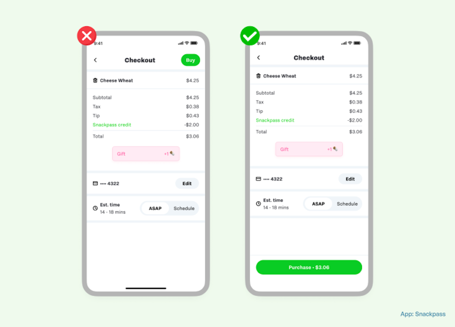
In the bad example, the Buy option is located at the top-right area of the screen, making it difficult for the user to tap with only one hand.
In the good example, however, the Purchase button is at the bottom of the screen, with all of the relevant information spanning from left to right, making it simple to tap and complete the task at hand.
In the below screenshot, the user is in the middle of an onboarding process for the language learning app Duolingo (RIP 2025) and must select his major goals for using the application:
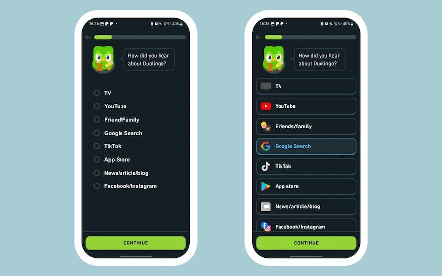
In the bad example, the goals are simply a checklist with radio buttons that are too close together, making it difficult for the user to tap. This list also requires more cognitive effort to digest all of the information on the screen. In addition, the Next action button is located far away from the user’s thumb range.
However, in the good example, all of the goals are set properly, with supporting graphics and the perfect distance between them. The CTA button is also conveniently accessible with the thumb.
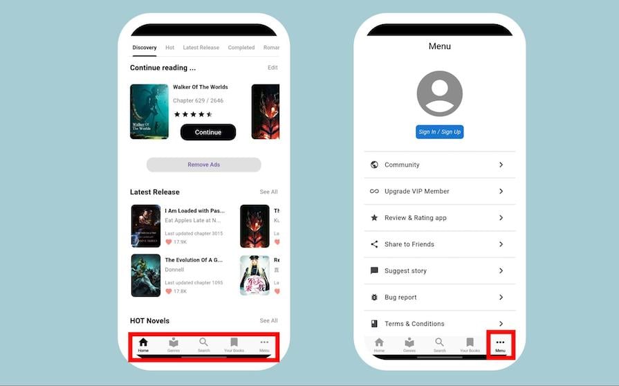
In the example below, you can see the application Free Novel’s homepage:
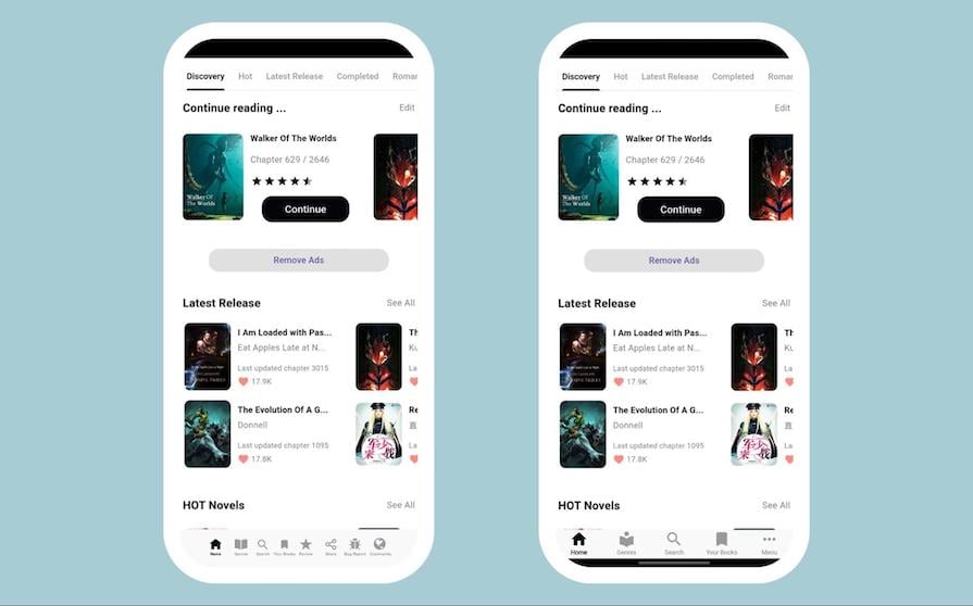
The homepage is the most important part of any digital product since it determines the next step the user will take. Do it right, and you may have a loyal, paying customer; do it wrong, and it just takes seconds to uninstall.
The “bad” example has a cluttered tab bar with too many functions placed closely together, making it susceptible to errors. In contrast, the good example uses only the necessary functions and places them at a safe distance from one another.
As per Apple’s accessibility guidelines, all touchscreen controls and interactive elements should have a hit target that measures at least 44×44 pt (about 59×59 px). The “good” example achieves this by placing additional functions in a “More” button on the tab bar rather than displaying every option.
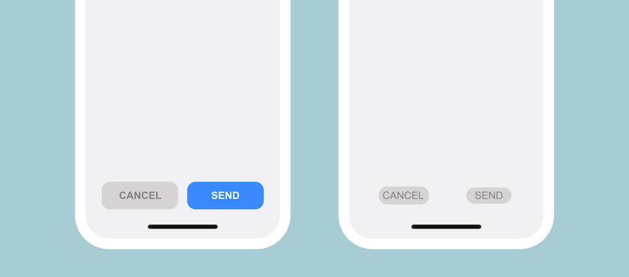
Gmail is probably the most used email service on the planet. In the screenshot below, you can see two examples of the email composer window:
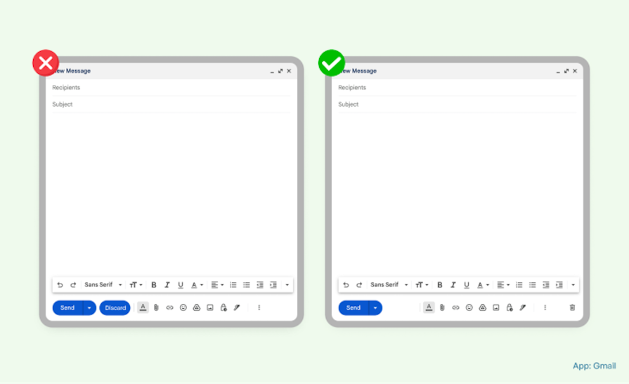
The primary objective of the email composer is, as you might guess, to compose an email and send it to recipients. In the example on the left, you can see a Discard button next to a Send button. Here’s why this isn’t the best for UX:
The example on the right places a trash icon on the opposite side of the window from the Send button, reducing the possibility of human error. Doing this keeps it easy to identify and within convenient reach (on the other edge of the screen), but makes it visually distinct from the Send button, reducing the chances of confusion and error.
Dropdown menus are a prime example of the challenge in applying Fitts’ law. While they help reduce visual clutter by grouping together multiple options in a smaller space, as the dropdown list gets longer, the distance between the last option and the prime pixel becomes significant:
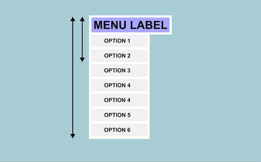
This increases the time and effort needed to reach the target, while the limited surface area of the options can cause mistakes.
Mega menus offer an alternative that still adheres to Fitts’ law. They reduce the travel distance of a cursor while grouping and organizing the different menu options. This is very common in SaaS websites that provide a wide range of services:
If LogRocket’s many menu options were all listed in one single-column dropdown, it would be visually confusing and hard to reach items lower down on the list. Grouping the menu options like this, and using typography and iconography strategically, reduces the cursor’s travel distance while keeping menu options readable and preventing potential errors.
Fitts’ law can’t solve every problem. In some cases, it’s not appropriate or user-friendly, and in some others, alternative principles could be more appropriate.
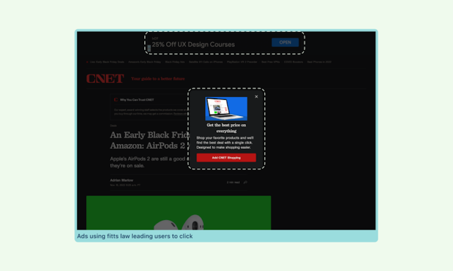
There are instances where Fitts’ law could be used as a dark pattern, which happens with ads that pop up suddenly on search engine pages.
In the following example, the advertisement appeared in the prime pixel location immediately after I opened the page. After closing the first ad, a second ad appears on the top edge with big text and a CTA:
This is just one of the numerous ways websites make use of Fitts’ law in ads. While there are many examples of websites displaying relevant ads next to search results, there are competitors who use this to misdirect users.
Reducing interaction costs and cursor movements is an integral part of Fitts’ law. However, doing this in the wrong manner can have negative effects rather than positive ones.
Putting too many elements too close together can result in visual clutter as whitespace is an important tool to reduce cognitive overload. Proper space between elements makes it easier for users to read and guides users through the interface.
As such, it’s important to balance whitespace and content when leveraging Fitts’ law. This can be done by only grouping related elements together, while using dropdowns or progressive disclosure (moving secondary advanced features to another screen) strategically.
The Free Novel app example we looked at before does this by having the plus button with the additional elements in a secondary page rather than cramming them all in the tabs bar:
While we’ve already discussed how delete should be kept away from download and edit, there are a couple other interface elements that shouldn’t be kept too close together to avoid misclicks. Keeping the delete button away from the rename button can avoid situations where a misclick turns the end of your project into the restart. Keeping the save button away from the exit modal can avoid the frustrating situation we have all experienced where your hard earned progress fails to get saved. Finally, keeping the share button away from the edit button can avoid situations where unfinished work ends up in the wrong hands.
Fitts’ law, or Fitts’s law, is a mathematical model that is a key principle in human-computer interaction today.
Fitts’ law states that the size required to reach a target depends on its size and distance. Basically, the bigger and closer a target is, the easier and faster it is to interact with it, whereas the smaller and farther away it is, the more time and effort is required to reach it.
Applying Fitts’ law in UX design allows you to create more intuitive UIs that reduce user error and effort.
Fitts’ law reduces user effort by decreasing interaction costs, or the amount of effort a user needs to complete a task. This cost increases when targets are small, far away, or need precise movement to interact with them. You can reduce this cost by optimizing the placement and size of UI elements.
The prime pixel is where the cursor initially lands at the start of an interaction. This is usually closer to the center, as it is the point that requires the least amount of effort to reach. As such, in accordance with Fitts’ law, we should place high-priority UI elements near the prime pixel for improved efficiency and reduced interaction costs.
Magic pixels refer to the pixels that make up the four corners of the screen as well as its edges, which act as a natural barrier for all interactions, as the cursor can’t get past that area. While magic pixels are the farthest possible pixels from the prime pixel, they still provide quick access to controls and actions — since the cursor will be stopped anyway, they don’t require much precision to interact with. Thanks to this, assigning quick-access functions to magic pixels, like the “hot corners” on a Macbook, can be a great way to make use of them.
Yes, Fitts’ law enhances accessibility by making sure that:
While Fitts’ law is useful most of the time, avoid using it for:
Although Fitts’ law was developed in the late 1950s, long before the advent of the Internet, it remains an important principle in digital product design to boost engagement and profitability.
While Fitts’ law is a good starting point for good usability, it’s not the only or even the most important design principle to consider. Data tells us more than what a principle can theorize, and the best option to understand if the design solution is user-centered is to conduct usability tests on your users.
Theories are a good place to start, but asking questions, taking inspiration from the real world, iterating on solutions, getting a deeper understanding of why and how things are working, and then ultimately applying them back to the real world will be most effective.
Key takeaways:
Header image source: IconScout

LogRocket's Galileo AI watches sessions and understands user feedback for you, automating the most time-intensive parts of your job and giving you more time to focus on great design.
See how design choices, interactions, and issues affect your users — get a demo of LogRocket today.

I was working with an intern on a UX research project, and before we even started, we both had private […]

AI has accelerated design execution, but speed can come at the expense of intentionality. Learn how UX teams can preserve product thinking and judgment.
UX testing is not limited to layouts, copy, and visual design. Full-stack and server-side experiments help teams evaluate how backend logic, APIs, algorithms, and product flows affect the overall user experience.
In A/B, A/B/n, or multivariate testing scenarios, using p-value with traditional null-hypothesis-based statistical analysis is so common, and most designers […]

 Learn more →
