Ever found yourself on a website that just wouldn’t cooperate, pushing your frustration to the brink? Imagine this: you’re navigating a site for a last-minute gift, but it’s unresponsive. Time is of the essence, so in a fit of irritation, you start “rage clicking,” hoping for a miracle.

The miracle rarely comes, and you bounce to another website and complete your goal there. From your perspective as a user, you’re frustrated. From the perspective of the website you just left, they’ve missed out on a valuable sale.
Welcome to the world of rage clicks, where a user becomes so annoyed they leave telltale signs they’ve attempted something and haven’t been successful. Navigating a website should be smooth and frustration-free, but sometimes users express their dissatisfaction in ways that are only obvious when we’re looking at these patterns using an analytical platform.
While rage clicks are certainly not the only way, they can be one way to quickly identify issues that need to be fixed. Especially if a noticeable trend emerges. If it’s one user, perhaps that’s an isolated issue. But what about five users, or ten?
Whether it’s slow loading, broken links, or a confusing layout, rage clicks give us a clear signal about the emotions users feel during their online visits.
With such an emphasis on delivering exceptional user experience now, keeping users happy is crucial. But if we can’t keep users happy, we need to understand why that is, and assessing rage clicks is one of the most immediate ways to do that.
Recognizing rage clicks as part of a practical and comprehensive UX solution enables businesses to implement smart adjustments to their products. This, in turn, enhances user interactions and contributes to an overall improved digital experience.
It gives teams the ability to unveil how folks are really interacting with something. It also aligns perfectly with a saying I use all too often in UX, focus on what people are doing, rather than what they are saying.
While specific rage click statistics may vary, it’s well-documented that slow website loading times can significantly impact user behavior. According to a study by Google, a delay of just three seconds in page load time increases the likelihood of users bouncing by 32 percent.
If you assess user experience and there’s an increase in rage clicks, there’s also a greater chance that folks are dropping out of the experience entirely. The correlation between slow loading and negative user actions emphasizes the critical importance of optimizing website speed to retain user engagement and satisfaction.
Broken links or buttons that don’t perform as expected can be a major source of user frustration. When users encounter these issues, they might rage click out of annoyance and a desire for the intended action to take place. Clicking multiple times might be a sign that links aren’t working as they should be, which you can confirm by cross-referencing rage clicks with 404 or similar errors.
Navigating a website becomes especially challenging for users when faced with a complex or unclear structure, particularly on mobile devices. The difficulty arises as users try to find the information they seek, encountering frustration when they can’t do it quickly.
Users often manifest this frustration with repeated clicks to try to pinpoint the desired content or specific page within the website.
Within its limited screen space, things have the potential to get even trickier for mobile users. Businesses need to streamline their navigation to enhance user experience and mitigate the risk of user frustration, especially as trends continue to suggest that mobile will forever be more popular than desktop.
A user friendly mobile navigation system is key to ensuring that visitors can effortlessly access the information they need, contributing significantly to an overall positive digital interaction.
Poorly designed or confusing user interface elements, such as nonintuitive forms, unclear buttons, or misleading graphics, can contribute to rage clicks. Users may repeatedly click in an attempt to figure out how to interact with these elements or to get their desired outcome.
Addressing these issues is crucial for improving the overall user experience on your website. Regularly testing and optimizing page speed, ensuring all links and buttons work correctly, simplifying navigation, and refining the user interface can significantly reduce the likelihood of users resorting to rage clicks.
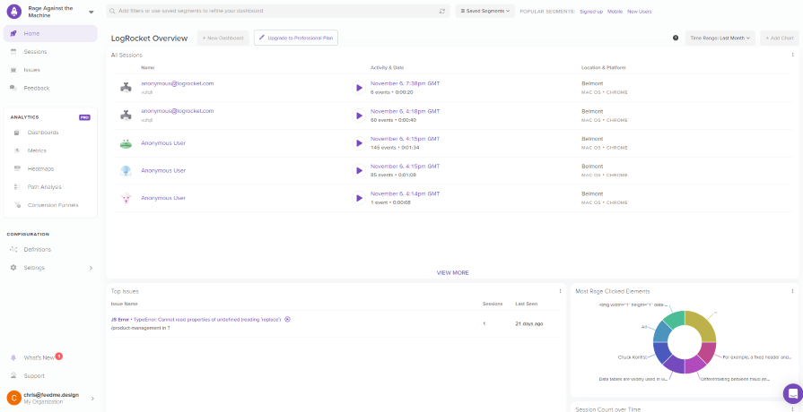
User frustration on a website can manifest in various ways, but we’re going to focus on finding and fixing rage clicks using LogRocket for this article:

LogRocket’s error logging feature helps correlate technical issues with instances of rage clicks, offering valuable insights into the context of user frustration.
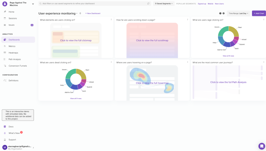
Complementing session replay, LogRocket often includes features like click heatmaps and scroll heatmaps. Click heatmaps visually display where users click the most, highlighting potential areas of interest or frustration.
Essentially, there are a couple of main ways to identify rage clicks, which you can find below.
Session replay tools allow you to visually recreate the user’s journey on a website, offering insights into their interactions. When analyzing these replays, rage click patterns become apparent, usually in the form of rapid and repetitive clicks on particular web elements.
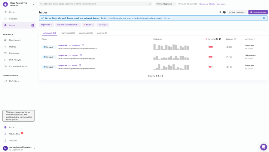
This visual feedback is instant and frequently highlights areas with potential for rapid improvement. With LogRocket specifically, not only can you identify patterns in terms of rage clicks, but you can also prioritize which rage clicks to address first based on the severity or page they occur on:

As shown in the above example, on selecting the issues tab, we can filter the data to show specifically what we want. In this instance, we’re focusing on rage clicks. Notice how LogRocket tells us the severity of the issue. How does it identify what’s severe and what’s not? Machine learning!
Machine learning plays a pivotal role in distinguishing between severe and minor issues in user experience. By analyzing patterns and user behaviors, it enables LogRocket to identify critical pain points. This technology empowers you to prioritize and address significant concerns, ensuring a more effective and targeted enhancement of the overall user experience.
We can also watch session replays of the most severe issues here by clicking on the play button. Minimizing the need to search manually for issues ensures teams stay efficient in delivering UX improvements, which is why having these issues surfaced by priority is key.
Implementing session replay for identifying rage clicks is not just about detecting individual problems, but also about proactively enhancing user satisfaction. By recognizing the triggers that lead to frustration, teams can take targeted measures to rethink their design and create more obvious, clickable elements.
Assuming, of course, it is a design issue and not a technical one!
An iterative approach using session replay regularly, as part of the design process, empowers you to create a more user friendly and responsive online environment, fostering positive interactions and, ultimately, a stronger connection between users and the digital platform.
While it’s likely that most of us will identify rage clicking through session replay, we shouldn’t dismiss the potential for click maps to offer us value, too. The best thing about maps of any kind is their ability to convey meaning visually.
For example, if you work within a busy team reporting to a product owner, they might appreciate any research you’ve conducted regarding rage clicks backed up with click maps. In a presentation, they’re a fantastic way to quickly communicate to stakeholders that something isn’t quite right, and what you intend to do about it.
For some, a picture really is worth a thousand words:

Given that we have a number of tools to identify rage clicks, we’re also in a position to determine what is a rage click and what isn’t. For example, let’s imagine we’re fairly confident that a blog page has a series of rage clicks on it, and we want to explore why that is.
We venture over to the Sessions tab and isolate the blog post in question using filters. On viewing the session back, the user is repeatedly clicking on the blog post title. Why? Well, without asking the user, we don’t know, but humans have all sorts of idiosyncratic habits that result in some of them clicking furiously at things that cause false positives.
Looking at this situation, the team will likely decide that there’s no apparent cause or explanation for what happened, leading them to conclude that some things aren’t worth the time investigating. But what if a pattern emerges where users are rage clicking an image that looks like a button but doesn’t navigate anywhere?
In this instance, yes, this is probably worth the team’s effort to investigate further. Session replay is fantastic at highlighting issues, but ultimately, it’s entirely up to the team to decide if they should take further action.
When dealing with a large number of recorded sessions, relying solely on indicators like intense clicking might not uncover all the challenges your users are facing. While rage clicks can be a sign of user frustration, it’s essential to take a holistic approach by examining broader patterns.
View these rage clicks as part of a comprehensive strategy to enhance the overall user experience.
After analyzing sessions and employing various tools to understand user traffic, pinpoint potential sticking points. Apply filters to sessions (concentrating on specific pages), and integrate frustration indicators such as intense clicks for a more nuanced understanding of user interactions and pain points.
LogRocket's Galileo AI watches sessions and understands user feedback for you, automating the most time-intensive parts of your job and giving you more time to focus on great design.
See how design choices, interactions, and issues affect your users — get a demo of LogRocket today.

A three-week mobile banking project taught me that the “proper” UX process is not always realistic. Sometimes, the better approach is to work with what you know, identify what you still need to learn, and make the strongest decision possible under real constraints.

A/B testing compares two versions of a design to see which performs better with real users. Here’s how UX teams can use it to test hypotheses, measure outcomes, and make smarter product decisions.

This case study shows how one ad experience redesign increased total ad exposure while lowering perceived friction, proving that timing and context can matter more than raw interruption.

As products evolve into ecosystems, navigation becomes a system-level challenge. This article explores how to align structure, context, and user journeys to create seamless movement across tools without confusion.