So, you need to prove you’re drawing users’ attention to your CTAs, to your sign-up forms, and to the right taglines and information. Heatmaps are a simple way to measure what draws the eye.

UX heatmaps are used to improve the user experience of apps and websites. In this article you’ll learn what UX heatmaps are, what the different types of UX heatmaps are used for, how to identify user pain points on UX heatmaps, and how to set up UX heatmap tools.
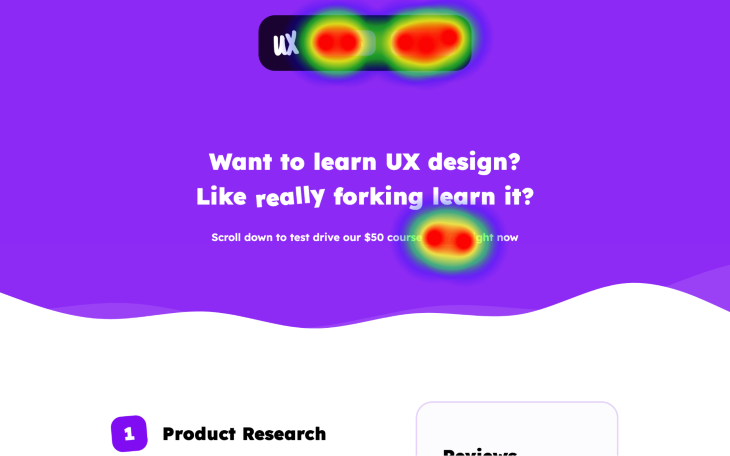
Heatmaps are data visualizations generated by heatmap tools. In UX design, a single heatmap depicts what users did on an app screen or website page in regards to clicking, scrolling, and moving their mouse. Using this information, UX designers can improve the UX of said app or website.
They’re called heatmaps because high-activity areas are visualized as “hot” (red-orange), mid-activity areas are visualized as “warm” (orange-yellow), and low-activity areas are visualized as “cold” (yellow-transparent). These visualizations are placed on top of snapshots of the screen/page so that product teams (usually UX designers) can see how users behaved while they were there:
Generally speaking, UX research doesn’t need to be expensive. That being said, some aspects of it definitely aren’t cheap (for example, recruiting participants and compensating them for their time, especially for new products with little to no users).
Luckily, UX heatmaps are used to identify problems — albeit minor ones, usually — without participants. Sometimes they can even be used to narrow down large problems. This means that when the time comes to conduct UX research with participants, things will go a lot smoother and you won’t need to compensate them for an unnecessary amount of time.
Alternatively, it’s possible to validate potential solutions to problems identified via UX heatmaps using A/B testing or multivariate testing instead of participants, but only in low-risk scenarios where said solutions are quick/easy/cheap to implement.
To summarize, UX heatmaps facilitate the identification of user pain points in a cost effective way.
There are different types of UX heatmaps; each type tracks a different user behavior.
Clickmaps visualize where users click:

UX designers or UX researchers can use this information to discover which interactive elements aren’t being clicked. They can also use it to discover misclicks (when users click on noninteractive elements mistakenly believing that they’re interactive).
Also, developers can use clickmaps to discover deadclicks, when interactive elements fail to react to clicks or fail to react to them as intended. When users misclick or deadclick multiple times out of frustration, some clickmap tools flag them as “rage clicks.”
Scrollmaps visualize where users scroll to:

UX designers/researchers can use this information to see if users are scrolling to key calls-to-action (CTAs). They can also use it to see which sections users appear to be interested in or confused by.
Attention maps/hovermaps visualize where users move their mice to:
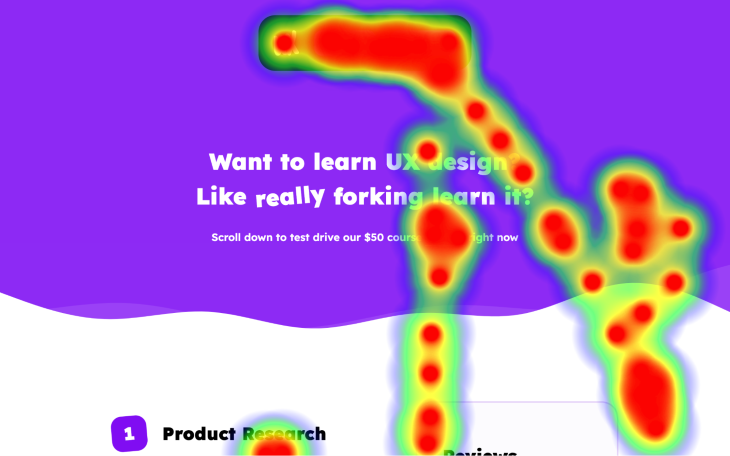
Hovermaps aren’t useful and should be avoided. The reason for this is that they don’t really reveal areas of interest because users don’t point their mice at what they’re looking at. In fact, they usually try to rest their pointer in a safe location where they can’t accidentally interact with something while they engage with the content they do want to see.
In addition, although they somewhat track clicks and scrolls, clickmaps and scrollmaps respectively already do this and do so more accurately.
Finally, they don’t work on touch devices due to them not having a pointer.
In this section, I’m going to go into more detail about the different types of user problems that heatmaps can highlight, what they might look like on a heatmap, and how you’d go about validating the problems as well as their solutions.
If a clickmap reveals a hot region where there shouldn’t be one, it’s because users have reason to believe that there’s a clickable element within that region. The most common example of this is when text is underlined for emphasis, causing users to misclick it for a link.
Clickmaps (and heatmaps in general) rarely pinpoint the root cause of problems; however, misclicks are usually pretty easy to spot because we know where our users shouldn’t and shouldn’t be clicking.
You can fix a misclick by making it clear that the element isn’t clickable:

Dead links and buttons are difficult to spot on a clickmap; after all, users clicking on clickable elements is a totally normal thing. However, users tend to rage click them as a result of them being unresponsive, and clickmaps (or rather, the heatmap tools that generate them) are able to pick up on this.
All you need to do is pass these concerns onto developers for them to investigate as bugs.
It’s easy to see which CTAs (calls-to-action) users aren’t clicking on. Areas with low-activity will be cold (yellow/blue) and areas with no-activity won’t have any color. However, to find out why users aren’t clicking on them, you’ll need investigate further using other UX research methods:
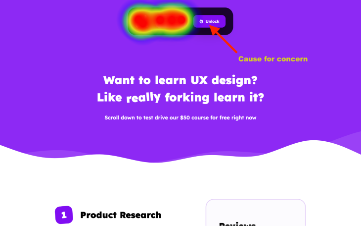
I don’t recommend trying to find out why users aren’t clicking on the element. Instead, try to find out why they’re not taking the action that we’re calling them to. The former assumes that the element is the right way to take the action and that users want to take the action, whereas the latter removes those assumptions. User testing (either moderated or unmoderated) is the only way to truly learn what’s going on.
If you’re generating clickmaps with prototype testing tools, you’ll be able to watch and listen to the session recordings of your deadclickers. If you’re generating clickmaps from actual app/website traffic, you’ll only be able to watch what users do and that might not be useful enough to infer what’s going on.
However, check your scrollmaps first (see below) because it’s possible that users aren’t even seeing the clickable elements.
A CTA can be cold if it’s too far down the page, not noticeable enough, or not within the landmark that users expect. Also, if it’s not labelled clearly enough by its section header or its own label, users might think that it does something else:

Since the number of potential culprits is smaller in this scenario, a keen eye for design heuristics combined with A/B/multivariate testing might suffice if you don’t have access to session recordings with audio feedback.
You could test moving the section further up the page, redesigning it, moving it to a landmark (e.g., primary navigation) if that’s where users might expect it to be, or labelling it more clearly.
When it comes to cold informational content, check if the section has a clear heading. If it does have a clear heading, then users simply weren’t interested in it and you should consider just deleting it. If the section is followed by warmer colors, this further supports the suggestion that users are skipping it:

If it’s mostly followed by more cold sections and users aren’t navigating to another page prior to it (you can cross-reference this with your clickmap), this is what we call a “drop off.”
Regardless of whether users found what they were looking for at that point or not, this is an opportunity to do something to prevent the drop offs. Consider testing optimized content. For example, fewer words, more visuals, linking to something else, or just improving the content):

Finally, double-check hot areas to make sure that users aren’t spending a lot of time on things that don’t require it. If they are, it’s likely because the design/content is confusing, such as engaging for the wrong reasons. Getting feedback via prototype testing is the best way to handle this.
However, if it’s an important area that users might want to spend some time with but there’s no call-to-action there, you should probably add one!
There are two different types of heatmap tools when it comes to UX: There are heatmap tools that can track what real users are actually doing on live apps and websites, and then there are prototype testing tools with heatmap features.
Prototype testing tools with heatmap features are useful for product teams that haven’t actually built their product yet and therefore can’t use app/website-based heatmap tools yet. They’re also useful for product teams that want to do research before implementation, which is cheaper than implementing unvalidated solutions if said solutions turn out to be ineffective — it’s also less risky for the same reason. Finally, prototype testing heatmaps exclusively highlight design issues whereas app/website-based heatmap tools can highlight development issues as well, which might not be ideal for the initial round of testing.
Prototype testing tools don’t differ that much in terms of heatmaps. The main differences are in the types of research/testing features that they offer, which yield heatmap data in addition to other types of data. UXTweak, UXArmy, Useberry, Maze, Userbrain, UserTesting, and Ballpark are all great choices.
When using prototype testing tools, heatmaps are generated automatically and you’ll be able to see them alongside the rest of the data that’s collected during tests. When setting up a test, you’ll need your prototype’s share link. To do this in Figma for example, start by opening your prototype in Present mode (Command + Option + Return / Ctrl + Alt + Return):

After that, click on the blue Share prototype button in the horizontal toolbar, ensure that the settings are set to Anyone with the link can view prototypes, and then click on Copy link.
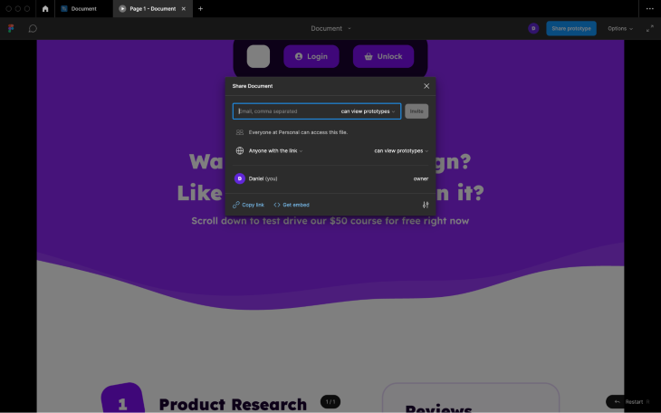
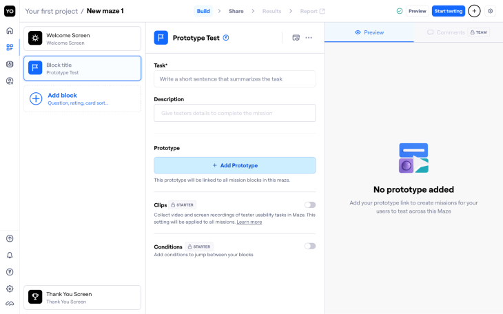
Next, provide this share link to your prototype testing tool of choice. For example, when setting up a test in Maze, click on the Add block button, select the Prototype Test option, click on the + Add Prototype button, and then paste in your share link there:
Make sure that you track what’s called a representative sample of users, which is basically a subset of users that accurately depict the characteristics of all users. If you don’t track a representative sample of users, the insights won’t be an accurate representation of all users. The best way to do this is usually to pick a large sample size of, say, 20 participants at random.
Heatmap tools like LogRocket provide you with a tracking code that you’ll need to pass on to your developer(s) for them to install.
After that you’ll need to set up a campaign. This is where you’ll specify screens/pages to track, which devices to track on, the start and end date for the campaign, and more. This process differs depending on the tool but is fairly straightforward.
Plus, you won’t need to worry about having a representative sample of users as long as the app/website is getting some traffic.
UX heatmap tools are privacy friendly. They usually confirm which laws and regulations (e.g., GDPR) they’re compliant with, what data they collect, and what they do with it. They tend to anonymize analytics data and also blur out sensitive user-submitted data when creating snapshots and recording sessions.
However, you’ll need to obtain your user’s content before you can track them on live apps and websites because these types of trackers aren’t considered essential. Only essential trackers don’t require consent according to the laws and regulations of many countries.
UX heatmaps are great for identifying user pain points. Even when they don’t help you to identify all of them or identify what the problems actually are, it’s still a fairly cheap way to at least find due north. This saves time and money when it comes to more intensive methods of UX research or when the UX heatmaps are telling enough that it’s safe to jump right into A/B testing or multivariate testing.
UX heatmap tools are relatively cheap, easy to implement, and easy to use as well. Once set up, they generate heatmaps in the background for you to use whenever you need them.
If you have any questions feel free to drop them into the comment section below, and thanks for reading!
Header image source: IconScout
LogRocket's Galileo AI watches sessions and understands user feedback for you, automating the most time-intensive parts of your job and giving you more time to focus on great design.
See how design choices, interactions, and issues affect your users — get a demo of LogRocket today.

As products evolve into ecosystems, navigation becomes a system-level challenge. This article explores how to align structure, context, and user journeys to create seamless movement across tools without confusion.

Figma’s AI features have exploded in 2026 — from text generation and image editing to full UI drafts and code handoff. But speed isn’t the same as quality. This guide breaks down every major feature, what it’s good at, and where human judgment still does the heavy lifting.

Zero UI works well for screenless, voice-first experiences, but most digital products still require visual interaction. Here’s why multimodal UX offers a more scalable foundation for the future of design.

Multimodal UX goes beyond designing for screens. Learn how context-aware systems, progressive modality, failover modes, and accessibility-first design create better digital product experiences.