Imagine you’re online shopping for a new summer swimsuit — how would you approach the process? You’d probably go to your favorite store’s website, select the “swimwear” category, then specify the colors and sizes you’re looking for to browse relevant options.
What if this kind of refinement wasn’t available? You’d have to sort through pages of options to find even one swimsuit, and it would be nearly impossible to make quick comparisons between swimsuits you like (unless you opened each option in its own browser tab).
Luckily, many ecommerce websites know how frustrating it is to have to through all their product offerings, so they provide ways to find items you’re interested in through faceted filtering:
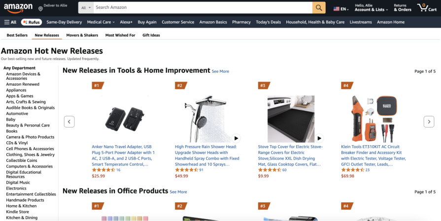
Faceted filtering optimizes the search experience by allowing the user to select attributes from predefined categories so they only have to choose from the ones that meet their constraints. Not only that, faceted filtering helps the user discover more relevant options than they would with a standard search query.
With search, the user has to know what they need to type in their query to get the right results. For example, a user searches, “trench coat,” and only trench coats appear in the results. However, maybe the user actually wants to find top coats but their search limited the results. Faceted filtering helps the user understand categories to quickly find what they want – even before they know what they’re searching for.
But what exactly is faceted filtering and how should designers best use it in their designs? This article examines the key differences between facets and filters, reviews best practices and drawbacks of faceted filtering, then looks at its advanced methods.
Editor’s note: This blog was updated 27 March 2025 by Allie Paschal to ensure updated information and provide new insights relevant to designers in 2025.
Faceted filtering (also known as faceted navigation or faceted search) supports users in quickly navigating and searching through a lot of data. It involves two separate concepts working together — facets and filters. Although both concepts help the user refine results on different search parameters, they have slightly different functions and are often used simultaneously.
Filters are used to refine a set of data (like product listings or booking hotels) according to specific attributes. Once the user sets an attribute, all the options that don’t meet the criteria are eliminated from the results.
Differences of filters include:
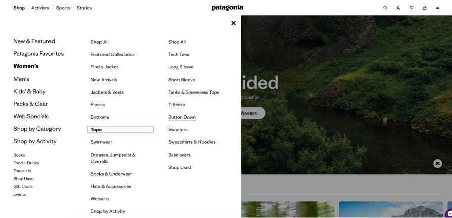
Facets, on the other hand, categorize information or data from a search or on a web-page. They give the user a summary by organizing data into buckets, such as product type or color. For instance, if the user selects “shorts” and “pants” for the product type and “blue” for the color, only blue shorts and pants will show in the results.
Differences of facets include:
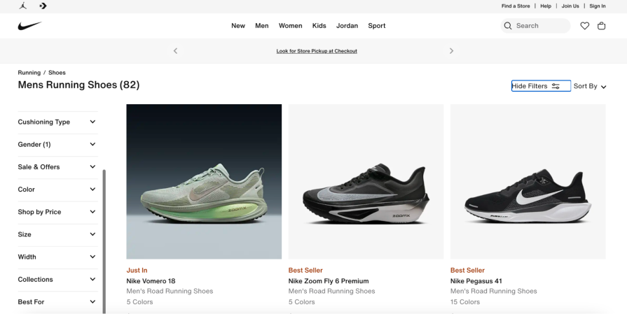
Use the following best practices to ensure your facets and filters allow users to quickly find what they need on your site:
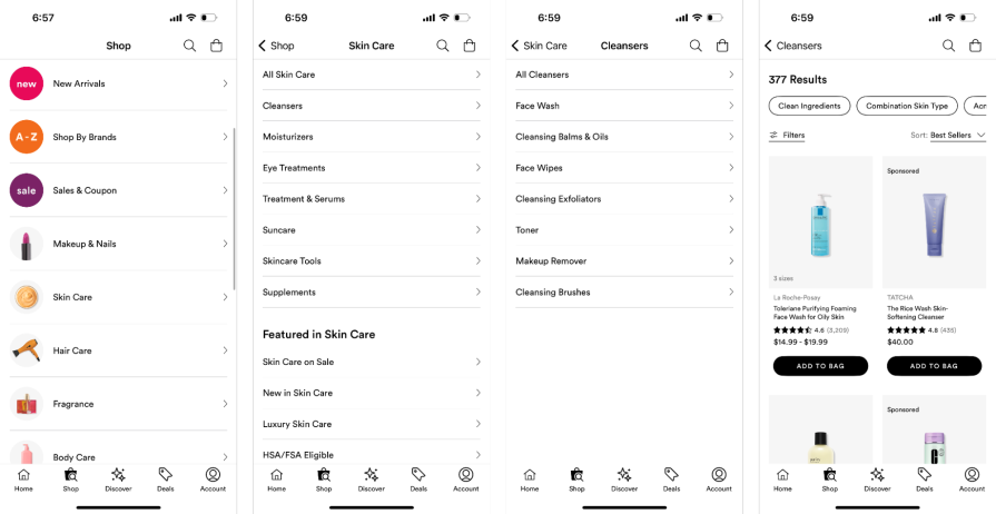
Now that you know the best practices for faceted filtering, this section covers common pitfalls that you may encounter and how to navigate through them:
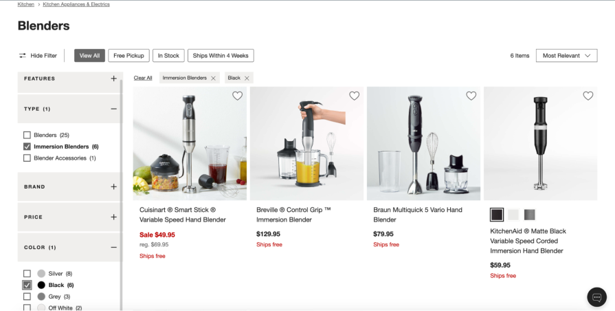
Beyond the basic concepts of faceted filtering, you can also apply more advanced methods to help automate the process and give users additional control. These include:
Here, instead of the user seeing the same facets and filters regardless of their initial search, the facets and filters adapt based on the context. For example, if the user searches for “jackets,” facets such as “inseam” and “product category” are no longer relevant.
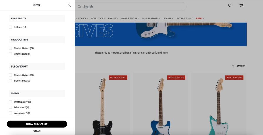
Dynamic faceting can also be used to prevent zero results. As the user selects multiple filters and fine-tunes their results, filters that don’t have results that meet the selected criteria should be disabled or removed. If the user selects “heels” when shopping for shoes, brands like Nike and Adidas should be eliminated from the “brands” facet – this way, users can’t select a filter that doesn’t yield any options:
You have an opportunity to incorporate AI into your filtering process by using the historical data of your users. Once the user applies one filter, AI can suggest the next filter based on their past choices or even what similar users have chosen.
AI can also be used to generate filters for the user. For instance, the user could ask an AI agent, “Show me blue button-down tops under $40,” and the AI agent could apply filters for the user. Or the user can upload an image of an item they like and ask the AI agent to find them something similar.
Here, the user doesn’t have to know which filters to apply to get the results they want — AI does it for them. Better yet, the user still has control over the filters applied, and can remove a filter if it’s impacting the results.
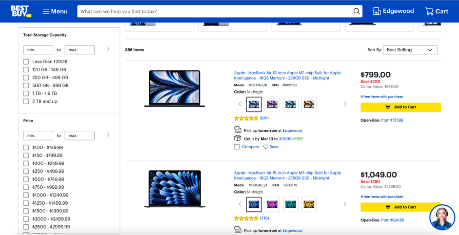
Typically, filters are applied using standard checkboxes, but you can give the user even more control with UI components like sliders, toggles, or color swatches. For example, instead of providing checkboxes to filter prices (like “Under $50”), allow the user to specify both their minimum and maximum price range with a range slider component.
For binary options, such as “eligible for free shipping” or “on sale,” use a toggle so users can quickly turn a filter on or off (versus throwing the filters into a miscellaneous facet). This also differentiates filters that are stand-alone options and don’t easily fall into a facet. Lastly, for colors, provide a color swatch that also acts as a button so users can visually reinforce the color with its label (you still need to apply a label next to a color swatch so it’s accessible):
There’s a reason why so many ecommerce websites use faceted filtering — it helps users control how they navigate through information to efficiently find what they’re looking for. Users don’t have the time or patience to go through all the listings in a website; without facets and filters, users get quickly frustrated and abandon the website.
To review, faceted filtering involves (you guessed it) facets and filters. Although they seem like they describe the same thing, filters describe a single attribute the user can use to narrow down their search, while facets describe the main buckets the content is organized into. Filters are broad and used when the user begins their search, and facets are specific and used when the user wants more precise search results.
If you decide to use faceted filters, use clear labels, don’t include too many, and regularly test them with real users. As faceted filtering has become common in ecommerce websites, advanced methods, such as dynamic faceting, have begun to pop up. These advanced methods give the user more control in the results they see and automate filtering for them.
LogRocket's Galileo AI watches sessions and understands user feedback for you, automating the most time-intensive parts of your job and giving you more time to focus on great design.
See how design choices, interactions, and issues affect your users — get a demo of LogRocket today.

Design engineering has always lived between design and code. But with AI tools turning prompts into interfaces and code into editable canvases, that bridge is becoming a new way of building.
A three-week mobile banking project taught me that the “proper” UX process is not always realistic. Sometimes, the better approach is to work with what you know, identify what you still need to learn, and make the strongest decision possible under real constraints.
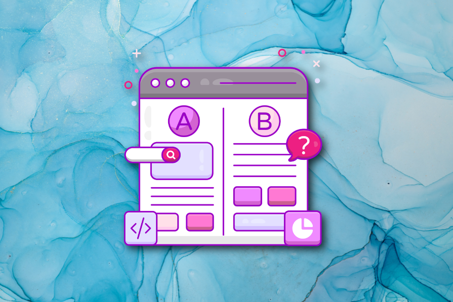
A/B testing compares two versions of a design to see which performs better with real users. Here’s how UX teams can use it to test hypotheses, measure outcomes, and make smarter product decisions.
This case study shows how one ad experience redesign increased total ad exposure while lowering perceived friction, proving that timing and context can matter more than raw interruption.