When facing an ambiguous and complex problem, a solution might not always be immediately apparent, right? Starting in one direction of ideation may lead you down the wrong path. And before you know it, you’ve invested too much time, energy, and resources into one line of thinking, only to hit a roadblock and start over.

Lateral thinking offers a way to address this by examining a problem situation from different angles. Essentially, lateral thinking is horizontal or creative thinking.
In this blog, I talk about lateral thinking for UX designers — exploring the importance of this line of thought, techniques you can use to develop your lateral thinking brain, and some of my favorite examples of lateral thinking in practice.
When you think laterally, your imagination and intuition play a major role in the problem-solving process. Visualizing your ideas can help you see problems differently, make unexpected connections with other problems in a different field, and spark new ideas.
The process of lateral thinking involves both divergent and convergent thinking — divergent thinking uses creativity and innovation to come up with a broad range of ideas, while convergent thinking hones in on a logical solution. And combining these two approaches results in creative and unique solutions.
Linear, or vertical thinking, in contrast, is reason-based. It follows a step-by-step approach down a path of logical reasoning. It is commonly thought of as an honest and intelligent way of thinking, but in reality, it can lack innovation, imagination, and creativity.
As problems become more complex, linear thinking may fall short of generating innovative solutions. You might not know where to start with your research due to the ambiguity of the problem. Or you might start going down a path of ideation based on research that doesn’t consider all the necessary factors. And to complicate things further, the problem may involve multiple interdependent factors — making it all the more difficult to come up with a solution.
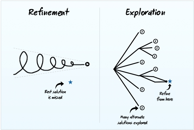
Lateral thinking can help you break down the problem into smaller, manageable parts, making it more digestible and approachable. It allows you to generate creative ideas by looking at the problem in different ways and applying techniques to consider a multitude of potential solutions. This diagram will visualize what I’m saying here:

Lateral thinking also prompts you to analyze a problem by revisiting and questioning the facts and existing solutions. It opens up your mind to seeing things differently and allows you to make connections that might unexpectedly help lead you down a path to innovation.
In the end, your creativity can help you experiment and develop new and effective user experiences that simplify complex problems for your users.
Lateral thinking is all about framing a problem from different angles and using creativity to reach a solution.
In this section, I’ll share some techniques to apply lateral thinking to your design process. Try them out with your team, including cross-functional stakeholders, especially during discovery and ideation sessions.
At first glance, a problem might seem straightforward, but identifying its root cause helps you understand why it’s happening.
Break down the problem by using the 5 Whys method. Start with the initial problem statement and ask “why” it’s occurring. Based on each answer, ask “why” again four more times.
For instance, if the problem is a high bounce rate on a website, the first “why” might be “because the website is slow.” The second “why” could be “why is the website slow?” and so on. This will help you get closer to the root cause, enabling you to focus on areas that need attention.
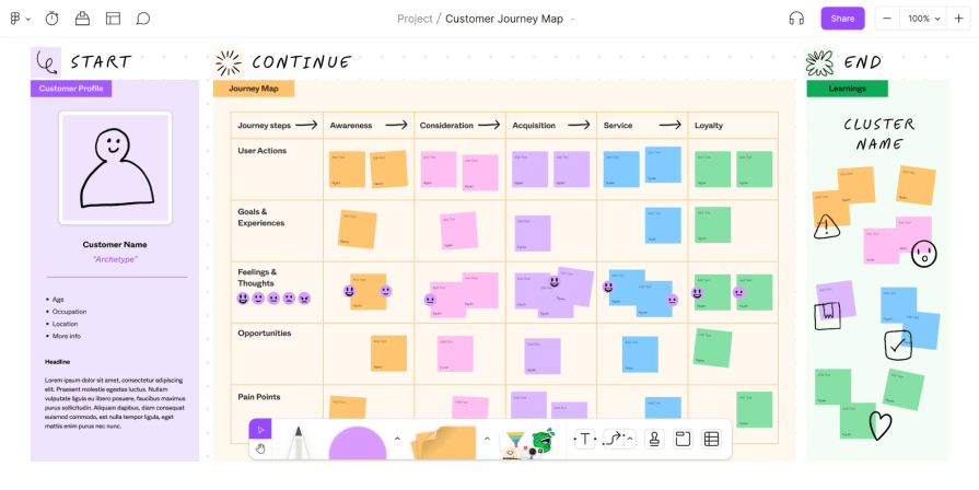
Another approach to breaking down a problem is by creating a user journey map. By mapping out your user’s goals and pain points throughout a process, you might discover common themes or trends that are driving your users’ frustrations. This will help you break down the overall problem into smaller ones, making it easier to ideate solutions that contribute to solving the main problem.
This example from Figma shows this process well:

Breaking down the problem also helps you to challenge any assumptions you might have about the problem.
When faced with a degree of uncertainty, it’s natural to make assumptions about things you don’t know. But design decisions shouldn’t be made based on assumptions. So, it’s key to challenge any existing assumptions and conduct validation research to test their viability and value.
List out any assumptions or questions that you might have about the problem, and consider how things might change if they were false. This will help you expand your thinking and see the problem from a different angle, possibly leading to new ideas.
This is an exercise that can help you approach the problem from the mindset of different user roles.
If you’ve already conducted research on your users, create personas based on the types of user roles involved in the problem. You can also role-play as a competitor or key stakeholder to gain deeper clarity around their unique goals. Consider how they would feel, think, and speak if they were to approach the problem.
For instance, if you’re designing a new feature for a social media platform, you could role-play as a user who wants to share a post and think about the steps they would take and the potential issues they might encounter. Talk through their goals, needs, and frustrations, and potentially what solutions they might consider.
Role-playing during prototyping can be an effective ideation exercise, especially when conducted in pairs, with one person assuming the role of a stakeholder and the other asking probing questions.
Drawing comparisons to different industries or different concepts entirely can yield interesting outcomes.
Analogies can help simplify problems by looking at them in a different light, based on an existing problem that may have already been solved. For example, startups often use phrases like “Uber for X” or “Airbnb for Y” to explain their concepts — that is, using an analogy to simplify a concept by comparing it to something familiar.
By looking at problems the same way, try to draw comparisons by finding similarities in unrelated industries and understanding how those problems were solved. This technique can help you zoom out your thinking by focusing less on the details and more on how systems operate.
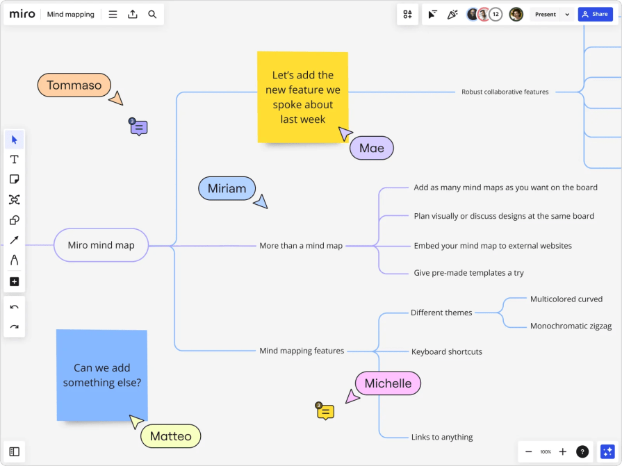
Whether you’re breaking down a complex problem or brainstorming your next big idea, mind mapping can be an effective way to get all your ideas onto a page and visualize the relationships between them.
Visually organizing our thoughts can help us identify connections, notice central themes, and uncover new directions. Start by writing out one overarching theme or idea and begin to brainstorm related ideas or words, connecting them with lines.
Soon, you should have a web of words. This should give you a glimpse of the overall problem space and potential topics to dive further into.
I use online tools like Miro or MindMeister to take advantage of infinite digital canvas space or conduct a virtual mind-mapping session with my team.

SCAMPER is a lateral thinking technique. The acronym stands for substitute, combine, adapt, modify, put to another use, eliminate, rearrange. It’s used to ideate on an existing product, process, or idea by imagining how changes in one area could affect the whole.
To build up lateral thinking when wireframing, for example, ask yourself questions like:
This method of questioning a current state solution can often lead to creative breakthroughs.
Provocative questioning — frequently used in user research interviews — ignores real-world constraints and encourages you to run the horses of your imagination. It’s a way to challenge the status quo and think outside the box. Think of questions like:
Asking such questions will allow you to dream up unrealistic scenarios or features, but the answers can often spark the next big idea.
Envisioning an extreme case scenario, regardless of limitations, and working backward to break down the idea and identify realistic next steps is a great way to generate ideas and develop a roadmap.
When Facebook first became popular, it introduced a new way to connect with people.
To help users understand its purpose, they created the concept of the Wall. It was based on an analogy of a scrapbook or personal diary where people can post messages to each other.
Using the lateral thinking technique of analogies made the Wall feel like a familiar concept to users, which encouraged not only social interaction but also the sharing of personal thoughts, memories, and experiences. This ultimately helped with engagement as users became invested in personalizing their own Wall and interacting with others on theirs.

Apple AirPods used SCAMPER to bring lateral thinking to their product.
In reimagining their traditional EarPods, they substituted a wired connection with wireless Bluetooth technology, removing the need to physically connect your earbuds to a device.
Plus, they combined the Airpods with Apple’s Siri technology as well as their ecosystem, opening up a whole new way for users to interact with their devices — making them useful in multiple ways, such as listening to music, taking calls, or using voice commands. The design was also adapted to fit into a charging case, solving the problem of tangled wires and limited movement.
The next time you face a wicked problem in UX design, take a deep breath and apply some lateral thinking techniques.
Don’t pigeonhole yourself into the first idea that you think of by only thinking vertically — you might not be considering all the different factors involved. By looking at the problem from different angles, breaking it into smaller problems, and using lateral thinking to broaden your understanding of the situation, you’ll uncover more insights and identify areas to focus on. It can also lead to more creative ideas that spark your next innovation.
Of course, there isn’t one perfect way to apply lateral thinking, but the general idea is to tap into unconventional methods of questioning and ideation, which can help bring a fresh perspective to your design process.
LogRocket's Galileo AI watches sessions and understands user feedback for you, automating the most time-intensive parts of your job and giving you more time to focus on great design.
See how design choices, interactions, and issues affect your users — get a demo of LogRocket today.

A three-week mobile banking project taught me that the “proper” UX process is not always realistic. Sometimes, the better approach is to work with what you know, identify what you still need to learn, and make the strongest decision possible under real constraints.

A/B testing compares two versions of a design to see which performs better with real users. Here’s how UX teams can use it to test hypotheses, measure outcomes, and make smarter product decisions.

This case study shows how one ad experience redesign increased total ad exposure while lowering perceived friction, proving that timing and context can matter more than raw interruption.

As products evolve into ecosystems, navigation becomes a system-level challenge. This article explores how to align structure, context, and user journeys to create seamless movement across tools without confusion.