An empathy map in UX design is a collaborative visualization tool that helps design teams understand what users say, think, do, and feel in a specific situation so we can better solve the problems they’re facing. Working together to map our shared understanding of user needs lets us make more informed design decisions and identify any gaps in our understanding of our users as a whole.
Editor’s note: This article was refreshed by Daniel Schwarz on 17 March 2025 and updated to compare empathy maps with other UX research tools, provide a free downloadable empathy map template, mention additional best practices, and answer common questions about empathy maps in UX design, such as:
An empathy map is a tool your design team can create together to visualize and synthesize what you know about your users. It breaks down user research findings so you can more clearly understand user needs, thoughts, emotions, and behaviors.
Empathy in UX design is the ability to understand and share users’ feelings and experiences so you can design solutions that solve their real needs. It involves active listening, observation, and an open mind to avoid assumptions and biases during the design process.
The four main elements of an empathy map are:
An empathy map is a specific aspect of a user persona that focuses on how a user thinks, feels, and behaves in a specific context. A persona map includes additional demographic and behavioral data. The purpose of both UX tools is to help designers develop a deeper understanding of user needs.
UX design is all about solving the problems that users actually have — not about solving the problems we assume users want to be solved. That’s when empathy comes into play: the ability to understand and share users’ thoughts and feelings in a specific situation by using our own experiences to relate theirs.
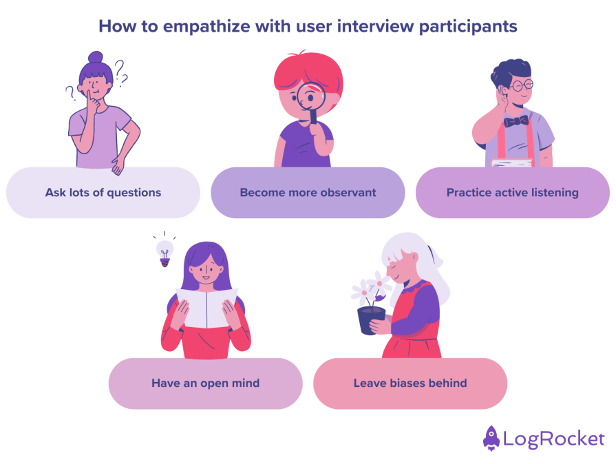
Empathy is a critical part of human-centered design, and it starts at the research stage. Here are a few ways to empathize better with your participant during user interviews:
Without empathy, we can at best sympathize with our users, which can lead us to make false assumptions about what our users want solved rather than identifying their real concerns. Empathizing with our users can help us solve problems they actually have.
A good method for developing empathy for users is creating empathy maps. We’ll cover how you can make your own empathy map step by step and demonstrate what they’re useful for.
An empathy map is a design tool that represents a collaborative visualization of what we know about the user. It breaks down each user interview into digestible pieces of information.
Empathy maps shed light on which problems to solve and how. They are widely used throughout the Agile design process, and they are most useful at the beginning of the design process, after user research but before concepting.
You’ve probably heard a lot about mapping in the UX space, so let’s clarify some terms.
Empathy maps are not replacements for journey maps. Journey maps provide a visualization of the end-to-end user experience, whereas empathy maps offer a focused view based on the specific problem statement.
Let’s take a closer look at how these maps are different from one other:
| Journey maps | Empathy maps |
|---|---|
| Showcase a detailed footprint of user interactions | Abstract visualizations about the user’s mental model |
| Represent movement from point A to B to C in order to complete a designated task | Paint a picture about the task itself from a broader point of view |
| The product (or the experience) has to be already designed in order to have a journey map | An empathy map is used for informing the potential design concepts (aka “before” the experience is designed) |
| Helpful artifacts for the entire cross-functional team (especially stakeholders in marketing) | Powerful tools for designers and researchers |
In UX design, affinity maps are used to group recurring snippets of qualitative feedback so that we can then quantify them. For example, if one person gives “Feedback A” and ten people give “Feedback B” (as totaled on an affinity map), we can conclude that Feedback B needs to be prioritized.
We can use affinity mapping to decide what to put on our final empathy map, thus summarizing our average user.
Although empathy maps are obviously useful by themselves, they’re also an important part of personas, which paint a more complete picture of the user. The other half of a persona is the user’s demographics, which includes information such as their age and location, and is used for targeting.
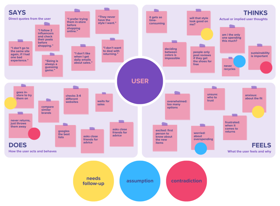
Traditional empathy maps are created as a 2×2 grid (four quadrants), each quadrant representing what the user says, thinks, does, and feels:
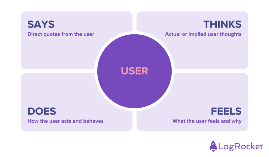
Once the user interviews have been conducted, the designer (and/or the team) come together to reflect and add sticky notes (with quotes and observations) into each specific quadrant.
Empathy maps can either be made for an individual user or a group of users in order to begin identifying patterns.
Let’s walk through the steps to create one, and then we’ll explain how to use an empathy map.
While empathy maps vary in format, they all have common elements:
Before the actual mapping exercise, make sure to agree on the goals and the scope:
Let’s go over an example to demonstrate the process. The objective was to improve the shopping experience for an ecommerce website, and we conducted user interviews about the overall experience when it comes to buying shoes online.
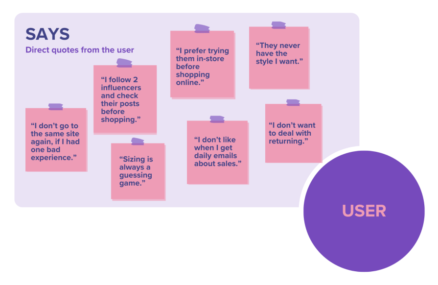
The Says quadrant contains direct quotes from the research. I recommend keeping it verbatim so that nothing gets lost in translation or paraphrased by mistake.
For example:
We take these and put them as individual sticky notes in the Says quadrant:
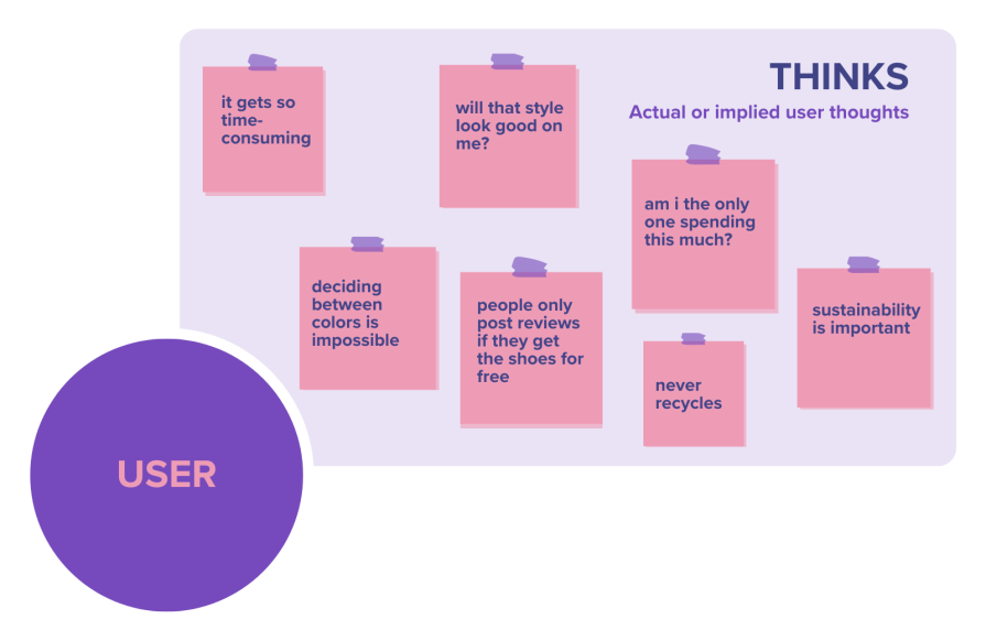
The Thinks quadrant represents the user’s thoughts on the given topic. Since us humans are not yet capable of mind reading, these “thoughts” will be our interpretation of what the user might think during the research/interviews.
That’s why the Thinks quadrant also represents “implications”; the things that they didn’t actually say out loud but we think they might mean it. Be aware of their body language as well. It might reveal hints about their true intentions, especially if they are hesitating or afraid of being judged or maybe they are just simply being nice and hiding their true feelings. (If your sticky note is based on assumptions, make sure to note that in the map as well.)
It is possible to have the same content in both Says and Thinks quadrants as well as contradicting information since what the user says out loud that might not match what they actually think, and that’s totally normal.
Examples:
We take these and put them in individual sticky notes in the Thinks quadrant.
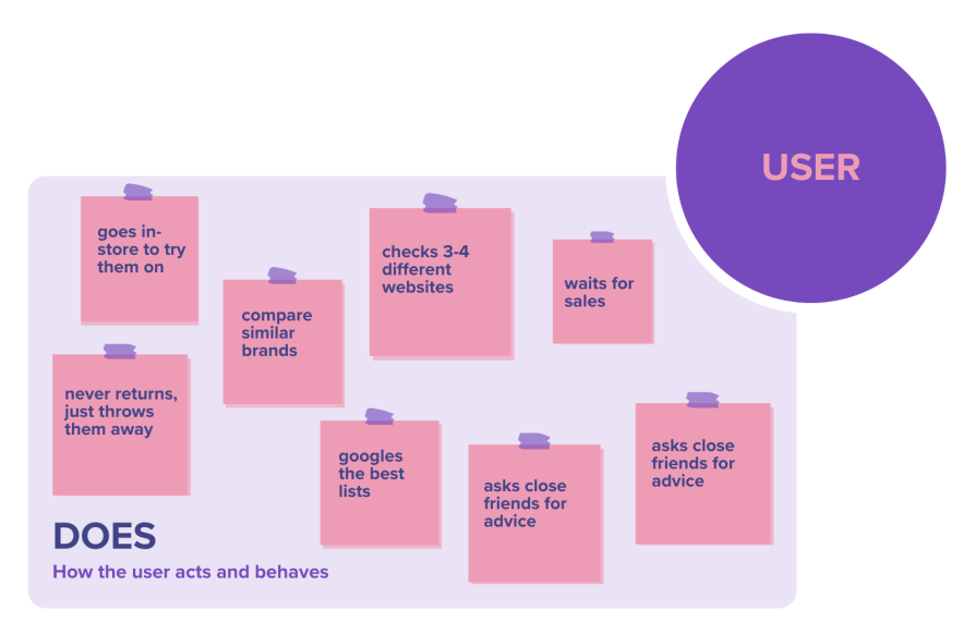
The Does quadrant showcases the particular actions that the user takes regarding the topic or the particular things that they do during the interview.
It can be both the physical actions while interacting with the product (refreshing, tapping, closing, adding an item to a cart…), or the steps they would take throughout the process (asking a friend, reading comments, calling a representative…).
Examples:
We take these and put them in individual sticky notes in the Does quadrant.
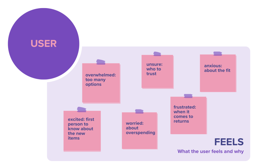
The Feels quadrant represents the user’s feeling and what is causing this. It is often written as “an adjective + the reason.”
Pay attention to the positive and negative sides of thoughts. What makes the user feel good or bad? Frightened? Excited? Anxious? Worried? Think about the root cause that’s related to the feeling.
Examples:
We take these and put them in individual sticky notes in the Feels quadrant.
When all the quadrants are filled with sticky notes, take a moment to reflect. The purpose of the mapping is to put the user at the center and put you in their shoes.
Within each quadrant, look for similar themes, move them closer together, label them. Mark the stickies if they are based on assumptions, indicate if any followups needed, or label if they are contradicting with each other. Bring them back to the team and talk about:
Just because the workshop is over, that doesn’t mean the empathy map can be thrown away. Even though empathy maps shine the brightest during the early stages of the product development cycle (e.g., ideation and research), they can still be used as a powerful aid throughout the rest of the process (prototyping, sourcing, costing, and commercialization).
Since they provide a deep dive into the users as a whole, empathy maps can be leveraged as a design artifact that can be used to fact check throughout the development. If a user assumption needs to be validated, reference your empathy map’s related quadrant. Or if the team needs alignment on metric definitions such as OKRs, KPIs, or leading and lagging indicators, use your empathy map as a starting point.
Keep in mind that iteration is the key when it comes to developing successful products, and with every new version of the experience, we also learn more about user behaviors. Make sure to update your empathy maps whenever there’s a new input, research, study, or interview that’s related to that map’s specific user.
Here are a couple of tips and tricks to help you get started making effective empathy maps:
You can do empathy mapping with just pen and paper, so literally anything will do! For this reason, the most budget-friendly empathy mapping tool is the tool that you already have, whether it’s as technical as Figma or as basic as Microsoft Paint.
Some tools are obviously better than others though — to be specific, whiteboard tools make the best empathy mapping tools because they’re collaborative and designed for diagramming. They’re also multi-purpose, so maybe you’re using one already? If you are, that again means no added dent in the budget.
According to the 2023 Design Tools Survey, the best empathy mapping tools (digital whiteboarding tools), ordered by rating, are:
Empathizing is the number one superpower for designers to spot user problems, and solving user problems is the ultimate goal of UX design. Take advantage of empathy mapping and use it as a powerful tool in the product development cycle.
Header image source: IconScout

LogRocket's Galileo AI watches sessions and understands user feedback for you, automating the most time-intensive parts of your job and giving you more time to focus on great design.
See how design choices, interactions, and issues affect your users — get a demo of LogRocket today.

Explore the core principles of GUI design and learn how consistency, simplicity, feedback, accessibility, and user testing contribute to better digital experiences.

After five years in UX, I revisited the Daily UI challenge to reconnect with hands-on design. Along the way, I learned that great interfaces come from thoughtful briefs, sound judgment, and user feedback, not just better AI tools.

Learn what makes a great login screen through real-world examples and UX best practices for creating secure, accessible, and low-friction authentication flows.

Skeuomorphism helped define early digital interfaces by mimicking real-world objects to make technology more intuitive. Learn how it compares with flat design and neumorphism, why it declined, and where it still has a place in modern UX.


