A reported 33.3 percent of the world’s population — making up about 2.64 billion people — participate in online shopping. However, statistics also reveal a cart abandonment rate of about 70.2 percent. This raises the question: Why do so many visitors to online stores leave their carts behind? The answer is likely to be linked to a problematic checkout process.

Imagine your ecommerce store to be an epic drama film you’re writing, where the checkout flow is the final act. Similar to how an unsatisfying conclusion to a movie can leave an audience disappointed as they exit the theater, a poorly designed checkout experience can leave your store visitors frustrated, potentially leading them to abandon their shopping journey altogether.
Before we look into the common problems in checkout flows and how we can fix them, let’s first familiarize ourselves with the term.
A checkout flow refers to the series of steps a customer takes to finalize a purchase on a platform. It encompasses the entire process from adding items to the shopping cart to finalizing the transaction and receiving an order confirmation.
Designing a seamless checkout flow is crucial to the success of any online store. A seamless checkout flow can increase purchase success rates, bring repeat customers, and reduce cart abandonment. It’s also good for the business because it affects conversion rates and increases customer satisfaction.
A Baymard Institute survey highlights that a seamless checkout flow can boost a site’s conversion rate by 35.26 percent.
Checkout flows may vary across different products, but the key stages a user passes through in a typical checkout flow include the following:
In this post, we’ll discover problems that often occur in checkout flows and find fixes for them to improve the user experience of your store and keep customers satisfied.
Taking the time to optimize the checkout flow of your product can have a significant positive effect on reducing customer fatigue, conversion rates and business revenue. A checkout flow can be looked at as a hypothetical bridge your visitors walk on to convert to customers. As an online store owner, you’ll want to make your visitors feel secure whilst taking the risk to trust your brand.
A good first step to improve your checkout flow would be to take note of the common pain points online shoppers face during the checkout process. Some of them include:
While there’s no one-size-fits-all formula, we’ve curated a collection of invaluable insights to guide you towards crafting a frictionless and efficient checkout process.
Displaying a clear and intuitive progress indicator that showcases the user’s journey through the checkout flow can help users complete the checkout process faster. This visual cue provides users with a sense of control and helps them understand the process and reduce uncertainty.
Having your users fill out a lengthy or complex form to make a purchase will have a negative impact on your store’s user experience. Lengthy forms are time consuming and can throw a user off — especially when validation only occurs after the form is submitted and not in real time. Instead, using strategies like presenting the fields in a multistep form and providing auto-fill options can reduce cognitive load and help speed up the process.
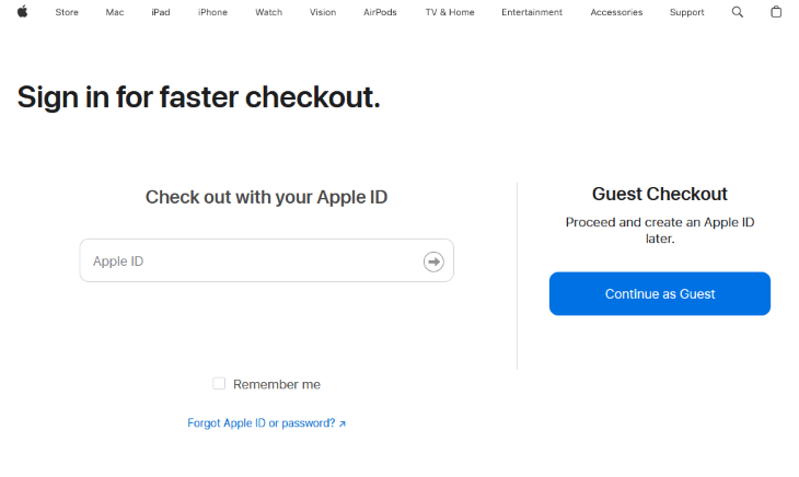
Offering your users the luxury of a guest checkout will encourage swift purchases because you avoid the extra steps required to create an account. Balancing this with the option to create an account post-purchase can help strike a balanced blend of convenience and customer engagement. Examples of brands that do this include the Apple Store and Oraimo.

You should always provide your users with an opportunity to review their cart before finalizing their purchase. This practice will minimize errors, allowing users to make last-minute changes to their orders. Alongside making your users feel confident in their selections, this saves you complaints and return expenses in the future.
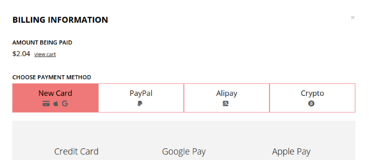
Offering a diverse range of payment methods makes your products available to a wider audience and fosters trust in your ecommerce platform. Include payment options like credit and debit cards, digital wallets, bank transfers, or any other secure online payment option. Also, you should display payment icons to assure users of a secure and seamless transaction experience.

Offer real-time validation for form fields to prevent errors and guide users toward correct input. This will keep your users engaged as they get instant feedback on their inputs. Use clear and informative error messages to direct users to rectify any issues without frustration.
A lot of consumers are attracted to discounts and will be more willing to spend when they learn they are getting a sale. It might even be the first reason that brought them to your site! I’m willing to argue this is why I (like many others) am guilty of having a queue of unfinished courses purchased on Udemy. Udemy runs sales frequently that attracts customers to buy — even when they didn’t prioritize it in the first place.
Research shows 28 percent of shoppers are likely to spend more money if there is an ongoing discount. So be sure to use this to your advantage!
Transparency is crucial. Displaying the estimated delivery time prominently during the checkout process helps to set your user’s expectations. This information reassures users about the logistics of their purchased items and improves the user experience.
Giving your users real-time customer support can be a big leverage to completing a sale. With a live chat, for instance, your potential customer can make inquiries on a product regarding shipping, pricing, payment or any other concern. This can provide them with enough clarity to conclude a purchase.
Part of the process of understanding users is to be clear about the primary objective of the product you’re making for them. For an ecommerce store, especially in the checkout process, you want your product to be usable — meaning your product is easy to learn, efficient, and safe to use.
We can leverage UX design to improve the checkout flow experience in the following ways:
Information Architecture refers to the intentional organization, structuring, and labelling of content in an effective way so that it is easily digestible by a viewer. Applying techniques like grouping related form elements into digestible chunks or making critical information such as cart items, estimated delivery time, payment options, and promo codes stand out will go a long way to aid the user in the checkout process.
Visual cues in an interface help boost recognition, which is an important usability metric. These cues can come in the form of typography, icons and graphics that subconsciously inform the user about the action they’re about to take. Examples of visual cues in a checkout process include:
Mircointeractions are similar to visual cues except that they’re used to draw the user’s attention to important elements, evoke a certain kind of emotion, or give users feedback on their interactions. Microinteractions can be used in the checkout experience in the following ways:

Designing your store with a mobile-first approach will be highly advantageous, given that a majority of online shoppers make their purchases using mobile devices. Ensure that all design elements are mobile-responsive and provide a seamless experience on smaller screens. Implement touch-friendly controls and ensure that your form fields are large enough for easy input.
After designing your checkout flow, it is just as important to measure and analyze its performance in production to identify bottlenecks, optimize user experience, and ultimately improve customer satisfaction rates. There are some concepts, key metrics, and analytics tools you can use to monitor and evaluate the effectiveness of your checkout process. One of which is A/B testing.
Discuss the importance of A/B testing, user testing, and qualitative feedback in identifying areas for improvement.
A/B testing, also known as split testing, is a method of comparing two versions of a webpage or user experience to determine which one performs better in terms of achieving a specific goal — such as higher conversion rates in ecommerce applications.
In this technique, product owners create two (or more) variants with a hypothesis of why each one may perform better. These variants are then assigned to different categories of the audience and tracked to see which variant performs better.
The feedback gotten from the data analysis in the testing phase can then be used to make informed decisions on how to improve the checkout flow. Now, let’s take a look at important metrics that are used to measure the success of a checkout flow.
There are also tools in this niche that help monitor these metrics and improve them for a better checkout experience. Some of them include:
Google Optimize is another popular A/B testing tool worthy of mention. However, because Google has decided to sunset the project (classic Google) this September, it has been excluded from the list.
Drawing inspiration from established successes (and building on them) often proves to be more productive than starting any process from scratch. In this section, we will analyze real-world examples of ecommerce platforms with user friendly checkout flows and examine the choices they make that streamline their checkout experience and increase conversion rates.
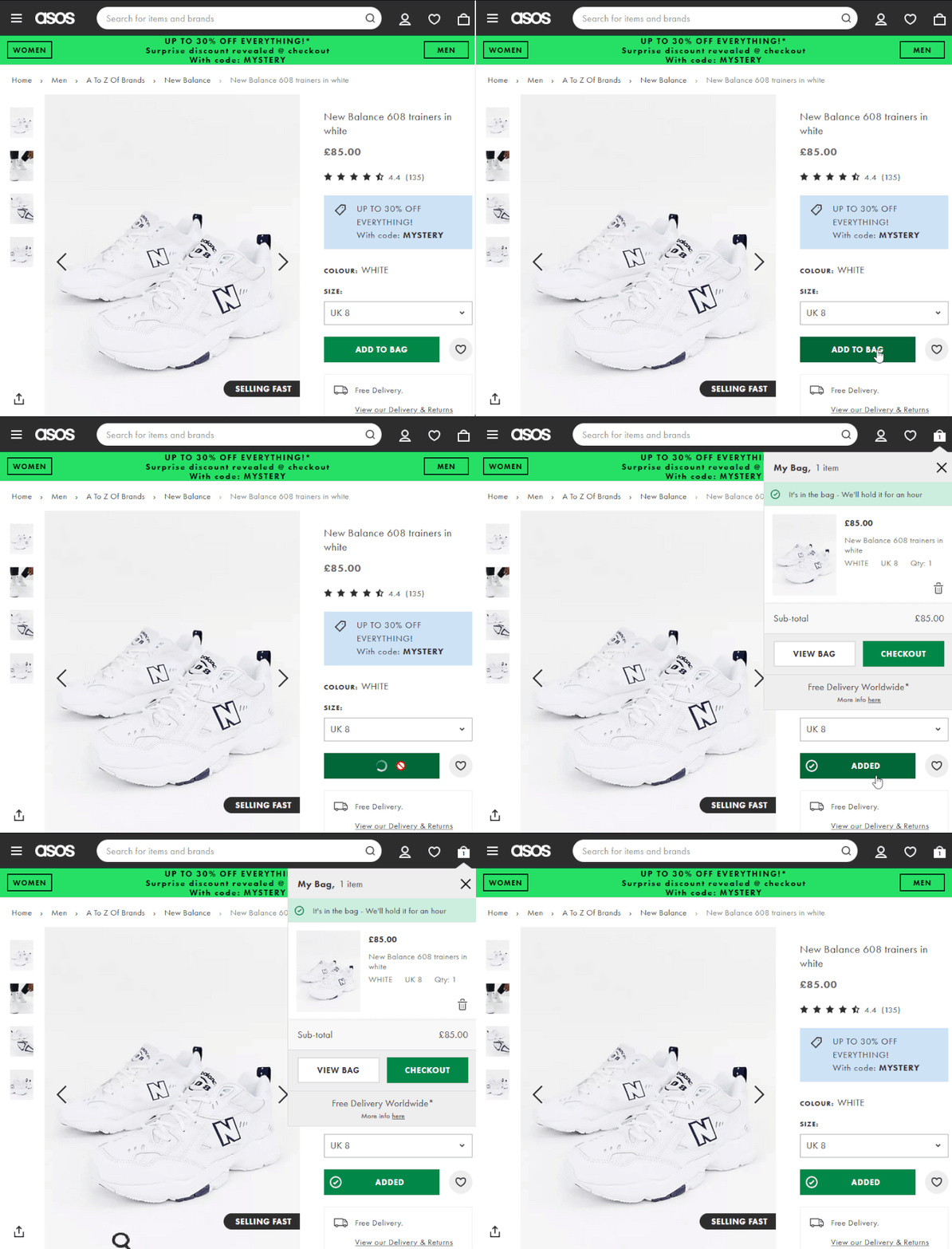
ASOS is a prominent online fashion retailer based in the UK. The store has impressive statistics, garnering 26 million active users and selling 99.7 million items in 2022, accruing a total revenue of £3.93 billion for the year 2022. Clearly, they’re doing something right! Let’s go over some things ASOS does to streamline its checkout process.
Apple is a brand that has undeniably etched itself into the fabric of modern culture. Apple boasts 1.46 billion active iPhone users and a 2022 financial year of $394.33 billion — you’d know they’re definitely paying attention to their checkout process.
Here are some key highlights from the Apple store’s checkout process:
In the world of ecommerce, where millions engage in online shopping, the checkout flow stands as the pivotal point where successful transactions come to fruition. Yet, despite the vast potential for sales, there is still a staggering cart abandonment rate of around 70.2 percent.
Understanding the importance of a seamless checkout flow is fundamental. It’s not merely a transactional step; it’s an intricate journey that encompasses multiple stages, each holding the potential to deter or delight customers. By embracing best practices and strategies, businesses can navigate through common challenges and offer an intuitive, secure, and efficient checkout process that resonates with their audience.
LogRocket's Galileo AI watches sessions and understands user feedback for you, automating the most time-intensive parts of your job and giving you more time to focus on great design.
See how design choices, interactions, and issues affect your users — get a demo of LogRocket today.

Zero UI works well for screenless, voice-first experiences, but most digital products still require visual interaction. Here’s why multimodal UX offers a more scalable foundation for the future of design.

Multimodal UX goes beyond designing for screens. Learn how context-aware systems, progressive modality, failover modes, and accessibility-first design create better digital product experiences.

Learn how context-aware mode prioritization and seamless transitions improve multimodal UX and reduce mode confusion.

Research is becoming more democratized, product cycles are accelerating, and AI is transforming synthesis and ResearchOps. Here are the three trends shaping UX research in 2026.