In the past, free trials were a golden tactic used to drive conversion rates and encourage people to sign up for premium services. All you needed to do was give something away for free; after all, people love receiving free stuff. But it doesn’t work like that anymore.

With nearly every subscription product offering a free trial, it’s no longer a competitive advantage or a differentiator.
And from a business standpoint, poorly optimized trials can mean:
Even worse, people got tired of free trials. They were fun at first, but even though they are free, they still require the user to invest time and effort. Not to mention the additional anxiety dose from the fear of an accidental renewal.
As a result, you need much more than just enabling the free trial for your users. You need to actually sell it to them. “Free” doesn’t sell itself anymore.
For the couple of years I’ve been working as a monetization product manager and a consultant, I’ve had plenty of free trial experimentation under my belt. Let me share what works.
There are several proven and effective ways to encourage people to start a free trial. I tested each of these examples multiple times, so it’s more than just a theory:
People are tired of testing new products through trials and often forget about the renewal.
Whenever I tested replacing the copy, variants that don’t focus on the trial itself were the winner. And this isn’t just about semantics — it’s about positioning. When you lead with “trial,” you position your product as a risk. When you lead with value, you position it as a reward:
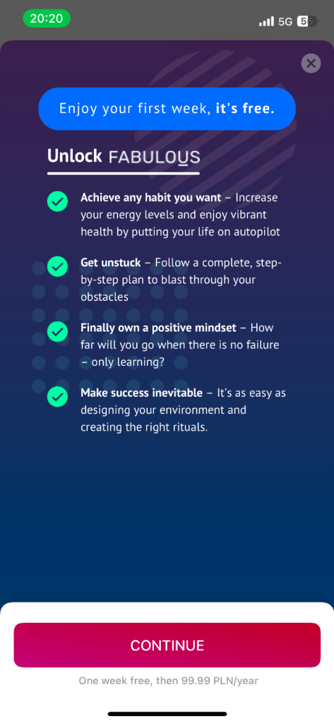
For example, for the CTAs, instead of “Start a free trial”, use:
Pro tip — Run multivariate tests not only on the button copy but also on the surrounding context. A CTA that says “Try it free” performs differently when paired with “Cancel anytime” versus “Get full access today.”
People love getting gifts.
Instead of positioning your trial as a part of signing up for a subscription, make it feel as if a user is getting something special. A special gift — maybe just for them?
Positioning your trial as a gift rather than an offer leans into the reciprocity principle — when people feel they’ve received something personal, they’re more likely to give something back (e.g., a signup or subscription).

From small cosmetic changes, such as adding a gift icon, to modifying the copy, to focusing the entire communication around “You got a gift from us! Open it!”, they tend to make small but meaningful improvements in conversion.
Personally, I like to:
$0 seems to be a more convincing value proposition than “free”. After all, everyone says about giving out “free” stuff that isn’t necessarily so free in the long run. And “Free” has become diluted. “$0 today” is more concrete — it clearly communicates no immediate financial commitment while still signaling value.
The “$0” is a fresher, more unique communication that more strongly suggests “not losing a dime”:
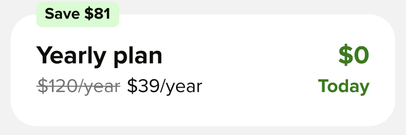
The above plan summary tile was tested a few times. “$0 today” worked better than “7 day free”, “free today”, etc.
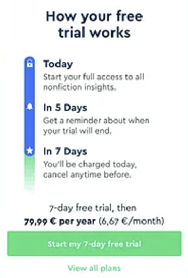
Pro tip — Consider pairing this with transparent trial terms upfront (e.g., “$0 today. $9.99/month after 7 days. Cancel anytime”) to reduce churn caused by unexpected renewals.
I often talk about free trial length in the context of the trial experience itself. However, they also impact the trial signup rate.
But not in a way most people would expect.
Although those are a few anecdotal examples, I’ve noticed that shorter trials tend to attract more people. Yes, a three-day trial is more tempting to try than a thirty-day trial.
I have a theory why.
Even though most people cancel the trial on day one, initially, it still feels like a commitment. A shorter trial lowers the psychological barrier. It feels more like a micro-commitment and less like a lifestyle change.
Imagine a personal trainer offered you a thirty-day free period. Even though you can resign at any time, initially, you imagine yourself going to the gym for thirty days. It’s tiring. Not to mention that if it’s so long, you might wait for “perfect time”. There’s no point starting this trial now if you have holidays in three weeks — you wouldn’t be able to use it fully.
But if that trainer offered you a free session? No commitment, just one training session to see how it goes. You could even start today with minimal hassle. In practice, you could resign from the thirty-day option after day one, too, but mentally, it feels like 30 times the effort.
Pro tip — Use shorter trials to target high-intent users. You can also segment users based on behavioral triggers (e.g., completed onboarding, visited pricing page) and offer longer trials only to late-stage evaluators.
We appreciate things much more when we have actually worked (even unconsciously) to obtain them. Instead of giving the trial for free, make it an actual reward.
For example, I once ran an experiment in which users got a daily visit streak. After three consecutive visits, they unlocked a seven-day trial. Not only did almost everyone participate in the trial, but we also did a great job attracting users with extremely high intent.
Two things come into play here:
Another strategy that is gaining traction, although I have yet to test it myself, is mobile app offer walls:
The idea is simple. Would you like to receive a reward, such as a trial? You need to first earn enough points, which can be obtained by downloading affiliate apps and completing specific quests.
It’ll severely limit the number of users who’ll be eligible for trial (only a few people will actually be willing to go through the hassle), but these will be enormously high-intent, so it might make sense if you care about quality over quantity (e.g. your cost to serve trial is high). Plus, you get extra revenue from affiliate programs.
I’m including it as a bonus because I’m personally a bit skeptical about the complexity of the flow, but I know a few experts who swear by it, so I thought it’s worth mentioning here.
This works primarily with native mobile products, but consider signupless trials.
Why would people need to create an account in the first place? These trials are almost always tied directly to the mobile store profile, and it is the App Store and Google Play that decide on the eligibility. If you don’t need to support cross-platform access, allow users to try the product without registration.
Faster signup, less hassle, and fewer worries about getting spammed with promotional emails afterwards.
If you can’t remove the signup process altogether, at least ensure it’s brief. The journey from visit to trial should be as smooth as possible. There are two areas to consider:
I’m overall a fan of short onboarding and disclosing value to users over time. However, even if you need a longer onboarding process, consider shortening it at high-intent entry points.
For example, if an unregistered user clicks on “claim a free week” CTA, don’t force them to go through the whole onboarding process. Move them to the payment flow as soon as possible and let them finish the onboarding later.
The principle here is simple. The less effort there is between the moment the user decides to make a purchase and the actual purchase, the higher the chance they will actually make a purchase.
While there are exceptions (e.g., sometimes it’s better to add extra steps that reinforce credibility and value, especially for high-ticket products), in most cases, the fewer choices and effort required on the user’s side, the better.
Make finalizing the trial quick as well. Two main things you can do are:
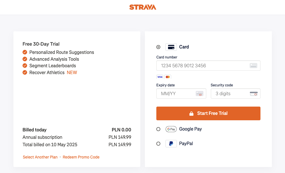
You know what happens when you click the trial CTA on Trello? You’re getting a confirmation screen.
No CC details, no onboarding, no decision-making. Just immediate access.
Once people are already signed up for a trial, their willingness to come back and try features is higher, and since the marginal cost of adding a new premium user is marginal to Trello, it’s a sound tactic to truly maximize their conversion rates and get as many people as possible to taste their offering.
Want to get a 100% conversion rate to trial? Try the reverse trial. Reverse trials aren’t just a clever tactic. They reflect a “value-first” acquisition model.
In short, it works by offering every new user a trial from the outset, without even asking if they are interested. Then, you take away the benefits after a couple of days and offer them to subscribe to get them back.
With reverse trials, you don’t ask users to make a yes/no decision upfront. Instead, you default them into premium and let them feel the value before introducing friction. This helps you:
Maximize first-session value
Hook users during the most curious and engaged phase
Use loss aversion to your advantage when premium ends
Although the promise of reverse trials is exciting, for me, it’s been hit or miss. This is a type of experiment that can drive -50% on all metrics, as well as +50%.
For me, it was a winner one out of four times, but when it won, it won big.
So, note — Reverse trials also inflate activation metrics artificially, so track conversion-to-paid, not just engagement. And beware of backlash if users feel you’ve baited them.
Lastly, I strongly encourage continuous research and experimentation with your free trial flow. A few classical experiments to run include:
I didn’t put them in separate sections because the situation depends on it. For example, testimonials are great, but they take a lot of space, and in some products, social opinion is secondary.
Whether you shorten the path to value or hide the paywall behind confetti, what matters is this: you meet the user where they are and guide them to where they want to be.
And although I believe most of the tips I gave you in the article will help you boost your free trial conversion rates, you won’t achieve your full potential without continuous experimentation. So test, test, test!

LogRocket's Galileo AI watches sessions and understands user feedback for you, automating the most time-intensive parts of your job and giving you more time to focus on great design.
See how design choices, interactions, and issues affect your users — get a demo of LogRocket today.

Learn what makes a great login screen through real-world examples and UX best practices for creating secure, accessible, and low-friction authentication flows.

Skeuomorphism helped define early digital interfaces by mimicking real-world objects to make technology more intuitive. Learn how it compares with flat design and neumorphism, why it declined, and where it still has a place in modern UX.

Memos don’t have to be complicated. Just keep them clear, concise, and focused on actionable items. More on that in this blog.

AI has made polished, confident content easy to generate, but that does not make it trustworthy. This article explains how UX teams can design stronger quality signals using source transparency, validation, confidence communication, and reputation.


