
Design critiques help us answer a question before a product ships: Do we think this is the right solution? Once a feature launches, we rarely go back to analyze how our decisions actually played out. And even when we do, the outcomes may not always tell the whole story. Thoughtful design decisions could lead to poor outcomes due to changing user needs. Meanwhile, weaker decisions might succeed unexpectedly. Reviewing a project retrospectively can help us understand the difference between making a good decision and getting a good result.
As a senior UX designer, I’ve spent years in design critiques discussing how users might behave, which workflows will make the most sense, and where they might get confused. Once the design ships, the team usually moves on to the next problem. We might look at adoption metrics or support tickets, but we rarely revisit the original design decisions and compare them with what actually happened.
Some of the most useful design lessons I’ve learned have come from revisiting shipped work and realizing that my assumptions were either wrong or more nuanced than I expected.
In this article, we’ll explore why design teams predict outcomes before launch but rarely revisit them afterward. We’ll look at treating design decisions as hypotheses and what I’ve learned from revisiting shipped work. I’ll also share a simple framework for running UX postmortems without turning them into another heavy process for the team.
A UX postmortem, also called a design postmortem, is a post-launch design review. It compares design assumptions with real user behavior. A broader UX retrospective may also examine teamwork and process. Here, the focus is on what shipped work teaches us about our design decisions.
Key Takeaways
Part of the problem is that the reasoning behind those decisions can get lost over time. When a product decision influences the design, we document it in our Figma files. This keeps the reasoning accessible beyond a Zoom recording and helps us understand why certain choices were made. A record of the context and reasoning helps someone new pick up a design. It also helps when a project gets shelved and revisited months later. It also gives us a starting point for understanding our decisions after launch.
Most design critiques happen before launch. We discuss the problem, review concepts, challenge assumptions, and try to predict how users will respond. That process is vaanalytics, usability research, and customer feedbackwhat will happen.
Mature UX teams already use analytics, usability research, and customer feedback to understand how their products are performing. Once our customers start using the product, we finally have evidence about whether those predictions were right. But what I think many teams are missing is the connection between those findings and the decisions that led them there. Product analytics might show that a feature is underused, support tickets might reveal confusion, or research might uncover an unexpected workflow. We address the immediate issue and move on without revisiting why we made the original decision.
Sometimes, we get so caught up in work and priorities that we forget to look back. On one project, we hid several secondary controls to simplify a workflow. We expected most users to follow the same path. After launch, we noticed experienced users repeatedly opening the advanced options. They needed those controls to handle less common scenarios. The solution wasn’t simply to put everything back. What initially looked like an interface problem was actually a gap in our understanding of how different users approached the task.
You can easily miss that lesson if you’re only looking at whether the feature is performing well. The more useful question is what the outcome tells us about the assumptions behind the design. That’s where looking back becomes useful because we can compare what we expected with what actually happened.
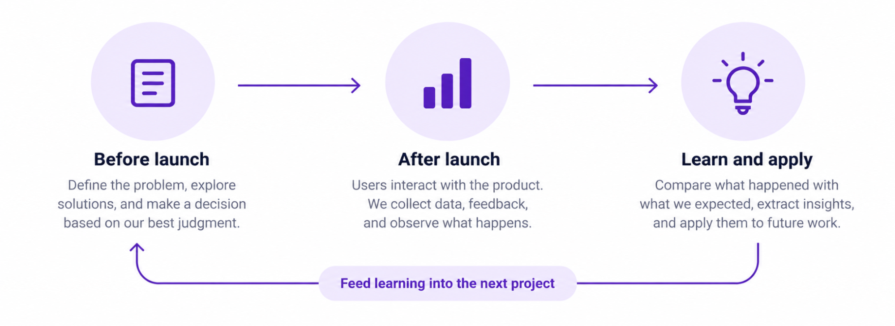
I’ve also had hypotheses that didn’t play out as I expected. On one workflow, we debated adding an extra review step because it felt like it would slow users down. We ultimately kept it because it gave users a chance to confirm their changes before committing them. We noticed that users were completing the review step and continuing through the workflow rather than dropping off at that point.
I realized I had been treating the extra click as friction without considering what it provided in return. At first, I took this as a sign that the extra step wasn’t creating as much friction as we’d expected. But the completion rate alone wasn’t enough to tell us whether users found the extra step helpful or were simply clicking through it. To better understand that, we’d need to look more closely at how users interacted with the review step or hear directly from them. When I revisit shipped work now, I separate three things. First, what did we believe before launch? Second, what does the evidence tell us now? Finally, what would we change if we were designing it today? That last part is especially important. Looking back gives us an opportunity to understand what the experience taught us and carry that ktreating decisions as hypotheses rather than conclusionssign-decisions-like-hyA critique can help us challenge those assumptionsh2>
One thing that’s changed how I think about design is treating decisions as hypotheses rather than conclusions. Every workflow makes assumptions about what users need, what they’ll understand, and how they’ll behave. A critique can help us challenge those assumptions, but we won’t know how well they hold up until people actually use the product.
To evaluate our hypotheses, we need to document the reasoning behind our decisions. Capture the problem, the evidence supporting our approach, and the outcomes we expect for users. This way, we have answers to revisit and anchor to later on.
On another project, we cleaned up a map interface by grouping several actions together. They seemed to belong to the same task. After launch, we noticed users were separating those actions and moving between different parts of the workflow instead. Their behavior showed that our mental model didn’t fully match theirs.
But this observation wasn’t enough to conclude that our direction was wrong. Another explanation for their behavior could be that they were unfamiliar with the layout, the actions weren’t discoverable, or different types of users needed different workflows. To explain the behavior, we’d need to understand what users were trying to accomplish. We’d also need to check its frequency and whether it affected task completion. The useful part is understanding what that behavior tells us about the decision we made. Users may simply think about the task differently than we expected. A decision that worked once isn’t automatically a decision I’d make again. I want to know what evidence supports it and whether the same conditions still apply.
Engineering teams have long used postmortems to understand what happened after a system goes live. I think there’s something useful for design teams to borrow here, but not necessarily the process itself. A design postmortem makes time to understand what happened after a decision and which factors contributed to the outcome. A design might underperform for multiple reasons, such as incorrect assumptions, technical limitations, changing requirements, or simply lack of visibility to users.
There’s often not a single cause of failure, but rather many different factors that influence the performance of a new feature. A feature that enables a successful task completion can still have a poor user experience. For designers, it’s important to look at the outcome from different angles and consider the context in which the decisions were made and what information was available at the time.
I don’t think every shipped feature needs a formal meeting or a detailed document. That would quickly become another process for designers to maintain. The depth of the retrospective should depend on how much the decision impacts users, how uncertain we were about our assumptions, and whether the same decision could influence future work. A small interaction might only need a quick discussion during a team meeting, while a major workflow may warrant deeper analysis. If every feature requires a formal postmortem, teams will eventually stop seeing them as useful.
A useful postmortem doesn’t need to review the entire project. It should focus on what we expected, what happened, and what we learned. You don’t need a lengthy retrospective or a detailed report. The idea is to connect what you believed before launch with what you learned afterward, then carry that lesson into the next project.
To run an effective postmortem post-launch, your team should have a clear understanding of the problem that you’re solving before launching. Document the assumptions and evidence behind your design decisions. Explain how those decisions might affect users. It can also be useful to write out your hypotheses around how you expect users’ behaviour to change afterwards. This gives clear expectations to evaluate and reflect on later.
Start by going back to what the team believed before launch. Which problem did you think you were solving? How did you expect users to behave? What assumptions did the design depend on? Which elements did you intentionally simplify, prioritize, or leave out? That gives you something concrete to compare against when you look back at the design.
Then look for evidence that supports or challenges those assumptions. This could be product analytics, usability research, support tickets, customer feedback, session recordings, or conversations with customer-facing teams.
Don’t rely on a single metric. Each source can tell you something different about the outcome. Analytics can show things like where users dropped off or which features they use, but not explain why. Session recordings or user testing sessions can highlight where users are challenged or get frustrated with a feature, but may not represent your entire user base.
A feature being heavily used doesn’t necessarily mean the experience is working well, just as low usage doesn’t automatically mean the design failed. You’re trying to understand not just what happened, but why. You might also find that some outcomes remain uncertain and need further investigation.
This is often where the most useful insights emerge. Look for anything that happened differently than expected, both good and bad. Maybe users found a workflow easier to learn than anticipated or they ignored a feature the team thought would be valuable. Maybe experienced users found a simplified workflow too restrictive.
Surprises can make us question how well we understood the problem or if we thought of it in a different way. If users behaved differently than expected, try to clarify what led to those expectations in the first place. Perhaps some use cases were overlooked or the research that we thought backed up our assumptions wasn’t that strong. Unexpected successes can be just as useful. They can show you which decisions or patterns are worth repeating.
Don’t stop at documenting what happened. Ask what you can take from it and apply to the next project.
For example, “users kept opening the advanced controls” is an observation. “Design simple defaults without removing the flexibility experienced users need” is a lesson you can apply to other workflows. The feature might be different next time, but the lesson can still shape how you approach the problem.
Finally, capture the lesson somewhere the team will actually find it. It doesn’t need to be a lengthy document. A simple page with four things is often enough: the original assumption, what actually happened, what surprised us, and what we’d do differently next time.
Over time, these small records give the team a history of what we’ve learned from our own products. That means the next designer working on a similar problem doesn’t have to start from scratch or rely on someone remembering what happened months ago.
Design critiques help us make better predictions. Postmortems help us get better at making those predictions. But we won’t always learn the right lessons from looking back at our work. Often, confirmation bias can get in the way of learning from our past decisions. We might focus on evidence that supports what we already believe while overlooking details that challenge or invalidate our assumptions. Designers should be open to questioning their own interpretations and try to see things from different perspectives.
If you want to try this with your own team, start small. Pick one recently shipped feature and compare what you expected to happen with what actually happened. Look for one assumption that held up, one surprise, and one thing you’d approach differently today. Then capture that lesson somewhere the team can find it.
Postmortems shouldn’t become another process the team has to maintain or another document that nobody reads. They build a habit of learning from what happens after we ship. Over time, this practice can change the way design teams approach new feature work. The more often we look back at our decisions, the less we have to rely on intuition alone. We become more comfortable questioning our assumptions, more careful with the research and insights we use to support our decisions, and more open to taking criticism and learning something new. Over time, we build a shared understanding of what actually works, what doesn’t, and how to apply those lessons in the future.

LogRocket's Galileo AI watches sessions and understands user feedback for you, automating the most time-intensive parts of your job and giving you more time to focus on great design.
See how design choices, interactions, and issues affect your users — get a demo of LogRocket today.
Learn how to build hero sections that load quickly, respond smoothly, and remain accessible, with practical checks for contrast, keyboard navigation, motion, media, and Core Web Vitals.
A design can look right and still fail in users’ hands. Learn how five kinds of prototype stress tests expose edge cases early, from awkward screen widths and real-world inputs to loading states, unexpected interactions, and accessibility.

Prepare your 2027 UX workflow with a practical guide to visualization tools, AI-assisted analytics, accessible charts, and a worked checkout example. Learn what to verify before acting on the data.
Explore how UX designers can use ADPList to find guidance and share experience, what to check before booking, and how its free and paid options compare with other mentorship platforms.

 Learn more →