The funny thing about design school is that it teaches you about Figma, prototyping, color theory, typography, and user-centered design. Still, it often overlooks one of the most critical skills you need in your UX career: communication. Communication and how to provide and receive feedback on your design work.

In school, you might have peer reviews and design critique sessions, but let’s be honest: it’s not the same as the real-world dynamics of a fast-paced product development team.
In design school, we’re kind and phrase our feedback constructively. But when you get into tech, your product and engineering partners might not know how to give feedback, and in school, you don’t learn how to deal with feedback, such as:
As long as there’s creativity in our work, we need to face critique. Only those who don’t do anything don’t get negative feedback.
However, not all critiques are created equal, and you need to know which feedback to incorporate into your design and which feedback you should just thank others for and move on. In this post, I’ll walk you through how to differentiate between the two.
Let me share a personal story:
At the beginning of my design journey, I feared critique sessions and judgements. I often had a knot in my stomach and treated the critique sessions as a battle I wanted to win — or at least not get too many scars by the end of the meetings. I had trouble separating my design work from my sense of self.
I was also afraid that people might find out I was an impostor and didn’t know what I was doing. Aren’t we all afraid of this as junior designers? Sometimes, I let the negative feedback affect me deeply. It was a long time ago, and since I learned how to give and receive effective feedback.
Now, I see my design crit sessions as a time to improve my design and bring people together to make the product better. Design crits and judgments are an all-natural part of our workflow; we can’t move on and create exceptional design without our work being judged.
Giving and receiving feedback can make or break your design iterations and affect the project outcome.
Feedback is like a signpost for designers, guiding us through design iterations and steering us toward successful features and product outcomes.
Here’s an example from my past career: I was deep in designing a mobile app interface to make grocery shopping a breeze. I poured all of my creativity into crafting a minimalist and elegant interface. I approached the task with some fear, but I couldn’t wait to show it off to my team of engineers, fully expecting them to be as excited with it as I was.
But then, reality checked in.
With their technical know-how, my engineers pointed out a problem: those stunning animations I was so proud of could slow down the app’s performance. I was disappointed as I realized that my artistic flair unintentionally compromised the app’s functionality.
However, I didn’t let this setback derail me. I took that feedback to heart, recognizing it was the way to elevate my design. So, I went back to my design tool, ready to make magic happen again. This time, though, I simplified the animations, making them just as delightful but far less resource-intensive.
And there it was: a well-designed app, balancing aesthetics with peak performance and intact user experience.
What’s the key message of the story?
Feedback is our ally. It pushes us to fine-tune our design until it’s easy on the eyes but also shows efficiency and usability.
I like to think about user needs as an island and business goals as another island. So when a product manager tells me, “The interface needs to focus more on user engagement,” they essentially help me align my design vision with the company’s goals.
Similarly, when users provide feedback such as, “This navigation structure is confusing because [whatever the reason might be],” they give us valuable insights into their thinking and needs. By incorporating this feedback, we’re solving real-world problems by creating a design that resonates with people and contributes to business success.
Our job is to build that bridge between the islands. Think about feedback as your compass that helps you find the right path. Always listen and iterate.
Open dialogue with your teammates is the key to excellent product development. It’s the secret ingredient that turns a group of people into collaborative colleagues.
We need to foster a culture where everyone (us included), from engineers to product managers, feels empowered to share their ideas and thoughts.
It’s not always easy to keep an open mind and have open and respectful communication during design review sessions. Still, we must try our best to encourage team members to contribute their perspectives to the discussion.
What if someone doesn’t say anything during the review session? Reach out to them privately and ask for their feedback. They might be nervous about someone else on the team, have social anxiety, or prefer one-on-one conversations.
During design reviews, it’s important to understand that meaningful feedback goes way beyond a simple “I like it.”
Constructive feedback is a carefully considered critique aimed at elevating our design work. This kind of feedback provides insights into what’s working, what’s not, and most importantly, the reasons behind our team members’ critique. The goal is to strengthen and refine our design.
I hope you can see the difference between “This shopping cart design isn’t appealing,” versus “The color scheme of the shopping cart page could be tweaked to better align with our brand identity.”
The first one leaves you with nothing, and you don’t know what to do next. However, the second provides a clear direction for improvement.
Vague feedback does nothing for our design. However, these are the trifecta that make feedback genuinely constructive:
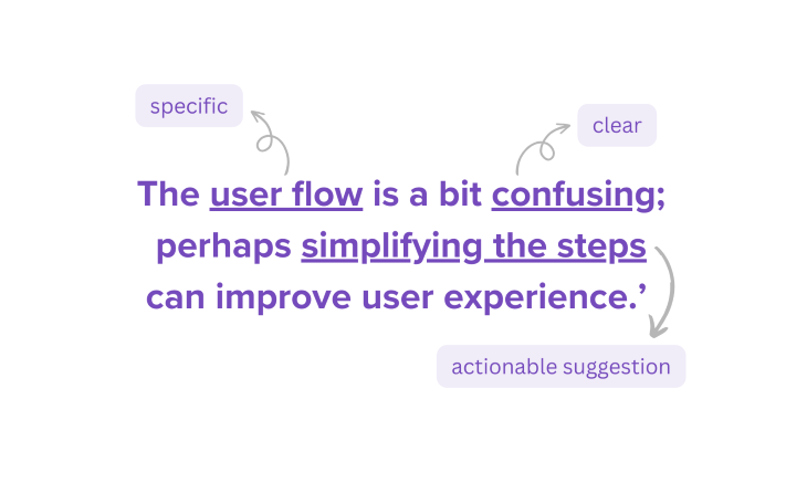
When you say, “The user flow is a bit confusing; perhaps simplifying the steps can improve user experience,” you’re being specific (user flow), clear (it’s confusing), and offering an actionable suggestion (simplifying the steps).

This kind of feedback is like a map, guiding the designer on what to focus on and how to improve. It eliminates guesswork and sets the stage for effective design iterations. The more specific you can be, the better. Instead of saying, “This color doesn’t work,” say, “The red color on the CTA button might be too aggressive; perhaps a softer shade would be more inviting.”
Constructive feedback is about providing specific, clear, and actionable insights that help move our design projects in the right direction.
Have empathy and respect, and never be rude when giving feedback to someone.
Giving feedback is not just about what we say but how we say it. An empathetic and respectful tone can significantly affect how our feedback is received.
Imagine telling your designer colleague, “I see where you’re coming from with this solution, but have you considered the accessibility aspect? If you’d add some alt text, you could make the design more inclusive.”
With this approach, you acknowledge the effort, pose a question, and offer a solution while being respectful. It’s way more effective than simply saying, “This design isn’t accessible!”
If you don’t want your feedback to be a trigger for conflict, deliver your message with empathy and respect.
Before you even think about offering your wisdom, pause and take a moment to understand the design’s goals and constraints.
Think about questions such as:
Knowing the context is essential because it helps you give feedback that’s not just relevant but also incredibly useful.
Now, let’s talk about the “how” of giving feedback.
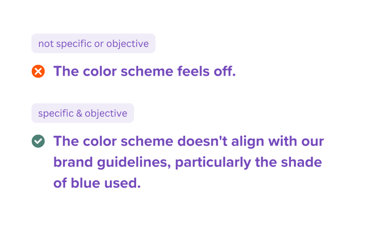
You should ditch those vague or subjective terms like “interesting” or “kind of.” Instead, be as specific and objective as possible.
For instance, instead of saying, “The color scheme feels off,” say, “The color scheme doesn’t align with our brand guidelines, particularly the shade of blue used.”

Do you see what I did there? I focused on the facts and design elements, making the feedback specific and objective.
Actionable suggestions are a huge part of effective feedback.
Saying, “Could you try making the text larger for better readability?” is far more helpful than a vague comment like, “The text is too small,” which leaves designers guessing what to do next.
A little praise makes the criticism easier to swallow, so I like to start with what I like about the design and then move on to areas that need improvement.
This approach makes the feedback easier to accept and motivates and guides the designer toward making effective changes.
Let’s flip the script and talk about receiving feedback.
Firstly, you need to adopt a growth mindset.
You need to see feedback as an opportunity to grow, learn, and refine your skills.
It’s not an attack. It’s a stepping stone to becoming a better designer. So, when feedback comes your way, embrace it and keep an open mind, trying to see where your teammate is coming from.
If a piece of feedback feels like it’s written in hieroglyphics, don’t hesitate to seek clarification.
Ask for specifics, examples, or even alternative solutions. The goal is to understand the feedback fully so you can act on it effectively. Don’t just assume; ask!
Lastly, let’s talk about prioritization.
Not all feedback is created equal.
Some comments will be crucial to the project’s success, while others might be more like ‘nice-to-haves.’ Your job is to sift through the feedback, identify what’s most important, and act on those first.
It’s like triage in an emergency room; you first deal with the most critical issues and then move on to the less urgent ones.
Timing is crucial when deciding when you need to incorporate feedback into your design. You receive a lot of feedback, but when do you start sifting them through?
I like to align the design revision and feedback incorporation with the project’s goals and timelines. For example, if feedback is critical to reach the next milestone, I prioritize it. If it’s something that can enhance the design but isn’t urgent, I save the feedback for the next iteration.
Be strategic and use your project timeline as a guide to help you decide what to tackle first and what can wait. If you’re ever in doubt, ask your product manager because they’d be able to provide you with priority.
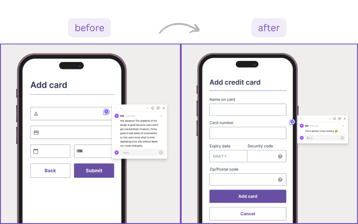
Tools like InVision or Figma allow us to annotate our designs, making the feedback process interactive. That’s the beauty of technology. Imagine having a conversation right on the canvas of your design.
You can point to specific elements, make real-time changes, and even reply to comments. It’s like having a dynamic, living document that evolves as you receive and incorporate feedback.
For posterity, I never remove feedback or delete comments, and I’d recommend you do the same.

When it comes to collaboration, you’ve got options.
Whether it’s Slack for quick chats, Microsoft Teams, Zoom, or Google Meet for more formal conversations, or good old email for detailed feedback, choose a platform that makes collaboration seamless for you and your team. The goal is to have a centralized place where feedback can be easily accessed, discussed, and acted upon.
Some of the most used collaborative platforms in design and product development are Slack, Jira, Figma, Miro, InVision, Sketch, Zeplin, and Loom.
Since the pandemic, most of us have embraced remote work.
Video calls and screensharing make giving and receiving feedback feel almost like you’re in the same room. You get to hear the tone and see the person’s facial expressions on the other end, making the whole feedback loop way more genuine and effective. So, in this remote work life, think of video calls and screensharing as your go-to tools for keeping feedback real and relatable.
However, if you work across time zones, you might need to do feedback asynchronously. In this case, I usually record a short video to walk people through my design and thinking and ask them for feedback. The receiving person also creates a video, writes me a message, or takes a screenshot and annotates it with arrows, words, and scribbles as suggestions.
Either way, don’t shy away from talking as closely to face-to-face as you can. This prevents miscommunication.
Make feedback a regular part of your design process. Whether it’s a weekly check-in or a bi-weekly design critique, having a set schedule ensures that everyone is on the same page and that feedback is timely.
Let’s be honest: conflicts are part of the game. When they arise, don’t panic. Instead, go back to the basics: open communication and empathy.
Have a candid conversation to understand the root cause of the conflict and find a middle ground. Once that’s sorted, iterate based on the feedback received.
Keep refining your design, incorporating new rounds of feedback until you hit that sweet spot where you and the stakeholders have a happy face.
When I was a fresh out of school “baby designer” ready to seize the industry in the real world, I received the following feedback. I share these with you because they demonstrate differing stakeholder needs and will help you preempt issues with your own designs, as well as help you understand where your critics are coming from.
Product managers are also in the business of bridging user needs and business needs. They’ll give you these types of critiques:
Engineers will usually be building your design. Because of this, they’ll be considering the practicalities of actualizing your concept. You’ll be getting critiques related to:
Asking other designers for feedback can give you a goldmine of actionable results, but only if they’re clear. Here’s what you’ll likely hear from other designers:
Each of these pieces of feedback offers a unique perspective that can help you refine your design:
The key is to take the feedback, no matter the source, and use it to make your design more robust, effective, and aligned with the project’s overall goals.
Giving and receiving design feedback is an art form that every UX designer should master.
It’s the essence of effective collaboration and the key to creating designs that look good and solve real-world problems.
So embrace the feedback culture and watch your designs improve!
Header image source: IconScout
LogRocket's Galileo AI watches sessions and understands user feedback for you, automating the most time-intensive parts of your job and giving you more time to focus on great design.
See how design choices, interactions, and issues affect your users — get a demo of LogRocket today.

Zero UI works well for screenless, voice-first experiences, but most digital products still require visual interaction. Here’s why multimodal UX offers a more scalable foundation for the future of design.

Multimodal UX goes beyond designing for screens. Learn how context-aware systems, progressive modality, failover modes, and accessibility-first design create better digital product experiences.

Learn how context-aware mode prioritization and seamless transitions improve multimodal UX and reduce mode confusion.

Research is becoming more democratized, product cycles are accelerating, and AI is transforming synthesis and ResearchOps. Here are the three trends shaping UX research in 2026.