Editor’s note: This article was updated by Chinwike Maduabuchi on 5 December 2024 to discuss broader comparison features in UX design, provide updated examples of both static and dynamic comparison features, answer common questions about comparison table design, and more.

Picture this: you’re torn between two smartphones, both sleek and promising. One boasts stunning camera features, while the other wins on battery life. How do you choose? Whether it’s selecting the right subscription plan, comparing loan options, or picking a product, the decision-making process often feels overwhelming.
This is where feature comparison tables come into play — a simple yet powerful tool that cuts through the noise. By designing comparison tables that clearly highlight similarities, differences, and unique selling points, we can help users make confident, informed choices in less time.
In this article, we’ll break down the step-by-step process for designing effective comparison tables, explore best practices to enhance their usability and share tips to make them persuasive, accessible, and user-friendly. This will help your users make informed decisions and could lead to a conversion.
People make decisions all the time, and comparing different options is naturally part of the decision-making process. It’s normal for us to want to shop around to find the best deal, whether we’re deciding on which product to purchase, which service provider to choose, or which lender to sign up with.
A comparison table is a tool used in the decision-making process that helps weigh the pros and cons by displaying common features or characteristics in a clear, easy-to-read format:
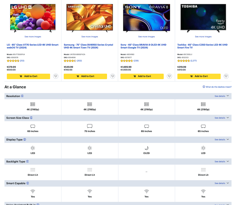
Often, we care about a few key things when making a decision — for example, the price, technical performance, or available features. It helps to see an overview of each option by highlighting the similarities and differences in order to make a choice that fits our needs.
Comparison features like tables are a vital UX tool, especially in contexts like pricing pages or when offering multiple product or service options. However, they must be used thoughtfully to avoid overwhelming or confusing users.
It’s a good idea to use feature comparison tables when you have:
However, feature comparison tables may not be ideal when:
Considering these points may help you decide whether a comparison table will add value or detract from the user experience instead.
When designing a feature comparison table, a key consideration is whether to create a static or dynamic table.
A static comparison table is a simple table that displays information in a fixed format. The information in the table remains the same, and the user can’t interact with the table to change the displayed information.
A dynamic comparison table, on the other hand, allows users to interact with the table to change the displayed information. The user can select which products or services to compare, and the table will update to display the relevant information.
Static tables are useful when the information being compared will likely stay the same. Dynamic tables, meanwhile, are useful when there are many products or services to compare, and the user needs the ability to filter and sort the data:
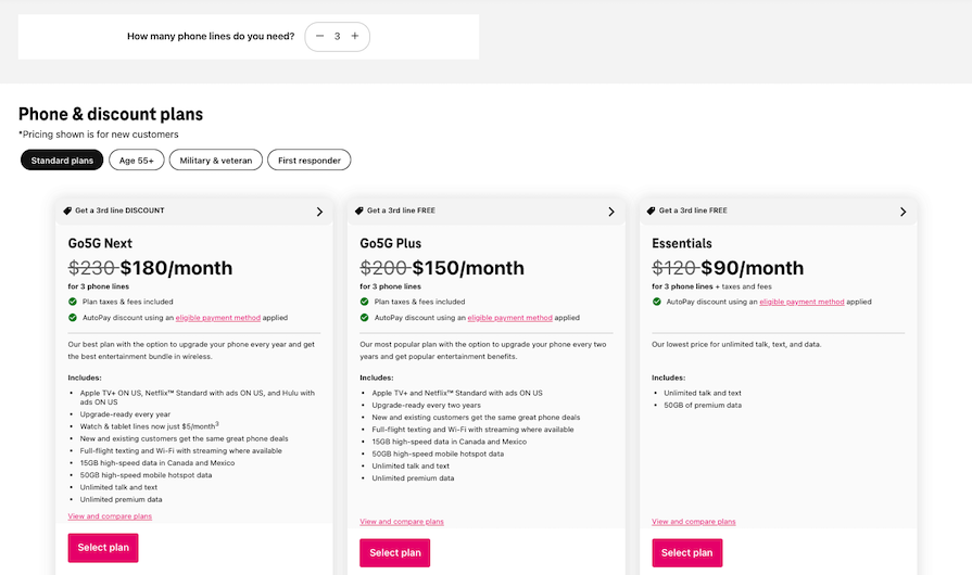
The first step to creating a feature comparison table is to define the purpose and identify the target audience. This will help determine the relevant features to compare and the level of detail required.
Some purposes of a feature comparison table can include:
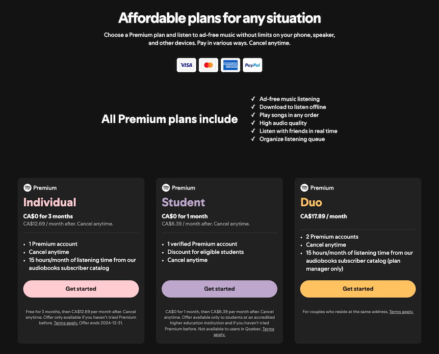
Here’s an example table from Spotify that compares different Premium plans:
The next step is to research the products or services being compared and collect data from various sources such as product manuals, company websites, customer reviews, and competitor analysis.
Focus on collecting data that will help the viewer in the decision-making process, such as prices, performance specs, or any unique features. It’s important to ensure that the data collected is accurate, up-to-date, and relevant to the target audience.
Once the data has been collected, it needs to be organized in a structured and easy-to-read manner. The table should have a clear and concise layout with headings and subheadings that guide the reader through the information.
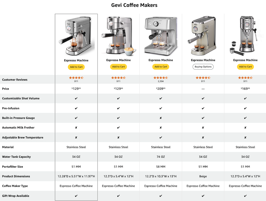
The categories or features being compared can be listed in a column on the left-hand side, with the corresponding information displayed in columns to the right. Alternatively, a simple pillar format could be better suited to avoid cluttering the table:
There are few general best practices you can follow while designing feature comparison tables to ensure the best experience for all users on all devices, including those who use assistive technologies like screen readers or keyboard navigation.
Let’s talk about some UX best practices first. Then, we’ll discuss responsive design, incorporating interactivity, and accessibility considerations.
The way you present information — known as information architecture — is crucial for guiding users toward a decision. Make a conscious effort to structure the table thoughtfully by prioritizing features that matter most to the user, rather than focusing on your marketing goals.
For example, on a software product’s pricing page, features like “number of users” or “storage capacity” should appear before less critical details, such as add-ons.
When including pricing in comparison tables, clearly indicate whether the prices are monthly, yearly, or one-time payments. Offer toggle options (e.g., “Monthly/Yearly”) so users can view prices in their preferred billing format. A few other tips:
This matters because transparent pricing builds trust, reduces cognitive load, and helps users make informed decisions more efficiently.
Row height can make a big difference in the readability of the table. Condensed rows can make the table look cluttered, while tall rows can make it harder to compare the information by spacing out the table too much.
Of course, if you have enough screen real estate, like on a desktop view, expanding the height of your rows could be to your advantage. In general, use enough whitespace and avoid cluttering the table with too much information or unnecessary details:
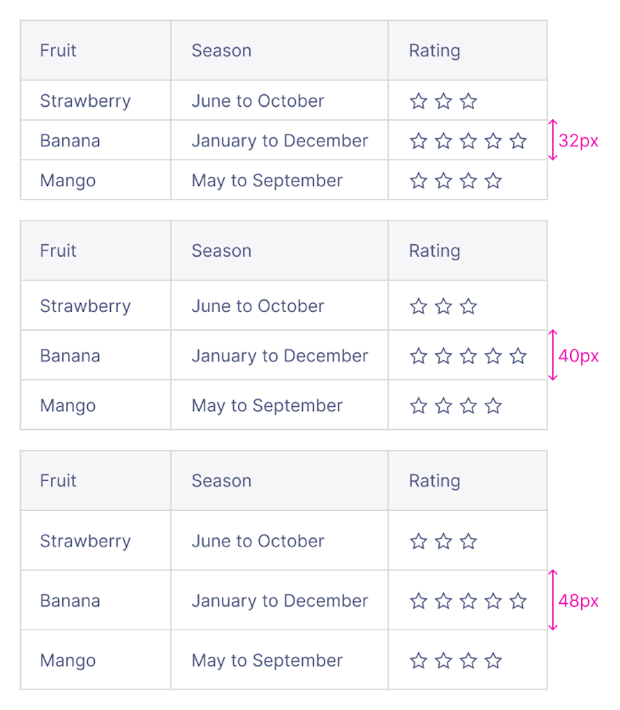
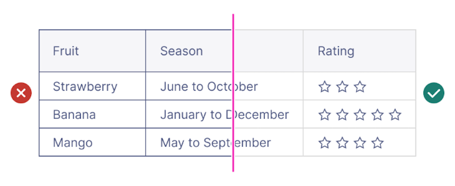
Row and column separators may not always be necessary, as they can add more visual clutter to the table. If you prefer to add separators to the table, use a light color that doesn’t clash with the text color to maintain focus on the information instead of the table itself.
Use color, bolding, or icons to highlight key features or differences between the options. This will help the reader quickly identify the most important information:
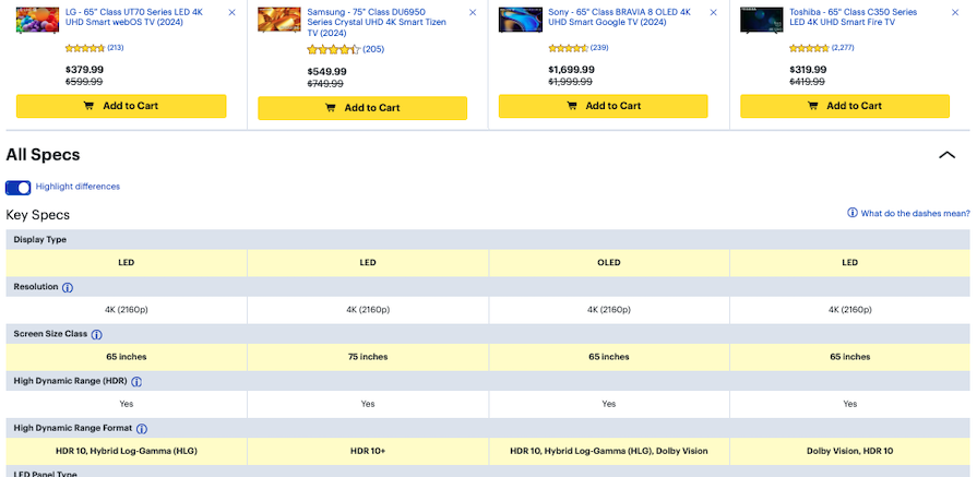
Consider giving the user the option to only show the differences. By hiding the attributes that are the same across the board, it makes the comparison process much easier for users.
Using graphics, images, or icons can help illustrate the information and make the table more visually appealing. This can also help break up the text and make it easier to scan:
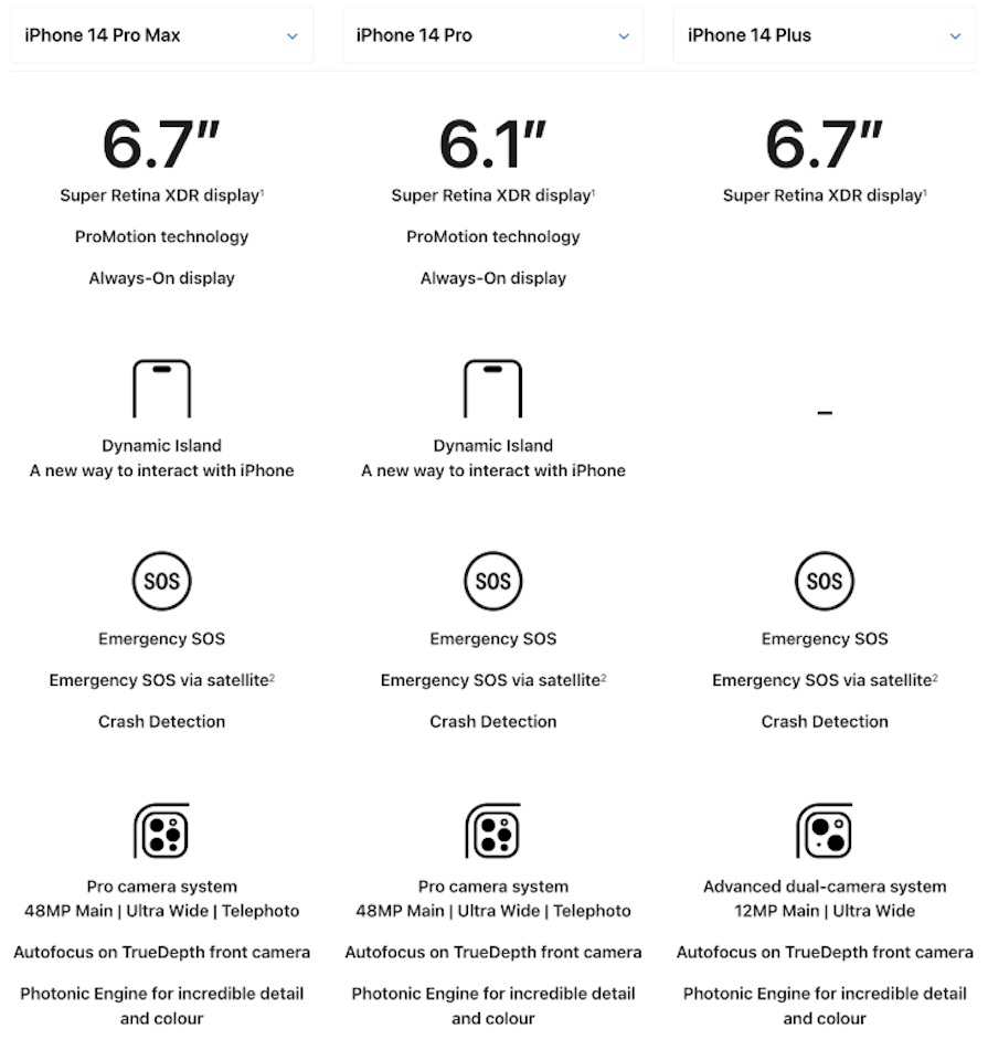
Keep your visuals simple and easy to identify. Effective iconography is universally understood by audiences from any background.
It’s admittedly hard to condense all the shiny features your product offers onto a mobile screen. But with a few tactics, you can make your feature comparison tables responsive while still maintaining a neat and compact design. These tactics include:
Here’s an example of making group labels highly visible:
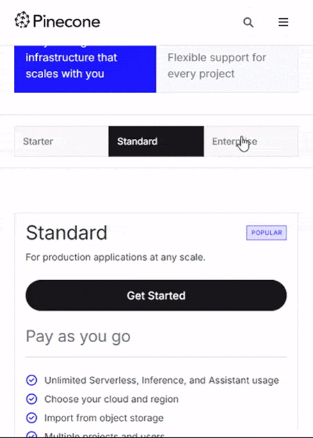
Enhance comparison tables by adding interactive elements like hover states, sorting, and filtering:
These interactive principles improve usability by making the table dynamic, user-driven, and tailored to individual needs.
Designing feature comparison tables with accessibility in mind is crucial for creating an inclusive user experience. This ensures the interface is usable by individuals with disabilities, as well as those facing temporary or situational limitations, such as low-vision environments, limited mobility, or device constraints.
By building accessibility into the table, everyone can consume the same information, leading to a higher potential for conversion. Here are some best practices to follow to ensure that your comparison table is fully accessible:
By following these best practices, businesses can ensure that their comparison tables are navigable for people with disabilities. This not only helps to improve accessibility but also ensures that all users have an equal opportunity to make informed decisions based on the information provided.
Comparison tables should be persuasive to the audience and help guide them into making a decision. Although comparison tables shouldn’t be biased toward one option or push a marketing agenda, they should ultimately be able to persuade the viewer to make the right decision for their needs based on the information presented.
Here are some best practices for using data and sources to make a comparison table persuasive:
Now that we’ve covered the principles of designing effective feature comparison tables and the best practices behind them, let’s explore some real-world examples. These examples not only showcase key skills like persuasion and visual appeal but also highlight how dynamic elements — such as interactivity and user-centered design — can improve decision-making.
Resend is an email delivery software service. Their feature comparison table is a standout example of user-focused interactivity. The table incorporates a slider component that allows users to select the number of transactional emails they expect to deliver in a month:
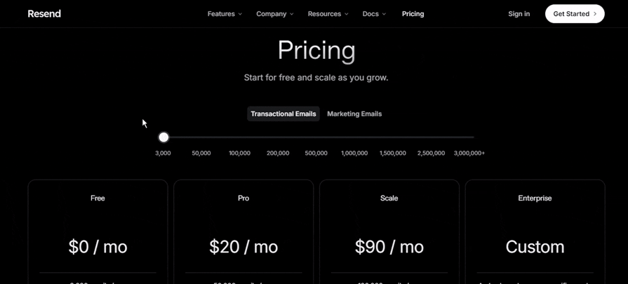
This interactive element introduces a dynamic, real-time pricing experience. As the slider is moved, the visibility of the pricing plan cards responds instantly to reflect the user’s selection.
Notably, the cards that match the selected number of emails become highlighted, while the other cards become blurred. This visual cue makes it easy for users to focus only on the plans that are relevant to their needs, reducing cognitive load and improving decision-making.
This design not only creates an engaging purchasing experience but also facilitates decision-making, helping users identify their ideal plan based on their specific email volume.
Framer is a website builder. Their feature comparison table enables flexibility through a toggle button that allows users to switch between monthly and yearly pricing:
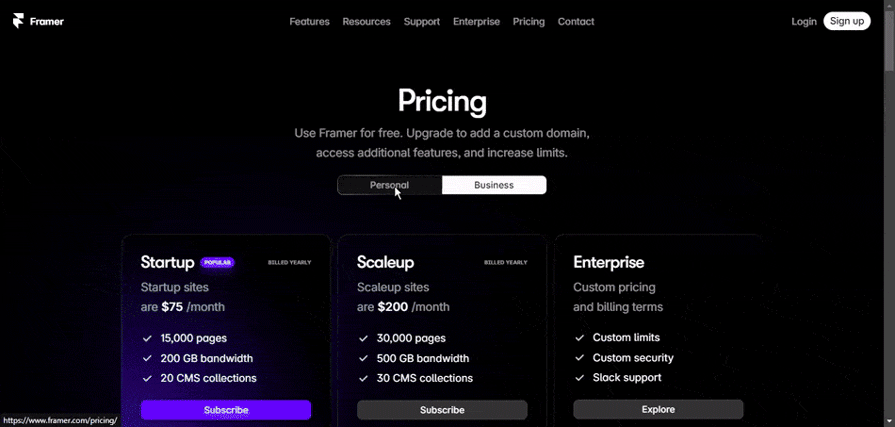
This is a clear example of how Framer caters to a range of user preferences by providing a streamlined way to view both pricing models.
This design becomes even more interesting as users scroll down the page. On Framer’s pricing table, the pricing cards slightly collapse and stick to the top of the screen. This approach ensures the Subscribe CTA is always visible.
It’s a clever persuasion tactic: the payment button stays within reach, making it easier for users to take action after reviewing the page for supporting information.
Use a comparison table when you need to present multiple options with shared features, such as pricing plans, software tools, or product models, to help users easily compare them.
Best practices include keeping it simple, grouping features logically, highlighting key differences, maintaining visual hierarchy, managing whitespace and ensuring responsiveness for mobile devices.
Design interactive comparison tools by incorporating sorting, filtering, and collapsible sections to let users focus on relevant information. Use hover states for clarity, toggles for options like “Monthly/Yearly,” and ensure smooth navigation across devices.
Common mistakes include overwhelming users with too much information, poor responsiveness on mobile, unclear pricing formats, lack of accessibility, and missing interactive features like sorting or filtering. Avoid clutter and prioritize scannability.
To make tables mobile-friendly, stack columns vertically, allow horizontal scrolling, or use collapsible sections to reveal additional details as needed.
Use whitespace effectively, keep text concise, and limit the number of features. Highlight the most important attributes and use visual markers like checkboxes, arrows, or icons to aid scanning.
A pricing table focuses specifically on comparing prices for different plans or products, while a feature comparison table also compares other attributes like features, performance, and specifications.
If the table is long, consider breaking it into sections or providing a search/filter option. Collapsible sections or pagination can also help keep the table manageable.
Feature comparison tables are a powerful tool for simplifying decision-making, enabling users to compare options efficiently and make informed choices. By combining clear information architecture, persuasive design, and interactive elements, you can create comparison tables that not only enhance usability but also drive conversions.
The key to success lies in understanding your users’ needs, presenting relevant and well-structured data, and ensuring accessibility for all. Whether static or dynamic, a thoughtfully designed comparison table can highlight key differentiators, reduce cognitive load, and build trust — ultimately guiding users toward the best decision.
LogRocket's Galileo AI watches sessions and understands user feedback for you, automating the most time-intensive parts of your job and giving you more time to focus on great design.
See how design choices, interactions, and issues affect your users — get a demo of LogRocket today.

Design engineering has always lived between design and code. But with AI tools turning prompts into interfaces and code into editable canvases, that bridge is becoming a new way of building.

A three-week mobile banking project taught me that the “proper” UX process is not always realistic. Sometimes, the better approach is to work with what you know, identify what you still need to learn, and make the strongest decision possible under real constraints.
A/B testing compares two versions of a design to see which performs better with real users. Here’s how UX teams can use it to test hypotheses, measure outcomes, and make smarter product decisions.

This case study shows how one ad experience redesign increased total ad exposure while lowering perceived friction, proving that timing and context can matter more than raw interruption.