Creating a table in Figma may seem like a straightforward task, but poses some common challenges that many designers face. The lack of a standardized approach has led designers to create tables manually, cell by cell, often with inconsistent formatting for different cell types. This results in inefficient workflows and a lot of wasted resources, not to mention the negative impact that design inconsistencies can have on user experiences.

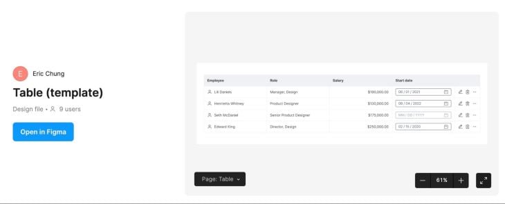
When done correctly, table creation in Figma can be streamlined and result in a powerful tool for your product. In this tutorial, we’ll walk through step-by-step how to create a table in Figma, as well as a few techniques to style and customize it to enhance the user experience. I’ve also created a Figma template that contains all the components needed for the tutorial:

Before we jump in, you can download our Figma table template from the Figma Community if you want to work with a prebuilt table and follow along:
Download the Figma table template here.
Let’s get started by creating a new Figma file. Click on the blue + Design file button in the top right corner. To ensure a clean and organized workspace, rename your file by clicking on the title in the top header. Also, name your page to indicate its purpose. These steps may seem like no-brainers, but proper file naming can go a long way when keeping your files organized.
To start building our table, we’ll be using the Frame tool, located third from the left in the top header. Frames are helpful in establishing containers within designs and come with various capabilities to create a table:
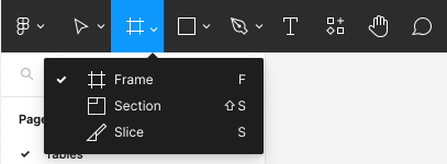
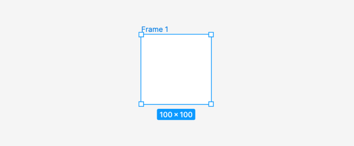
Once you’ve selected the Frame tool, you can click and drag anywhere on the canvas to create a new frame. Single-clicking on the canvas will automatically create a 100-pixel by 100-pixel square frame by default:
Figma has a built-in list of frame dimensions to choose from that align with standard mobile screen and paper sizes. Select your frame, and in the Design tab in the right panel, click on the Frame dropdown to access the dimensions. This is a quick way to get the perfect size container for what you’re designing.
If you don’t know what size you want your table to be, don’t worry. Using Figma’s auto layout settings, we can resize the table to fit any space. Let’s come back to this once we’ve set up the table’s components.
Tables are essentially a combination of rows and columns populated with content. Each row and column contains multiple cells. To create the cells for our table in a scalable way, we’re going to use components.
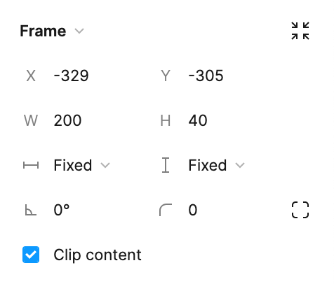
To create the base for our cell components, insert a frame onto the canvas. For this example, let’s make the frame a fixed width of 200 pixels and a fixed height of 40 pixels. The cells can be resized after we fit them into the table frame if needed:

Set the background fill color to white to maintain a visually clean look. Additional background colors can be applied to cell variations if your table requires different states, such as selection, success, or error:

With the cell selected, add auto layout from the Design tab on the right panel so that we can easily format the content inside and adapt it to different use cases. You can also right-click on the cell and choose Add auto layout from the dropdown or use the keyboard shortcut:
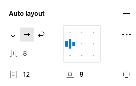
With auto layout applied, let’s set the padding for our frame. In the auto layout settings in the Design panel, set the cell horizontal padding to 12 pixels and vertical padding to 8 pixels to create a consistent look across all cells with enough whitespace:
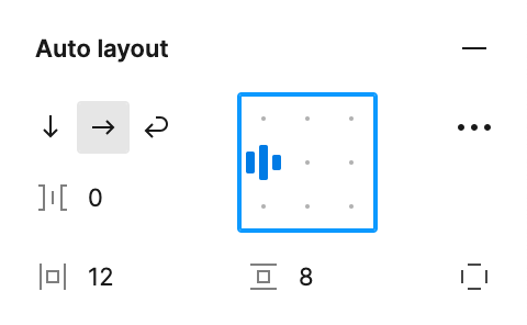
Select the align left option in the auto layout settings so that our content will be centered vertically within the cell. Most of our cell types will be aligned left, while right-aligned cells can be easily adjusted with auto layout.
Next, let’s add borders to our cells. This will give them the lines that separate your table’s rows and columns. Depending on your table’s style, you might want a few variations of bordered cells. For example, you might want cells without borders separating your columns. In this case, omit the side borders in your cells.
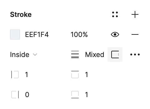
As a default, let’s add a left and top border to the cell. In the Stroke settings, choose a light grey as the fill color. This is a good neutral color that will be visible enough on the white background but not distract from the content of the cells. Ensure that your stroke is set to Inside so that the stroke is contained on the inside of the frame.
Then, click on the Strokes per side setting and choose Custom. This will let you customize the stroke for each side of the frame. Enter 1 for the left and top sides and 0 for the right and bottom sides:
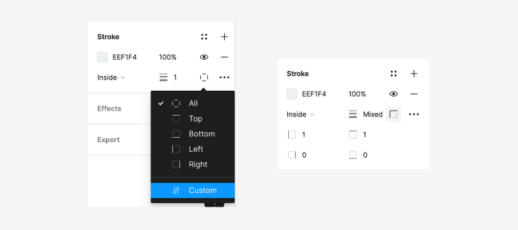
Create copies of the cell component as needed to apply different borders for each variation.
Depending on the context, a table can require various types of content within its cells. Some cell types include text, numeric, icon, input field, or a combination. We’ll create a component variant for each content type to make it easy to leverage each one in the base cell.
Starting with the base cell, use the Text tool to add placeholder text and set the horizontal resizing to Fill container:

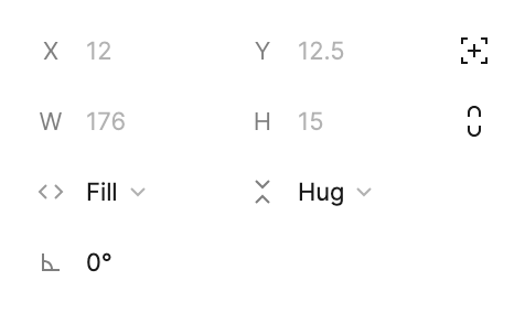
Now let’s turn this cell into a component for easy access and reuse in our file. Right-click on the cell and select Create component from the dropdown. You can also use the keyboard shortcut:

To create a variant of this component, click on Create component property under the Properties section in the Design tab and select Variant from the dropdown:
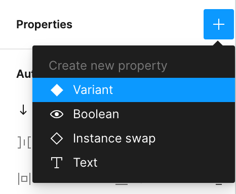
Your cell component should now have a purple dotted border around it with a label that says 1 Variant and a + button underneath. Click on the + to add a second variant to your cell component:
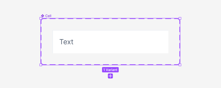
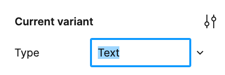
You can rename your variants in the Design panel under Current variant:
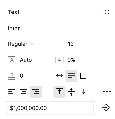
To create a numeric cell, change the text to a number. In the auto layout settings, change the alignment to align right, as numeric cells are easier to read when right-aligned:

Sometimes icons are used for easier categorization or visual appeal. Using the text cell as a base, create another variant. Add an icon placeholder to the left of the text. In the auto layout settings, change the horizontal gap between items to 8 to create space between the icon and text:

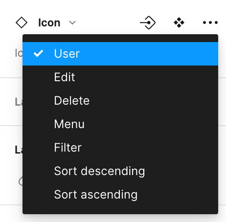
For the added flexibility of using different icons in your cell, create an icon component with each icon as a variant:
![]()
Then, insert the icon component into the cell component. This way, you can easily switch between different icons:
![]()
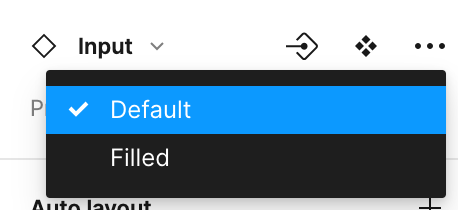
Tables are often interactive and allow users to input or change values within the cells. Types of input fields can include dropdowns, text fields, or toggles. For this example, we’ll use a date picker. Since the input field can have multiple states, such as default or filled, we’ll create a separate component with two variants to switch between:
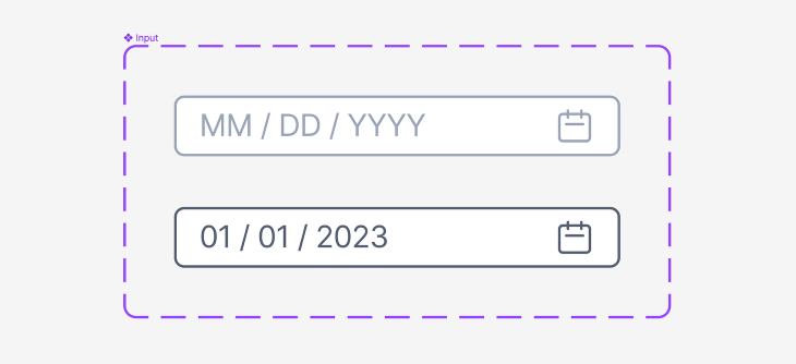
After you’ve created the input field component, add it to the base cell component. Now, when we use our date picker cell, we can easily switch between default and filled states:

Some cells may only contain icons, such as for icon menus. For our example icon cell, we’ll use an edit icon, delete icon, and overflow menu icon. Insert the icon components into the base cell and select the variants of the icon that you want:
![]()
Set the horizontal gap between items to 8 in the auto layout settings. Since this cell will go at the end of each row, let’s add a stroke to the right side of the frame to close off the table:
![]()
We also don’t want this cell to take up too much horizontal space, so set the horizontal resizing to Hug contents. Now, the cell components for our table are complete:
![]()
When you’re scanning through a table, how do you know what the data means? Headers help categorize the content within each column. They display column titles, as well as additional functions that the table might have, such as sort or filters, which we will cover later in this tutorial.
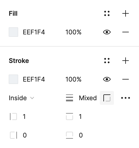
Header cells can also be styled differently, such as with a different color background, to differentiate from the rest of the table. To set up a visually effective header cell, simply take the base cell that we created earlier and change the background fill color to the same light gray color as our borders.
Then, use Figma’s Text tool to add bolded placeholder text to the header cell. Set the text color to black to ensure sufficient color contrast:

Finally, our header is ready to be turned into a component for easy access and reuse in our file. Right-click on the header and select Create component from the dropdown or use the keyboard shortcut:
With our headers and various cell types created, let’s put them together to create columns. To make our text column, combine a header and multiple text cells vertically with auto layout. Make sure that the vertical gap between items is set to 0. Now, our text column is created and we can turn it into a component:
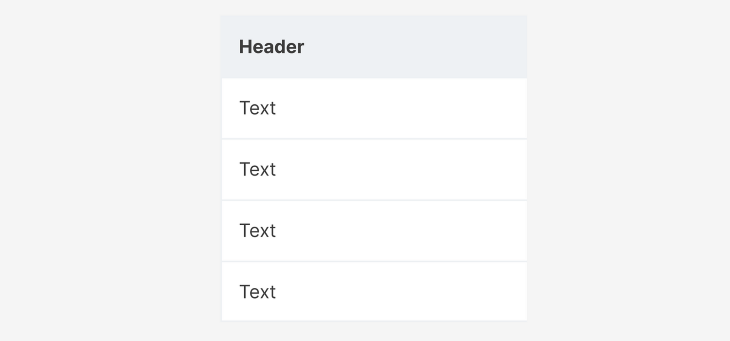
Continue creating variants of the column component by changing the cell types and naming each one accordingly. Add a bottom border to the last cell in each column in the Stroke settings to close off the table:
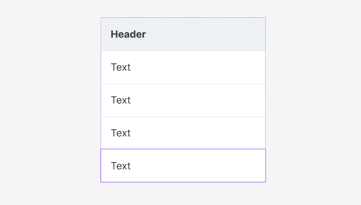
For the icon column, the header doesn’t need a title, so hide the text layer in the header. After joining the header with the cells using auto layout, set the horizontal resizing of the header to Fill container so that it’s as wide as the cells. This way, the menu doesn’t take up any unnecessary space at the end of our table:
![]()
Now that our column components are complete, it’s time to put them together to create our table.

On the Assets tab in the left panel, search for your column component and drag it onto the frame that we created at the beginning of this tutorial:
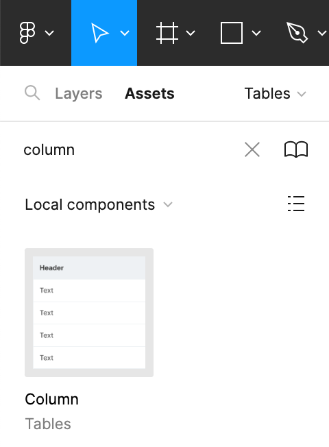
Copy and paste it so that you have five columns. Once all your variants are in the frame, select all of them and add auto layout so that they are neatly connected with no horizontal gap between items. Using auto layout to join your columns together allows you to easily reorder them by using the left and right arrows on your keyboard:

Using the component property settings, select each of the column variants that you created:

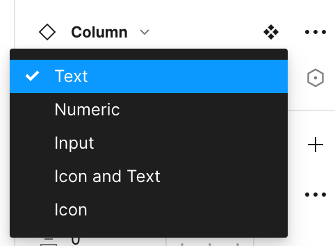
Now, your table is complete! All that’s left to do is change the placeholder content to fill your table with real data.
If you want to stretch the table horizontally to fill up your frame, first add auto layout to the frame. Then, set the horizontal resizing of your table to Fill container. Finally, set the horizontal resizing of each of your columns to Fill container, and your table should now span the width of the frame:
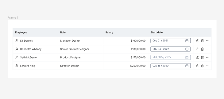
To style your table according to your company’s brand, you might want to adjust the formatting of your content, such as font attributes, size, color, and alignment. This can have a significant impact on the readability of your table. Here are some tips for effectively formatting text and numbers within your table.
The font styles that you use for your table will affect your user’s ability to read and understand the content. Choose a sans-serif font that is easy to read, such as Calibri, Open Sans, or Arial, or a font that aligns with your company’s brand style guide. Bolded text should be used only for headers or important data points.
As a rule of thumb, keep your font size between 8px and 12 =px for readability. Headers can have larger fonts to stand out, while the content of your table should be readable but not too small that it gets hard to read. Use a consistent font size throughout your table.
Color can convey different meanings depending on the context. Keep the background of your cells a neutral color that is easy to read, such as white or light grey. Choosing a different color for your headers can help make them stand out and improve readability. Don’t forget to consider accessibility by ensuring sufficient color contrast between text and background colors.
Aligning your content properly within each column can have a massive impact on readability. In general, most columns, such as text or input fields should be left-aligned, while numeric columns are easier to read when right-aligned. Headers are best left-aligned as they leave room on the right side for optional icons used for features such as sorting or filtering. If those features are unnecessary for your table, you can consider center-aligning your headers.
Now let’s talk about styling the background and borders of your table. Both of these visual aspects can impact the aesthetics and readability of your design.
In general, the background color of a table should be neutral, such as white or light gray. It should have sufficient color contrast with the content to ensure that the table is accessible to all users.
In some contexts, cells might change their background color, such as green for validation or red for error states. To account for different contexts, you can create a variant for each cell component with the background colors that your table requires. This will make it easier for you to switch between background colors in your table without having to manually change the fill color:

Headers usually have a different background color than the rest of the table to set them apart. The contrast in background colors helps users scan the table more easily and lends itself to creating a visual hierarchy.
Changing the borders of your cells can be an effective way to customize your table. Keeping your borders thin provides a clean, modern look, while thicker borders can add additional separation between columns, such as to indicate a fixed column. Removing column borders can also help reduce the visual clutter of your table:

Applying alternating row colors, or a zebra-striped table, is a technique that claims to enhance the readability of a table. Although it’s questioned whether or not zebra striping actually improves a user’s accuracy or speed when looking for data within a table, some may find the pattern to be visually appealing.

The idea is that the alternating row colors help users scan rows from left to right more easily without losing their place. This can be especially helpful in big data tables with many columns.
Depending on what your table is used for, it may appear on various screen sizes, such as desktop, mobile, tablet, or even television. Responsive design is necessary to ensure that your table scales well to all sizes so that its aesthetic and functionality are maintained on all platforms. Here are some practical tips for handling tables in mobile views and smaller screen sizes.
Designing for mobile screens first ensures that your design can work on a small screen size. A key element of mobile design is white space, which aids in creating clean layouts that give the content room to breathe. White space is built into our cell components by giving each horizontal and vertical padding.
Prioritize content based on what’s important to the user. Style your content using font attributes, iconography, and color to create a visual hierarchy. This will help users understand where to look when using a small screen:
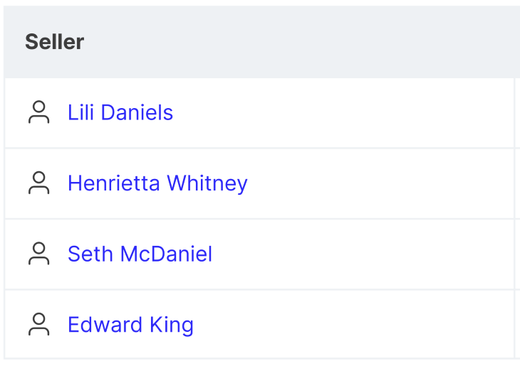
Consider hiding less important columns and displaying them behind a Show More button or a different method. Focusing your table on the most important content prevents clutter and doesn’t waste the user’s time.
If limited space is a factor, consider creating a condensed version of your table by shortening the row height. Adjust font sizes and padding to adapt to the condensed table, but ensure that text remains readable without forcing users to zoom in:

Instead of shrinking a table’s width down to fit a mobile screen, allow users to horizontally scroll through the table’s columns. This feature can work well with column fixing so that users can fix columns on the left, and view columns on the far right side of the table while keeping the context of the data that they are looking at.
Icons and symbols can be used to convey hierarchy and meaning in various ways. They can be used to create a visual hierarchy within a table, such as using a star icon to indicate priority within a dataset.
Icons are also commonly used to display conditions, such as green checkmarks, yellow warning symbols, and red danger icons. These symbols are well-known globally and offer users feedback regarding a cell’s input or other meaning that requires their attention:
![]()
As seen in our example, icons can be used for menus that enable actions or interactions. A pencil icon is commonly used for editing an object, while a trash can represents deleting an object. These intuitive symbols save space by providing action buttons without having to include a label.
When it comes to data visualization, icons can emphasize specific data points or trends that help users understand the data that they’re viewing. Visual symbols allow users to quickly grasp the meaning of data and process information quicker. They can be used to break up large datasets of text and numbers, making your table more visually engaging.
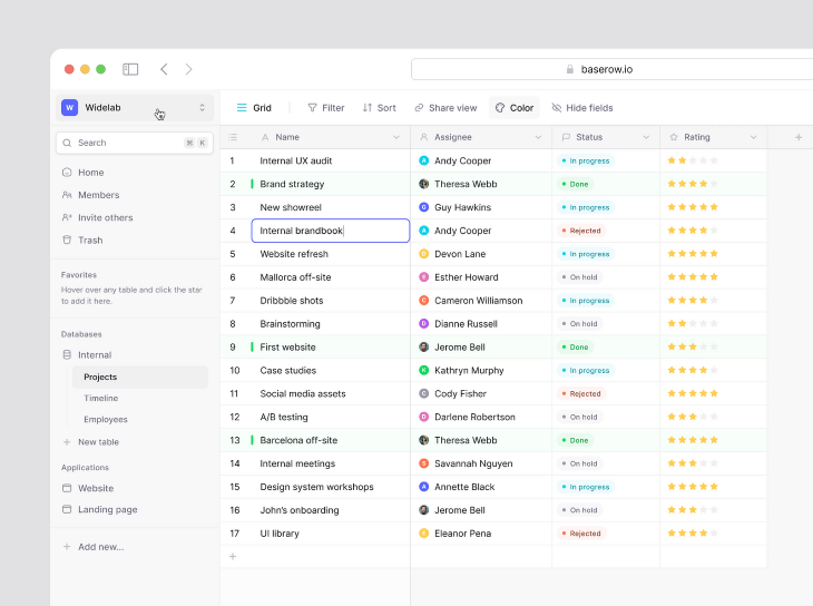
Conditional formatting can turn your table into a powerful tool. The basic concept of conditional formatting is to emphasize specific data points, making them stand out usually by changing the visual appearance of a data cell based on predefined conditions. This can be achieved by changing the background or text color of a cell when a certain condition is met.
This technique can help users interpret data quickly and easily identify when thresholds have been met. It transforms the table by providing actionable insights at a glance. The changes in color or style are noticeable and guide users toward receiving the information that can be critical for their business.
As mentioned, color coding is a common way to apply conditional formatting to a table. For example, in a sales data table, you might want values to become green when they exceed a certain threshold or red if quotas have not been met:

Icons can also be used to apply conditional formatting. You can set the condition to show a danger icon in a cell to alert the user that a condition has not been met and needs attention. Alternatively, a checkmark icon could indicate that a condition has been met with a positive tone:
![]()
Tables are often interactive, allowing users to change their state by sorting and filtering the data. Sorting allows users to control the order in which data is presented in a table. This can be helpful when the user is looking for something specific or wants to view the data in a certain way, such as descending numerical order or by most recent. The sorted column is indicated by a sort icon, either descending or ascending, in the column header:

Filtering is essential in any table that deals with large datasets. It allows users to customize their views by displaying only what is relevant to them. Typically, tables can be filtered by any column within the table. Some common filters include date range, categories, or custom search.
Tooltips are also a great feature that lets users understand more about the table and can help guide them in using it. They are accessible on hover or click of a trigger point, usually an icon. This way, they are available when needed but don’t take up space on the screen otherwise. Essential information or guidance should be displayed on the screen, while contextual information is well suited in a tooltip:

These features can elevate the user experience of a table by encouraging users to engage with the data and customize the table to their preferences.
When you’re ready to hand off your designs to development, Figma has a feature called Dev Mode that provides development specifications to implement your designs into code. Click on the Dev Mode toggle in the top right corner to enable it:

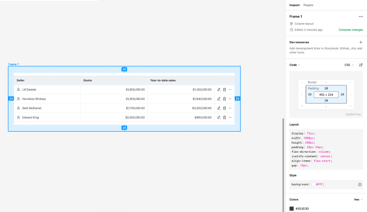
Using this feature, developers will be able to see the CSS behind your designs, including layout and style specifications. They can then take this code and integrate your table into websites, apps, or other platforms:
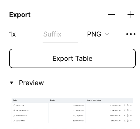
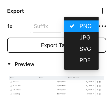
For designers, Figma has an Export feature that allows users to export their designs to PNG, JPG, SVG, or PDF files. This can be useful for sharing your designs with stakeholders:
To maintain design integrity during the implementation process, it’s important to include documentation in your designs that communicates any interaction behaviors or accessibility considerations that developers need to know. Collaborate closely with your developer, conducting reviews during implementation to ensure that your table is being implemented as intended and to answer any design questions that they might have during the process.
Creating and styling tables in Figma can be challenging, but through this tutorial, we were able to walk through the steps of creating a table as well as techniques to enhance its usability. A main takeaway is to focus on styling your table appropriately to ensure that it is readable and aesthetic. This can be achieved through formatting text and numbers, applying background colors and borders, ensuring sufficient white space, and using icons and symbols.
A well-designed table enables users to comprehend data effortlessly, through features like conditional formatting, sorting, filtering, and tooltips. This can save users valuable time, help them reach insights quicker, and make better-informed decisions. By incorporating these best practices into your designs, you’ll be able to create a robust table in Figma that enhances your product’s overall user experience.
LogRocket's Galileo AI watches sessions and understands user feedback for you, automating the most time-intensive parts of your job and giving you more time to focus on great design.
See how design choices, interactions, and issues affect your users — get a demo of LogRocket today.

A/B testing compares two versions of a design to see which performs better with real users. Here’s how UX teams can use it to test hypotheses, measure outcomes, and make smarter product decisions.

This case study shows how one ad experience redesign increased total ad exposure while lowering perceived friction, proving that timing and context can matter more than raw interruption.

As products evolve into ecosystems, navigation becomes a system-level challenge. This article explores how to align structure, context, and user journeys to create seamless movement across tools without confusion.

Figma’s AI features have exploded in 2026 — from text generation and image editing to full UI drafts and code handoff. But speed isn’t the same as quality. This guide breaks down every major feature, what it’s good at, and where human judgment still does the heavy lifting.