Figma’s first auto layout version was initially released back in 2019, but it was recently updated during config in May 2022. New features have been added and some updated, and regarding interface visuals, some have moved or changed.
This article will explore the latest version of auto layout. We will deep dive into learning how to use this powerful feature and its major capabilities or functionalities so you can create design systems with it. Let’s start.
Editor’s note, 11 April 2025: This article (last updated 12 January 2023) now has a companion video tutorial with all the latest info you need to work with Figma’s auto layout feature in 2025! Check it out here:
Auto layout is a feature that will allow you to create frames that respond to content or layout size changes. These dynamic components or frames respond to the size of their child objects, such as a button that grows with the length of its label or a button that now has an icon added and again grows with the length of the component.
For those that are newbies, a frame is like a container made of smaller objects, and all together form a frame. So the frame is the parent object that controls all the child objects that live inside.
Frames have a size that is explicitly set by the designer, whereas groups are just multiple objects combined without any size specification. Sometimes frames are referred to as components as well.
Auto layout can be applied to all of the following already explained :
You can find frames, groups, or single objects placed across a canvas, the limited backdrop where designers make the magic happen. According to Figma, a canvas has a finite size of -65,000 through +65,000 on each axis.
There are multiple capabilities we will explore in this article like the padding to let your items breathe or the alignment to change their position within the frame.
Auto layout can be applied to almost all of your components of a design system, making them more flexible and cohesive when used by the different team members on each of the projects the team is working on.
There are two important concepts to understand the importance of this feature: first, we need to know what a layout is; and second, what it means to use a responsive layout.
First, a layout is defined as the arrangement of single or compound items such as images, text, or components on a screen. Layouts use simple or complex components and spacing to encourage consistency across platforms and screen sizes.
Second, a responsive layout allows a frame to change and readapt dynamically based on the screen size, guaranteeing consistency across devices.
Responsive design is crucial to building products for different device sizes from mobile to desktop and tablet in between. Designers have been using layouts and grids to better readapt designs to different screen sizes. If using auto layout, you can place each component in different layouts and they will dynamically adapt to the new content dimension, saving you time readjusting manually each component for each viewport.
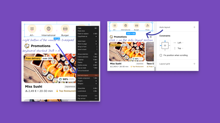
There are three different possibilities to apply auto layout to a frame or a group, always by selecting the entire frame, group, or just the multiple elements you want to convert:
In either case, after applying the auto layout, you will see on the properties panel on the left of the screen that a new frame will appear. You can change its name if you double-click the new frame with your mouse or trackpad; clicking the right-facing arrow will allow you to unfold the child objects living in the parent frame. The child objects are shown in order of appearance on the canvas, from top to bottom or left to right.
Once you have created the auto layout, you will see new options on the auto layout panel or menu on the right. Also, a new feature will appear on the Frame menu.
In the following section, we will walk through the basic options of auto layout first, and then move to the more advanced features that will make your work shine.
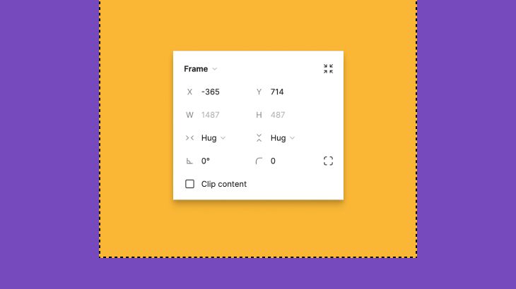
A new section named horizontal and vertical resizing will show up after creating the auto layout. This section has two possible variables that are worth using, depending on your goal:
This option is also new and does help you position children in an absolute positioning inside an auto layout frame. You need to select one of the children and then select the plus button on the top-right corner.
The object will automatically change its properties and will be fixed to the place you have set. You can move it wherever you want, but it will remain fixed while resizing the component.
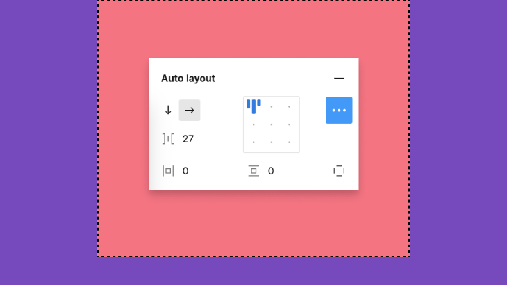
There are multiple options in this simplified menu on the right panel. Remember to keep the frame selected to have the panel visible, and I will walk you through all the options from top to bottom and left to right:
Now you can control the padding and the spacing between items inside the same frame. You just need to look for the little red handles that appear while hovering the frame and drag them manually to increase or decrease the sizing. If you press one of the handles, a controller will prompt and you can manually change the spacing or padding using your keyboard.
There are a couple of keyboard shortcuts that may be worth it mentioning:
If you hold the Shift key while dragging the handler, the pixels will increase or decrease with the pixel number set previously on the auto layout menu.
If you press Alt while dragging the handler for padding, both sides of the vertical or horizontal realm will increase or decrease equally.
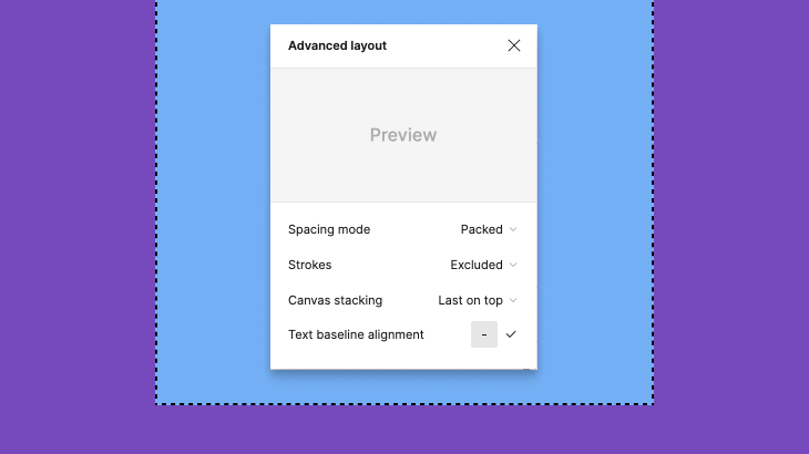
By clicking the three dots of the auto layout menu, an advanced menu will prompt on top. The first thing you’ll notice is a preview section to show the different stages of your selections. Let’s talk about these options:
Is not possible to place an object on top of an auto layout frame, unless you add the object to the frame and you place it wherever you want.
Now the tip holds the spacebar while placing the object on top of the frame and the magic is done, the object is now set on top of it.
Quite impressive for all the things you can do using Figma’s auto layout feature, the latest release skyrocketed the capabilities to another level of customization. There is still room for improvement, and I am pretty sure Figma will surprise all of us pretty soon with more updates, but still quite good.
I would recommend all users play around with all the options on the simplified menu and then the advanced one to learn more in-depth about all the possibilities available.
Auto layout is a great option to create design systems for teams working and designing for responsive devices. Components created using auto layout are easy to consume in all kinds of viewpoints without the need for much manual work, so overall speeds up the design process and keeps the design clean and cohesive.
Now that you know all the tricks, you have no excuses to have fun playing with auto layout!
LogRocket's Galileo AI watches sessions and understands user feedback for you, automating the most time-intensive parts of your job and giving you more time to focus on great design.
See how design choices, interactions, and issues affect your users — get a demo of LogRocket today.
Discover how to craft UX-friendly hero sections with examples, design tips, and strategies that drive engagement and conversion.

While Apple’s Liquid Glass can’t yet be perfectly recreated with CSS or Figma, we can still think about how to adopt the effect thoughtfully in our designs.

Figma Make is here to automate your design-to-code workflow. I tested it. Let’s talk about the good, the bad, and the straight-up weird.

After designing AI search systems, I’ve seen what builds trust — and what kills it. Here’s my take on what really works.