When you hear the term “wizard” in the context of UI design, does your mind whimsically wander to the likes of Gandalf or Merlin, conjuring up enchanting designs with a flick of their wands? 🧙🪄
Well, while our topic today might (sadly) not involve mystical figures, it’s no less magical in its bid to create optimal experiences for users.
Let’s set aside our fantasy for a moment. Instead of ancient wizards, think of a different kind of guide: one that leads users through a complex digital interface with ease and efficiency.
This article is a comprehensive guide to understanding the wizard UI. We’re not just talking about what a wizard UI is; we’re digging into the essentials of creating one that’s helpful, usable, and valuable. This is your all-in-one resource for best practices in creating wizard UIs that are truly helpful.
In relatable terms, it’s like having a guide on an advanced hiking trail. Imagine Hansel and Gretel’s story, but instead of the witch, there’s a friendly guide leading them through the woods. In interface design, a wizard UI does just that — it takes users by the hand and walks them through a series of steps, making sure they reach their end goal without getting lost in the “big, bad woods” of complex processes and choices.
Nielsen Norman Group defines a wizard UI as “a step-by-step process that allows users to input information [or complete tasks] in a prescribed order and in which subsequent steps may depend on information entered in previous ones.”
Are you a little confused about the difference between a product walkthrough tooltip and a wizard?
I spoke with Clement Bazuaye, a seasoned front-end developer, who clarified the difference between a wizard and a tooltip walkthrough. He described a wizard as an interface that leads users through a series of required steps to complete a task.
In contrast, a tooltip walkthrough provides optional, informative guidance that users can choose to skip; it doesn’t necessitate any action. Clement emphasized that the step-by-step nature of a wizard is intentional to avoid errors. This design ensures that users don’t accidentally complete steps out of order, like doing Step 5 before Step 1, thus preventing mistakes in the system.
Here’s what Slack’s setup tooltip looks like:
Here’s what an onboarding wizard UI looks like:
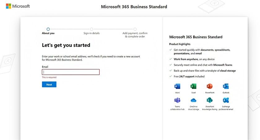
The key to designing a setup wizard UI that is not only helpful but enables users to complete complex tasks quickly, seamlessly, and without errors is to apply the following usability heuristics:
Let’s see how companies put these instructions to use.
For instance, Apple implements error recovery with a Back button. They also prevent errors by keeping the Continue button inactive until the user fills out their form. And lastly, they supply help and documentation should a user want to learn more about how Apple handles data:
Ruckus has a breadcrumb design pattern that enables visibility of system status. The wizard prevents errors by retaining all information previously entered when users need to correct an error.
Setting up face ID with Apple’s wizard is user friendly, too. Again, the Cancel button corrects errors. The grayed-out Continue button prevents errors. And the checkmark when a user completes their face scan adds a sense of accomplishment:
To maximize the benefits of wizard UIs and genuinely enhance your users’ experience, it’s important to use them in the right situations. Wizard UIs aren’t perfect for every case; they’re best for certain types of tasks. Let’s look at the main things to think about to make sure your wizard UI is both helpful and effective.
It’s important to implement a Wizard UI only in instances that meet all the following criteria:
I’ll explain why…
I’ve found that a well-designed wizard that adheres to the criteria above significantly improves user experience in the following ways:
We’ve established that wizards are best suited for situations where users need to complete complex or unfamiliar tasks in a structured, step-by-step manner. Some common examples of instances where a wizard UI can be used optimally and effectively include:
Here, a wizard will guide users through the installation process of a software application, including setting preferences, choosing installation locations, and configuring initial settings:

A wizard would involve helping new users create an account where they need to enter various pieces of information, like their personal details, preferences, and security settings, in a structured manner:
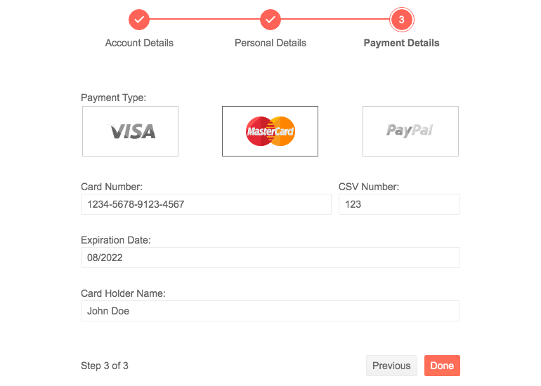
A wizard would be useful to streamline the process of purchasing items online, where users go through steps like entering shipping information, choosing payment methods, and reviewing their order before finalizing:
A wizard would be particularly useful for guiding users through the initial setup of a smartphone, computer, or smart home device, which might include connecting to Wi-Fi, setting up user accounts, and configuring basic settings.
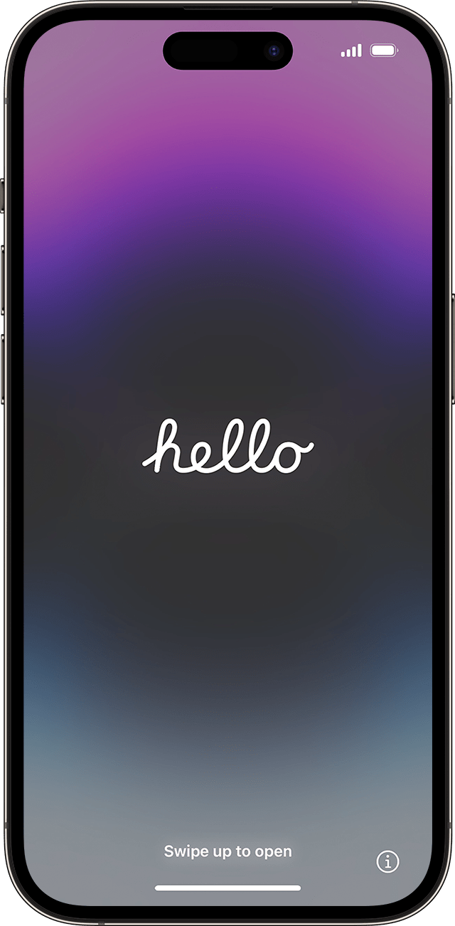
Watch this video to see how Apple does its new device setup.
This could include assisting users in filling out detailed forms, such as loan applications, tax filings, or job applications, where information needs to be provided in a specific order:
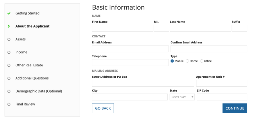
In this scenario, a wizard UI guides users through transferring their data from one device to another or backing up their data to a secure location. It might include selecting data types, choosing a destination, and setting backup schedules:

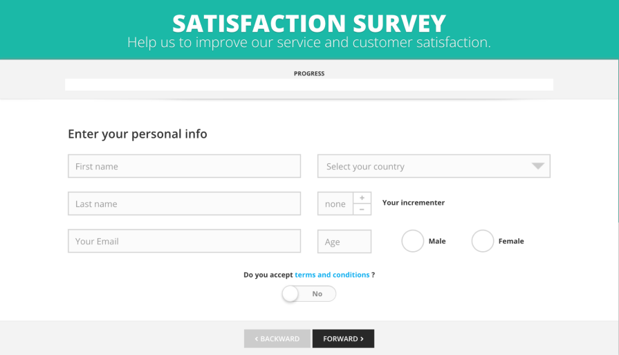
For creating surveys, a wizard can help in designing the questionnaire, choosing question types, and setting logic for responses. When completing a survey, the wizard leads users through each question, ensuring all necessary responses are provided and guiding them based on their previous answers:
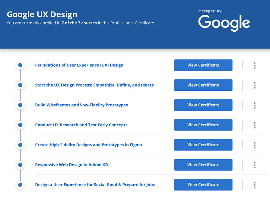
Wizard UIs are excellent for step-by-step online tutorials, especially for complex tasks or learning new software. They can guide users through each part of the module, exercise, or tutorial, ensuring they understand each step before proceeding to the next:
We’ve covered a lot, from what makes an effective wizard UI to how to make one really work for your users. A well-executed wizard, as we’ve seen, transforms daunting processes into manageable steps, thereby enhancing user engagement and satisfaction.
Here’s a quick recap of what to keep in mind when designing Wizard UI:
If the task at hand doesn’t fit these criteria, then it’s likely that a wizard isn’t necessary and could be more of a hassle than a help for your users.
Armed with these insights and the practical examples and heuristics provided, you’re now equipped to create wizards that do more than just lead; they create an experience where users feel supported and accomplished.
The ultimate aim is to make complex systems feel simple and intuitive.
LogRocket's Galileo AI watches sessions and understands user feedback for you, automating the most time-intensive parts of your job and giving you more time to focus on great design.
See how design choices, interactions, and issues affect your users — get a demo of LogRocket today.

Multimodal UX goes beyond designing for screens. Learn how context-aware systems, progressive modality, failover modes, and accessibility-first design create better digital product experiences.

Learn how context-aware mode prioritization and seamless transitions improve multimodal UX and reduce mode confusion.

Research is becoming more democratized, product cycles are accelerating, and AI is transforming synthesis and ResearchOps. Here are the three trends shaping UX research in 2026.

Voice support is not the same as multimodal UX. Here’s how to design systems with true mode continuity and context-aware interactions.