Hello, welcome! Let me show you around and introduce you to what’s here. Opps, but you just started clicking Next, Next, Next. Hey, are you listening to me? I can be really helpful if you could give me 1 minute. Maybe 30 seconds? Okay, just give me 5 seconds then. No? I guess you just want to go on your own. I’ll leave you alone then.
You already clicked Close. I hope you won’t regret your decision later…
This was the sad short story of an user onboarding flow. I bet it sounded a little familiar to you, too.
However, the data shows that people count on having a good user onboarding experience. According to Wyzowl, 86 percent of people tend to become loyal customers of a company that provides a good onboarding experience and invests in user onboarding. Furthermore, 67 percent of churn can actually be prevented if the problem is solved at first engagement, according to Groove’s research.
This means that there is a broken link here. People care about user onboarding, but we could be failing to provide relevant and helpful user onboarding experiences.
Are you trying to guide the user through the first Aha Moment so that they stick with your product? Do your customers feel abandoned and confused after they sign up? Then you need to think about building a frictionless user onboarding experience.
We’ll use Asana as our example. Asana is a task and project management software. People are using Asana to organize, collaborate, plan, and execute tasks. Let’s take a look at the steps to build frictionless user onboarding via Asana’s best practices.
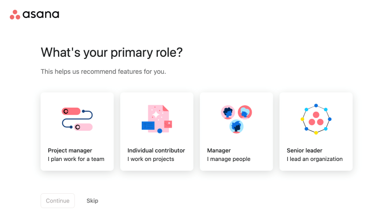
According to Zendesk’s Annual CX Trends Report, 90 percent of consumers say they are willing to spend more with companies that personalize the customer service experience. Don’t you think user onboarding is included in this expectation? Different people are using your product to solve different problems. The value they see in your product may vary.
Differentiating your onboarding according to user types enables you to emphasize on the relevant features and optimize according to their own “Aha Moment.” This also helps users understand that you care about their unique problems.
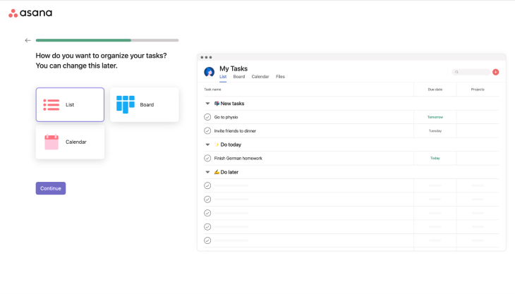
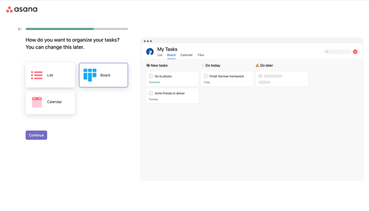
In order to achieve this, list the main user types that you have and list important things they should discover first. Let’s assume that you listed your user types but you have the same value for all and you can’t differentiate your onboarding. It’s still valuable to show users that your product is used by people like themselves. Asana is also welcoming users to their onboarding flow by asking them to choose their primary role to enable this customization.
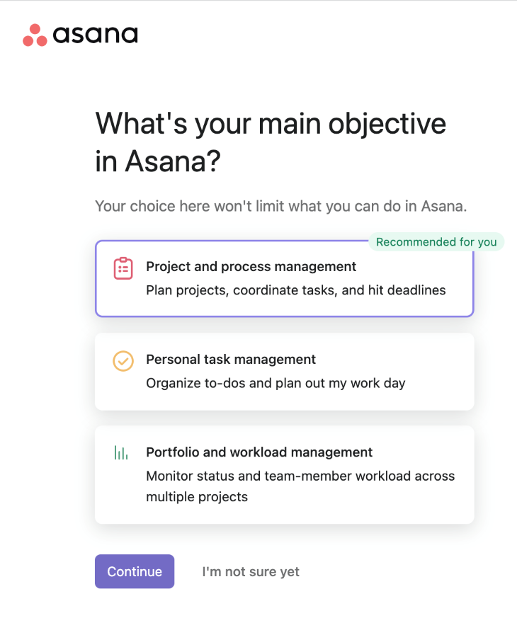
User onboarding’s main aim is not to teach users or force them through a path. As a product, one should also learn from its users. For instance, what do they expect from you? The user will enjoy the onboarding more if they feel like you are configuring your product according to their needs. However, it doesn’t mean that they always know what they want.
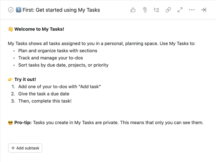
In order to keep users in the onboarding flow, give them an option to be confused too. Asana also gave users the option to say “I’m not sure yet” and avoid any dead ends on their onboarding.
On a similar note, the Vevo App found that adding a skip option to their onboarding flow increased logins by nearly 10 percent, and the number of successful sign ups jumped by almost 6 percent.
Users like to understand how long it’s going to take seeing your actual product. The progress bar is highly recommended to have a representation of their progress. When you force users to click one button after another without a clue, they are more likely to feel you are interrupting them. You don’t guide them to achieve what they want but you are a barrier for them.
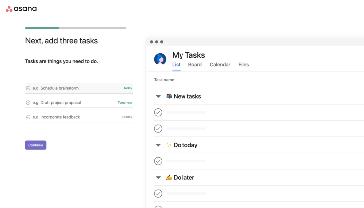
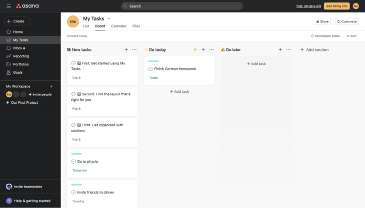
If you enable the users to do what they have come for, they won’t like to get rid of your onboarding. In Asana’s case, you are already using the product during the onboarding experience. They are just asking you to add some to-dos and My Tasks are getting updated according to your input. It visualizes how the product works too. It’s a smooth discovery experience.
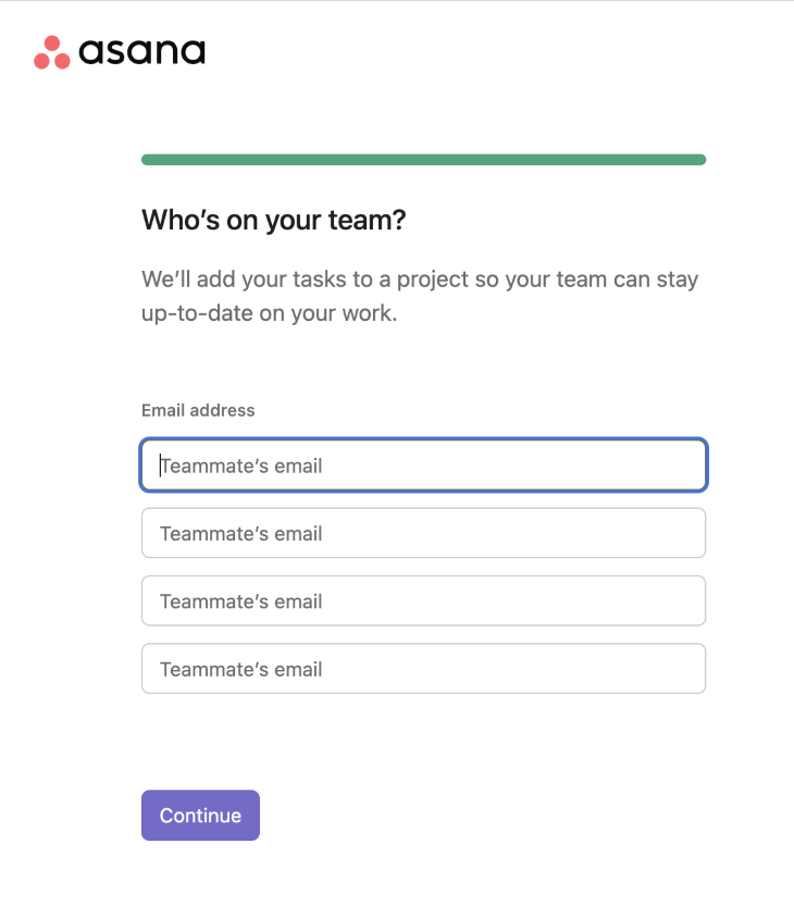
Asana is a project management tool. Therefore as a user, you’ll see the most value when you start to use it with your teammates and collaborate. That’s why they are asking users to invite their teammates to the platform as a part of the onboarding flow.
While designing the user onboarding, it’s essential to think about your aha moment. The writer of the book: Hacking Growth, Sean Allis defines Aha Moment as follows: “Aha is the moment that the utility of the product really clicks for the users; when the users really get the core value — what the product is for, why they need it, and what benefit they derive from using it.”
To clarify it more, let me give more examples. Facebook’s Aha Moment is when a user connects with 7 friends in 10 days. Slack defines an Aha Moment as 2,000 messages sent between a team.
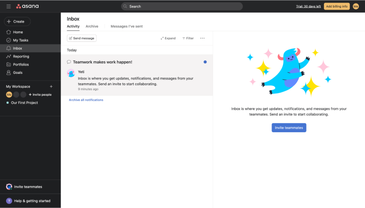
I guess you already understand that onboarding doesn’t end that easily. When the users are out of the “official” user onboarding, actually they are still onboarding. Asana has various features like Reporting, Portfolios, Goals. Those features seem cool too. Why do you think they are not pushing for those features then?
Asana is keeping the focus on “Invite teammates.” They keep reminding you how to bring teammates to the tool. As the trial ends in 30 days, they want you to stick before that period. You can discover those features later too, there is no rush for them right now. But there is a 30-day deadline as a time to value metric.
After users complete or skip the initial onboarding, they still need to discover your products and find answers to their questions. They want to know how to use it like a pro and get the maximum value for themselves.
Asana wanted to achieve this via Help & getting started on their main navigation. If you feel comfortable enough to discover advanced features, that’s your door to learn. As you can’t put everything to your onboarding, you may answer further questions with this approach.
Another way of onboarding users is product tours as a checklist. Asana is lucky because it already has a to-do list within their app. They utilized their tool to give customers a checklist to be an Asana pro. Checklists are useful to let users discover the products at their pace and time.
User onboarding is not a one-time thing. You might go through all the steps mentioned above and create a frictionless user onboarding experience. Bad news is your job is not done. You need to keep monitoring whether users are engaging with your user onboarding experience. Where are they dropping? Are there any user onboarding steps that you think people are not engaging in particularly? Have you started to understand that your users started to see your product’s value in a different feature? You need to measure your user onboarding experience performance like your product and change it accordingly.
User onboarding could be dangerous if you solely count on it for your product success. You should focus on creating user experiences such that your users can get value without you getting involved in the process too. I suggest you to keep in mind that the user onboarding shouldn’t be more than a catalyst for your product.
Header image source: IconScout

LogRocket's Galileo AI watches sessions and understands user feedback for you, automating the most time-intensive parts of your job and giving you more time to focus on great design.
See how design choices, interactions, and issues affect your users — get a demo of LogRocket today.

Explore the core principles of GUI design and learn how consistency, simplicity, feedback, accessibility, and user testing contribute to better digital experiences.

After five years in UX, I revisited the Daily UI challenge to reconnect with hands-on design. Along the way, I learned that great interfaces come from thoughtful briefs, sound judgment, and user feedback, not just better AI tools.

Learn what makes a great login screen through real-world examples and UX best practices for creating secure, accessible, and low-friction authentication flows.

Skeuomorphism helped define early digital interfaces by mimicking real-world objects to make technology more intuitive. Learn how it compares with flat design and neumorphism, why it declined, and where it still has a place in modern UX.


