The design process was not efficient, the stakeholders had complaints about our practices, and there was tension in the design team — I had no idea. So how did I uncover all these issues? The answer is simply one meeting: a well-run design retrospective.
As designers, there needs to be time at the end of a sprint to celebrate the positives, as well as face the reality of the negatives — which exist in all teams. In order to achieve success in UX design, it’s essential to constantly reflect on the design process and identify areas for improvement.
This is exactly where a design retrospective comes in as a powerful tool for aligning your team and maximizing efficiency. Retrospectives allow the team to reflect on their work, gather feedback, and make changes. This type of reflective practice is essential for making informed decisions and continuously refining the design process.
Here’s how to make the most of your retrospective, drawing on the principles of agile development, design, and collaboration:
A design retrospective is a reflective process that allows a design team to evaluate and reflect on their design process, work, and outcomes. It provides an opportunity to identify what worked well, what didn’t work, and what could be improved in future projects or sprints.
The goal of a design retrospective is to gain insights and make changes that will improve the overall design process, resulting in better design outcomes. A design retrospective typically includes reflection, discussion, and evaluation of the overall design process and its end result.
Retrospectives famously come from the scrum framework, which focuses on development and has become a very common practice among product teams. By the rule of thumb, UX designers embedded within product teams often attend general retrospectives alongside the whole team (product managers, developers, designers, and stakeholders).
However, developers usually overshadow designers in these meetings, leading many designers to feel that retrospectives are inapplicable.
Dependent on how your design teams are organized, it might make more sense to do a retrospective with the design team instead of the whole product team. Although, this is highly dependent on organizational structure.
Retrospectives are commonly done at the end of every design sprint, which tend to last one to four weeks. Although scheduling is dependent on the goals of the design team, sometimes retrospectives might be done at the end of a short project to get insights going into another project. Learnings after each sprint or project can be translated into an action plan for future work.
Retrospectives take the format of a facilitated meeting; and although they are typically practiced within an Agile or scrum process, they can benefit any team, whatever design or development methodology it employs.
So let’s take the ideas of retrospectives and apply them to improving the design process. It is not uncommon for design teams to get complacent about reflecting on and improving their processes.
The first thing to define when going into a retrospective is why we are doing retrospectives. Often the end goal is to reflect on our most current work to increase the quality and productivity of designs. Let everyone know the purpose.
An example objective statement:
The purpose of this meeting is to reflect on the previous sprint.
Next, we should work out what we will discuss. Designers should think of a design retrospective as a workshop where participation is required, so make sure they have an idea of what the team will explore.
When we send out this meeting invite, we want everyone to be able to attend, and we want to include the statement of our objectives. Give a basic layout of what will happen in the meeting and what we hope to learn, so what is expected of everyone is clear.
An example discussion statement:
We will discuss the following…
Going into a retrospective, we want everyone in a good mood and ready to share. So at the beginning of the meeting, break the ice.
Every company and facilitator has different ways to do this. Do not waste too much precious time on this; many facilitators start chatting as people make their way into the room or video conference. Maybe ask a fun question and let your team submit answers or share out loud.
Ideally, something that might spark interesting conversations or laughs.
Keep it light-hearted and make sure it is something most everyone could answer. “Favorite holiday tradition,” “favorite food,” “most fun thing you did this week,” “If you could be any animal, which animal would you want to be?”
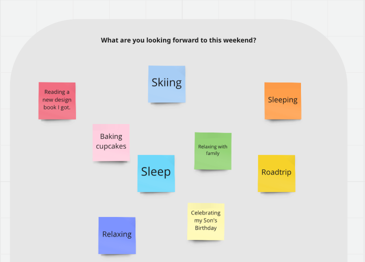
As a facilitator we want everyone to feel welcome and ready to open up. With design teams that work closely together, sharing in front of the group might not be an issue as we do it every day. But when people with more siloed-off roles come, or when we invite stakeholders we want to feel welcoming, and avoid any sense of hostility.
After a couple of minutes of sharing, transition into the meeting, and hopefully people feel more welcomed and ready to participate in a more serious conversation.
Whether it is the end of a sprint or the end of a project, it’s best practice to establish where we are as a team on the project. Maybe bring in that one product manager obsessed with data analytics and burndown charts to show what was accomplished and what was not.
There should always be transparency with the design team on progress. Maybe development is behind and has questions about design tweaks on past screens. Perhaps they are ahead and designers need to ramp up the speed of the new iteration.
Let the team know the state of the product or designs. Set the scene, show the progress, and get everyone in the same boat. Answer the question: How did we get here?
Psychological safety is a key factor in conducting a successful retrospective and creating a thriving team environment where team members can bring their best selves.
Trust me, I’ve seen teams fall into an endless cycle of poor quality work due to coworker related issues. They ask for help from their busy coworkers and are afraid to reach out to the higher-ups. Why? Because higher-ups might put the blame on them — instead of help.
Toxic work culture creates uncollaborative teams and garbage design. Team members should feel okay calling out toxic work culture whether it’s done directly or indirectly. Yet many teams stay silent in fear of retaliation, so nothing changes.
When a teammate doesn’t trust another teammate (either through tension, harassment, blame, or small passive-aggressive incidents), productivity falls. Less collaboration and questions occur, and bold ideas fall into darkness. Results become mediocre, or worse: the team fails at its objective.
One of the easiest steps you can take to create psychological safety is to embrace failure and avoid blame. As designers, we know that failure is key to our work, and we aren’t afraid to take different approaches to ideas.
Organizations with minimal hierarchy and bureaucracy tend to create the safest and most productive design teams. Make sure your team is treating each other as equals and get an understanding if someone or something in the organization is holding people back. Create an environment and broader culture where it is safe to fail, learn, reflect, and do better next time.
So, acknowledge all your team accomplished in the sprint, and call out anyone or any teams within the meeting that did outstanding work. Then maybe share where the teams did not meet their goals and ask them to keep that in mind going into the discussion. Reassure everyone that no singular person is at fault and that we want to learn from the shortcomings.
A famous anecdote about embracing failure comes from leadership at Supercell. Supercell, one of the most successful mobile app companies to ever exist, has openly encouraged teams to try new things and fail. The company celebrates hardworking teams who build products — even if they did not make it to launch. Teams would get vacation time and champagne for failing.
Obviously, stakeholders need results to justify the project, team size, and spending. Yet, this is exactly why retrospectives exist. We call out failures, we call out what we learned, and next sprint we are more organized and productive than before.
“It’s through mistakes that you actually can grow. You have to get bad in order to get good.” – Paula Scher
Failures are inevitable and should not be looked down upon — unless we keep falling into the same exact traps. Retrospectives are meant to create a growth mindset in teams and induce learning. There is a very fine line between learning from failure and straight-up bad work.
So acknowledge the wins, mention that maybe we did not finish everything we wanted to, and encourage the team to share how the process and team can improve based on the past couple of weeks.
All retrospectives need a format. The most common format used revolves around the ideas of “Continue doing, start doing, stop doing.”
There are many different ways to word these three prompts, but they tend to hit the same concepts. We are basically asking what is working, what we need to start doing, and what is not working.
Although what we want to learn is highly dependent on the project and the goals of the organization, most every design retrospective should hit on these three questions in some format or another:
The format might look something like this in an online workspace environment:

Another alternative becoming more popular is a sailboat format, which has visuals that might make it perfect for the visual learners on your design team.
Here is an example template of the sailboat format:
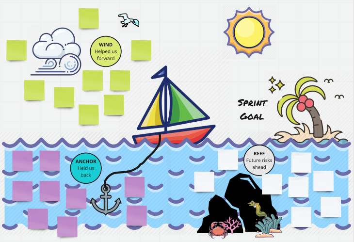
Again we are answering the same kinds of concepts with just different layout or wording. So definitely do your research and feel free to adjust how you phrase statements based on how your team works best.
There are many different styles of organizing retrospectives, especially when it comes to in-person vs. online meetings. This impacts how the organization’s teams are organized and the size of the meetings or teams.
If we are in person, it is typical to invite people to write down ideas on sticky notes and post them on the board. If online, send them a link to a digital board. Dependent on the meeting length, give them time to ideate and post ideas of what should be under each prompt.
Here are real-world examples of answers you might see:
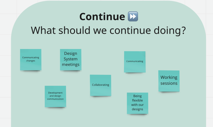
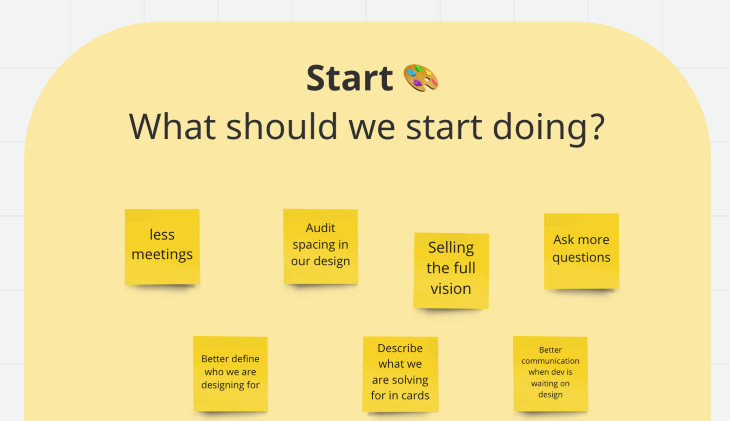
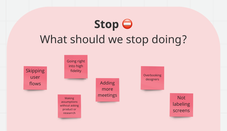
The teams ideas might be related to culture, design process, organizational issues, or other topics, and that’s great! We want to know what the team is thinking about, all aspects of the workplace, and our work is fair play in order to help teach us how to do better.
If we want to narrow in on the design process, we can begin to ask questions about growth and techniques. Do not overload your team with questions, but feel free to add one or two questions about design, design process, or specific things you did this past sprint you want feedback on.
Example questions:
If the design team tried new processes or evaluation methods this sprint, this is a perfect discussion to have during the retrospective. Keep the conversation open and flexible.
Once the sticky notes are on the board, or anonymous entries online are finalized, ask your team to read through everyone else’s thoughts and vote on what they agree with or think is important. Voting will show if the teams agree with certain comments or sentiments.

In person, you could use small stickers, a certain post-it color, or a whiteboard marker to make a mark on each point the design team agrees with.
As a facilitator, it is important to address and discuss the most pressing issues in an open format so you can form an action item and a resolution can arise. This is where teams might get a little uncomfortable — or a couple of people might take the conversation hostage.
As a facilitator, it is your job to encourage participation, discussion, and critical thought. Obviously, it makes people uncomfortable if they are forced to talk. Maybe get the conversation started or ask leadership to get the ball rolling. It is okat to sit in silence; this makes people want to fill the silence. If participation is bad, it might be a sign there is a more overarching issue within the team or leadership that doesn’t want to be addressed.
We can’t just stare at the wall of insights and the mountain of votes. We have to discuss them. There will be so much valuable information. Even if there are only a couple of ideas for each question, they mean something, and we need to understand their meaning.
“Information is only useful when it can be understood.” – Muriel Cooper
Go through each question and read the comments. Start with the most voted-on comments and discuss them with the team. Ask what a comment means, and what the problem is, and don’t be afraid to ask how we can resolve any issues. You will be surprised how helpful your team can be in elaborating and getting to the cause of an issue, as well as recommending a solution.
Now that we understand what went down these past couple weeks, we have to take the dissected problems and create action items.
This is where it is essential to have a bias for action. There is always something to do better and everyone needs to make sure they are doing their part. Maybe the lead designer needs to be more vocal, leadership might need to cut back a couple of meetings, and some team members need to be better about giving critique feedback.
Once we understand problems and possible solutions, we can wrap up the meeting and make action items based on what we talked about or wrote down.
These action items we make need to be discussed and assigned to the right people. Action items are not always cards, but may instead be a discussion with someone. If there is an issue with designers not being vocal enough in meetings, then maybe we set up quick one-on-ones in a couple of weeks to see if there is an improvement in the work culture.
Follow up with the appropriate people and make sure we start doing what the group agreed on. What we identified as “needing to stop” might be a step in the right direction — but it could also be a step in the wrong direction. So make sure we are making the correct steps as we go through these action items.
Team recommendations will not always solve the problem, even if they think it will. There might be tough conversations to be had, but it’s for the better. Be a leader.
Now that we have hopefully brought up all the feedback from the process, we need to get feedback about how you conducted the retrospective. After the meeting is over, it is a good idea to send out a survey. Ask questions such as: Did we discuss the issues you wanted? Did you like the format? What should we do differently for the next retrospective?
People don’t really care for surveys, so make it short and anonymous if possible so we get good feedback. Just like the team can always improve, so can the retrospective and the facilitation. Let’s make sure the teams think retrospectives are just as helpful for them to reflect, grow, and learn as they are for you.
Let’s continue to discuss and fix the issues as a team.
Want to make things easy? We’ve created a template spreadsheet you can use for your team to give their feedback during a design retrospective. If you don’t have access to other tools, or want to use a tool that’s nearly universally known, go ahead and try this one out.
Download the design retrospective feedback template here.

Header image source: IconScout
LogRocket's Galileo AI watches sessions and understands user feedback for you, automating the most time-intensive parts of your job and giving you more time to focus on great design.
See how design choices, interactions, and issues affect your users — get a demo of LogRocket today.
A three-week mobile banking project taught me that the “proper” UX process is not always realistic. Sometimes, the better approach is to work with what you know, identify what you still need to learn, and make the strongest decision possible under real constraints.
A/B testing compares two versions of a design to see which performs better with real users. Here’s how UX teams can use it to test hypotheses, measure outcomes, and make smarter product decisions.
This case study shows how one ad experience redesign increased total ad exposure while lowering perceived friction, proving that timing and context can matter more than raw interruption.

As products evolve into ecosystems, navigation becomes a system-level challenge. This article explores how to align structure, context, and user journeys to create seamless movement across tools without confusion.