A good design system is an incredibly powerful tool for you and your team. When implemented well, it can save you and your team huge amounts of time while also improving the experience for your users. Let’s be honest though: keeping a design system up to date is a pain.

Let’s assume you have a simple design system in place. Whenever anyone works on something new, you have to make sure they’re making every effort to use the system. If they don’t, you’re going to end up with small, unintentional deviations proliferating all over your product. When new needs arise that your design system can’t handle, you need to make intentional updates to the system and likely refactor those updates in multiple other places. Then, as great as it all looks in Figma, you need to actually convince your PM, someone whose job it is to ruthlessly say no, that it’s something worth prioritizing building.
It’s a near impossible task, and no team is able to do it perfectly. I call the small deviations from your design system that happen inevitably over time “design system drift,” and I’m here to tell you it’s inevitable to have some amount of it. The problems arise when you have too much of it or it goes unaddressed for too long.
Unchecked design system drift can undermine trust and usability with your users and can slow your team down as they struggle to manage multiple variations. As your system drifts, it exacerbates the problem as your team members (never you, of course) invent new design patterns without a clear source of truth to reference.
So, how do we get it back under control?
Before you start work on your design system, you need buy-in from your organization that this is actually worth doing. Nothing’s worse than sinking a ton of effort into a project only to find out it’s never going to see the light of day. Design systems can be tricky to make the case for against other pressing business priorities, but here are some arguments I’ve used in the past with success:
Building new features is faster with a robust design system in place because designers don’t need to reinvent the wheel, and developers have prebuilt components they can use to construct interfaces faster. In my experience, the effort spent maintaining a design system more than pays for itself through dividends in overall development speed.
Users associate polish and consistency in an interface with trustworthiness and reliability of the service. Implementing a design system is a great way to make the experience feel more consistent and therefore more trustworthy.
When users can predict how elements of an interface will behave, the interface is easier to use. Consistent behavior of components from a design system that a user encounters over and over again make it easier for them to use your tool with ease.
Also, designers can use ready-made components that have already been thought through, freeing them up to think through more unique elements of their design and helping them improve usability.
A strong component system is critical to accessibility. Ensuring components have visible focus states and are screen reader compatible, for example, is much easier at the component level than trying to do on every individual project.
Still having trouble getting buy-in? That’s okay. I get it. It’s hard, and sometimes, it just isn’t the right time. If your leadership or team is telling you that you can’t possibly invest in this right now compared to other priorities, I suggest doing the following things:
Have the conversation with your peers that you’re taking on design debt to ensure they know you all need to come back to it later. Much like tech debt, it’s okay to cut corners and take on design debt sometimes to move faster in the short term. But it is debt, and will need to be paid back in time and energy, often with interest.
The first step you need to take is to audit your current system and find the biggest inconsistencies and opportunities. If you’re still having trouble getting buy-in, you can conduct this audit as a tool to help you make the case. A well-organized audit that illustrates some major inconsistencies can speak for itself.
To do this, you and your team are going to need to comb through every corner of your app (or other surfaces) you own to identify common patterns and components.
Depending on the size of your app, this is likely not a job for one person. If you’re dividing up the work, I suggest doing it by component/style rather than page so that one person can fully wrap their mind around the use cases and contexts. In later steps, that same person can then own the redesign.
For each component or style, go through and screenshot every instance where that component or style shows up. Then drop the images onto a frame in a Figma file to collect them. It’s helpful to label each with where you found it to help remind yourself later.
You’ll want this audit to be as comprehensive as possible so you can accurately take all variations and use cases into account. If you miss some, it might throw off your designs later.
Here’s an example of what a very simple audit of buttons might look like:
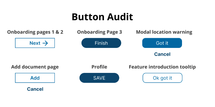
You’ll want to create a grouping like this for each component and style type you uncover. This is going to vary from team to team, but here’s a list of the types of things you should be capturing:
Styles —
Components —
Once you have this audit complete, it’s helpful to do a review with your full team to make sure everyone is familiar with the different components and able to participate in prioritization conversations.
Once you have your audit, you’re going to need to prioritize what to actually redesign and implement. It’s probably going to be too costly to do everyone all at once. With your team, PM, and engineering leads, create a stack ranked list of the styles and components.
There are many ways to prioritize. Personally, I like to work collaboratively as much as possible and use dot voting.
Before voting, ensure everyone’s familiar with the work so they can vote effectively.
Give everyone between 1–3 votes depending on the size of your group.
Ask everyone to consider both impact updating the component and the cost. Some components may be very complex and costly to redesign and/or build. Your team should be looking for the low-effort, high-impact changes wherever possible.
Your votes should look something like this (but hopefully with more than one style and component).
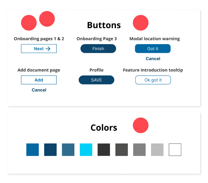
Using the votes as a guide, have a conversation with your team and decide what you should take on. There’s no right answer here, and what you decide to do is going to vary a lot from team to team. Common, high-impact styles and components that I often see teams start with are color, typography, iconography, and buttons — but it might be totally different depending on your situation.
Once you have your prioritized list, you and your team can start redesigning components and patterns. When you design a component or style, it’s important to use the minimum amount of variance possible while still accounting for all your current and reasonably possible future use cases. Here’s the step-by-step process of how you can do that:
First, you’ll want to go through your component or style (I’m going to continue using the button example) and identify what distinct needs your business and users actually have with relation to the component.
For example, for buttons a key need is: as a user, I need to visually distinguish between different levels of importance in actions. We know we can’t use the same button everywhere, because we need hierarchy between the buttons to support this need.
You also may have additional use cases that you know are going to need in the near future. For example, maybe right now your app only supports creating one type of object — let’s say documents. But soon, you’re launching a new feature where users will also be able to create spreadsheets.
You’re going to need a way for members not only to create an object, but choose which object to create. You may not have this now, but if you know you’re going to need to support it soon, you should design it into your component now.
N.B., don’t design too far into the future or you’re going to make your life very difficult. Stick to what’s planned and above a 90 percent chance of being built in the next quarter or two.
Now that you understand your distinct use cases, you should go back to your audit and look at your existing styles to evaluate which ones you can consolidate. The core principle is that you shouldn’t address the same need in more than one way.
For example, don’t have multiple button styles for the same level of button hierarchy unless there is a different need that requires you differentiate them.
Let’s take a look at the button styles we audited in my example:

In this simple audit, we have the following visual variations between buttons:
Yikes! I think we can pare this down while still accounting for multiple levels of visual hierarchy in buttons. In this example, I’m going to use the difference between a filled box, an outlined box, and having no box at all as the primary way to differentiate between three different levels of visual hierarchy. We can remove all other variants unless new requirements arise.

Of course most real world examples are more complex than this. I suggest sharing designs iteratively with your team to ensure everyone is bought into the direction your designs are going and has a chance for input.
Where appropriate, you might want to test some of your more complex components with users. I probably wouldn’t do this with buttons in most cases, but if you’re redesigning complex table interactions or other complex components that are mission critical, it’s worth the effort since you’re going to be reusing this again and again.
Once you’ve settled on your designs, you’ll need to partner closely with your engineering team to bring them to life. I’m not going to spend too much time on this phase during this post, but a few principles to keep in mind:
When building components, you should absolutely collaborate closely with engineers to ensure every last detail is implemented with quality. You and your team will be using this component over and over, so you want to make sure you got it right.
Test your new components as they’re implemented in every instance you’re planning to use them. It’s so easy to miss something when you’re updating many places.
Keeping your design system well documented is well worth the time invested. It will enable both designers and engineers to use the library effectively and minimize future design system drift. I highly recommend both keeping a component system in Figma and a living system with your engineers.
A component system in Figma is frankly a must. If you don’t have one yet, make one! You won’t be able to effectively keep your designs consistent and prevent variations from being introduced without one. It’s a critical tool for you and your design team to use during the design process.
A living system is one that your engineers maintain that represents your components and styles live in code. Engineers and designers should strive to keep your figma system and your living system as in sync as possible. This ensures that when a designer designs with a component in Figma, it actually shows up like they expect when the engineer builds it.
You did it! But wait… How do we stop this from happening again?
Use design reviews to ensure component and style use. As your app and team grow, they’re critical touch points where subject matter experts from different areas can weigh in and help other designs use the system effectively.
Design reviews are also the perfect place to facilitate conversations about when it is appropriate to deviate from the design system, or when an update to a component is needed to address a new use case.
Aim to foster a culture where as much as possible, component upgrades are worked into projects as part of the scope. You might not be able to tackle everything, but if you’re working on an area, try to work in 1–2 design system upgrades into the scope of the project. It’s usually easier this way, because your team members will see the immediate value of the upgrade in the project, and engineers are already working in that area.
Keep a backlog of design system drift and differences in your Figma system and living system. As this backlog grows, keep sharing it with your team and proposing projects or ways of working down some of the debt. Seeing a long, growing list might help convince some people that it needs to be addressed.
With that, you and your team should be in a great place with your fancy new design system. Do you have other methods that have helped keep your design system under control? I’d love to hear from you in the comments.
Featured image source: IconScout
LogRocket's Galileo AI watches sessions and understands user feedback for you, automating the most time-intensive parts of your job and giving you more time to focus on great design.
See how design choices, interactions, and issues affect your users — get a demo of LogRocket today.

I’ve reviewed “final” designs more times than I can count — and the copy almost always gives users a reason to hesitate.

The checkbox is one of the most common elements in UX design. Learn all about the feature, its states, and the types of selection.

Optimization fatigue is real. Here’s why designing only for metrics drains creativity, and how to bring the human back into UX.
Let’s explore why and when to use drag and drop, discussing real-world examples, platform-specific considerations, and accessibility tips.