Systems are all around us, even if we don’t notice them. They are the hidden engines behind banking, healthcare, and even the economy. A system is like a team of different parts that work together to achieve a specific purpose. They bring order to potential chaos and make things work better and faster.

Design systems play a significant role in helping teams create consistent and scalable solutions. A robust design system helps designers and engineers work more efficiently and implement design consistency across one or more products. By leveraging common components and patterns, they can get from problem to solution much faster. This article will talk about the principles that guide successful design systems and key takeaways from a few examples to help you develop your own.
A design system is a centralized repository of design principles, guidelines, and reusable components that aid in design decision making. Its purpose is threefold: to promote consistency, efficiency, and brand cohesion.
Serving as a single source of truth for a team or organization, a design system establishes standards and guidelines, giving designers and developers the building blocks necessary for efficient and scalable design creation. By providing a library of shared components, a robust design system can reduce redundant workflows and boost a team’s efficiency, making it relatively quicker to go from a problem to a high-fidelity solution.
Using a design system promotes consistent user experiences across a product or platform of products. It provides the visual elements necessary to ensure cohesive branding, which is important for making digital products and websites recognizable and memorable by users.
Design principles create the foundation of a successful design system. They are shared guidelines that set the standard for design excellence and support the team’s mission to create solutions that resonate with their users. Although design systems can each have unique principles tailored toward their context, here are a few overarching ones that can contribute to their effectiveness.
Design components and patterns should be able to work well together to create unified user experiences. Cohesive design systems integrate closely related elements that can maintain visual harmony, and consistent interactions, and address a range of user needs.
By focusing on closely related elements within the design system, designers will have the necessary tools to create consistent and intuitive user journeys.
Effective design systems are composed of reusable modular components, which gives designers the building blocks to create a variety of interfaces. Modularity provides versatility in how components are arranged and configured within a layout.
This approach saves time and effort, allowing designers to easily mix and match the modules to create different page layouts while ensuring a coherent design language throughout the product.
A design system is a living entity that continues to evolve alongside the products. Adapting to changes in the scope and scale of products ensures that visual and functional experiences are maintained across screen sizes, devices, and platforms.
Using modular design principles, focus on frequently used components that can cover a range of scenarios by creating variants. This ensures that designers have the tools available to meet the requirements of any challenge.
Inclusive products allow fair and equal access to all users, regardless of their ability. Design systems should have inbuilt accessibility best practices that meet WCAG accessibility standards. This considers users who experience challenges while using products in a traditional way and might require assistive tools, such as a screen reader. Even though a design system contains accessible components and elements, designers must still consider how they work together in order to design a holistic, accessible experience.
Every design system has its own unique features or characteristics; however, there are several essential components that all design systems share. Let’s explore the purpose and application of design tokens, typography, color palettes, grid systems, UI components, and documentation within a design system.
Design tokens are variables used by designers and engineers to communicate the values of how things should be styled when building interfaces. These tokens point to important information such as colors, font styles, spacing, or animation.
Instead of providing fixed values to hard-code into a product, which can be hard to change, design tokens ensure that everything stays consistent and works well together, even if the values themselves change.
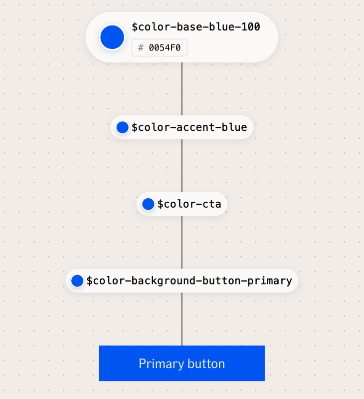
For example, a design token intentPrimary might point to a primary color value that is blue. But if the team decides to rebrand and change its primary color value to green, every element associated with the token intentPrimary will be updated to green, while the token remains unchanged. This example shows how design tokens keep design systems organized and easy to maintain.
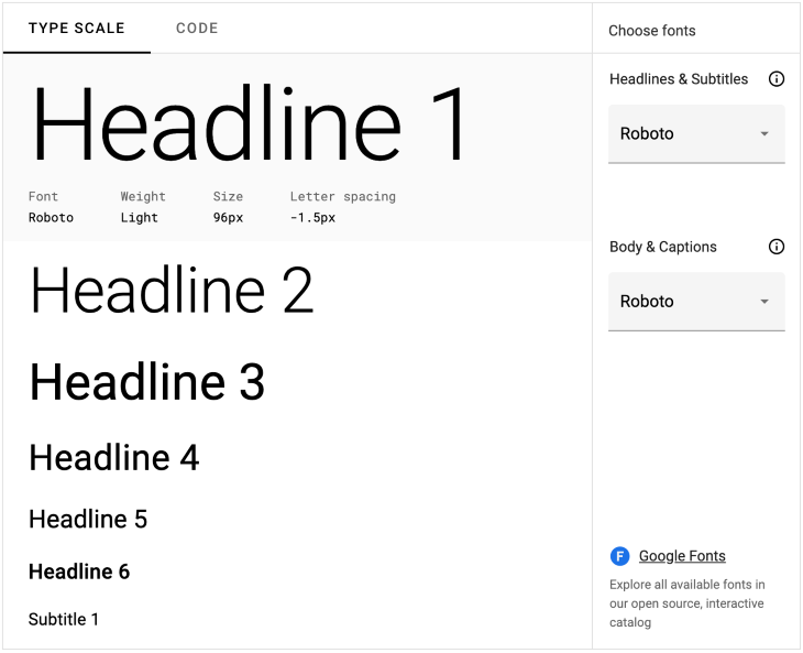
A major component of brand and style guidelines, typography consists of selecting fonts that can be used for specific scenarios. Some key aspects of typography include choosing the brand’s typefaces, as well as defining font sizes, weights, and styles for various use cases, such as headings, subheadings, body text, or labels. Typography guidelines keep content visually organized by establishing a hierarchy and ensuring legibility across various platforms.
A well-defined color palette within a design system has a number of benefits, including establishing brand identity, guiding user interactions, and maintaining visual consistency. A color palette generally consists of primary colors, secondary or tertiary colors, and background and text colors.
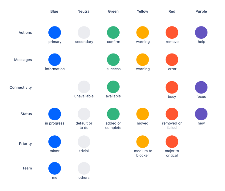
Before defining your colors, identify the different use cases and contexts in which color might be needed. Thoroughly test your color palette to ensure that there is sufficient contrast between background and text colors, and provide guidance on how colors should be used across different UI elements.

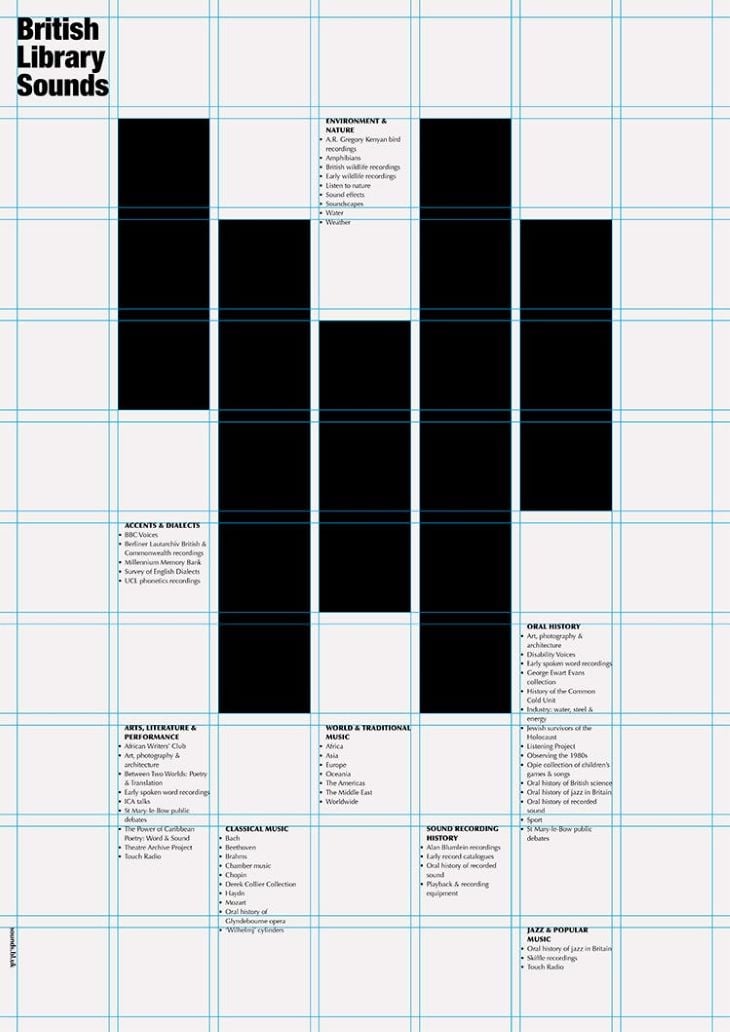
Grid systems help organize and align design elements to create cohesive layouts. A grid is a series of evenly spaced columns and rows that provide structure to designs. They can help position individual components in a way that makes information and content flow smoothly throughout a page.
A design system might have several grids to account for responsive layouts on different screen sizes, such as desktop, mobile, or tablet. The most common types of grid systems include column grids and modular grids.
A column grid system consists of a set number of columns that span the width of the page, providing vertical guidelines for visual alignment. A fluid column grid can adjust to the screen size, either by expanding the column widths or changing the number of columns used.

A modular grid system consists of columns and rows that break layouts into modules, providing more flexibility in how elements are arranged in the layout.
A design system would be incomplete without UI components, the fundamental building blocks of an interface. UI components are the elements users interact with on a page, ranging from common input controls like buttons, checkboxes, dropdowns, and radio buttons, to navigational components like search bars, breadcrumbs, pagination, and tags.
In addition, there are informational components like progress bars, tooltips, toast notifications, and modals, along with containers like accordions or panels. The components listed represent just a subset of the wide variety of UI components that contribute to a cohesive design system.
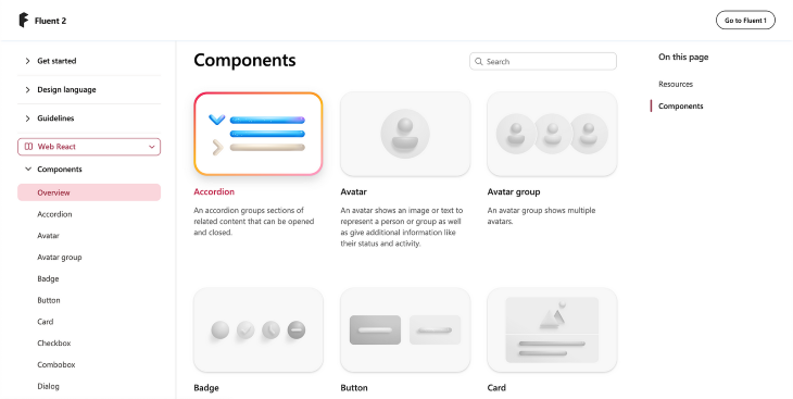
When selecting UI components for a design, it’s helpful to consider users’ mental models. Users have become accustomed to interacting with certain UI components in specific ways, so choosing the right component can help with familiarity, task completion, and ease of use.
Finally, each design element and component should have detailed documentation to provide guidance on how to properly use them. Well-documented design systems communicate rules and best practices to aid designers and developers during the design and implementation process. It’s helpful to explain common use cases for each element, as well as how not to use them, to avoid inconsistencies in the final design.
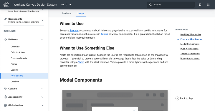
Documentation can be communicated in the form of an overview, visual examples or use cases, and scenario explanations to give enough detail on how to use each element and avoid any confusion. It also includes working code for developers to implement and customize the element for their application.
IBM’s Carbon is an open-source design system that provides a collection of reusable assets such as components, patterns, guidance, and code. Its primary goal is to build efficiency and consistency in the design process, giving designers a comprehensive toolkit they can leverage in their workflow. This saves designers time from building basic elements and instead allows them to focus on creating digital experiences that meet user needs.
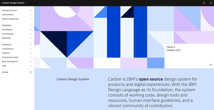
Carbon offers a well-defined design language that includes typography, content, color palette, iconography, grid systems, motion, and accessibility guidelines. This enhances the brand identity across multiple products by defining specific visual guidelines.
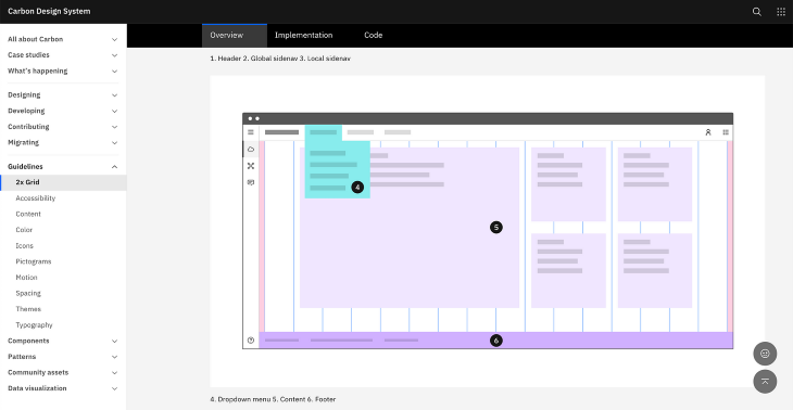
Carbon also hosts a library of UI components, patterns, and data visualizations for various use cases. This ensures that design decisions are unified, leading to consistent user experiences across multiple products. Each of the base elements leaves room for customization, which allows projects to scale well as the scope evolves. This modular approach gives designers the flexibility to design for any scenario.
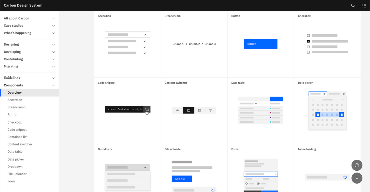
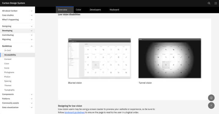
As an open-source design system, Carbon facilitates collaboration and knowledge sharing, encouraging contributions back to the design system. This leads to continuous improvement and has a direct impact on IBM’s projects, ensuring consistent and cohesive user experiences. Also, Carbon’s focus on accessibility shows its commitment to inclusive design, which empowers designers and developers to create accessible experiences for all users, regardless of their abilities.
The Audi design system highlights its focus on speed, consistency, and quality for development across all Audi products. The design system was created to support designers and developers to build products efficiently that meet the evolving needs of their customers.
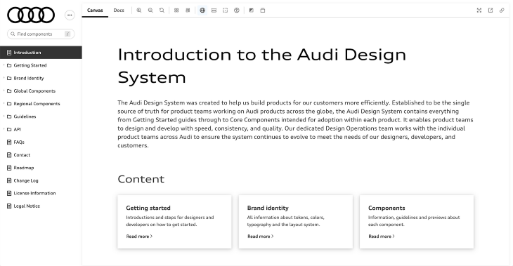
The design system acts as a single source of truth for Audi’s global product teams. Its products range from websites to in-vehicle applications, each with unique user interface requirements. Their design system offers a library of brand identity guidelines and components to ensure consistent branding and user experience regardless of the platform.
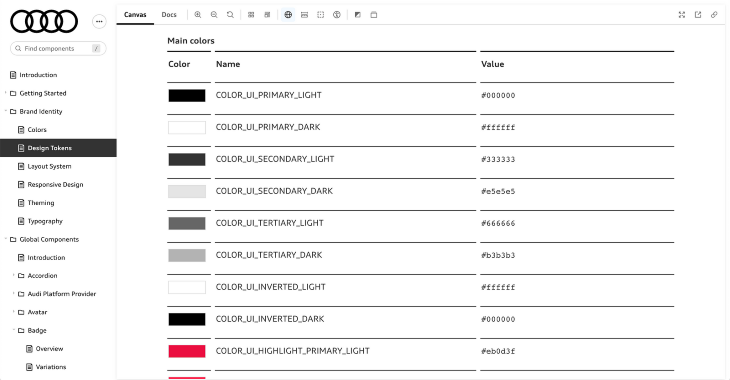
Efficiency is a common theme across design systems, and Audi’s design system aims to enhance the speed of asset creation by giving designers access to reusable components. By removing the need to recreate basic elements, designers are able to focus on innovation and quickly design pages by leveraging and customizing Audi’s purpose-built components and patterns.
Each of the UI components provides usage guidelines, as well as variations that cover different states and use cases. The documentation includes available properties for developers to understand how to customize each component.
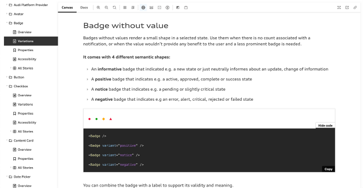
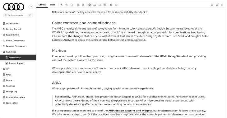
Audi emphasizes accessibility by providing WCAG and WAI-ARIA guidelines, as well as additional web accessibility resources for designers and developers to follow, ensuring that its final products allow equal and fair access to all users.
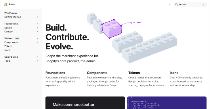
Polaris is Shopify’s design system, built to guide app developers and designers in creating outstanding merchant experiences for the Shopify admin. Its focus is on enabling designers and developers to create apps that add functionality to the Shopify admin experience.
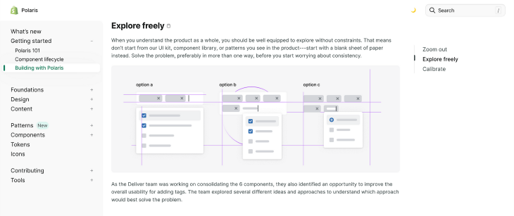
Shopify emphasizes that “Polaris is the floor, not the ceiling,” meaning that designers should use the design system as a foundation without limiting their creativity. They recommend focusing on solving problems first rather than worrying about consistency, which will come later. Polaris is meant to provide the building blocks with the added option to contribute back to the design system if a gap exists.
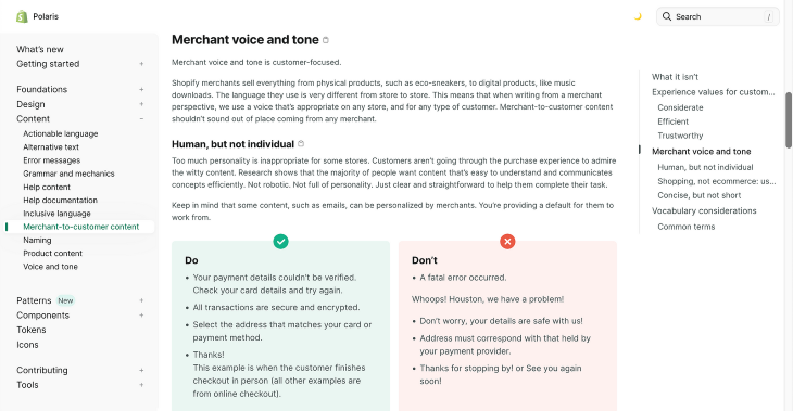
One of Polaris’ standout features is its robust content guidelines. It provides rules and best practices around actionable language, alternative text, error messages, and even grammar to ensure that the way copy is worded maintains the brand’s tone of voice and way of communicating with its users. The Do’s and Don’t’s are a great method for providing examples while explaining usage guidelines.
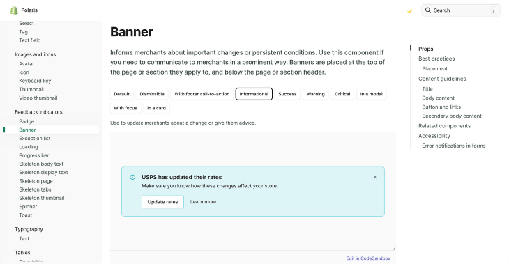
Polaris conveniently lays out the different variants of each UI component across the top of the page to allow users to easily view and compare to decide on the best one for their application. This convenience enhances the efficiency within a designer’s workflow, allowing them to quickly make informative design decisions.
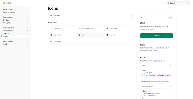
Its icon library is easily searchable with each icon associated with multiple tags, allowing users to quickly find visual elements without knowing the specific name. It provides guidance for both designers and developers on how to access and use the icons, further enhancing their workflow efficiency.
From exploring these design systems, there are common themes and best practices that can be applied when developing your own. Some of the core principles include efficiency, consistency, open collaboration, accessibility, and clear documentation. These principles can be applied to small and midsize businesses (SMBs) to improve design and development processes.
All three design systems emphasize the importance of efficiency in design and development. The main goal of any successful design system is to help product teams design and develop solutions faster without the need to recreate common assets. Providing reusable components saves time and effort by avoiding redundant work.
SMBs often have little resources allocated to development as they try to maintain a lean approach. By leveraging a design system, they can build efficiency into their workflow by speeding up product development and ultimately saving time and money that can be invested in other areas of the business.
Consistency is another common theme of successful design systems. The purpose of a design system is to ensure that teams develop consistent experiences across all their products so that customers can quickly familiarize themselves with their tools.
Consistency is key in preventing user confusion, especially for SMBs that are in the early stages of customer adoption. This can help users quickly understand and see the value of a product without being concerned about its usability.
Carbon and Polaris are open source design systems that encourage contributions from the community. Design systems are considered a foundation to start building from but may have gaps that don’t address specific use cases or customer needs.
SMBs often have to adapt to changing customer requirements as they learn more about their users. Thus, their design system might not contain the necessary elements for building robust solutions.
A design system shouldn’t limit a team’s creativity by being too prescriptive, but rather spark ideas and allow for innovation. It should leave room for flexibility and scalability, especially for a small team that is growing quickly. By fostering a culture of open collaboration, design and development teams can continuously improve the design system.
All three design systems prioritize accessibility by providing guidelines for designers and developers to build accessibility into their solutions. This ensures that product teams are considering users with disabilities creating products that are usable by all individuals.
Accessibility should be incorporated early into the development process instead of treated as an afterthought. SMBs can benefit from designing accessible products to help them reach a broader audience. It’s important to note that investing in accessibility early on can prevent teams from accumulating design debt and having to address accessibility issues later.
Implementing your own design system can seem like a daunting task. Here are practical guidelines and considerations for design system adoption, collaboration, documentation, and maintenance.
Before you jump ahead, first understand why your team needs a design system. This includes identifying any business goals and user needs that the design system would align with, such as improved designer efficiency and consistent user experiences across products. Communicating these benefits to stakeholders, such as product and development teams, can help with team adoption so that stakeholders are on board and aware of the design system’s existence.
Then, define the scope of your design system by outlining the essential elements and components that your team needs. Collaborate with your cross-functional partners, including design, development, product, and content, throughout this process to ensure alignment across teams and cover various requirements.
A guideline to consider is that proper documentation will lead to consistent experiences. It also takes the guesswork out of the team’s workflow, further enhancing their efficiency to get to results quicker. Even with limited resources, SMBs should focus on providing concise and clear documentation that outlines how to use design system elements. Investing the time and effort to document a design system clearly can lead to smoother implementation and avoid any confusion or misuse down the road.
Once your design system is up and running, provide thorough training to help your team use it effectively. Advocate for its adoption, but implement it gradually to avoid disrupting existing workflows and committing drastic product changes that might overwhelm users.
Maintaining a design system ensures that it evolves with changing customer needs and business objectives. It can be helpful to establish a regular cadence of feedback to gain input from team members in order to continuously refine the design system. Encourage team members to contribute back to the design system in order to fill gaps in the experience. Design system office hours are also a great way to broadcast any new changes or fixes to the design system components.
Many companies use Figma as their main design tool, so it’s a no-brainer to also use it to host design system assets. Teams can create a centralized library of reusable assets, including component variants and design tokens for designers to easily leverage in their Figma files.
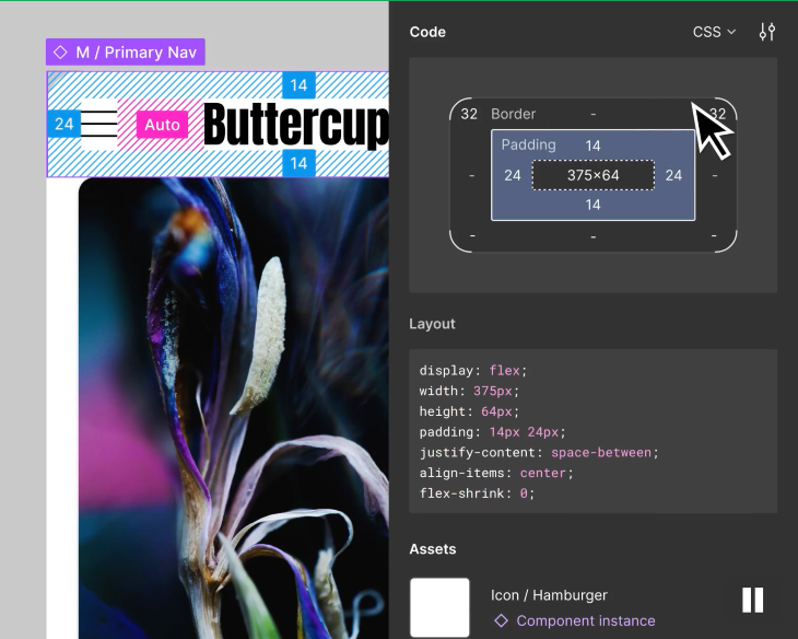
Figma is a collaboration tool, which is perfect for enabling multiple team members to work in real time on the design system, speeding up development and ensuring everyone is aligned. Figma recently introduced Dev Mode, which allows developers to quickly inspect and translate designs to code, further accelerating design system adoption.
A popular open source tool for developing UI components within a design system is Storybook. Its main feature is the ability to build UI components in an isolated sandbox environment, which enables developers to render different variations of a component by using props and mock data. This reduces the need to spin up the entire app to test the component, saving substantial development time.
Storybook can be used to maintain documentation for how UI components behave and interact. The platform is interactive, allowing users to test out various use cases for each UI component. It also supports collaboration by allowing teams to discuss feedback during the design system development process.
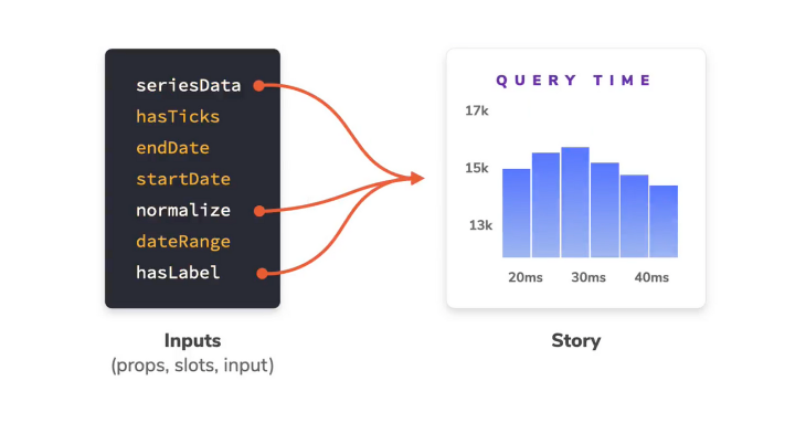
Zeroheight is a centralized platform for design system hosting and documentation. It allows teams to create organized and interactive style guides, component libraries, and guidelines. Zeroheight ensures that design documentation remains up-to-date as components and guidelines evolve, making it easier to communicate changes across teams.
It also has inbuilt integrations with other design system tools, including Figma and Storybook, which help automate the workflow from design to code. Teams can import their assets from Figma and display developer resources for each component all in the same place as their design system documentation.
After your design system is implemented and teams have adopted its usage, it’s important to evaluate the impact and effectiveness that it has on your business to understand which areas are working or need improvement. The impact of a design system can be assessed by evaluating a combination of quantitative metrics and qualitative insights. This will result in a broader understanding of its performance.
In terms of quantitative metrics, it can be useful to track:
These metrics will give you an idea of adoption rates across the organization, as well as which components are the most valuable to your teams. This can help in measuring which areas of the design system are most successful and which ones might need improvement.
On the other hand, qualitative insights offer a more human perspective. By gathering feedback through surveys and testing, you can begin to uncover the challenges that your team faces when using the design system and what can be done to alleviate these pain points. Continue to iterate and gather feedback in an iterative loop to improve your design system, which will lead to further adoption and success.
Setting measurable goals can help craft a clear understanding of how to improve your design system. These goals can cover things such as reduced design time, improved consistency, and increased user satisfaction. Achieving a successful design system requires an ongoing commitment to collaborate with your team: listen to their feedback and adapt to changes. The resulting value will benefit both your team and users in a significant way.
Design systems are essential for achieving design consistency and scalability in products. They also play a big role in enhancing efficiency in product development workflows. Design systems offer centralized repositories of guidelines and components, driven by principles like cohesion, modularity, scalability, and accessibility. These principles can apply to businesses of all sizes, including SMBs looking to streamline design processes and enhance user experiences.
For designers and teams interested in developing their own design systems, start by collaborating with cross-functional partners to understand its purpose and scope. Then, communicate its benefits to stakeholders so that everyone is on board.
As your team gradually adopts the design system, remember to maintain clear documentation and gather feedback from them. Using tools like Figma, Storybook, or Zeroheight can help you manage and broadcast changes to the design system as it evolves. By continuously tracking the success metrics of your design system, you can identify areas that are lacking and make the necessary improvements that your team and users will benefit from.
LogRocket's Galileo AI watches sessions and understands user feedback for you, automating the most time-intensive parts of your job and giving you more time to focus on great design.
See how design choices, interactions, and issues affect your users — get a demo of LogRocket today.

A three-week mobile banking project taught me that the “proper” UX process is not always realistic. Sometimes, the better approach is to work with what you know, identify what you still need to learn, and make the strongest decision possible under real constraints.

A/B testing compares two versions of a design to see which performs better with real users. Here’s how UX teams can use it to test hypotheses, measure outcomes, and make smarter product decisions.

This case study shows how one ad experience redesign increased total ad exposure while lowering perceived friction, proving that timing and context can matter more than raw interruption.

As products evolve into ecosystems, navigation becomes a system-level challenge. This article explores how to align structure, context, and user journeys to create seamless movement across tools without confusion.