One aspect of inclusive design that is often overlooked is age-inclusive design. This is the approach of designing products and interfaces that give users of all ages fair and equal access to the same experiences. Its goal is to make websites and apps accessible to all individuals, from children to older adults, considering their various unique user needs and goals.

But reaching this audience and understanding their needs isn’t always easy. The pool for user research often leaves some groups out, particularly age groups that are hard to reach through user testing platforms. To design inclusive experiences, we need to do better and include a wide range of users in the design process.
In this article, we’ll talk about the importance of age-inclusive design, the design principles to follow, and tips for testing interfaces for age-inclusivity. By the end of this, you’ll be thinking about reaching your target audience in a new light.
We live in a world that’s filled with modern technology, and people of all ages are using it. From an early age, children use technology to access the internet through mobile apps, social media, games, and websites. As they transition to adulthood and late adulthood, their reason for using technology often shifts to include school, work, and connecting with family and friends.
Now, not all websites or products are targeted toward a wide age range of users. Some may target a group of users down to a specific age range and demographic other factors. But if a product can be used by people of all ages, such as a learning app or messaging website, then it should be designed with all age groups in mind.
As people grow older, they may continue to use the same products, but their needs may change. The practice of age-inclusive design takes into account the diverse range of user needs. It aims to create experiences that are enjoyable for everyone and contribute to users engaging with the product throughout their lifespan, and that’s why we need age-inclusive design.
Now, let’s talk about the design principles to follow when using an age-inclusive design approach. Since age-inclusive design aims to make interfaces accessible to all, we can follow these key principles when designing any product.
Interfaces should be clear enough for all users to understand the intent of the page. For example, a checkout page for an ecommerce site should be clear enough for the user to review the items in their cart, and see the prices of each item, along with other details. They should also be clear about the main actions to take on that page, such as proceeding to payment or continuing shopping.
Ensure that navigation is clear and easy to find so that users feel in control when they use your website or app:

By keeping your interface simple, it avoids distracting users with any nonessential elements, such as pop-ups, countdown timers, or flash animations. This helps prevent confusion, especially with users who are not as familiar with technology, such as children or older adults. It also increases the chances of users staying on your website rather than abandoning it.

Avoiding dark patterns is particularly important for age inclusivity. Advertisements without clear cancellation options take advantage of less technologically savvy users.
A closely related principle to clarity and simplicity is readability. The text on a page has several different factors that can affect its readability.
WCAG doesn’t provide a recommended minimum font size, but typically 16px text ensures readability for most users. Use headings to separate sections of content and reflect the hierarchy of content on a page.
Line height, text spacing, and font styles can all affect users’ abilities to interpret and understand text. With so many different typefaces to choose from, use one that is less distracting.
Although there isn’t conclusive evidence that serif fonts are more readable than sans serif ones, some users may find the decorative lines of serif fonts to distract from reading the overall word. However, some characters may benefit from serifs to distinguish from similar-looking characters:

Some commonly used accessible sans-serif typefaces include Arial, Helvetica, or Calibri. Serif fonts including Century Schoolbook, Georgia, and Times New Roman, are popular accessible serif typefaces.
If you want to learn more, we have a whole guide on readability — the same principles apply for age inclusivity.
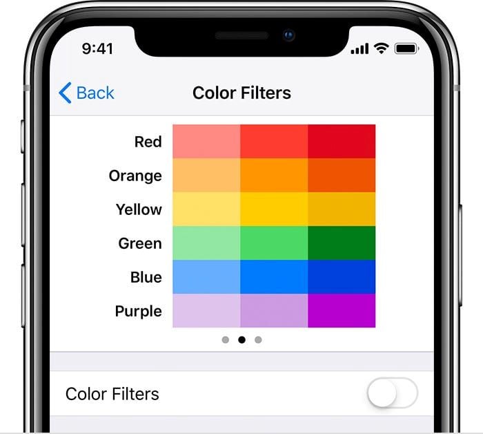
No product can be fully catered to everyone’s needs at the same time. To accommodate additional use cases, provide the option for individual users to customize their interface to suit their needs. Some common customization options include changing the text size or color filters to make reading easier:
With the basic principles out of the way, we can get into specifics for your target audience, starting with older adults.
As people age, they experience changes in their physical and cognitive abilities. Although adults will continue to become more familiar with technology as time goes on, designers need to keep in mind the changes to their abilities and how they can affect their experiences with digital interfaces.
It’s more common for older adults to develop low vision. In fact, one in six adults over age 45 has low vision, which can include a blindspot in the center or peripheral of one’s vision, night blindness, or blurred vision.
To design accessible interfaces for older adults, ensure that they accommodate low-vision users. This means using adequate text size (minimum 16px) or providing the option for users to change the text to their preferred size.
What also helps with low vision is ensuring sufficient color contrast. When visual elements don’t have enough color contrast between themselves and the background, it can be hard for users to identify the object.
This also applies to text. Using a color contrast checker, you can determine if your interface meets the WCAG AA and AAA guidelines:

Older adults often experience a decline in their cognition, which means it might take them longer to understand or process things that they see.
To design for these use cases, aim to use a simple navigation. Multi-level navigation menus may be too complex and result in cognitive overload. Simple navigation can include providing back buttons on every page, leading the user through a wizard, or including visuals in a navigation menu:
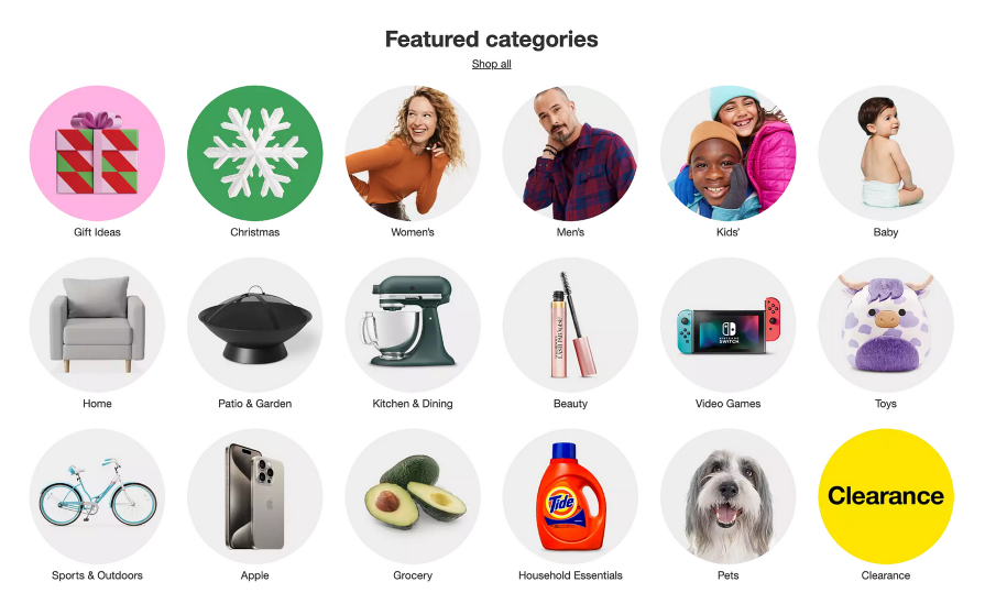
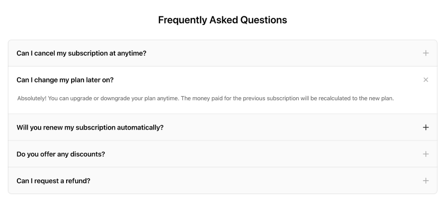
Using progressive disclosure can also assist with cognitive load. By showing the user content only when it is relevant to them, they are less likely to get overwhelmed. This technique is most useful when a lot of content is required, but not all at once:
Although not all adults are affected, many also develop memory issues, making it easier to forget things, especially when they are distracted or need to remember multiple things.
For starters, using easily recognizable icons and colors can help users with memory issues to form connections with certain actions. Basic examples include using a house icon to represent the home page or a trash can to represent deleting an object. This is where universal icons come in handy; most age groups and cultures are familiar with common web icons.
Color also plays a role in memory, as the combination of a visual and color can strengthen the memorability of an object:
Users with memory issues may need assistance to remember tasks to complete. You can use elements such as progress bars, success or error toast messages, or tooltips in an interface to provide the user with feedback. These can help nudge the user to complete an unfinished task, let them know if a task was successful or not, and provide helpful tips on how to complete it:
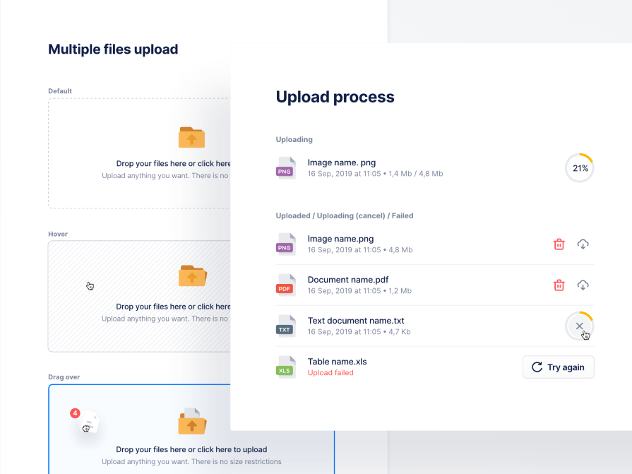
Older adults may need additional guidance while younger people who are familiar with technology may not require it. Upon using your product for the first time, provide an onboarding experience so that users can get acquainted with the app. This can be in the form of carousel slides that explain key features of the product, or tooltip walkthroughs to orient users around the home page:

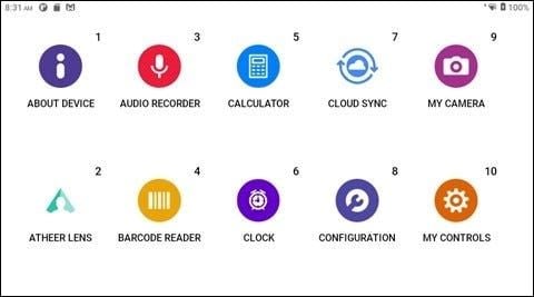
If users get lost while using your app or website, it should be easy for them to find a way to get help. Whether that’s a link to documentation, an FAQ section, or multiple ways to contact support, make sure that it’s accessible and easily recognizable. This will reduce the number of users who abandon your product or website because they are unable to find the help they need.
Meanwhile, children’s usage of technology is increasing because they have access to the internet at a young age. They are easily impressionable and still developing their brains, so it’s important to design with good intentions and create a digital environment that is supportive of their growth.
Ensure that all content is easily understandable by children. This means using simple terms and providing explanations for complex content.
Children have varying language abilities at each age, so consider using different forms of communication, including text, images, video, or audio. This gives users alternative ways to access the same information, depending on how they prefer to consume content:

Children often react well to interactive elements because it allows them to engage deeper with the interface and play around.
When designing interactions or animations, consider integrating multiple senses, such as using colorful and vibrant graphics, music or sound effects, or tactile feedback to capture their attention. However, children may struggle with complex gestures, so it’s best to keep any controls simple and easy to execute:
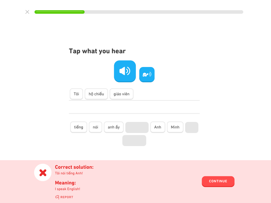
Children react well to positive reinforcement when completing actions. Incorporate visual and auditory cues, such as rewards, messages, and sounds to engage them and motivate them to continue using the product. If you haven’t heard of gamification, look into its principles to make interacting with your content fun and give children an engaging feedback loop.
Create experiences where they can explore on their own but also provide enough instructions to support them if they need help or make a mistake:

Another great way to design for children in a web interface is to incorporate storytelling aspects. Storytelling gives users a narrative where they potentially face challenges that can lead to rewards, further increasing their engagement with the product.
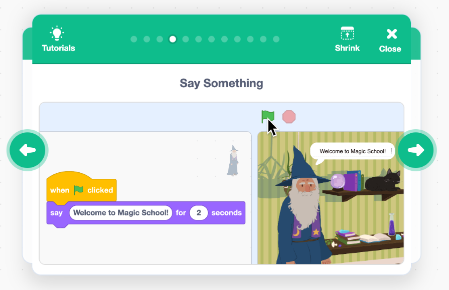
You can also use storytelling for tutorials, teaching users how to complete a task from start to finish. Stories can evoke emotions in users, causing them to react in a certain way, which can influence their use of the product:
When you design products and websites that are age-inclusive, you immediately open up your potential audience to a broader group. In the early days of Facebook, the website only accepted users who were in college. It wasn’t until two years after it was founded that they expanded their membership to users 13 years of age and older. If the social media platform kept its target audience in a very narrow age group, it wouldn’t have seen the growth and success that they have today:

In general, when you design interfaces that are accessible for a specific group, such as older adults or young children, the product becomes more accessible to the rest of the user base as well. This is because all users regardless of age can benefit from simple, clear, readable, and customizable interfaces.
Another benefit to age-inclusive web interfaces is the long-term impact they can have on your users. By creating a product or website that is universally accepted by people of all ages, your users can continue using it as they grow older, as long as it is still relevant for them to use throughout their lifespan.
To ensure that we’ve designed interfaces accessible for all ages, conduct user testing with users of different age groups. This means involving children, young adults, and older adults in your user tests. In order to find users of different age groups, consider reaching out to schools, student programs, nonprofits, senior centers, and other communities that cater to a specific demographic or age group
Another strategy is to employ user testing tools such as UserTesting or Userlytics that provide audience management and participant recruitment services. These tools have access to a wide network of testers and can promote your research study to a defined demographic, including age, within their platform.
Ask users if they understand the purpose of the page to identify if all age groups comprehend what it is supposed to be used for. If some groups can’t identify the page’s purpose, then consider techniques to modify the page, such as improving the readability of content, simplifying the language, or providing better guidance.
Furthermore, ask participants to try completing certain actions within your product or website. This can uncover insights into its usability, clarity, and ease of navigation for each age group.
Notice the similarities and differences across the participants’ responses. Identify common themes in their answers, including areas that didn’t make sense and areas to improve. After synthesizing the data and making changes to your designs, conduct a follow-up round of testing to gather additional feedback.
Designing age-inclusive interfaces isn’t that much different than designing accessible products to begin with. Principles like clarity, simplicity, readability, and customization put the user’s needs first, no matter what age they are.
In particular, older adults may experience challenges with low vision, cognitive load, memory, or guidance while children are best supported with good communication, interactivity, feedback, and storytelling incorporated into the design.
Age is just a number, but it can come with different sets of user needs. It can be easy to forget about different age groups when designing web interfaces, especially when they are not all represented during user testing. With age-inclusive design, your products and websites become timeless, as they appeal to a much larger audience and can capture loyal users as they get older.
LogRocket's Galileo AI watches sessions and understands user feedback for you, automating the most time-intensive parts of your job and giving you more time to focus on great design.
See how design choices, interactions, and issues affect your users — get a demo of LogRocket today.

As products evolve into ecosystems, navigation becomes a system-level challenge. This article explores how to align structure, context, and user journeys to create seamless movement across tools without confusion.

Figma’s AI features have exploded in 2026 — from text generation and image editing to full UI drafts and code handoff. But speed isn’t the same as quality. This guide breaks down every major feature, what it’s good at, and where human judgment still does the heavy lifting.

Zero UI works well for screenless, voice-first experiences, but most digital products still require visual interaction. Here’s why multimodal UX offers a more scalable foundation for the future of design.

Multimodal UX goes beyond designing for screens. Learn how context-aware systems, progressive modality, failover modes, and accessibility-first design create better digital product experiences.