Affordances are the properties of an object that suggest or indicate how it can potentially be used. Have you ever used a product that’s so intuitive you can use it with both eyes closed? If so, you’ve witnessed the power of affordances in UX design.
Leveraging affordances enables us to craft exceptional user experiences that are user-friendly and effortless to navigate. Let’s take a closer look at the various types of affordances we can design to guide users effectively through using our digital products.
Editor’s note: This article was updated by Neel Dozome on 2 April 2025 to expand on the types of affordances with clearer definitions, more real-world examples, and a comparison table. It also covers best practices for designing affordances and multi-device considerations.
In UX design, affordances are crucial because they let users know which actions are possible on an interface.
Affordances can be actual or perceived. To understand these concepts, let’s consider a physical example before applying them to digital products — a coffee mug:

It’s important to note that the actual affordance of an object largely depends on the user’s abilities. If a user can’t grasp the handle on a coffee mug, it doesn’t offer the affordance of being held by that particular user.
Affordances and signifiers are often used together to make an object’s function a user-friendly and intuitive experience. While the term “affordance” refers to the properties and functions of an object, the term “signifier” refers to information that makes affordances more apparent to the user:
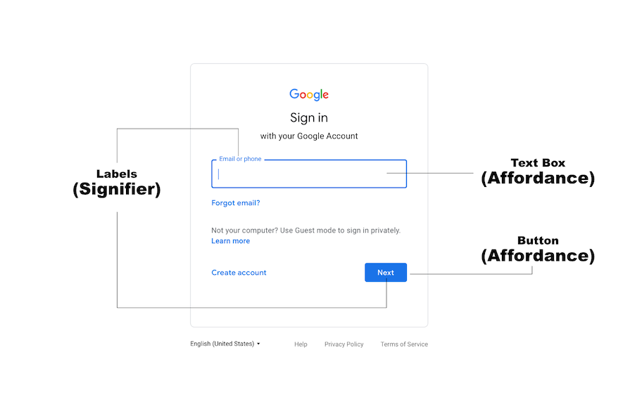
Buttons are a common example of how affordance and a signifier work together to make the function of an object explicit. The shape of a button (e.g., raised, flat, rounded) is primarily an affordance as it suggests the action of pressing or clicking.
A label, however, is a type of signifier. This is used to clearly communicate the affordances of the button. A button with a “+” icon might signify that clicking it will add something, while a button with a trash-can icon will signify deletion.
Let’s delve into the various affordances commonly used in UX design. We’ll also throw in some examples to illustrate the actions they indicate.
Explicit affordances are sometimes called obvious affordances or perceptible affordances. These affordances use clear, unambiguous cues to show users what actions and functionalities are available in a design. Such cues can be physical appearance or language.
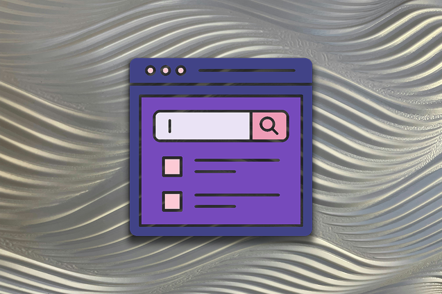
For example, a button on an interface with the word Search indicates that you can trigger a search by pressing it. You know this because its appearance is similar to the button you use to trigger actions in real life, and the accompanying text explicitly states the action that will be triggered:
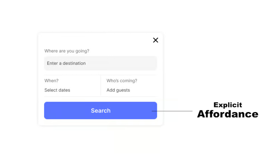
With explicit affordances, it’s easier for users — regardless of their technological know-how — to discover and use the functionalities they need. Some scenarios where they’re particularly useful include designing new or innovative interfaces and designing for users with limited prior experience.
Implicit affordances are also called hidden affordances. These affordances aren’t immediately apparent or visually evident on the interface. Hence, users might need to explore further to discover the cues that reveal their functionalities. Such explorations are usually due to curiosity or familiarity with similar designs.
For example, you need to interact with the dropdown menu on a website for the functionalities to become evident. However, you’re less likely to interact with the menu if you’re unfamiliar with similar designs — unless, of course, you’re just curious:
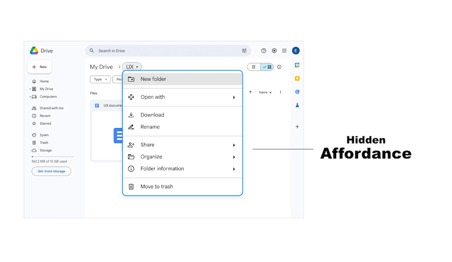
Hidden affordances help to reduce clutter while prioritizing and streamlining the user flow. This helps ensure that users aren’t overwhelmed by too many options.
N.B., you should apply caution when using hidden affordances as users might not always be able to reveal the functionalities.
These are design elements or cues that appear to afford an action, but in reality, they don’t. A false affordance occurs when a user gets the impression that an action is possible, but in reality, that function doesn’t exist: it’s false, like a rotten floorboard. Obviously, this leads to user confusion, frustration and annoyance.
Examples of false affordances are:
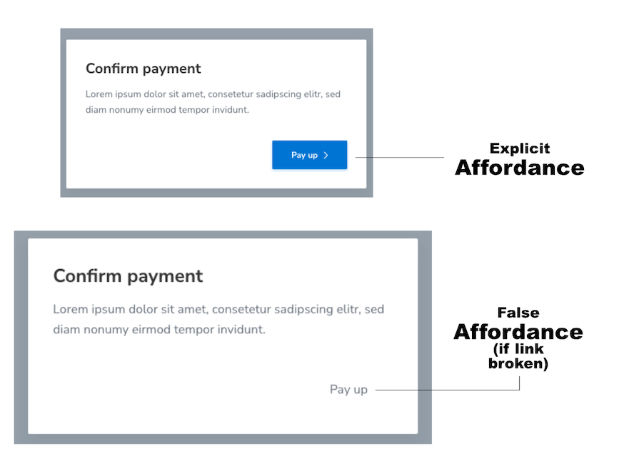
A false affordance is a consequence of poor design. It can lead to low conversion rates and should be avoided. It’s sometimes used as a dark UX pattern to mislead users into actions that benefit the business — for example, fake exit buttons in popup ads or “Unsubscribe” buttons that aren’t real.
However, there are certain rare situations in which a false affordance can be used:
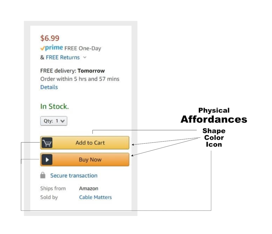
Physical affordances relate to the physical characteristics of an object or interface element that suggests its function. These properties include the object’s appearance, shape, color and other similar properties.
There is some overlap between physical affordances and explicit (obvious/perceptible) affordances, and the two terms are often used to describe the same thing. There is, however, a subtle difference between the scope of the two terms:
An example of a physical affordance are the signature yellow “buy” buttons that Amazon uses to emphasize their importance and function. Through repeated use, a physical affordance aids its user through memory, and the user no longer relies on the explicit label.
These affordances use imagery of real-life objects to communicate functionalities within an interface. However, perceiving these functionalities depends on the users’ preexisting knowledge and experiences:
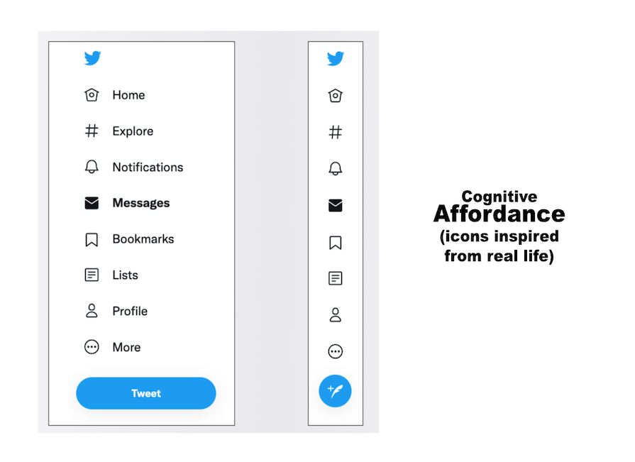
For example, when you see an eye icon in a password input field, the function of an eye immediately comes to mind — to make something visible.
With metaphorical affordances, you can design interfaces that feel more natural and intuitive to users, making it easier for them to complete complex tasks.
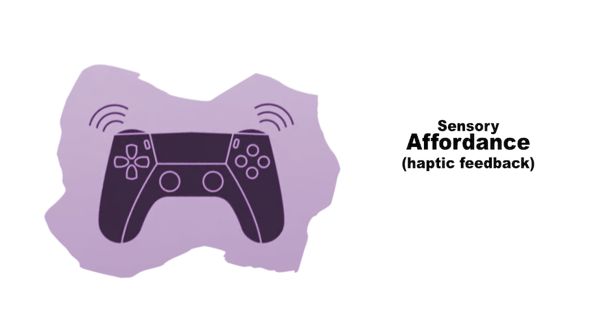
A sensory affordance enhances usability by providing clear sensory cues, such as:
Sensory affordances are important in interaction design because they help users understand and confirm their actions intuitively. They can help indicate the success or availability of actions. For example, a flashing light can signal an alert, while a sound can confirm a completed task.
These cues reduce uncertainty and improve user experience by making interactions more responsive and perceptible.
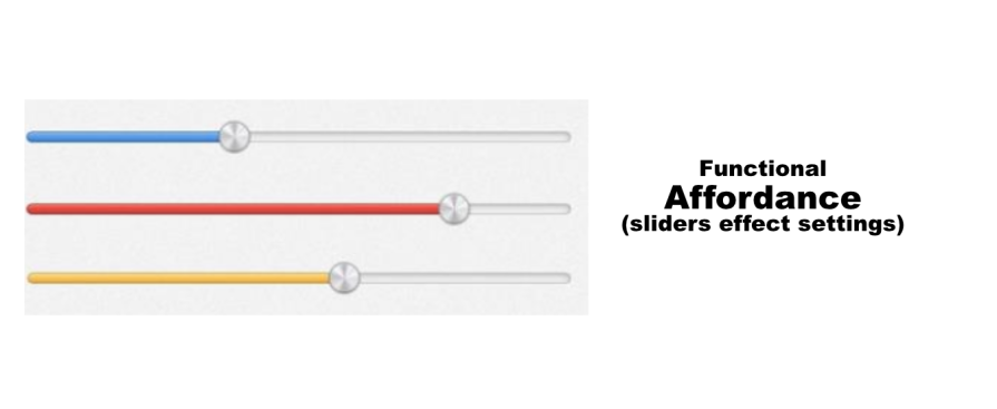
Functional affordances refer to the actual actions or functionality that users can perform with an interface element, linking usability to usefulness. They help users get things done, adding purpose to physical affordance. They are the reason users make physical actions. Examples of functional affordances are:
Pattern affordances rely on the user’s knowledge of common patterns in UI design.
For example, the navigation menu on a website usually follows a pattern that users are familiar with. Also, users can recognize the logo at the top left of a webpage as a way to navigate to the homepage:
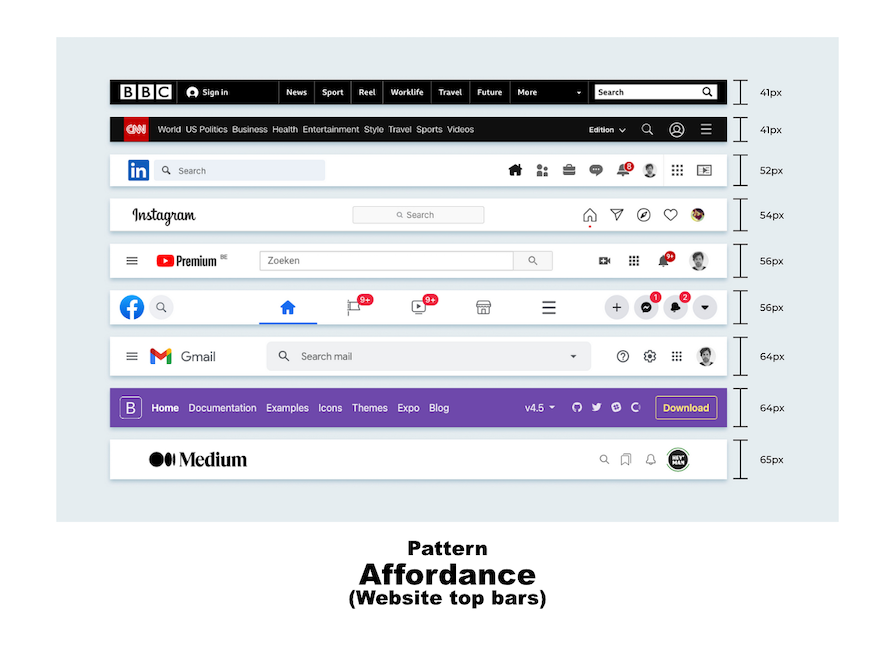
By using patterns, you can provide mental shortcuts for users, eliminating the need to memorize.
N.B., pattern affordances are more useful when designing for tech-savvy audiences because non-tech-savvy people might be unfamiliar with the patterns.
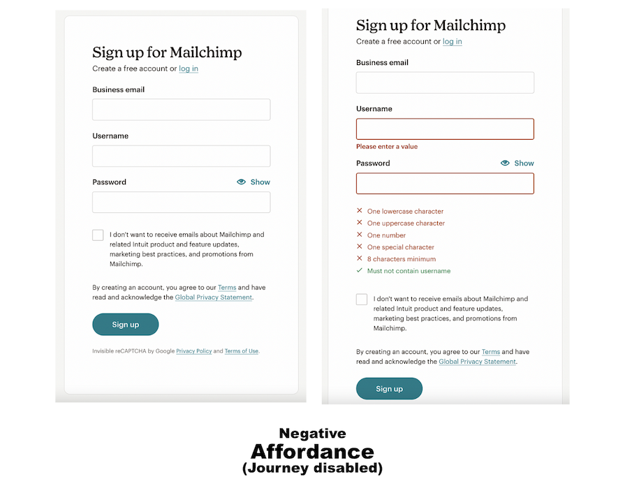
These affordances indicate an absence of interaction possibilities for certain actions. They are typically used to discourage specific actions, prevent errors, or show that an element cannot be acted upon at the present instance.
A negative affordance is different from a false affordance, as it is not misleading and an unintended result of poor design. Rather, the withholding of function is a deliberate choice included in the design to guide the user’s journey.
For example, the feedback in red indicates that the specific data the user needs to input in order to proceed:
| Type | Definition | Examples |
|---|---|---|
| Explicit affordance (a.k.a. obvious or perceptible affordance) | Clear, unambiguous cues to show users what actions and functionalities are available. | Labeled button |
| Implicit affordance (a.k.a. hidden affordance) | Affordances not immediately apparent and require exploration to discover | Dropdown menu/feature |
| False affordance | Design feature that is misleading or confusing. | Underlined text that doesn’t hyperlink to anything |
| Physical affordance | Function that arises from an object’s shape, color or other physical properties. | A button with a unique shape, location and color |
| Cognitive affordance (a.k.a. metaphorical affordance) | Uses real-life object imagery to communicate functionalities | Icons |
| Sensory affordance | Enhances usability by providing clear sensory cues. | A chime or sound that accompanies a helper chatbot’s message |
| Functional affordance | Physical or digital attributes that indicate possible actions or interactions | Sliders that invite a swipe gesture |
| Pattern affordance | Based on the user’s knowledge of common patterns in UI design. | Website navigation top bar |
| Negative affordance | Disabling function to prompt response from user. | Grayed-out button on a login form |
When you come across a new object, how do you know the right way to use it? You rely on design cues that indicate the object’s intended behavior. If you see a light switch, the shape and position indicate that you need to flip it up or down. If you see a button, the shape indicates that it can be pressed down. And so on.
This concept also applies to UX design. Users rely on cues and indications in an interface (aka, affordances) to interact with a system effectively. Here are some ways designers use affordances to guide user interaction and behaviors:
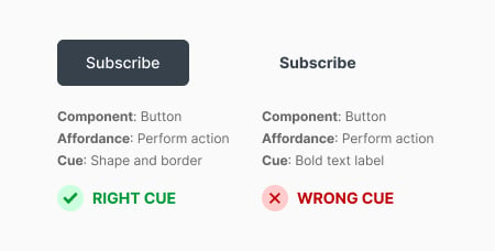
One of the core visual elements designers use to show interactivity in an interface is buttons. They use visual cues such as the button’s shape, color, and style to align with the users’ expectations and prior experiences.
For example, the expected convention is that a button has a proper border. This suggests clickability, guiding users to interact with it. If there is no such visual boundary, the user might be confused:
Another way designers guide user interaction is through the use of functional cues. These cues are not explicit. Instead, they suggest potential interaction with an element.
For example, a search input field with a magnifying glass icon implies that users can input a query to initiate a search. With functional cues, designers can guide users toward specific actions without explicitly stating them.
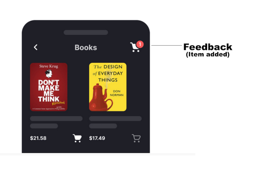
People naturally seek cues that indicate progress or completion of a task. So, designers can guide user behavior by employing response and feedback mechanisms. One way is through the use of notifications.
For example, when you add an item to your shopping cart, a number appears next to the cart icon, acknowledging your action. Clear and timely feedback like that can encourage you to take further action:
Other forms of feedback/response include hover effects, animations and color changes. With smartphones, another expected form of positive reinforcement involves haptic feedback like chimes and vibrations.
Designers use affordances to prevent user errors by guiding them to interact with the system in a desired manner. One way is by offering confirmation and undo options for critical or irreversible actions. For example:
When a process involves multiple steps, it can get overwhelming for users. Designers avoid this information overload by disclosing information progressively.
An example is the progress indicators in the ordering process on shopping platforms. These indicators guide you by showing the different steps involved and how much progress you’ve made. Progressive disclosure makes navigation easier, thereby improving usability and engagement:
These are some ways designers use affordances to guide user behavior and interactions. You can use them to create intuitive designs that guide users to perform the required actions.
But not so fast. There are a few things to keep in mind before designing affordances. Let’s check them out.
Speaking of designing for smaller screens, let’s explore some considerations for designing cross-platform and multi-device affordances.
Also, prepare for upcoming changes around emerging technology like AI and VR. At the time of this update, the buzz is that Apple is considering a major re-design of iOS across all platforms to ensure consistency with the VisionPro headset:
Affordances have a huge impact on user experience. They can help guide user interactions and behaviors effectively. By applying the principles and considerations discussed in this article, you can create exceptional user experiences that are so intuitive users can navigate them effortlessly.

LogRocket's Galileo AI watches sessions and understands user feedback for you, automating the most time-intensive parts of your job and giving you more time to focus on great design.
See how design choices, interactions, and issues affect your users — get a demo of LogRocket today.
Explore the core principles of GUI design and learn how consistency, simplicity, feedback, accessibility, and user testing contribute to better digital experiences.

After five years in UX, I revisited the Daily UI challenge to reconnect with hands-on design. Along the way, I learned that great interfaces come from thoughtful briefs, sound judgment, and user feedback, not just better AI tools.

Learn what makes a great login screen through real-world examples and UX best practices for creating secure, accessible, and low-friction authentication flows.
Skeuomorphism helped define early digital interfaces by mimicking real-world objects to make technology more intuitive. Learn how it compares with flat design and neumorphism, why it declined, and where it still has a place in modern UX.

 Learn more →
