Have you ever heard the saying “form follows function”? It’s a design principle that states that an object’s shape (form) should directly relate to its purpose (function). This principle originated in architecture, but it has crept its way into other design industries, such as industrial and interaction design.

The “form follows function” principle prioritizes simplicity and performance over aesthetics. Designs from the Bauhaus movement, for example, rely on functional design — they focus on pure usability while avoiding added decoration.

But it turns out that form is quite significant to users. Form can even obstruct a user’s perception of how well a design functions, which defeats the purpose of function-forward designs.
But how can designs made to function optimally be perceived as less usable?
In comes the aesthetic-usability effect. This effect explains the phenomenon where aesthetically pleasing designs are seen as easier to use compared to designs that are less aesthetically pleasing. This effect persists even if the more attractive design is less usable.
But it doesn’t only apply to physical product design — it works for digital products, too. Users assume that the best-looking UIs (user interfaces) will perform best.
The aesthetic-usability effect is critical to creating a balanced UX design. This blog discusses it in depth, so follow along.
The aesthetic-usability effect illustrates how users perceive designs with high visual appeal to be more functional than designs with low visual appeal. But how does this effect work?
There are two key principles that influence aesthetic usability — cognitive fluency and emotional response. Let’s discuss both to better understand this effect and then review how it alters the user’s perception versus reality.
Cognitive fluency refers to a user’s judgment of how easy or difficult it is to process and complete a task. Users are more comfortable using designs with high cognitive fluency over designs with low cognitive fluency. Designs with high cognitive fluency focus on simplicity, are similar to existing designs, and are visually appealing.
High visual appeal promotes high cognitive fluency by using standard design principles that make designs easier to process and comprehend. Principles such as visual hierarchy, legible fonts and colors, and providing visuals to support text information — all support creating attractive designs.
Cognitive fluency is subjective per user but is crucial to identify. A task may not be difficult to complete from the designer’s perspective, but if the design uses illegible typefaces (like a cursive font), its cognitive fluency will be low — the task will be difficult for the user.
Incorporate usability tests with interface designs to ensure users perceive tasks as easy to ensure the designs have a high cognitive fluency.
As users process a design for the first time, they develop an immediate first impression from their emotional response. Aesthetics in designs are more likely to create a beneficial first impression with users, which impacts how users will perceive the design in the long term. This is because visually appealing interfaces create positive emotions, like joy and satisfaction.
Once a user has developed a positive impression of a design, their overall experience of the digital product is strengthened. Users will even be tolerant of minor usability issues if they have established a positive attitude toward an attractive design.
As the saying goes, “You never get a second chance to make a first impression.”
So, being mindful of aesthetics in designs is vital to creating positive first impressions with users. Remember, it’s difficult to change or reverse a negative sentiment about a design once it is initially formed.
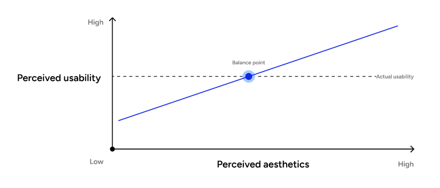
Cognitive fluency and emotional response go hand-in-hand in altering a user’s perception of reality.
You wouldn’t assume this, but prioritizing functionality over aesthetics is counterproductive — users will perceive the design as less usable compared to a more visually appealing design.
The aesthetic-usability effect is a cognitive bias. As our biased brains try to simplify information processing, they make subjective decisions that may not be entirely correct. Our brains value beautiful things, but they are also quick to judge a design’s usability just by its beauty.
Even if a less attractive design is more usable in reality, the user’s perception of the design will be distorted just because it’s unattractive. When creating and testing designs, ensure the user’s perception of its aesthetics doesn’t erase its functionality in reality.
Since the aesthetic-usability effect significantly influences how users perceive and engage with products, it has been applied to many interface designs. I’ll look at two notable products:
Spotify took a risk with its branding and aesthetics, but it truly paid off. Who would’ve thought neon green and black would work together? Not only is the color combination visually pleasing, but it has also made Spotify a highly distinct and recognized brand.
How Spotify uses the aesthetic-usability effect:
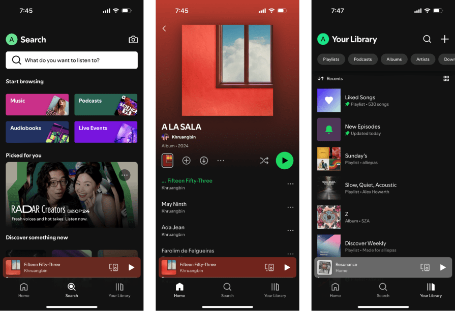
Because Spotify has such an attractive UI and noticeable brand, it’s the most used music streaming app, beating YouTube and Apple Music. Spotify’s aesthetics invite the user to create a positive impression that remains consistent with every app visit. Not only that, but its dynamic and well-layout content keeps the user engaged and encourages them to stay in the app longer and come back for repeat visits.
Ah, another award-winning tech giant. Like Spotify, Uber’s UI feels modern but is more minimal. Spotify uses bold color schemes; Uber uses a grayscale palette with subtle pops of color. To make it look even more simple, Uber applies a flat design — no shadows in the UI (minus 3D effects in its illustrations). Though Uber’s branding is not as distinctive as Spotify’s, it works better for the type of tasks users do in Uber (purchasing car rides or food versus choosing a song to listen to).
I’ve noted that Uber uses the aesthetic-usability effect in ways such as:
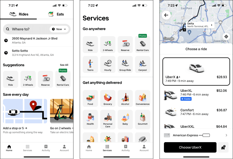
Like Spotify, Uber is the leader in its market. Currently, Uber holds about three-quarters of the ride-sharing market, with Lyft coming in second. From its color scheme, layouts, and illustrations, Uber’s visual appeal definitely plays a part in its market dominance. Its interface’s attractive designs give users positive experiences, which seals the deal for loyal users.
I know what you may think, “I don’t design for an entertainment app like Spotify.” Or “My company’s branding is too rigid to add aesthetics.”
Fortunately, aesthetics aren’t only found with bold colors and playful illustrations; they are also found in foundational design principles, which we’ll review below. Let’s get into it!
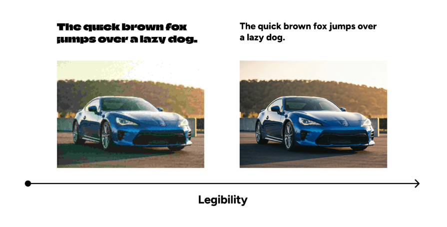
The first step to creating aesthetically pleasing designs is to ensure the user can read the selected typeface and understand what any type of imagery (photos, icons, or illustrations) shows.
For example, reading a sans serif typeface is easier than reading a display typeface, and high-quality photos are perceived as better than low-quality photos.
Though foundational, each element impacts how the user judges the design, so they must be legible.
Users need to be intuitively told which elements on the interface are more important, and this is done by applying visual hierarchy. Multiple ways, such as size, color, and positioning, can be used to create a hierarchy (which can be combined).
For example, headers on a page are larger and have a bold font, which draws the user’s eyes as they skim the page.
One characteristic of designs with high cognitive fluency is that they focus on minimalism. Prioritizing minimalism and white space in an interface reduces the user’s cognitive load as they process all the information being shown. This means removing unnecessary information or elements and using padding to create and separate groups.
Doing so simplifies the interfaces and prevents the user from feeling overwhelmed.
Though users are more tolerant of minor usability issues in attractive designs, it diminishes as usability issues become inhibiting.
For instance, if the design has poor navigation, the user won’t be able to use the interface properly, which causes a critical usability issue. The trick here is to balance aesthetics and usability, prioritizing both so users can create positive emotions that are backed up by its functionality.
Being in the design industry, we all know that the user’s opinion of a design varies per user. This is especially true if the designs are being shown to different cultures.
Look at the differences in McDonald’s UI between China and the United States—there are different layouts, advertisements, and levels of simplicity. Through user testing, different preferences can be found, so designs are optimized for the specific user group.
While creating aesthetically pleasing designs, it can be easy to forget about web accessibility. Designers want the exact right shade or tint of a color for their color palette. But if the colors don’t meet ideal color contrast requirements (4.5:1 for text to meet WCAG, Level AA standards), people with low vision won’t be able to read the content. It’s important to keep users with disabilities in mind when focusing on the aesthetics of a design.

Form follows function, sure. But users want visual appeal, so much so that they sacrifice usability. The aesthetic-usability effect challenges this phrase by proving that users believe attractive designs are easier to use versus less attractive designs (even when they’re not).
Aesthetics impact a user’s cognitive fluency and their emotions. When an interface is rated with high cognitive fluency, the user thinks completing tasks on that interface is easy. And when designs apply aesthetics, users are more likely to create positive first impressions of the UX. Both of these principles alter the user’s perception of their reality. A design may be easier to complete versus another (less time-on-task or user mistakes), but if the design doesn’t apply principles like visual hierarchy, the user will have low cognitive fluency as well as a negative impression of the design.
Aesthetics aren’t only found in entertainment or consumer-facing digital products like Spotify and Uber.
All designers should be mindful of aesthetics in their designs, regardless of their user group or intentions while using the product. Without aesthetics, users will choose a competitor’s product that does apply the visual appeal they seek — even if the product has usability issues.
As you create your next UX designs, consider the balance required between the aesthetic-usability effect and user-friendly functionality. Strategically apply visual appeal while balancing user-friendly functionality.
LogRocket's Galileo AI watches sessions and understands user feedback for you, automating the most time-intensive parts of your job and giving you more time to focus on great design.
See how design choices, interactions, and issues affect your users — get a demo of LogRocket today.
Multimodal UX goes beyond designing for screens. Learn how context-aware systems, progressive modality, failover modes, and accessibility-first design create better digital product experiences.

Learn how context-aware mode prioritization and seamless transitions improve multimodal UX and reduce mode confusion.

Research is becoming more democratized, product cycles are accelerating, and AI is transforming synthesis and ResearchOps. Here are the three trends shaping UX research in 2026.

Voice support is not the same as multimodal UX. Here’s how to design systems with true mode continuity and context-aware interactions.