A unified visual design system is not an idea exclusive to UX. Nor is it a new idea.

For hundreds of years, ranchers have branded their cattle and guilds of merchants have trademarked their goods to differentiate their business’ products in their respective markets. In the mid-twentieth century, graphic designers began creating expansive, rich corporate visual systems to unify companies’ image and messaging to make them easily identifiable and set them apart from competitors. These masters combined color, iconography, type, grids, and illustration to foster consistency and brand recognizability.
Famous examples include Giovanni Pintori’s work for Olivetti typewriters, Paul Rand’s legendary work for IBM, and the 1960s Lufthansa German Airlines identity program designed by Otl Aicher.
One of the key features of Lufthansa’s new visual identity system was its focus on consistency and clarity. Aicher’s design rules specified that all communications should be organized using a strict grid system, with a clear hierarchy of information, and consistent use of a limited blue and yellow color, bold sans-serif typography, and imagery. The system encompassed everything from uniforms, ads, and posters to food packaging, aircraft interiors, and exterior livery.
The goal was to ensure that all of Lufthansa’s customer touchpoints were easily recognizable and reflected the airline’s reputation for quality and reliability. In doing so, Aicher established a pioneering example of modern corporate branding and a highly recognizable brand that has stood the test of time.

Like the examples above, modern digital product designers utilize visual systems to create distinct experiences for their companies. The visuals are the first part of the experience the user will encounter, and they have a powerful impact on the perceived quality of the rest of the experience.
In Dan Ariely’s book on consumer psychology Predictably Irrational, he describes how students presented with free samples of coffee served in styrofoam cups said it tasted cheap, but when the same coffee was presented in nice cups with saucers and spoons, they said it tasted expensive and were willing to pay more for it.
Similarly, strong UI design has been shown to have a high correlation with users’ perceived usability of an interface thanks to the aesthetic-usability effect.
Simply having a visual style is not a strategy. Having a roadmap for how to implement a visual style is not a strategy. The word strategy in a business sense is about knowing “where to play, and how to win” in a competitive market.
Therefore, a visual design strategy is not only about aesthetics. A good strategy should provide marketplace advantages when executed well. Consider these questions:
Done well, a visual design strategy produces an identifiable brand across various web and mobile touchpoints. It should support and tie directly to broader company strategic advantages.
In this article, I’ll help you develop the atomic-level pieces of your design system such as color, spacing, and typography. I can’t tell you how to make it appropriate for your individual company, only you can do that, but I can provide a framework for focusing your fundamental visual design decisions.

Upon this foundation, you will build your entire strategy. The three pillars of this approach are Personality, Clarity, and Unity.
Let’s get started.
Many product designers work with marketing and brand teams that have already defined many aesthetic guidelines like the company logo, color palette, and corporate typeface. Many marketing style guides also describe the brand’s tone of voice and intended personality.
With all these established standards in place, UI designers already have a starting point toward a visual design personality; however, most marketing teams are focused on expressive contexts like campaigns and landing pages rather than utilitarian contexts like authenticated digital applications and tools. UI designers need to balance familiar brand personality and assets with focusing users on their goals.
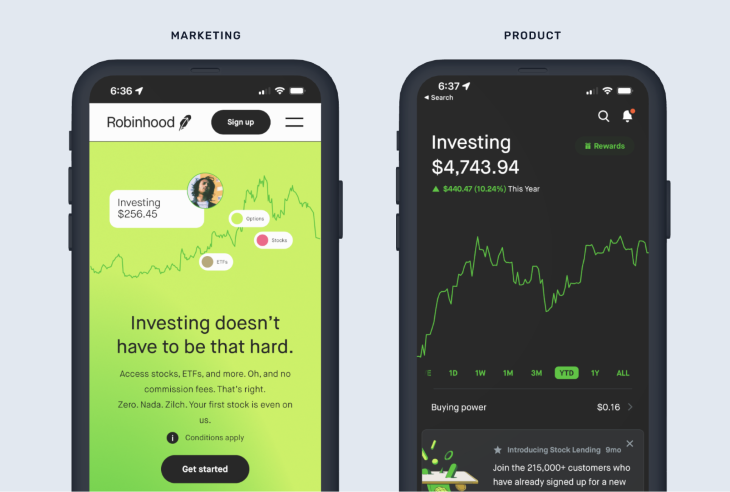
Your visual design strategy should be appropriate to your target audience. Past UX research and personas can help you determine your user’s needs and aesthetic preferences. If you haven’t established these artifacts, your marketing team hasn’t produced a brand style guide, or you’re working on an MVP without any previous assets, then you’ll need to start at the beginning.
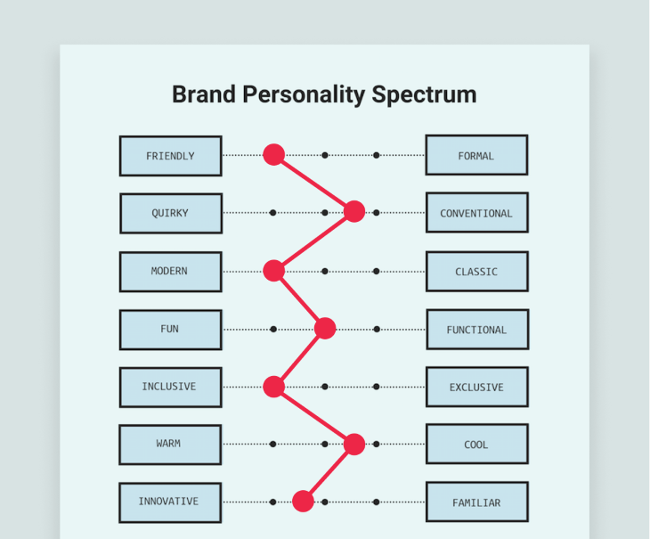
You can use adjective association exercises, like the Brand Personality Spectrum pictured below, to uncover descriptive words that you’d like your visual design to convey — and those you want to stay away from.
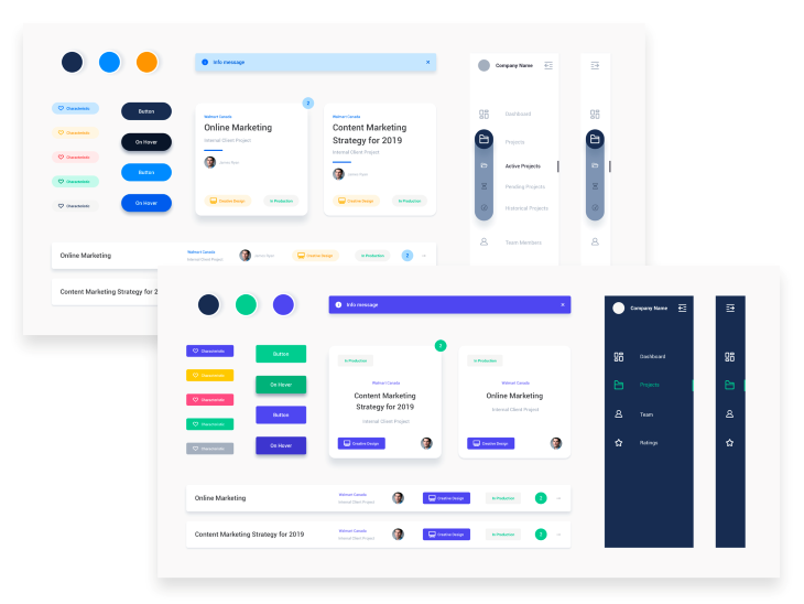
Style tiles are another useful technique at this stage. They allow you to rapidly explore multiple visual directions and solicit stakeholder feedback without resorting to full mockups.
A style tile is like a moodboard of user interface elements. The goal is not to design the whole application but rather a few isolated components that explore variations in color, shadow, border radius, icon style, and typography in order to quickly and inexpensively select a visual direction.
A key ingredient to the Personality pillar is a flexible and appropriate color palette. Colors can convey a range of emotions and moods, and their careful selection can enhance usability and guide users toward desired actions. Think about Amazon’s use of orange, which generally conveys excitement and optimism, or Chase Bank’s use of blue, which generally conveys stability and trust. Be aware that emotional associations may vary across cultures.
The corporate brand team will usually give UI designers one or two primary colors that will form your color palette starting point. However, for a complete design system palette, designers will want to extend this to include tints and shades of primary and neutral colors.
It’s also beneficial to have a range of success, error, warning, and info colors to convey system status. Jordan Bowman from UX Tools has an excellent video explanation of how to do this.
Be sure to check your colors meet WCAG accessibility guidelines. There are lots of tools and plugins for testing color-contrast ratios and simulating color blindness.
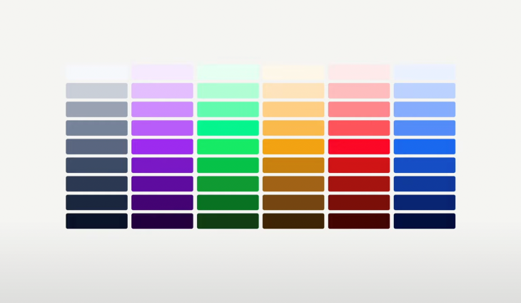
With the color palette in hand, your next strategy will be determining rules for how to apply it. A classic 60/30/10 interface is a good choice for getting started.
The second pillar of your visual design strategy is about clear information transmission. Content is still king. Your visual style should not interfere with or distract from the product’s key tasks.
The UI controls, navigation, and text styling should generally recede in importance until called upon, allowing the content to take center stage.
The workhorse of any design is text. Similar to color, the corporate typeface may have been chosen already by your brand team, but typography usage often plays a very different role in product design and brand design.
IBM’s Carbon design system has a useful distinction for productive vs. expressive typography to provide guidelines to their designers for utilitarian, task-based designs vs. exploratory, editorial use cases.
For UX design, your typeface must be highly readable in a variety of sizes. Tiny sizes are often needed for mobile applications and data visualization labels. Be sure to test your fonts on the actual device types and platforms your users will be using to view the designs.
Years ago I read the classic book The Elements of Typographic Style; it’s dense but the best book on the subject. The author discusses in vivid detail the use of musical scales to define harmonious dimensions and proportions to layouts. At the time I laughed, but have since come to see the wisdom in the advice.
In the design systems I now work on, I utilize design tokens to define a standard scale of spacing and typography constants. Use online tools like Typescale.com as a starting point in creating your own font sizing scale.
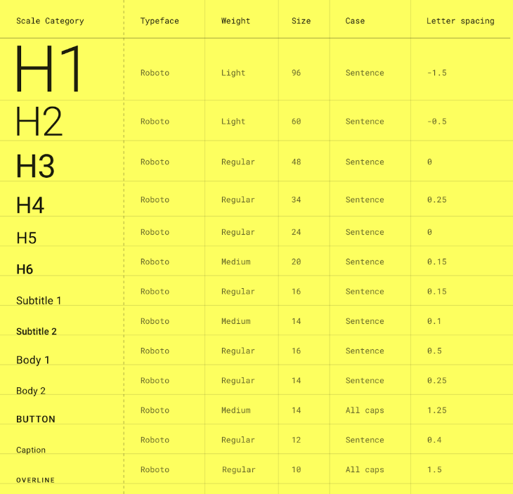
Proper usage of type sizes is an important way to create visual hierarchy within a design, but it’s not the only way. Just like with typography, you should also define a unified scale for the space between and around objects. Designing whitespace using multiples of 8 pixels (8, 16, 24, 32, 40, 48, etc.) is a popular choice.
Objects that appear in the foreground of the composition, such as modals or content cards, will also register higher importance than objects perceived to be on the same plane as the background. Layering and drop shadows can help sell this illusion.
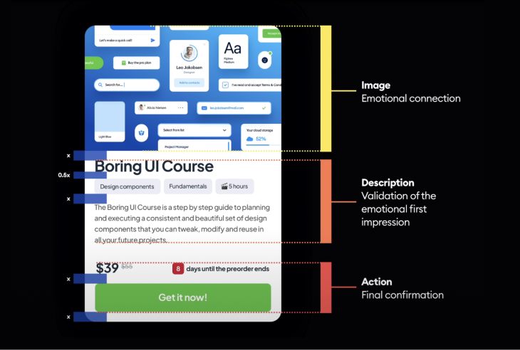
Images, particularly of people and faces, will naturally draw the eye first and establish an emotional connection. Headings reinforce the imagery, leading into supporting body copy, and finally, a strong call to action. It sounds simple, but getting hierarchy right requires practice and a refined eye for detail.
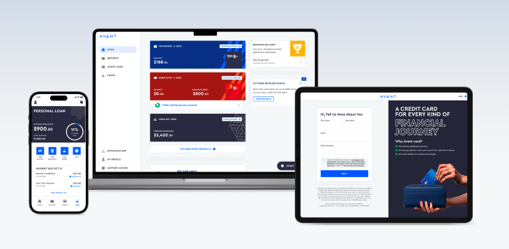
The third pillar of your visual design strategy is developing unity across all digital touchpoints. As your company and design team grow, inconsistencies are bound to creep in unless you establish a set of reusable components and a repeatable process to keep internal teams aligned.
Navigating across pages on your company website, or between a mobile app and another digital channel, should offer a consistent experience to users. Consistency creates cohesion; inconsistency creates dissonance. Misaligned visual patterns can be confusing or even frustrating to users.
Unity can be difficult for large, distributed design teams. To overcome this, I schedule regular design review meetings where my direct reports can stay aware of other design projects across the company. Together, we develop usage guidelines for key visual patterns that we document in internal wikis. We also use shared Figma libraries to manage components and style tokens.
Our design system language at my current employer is called Tapestry. The name serves as a reference to the bold, graphic patterns that are the center of our new brand styles, but it also invokes the goal of an interwoven, unified set of standards and components.
Finally, as with anything in user experience design, you should regularly test designs with your target users to ensure that visual design choices align with user needs and your intended strategic outcomes.
This can feel very subjective. You shouldn’t simply ask users if they like the design. Rather, you should observe how the interface is enhancing the experience. The layout and patterns you’ve established should aid users in learning the system. Visuals should not distract the user from task completion.
A few examples of what to test in your visual design:
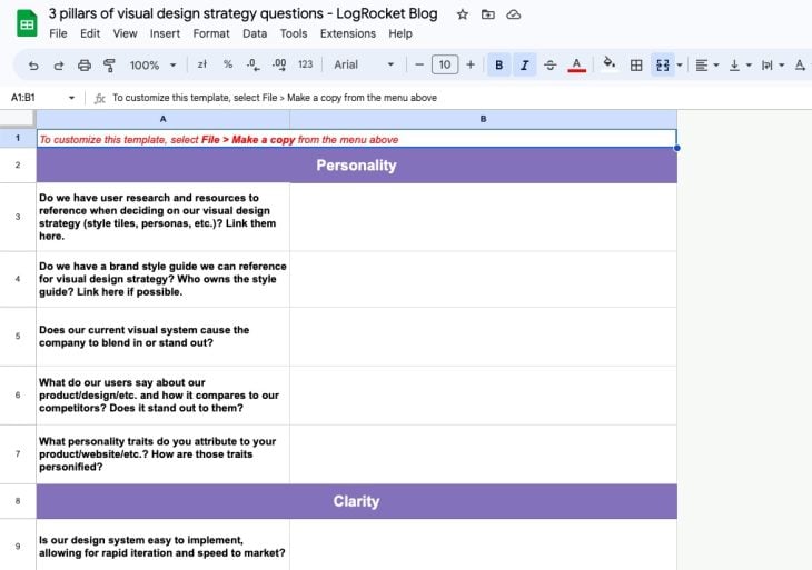
We’ve put together a list of questions centered on the three pillars of visual design strategy to help you and your team determine steps to improve your designs. You can work through these questions to see where your org stands and consider each pillar as you make standout designs.
Download the template of questions here.
Visual design strategy is only part of your larger UX strategy, which is only part of your company strategy. To achieve desired results, all parts should be aligned on expected outcomes. The three pillars of Personality, Clarity, and Unity provide the foundational framework for defining a visual identity unique to you and distinct in the marketplace. I wish you success in your journey.
LogRocket's Galileo AI watches sessions and understands user feedback for you, automating the most time-intensive parts of your job and giving you more time to focus on great design.
See how design choices, interactions, and issues affect your users — get a demo of LogRocket today.

Zero UI works well for screenless, voice-first experiences, but most digital products still require visual interaction. Here’s why multimodal UX offers a more scalable foundation for the future of design.

Multimodal UX goes beyond designing for screens. Learn how context-aware systems, progressive modality, failover modes, and accessibility-first design create better digital product experiences.

Learn how context-aware mode prioritization and seamless transitions improve multimodal UX and reduce mode confusion.

Research is becoming more democratized, product cycles are accelerating, and AI is transforming synthesis and ResearchOps. Here are the three trends shaping UX research in 2026.