Apple has introduced a significant update to the look and feel of its apps and systems — a brand new, adaptive “material” for controls and navigational elements called Liquid Glass. Inspired by the optical properties of glass and the fluidity of liquid, this lightweight, dynamic material adds a flexible, responsive layer across Apple’s ecosystem of products.
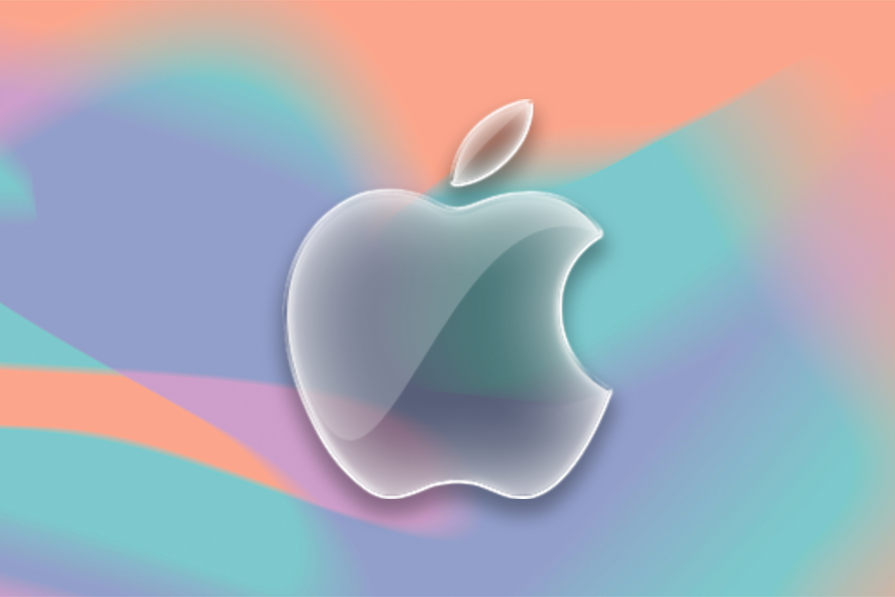
This is not just about adding transparency and glass shine effects to Apple’s in-app interfaces across its iOS 26, iPadOS 26, macOS Tahoe 26, watchOS 26, and tvOS 26 operating systems. Liquid Glass is a major UI rethink that will shape many coming generations of Apple products and could have a far-reaching impact on product UIs in general.
It’s important for UI/UX designers to consider how Liquid Glass might matter to their work in practice. Likewise, it’s a good time to start thinking about best practices for adopting elements of Liquid Glass thoughtfully in your own designs. So, let’s take a closer look at this new design language, exploring best practices, how to adapt Figma concepts for quick iteration, and how developers are experimenting with re-creating the Liquid Glass effect via CSS.
It’s important to note here that, as of right now, the Liquid Glass effect can’t be perfectly recreated outside of Apple’s dev tools using Figma or CSS. The methods we’ll discuss are approximations, workarounds, and hacks to apply a Liquid Glass-like look and feel to certain UI elements.
Towards the end of this article, we’ll consider some tips to apply elements of Liquid Glass thoughtfully and look at errors to avoid. Finally, we’ll conclude with a discussion of how these changes will impact user experience design in the near future.
Liquid Glass has been introduced as a powerful opportunity to adopt holistic design. The aim is to facilitate designers to scale principles across every surface and interaction within the Apple product ecosystem.
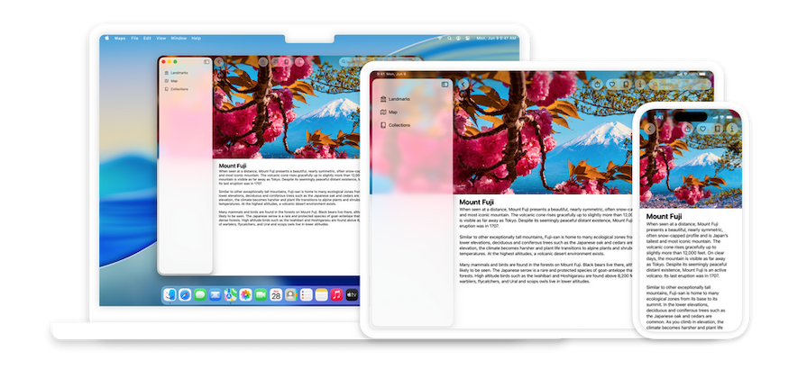
To take advantage of this material, developers will need to be familiar with how to design using standard components from SwiftUI, UIKit, Mac Catalyst and AppKit. Moving towards a shared design foundation will require developers to use component libraries and other new software capabilities like iPad Window Resizing.
The objective is that as the Liquid Glass system evolves alongside app development, flow can be easily updated and maintained across devices, screen sizes, and input modes.
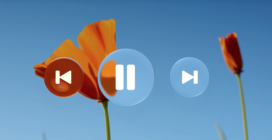
Features like light play, depth effects, adaptive changes, and tinted highlights act as layers inside a sophisticated system. These features work together to create a material that is greater than the sum of its parts.
A key aspect of the layer-based system is how scroll edge effects work in concert with Liquid Glass to maintain separation between the UI and content layers. Just like Liquid Glass, scroll edge effects are inherently adaptive. This style provides an extra degree of visual separation between floating elements in the accessory view and the scrolling content below.
By emphasizing a system-based design, Apple is encouraging developers to restrict custom backgrounds in controls and navigation elements. Any custom backgrounds and appearances used in these elements might overlay or interfere with Liquid Glass or the scroll edge effects.
Prefer to remove custom effects and let the system determine the background appearance.
Another reason to limit custom elements is accessibility. Liquid Glass is intended to be adaptable to individual needs. Users, based on their preferences, can turn on accessibility settings that reduce transparency or motion in the interface. This can remove or modify certain effects.
If you use standard components from system frameworks, this experience adapts automatically. If you use custom elements and animations, provide a good fallback experience when accessibility settings are on.
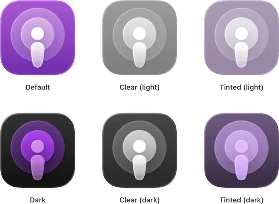
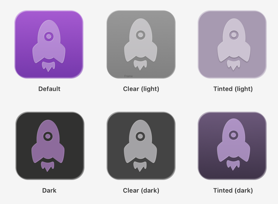
In the Liquid Glass system, icons will now contain layers, which dynamically respond to lighting and other visual effects the system provides. Apple’s platforms will now offer light and dark appearance variants in three modes:
Below is an approach by which we can use Figma to iterate design prototypes quickly by approximating the principles of the Liquid Glass system.
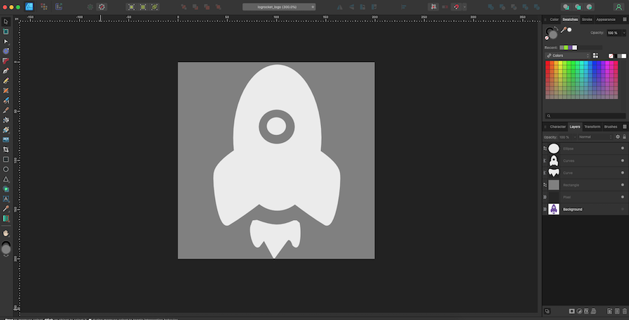
To start, I draw a vector-based SVG outline in Affinity Designer (this can be done in Figma, too). Keeping in mind the principles and best practices of glassmorphism, I’ve used more rounded shapes for the logo.
Unlike raster images, vector graphics (such as SVG or PDF) scale gracefully and appear crisp at any size. Apple recommends that artwork and text be converted to outline in your design. For mesh gradients and raster artwork, you should use the lossless PNG image format:
According to Apple’s developer notes, subtle top-to-bottom, light-to-dark gradients tend to respond well to system lighting effects.
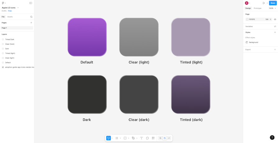
I’ve created backgrounds for my icons using the rectangle tool and rounded the corners. For color, I used the eye dropper tool and added a gradient effect for the default and tinted backgrounds. Finally, I added inner shadows using the effects panel.
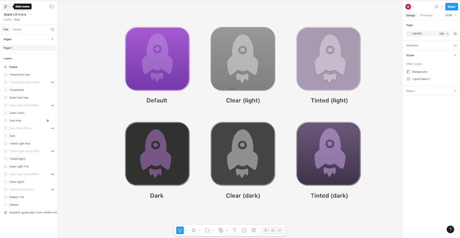
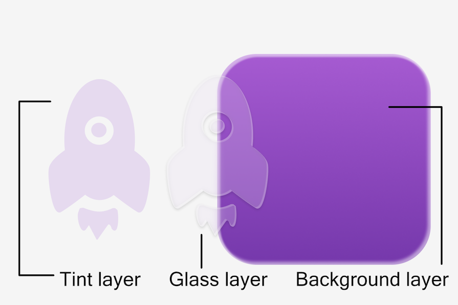
To take full advantage of Liquid Glass, you should break logos down into multiple layers that contain translucent pieces. This will bring greater dynamism to the design. To do this in Figma, I can select a tint and adjust the opacity from the Appearance and Fill layers:
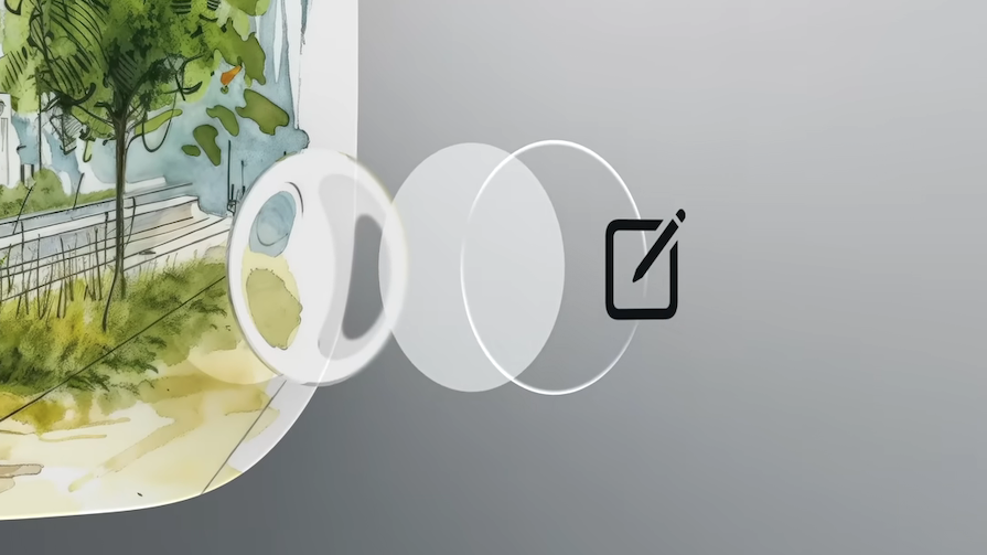
Lensing is the intuitive human understanding of how the warping and bending of light in a transparent object communicates to us presence, motion and form. It dynamically bends, shapes, and concentrates light in real time:

Liquid Glass uses lensing to provide separation and communicate layering while letting content shine through underneath it.
To mimic this effect in Figma, we can use the Effects panel to create inner shadows and add textures. Moreover, we can save a combination of effects as a style to re-apply at the click of a button. I created a custom style that adds shadows and texture to my design to approximate lensing:
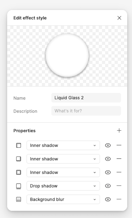
Adding another layer underneath my previously tinted layer, I duplicate my vector drawing, add shadows (using darks and grays) and highlights (selecting the White color). You can also use plugins to recreate this effect:
Here’s the result in the style of Apple’s six variants:
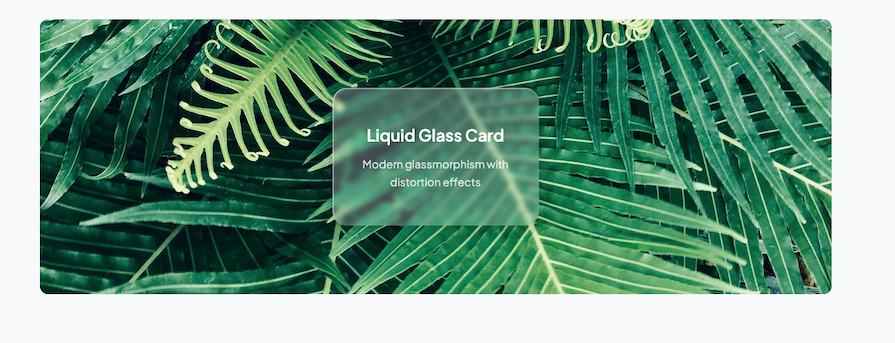
You don’t need to create your own components from scratch. There are now several community resources and repositories, like UI kits or effects layers, that you can use to kickstart your own projects.
The layer breakdown we experimented with in Figma can be recreated via CSS, too:
For example, you can apply the following functions to a shape to imbue it with glass-like attributes:
rgba() to control the tint and transparency of the layersbackdrop-filter: blur() provides a frosted glass blur effectinset box-shadow to add inner glow and shadow depthsBorder: rgba() creates subtle glass-like edgesWhile you can create slick glassmorphism effects through CSS, it’s important to remember that without incorporating JavaScript libraries, it’s difficult to duplicate Apple’s signature lensing style animations through just HTML and CSS.
What makes Liquid Glass visually appealing and distinguished are the delightful animation effects — where glassmorphic elements distort light as it moves over underlying content.
If you’re aiming for that sleek, frosted-glass aesthetic with smooth animations in React, one standout library is Liquid Glass UI. Inspired by Apple’s visionOS design, the library offers:
Another good option is liquid-glass-react on GitHub. It gives you more control with props like:
displacementScale for distortion intensityblurAmount and saturation for the frosted lookelasticity to mimic that “liquid” bounce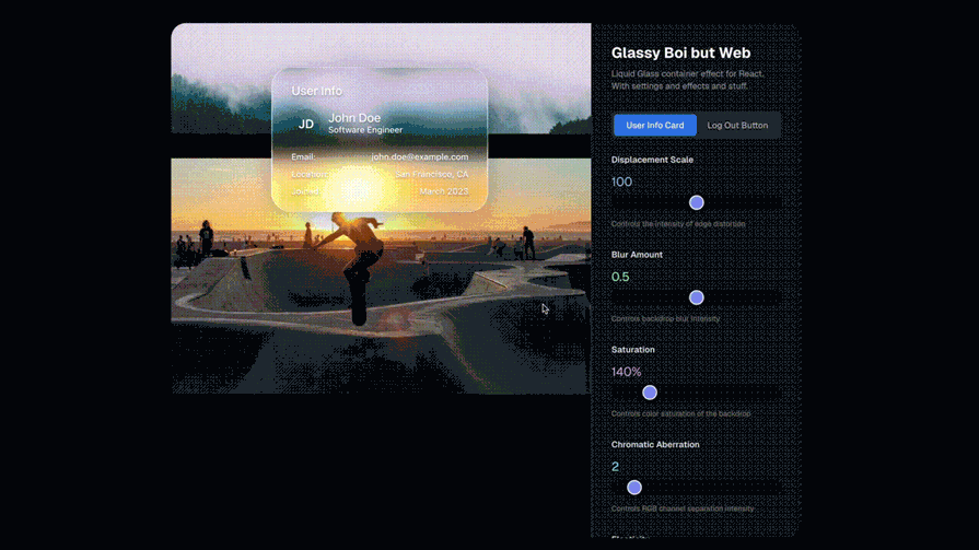
If you want something lightweight and customizable, @liquidglass/react on npm is a solid pick. It uses SVG displacement mapping and backdrop filters to create dynamic glass effects with props for brightness, contrast, and more.
Early adopters of Liquid Glass principles could gain significant advantages. Given the influence of Apple, apps and other digital product designs could start to look outdated as Liquid Glass becomes a familiar design style. Let’s look at some tips to manage this transition.
Start by aligning brand guidelines with the new visual language Apple is promoting. Audit your current experience against Liquid Glass principles.
Then, if relevant, prioritize an iOS development roadmap to incorporate translucent design elements and retrain UX teams on translucent design best practices. Test simplified navigation patterns. Redesign existing apps to align with new visual standards and test extensively across the expanded range of Apple devices.
Adopting Liquid Glass is an opportunity to reduce development complexity for brands maintaining apps across Apple’s ecosystem. The objective should be to create experience consistency across all Apple platforms.
Instead of an update headache, think about approaching this new developmental cycle as an invitation to create designs that sync seamlessly with different interfaces. This could actually make future updates less complex going forward.
Apple’s new translucent design elements and adaptive UI necessitate cleaner visual hierarchies. For example, for ecommerce apps, this could mean product images take center stage with less visual clutter from navigation elements. You can invite user interaction naturally with:
If combined well, these features can create more immersive experiences. This means tightening up design details, but also offers an opportunity to create a more engaging journey for users.
Going forward, standard components like bars, sheets, popovers, and controls will automatically adopt Liquid Glass. System frameworks will dynamically adapt these components in response to factors like element overlap and focus state.
For example, large controls will now use capsule shapes, alongside with a new “X-Large size” which takes advantage of Liquid Glass to provide emphasis in more spacious areas.
It’s important that your own visual design language and interface elements harmonize
with these Liquid Glass features.
When placing elements on top of Liquid Glass, avoid applying the material to both layers. Instead, use fills, transparency, and vibrancy for the top elements to make them feel like a thin overlay that is part of the material.
Liquid Glass has two main variants: Regular and Clear. They should never be mixed, as they each have their own characteristics and specific use cases.
Regular is the most versatile and the more commonly used. This variant gives you all the visual and adaptive effects we’ve discussed, and provides legibility regardless of context.
Clear should only be used when the following three conditions are met:
If you apply Liquid Glass effects to a custom control, do so sparingly. Liquid Glass seeks to bring attention to the underlying content, and overusing this material in multiple custom controls can provide a subpar user experience by distracting from that content. Limit these effects to the most important functional elements in your app.
When Apple rolls out a new design, it often sparks a trend. The question isn’t whether Liquid Glass will influence design standards and practices—it’s whether your brand will be leading that transformation or playing catch-up.
The introduction of this material by Apple has triggered discussions around readability, legibility, and the efficacy of established WCAG guidelines that facilitate accessibility. Liquid Glass, if done incorrectly, can lead to legibility getting noticeably worse. This is why it is important to understand the structure of the new design language and the appropriate context for application.
While Liquid Glass is a proprietary technology, intended to differentiate the Apple experience from others, it will for certain influence design across the board. This is why designers must brush up on concepts like glassmorphism and lensing-based animation. One can anticipate a market demand for design based on these concepts.
Developers who embrace these design principles early won’t just be following Apple’s lead; they will be positioning themselves at the forefront of a design evolution that prioritizes content, simplifies interactions, and creates seamless multi-platform experiences–and, above all, provides delightful user experience.

LogRocket's Galileo AI watches sessions and understands user feedback for you, automating the most time-intensive parts of your job and giving you more time to focus on great design.
See how design choices, interactions, and issues affect your users — get a demo of LogRocket today.
Multimodal UX goes beyond designing for screens. Learn how context-aware systems, progressive modality, failover modes, and accessibility-first design create better digital product experiences.
Learn how context-aware mode prioritization and seamless transitions improve multimodal UX and reduce mode confusion.
Research is becoming more democratized, product cycles are accelerating, and AI is transforming synthesis and ResearchOps. Here are the three trends shaping UX research in 2026.
Voice support is not the same as multimodal UX. Here’s how to design systems with true mode continuity and context-aware interactions.

 Learn more →
