Every day, people around the world interact with graphics that are made to convey data to us. Reading road signs, infographics, and admin dashboards are all common examples that require us to think and understand the message being passed through these visuals.
For the message to pass across smoothly, a reader has to be able to comprehend your visualizations. This involves being able to see it, understand its context, and draw conclusions from it. This skill is known as visual literacy — the ability to interpret and comprehend visual images as well as create them.
Visual literacy differs from person to person, and we already know it doesn’t necessarily get better as we age. As a designer attempting to create effective visualizations, there are some questions you can ponder before getting to work, such as:
Considering questions like these helps you gain a holistic view of your problem, allowing you to pick the right approach to visualize your dataset. Throughout this post, we’ll go over some steps and best practices to consider when creating effective data visualizations. We’ll narrow in to modern user interfaces like charts and graphs, and look at popular ways data is visualized in modern user interfaces.
Before you start attempting to visualize any dataset, take some time to understand the data you’re working with. Knowing your data inside and out will help you choose the best way to show it visually. Let’s go over some questions to help you get started.
First, it depends on the type of data you’re working with — qualitative or quantitative. Data made up of numbers, such as ages or amounts, is quantitative. If it’s made up of words or descriptions that can’t easily be translated to numbers, it’s qualitative.
Your dataset could be made up of both, but whatever the case, you have to record this, as it will help you structure your visualization.
Understand the main point you want to convey through your visualization. Whether it’s showing a trend, comparing different aspects, or highlighting specific details, clarity on your message is essential for effective visualization.
Identify all the different pieces of information (variables) in your dataset that are relevant to your message. Decide which ones are crucial for your visualization and focus on representing them. This is where a deep knowledge of what your audience wants can give you a great starting point.
Fundamental graphic design principles like whitespace, alignment, typography, and visual hierarchy will enhance the clarity and effectiveness of your visualizations. Whitespace creates breathing room, alignment gives your visualizations balance, and visual hierarchy helps direct the reader’s attention as you intend.
Recognize any shortcomings or biases in your dataset that might affect your analysis or conclusions. Being aware of these limitations helps you interpret your findings accurately and communicate them transparently.
Different ways of asking questions change how we analyze data and understand the results. It’s essential that your data and charts support any conclusions you’re making.
Also, it’s important to be careful with numbers and not abuse them. For example, it’s better not to use percentages if you have a small dataset — less than 10 data points. This can give readers a wrong idea of what you’re saying.
Having a deep understanding of your niche and target audience, as well as being able to think for them and present the information they way they need it at the right time, is a defining characteristic of great user experience.
Let’s take, for example, the image below of a terminal at Heathrow Airport:

The “Departures” display board in the top right corner shows information about the volume of people trying to get through security in each terminal section. The human illustrations don’t convey the actual number of people going through security at the time, however, the ratio between them informs readers that the North section is busier than the South.
Notice how this visualization is directed towards a particular audience (airport travelers). This strategy is important and should be applied to every visualization you create. Before designing, stop and think: what information is most important to my audience when they visit my platform?
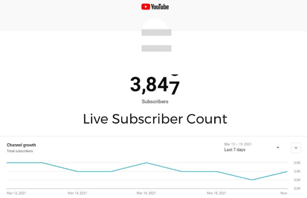
YouTube Studio does this by visually emphasizing a channel’s subscriber count on their dashboard, as well as how it’s performed over time. This is also common in finance apps to display how a certain portfolio or cash balance is doing:
Different types of applications have their unique needs. For instance, your Uber driver needs an interactive map and ETA updates for the trip. Football coaches analyze opponent player heat maps to devise strategies. Finance professionals also depend on visual indicators like moving averages or a Fibonacci scale to inform their market trades.
Once you’ve determined the nature of your data, clarified the message you want to convey through your visuals, and identified your target audience, you’re prepared to select a format that presents your data effectively. You want to ensure clarity and accessibility — bonus points if the format allows for interactivity, which enhances engagement and understanding.
It’s a unanimous saying that data visualization graphics can be categorized based on the following functions:
Let’s talk about each examples of data visualizations to see how they help achieve one or more of the functions above.
Bar charts are very common for data visualization. A bar chart consists of rectangular bars drawn across the cartesian plane. The length or height of each bar is proportional to the value it represents, making it visually easy to compare the quantities of different categories or groups from the dataset.
Here is an example of how Stack Overflow used a bar chart to represent the most commonly used programming language from a survey with >87,000 responses:
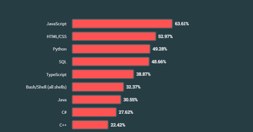
Glancing at the chart, you’ll immediately notice the category with the highest votes (JavaScript). This is the major advantage bar charts have over other visualization techniques that describe relationships between datasets.
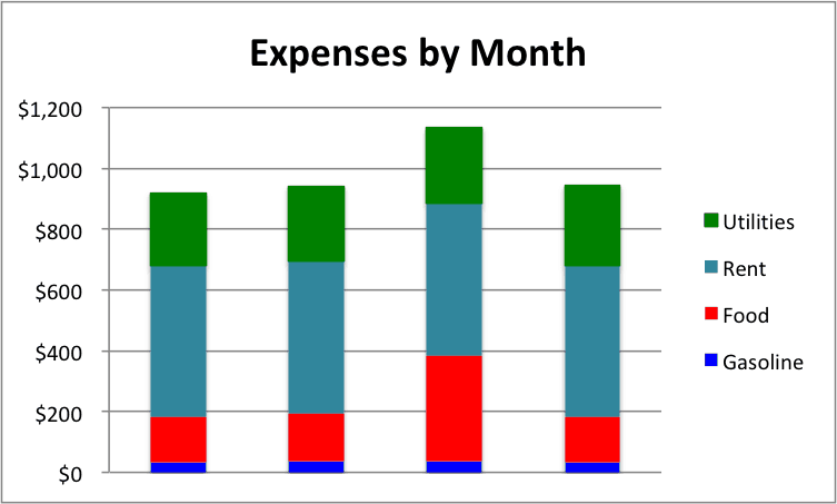
Bar charts can also be extended into an advanced format — the stacked bar chart — which helps you add more information about the composition of each category:
Pie charts, on the other hand, are used to show the relationship of parts of a dataset to a whole. This technique works well for situations where you’re attempting to visualize ratios and percentages. They illustrate the composition of a whole dataset by dividing it into slices, with each slice representing a category.
However, be cautious of the size of the dataset you’re visualizing. Pie charts are optimal for representing a small dataset. Too many categories in a pie chart make it look bloated and hard to understand. Designers often resort to using legends to compensate, but this only hurts the user experience. Viewers now have to focus on two different areas to draw meaning from your visuals.
Here’s an example of the earlier Stack Overflow dataset presented in a pie chart:
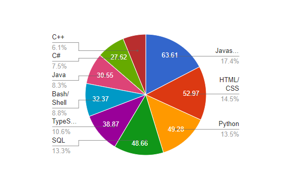
It takes slightly more effort to analyze the pie chart for this use case compared to the line chart, but it’s still a quick way to see the breakdown of the data.
A line chart is the most powerful and most used data visualization strategy in recent times, particularly because of its ability to accurately represent time-series datasets.
A line chart consists of a series of data points connected through line segments on a cartesian plane. Typically, the horizontal axis represents time or a continuous numerical variable, while the vertical axis represents the value being measured. Each data point on the chart represents the value of the variable at a specific point in time or along the numerical scale.
Line charts let you reveal both short-term fluctuations and long-term trends. For instance, in stock and cryptocurrency markets, line charts vividly display the volatility and trajectory of prices. They highlight significant turning points, such as sudden spikes or prolonged dips, enabling analysts to spot trends and make informed decisions:
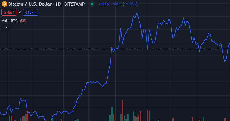
By plotting data points in chronological order and connecting them with lines, line charts provide a clear and intuitive representation of how values change over time (or a continuous variable).
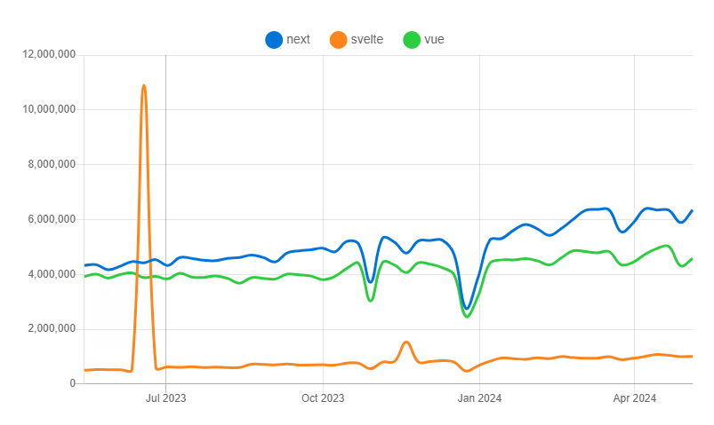
Line charts get more interesting when you convert them to work as a comparison tool using the multi-line chart technique. Take this data visualization from npmtrends.com for example:
Scatter plots are a widely used tool in machine learning and data visualization. They help visualize the relationship between two variables, allowing you to identify patterns, trends, outliers, and correlations.
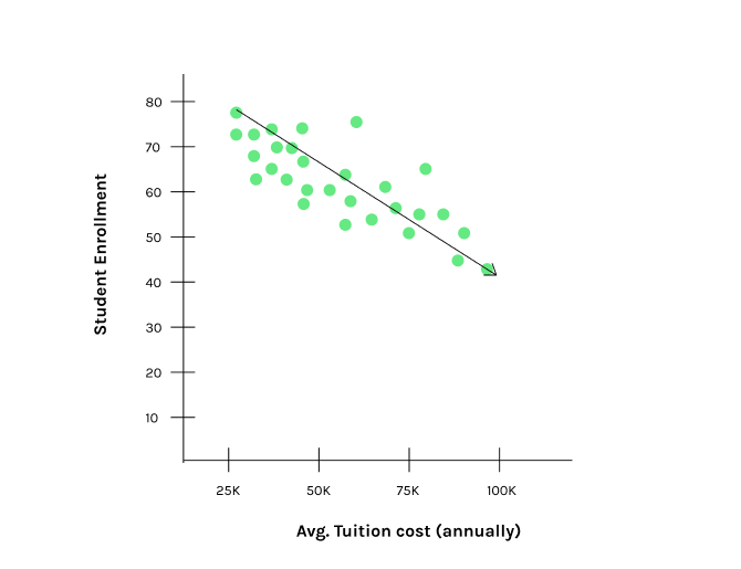
A scatter plot displays individual data points as dots on a cartesian plane. Each dot represents the values of two variables, one on the x-axis and the other on the y-axis. Scatter plots are especially useful for visualizing correlations between continuous variables.
For example, the fictional dataset below demonstrates a scatter plot with a linear regression line, showing how student enrollment decreases as the average tuition cost increases:
In machine learning, scatter plots are key for exploratory data analysis and model development. They help visualize relationships between input features and target variables, aiding in feature selection and model evaluation. Additionally, scatter plots are crucial for unsupervised learning algorithms like K-means clustering. K-means aims to partition data into “K” clusters, assigning data points to the nearest cluster mean. Scatter plots visualize these clusters, assess results, and reveal data structure.
Scatter plots can also be enhanced to show more information. Increasing the size of the dots creates a bubble chart, where the size of each bubble represents a third variable. This addition can visually enhance the frequency of each label in the dataset for easier consumption by the reader:
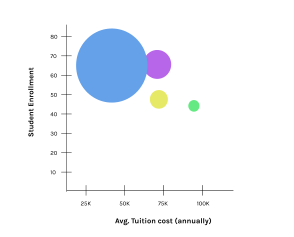
Now, it becomes easier to spot that a large number of students enrolled into institutions with tuition fees between $25,000 – $55,000.
Tree maps is a complex data visualization strategy, but is still an effective means to represent composition in a dataset, making it worthy of being on the list.
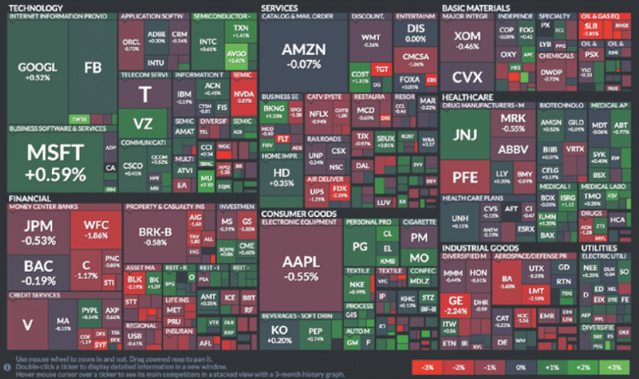
Tree maps use nested rectangles to represent hierarchical data, where the size and color of each rectangle indicate different quantitative values. This makes it easy to see the proportion and structure within a dataset given the right use case.
Below is an image of what was once known as a market map, which uses the tree map technique to illustrate price changes in the S&P 500:
Word clouds display text data where the size of each word reflects its frequency or importance, offering a quick visual impression of the most significant terms. A creative way I’ve seen this used is at conferences, where the audience votes on an active poll for any question, such as, “How would you describe the past week?” The frequency of each selection is made visible through a word cloud:
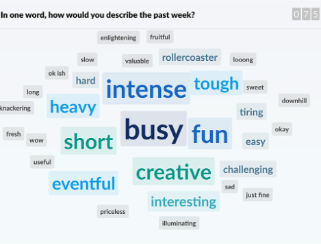
One of the key advantages of this technique, as well as of tree maps, is its ability to efficiently convey a large amount of information compactly, earning them a spot on this list.
In most cases, static charts and graphs are enough to convey your message. However, making your visualizations interactive can take the user experience to a higher level.
Interactive data visualizations allow users to engage with your dataset through responsive graphical representations. This means users can alter the visuals with actions like zooming in, clicking, filtering, and exploring different aspects of the data. This helps gain deeper insights and uncover patterns — something static charts or graphs are unable to fully convey.
A popular example of this is how weather broadcasters use an interactive forecast display on the news:
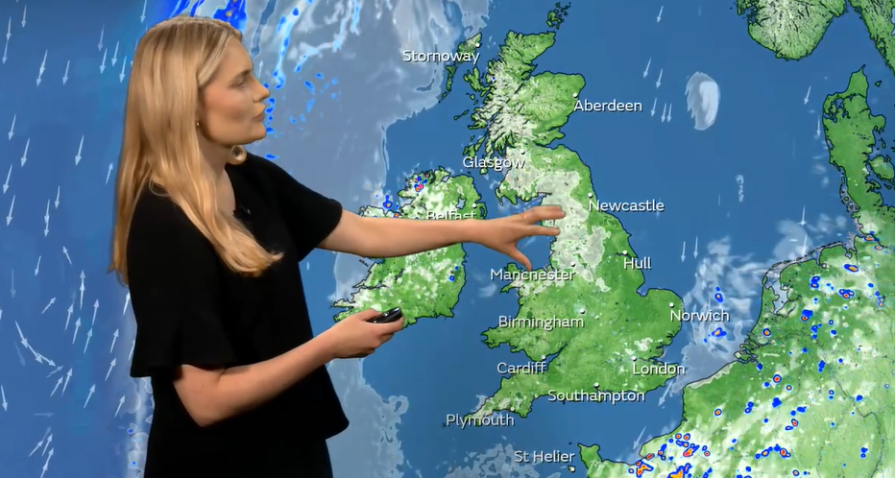
The broadcaster can zoom in on different parts of the world map to show detailed weather information. By doing this, they might notice patterns, like how certain weather conditions change throughout the day. Panning across the map allows for easy weather comparison between regions. This tool also gives insight into long-term forecasts and how sudden changes in atmospheric pressure may affect upcoming weather events.
Colors are also strategically used throughout the display to convey information quickly and effectively to viewers. For instance, blue is used to represent precipitation, with lighter shades indicating light rain and darker shades indicating heavy rain. Red is used to signify severe weather alerts, such as tornado or hurricane warnings, ensuring that these critical updates stand out immediately.
Data visualization is a vital tool for transforming complex data sets into accessible and comprehensible visual formats. The process of going from raw data to polished visualization involves understanding the nature and limitations of your data, identifying your audience’s needs, and choosing the most effective visualization methods.
Now, as we have more data in our world than ever, enhancing visual literacy becomes more critical. Designers must constantly refine their techniques to keep pace with evolving user expectations and technological advancements. That’s why it’s important to create visualizations that not only convey information clearly, but also engage and inform audiences in meaningful ways.
At the end of the day, the power of data visualization lies in its ability to make data understandable and actionable.
LogRocket's Galileo AI watches sessions and understands user feedback for you, automating the most time-intensive parts of your job and giving you more time to focus on great design.
See how design choices, interactions, and issues affect your users — get a demo of LogRocket today.
A three-week mobile banking project taught me that the “proper” UX process is not always realistic. Sometimes, the better approach is to work with what you know, identify what you still need to learn, and make the strongest decision possible under real constraints.
A/B testing compares two versions of a design to see which performs better with real users. Here’s how UX teams can use it to test hypotheses, measure outcomes, and make smarter product decisions.
This case study shows how one ad experience redesign increased total ad exposure while lowering perceived friction, proving that timing and context can matter more than raw interruption.

As products evolve into ecosystems, navigation becomes a system-level challenge. This article explores how to align structure, context, and user journeys to create seamless movement across tools without confusion.