
Optimization fatigue is real. Here’s why designing only for metrics drains creativity, and how to bring the human back into UX.

Let’s explore why and when to use drag and drop, discussing real-world examples, platform-specific considerations, and accessibility tips.

We’re told to reduce friction, but sometimes friction builds value. This blog explores how scarcity, when designed well, sharpens focus and strengthens user trust.

Discover how to craft UX-friendly hero sections with examples, design tips, and strategies that drive engagement and conversion.
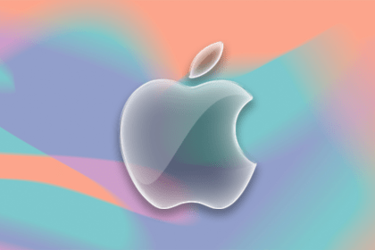
While Apple’s Liquid Glass can’t yet be perfectly recreated with CSS or Figma, we can still think about how to adopt the effect thoughtfully in our designs.

Figma Make is here to automate your design-to-code workflow. I tested it. Let’s talk about the good, the bad, and the straight-up weird.
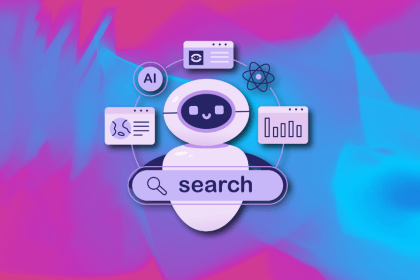
After designing AI search systems, I’ve seen what builds trust — and what kills it. Here’s my take on what really works.
I used to think ‘clean’ design meant hiding things. Turns out, less isn’t always better. This blog walks through lessons from my own overdesign moments.
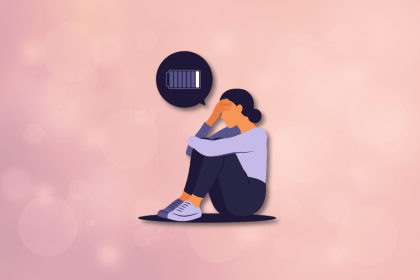
This blog outlines how poor feedback, unclear roles, and low UX maturity quietly burn out even great designers — and what to do instead.
Design cancel buttons that feel safe, not frustrating. Learn how to build clear, accessible flows that protect users and their data.

Commoditized UX design is everywhere — and it’s killing strategy. This blog shows how to push back and reclaim design as a problem-solving tool, not a factory line.
Apple’s Liquid Glass UI is beautiful, controversial, and possibly trend-defining. Here’s what UX designers need to know — and do — right now.