
Styling is an essential part of building web and mobile applications. For an application to look presentable to your users, it needs to be styled. CSS is what we most commonly use to beautify our applications.

But as much as we love CSS, there are annoying issues to deal with, such as class name duplication, misspelled and unknown class names, uncertainty about whether class names will fit, and many more. In projects where you have a large codebase, using plain CSS can become time-intensive and tiring. That’s where styled-components comes in.
In this tutorial, we’ll show you how to build and style a TypeScript app using styled-components.
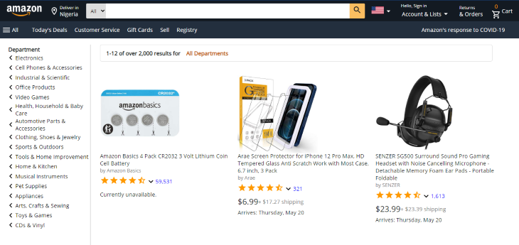
To demonstrate with a practical example, we’ll use styled-components and TypeScript to create an Amazon-like e-commerce page. The finished product will look something like this:

You can access the images required for this demo in my GitHub repository. By the end of this tutorial, you should be able to style your own TypeScript projects using styled-components.
The Replay is a weekly newsletter for dev and engineering leaders.
Delivered once a week, it's your curated guide to the most important conversations around frontend dev, emerging AI tools, and the state of modern software.
Styled-components is a CSS-in-JS library that enables you to write regular CSS and attach it to JavaScript components. With styled-components, you can use the CSS you’re already familiar with instead of having to learn a new styling structure.
styled-components lets you style your work without having to worry about whether class names clash or whether they’re appropriate for a given use case. It also helps with debugging because once you figure out what component has an issue, you know where to find its styles.
We’ll use create-react-app to generate a template for our project. Since it’s a TypeScript project, we’ll add --template typescript to our command.
Open your terminal and type the following, then press enter:
npx create-react-app --template typescript
After creating your project, go into the project directory by typing the following:
cd amazon-clone
Type code . in your terminal to open the project in your code editor. Alternatively, you can open it from your file manager by right-clicking the folder and selecting Open with code.
We need to install some dependencies because styled-components doesn’t come with create-react-app.
Run the following command:
yarn add styled-components
When it’s done installing, run the following:
yarn add -D @types/styled-components
This installs the styled-components types for TypeScript as a dev dependency.
We’re also going to use Material Icons, so let’s install the material-ui package. Type the following and press enter:
yarn add @material-ui/icons @material-ui/core
There’s a styled-components extension for VS Code that makes it look like we’re typing actual CSS even though it’s a TypeScript file. It’s called vs-code-styled-components and I suggest you install it before proceeding if you haven’t already.
Your folder should now look this:
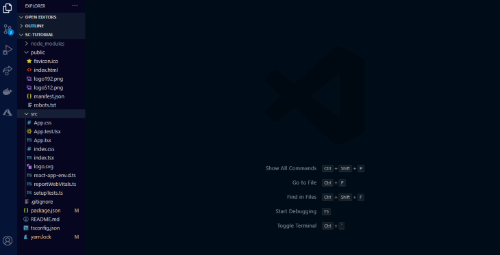
Now it’s time to clean up our project. We do not need all the files generated by Create React App, so let’s delete the superfluous files:
index.html file, change the title to whatever you want and delete all the information from the meta description to where the title tag startssrc folder, delete all files except the App.tsx and index.tsxindex.tsx, delete the lines importing index.css and reportWebVitals. Also remove all lines related to webVitalsApp.tsx, except where we import React and export the appWith that out of the way, let’s start building.
First, let’s plan the layout of our page:
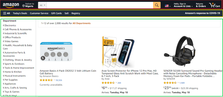
Our page is made up of three main parts: the navbar, the menu bar, and the body. We will start from top to bottom.
In App.tsx, create a React functional component. It should look like this:
 import React from 'react';

 const App:React.FC = ()=> (
   <> </>
 )

 export default App;
In your src folder, create a styles folder. You can name it whatever you like; I’ll name mine styles.
In the styles folder, create a file and name it global.ts. This file will contain our global styles. Global styles are styles that are used by all elements in a page.
In global.ts, we import createGlobalStyle and create the global styles. Your global.ts file should look like this:
 import {createGlobalStyle} from "styled-components"

 export default createGlobalStyle`
    *{
        margin: 0;
        padding: 0;
        outline:0;
        box-sizing:border-box;
        font-family: 'Open Sans', sans-serif;
    }
    #root{
        margin:0 auto;
    }
 `
These styles ensure that there is no margin or padding on the page, except in places where they are explicitly stated.
In the src folder, we’ll create a folder for the components. In the components folder, we’ll create three more folders, one for each section of the page. We’ll create one more folder for our assets. All the images should be stored in this folder.
In the navbar folder, create two files: index.tsx and styles.tsx. In index.tsx, import the following items:
import React from 'react'
import {
    Container,
    Logo,
    Flag,
    Text,
    Wrapper,
    Searchbox,
    Select,
    SearchIconWrapper
} from "./styles"
import { ShoppingCartOutlined, SearchOutlined, ArrowDropDown, RoomOutlined } from '@material-ui/icons';
import logo from "../assets/logo.png"
import flag from "../assets/flag.png"
Importing React is important because we need it to create our function.
On the second line, we imported a number of components from the styles file (we’ll see what they do soon). Then, we imported our icons from Material Icons. Finally, we imported our images from the assets folder.
In the index folder, let’s create a functional component and put our container component in it:
import React from 'react';

const App:React.FC = ()=> (
  <>
    <Container></Container>
  </>
)

export default App;
This may look strange if you’re not used to using styled-components.
The container component represents the overall wrapper for the other components that we’ll use. It’s used in the same way as a div when styled-components is not used. When we start with the styling, you’ll come to learn that the container component is really a div under the hood.
Let’s see what the style file looks like:
import styled from "styled-components"

export const Container = styled.div`
    display: flex;
    justify-content:space-evenly;
    align-items: center;
    color: white;
    background-color: #131A22;
`
At the top, we imported styled from styled-components. styled gives us the option to use any HTML element, such as div, section, span, inputs, etc. We have access to them all.
For our container component, we used a div. After the element’s name, we added template literals, which serves as the wrapper for the component’s styles. We then wrote our CSS styles inside the template literals.
Notice how it looks like I’m writing plain CSS? That’s because of the extension I mentioned earlier. It helps with the colors and autocompletion.
These components are reusable and they make it easier to associate each component with its style. This is because each component already has its style in its body, so when you need to debug, you immediately know where to check.
Let’s create one more folder: a helper folder. In the helper folder, we’ll create two files: PageText.tsx and ItemWrapper.tsx.
The page has a lot of text on it with different sizes and colours. To avoid repetition, we need to create TypeScript components and pass some CSS properties as props. This will enable us to reuse the components and modify them as we want without the need to write new lines of code in our styles file.
The PageText component will be for all the text on the page. The ItemWrapper component will be used as a container to wrap various elements on the page.
In PageText.tsx, insert the following:
import React from 'react'

interface Props{
    className?: string;
    fontSize?: any;
    color?: string;
}
export const PageText:React.FC <Props> = ({className, children}) => {
    return (
       <span className={className}>{children}</span>
    )
}
Notice the prop being passed in the component? These are the props that will be accepted when using the component. If you don’t include the className prop, whatever style you try to declare in the component body will not take effect. When working with it, you can remove the className props to see what error it throws. The children props represent any item that we will write or use inside the component.
In ItemWrapper.tsx, insert the following lines of code:
import React from 'react'

interface Props{
    className?: string;
    display?: string;
    flexDirection?: string;
    alignItems?: string;
    maxWidth?: string;
    margin?: string;
}
export const PageItemWrapper:React.FC <Props> = ({className, children}) => {
    return (
       <div className={className}>{children}</div>
    )
}
Now that we’re finished with the helpers, let’s create our navbar. The navbar of the example page starts with the Amazon logo. We already imported it in our index file, so let’s create a component for it and style it as well:
import{ PageText as NavText} from "../helpers/PageText"
import{ PageItemWrapper as NavItemWrapper} from "../helpers/ItemWrapper"

export const Logo = styled.img`
    width: 6em;
    border:1px solid #131A22;
    padding: .2em .1em;
    cursor:pointer;

    &:hover{
        border:1px solid #ffffff;
        border-radius: .2em;
    }
`
We created styles for the width, border, padding, and cursor behavior. We also added additional styles for when the logo is hovered on. Unlike in plain CSS, where we’d use something like a:hover, here we use the & symbol to signify that we’re creating styles for when the element is hovered on.
This same process is used when creating styles for ::before, ::after, and other pseudo-elements. One of the best things about styled-components is that you can write all of your styles in one place.
Now that we’re done with the logo, let’s move on to the other parts of the navbar.
In styles.tsx, add the following:
import{ PageText as NavText} from "../helpers/PageText"

export const Text = styled(NavText)`
    color:${(props)=>props.color ? props.color :"#ffffff" };
    font-size: ${(props)=>props.fontSize ? props.fontSize  : ".9em"
};
`
Here, we used styled-components in another way. We imported PageText as NavText from the helper folder. In place of the element’s name, we used NavText.
Note that when using an existing component, we didn’t include a dot. Instead of writing styled.NavText, we wrote styled(NavText). We also created default styles for our component.
The lines of code inside the component mean that if a color or font-size prop is specified when using the component, then color and font-size are equal to the specified one, Otherwise, the text component uses the default values stated therein.
import{ PageItemWrapper as NavItemWrapper} from "../helpers/ItemWrapper"

export const Wrapper = styled(NavItemWrapper)`
    display: flex;
    flex-direction: ${(props)=>props.flexDirection ?  props.flexDirection  : "column"};
    align-items:  ${(props)=>props.alignItems ? props.alignItems  : "flex-start"};
    padding: .1em;
    cursor:pointer;
    border:1px solid #131A22;

    &:hover{
        border:1px solid #ffffff;
        border-radius: .2em;
    }
     @media(max-width:850px){
        display: none;
    }

`
Now let’s use them in our page. In index.tsx, add the following lines of code:
const Navbar:React.FC = () => {
    return (
        <>
            <Container>
                    <Logo src={logo}/>

                    <Wrapper flexDirection="row"
                    alignItems="center">
                        <RoomOutlined/>


                        <Wrapper >
                        <Text fontSize=".7em">Deliver in
                        </Text>
                        <Text >Nigeria</Text>
                        </Wrapper>
                    </Wrapper>

                 {/* the search button */}
                    <Select>
                    <option value="All">All</option>
                    </Select>
                    <Searchbox/>
                    <SearchIconWrapper>
                        <SearchOutlined/>
                    </SearchIconWrapper>

                    {/* flag image */}
                    <Wrapper flexDirection="row"
                    alignItems="flex-start"
                    >
                        <Flag src={flag}/>
                        <ArrowDropDown/>
                    </Wrapper>

                    <Wrapper>
                        <Text fontSize=".7em">Hello, Sign   in</Text>
                        <Wrapper flexDirection="row" alignItems="center">
                            <Text>Account & Lists </Text>
                            <ArrowDropDown/>
                        </Wrapper>
                    </Wrapper>


                    <Wrapper>
                        <Text fontSize=".7em">Returns</Text>
                        <Text >& Orders</Text>
                    </Wrapper>

                    <Wrapper flexDirection="row"
                    alignItems="center">
                        <Wrapper alignItems="center">
                        <Text color="#ff9900">0</Text>
                        <ShoppingCartOutlined/>
                        </Wrapper>

                        <Text>Cart</Text>
                    </Wrapper>


              </Container>
        </>
    )
}

export default Navbar
It’s a lot of code, but don’t get overwhelmed. Let’s go through it together.
We used our Wrapper and NavText components, and you can see how to modify them as needed. We also used the icons that we imported at the beginning of this tutorial. The only new things here are the Select, Searchbox, SearchIconWrapper, and Flag components. Let’s explain what they are and how we created them.
In the page’s navbar, there is a search box and two elements on both sides of it. Let’s create them.
In styles.tsx:
export const Searchbox = styled.input`
    background-color: #ffffff;
    padding: .78em;
    width: 47%;
    border: none;

    @media(max-width:850px){
       border-radius: .2em;
       margin: .3em 0;
    }

`
export const Select = styled.select`
    background-color:#ddd;
    margin-right: -1.2em;
    padding: .72em .5em;
    border-radius: .2em 0em 0em .2em;
    border: none;
    cursor: pointer;

@media(max-width:850px){
        display: none;
    }

`
export const SearchIconWrapper = styled.span`
    background-color:#fabd60;
    color: #131A22;
    margin-left: -1em;
    border-radius: 0em .2em .2em 0em ;
    padding: .32em .5em;
    cursor: pointer;
    transition: all 250ms ease;

    &:hover{
        background-color:#ff9900;
    }

     @media(max-width:850px){
        display: none;
    }

`
export const Flag = styled.img`
    width:2em;
`
We used an input tag for the Searchbox component, a select tag for the Select component, an img tag for the Flag component, and a span for the SearchIconWrapper. We also added a hover effect for the SearchIconWrapper as well as media queries for the new components.
That’s all for the navbar. Now your page should look like this:

Now, let’s build the menu bar.
In the Menubar folder that we previously created, create an index.tsx file and a styles.tsx file.
In index.tsx, create a functional component and add the following line in it:
import React from 'react'
import {Container, Wrapper, Text, LeftText} from "./styles"
import {Menu} from '@material-ui/icons';

const Menubar:React.FC = () => {
    return (
        <></>
    )
}

export default Menubar
We imported some components from styles.tsx and the menu icon from Material Icons. Just like in our Navbar folder, we’ll import the wrapper and text components from the helper folder and use it in our styles.tsx file:
import styled from "styled-components"
import{ PageText as MenuText} from "../helpers/PageText"
import{ PageItemWrapper as MenuItemWrapper} from "../helpers/ItemWrapper"

 export const Container = styled.div`
   display: flex;
   justify-content:space-between;
   color: white;
   padding: .3em;
   background-color: #232f3e;
`

export const Text = styled(MenuText)`
    color:${(props)=>props.color ? props.color :"#ffffff" };
    font-size: ${(props)=>props.fontSize ? props.fontSize  : ".9em"};
    margin-right: 1em;
    border:1px solid #232f3e;
    padding: .5em .1em;
    cursor:pointer;

    &:hover{
        border:1px solid #ffffff;
        border-radius: .2em;
    }
    @media(max-width:850px){
        display: none;
    }

`
export const LeftText = styled(Text)`
    @media(max-width:850px){
        display: block;
    }
`

export const Wrapper = styled(MenuItemWrapper)`
    display: flex;
    flex-direction: row;
    align-items: center;
    margin-right: 1em;
`
We styled our Container, Wrapper, and Text components. We also made the color and font size of the Text component customizable. Let’s use them in our index.tsx file:
const Menubar:React.FC = () => {
    return (
        <Container>


            <Wrapper>
                <Wrapper>
                        <Menu/>
                        <Text>All</Text>
                </Wrapper>

                <Wrapper>
                    <Text>Today's Deals</Text>
                    <Text>Customer Service</Text>
                    <Text>Gift Cards</Text>
                    <Text>Sell</Text>
                    <Text>Registry</Text>
                </Wrapper>
            </Wrapper>

            <Wrapper>
                <LeftText>Amazon's response to COVID-19</LeftText>
            </Wrapper>


        </Container>
    )
}

export default Menubar
Our menu bar should look like this:

Now let’s build our page body.
On the left side of the page, there is a dropdown showing various department names. We also have product details on the page. Let’s create a new file in our PageBody folder to store this information.
In PageInfo.ts:
import battery from "../assets/cell-battery.jpg"
import headset from "../assets/headset.jpg"
import screen from "../assets/screen-protector.jpg"

export  const departmentList = [
    "Electronics",
    "Cell Phones & Accessories",
    "Industrial & Scientific",
   " Office Products",
   " Video Games",
   " Health, Household & Baby Care",
   " Automotive Parts & Accessories",
   " Clothing, Shoes & Jewelry",
    "Sports & Outdoors",
   " Tools & Home Improvement",
    "Home & Kitchen",
    "Musical Instruments",
    "Pet Supplies",
    "Appliances",
    "Arts, Crafts & Sewing",
   " Toys & Games",
   " CDs & Vinyl"
]

export const productDetails=[
    {
        name:"Amazon Basics 4 Pack CR2032 3 Volt Lithium Coin Cell Battery",
        by: "by Amazon Basics",
        starcount: "59,531",
        price: "",
        shipping: "",
        available: "Currently unavailable.",
        src: battery
    },
    {
        name: "Arae Screen Protector for iPhone 12 Pro Max, HD Tempered Glass Anti Scratch Work with Most Case, 6.7 inch, 3 Pack",
        by: "by Arae",
        starcount: "321",
        price: "$6.99",
        shipping: " + $17.27 shipping",
        available: "Arrives: Thursday, May 20",
        src: screen
    },
    {
        name: "SENZER SG500 Surround Sound Pro Gaming Headset with Noise Cancelling Microphone - Detachable Memory Foam Ear Pads - Portable Foldable",
        by: "by SENZER",
        starcount: "1,613",
        price: "$23.99 ",
        shipping: " + $23.39 shipping",
        available: "Arrives: Thursday, May 20",
        src: headset
    }
]
In the PageInfo file, we have departmentList, which is an array of the department names, and productDetails, an array of objects containing product information. At the top, we imported the product images from the assets folder.
Let’s create some new files in the PageBody folder. Create an index.tsx file and a styles.tsx file. In index.tsx, add the following:
import React from 'react'
import {
    Container,
    LeftContainer,
    RightContainer,
    Wrapper,
    Image,
    Text,
    Paragraph,
    ProductContainer,
    ImageContainer,
    SearchResultDiv,
    IconWrapper,
    BoldText
} from "./styles"
import {KeyboardArrowLeft, Star, StarHalf, KeyboardArrowDown} from '@material-ui/icons';
import {departmentList, productDetails} from "./PageInfo"
We imported our components from the styles file and our icons and the page’s information from PageInfo.ts.
Now let’s create our components and style them.
In your styles.tsx file, add the following lines of code:
import styled from "styled-components"
import {PageText} from "./PageText"
import {PageItemWrapper} from "./PageItemWrapper"

export const Container = styled.div`
    display: flex;
    padding: 1em;
`

export const LeftContainer = styled.aside`
    height:80vh;
    width: 18vw;
    border-right: 2px solid #ddd;

    @media(max-width:650px){
        display: none
   }

`

export const RightContainer = styled.section`
    height:80vh;
    width: 82vw;
    display: flex;
    flex-direction: column;
    margin-left: 1.5em;

`
export const Image = styled.img`
    width: 13em;
`
export const Text = styled(PageText)`
    color:${(props)=>props.color ? props.color :"#131A22" };
    font-size:${(props)=>props.fontSize ? props.fontSize :".9em" };
`
export const BoldText = styled(Text)`
    font-weight: bold;
    padding: .4em;
`

export const Paragraph = styled.p`
    font-size:.9em;
    display: flex;
    align-items: center;
    padding-bottom: .1em;
`
export const SearchResultDiv = styled.div`
    border: 1px solid #ddd;
    padding: .6em;
    width: 95%;
    border-radius: 4px;
`
export const ProductContainer = styled.div`
    display: grid;
    grid-template-columns: repeat(auto-fit, 22em);
    margin-top: 2em;

    @media(max-width:915px){
        grid-template-columns: repeat(auto-fit, 15em);
        align-items: center;
        justify-content: center;
    }

`
export const ImageContainer = styled.div`
    height: 14em;
    display: flex;
    align-items: center;
`

export const Wrapper = styled(PageItemWrapper)`
    display: flex;
    margin-right: 1em;
    flex-direction: ${(props)=>props.flexDirection ? props.flexDirection  : "row"};
    align-items:  ${(props)=>props.alignItems ? props.alignItems  : "left"};
    margin:  ${(props)=>props.margin ? props.margin : ""};
`

export const IconWrapper = styled.div`
    color: #ff9900;
`
In the code above, we created a container for our page body, then divided the page into two sections. The left section contains the department list and the right section contains the products and their information.
We then created a component for our product images and also used our imported helper components.
If you take a look at the BoldText component, you’ll notice that it’s an extension of the PageText component with some new styles in it. We use it to create texts that are bolder than the page’s text. With styled-components, you can extend another component. It’s like copying the component with all of its styles and then adding extra styles to it.
The SearchResultDiv component is the long bar above the product images that contains the search result details.
We also created a ProductContainer component that contains our products and their information, then an image container for the product image.
The last component in our styles file is a wrapper for our star icons.
If you’re so inclined, you can take some time to study the styles and understand what each line does if you feel like it.
Now, let’s use the components in our index file:
const Menubar:React.FC = () => {
    return (
        <Container>
            <LeftContainer>
                <BoldText>Department</BoldText >
                {departmentList.map(item =>(
                    <Paragraph> <KeyboardArrowLeft/>{item}</Paragraph>
                ))}
            </LeftContainer>
            <RightContainer>
                <SearchResultDiv>
                    <BoldText>1-12 of over 2,000 results for
                    </BoldText>
                    <BoldText color="#c45500"> All Departments
                    </BoldText>
                </SearchResultDiv>

                <ProductContainer>
                {productDetails.map(item =>(
                    <Wrapper
                    flexDirection="column"
                    >
                        <ImageContainer>
                            <Image src={item.src}/>
                        </ImageContainer>
                        <Text>{item.name}</Text>
                        <Text fontSize=".8em" color="grey" >{item.by}</Text>

                        {/* stars */}
                        <Wrapper
                        margin=".3em 0 0 0"
                        alignItems="center"
                        >
                            <IconWrapper>
                                <Star/>
                                <Star/>
                                <Star/>
                                <Star/>
                                <StarHalf/>
                            </IconWrapper>

                            <KeyboardArrowDown/>
                            <Text color="blue">{item.starcount}</Text>
                        </Wrapper>

                        <Wrapper
                        alignItems="center"
                        margin=".3em 0 .3em 0"
                        >
                            <Text fontSize="1.3em">{item.price }</Text>
                            <Text color="grey">{ item.shipping}</Text>
                        </Wrapper>
                        <Text>{item.available}</Text>

                    </Wrapper>
                ))}
                </ProductContainer>
            </RightContainer>
        </Container>
    )
}

export default Menubar
Above, we used the components that we created to build our page body and customized them to fit wherever they are supposed to be.
We made use of our product details, which were imported from the pageInfo file. In the LeftContainer component, we mapped through the departmentList array. And in the ProductContainer component, we mapped through the productDetails array. Mapping through the array instead of writing the details one after another enables us to write cleaner, less repetitive code.
That’s all for the page’s body. Our page should look like this now:
Congratulations! You now have all the foundational knowledge and skills to style your own TypeScript projects with styled-components. You can check out the finished example page here.
To learn more about styled-components, you can check out the official documentation.
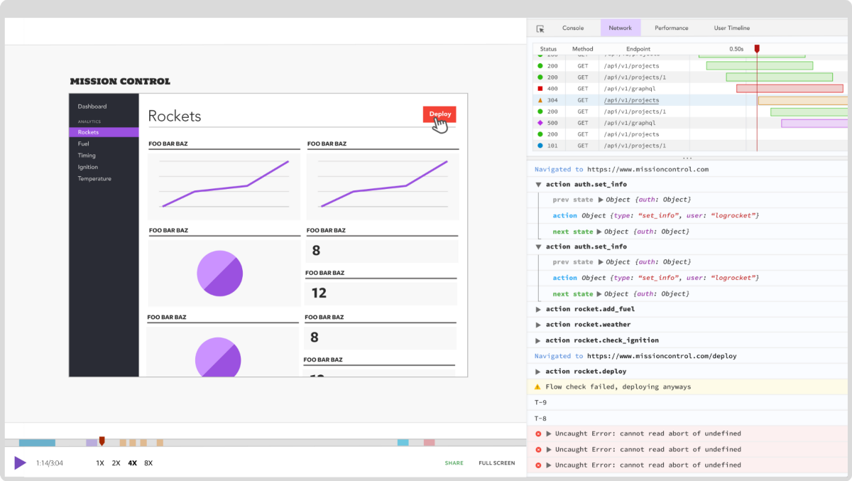
LogRocket lets you replay user sessions, eliminating guesswork by showing exactly what users experienced. It captures console logs, errors, network requests, and pixel-perfect DOM recordings — compatible with all frameworks, and with plugins to log additional context from Redux, Vuex, and @ngrx/store.
With Galileo AI, you can instantly identify and explain user struggles with automated monitoring of your entire product experience.
Modernize how you understand your web and mobile apps — start monitoring for free.

Write agent-friendly API documentation with OpenAPI, clear schemas, workflow guidance, and llms.txt for safer AI automation.

Local AI proxy tutorial for detecting, masking, and rehydrating PII before prompts reach cloud LLMs.

Learn how Graph RAG uses connected knowledge structures to improve retrieval beyond simple text similarity.

Learn how sibling-index() enables clean, JavaScript-free stagger animations using native CSS.
Would you be interested in joining LogRocket's developer community?
Join LogRocket’s Content Advisory Board. You’ll help inform the type of content we create and get access to exclusive meetups, social accreditation, and swag.
Sign up now