Pop-up messages have become very common on websites. You can use these messages to display notifications or relevant information to your users based on the user’s interaction state — for example, to indicate loading pages, getting requests, and so on.

Snackbar is a tool that can help you achieve this feature in your React Native project. Just like toastify-react-native, react-native-toast-message, and other toast libraries, Snackbar helps you display notifications or pop-up messages in your React Native application.
Besides being the name of this toast library, “snackbar” also refers to a specific type of pop-up message that can be used to display information to users. Snackbars animate into the viewport from the bottom of the screen and come with an optional action button for the user.
In this article, we will see how to use the React Native Snackbar package to create a really cool pop-up message or notification. We will see the features that Snackbar provides us and how to add and handle button events with the package.
Jump ahead:
You can use either of the code commands below to install the package in your React Native application:
// Npm
npm i react-native-snackbar

// Yarn
yarn add react-native-snackbar
Once you have installed the package, you should be ready to use Snackbar in your project.
To use the Snackbar package, first import it at the top of your component in your React Native application:
/* App.js */
import Snackbar from "react-native-snackbar"
You may run into the error like the image below or something similar after importing the Snackbar library in your app:
![]()
If you encounter this problem, create a folder called _mocks_ in the root of your application. Within the folder, create a file called react-native-snackbar.js and add the following code inside the file:
/* react-native-snackbar.js */

module.exports = {
  show: jest.fn()
};
After that, clean your Gradle and build to sync the changes:
cd android && ./gradlew clean
In the above code, you’re moving into your android folder, which is found within your React Native folder. Then, ./gradlew clean uses your Gradle wrapper to clean your project by deleting your previous build directory, rebuilding it, and configuring your modules in the process.
This solves the React Native problem above because it syncs our new changes while it creates a new build directory.
After building your project and making sure everything works fine, you can simply call Snackbar in your component like so:
/* App.js */

Snackbar.show({
  text: 'Hello world',
  duration: Snackbar.LENGTH_SHORT,
});
Simple, right? You can also add a button to your Snackbar and handle your button event to make sure the right thing happens when your user touches the button — for example, undoing a prior action or closing the Snackbar.
See how to set this up in the code below and notice the */ Do something. */ comment where you can customize your button event:
/* App.js */

Snackbar.show({
  text: 'Hello world',
  duration: Snackbar.LENGTH_INDEFINITE,
  action: {
    text: 'close',
    textColor: 'green',
    onPress: () => { /* Do something. */ },
  },
});
Some toast libraries offer several notification variants. For example, React-Toastify has toast variants such as success, error, and so on. Snackbar does not offer such a feature; it has only one notification variant.
Nevertheless, you can always style your pop-up messages to fit whatever state, event, or information you want to communicate to your users. Generally speaking, the color green tends to indicate a success notification, whereas the color red is usually used to show an error or warning message.
Snackbar also has some options such as text, duration, number of lines, and others that allow to you style and customize your notifications. We will be looking at what these options are, along with where and how to use them in our application.
text optionThe first option is the text option. It allows you to specify what information you want to pass across to your user, such as success text or an error message.
/* Success */
Snackbar.show({
  text: 'Login successful',
  duration: Snackbar.LENGTH_SHORT,
});

/* Error */
Snackbar.show({
  text: 'Sorry, Incorrect login details',
  duration: Snackbar.LENGTH_SHORT,
});
In the code above, we created two Snackbars with different text options: Login successful and Sorry, Incorrect login details. The text option is always required since you are the one setting what information you want to pass across.
duration optionYour Snackbar’s duration option specifies how long you want your toast notification to be shown. Snackbar has provides three duration options: SHORT, LONG, and INDEFINITE.
Snackbar_LENGTH_SHORT runs for just over a secondSnackbar_LENGTH_LONG runs for about three secondsSnackbar_LENGTH_INDEFINITE stays on the screen until it is replaced by another Snackbar or dismissed by the userBy default, the duration uses the Snackbar.LENGTH_SHORT option unless you specify your desired duration explicitly.
Take a look at the code below to see how to implement each option:
/* Snackbar.LENGTH_SHORT */
Snackbar.show({
  text: 'Login successful',
  duration: Snackbar.LENGTH_SHORT,
});

/* Snackbar.LENGTH_LONG */
Snackbar.show({
  text: 'Login successful',
  duration: Snackbar.LENGTH_LONG,
});

/* Snackbar.LENGTH_INDEFINITE */
Snackbar.show({
  text: 'Login successful',
  duration: Snackbar.LENGTH_INDEFINITE,
});
numberOfLines optionThe numberOfLines option specifies the number of lines the Snackbar notification is allowed before it can be truncated. For example:
/* App.js */

Snackbar.show({
      text: 'Hello toast worldHello toast worldHello toast worldHello toast worldHello toast worldHello toast worldHello toast worldHello toast worldHello toast worldHello toast worldHello toast worldHello toast worldHello toast worldHello toast worldHello toast worldHello toast worldello toast world ',
      duration: Snackbar.LENGTH_SHORT,
      numberOfLines: 2
    });
The above only allows for two lines before the rest of the text is truncated. An ellipsis is used to show that the text has been cut off. You can see the results below:
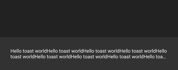
The default number of lines for this option is two lines.
fontFamily, textColor, and backgroundColor optionsYou can make your Snackbar more customized in your React Native app by using textColor, backgroundColor, and fontFamily options.
textColor allows you to change the color of the pop-up textbackgroundColor changes the background color of the pop-up notificationfontFamily can be used to change the font family to whatever you wantThe default textColor is White, while the default backgroundColor is Darkgrey.
See the textColor and backgroundColor options in action below:
/* App.js */

    Snackbar.show({
      text: 'This is an Error message',
      duration: Snackbar.LENGTH_SHORT,
      numberOfLines: 2,
      textColor: '#fff',
      backgroundColor: '#cc0000'
    });
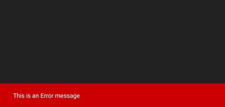
action optionThe action option allows you to create an action to be handled on the Snackbar. It shows along with the Snackbar and allows the user perform an action. An example action could be closing or hiding the Snackbar after it opens.
You might want to pass important information when the user loads a screen or when the user clicks on a view or button. In such a scenario, you would want to keep showing this information to the user until the user decides to hide or close it manually.
You can use Snackbar.dismiss() to to remove or dismiss any available or existing notification, like so:
/* App.js */

Snackbar.show({
   text: 'Welcome to our Snackbar tutorial! Are you excited?',
   duration: Snackbar.LENGTH_INDEFINITE,
   numberOfLines: 2,
   textColor: '#fff',
   backgroundColor: 'green',
   action: {
     text: 'Hide Pop-up',
     textColor: '#fff',
     onPress: () => {
        Snackbar.dismiss();
      }
   }
 });
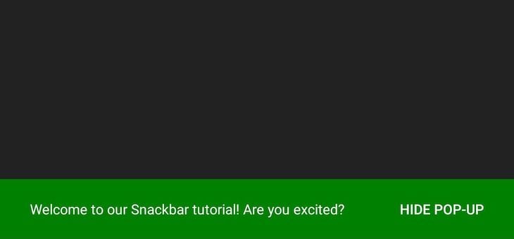
If you click on the Hide Pop-up action button, it closes the Snackbar notification.
You can also create a different button function and call it in your Snackbar, like so:
/^ App.js */

  const closePopup = () => {
    Snackbar.dismiss();
  };

  const showToast = () => {
    Snackbar.show({
      text: 'Welcome to our Snackbar tutorial! Are you excited?',
      duration: Snackbar.LENGTH_INDEFINITE,
      numberOfLines: 2,
      textColor: '#fff',
      backgroundColor: 'green',
      action: {
        text: 'Close Pop-up',
        textColor: '#fff',
        onPress: () => closePopup
      }
    });
  };
The above example works just like the other examples where we called our Snackbar.dismiss() inside our action. However, you can decide to use a different function to prevent code ambiguity — i.e., make your code cleaner — instead of having a long function inside another long function.
Another common scenario for which the above example can be used is one where you are calling different Snackbars. In such a scenario, you can choose to have one closePopup function and call it wherever you need it. See below example for further clarification:
/^ App.js */

  const closePopup = () => {
    /* you can do something here before closing the Snackbar */
    /* like opening a "Are you sure you want to cancel" modal */
    Snackbar.dismiss();
  };

  const getRequest = () => {
    axios
      .get(api)
      .then((response) => {
        // console.log(response)

        Snackbar.show({
          text: "Request was successful",
          duration: Snackbar.LENGTH_INDEFINITE,
          numberOfLines: 2,
          textColor: "#fff",
          backgroundColor: "green",
          action: {
            text: "Close Pop-up",
            textColor: "#fff",
            onPress: () => closePopup
          }
        });
      })
      .catch((error) => {
        Snackbar.show({
          text: `Error message: ${error}`,
          duration: Snackbar.LENGTH_INDEFINITE,
          textColor: "#fff",
          backgroundColor: "red",
          action: {
            text: "Close Pop-up",
            textColor: "#fff",
            onPress: () => closePopup
          }
        });
      });
  };
Now that we have seen how the Snackbar library works, let’s put what we have learned together and build a very simple React Native application with it. See the full code below, with a more detailed explanation underneath the code block:
/* App.js */

import React, { useState, useEffect } from 'react';
import { SafeAreaView, StyleSheet, Text, useColorScheme, View, TouchableOpacity } from 'react-native';
import { Colors } from 'react-native/Libraries/NewAppScreen';
import Snackbar from 'react-native-snackbar';

const App = () => {
  const isDarkMode = useColorScheme() === 'dark';
  const [ loadOptions, setLoadOptions ] = useState(false);
  const backgroundStyle = {
    backgroundColor: isDarkMode ? Colors.darker : Colors.lighter
  };

  useEffect(() => {
    Snackbar.show({
      text: 'Welcome to our Snackbar tutorial! Are you excited?',
      duration: Snackbar.LENGTH_INDEFINITE,
      textColor: isDarkMode ? Colors.lighter : Colors.darker,
      backgroundColor: isDarkMode,
      action: {
        text: 'Close Pop-up',
        textColor: '#fff',
        onPress: () => {
          Snackbar.dismiss();
        }
      }
    });
  }, []);

  const showOptions = () => {
    Snackbar.show({
      text: 'Loading SnackBar Options...',
      duration: Snackbar.LENGTH_SHORT,
      textColor: '#fff',
      backgroundColor: 'green'
    });
    setTimeout(() => {
      setLoadOptions(true);
    }, 2000);
  };

  return (
    <SafeAreaView style={[ backgroundStyle, styles.sectionContainer ]}>
      <View>
        <Text style={styles.sectionTitle}> A SnackBar Tutorial </Text>
      </View>
      <TouchableOpacity onPress={showOptions} style={styles.buttonHighlight}>
        <Text style={styles.button}>Show Snackbar Options</Text>
      </TouchableOpacity>
      {loadOptions && (
        <View>
          <Text style={styles.sectionList}>1. Text</Text>
          <Text style={styles.sectionList}>2. Duration</Text>
          <Text style={styles.sectionList}>3. Number of Lines</Text>
          <Text style={styles.sectionList}>4. Text Color</Text>
          <Text style={styles.sectionList}>5. Background Color</Text>
          <Text style={styles.sectionList}>6. Font family</Text>
          <Text style={styles.sectionList}>7. Action</Text>
        </View>
      )}
    </SafeAreaView>
  );
};

const styles = StyleSheet.create({
  sectionContainer: {
    flex: 1,
    paddingHorizontal: 24,
    paddingTop: 24
  },
  sectionTitle: {
    fontSize: 24,
    fontWeight: '600',
    marginBottom: 20
  },
  buttonHighlight: {
    marginVertical: 8,
    fontWeight: '400',
    backgroundColor: '#fff',
    padding: 5,
    borderRadius: 5
  },
  button: {
    fontSize: 24,
    color: '#000',
    textAlign: 'center',
    fontWeight: '700'
  },
  sectionList: {
    fontSize: 22,
    fontWeight: '600',
    marginBottom: 10
  }
});
export default App;
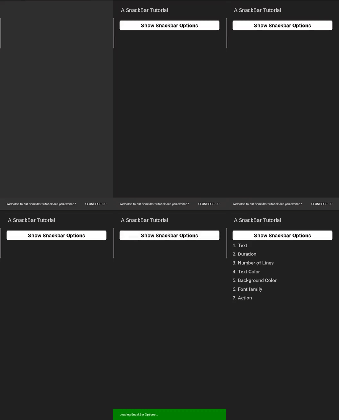
In the above code, we are showing a Snackbar pop-up message to welcome the user as our page loads. This message — Welcome to our Snackbar tutorial! Are you excited? — has an indefinite duration, so it doesn’t leave until the user dismisses it.
Next, on click of the Show Snackbar Options button, we call the second Snackbar, but this time we use a short duration to show the Loading SnackBar Options... message to indicate to the user that their request is loading.
This second Snackbar then disappears just before the list of options loads on the page, making the user experience and interactivity nice and cool.
See these Snackbars in action below:
We have seen how the Snackbar library works and how to use it. It is pretty simple to use and looks really cool in our application, too.
Practice with the code examples above, and you will easily get a hang of using Snackbar in React Native applications. This example is just to show how to use the Snackbar library to display custom pop-up messages. You can go ahead and use them anywhere you like in your app.

LogRocket's Galileo AI watches sessions for you and and surfaces the technical and usability issues holding back your React Native apps.
LogRocket also helps you increase conversion rates and product usage by showing you exactly how users are interacting with your app. LogRocket's product analytics features surface the reasons why users don't complete a particular flow or don't adopt a new feature.
Start proactively monitoring your React Native apps — try LogRocket for free.
Hey there, want to help make our blog better?
Join LogRocket’s Content Advisory Board. You’ll help inform the type of content we create and get access to exclusive meetups, social accreditation, and swag.
Sign up now
Not sure if low-code is right for your next project? This guide breaks down when to use it, when to avoid it, and how to make the right call.

Compare Firebase Studio, Lovable, and Replit for AI-powered app building. Find the best tool for your project needs.

Discover how to use Gemini CLI, Google’s new open-source AI agent that brings Gemini directly to your terminal.

This article explores several proven patterns for writing safer, cleaner, and more readable code in React and TypeScript.