
Headless CMSs are a vital part of modern web development. They provide much more power and flexibility compared to traditional CMSs.

A headless CMS works by “cutting” the head — in other words, the frontend, which is responsible for the look and feel of a web site or app — of a normal CMS. The end result is a system that manages only content and data, and allows us to use a frontend that best meets our needs.
In this tutorial, we’ll explore a powerful and flexible headless CMS called Payload. We will cover:
The Replay is a weekly newsletter for dev and engineering leaders.
Delivered once a week, it's your curated guide to the most important conversations around frontend dev, emerging AI tools, and the state of modern software.
Payload is a headless CMS and application framework based mostly on configuration, which makes it super easy to use and customize.
The function-based access control that Payload CMS provides can handle any access control pattern you need. Payload also provides document- and field-level hooks, allowing for easy integrations and maximum flexibility. Here are some of the other main Payload capabilities:
Payload achieves all of the great features listed above by implementing the concepts of configuration, collections, globals, fields, hooks, and access control. Let’s define each of these concepts before looking at how to get started with Payload CMS.
Payload uses config files, which are responsible for almost anything the CMS can do. Examples include defining data models, custom validations, hooks logic, authentication, and more.
Payload groups content into collections. Each collection creates a MongoDB collection automatically based on the defined fields.
Globals are pretty similar to collections, the main difference being that collections are designed to contain many documents while a global is more like a single, reusable template. Globals come in handy when you want to define headers, footers, navigation and menus, app-wide localized strings, and any other “global” data that you might need.
Payload uses fields as its building blocks. Fields are used in both collections and globals to define the kind of the data they store. Payload offers a wide set of fields ranging from simple to complex.
Additionally, Payload provides many hooks for adding custom logic and integrating with third-party tools and services.
Finally, Payload comes with fine-grained access control that is powerful, flexible, and easy to implement at the same time.
Before we get started with Payload, you need to make sure that you have installed Mongo and Node on your machine.
Getting started with Payload is as easy as running the following command in a directory of your choice:
npx create-payload-app
This will guide you through creating a new Payload app. Here is the information you will be asked for:
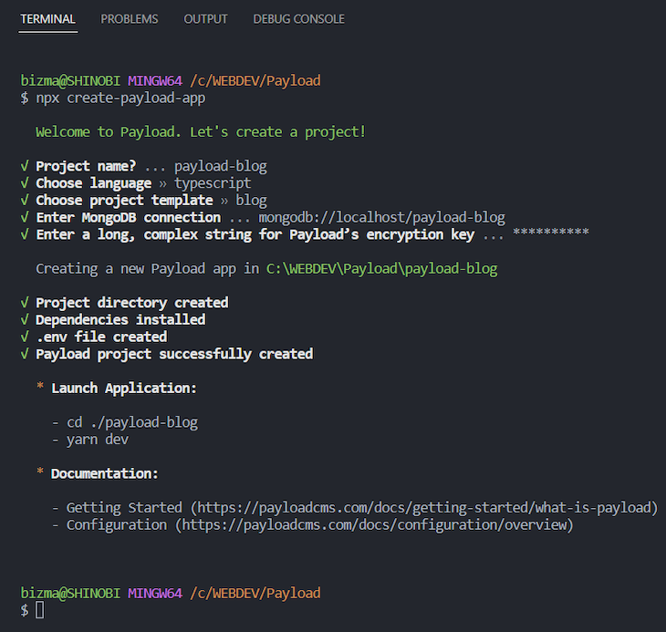
Note that if you run the above command for the first time, it may ask you to install create-payload-app before allowing you to proceed.
For the purpose of this tutorial, please make sure that you’ve selected blog as the project template and typescript as the language.
Be aware that the installation itself can take some time.
Navigate to the app directory after the installation is complete. When you run the yarn dev command, you should see something similar to the following:
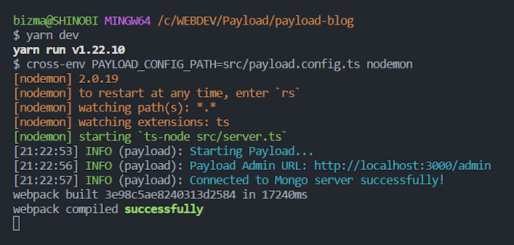
Now go to http://localhost:3000/admin to create the first user. When you’re done creating the first user account — which should be your own profile — log into the admin panel. You should see the following:
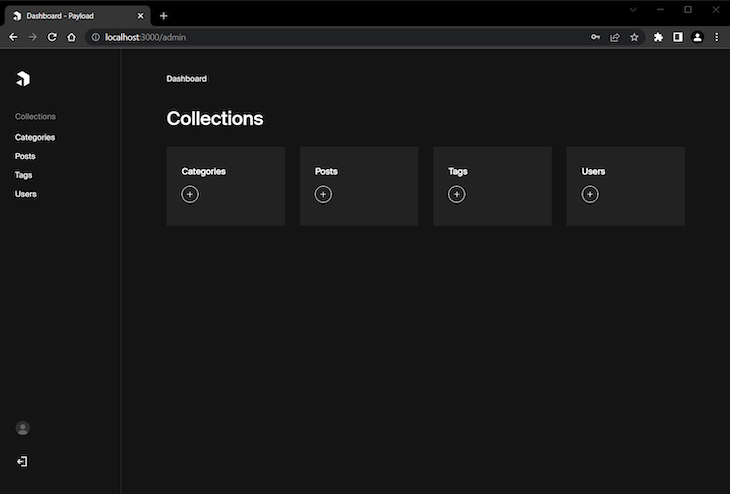
As you can see, there are four collections created automatically for you. These provide a good starting point for some simple blog functionality.
If you switch to your user account by hitting the circular avatar-like button at the bottom left corner, you will see this page:
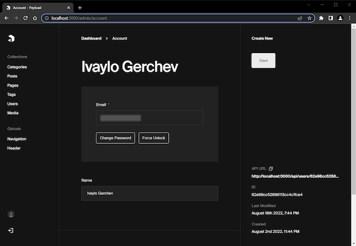
Your user account page is just a simple page with the name and email you entered while creating your first new user. Now, let’s switch to your code editor and explore the project structure, which should look like so:
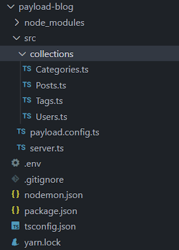
As you can see, there is a collections directory with four files in it. These four files correspond to the four collections in the admin. These are Payload CMS config files, which we will now import in the main payload.config.ts file, like so:
import { buildConfig } from 'payload/config';
import path from 'path';
import Categories from './collections/Categories';
import Posts from './collections/Posts';
import Tags from './collections/Tags';
import Users from './collections/Users';

export default buildConfig({
  serverURL: 'http://localhost:3000',
  admin: {
    user: Users.slug,
  },
  collections: [
    Categories,
    Posts,
    Tags,
    Users,
  ],
  typescript: {
    outputFile: path.resolve(__dirname, 'payload-types.ts')
  },
  graphQL: {
    schemaOutputFile: path.resolve(__dirname, 'generated-schema.graphql'),
  },
});
Technically, we can include all the code for the collections directly in the payload.config.ts file. However, to make the things more manageable, we split them into separate files. Then, we just import them and include them in a special collections array.
Let’s now explore the content of the server.ts file:
import express from 'express';
import payload from 'payload';
require('dotenv').config();

const app = express();
// Redirect root to Admin panel
app.get('/', (_, res) => {
  res.redirect('/admin');
});
// Initialize Payload
payload.init({
  secret: process.env.PAYLOAD_SECRET,
  mongoURL: process.env.MONGODB_URI,
  express: app,
  onInit: () => {
    payload.logger.info(`Payload Admin URL: ${payload.getAdminURL()}`)
  },
})
// Add your own express routes here
app.listen(3000);
Payload requires an Express server, which is automatically created for you. To initialize Payload, the init() method is called.
The first three options of the init() method are required. The first and second options are, respectively, the secret key and the Mongo database. You should have already entered this information in the .env file during installation. The third option connects the app with the Express server.
The last option of the init() method is a function called onInit, meaning “on initialization,” which takes a Payload instance as its argument.
You can see the rest of the available commands in the Server section of the Payload CMS docs.
Here is the fun part. In this section, we’ll explore how to extend our blog with new features and functionalities.
Most modern blogs require some sort of media management to include images in the posts. So, let’s first add some simple media support to our blog.
To add media support, create new Media.ts file in the collections directory with the following content:
import { CollectionConfig } from 'payload/types';

const Media: CollectionConfig = {
  slug: 'media',
  admin: {
    useAsTitle: 'title',
  },
  access: {
    read: () => true,
  },
  fields: [
    {
      name: "alt",
      type: "text",
    },
  ],
  upload: {
    staticURL: "/media",
    staticDir: "media",
    mimeTypes: ["image/*"],
  },
}
export default Media;
Here, we first imported the CollectionConfig type and used it to create the media configuration.
Each collection requires slug and fields properties. The slug property is used to refer to this collection. The fields properties are used to build the UI blocks that help us manage the app’s content.
In this case, we gave our collection a slug of media and added a simple text field used to enter alt text for the uploaded image.
To add admin-specific configuration, we used the admin property. In our case, useAsTitle defines which field will be used as a primary key for the collection.
The access property provides access control functions used to define the exact rights for specific users. In our case, we authorized all users to read the media collection.
Finally, to ensure our media support is functional in our app, we used the upload property. Each Payload collection supporting the upload feature requires staticURL and staticDir properties, which define the base path to app’s media and the folder directory used for media storage. Here we use also mimeTypes property to define that users can upload only images.
Now we have completed adding media support to our blog. We’ll see how to use it in other collections in the next section.
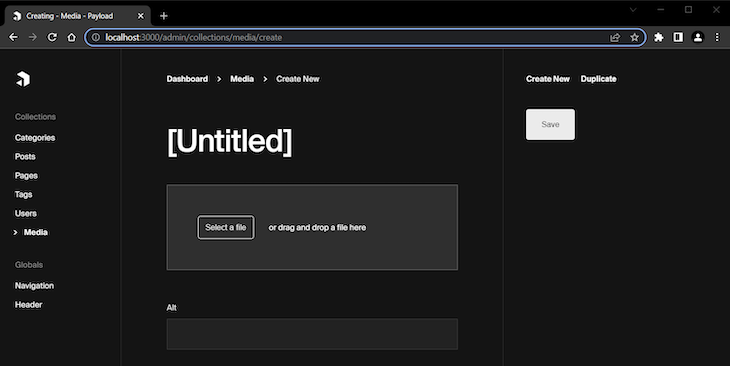
In the Media page, we can now add new images by hitting the Create New button. Then, we can select a file or drag and drop it in the designated area. We can also add alt text to our media files. See how these features look below:
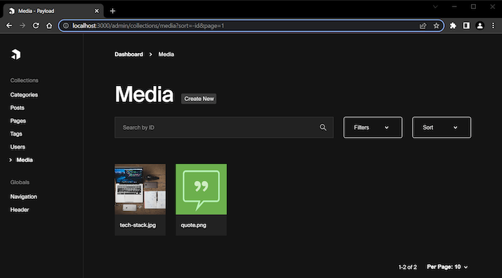
Here is how this collection looks when we have some media uploaded:
One of the most powerful fields Payload provides is the Blocks field. You can use this field to create and even combine individual reusable blocks.
In the next section, we’ll extend the Posts collection by creating a simple block editor for blog posts, starting by creating three necessary blocks: content, quote, and alert.
To start, create a new blocks directory and add a Content.ts file with the following content:
import { Block } from 'payload/types';

const Content: Block = {
  slug: 'content',
  fields: [
  {
    name: 'content',
    type: 'richText'
  },
  ]
};
export default Content;
This creates a bare-bones content block with only one field, which offers a Rich Text Editor. We use the Block type here to define the config for the Content block.
For the next block, create a Quote.ts file containing the following content:
import { Block } from 'payload/types';

const Quote: Block = {
  slug: 'quote',
  imageURL: 'http://localhost:3000/media/quote.png',
  imageAltText: 'Quote block',
  fields: [
    {
      name: 'quote',
      type: 'textarea',
    },
    {
      name: 'author',
      type: 'text',
    },
  ]
};
export default Quote;
Here, we created a quote block with two fields: one Textarea field for the quote itself, and one Text field for the quote’s author.
Meanwhile, the imageURL and imageAltText properties define the thumbnail picture to be shown when we select the block from a popup panel. We’ll see this in action a bit later.
For the last block, create an Alert.ts file containing the following content:
import { Block } from 'payload/types';

const Alert: Block = {
  slug: 'alert',
  fields: [
    {
      name: 'type',
      type: 'select',
      options: [
        {
          value: 'info',
          label: 'Info',
        },
        {
          value: 'success',
          label: 'Success',
        },
        {
          value: 'warning',
          label: 'Warning',
        },
        {
          value: 'danger',
          label: 'Danger',
        },
      ],
    },
    {
      name: 'message',
      type: 'textarea',
    },
  ]
};
export default Alert;
Here, we used a Select field to define the different alert types and a Textarea field for entering the alert message.
Okay, the blocks are ready. Let’s now see how to use them.
Now we’re ready to extend the functionality for creating our blog posts.
Open the Posts.ts file and replace its content with the following:
import { CollectionConfig } from 'payload/types';
import Quote from '../blocks/Quote';
import Content from '../blocks/Content';
import Alert from '../blocks/Alert';

const Posts: CollectionConfig = {
  slug: 'posts',
  admin: {
    defaultColumns: ['title', 'author', 'category', 'tags', 'status'],
    useAsTitle: 'title',
  },
  access: {
    read: () => true,
  },
  fields: [
    {
      name: 'postMeta',
      type: 'group',
      fields: [
        {
          name: 'title',
          type: 'text',
          required: true,
          minLength: 20,
          maxLength: 100,
        },
        {
          name: 'description',
          type: 'textarea',
          required: true,
          minLength: 40,
          maxLength: 160,
        },
        {
          name: 'keywords',
          label: 'Keywords',
          type: 'text',
        },
      ],
    },
    {
      name: 'title',
      type: 'text',
      required: true,
    },
    {
      type: 'tabs',
      tabs: [
        {
          label: 'Post Media',
          fields: [
            {
              name: 'postImage',
              type: 'upload',
              relationTo: 'media',
              required: true,
            },
          ],
        },
        {
          label: 'Post Layout',
          fields: [
            {
              name: 'layout',
              type: 'blocks',
              blocks: [
                Quote,
                Content,
                Alert
              ],
            },
          ]
        }
      ]
    },
// add sidebar fields here
  ],
}
export default Posts;
Here, we first imported the blocks we created earlier.
Next, we used the defaultColumns property to define which columns will be visible in the admin panel when the collection is rendered.
We then used the Group field to create a set of features for the post’s metadata and added some simple validation using the required, minLength, and maxLength properties. We also defined a field for editing the post title.
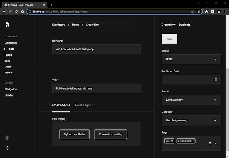
Finally, we created two Tabs — Post Media and Post Layout.
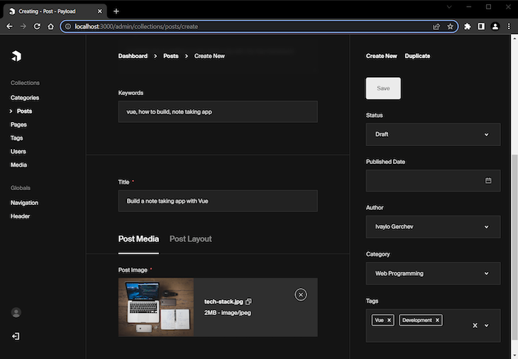
The Post Media tab uses the Upload field, connecting it with the previously created media collection by using the relationTo property.
The Post Layout tab uses the Blocks field and registers the blocks we’ve created by adding them to the blocks array.
All of the above configurations set the editing fields displayed in the main area of the post editing page. To add some fields in the sidebar area, add the following code:
{
  name: 'status',
  type: 'select',
  options: [
    {
      value: 'draft',
      label: 'Draft',
    },
    {
      value: 'published',
      label: 'Published',
    },
  ],
  defaultValue: 'draft',
  admin: {
    position: 'sidebar',
  }
},
{
  name: 'publishedDate',
  type: 'date',
  admin: {
    position: 'sidebar',
  }
},
{
  name: 'author',
  type: 'relationship',
  relationTo: 'users',
  admin: {
    position: 'sidebar',
  }
},
{
  name: 'category',
  type: 'relationship',
  relationTo: 'categories',
  admin: {
    position: 'sidebar',
  }
},
{
  name: 'tags',
  type: 'relationship',
  relationTo: 'tags',
  hasMany: true,
  admin: {
    position: 'sidebar',
  }
},
To move fields in the sidebar area, we used the admin property and set its child position property to sidebar.
We added a few different fields here:
The Select field allows us to define the post’s status — draft or published. We used the defaultValue property to set the default status for new posts.
The Date field allows us to set the post’s publication date.
We also added three Relationship fields to define post’s author, categories, and tags.
And that’s it. Now let’s explore what we’ve built so far. Go view your Posts collection:
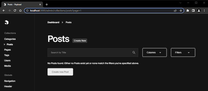
After clicking the Create new Post button, you’ll see the following:
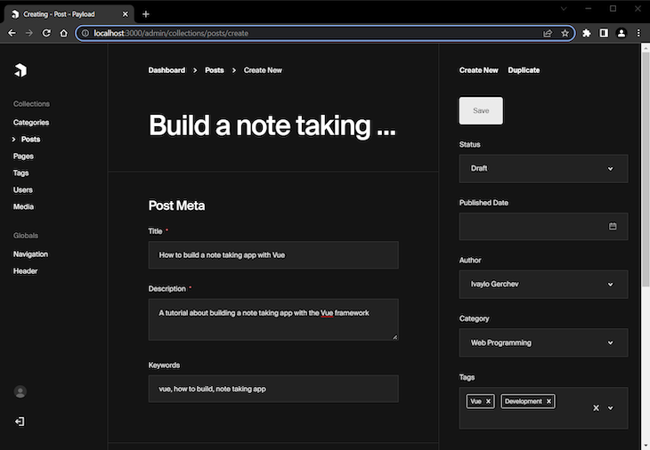
This screenshot shows the Post Meta part of the page and the sidebar fields. I’ve filled some of them out to demonstrate how they could be used.
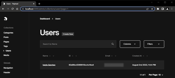
Note that the Author field shows the user’s name here — in this case, Ivaylo Gerchev. However, by default, the user’s email is used in this field. To change that, open the Users.ts file and change the useAsTitle property to name, like so:
admin: {
  useAsTitle: 'name', // changed to name from email
},
Now when you go to the Users collection, the primary key will be the user’s name, which will be used for the Author field:
Now, let’s return to creating our new post. When we scroll down, we can find a field for the post’s title along with the Post Media and Post Layout tabs we created earlier:
When we upload an image for the post via the Post Media tab, it will be shown like this:
When we switch to the Post Layout tab, we will see a plus sign in a circle next to some text reading Add Block:
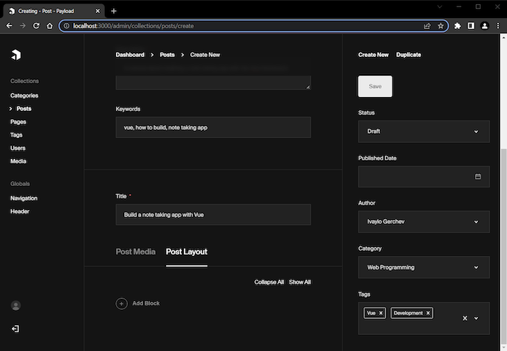
Clicking the Add Block button will show us a popup panel with all the available blocks that we added earlier:
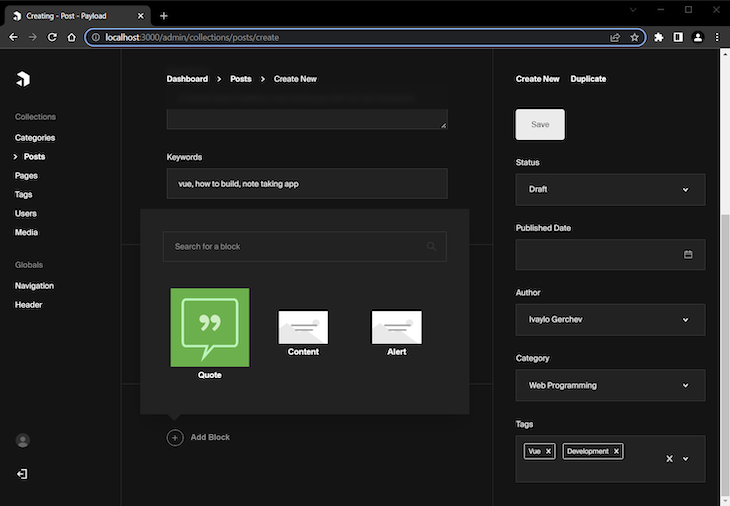
You can see that the image we defined for the quote block is shown here. The blocks without defined images use a default image. Also, you have the option to search for a particular block if you have many blocks.
Let’s see these blocks in action. In the next screenshot, I’ve added a quote component:
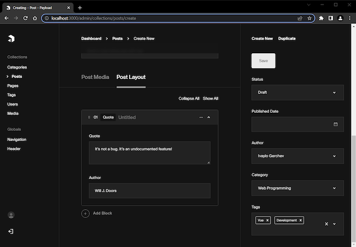
In the next screenshot I’ve added a content block after the quote:
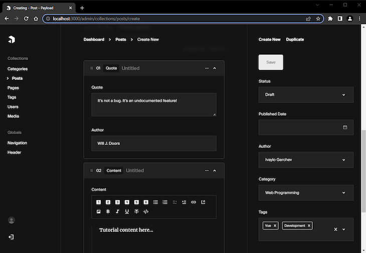
As you can see Payload allows you to build a custom block editor, which provides great flexibility for content structuring with some configuration.
Now when you save the post and go to the Posts collection, you can see the post you’ve just created:
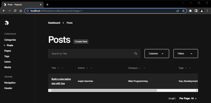
Usually, besides blog posts, a blog will also have at least a couple of other pages, like a Contact page, About page, and so on. Let’s add page creation functionality to our blog now.
In the collections directory, create a Pages.ts file with the following content:
import { CollectionConfig } from 'payload/types'

const Pages: CollectionConfig = {
  slug: 'pages',
  admin: {
    defaultColumns: ['title', 'status'],
    useAsTitle: 'title',
  },
  access: {
    read: () => true,
  },
  fields: [
    {
      name: 'pageMeta',
      type: 'group',
      fields: [
        {
          name: 'title',
          type: 'text',
          required: true,
          minLength: 20,
          maxLength: 100,
        },
        {
          name: 'description',
          type: 'textarea',
          required: true,
          minLength: 40,
          maxLength: 160,
        },
        {
          name: 'keywords',
          label: 'Keywords',
          type: 'text',
        },
      ],
    },
    {
      name: 'title',
      type: 'text',
      required: true,
    },
    {
      name: 'content',
      type: 'richText',
      required: true,
    },
    {
      name: 'status',
      type: 'select',
      options: [
        {
          value: 'draft',
          label: 'Draft',
        },
        {
          value: 'published',
          label: 'Published',
        },
      ],
      defaultValue: 'draft',
      admin: {
        position: 'sidebar',
      }
    }
  ],
}
export default Pages;
The above is actually a simplified version of the posts configuration; we defined a page meta section, then Title and Content fields. In the admin sidebar, we put only a Status field.
Let’s see our support for adding new pages in action. Here is the page meta editing section:
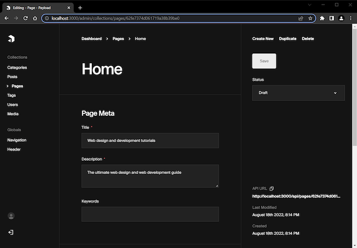
Here are the title and content editing sections:
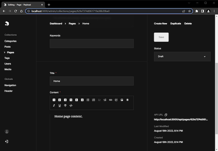
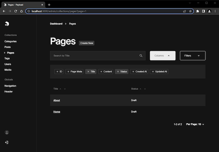
Here are the sample pages I created using this functionality:
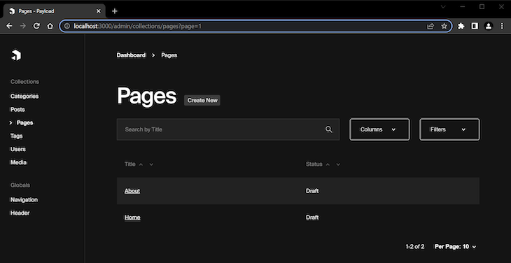
In the following screenshot, you can see that the columns we defined as default in the configuration are automatically selected and shown in the admin. Click the Columns button and you can see for yourself:
Up until now, we have explored the Payload CMS feature for creating collections. But as I mentioned in the beginning, Payload offers another great feature for more specific goals: the ability to create globals.
In this section, we’ll explore how to create one of the most common use cases for globals: creating a site navigation menu. In the following section, we’ll learn how to create a header section for our blog, another common use case.
To start, create new globals directory with a Navigation.ts file in it containing the following content:
import { GlobalConfig } from 'payload/types';

const Navigation: GlobalConfig = {
  slug: 'navigation',
  fields: [
    {
      name: 'menuItems',
      type: 'array',
      required: true,
      maxRows: 8,
      fields: [
        {
          name: 'page',
          type: 'relationship',
          relationTo: 'pages',
          required: true,
          unique: true,
        }
      ]
    },
  ]
}
export default Navigation;
Defining a global entity is pretty similar to defining a collection. In the code above, we used the GlobalConfig type instead of the CollectionConfig type we used previously.
We also used an Array field to add the ability to create a list of menu items. For these menu items, we used the Relationship field to get and select from the existing pages.
Here is how this looks like in action:
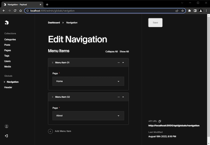
By clicking the Add Menu Item button, you can select an existing page to add to the navigation menu. Here, I’ve selected Home and About.
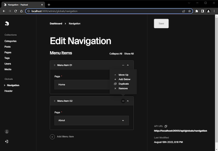
When we use an array editing field, we have some options to manage the array. These options are available when we click at the ellipsis icon button to the right of the field, as you can see below:
For the second global, create a Header.ts file with the following content:
import { GlobalConfig } from 'payload/types';

const Header: GlobalConfig = {
  slug: 'header',
  fields: [
    {
      name: 'styles',
      type: 'array',
      fields: [
        {
          name: 'cssLink',
          type: 'text',
        }
      ]
    },
    {
      name: 'scripts',
      type: 'array',
      fields: [
        {
          name: 'jsLink',
          type: 'text',
        }
      ]
    },
  ]
}
export default Header;
In the code above, we used two arrays to create two lists for CSS and JavaScript links respectively.
For this to work, you need to add a globals array in the payload.configts file. Put the following code below the collections array:
globals: [
  Navigation,
  Header
],
Here is how it looks in action:
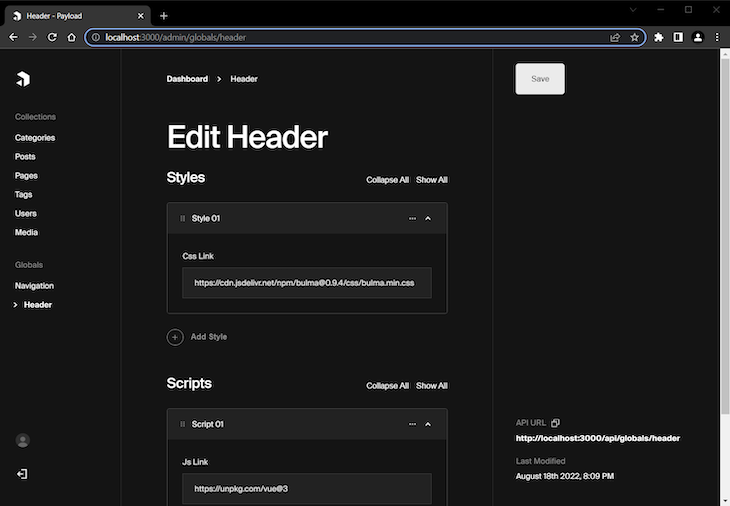
As you can see, now you can add links for styles or scripts, which will be globally available, similarly to CodePen.
Finally, after all our editing is done, the admin panel should look like this:
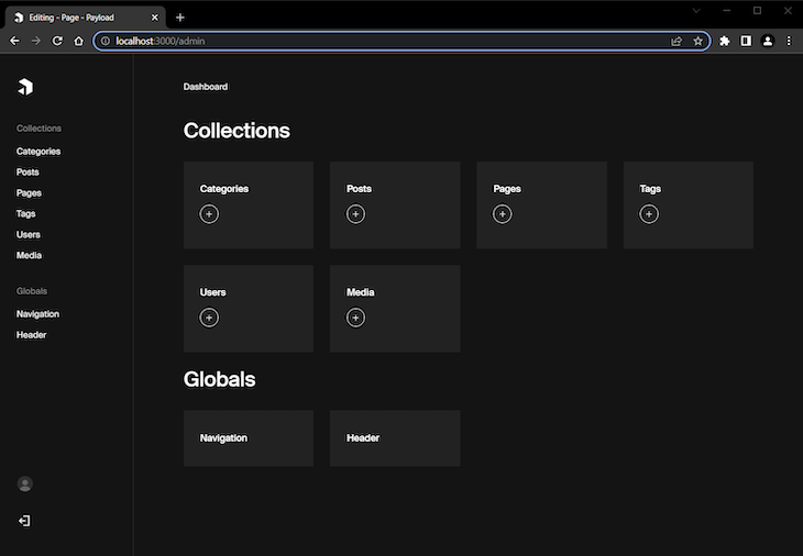
Congrats! You’ve just created a simple but powerful blog content management system using Payload CMS.
One last thing I want to mention is that Payload automatically provides an API endpoint for each collection item. For example, when you edit a particular page, you can click the API URL link at the bottom right corner to get JSON data for that page. See an example below:
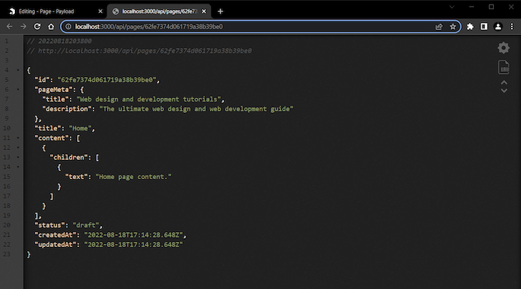
In the image above, you can see the data for the Home page we created earlier.
In this introductory tutorial to Payload CMS, we explored many of Payload’s great features by building a simple blog management system. Despite its apparent simplicity, Payload can be extremely powerful and flexible.
For more complex example of Payload, explore the public demo and its code in Github. You can also take a look at an example of Payload used with Next.js.
Finally, check the official documentation from Payload CMS for more in-depth information and guidance.

useEffect breaks AI streaming responses in ReactSee why useEffect breaks AI streaming in React, and how moving stream state outside React fixes flicker and stale updates.

A real-world debugging session using Claude to solve a tricky Next.js UI bug, exploring how AI helps, where it struggles, and what actually fixed the issue.

CSS wasn’t built for dynamic UIs. Pretext flips the model by measuring text before rendering, enabling accurate layouts, faster performance, and better control in React apps.

Why do real-time frontends break at scale? Learn how event-driven patterns reduce drift, race conditions, and inconsistent UI state.
Hey there, want to help make our blog better?
Join LogRocket’s Content Advisory Board. You’ll help inform the type of content we create and get access to exclusive meetups, social accreditation, and swag.
Sign up now