Editor’s note: This article was last updated 14 October 2022 to reflect changes made to MUI and the MUI Core.

If you’re building a cross-platform mobile app, it’s a good idea to base your app’s UI and UX on Material Design, Google’s own design language, which it uses in all its mobile apps.
Many of the most popular mobile apps use Material Design concepts heavily, including WhatsApp, Uber, Lyft, Google Maps, and more. Therefore, your users are already familiar with the look and feel of Material Design, and they will quickly and easily understand how to use your app if you adhere to the same design language.
React Native Paper is the heavy hitter of Material Design component libraries for React Native. In this article, we’ll focus on using React Native Paper to set up a starter app with the some of the most prominent and recognizable Material Design features, including a hamburger menu, floating action button (FAB), contextual action bar, and drawer navigation. Let’s get started!
We’ll build the starter app in the gif below. As you read through this guide, you can reference the full code for this demo in the material-ui-in-react-native GitHub repo:
First, I’ll initialize my React Native app using Expo. Run the following command in your terminal:
npx create-expo-app material-ui-in-react-native --template expo-template-blank-typescript
cd material-ui-in-react-native
To install the React Native Paper package, run the following command in your terminal:
#npm
npm install react-native-paper
#yarn
yarn add react-native-paper
To enable tree shaking and reduce the bundle size of React Native Paper, follow these additional installation instructions.
I’m also adding React Navigation to this project, and I recommend that you use it as well. React Navigation is the most popular navigation library for React Native, and there is more support for running it alongside React Native Paper compared to other navigation libraries.
You should follow the installation instructions for React Navigation since they’re slightly different depending on whether you use Expo or plain React Native.
Create two files in your app’s main directory called MyFriends.tsx and Profile.tsx. If you want to review the styles used, you can reference the GitHub repo:
import React from 'react';
import {View} from 'react-native';
import {Title} from 'react-native-paper';
import base from './styles/base';
interface IMyFriendsProps {}
const MyFriends: React.FunctionComponent<IMyFriendsProps> = (props) => {
return (
<View style={base.centered}>
<Title>MyFriends</Title>
</View>
);
};
export default MyFriends;
import React from 'react';
import {View} from 'react-native';
import {Title} from 'react-native-paper';
import base from './styles/base';
interface IProfileProps {}
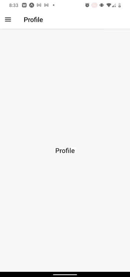
const Profile: React.FunctionComponent<IProfileProps> = (props) => {
return (
<View style={base.centered}>
<Title>Profile</Title>
</View>
);
};
export default Profile;
In this guide, I’ll link these screens to each other using both a navigation drawer and a hamburger menu and add MUI components to each of them.
Since Material Design promotes using a navigation drawer, I’ll use one to make the My Friends and Profile screens navigable to and from each other. First, I’ll add React Navigation’s drawer library:
yarn add @react-navigation/native @react-navigation/drawer
Now, I’ll add the following code into my App.tsx file to enable the drawer navigation:
import React from 'react';
import {createDrawerNavigator} from '@react-navigation/drawer';
import {NavigationContainer} from '@react-navigation/native';
import {StatusBar} from 'expo-status-bar';
import {SafeAreaProvider} from 'react-native-safe-area-context';
import MyFriends from './MyFriends';
import Profile from './Profile';

export default function App() {
  const Drawer = createDrawerNavigator();
  return (
    <SafeAreaProvider>
        <NavigationContainer>
          <Drawer.Navigator>
            <Drawer.Screen name='My Friends' component={MyFriends} />
            <Drawer.Screen name='Profile' component={Profile} />
          </Drawer.Navigator>
        </NavigationContainer>
      <StatusBar style='auto' />
    </SafeAreaProvider>
  );
}
This drawer also needs a button to open it. It should look like the classic hamburger icon ≡, and it should open the navigation drawer when pressed. The code for your button might look like the code below in components/MenuIcon.tsx:
import React from 'react';
import {IconButton} from 'react-native-paper';
import {DrawerActions, useNavigation} from '@react-navigation/native';
import {useCallback} from 'react';

export default function MenuIcon() {
  const navigation = useNavigation();
  const openDrawer = useCallback(() => {
    navigation.dispatch(DrawerActions.openDrawer());
  }, []);

  return <IconButton icon='menu' size={24} onPress={openDrawer} />;
}
There are a few things to notice here. For one, we’ll use React Navigation’s useNavigation Hook to execute navigation actions, from changing screens to opening drawers.
React Native Paper’s<IconButton> supports all the Material Design icons by name and optionally supports any React node that you want to pass, meaning you can add in any desired icon from any third-party library.
Now, I’ll add <MenuIcon> to my navigation drawer by replacing the code below from App.tsx with the following code, respectively:
  <Drawer.Navigator>
    ...
  </Drawer.Navigator>
import MenuIcon from './components/MenuIcon.tsx';
...
  <Drawer.Navigator
    screenOptions={{headerShown: true, headerLeft: () => <MenuIcon />}}
  >
    ...
  </Drawer.Navigator>
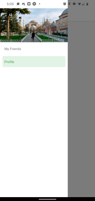
Lastly, I can customize my navigation drawer using the drawerContent prop of the same <Drawer.Navigator> component I just altered. I’ll show an example that adds a header image to the top of the drawer, but feel free to customize whatever you want to put in the drawer. Add the code below in components/MenuContent.tsx:
import React from 'react';
import {
  DrawerContentComponentProps,
  DrawerContentScrollView,
  DrawerItemList,
} from '@react-navigation/drawer';
import {Image} from 'react-native';
const MenuContent: React.FunctionComponent<DrawerContentComponentProps> = (
  props
) => {
  return (
    <DrawerContentScrollView {...props}>
      <Image
        resizeMode='cover'
        style={{width: '100%', height: 140}}
        source={require('../assets/drawerHeaderImage.jpg')}
      />
      <DrawerItemList {...props} />
    </DrawerContentScrollView>
  );
};
export default MenuContent;
Now, I’ll pass <MenuContent> into <Drawer.Navigator>. To do so, I’ll change the code in App.tsx from the code block below to the following code block, respectively:
import MenuIcon from './components/MenuIcon.tsx';
...
  <Drawer.Navigator
    screenOptions={{headerShown: true, headerLeft: () => <MenuIcon />}}
  >
    ...
  </Drawer.Navigator>
import MenuIcon from './components/MenuIcon.tsx';
import MenuContent from './components/MenuContent.tsx';
...
  <Drawer.Navigator
    screenOptions={{headerShown: true, headerLeft: () => <MenuIcon />}}
    drawerContent={(props) => <MenuContent {...props} />}
  >
    ...
  </Drawer.Navigator>
Now, I have fully functioning drawer navigation with a custom image header. Below is the result:
Next, we’ll flesh out the main screens with more Material Design concepts.
One of the hallmarks of Material Design is the floating action button (FAB). The <FAB> and <FAB.Group> components provide a useful implementation of the floating action button according to Material Design principles. With minimal setup, I’ll add this to the My Friends screen.
First, I’ll need to add the <Provider> component from React Native Paper and wrap that component around the <NavigationContainer> in App.tsx as follows:
import {Provider} from 'react-native-paper';
...
  <Provider>
    <NavigationContainer>
      ...
    </NavigationContainer>
  </Provider>
Now, I’ll add my floating action button to the My Friends screen. To do so, I’ll need the following:
<Portal> and <FAB.Group> components from React Native PaperfabIsOpen to keep track of whether the FAB is open or closedisScreenFocusedWithout isScreenFocused, the FAB might end up visible on screens other than the My Friends screen.
With all that added in, the My Friends screen looks like the following code in MyFriends.tsx:
import {useIsFocused} from '@react-navigation/native';
import React, {useState} from 'react';
import {View} from 'react-native';
import {FAB, Portal, Title} from 'react-native-paper';
import base from './styles/base';

interface IMyFriendsProps {}

const MyFriends: React.FunctionComponent<IMyFriendsProps> = (props) => {
  const isScreenFocused = useIsFocused();
  const [fabIsOpen, setFabIsOpen] = useState(false);

  return (
    <View style={base.centered}>
      <Title>MyFriends</Title>
      <Portal>
        <FAB.Group
          visible={isScreenFocused}
          open={fabIsOpen}
          onStateChange={({open}) => setFabIsOpen(open)}
          icon={fabIsOpen ? 'close' : 'account-multiple'}
          actions={[
            {
              icon: 'plus',
              label: 'Add new friend',
              onPress: () => {},
            },
            {
              icon: 'file-export',
              label: 'Export friend list',
              onPress: () => {},
            },
          ]}
        />
      </Portal>
    </View>
  );
};
export default MyFriends;
Now, the My Friends screen behaves as follows:
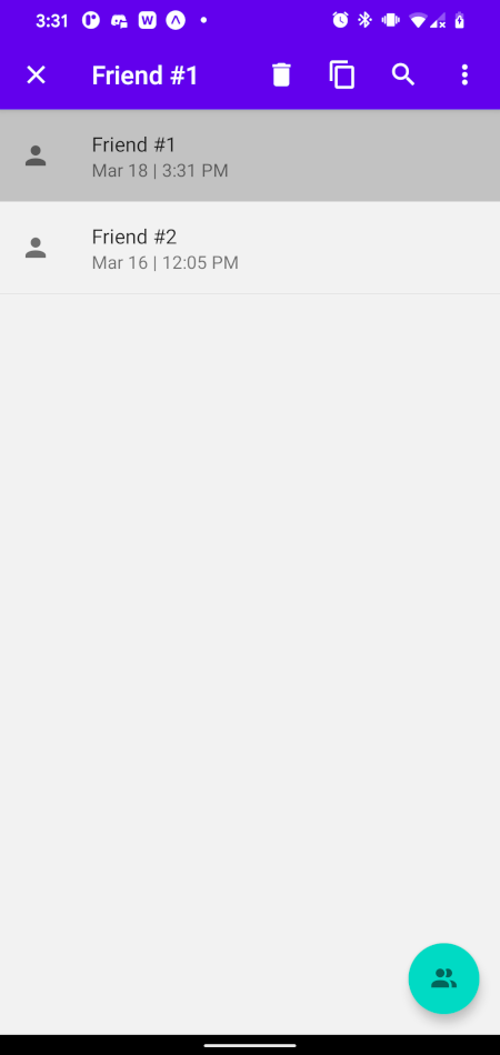
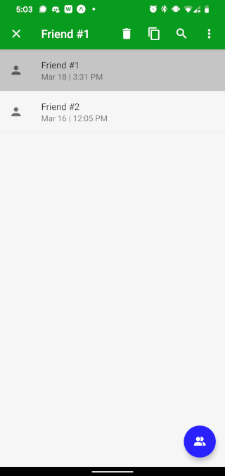
Next, I’ll add a contextual action bar, which you can activate by long pressing an item on any of the screens.
Apps like Gmail and Google Photos use a Material Design concept called the contextual action bar. In our current app, I’ll quickly implement a version of this.
First, I’ll build the ContextualActionBar component itself using the appbar component from React Native Paper. To start with, it should look something like the following:
./components/ContextualActionBar.tsx
import React from 'react';
import {Appbar} from 'react-native-paper';

interface IContextualActionBarProps {}

const ContextualActionBar: React.FunctionComponent<IContextualActionBarProps> = (
  props
) => {
  return (
    <Appbar.Header {...props} style={{width: '100%'}}>
      <Appbar.Action icon='close' onPress={() => {}} />
      <Appbar.Content title='' />
      <Appbar.Action icon='delete' onPress={() => {}} />
      <Appbar.Action icon='content-copy' onPress={() => {}} />
      <Appbar.Action icon='magnify' onPress={() => {}} />
      <Appbar.Action icon='dots-vertical' onPress={() => {}} />
    </Appbar.Header>
  );
};
export default ContextualActionBar;
Whenever an item is long pressed, I want this component to render on top of the given screen’s header. I’ll render the contextual action bar over the screen’s header on the My Friends screen by adding the following code to MyFriends.tsx:
>import {useNavigation} from '@react-navigation/native';
import ContextualActionBar from './components/ContextualActionBar';
...
  const [cabIsOpen, setCabIsOpen] = useState(false);
  const navigation = useNavigation();

  const openHeader = useCallback(() => {
    setCabIsOpen(!cabIsOpen);
  }, [cabIsOpen]);

  useEffect(() => {
    if (cabIsOpen) {
      navigation.setOptions({
        // have to use props: any since that's the type signature
        // from react-navigation...
        header: (props: any) => (<ContextualActionBar {...props} />),
      });
    } else {
      navigation.setOptions({header: undefined});
    }
  }, [cabIsOpen]);
...
  return (
    ...
    <List.Item
      title='Friend #1'
      description='Mar 18 | 3:31 PM'
      style={{width: '100%'}}
      onPress={() => {}}
      onLongPress={openHeader}
    />
    ...
  );
In the code above, I’m toggling a state boolean value cabIsOpen whenever a given item is long pressed. Based on that value, I either switch the React Navigation header to render the <ContextualActionBar> or switch back to render the default React Navigation header.
Now, when I long press the Friend #1 item, a contextual action bar should appear. However, the title is still empty, and I can’t do anything in any of the actions. The <ContextualActionBar> is unaware of the state of either the Friend #1 item or the larger My Friends screen as a whole.
Next, we’ll add a title into the <ContextualActionBar>, and we’ll also pass in a function to close the bar that will be triggered by one of the buttons in the bar. To do this, I’ll add another state variable to the My Friends screen:
const [selectedItemName, setSelectedItemName] = useState('');
I also need to create a function that will close the header and reset the state variable above:
  const closeHeader = useCallback(() => {
    setCabIsOpen(false);
    setSelectedItemName('');
  }, []);
Then, I need to pass both selectedItemName and closeHeader as props to <ContextualActionBar>:
  useEffect(() => {
    if (cabIsOpen) {
      navigation.setOptions({
        header: (props: any) => (
          <ContextualActionBar
            {...props}
            title={selectedItemName}
            close={closeHeader}
          />
      ),
      });
    } else {
      navigation.setOptions({header: undefined});
    }
  }, [cabIsOpen, selectedItemName]);
Lastly, I need to set selectedItemName to the title of the item that has been long pressed:
  ...
  const openHeader = useCallback((str: string) => {
    setSelectedItemName(str);
    setCabIsOpen(!cabIsOpen);
  }, [cabIsOpen]);
  ...
  return (
    ...
    <List.Item
      title='Friend #1'
      ...
      onLongPress={() => openHeader('Friend #1')}
    />
  );
Now, I can use the title and close props in <ContextualActionBar>. Add the code below to ./components/ContextualActionBar.tsx:
interface IContextualActionBarProps {
  title: string;
  close: () => void;
}
...
  return (
      ...
      <Appbar.Action icon='close' onPress={props.close} />
      <Appbar.Content title={props.title} />
      ...
  );
Now, I have a functional, Material Design-inspired contextual action bar that utilizes React Native Paper and React Navigation. It looks like the following:
Finally, I want to theme my app so I can change the primary color, secondary color, text colors, and more.
Theming is a little tricky because both React Navigation and React Native Paper have their own ThemeProvider components, which can easily conflict with each other. Fortunately, there’s a great guide available on theming an app that uses both React Native Paper and React Navigation.
I’ll add in a little extra help for those who use TypeScript and would run into esoteric errors trying to follow the guide above.
First, I’ll create a theme file, theme.ts, which looks like the following code:
import {
  DarkTheme as NavigationDarkTheme,
  DefaultTheme as NavigationDefaultTheme,
  Theme,
} from '@react-navigation/native';
import {ColorSchemeName} from 'react-native';
import {
  DarkTheme as PaperDarkTheme,
  DefaultTheme as PaperDefaultTheme,
} from 'react-native-paper';
declare global {
  namespace ReactNativePaper {
    interface ThemeColors {
      animationColor: string;
    }
    interface Theme {
      statusBar: 'light' | 'dark' | 'auto' | 'inverted' | undefined;
    }
  }
}
interface ReactNavigationTheme extends Theme {
  statusBar: 'light' | 'dark' | 'auto' | 'inverted' | undefined;
}
export function combineThemes(
  themeType: ColorSchemeName
): ReactNativePaper.Theme | ReactNavigationTheme {
  const CombinedDefaultTheme: ReactNativePaper.Theme = {
    ...NavigationDefaultTheme,
    ...PaperDefaultTheme,
    statusBar: 'dark',
    colors: {
      ...NavigationDefaultTheme.colors,
      ...PaperDefaultTheme.colors,
      animationColor: '#2922ff',
      primary: '#079c20',
      accent: '#2922ff',
    },
  };
  const CombinedDarkTheme: ReactNativePaper.Theme = {
    ...NavigationDarkTheme,
    ...PaperDarkTheme,
    mode: 'adaptive',
    statusBar: 'light',
    colors: {
      ...NavigationDarkTheme.colors,
      ...PaperDarkTheme.colors,
      animationColor: '#6262ff',
      primary: '#079c20',
      accent: '#2922ff',
    },
  };
  return themeType === 'dark' ? CombinedDarkTheme : CombinedDefaultTheme;
}
The combineThemes return type encompasses both ReactNavigationTheme and ReactNativePaper.Theme. I changed the primary and accent colors, which will affect the CAB and FAB, respectively. I added a new color to the theme called animationColor. If you don’t want to add a new color, you don’t need to declare the global namespace.
In App.tsx, I’ll add my theme to both the React Native Paper Provider component and the NavigationContainer component from React Navigation:
import {useColorScheme} from 'react-native';
import {NavigationContainer, Theme} from '@react-navigation/native';
import {combineThemes} from './theme';
...
  const colorScheme = useColorScheme() as 'light' | 'dark';
  const theme = combineThemes(colorScheme);
  ...
    <Provider theme={theme as ReactNativePaper.Theme}>
      <NavigationContainer theme={theme as Theme}>
      </NavigationContainer>
    </Provider>
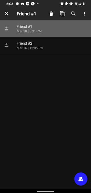
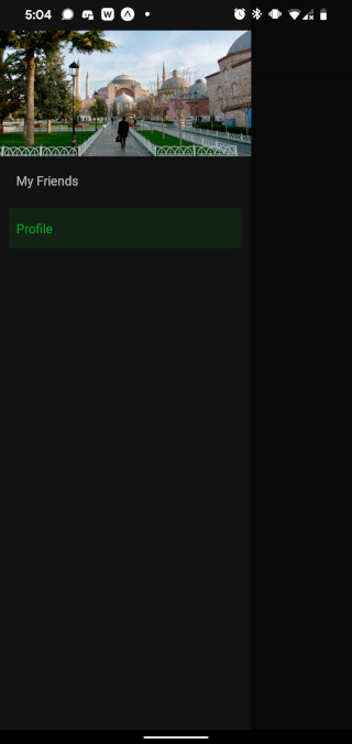
I’m using Expo, so I also need to add the following code in app.json to enable dark mode. However, you may not need to:
"userInterfaceStyle": "automatic",
Now, you have a custom themed, dark mode enabled, Material Design-inspired app:
At this point, you should have your own cross-platform app with Material Design elements from the React Native Paper library, like a drawer navigation with custom designs in the drawer menu, a floating action button, and a contextual action bar.
You should also have theming enabled, which works nicely with both the React Native Paper and React Navigation libraries. This setup should enable you to quickly and stylishly build out your next mobile app with ease.

LogRocket's Galileo AI watches sessions for you and and surfaces the technical and usability issues holding back your React Native apps.
LogRocket also helps you increase conversion rates and product usage by showing you exactly how users are interacting with your app. LogRocket's product analytics features surface the reasons why users don't complete a particular flow or don't adopt a new feature.
Start proactively monitoring your React Native apps — try LogRocket for free.
Hey there, want to help make our blog better?
Join LogRocket’s Content Advisory Board. You’ll help inform the type of content we create and get access to exclusive meetups, social accreditation, and swag.
Sign up now
This article explores several proven patterns for writing safer, cleaner, and more readable code in React and TypeScript.

A breakdown of the wrapper and container CSS classes, how they’re used in real-world code, and when it makes sense to use one over the other.

This guide walks you through creating a web UI for an AI agent that browses, clicks, and extracts info from websites powered by Stagehand and Gemini.

This guide explores how to use Anthropic’s Claude 4 models, including Opus 4 and Sonnet 4, to build AI-powered applications.

 Learn more →

2 Replies to "Using MUI in React Native"
Greetings. This section’s link doesn’t work (Not founf) “To enable tree shaking and reduce the bundle size of React Native Paper, follow these additional installation instructions.”
Hello, thanks for pointing out the broken link. We’ve replaced it with the correct one. Happy coding!