Editor’s note: This React Native UI library comparison article was last updated on 26 July 2023 to add UI Kitten and React Native Material UI to the list of the top 13 UI libraries.

React Native is used to build cross-platform mobile applications using JavaScript and React. Since its initial release in 2015, the library has grown and today enjoys widespread adoption among the mobile developer community.
In fact, the community has been a huge part of React Native’s success. It seems like every day, someone releases a new library that makes building apps with React Native much easier. In this guide, we’ll compare the most popular UI libraries for React Native:
The Replay is a weekly newsletter for dev and engineering leaders.
Delivered once a week, it's your curated guide to the most important conversations around frontend dev, emerging AI tools, and the state of modern software.
The styled-components UI library enables you to write CSS as React components, which allows for dynamic styling and auto-prefixing. The library also supports React Native. In React Native, you would usually write styles as JavaScript objects. However, writing styles as components allows you to write readable code and reusable components and use your styles multiple times, which means less code.
For example, you could use the classic style object, like below:
import {StyleSheet, Text, View} from 'react-native'
export default function App() {

return (
  <View
        style={{
          backgroundColor: '#a1cae2',
          borderRadius: 10,
          height: 200,
          width: 150
        }}
      >
        <View
          style={{
            padding: 2
          }}
        >
          <Text
            style={{
              fontSize: 20,
              color: '#000',
              textAlign: 'center'
            }}
          >
            Header
          </Text>
        </View>
        <View
          style={{
            padding: 2,
            display: 'flex',
            alignItems: 'center'
          }}
        >
          <Text
            style={{
              fontSize: 14
            }}
          >
            Lorem ipsum dolor sit amet consectetur adipisicing elit.
          </Text>
        </View>
      </View>

)

}
But with styled-components, you can make the code more readable and consistent:
import {StatusBar} from 'expo-status-bar'
import React from 'react'
import {StyleSheet, Text, View} from 'react-native'
import styled from 'styled-components/native'

const CardContainer = styled.View`
  background-color: #b34180;
  height: 200px;
  border-radius: 10px;
  width: 150px;
`
const CardHeader = styled.View`
  padding: 2px;
  text-align: center;
`
const CardTitle = styled.Text`
  font-size: 20px;
  text-align: center;
  color: #fff;
`

const CardBody = styled.View`
  padding: 2px;
  align-items: center;
  display: flex;
`
const CardDescription = styled.Text`
  font-size: 14px;
  color: #fff;
  text-align: center;
`

export default function App() {
  return (
    <View style={styles.container}>

      {/* styled component */}
      <CardContainer>
        <CardHeader>
          <CardTitle>Header 2</CardTitle>
        </CardHeader>
        <CardBody>
          <CardDescription>Lorem ipsum dolor sit amet consectetur adipisicing elit.</CardDescription>
        </CardBody>
      </CardContainer>
    </View>
  )
}
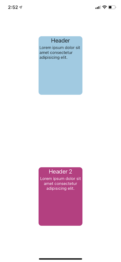
In the code above, you can see the major difference between the two examples in terms of code readability and component consistency. The results will still be the same in the UI:
Another reason to use styled-components is that it enables you to use the CSS syntax you’re already comfortable with if you’re coming from the CSS world.
React Native Extended StyleSheet is one of my favorite tools for styling in React Native. Though similar to the React Native StyleSheet abstraction that comes with React Native, this library offers extra advantages, such as media queries, variables, dynamic styles, and themes. Using React Native Extended StyleSheet enables you to make the UI responsive across multiple devices.
In general, React Native Extended StyleSheet is used the same way as the React Native StyleSheet. Below is a practical example of how to use variables and media queries at the same time with React Native StyleSheet.
First, define the global variables with the EStyleSheet.build() method. Usually, you would add this code in the main entry file App.jsx:
EStyleSheet.build({
  /* Smartphones (portrait and landscape) ----------- */
  $primary: '#301551',
  $green:"green",
  $white:'#fff',
  $black:"#000",
  $gray:"#ccc"


});
Next, get the value of any variable using EStyleSheet.value('variableName'):
const styles = EStyleSheet.create({
  container: {
    backgroundColor: EStyleSheet.value('$primary'),

  },
});
Here’s the full example:
/**
 * Sample React Native App
 * https://github.com/facebook/react-native
 *
 * @format
 * @flow strict-local
 */

import React from 'react';
import {
  SafeAreaView,
  StyleSheet,
  ScrollView,
  View,
  Text,
  StatusBar,
} from 'react-native';

import EStyleSheet from 'react-native-extended-stylesheet';
// This file is for a reusable grouping of Theme items.
// Similar to an XML fragment layout in Android

EStyleSheet.build({
  /* Smartphones (portrait and landscape) ----------- */
  $primary: '#301551',
  $green:"green",
  $white:'#fff',
  $black:"#000",
  $gray:"#ccc"


});

const App: () => React$Node = () => {
  return (
    <>
      <View style={styles.container}>
        <StatusBar barStyle="dark-content" />
        <SafeAreaView>
          <ScrollView>
            <Text>EStyleSheet </Text>
          </ScrollView>
        </SafeAreaView>
      </View>
    </>
  );
};

const styles = EStyleSheet.create({
  container: {
    width: '100%',
    backgroundColor: EStyleSheet.value('$primary'),
    height: '100%',

    /** IPad */
    '@media (min-width : 768px) and (max-width : 1024px) ': {
      backgroundColor: '#ed8a0a',
    },
  },
});

export default App;
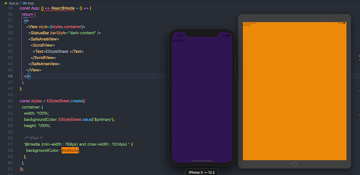
Above, we caused backgroundColor to change when the app is accessed on an iPad:
React Native Elements is my favorite UI library for React Native because it is simple to use, has great documentation, and superior support across iOS and Android. Here’s an example of how to use this library:
@copyrights https://reactnativeelements.com/docs/tooltip

import { Tooltip, Text } from 'react-native-elements';

...

<Tooltip popover={<Text>Info here</Text>}>
  <Text>Press me</Text>
</Tooltip>
React Native Paper is fairly similar to React Native Elements. The major difference is that React Native Paper uses the Material Design UI as the foundation of its UI components. If you’re a fan of the Material UI design system, React Native Paper is the UI library for you.
When using React Native Paper, you’ll probably use the theming feature quite often. Theming allows you to integrate your own custom design system that can be combined with the library’s design. For example, you could integrate your own color scheme, typography, etc.
Using the theming feature in React Native is simple; just wrap your app with PaperProvider and pass your theme object to it:
import { DefaultTheme, Provider as PaperProvider } from 'react-native-paper';
import Home from '/home'

const theme = {
  colors: {
    primary: '#90eee1',
    accent: '#6356e5',
  },
  fonts:{
    regular:16,
    small:12,
  },
  typography:{
  title:'Roboto',
   paragraph:'Open Sans'

  }
};

export default function App() {
  return (


  );
}
Now you can access theme values anywhere in your app and enjoy a consistent design system. To access the theme in any component, you have to wrap it using the withTheme higher-order component:
import {View,Text} from 'react-native'
import { withTheme } from 'react-native-paper';


const CardTitle = ({theme})=>{

 return (


     Headline 3


 )
}

export default withTheme(CardTitle)
Building forms can be tricky for mobile developers. The UI libraries we’ll explore from here can help you save time and avoid common keyboard-related issues, such as UI views being unresponsive when the user is typing.
React Native Credit Card Input is very easy to use. It has a nice UI and engaging animation, and produces a great user experience by making it easy to enter credit card information:
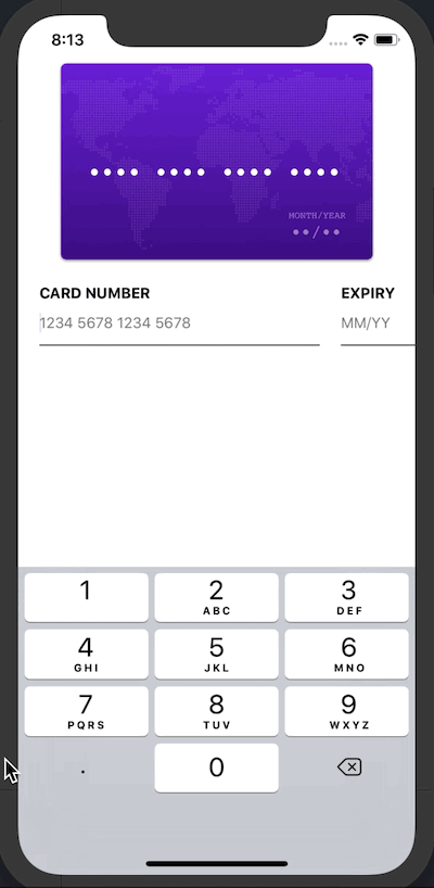
React Native Credit Card Input makes entering payment info more intuitive. It has an autocomplete feature and handles validation of the credit card number, so you don’t have to write any extra code to sanitize the input. React Native Credit Card Input also comes with custom styling, which enables you to integrate your own style and icons.
Below is simple example of how to use this UI library:
import React from 'react';
import {
  SafeAreaView,
  StyleSheet,
  ScrollView,
  View,
  Text,
  StatusBar,
} from 'react-native';
import {
  CreditCardInput,

} from 'react-native-credit-card-input';

const App: () => React$Node = () => {
  const _onChange = (e) => {
    /**
     *
     *
     * {"status": {"cvc": "incomplete", "expiry": "incomplete", "number": "invalid"}, "valid": false, "values": {"cvc": "", "expiry": "", "number": "8", "type": undefined}}
     */
    console.log(e.values.number);
    console.log(e.valid);
    console.log(e.values.cvc);
    console.log(e.values.expiry);
  };
  return (
    <>
      <StatusBar barStyle="dark-content" />
      <SafeAreaView>
        <View>
          <CreditCardInput onChange={_onChange} />
        </View>
      </SafeAreaView>
    </>
  );
};
The biggest advantage of using React Native Credit Card Input is that it’s a pure React component, so you don’t need to do any linking, which is not the case when using react-native-awesome-card-io, a similar tool.
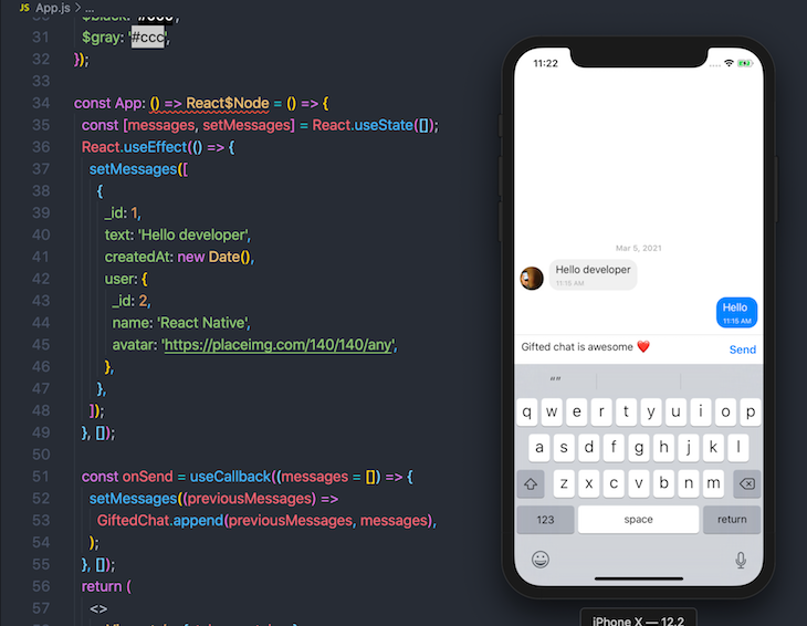
If you’re looking to add chat to your React Native app, Gifted Chat is an amazing library that enables you to create a UI chat box in a few simple steps. The library has support for iOS, Android, and the web:
Gifted Chat doesn’t require any linking because it doesn’t contain any native code. You can simply install the package using Yarn or npm:
yarn add react-native-gifted-chat
Here’s an example of how to start using the Box UI component:
# copyright https://github.com/FaridSafi/react-native-gifted-chat
import {GiftedChat} from 'react-native-gifted-chat';
import React, {useCallback,useState} from 'react';

const App: () => React$Node = () => {
  const [messages, setMessages] = React.useState([]);
  React.useEffect(() => {
    setMessages([
      {
        _id: 1,
        text: 'Hello developer',
        createdAt: new Date(),
        user: {
          _id: 2,
          name: 'React Native',
          avatar: 'https://placeimg.com/140/140/any',
        },
      },
    ]);
  }, []);

  const onSend = useCallback((messages = []) => {
    setMessages((previousMessages) =>
      GiftedChat.append(previousMessages, messages),
    );
  }, []);
  return (
    <>
      <View style={styles.container}>
        <StatusBar barStyle="dark-content" />

        <GiftedChat
          messages={messages}
          onSend={(messages) => onSend(messages)}
          user={{
            _id: 1,
          }}
        />
      </View>
    </>
  );
};
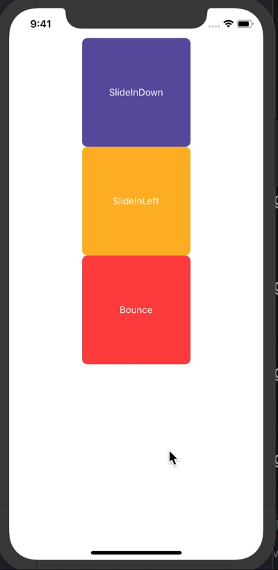
react-native-animatable enables you to add transitions and animations to the UI in React Native. It has a declarative API component, which you can use as a wrapper for the component you want to animate or add a transition to. Best of all, react-native-animatable is customizable so you can control the duration, delay, and direction of the transition.
Below is an example of a simple transition:
import React from 'react';
import {
  SafeAreaView,
  StyleSheet,
  ScrollView,
  View,
  Text,
  StatusBar,
  TouchableHighlight,
} from 'react-native';

import * as Animatable from 'react-native-animatable';


const App: () => React$Node = () => {
  const phoneRef = React.useRef(null);
  return (
    <>
      <StatusBar barStyle="dark-content" />
      <SafeAreaView>
        <ScrollView>
          <View
            style={{
              borderColor: 'red',
              flex: 1,
              alignItems: 'center',
              justifyContent: 'center',
            }}>
            {/* <LiteCreditCardInput onChange={_onChange} /> */}
            {/* <PhoneInput ref={phoneRef} /> */}
            <Animatable.View animation="slideInDown">
              <TouchableHighlight
                style={{
                  width: 160,
                  height: 160,
                  borderRadius: 8,

                  backgroundColor: '#6155a6',
                  alignItems: 'center',
                  justifyContent: 'center',
                }}>
                <Text
                  style={{
                    color: '#fff',
                  }}>
                  SlideInDown
                </Text>
              </TouchableHighlight>
            </Animatable.View>
            <Animatable.View animation="slideInLeft">
              <TouchableHighlight
                style={{
                  width: 160,
                  height: 160,
                  borderRadius: 8,

                  backgroundColor: '#fdb827',
                  alignItems: 'center',
                  justifyContent: 'center',
                }}>
                <Text
                  style={{
                    color: '#fff',
                  }}>
                  SlideInLeft
                </Text>
              </TouchableHighlight>
            </Animatable.View>

            <Animatable.View animation="bounce">
              <TouchableHighlight
                style={{
                  width: 160,
                  height: 160,
                  borderRadius: 8,

                  backgroundColor: '#ff4646',
                  alignItems: 'center',
                  justifyContent: 'center',
                }}>
                <Text
                  style={{
                    color: '#fff',
                  }}>
                  Bounce
                </Text>
              </TouchableHighlight>
            </Animatable.View>
          </View>
        </ScrollView>
      </SafeAreaView>
    </>
  );
};
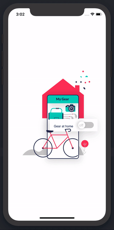
Lottie is a library developed by Airbnb that converts Adobe After Effect animations. It support iOS, Android, and the web. In React Native, the react-native-lottie command will allow you to use Lottie animations by providing a component wrapper API. It can be installed the same as any React Native library.
You can import LottieView as a component and pass the animation file path. To get Lottie animations, head to LottieFiles. Here’s an example of how to use Lottie in React Native:
import LottieView from 'lottie-react-native';

<LottieView
  source={require('./images/lottie-af-animation.json')}
  loop
  autoPlay
/>
Icons in mobile apps serve a similar purpose to that of signs on the road: you can’t navigate without them. Put simply, icons help users understand how to interact with your app.
I recommend using Vector Icons because:
Here’s an example of how to use Vector Icons:
import React from 'react';
import {
  SafeAreaView,
  StyleSheet,
  ScrollView,
  TouchableOpacity,
  View,
  Text,
  StatusBar,
} from 'react-native';
import Icon from 'react-native-vector-icons/FontAwesome';
const myIcon = <Icon name="rocket" size={30} color="#900" />;


const App: () => React$Node = () => {
  return (
    <>
      <View style={styles.container}>
        <StatusBar barStyle="dark-content" />
        <SafeAreaView>
          <TouchableOpacity>
            <Icon name="chevron-left" color="#000" size={20}/>
            <Text>Click Here</Text>
          </TouchableOpacity>
        </SafeAreaView>
      </View>
    </>
  );
};
Scalable Vector Graphics (SVG) is an XML-based markup language for describing two-dimensional vector graphics. SVG files are designed to be rendered cleanly at any size and with other popular web standards such as JavaScript, CSS, DOM, and SMIL.
SVG is not supported by default in React Native, but React Native SVG enables you to render SVG in React Native on both iOS and Android. The installation is simple. With Yarn, just run the following command line:
yarn add react-native-svg
Next, install pods for iOS with CocoaPods. In your terminal, navigate to the ios folder:
cd ios
Then, run:
pod install
If you’re using an old version of React Native (0.60 or earlier), you’ll have to link the package manually by running the following command line:
react-native link react-native-svg
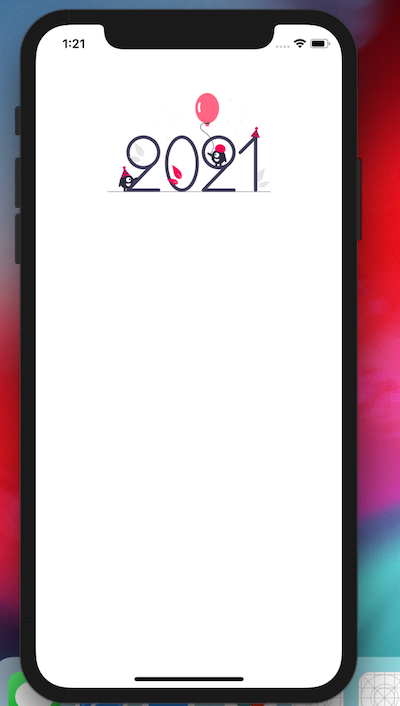
There are two ways you can use React Native SVG. You can include your SVG as a file, as show below:
import {SvgXml} from 'react-native-svg';
import SVGImage from './images/undraw_happy_2021_h01d.svg';
const App: () => React$Node = () => {
return (
<>
<View style={styles.container}>
<StatusBar barStyle="dark-content" />
<SafeAreaView>
<ScrollView>
<SvgXml width="200" height="200" xml={SVGImage} />
</ScrollView>
</SafeAreaView>
</View>
</>
);
};
Or, you can use it as a component, like so:
#@copyrights https://github.com/react-native-svg/react-native-svg
<Svg
  width="130"
  height="130"
  fill="blue"
  stroke="red"
  color="green"
  viewBox="-16 -16 544 544"
>
  <Path
    d="M318.37,85.45L422.53,190.11,158.89,455,54.79,350.38ZM501.56,60.2L455.11,13.53a45.93,45.93,0,0,0-65.11,0L345.51,58.24,449.66,162.9l51.9-52.15A35.8,35.8,0,0,0,501.56,60.2ZM0.29,497.49a11.88,11.88,0,0,0,14.34,14.17l116.06-28.28L26.59,378.72Z"
    strokeWidth="32"
  />
  <Path d="M0,0L512,512" stroke="currentColor" strokeWidth="32" />
</Svg>
React Native Material UI is one of the best and most popular React Native UI libraries. It implements Material Design guidelines in React Native applications. With React Native Material UI, developers receive pre-built Material Design components, including Cards, Dialogs, ListItems, etc.
React Native Material UI was built based on usability and simplicity for UI design patterns. It has one of the best engaged communities and its documentation is easy for developers to integrate. Here is a simple example of how to implement React Native Material UI in React Native applications:
import React from 'react';
import { Card, ListItem, Text } from 'react-native-material-ui';

const App = () => {
  return (
    <Card>
      <ListItem
        centerElement={{
          primaryText: 'React Native Material UI Card',
        }}
      />
      <Text>
        Hello React Native UI
      </Text>
    </Card>
  );
};

export default App;
UI Kitten is a popular UI framework for creating production-ready React Native applications. The library is design system driven and is built using the Eva design system. This framework consists of several customizable UI components, which give developers the freedom to create great cross-platform mobile applications.
When compared to other React Native UI frameworks, UI Kitten emphasizes a smooth user experience by focusing on component performance, memory usage, and optimized rendering. It also provides strong theming support, such as by allowing you to switch between light and dark themes. This improves product branding and the overall design of mobile applications.
In addition, the documentation is easy to navigate, and the community is active and offers strong support for developers who might be struggling with UI Kitten’s integration. Below is an example of how to use UI Kitten in React Native:
import React from 'react';
import { Button } from '@ui-kitten/components';

const App = () => {
  return (
    <Button onPress={() => console.log('Button Pressed')}>
      Press Me!
    </Button>
  );
};

export default App;
| Metric | styled-components | React Native Extended StyleSheet | React Native Elements | React Native Paper | React Native Material UI | UI Kitten |
|---|---|---|---|---|---|---|
| Performance | Performance impact is minimal, as it uses efficient rendering techniques | Pro: Optimizes performance through stylesheet caching and style resolution
Con: The parsing stylesheet during the initialization of the app might result in slight performance disparity |
Focuses on performance through its optimized component and effective rendering | Pro: Emphasizes performance with effective, optimized component behavior and rendering
Con: Performance issues might develop when implementing heavy customizations/complex components |
Prioritizes a smooth user experience, and efficient and optimized rendering of its components | Prioritizes performance optimization and was built on delivering effective component rendering and optimized memory usage |
| Theming and customization | Pro: Gives developers flexibility for easy custom component customization and theming using props and theme providers
Con: Additional config setup might be needed for the theming integration |
Pro: Provides effective theming and customization support that allows variables to be defined in a central stylesheet | Offers theming support and customization options for consistent styling throughout the application | Provides theming and customization options, which allow consistent design and branding across the application | Provides theming and customization features for consistent app design and branding | Offers highly customizable components that have support for theming, styling, and customization |
| Component availability | Pro: Styled components provides wide range of flexibility of creating custom reusable styled components
Con: It can get complex at times and also harder to manage when building large scale applications |
Pro: Provides easy and effective ways to manage styles with style objects and extended stylesheets
Con: Has limited components that focus on extending the existing stylesheets |
Provides rich collections of ready-to-use UI components that cover the majority of application needs | Pro: Provides a detailed set of Material Design components for design consistency in your app
Con: May have lesser ready-to-use components as other UI libraries |
Provides an extensive set of pre-built Material Design components for creating modern, accessible mobile applications | Pro: Provides many customizable UI components for creating stunning cross-platform mobile applications
Con: Provided components might not be as extensive as other libraries, like RN Material UI |
| Documentation and community support | Large community, with detailed documentation and resources | Relatively small community size | Relatively small community size | Active community with extensive documentation | Large community, and well written documentation | Offers robust community support and comprehensive documentation |
You should now have all the basic info you need to choose the right set of UI libraries for your next React Native project. It’s worth noting, however, that the React Native ecosystem is huge and getting bigger all the time as the community churns out tool after tool to make the developer experience even better.
To see what else the React Native ecosystem has to offer, join the open source community at Awesome React Native.

LogRocket's Galileo AI watches sessions for you and and surfaces the technical and usability issues holding back your React Native apps.
LogRocket also helps you increase conversion rates and product usage by showing you exactly how users are interacting with your app. LogRocket's product analytics features surface the reasons why users don't complete a particular flow or don't adopt a new feature.
Start proactively monitoring your React Native apps — try LogRocket for free.

Learn how to build advanced Next.js forms with rule engines, client-side previews, Server Actions, and server-validated form logic.

AI is reshaping engineering teams emotionally as well as technically. A CTO shares insights on fear, trust, burnout, identity, and leading through AI change.

Learn what context rot is, why AI agent sessions degrade over time, and how to fix it with compaction, prompt anchoring, context files, plan files, and RAG.

Learn about TypeScript v6’s breaking changes, new ES2025 features, and deprecated options. A complete migration guide from v5 to prepare for v7.
Would you be interested in joining LogRocket's developer community?
Join LogRocket’s Content Advisory Board. You’ll help inform the type of content we create and get access to exclusive meetups, social accreditation, and swag.
Sign up now

