
React Native developers often implement various input forms in their mobile applications, which typically contain and accept various input elements and input strings, like names, mobile numbers, dates, times, or postal codes.

Many developers implement input masks with form input elements to add user-friendly input constraints. Input masks are string templates that guide users to enter valid data according to a pre-defined format, usually by blocking invalid keystrokes and displaying the allowed string format as a placeholder. For example, users can only enter numerical digits inside a masked PIN/OTP input box.
The react-native-text-input-mask library provides input masking features on both Android and iOS platforms. In this tutorial, we will cover:
The Replay is a weekly newsletter for dev and engineering leaders.
Delivered once a week, it's your curated guide to the most important conversations around frontend dev, emerging AI tools, and the state of modern software.
react-native-text-input-mask offers a native module for creating masked text inputs with two platform-specific masked input libraries: input-mask-android and input-mask-ios. This cross-platform input mask library comes with the following impressive features:
The library offers a minimal, developer-friendly syntax for defining input mask constraints rather than using the typical regex syntax. Therefore, RN developers can define input mask constraints faster with self-explanatory mask definitions.
react-native-text-input-mask is a native module, so pattern matching and processing are handled with Kotlin and Swift — the JavaScript-based component only acts as a wrapper for the native RN module. Therefore, you won’t experience performance issues, such as slightly visible invalid keystrokes, even for complex input mask definitions, nor will you face issues on low-end devices, since the native code handles the masking logic.
react-native-text-input-mask works on both Android and iOS platforms. Both platform-specific masking library repositories are properly synced and maintained actively, so they are easily used in production.
This library offers various helpful customization support to configure masked inputs for your every input masking need. You can extend the default masking syntax, dynamically update masks, and change the masking direction with React component props. This RN library basically exposes every feature that input-mask-android and input-mask-ios implement.
Let’s build some sample input masks to practically understand all these features we’ve just learned about. After trying several sample input masks, we will build a complete registration form with several input masks.
First, make sure that your project uses React Native ≥ v0.60 — this library doesn’t officially support RN versions ≤ 0.60. You can either create a new RN project or use an existing project to try the upcoming example codes.
If you need to create a new project to get started, use the following command on your terminal:
npx react-native init inputmasks
cd inputmasks
Next, run the newly created application to check whether the project creation and setup were successful. Start the Metro bundler with npm start or yarn start and run the following command to start the app:
npx react-native run-android
# --- or ---
npx react-native run-ios
Now, install the input masking library.
npm install react-native-text-input-mask
# --- or ---
yarn add react-native-text-input-mask
For Android platforms, you may need to update the android/build.gradle file’s allprojects property with the following configuration to do a successful build:
configurations.all {
        resolutionStrategy {
            dependencySubstitution {
                substitute module("com.redmadrobot:input-mask-android:6.0.0") using module('com.github.RedMadRobot:input-mask-android:6.1.0')
            }
        }
    }
The reason for this is because the react-native-text-input-mask library can’t download the input-mask-android from JCenter; this is because this particular library uses JitPack for distributions, and Android projects also no longer use JCenter. The above configuration is a workaround to use JitPack artifacts instead of JCenter artifacts until the react-native-text-input-mask library maintainers refer JitPack for dependencies.
You can inspect the complete modified Gradle file in my GitHub repository.
Now, we will create a masked input for entering a standard US phone number to get started with the library. First, use the following imports in your App.js file:
import React from 'react';
import {
  StyleSheet,
  Text,
  View
} from 'react-native';
import TextInputMask from 'react-native-text-input-mask';
Here, we import the TextInputMask UI component to implement masked inputs. The TextInputMask component extends the native inbuilt TextInput with platform-specific masking implementation. Next, define the main App component with the following code:
const App = () => {
  const mask = '+1 ([000]) [000]-[0000]';
  return (
    <View
      style={styles.wrapper}>
      <Text style={styles.label}>Mask: {mask}</Text>
      <TextInputMask
        onChangeText={(formatted, extracted) => {
            console.log(`Formatted: ${formatted}`); // +1 (123) 456-7890
            console.log(`Extracted: ${extracted}`); // 1234567890
        }}
        style={styles.maskedInput}
        mask={mask}
        placeholder={mask}
        keyboardType="numeric"
        placeholderTextColor="grey"
        />
    </View>
  );
};
The masked input component accepts the input mask definition via the mask prop. The phone number mask definition uses the following rules:
Mask: +1 ([000]) [000]-[0000]
+1()- characters are fixed template characters, so the user’s numerical input will be formatted with these characters
555, the masked input will render +1 (555) on the screen, and the onChangeText callback won’t include these characters in the extracted parameter variable0 represents a mandatory digit (0–9) — we used this character ten times because ten digits are standard for a US phone number[] block can be extracted with the onChangeText callback, so we can see those characters in the extracted parameter variableAdditionally, we can use any inbuilt TextInput prop like placeholder, style, and keyboardType. Right now, we simply log the formatted input and extracted input (typically, without the fixed mask characters) to the console with the onChangeText callback.
Finally, add the style definitions and export the App component, as shown below.
const styles = StyleSheet.create({
  wrapper: {
    flex: 1,
    justifyContent: 'center',
    alignItems: 'center',
    backgroundColor: 'white'
  },
  label: {
    color: 'black',
    paddingBottom: 20,
    fontSize: 20
  },
  maskedInput: {
    borderWidth: 2,
    borderRadius: 6,
    width: '80%',
    padding: 12,
    color: 'black',
    fontSize: 20
  }
});

export default App;
Here is the complete App.js source code:
import React from 'react';
import {
  StyleSheet,
  Text,
  View
} from 'react-native';
import TextInputMask from 'react-native-text-input-mask';

const App = () => {
  const mask = '+1 ([000]) [000]-[0000]';
  return (
    <View
      style={styles.wrapper}>
      <Text style={styles.label}>Mask: {mask}</Text>
      <TextInputMask
        onChangeText={(formatted, extracted) => {
            console.log(`Formatted: ${formatted}`); // +1 (123) 456-7890
            console.log(`Extracted: ${extracted}`); // 1234567890
        }}
        style={styles.maskedInput}
        mask={mask}
        placeholder={mask}
        keyboardType="numeric"
        placeholderTextColor="grey"
        />
    </View>
  );
};

const styles = StyleSheet.create({
  wrapper: {
    flex: 1,
    justifyContent: 'center',
    alignItems: 'center',
    backgroundColor: 'white'
  },
  label: {
    color: 'black',
    paddingBottom: 20,
    fontSize: 20
  },
  maskedInput: {
    borderWidth: 2,
    borderRadius: 6,
    width: '80%',
    padding: 12,
    color: 'black',
    fontSize: 20
  }
});

export default App;
Start the Metro bundler and run the application — you will see the following result:
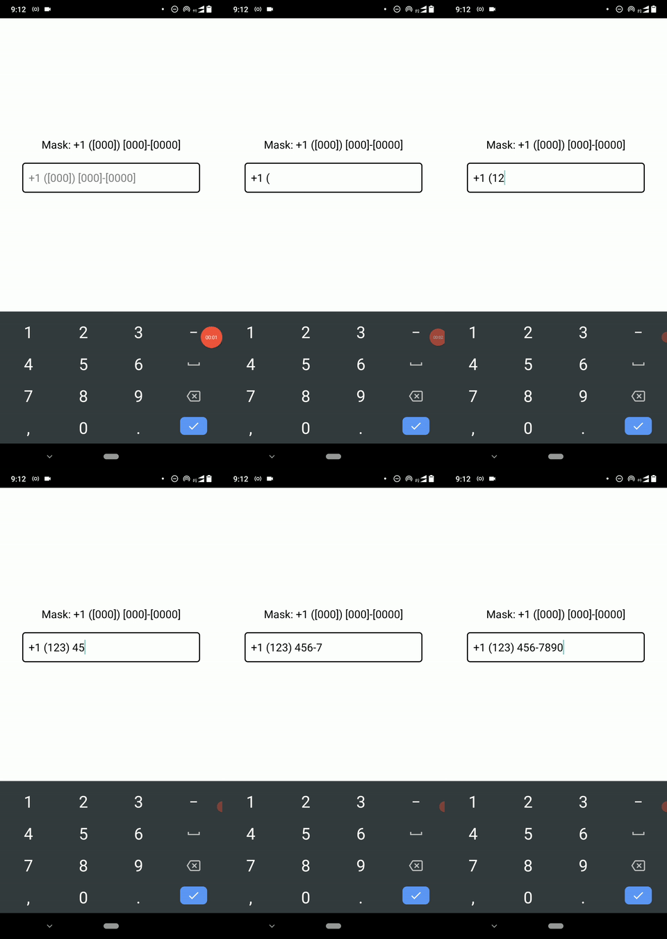
Let’s update the mask constant with different mask definitions and become more familiar with the masking syntax.
Developers often use the one-time password (OTP) mechanism to enhance mobile application security. Let’s create an input mask for a six-digit, Google-style OTP.
Use the following mask and check the application:
const mask = 'G-[000000]';
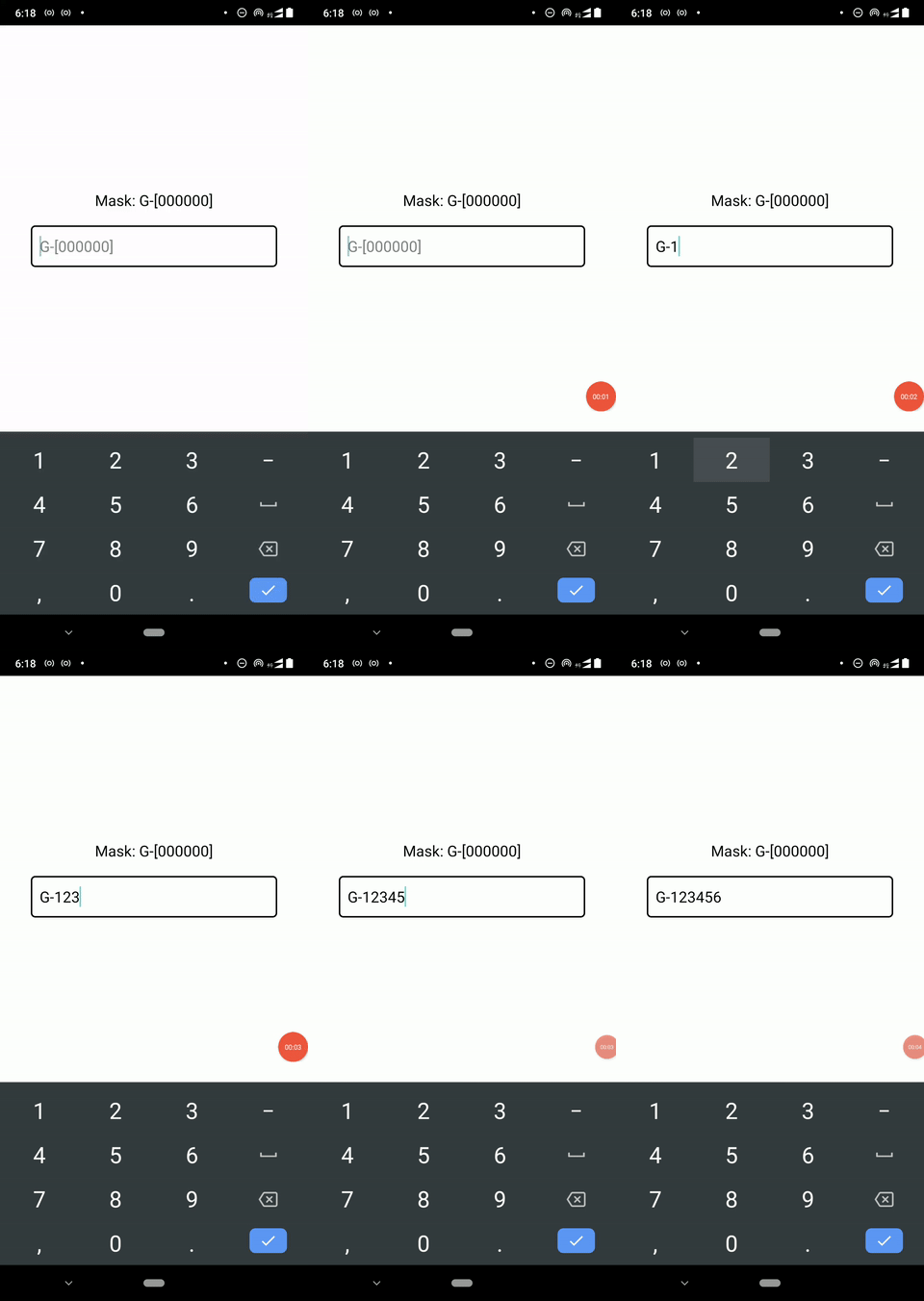
Similar to the previous phone number mask, G- characters will work as a static template and be visible instantly as the user types digits with the keyboard. Also, the [000000] block requests six mandatory digits.
When you use the above mask, you will see the following result:
Mobile app developers usually use native, platform-specific date and time pickers for capturing date/time inputs from the user. But, in some scenarios, like credit card expiration date inputs, masked text inputs behave better from the UX perspective.
We can easily implement masked date input elements with the 0 and 9 notations and our choice of three date formatting separators, as shown in the following table:
| Mask | Description | Sample inputs |
[00]{/}[00] |
MM/YY format for the credit card expiration date. / is used as the separator character |
07/22 |
[00]{.}[00]{.}[0000] |
DD.MM.YYYY format. . is used as the separator |
12.02.2023 |
[00]{-}[00]{-}[0099] |
Allows both DD.MM.YYYY and DD.MM.YY shorthand template. - is used as the separator. The 9 notation accepts optional digits |
12-02-9012–02–2022 |
We can use the same date masking notations for time format masks as well, as shown in the following table:
| Mask | Description | Sample inputs |
[00]{:}[00] |
HH:MM format with : separator |
20:30 |
[00]{:}[00]{:}[00] |
HH:MM:SS format with : separator |
20:30:20 |
Here, we use used {} constant blocks to wrap date/time separators. If we use [00]/[00] for the MM/YY mask and enter 08/22, the extracted value will become 0822 — not 08/22. Any string we wrap with the {} constant block will be included in the extracted value, but the user can’t edit those strings as the [] block’s content.
Once you experiment with these date/time input masks, you will notice that those inputs allow invalid inputs as well. For example, you can enter 55:95 for the HH:MM-based time input mask even though the MM section’s value is invalid. The input masking concept always provides a template to format raw user inputs according to a pre-defined format. In this scenario, [00]{:}[00] defines a template, but it doesn’t provide strict validation.
Therefore, it’s important to note that almost all input masking libraries, including react-native-text-input-mask, don’t provide inbuilt validation support. Validation is so domain-specific and needs to be implemented in both frontend and backend for better usability and data consistency.
We can use Formik and Yup for validating any input field including masks in RN input forms.
Update the example application’s mask definition with the following to get an input mask for a standard, 16-digit Visa credit card number:
const mask = '\[0000\] [0000] \[0000\] [0000]';
You also can add a validation rule to check for the Visa system number (4) as follows — pick one mask according to your preference (usability and onChangeText usage).
const mask = '4\[000\] [0000] \[0000\] [0000]';
Additionally, you can use the [000] mask for the CVV number, and, as discussed above, [00]/[00] for the credit card expiration date.
Mobile app developers often need to capture general numerical inputs such as monetary values, lengths, and quantities from users with various formatting, like thousand separators and decimals. This masking library offers numerical input handling features, so we can easily implement numerical input masks with various number formats.
First, let’s create a masked input to accept only digits. We can use this type of element for capturing product quantities like complete integer values. Use the following mask in your application:
const mask = '[9…]';
Here, use the 9 notation to define an optional digit and use the ellipsis notation (…) to extend the mask to accept any number of digits. Note that this is the single Unicode ellipsis (U+2026) character — not three separate dot characters.
We can implement thousand separator masks as follows:
const mask = '[000],[000],[000]';
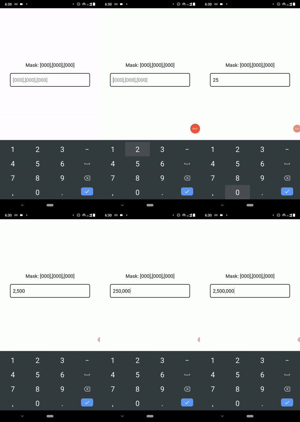
By default, masks will use Left-to-Right (LTR) processing, so if we use the above mask, 2500 will become 250,0 — not 2,500. We can use the Right-to-Left (RTL) processing by adding the following prop:
rightToLeft={true}
Here is the complete App component code:
const App = () => {
  const mask = '[000],[000],[000]';
  return (
    <View style={styles.wrapper}>
      <Text style={styles.label}>Mask: {mask}</Text>
      <TextInputMask
        onChangeText={(formatted, extracted) => {
            console.log(`Formatted: ${formatted}`);
            console.log(`Extracted: ${extracted}`);
        }}
        style={styles.maskedInput}
        mask={mask}
        placeholder={mask}
        rightToLeft={true}
        keyboardType="numeric"
        placeholderTextColor="grey"
        />
    </View>
  );
};
You will see the following result with the above source code snippet:
We have discussed some common masked inputs with the previous examples, but in some scenarios, we need to implement domain-specific input masks.
Assume that you need to create a product code mask according to the following rules:
Ar, AR#) character-) after the first two digitsConsider the following sample product codes:
AR#40-200Be#12-100ta#10-500We can use the following mask in the reusable ProductCodeInput component to satisfy all the above requirements:
const ProductCodeInput = ({value, onChangeText}) => {
  const mask = '[AA]{#}[00]{-}[000]';
  return (
    <TextInputMask
      style={styles.maskedInput}
      mask={mask}
      value={value}
      onChangeText={onChangeText}
      placeholder="NN#00-000"
      placeholderTextColor="grey"
    />
  );
}
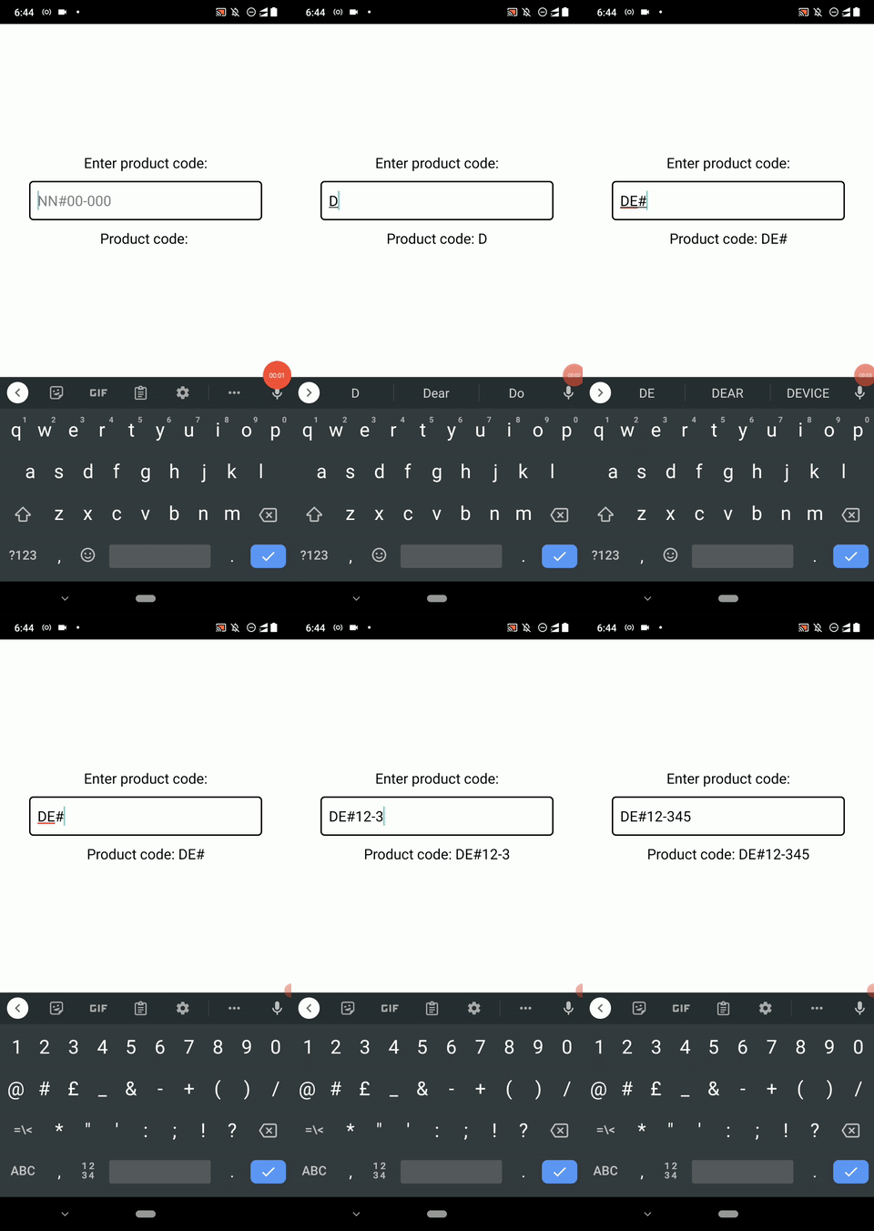
The A notation helps us to match mandatory English letters, and [AA] looks for two English letters. We wrap both fixed characters, # and -, with {} blocks because we need to include them in the extracted value.
Add the following code to the App.js file and check the product code masked input:
import React, {useState} from 'react';
import {
  StyleSheet,
  Text,
  View
} from 'react-native';
import TextInputMask from 'react-native-text-input-mask';

const ProductCodeInput = ({value, onChangeText}) => {
  const mask = '[AA]{#}[00]{-}[000]';
  return (
    <TextInputMask
      style={styles.maskedInput}
      mask={mask}
      value={value}
      onChangeText={onChangeText}
      placeholder="NN#00-000"
      placeholderTextColor="grey"
    />
  );
};

const App = () => {
  const [productCode, setProductCode] = useState('');
  return (
    <View style={styles.wrapper}>
      <Text style={styles.label}>Enter product code:</Text>
      <ProductCodeInput value={productCode} onChangeText={(formatted) => setProductCode(formatted)}/>
      <Text style={styles.label}>Product code: {productCode}</Text>
    </View>
  );
};
const styles = StyleSheet.create({
  wrapper: {
    flex: 1,
    justifyContent: 'center',
    alignItems: 'center',
    backgroundColor: 'white'
  },
  label: {
    color: 'black',
    paddingBottom: 20,
    fontSize: 20
  },
  maskedInput: {
    borderWidth: 2,
    borderRadius: 6,
    width: '80%',
    padding: 12,
    color: 'black',
    fontSize: 20
  }
});

export default App;
The product code masked input will work as follows:
react-native-text-input-mask supports dynamic masking based on user inputs via the affine masks feature. Affine masks are a group of masks that get applied based on a mathematically calculated value, called affinity.
For example, assume that we need to implement a product code mask with the following rules:
1 or 21 and have four total digits, including the prefix 1. Assume that about 90% of product codes start with 1, so we can initially set the 1xxxx template2 have five total digits, including the prefix 2We can implement a masked input component for the above requirements as follows:
const ProductCodeInput = ({value, onChangeText}) => {
  const mask = '1[000]';
  const affineMasks = ['2[0000]'];
  return (
    <TextInputMask
      style={styles.maskedInput}
      mask={mask}
      value={value}
      onChangeText={onChangeText}
      affineFormats={affineMasks}
      keyboardType="numeric"
      affinityCalculationStrategy="PREFIX"
      placeholderTextColor="grey"
    />
  );
};
Here, we used the primary mask 1[000] to accept product codes that begin with 1. Otherwise, we use the secondary mask 2[0000] to accept other product codes if the entered product code prefix is 2. The affinityCalculationStrategy="PREFIX" configuration prop tells the masking library’s pattern matching module to switch affine masks based on the user-entered prefix. You can learn all affinity calculation strategy options from the official library wiki.
Once you update the ProductCodeInput with the above code, you will see the following result:
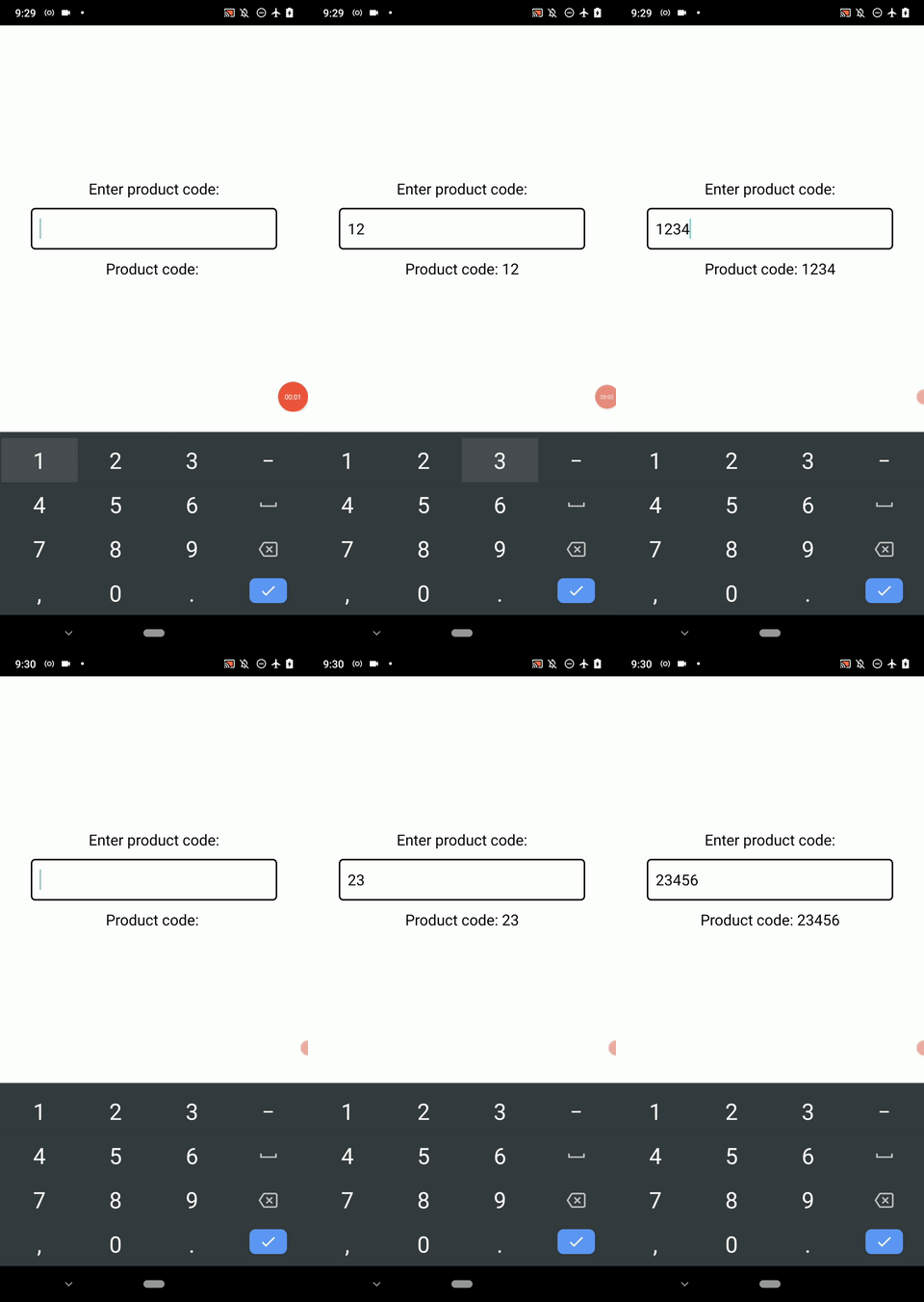
As shown in the above preview, you can’t enter more than four digits when the prefix is 1. If the prefix is 2, you can’t enter more than five digits.
The masked input will autofill prefix 1 for all other user-entered prefixes according to the primary mask definition.
Let’s create a complete, two-step user registration form using input masks and what we’ve learned so far in this tutorial.
First, the user will see a sub-form with the following input fields:
When the user clicks on the submit button, we will show another sub-form with an OTP verification field. Additionally, we display a summary of the previously entered form data as a note in the OTP verification form.
We will also implement basic validation and enable/disable the submit button in real-time.
Look at the following application preview:
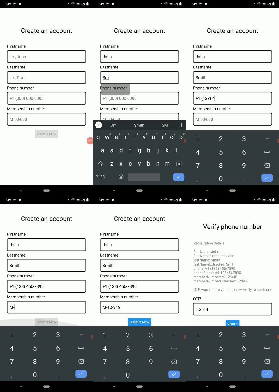
This project has multiple project files, so download or Git clone the complete source code from my GitHub repository first.
Let’s inspect important sections in the source code.
In the App component, we display one sub-form component at a time according to the form name stored in the form state variable, as shown below.
<SafeAreaView style={styles.container}>
  <ScrollView>
    { form == 'register' ?
      <RegisterForm onSubmit={handleOnSubmit}/> :
        <OTPForm note={note}/> }
  </ScrollView>
</SafeAreaView>
The handleOnSubmit callback constructs the note for the OTP form and switch sub-forms with the following code snippet:
const handleOnSubmit = (formData) => {
    let note = Object.keys(formData)
                  .reduce((acc, v) => (acc + `${v}: ${formData[v]} \n`)
                    , '');
    note += '\nOTP was sent to your phone — verify to continue.'
    setNote(note);
    setForm('otp'); // Switch the current sub-form
  };
Here, we used \n to render a new line in the native Text component. The RegisterForm component consists of four masked input elements and each element updates the formData state variable via the handleFieldUpdate function. For example, the membership number input element updates the state as follows:
onChangeText={(formatted, extracted) => handleFieldUpdate('memberNumber', formatted, extracted)}
The handleFieldUpdate stores both formatted and extracted values in the component state. Additionally, it enables/disables the submit button as follows via the setIsValid function:
const handleFieldUpdate = (field, formatted, extracted) => {
    setFormData((prevState) => {
      let formData = {...prevState,
                        [field]: formatted,
                        [`${field}Extracted`]: extracted};
      setIsValid(formData.firstNameExtracted
              && formData.lastNameExtracted
              && formData.phoneExtracted?.length == 10
              && formData.memberNumberExtracted?.length == 5);
      return formData; // new state
    });
  };
// ---- isValid controls the following button:
<Button title="Submit now" onPress={handleSubmit} disabled={!isValid}/>
Finally, the OTPForm component displays the form data summary in an inbuilt, native Text component and displays the four-digit OTP masked input. See the following code snippet.
<View style={styles.form}>
<Text style={styles.heading}>Verify phone number</Text>
      <Text style={styles.note}>Registration details: {note}</Text>
      <View style={styles.field}>
        <Text style={styles.fieldLabel}>OTP</Text>
        <TextInputMask
          style={styles.maskedInput}
          mask="\[0\] [0] \[0\] [0]"
          placeholder="0 0 0 0"
          placeholderTextColor="grey"
          keyboardType="numeric"
        />
      </View>
      <View style={styles.registerBtnWrapper}>
        <Button title="Verify"/>
      </View>
</View>
Note that here we didn’t create reusable masked input components since we only need to show masked inputs in one place. However, if you need to add the same TextInputMask properties in multiple places, make sure to create reusable masked inputs for better maintainability.
For example, we can create a component called OTPInput and wrap TextInputMask if we need to capture OTPs in several input forms.
You can read further about the masking syntax specification from the official library wiki.
As previously discussed, the react-native-text-input-mask library is a flexible and fully-featured input masking library that wraps two, platform-specific native modules.
But this library still has some key open feature requests, like keeping the placeholder visible while typing and support for React Native Web. Also, I noticed several app crashes — which another developer has already reported here — when I try to use the custom notations feature on Android.
Therefore, two other, similar masking libraries are becoming popular and competitive with react-native-text-input-mask nowadays:
Let’s see how each of them measures up.
react-native-mask-text is a new input masking library that supports Android, iOS, web, and Expo platforms. This library offers a minimal, developer-friendly masking syntax and many features for currency masking, which undoubtedly offers better solutions for implementing currency masks compared to react-native-text-input-mask.
For example, we can implement a currency mask for USD as follows:
<MaskedTextInput
  type="currency"
  options={{
    prefix: '$',
    decimalSeparator: '.',
    groupSeparator: ',',
    precision: 2
  }}
  onChangeText={(formatted, extracted) => {
    console.log(`Formatted: ${formatted}`);
    console.log(`Extracted: ${extracted}`);
  }}
  style={styles.maskedInput}
  keyboardType="numeric">
</MaskedTextInput>
The above code snippet produces the following currency masked input:
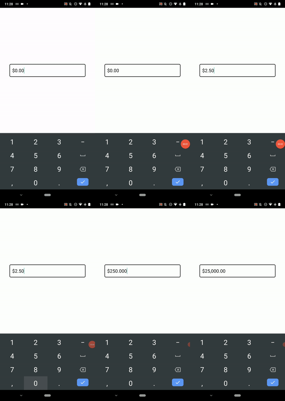
react-native-mask-input is another new masking library that comes with a regex-based masking syntax. This library supports character obfuscation, meaning we can replace visible characters with a specific character like a custom password input box.
For example, the following code implements a four-digit PIN by obfuscating the last two digits for security purposes.
const App = () => {
  const [otp, setOtp] = useState('');
  return (
    <View
      style={styles.wrapper}>
      <MaskInput
        value={otp}
        onChangeText={(formatted, extracted, obfuscated) => {
          setOtp(formatted);
          console.log(`Formatted: ${formatted}`);
          console.log(`Extracted: ${extracted}`);
          console.log(`Obfuscated: ${obfuscated}`);
        }}
        mask={[/\d/, /\d/, [/\d/], [/\d/]]}
        showObfuscatedValue={true}
        style={styles.maskedInput}
        keyboardType="numeric"
        placeholder="0000"
        placeholderTextColor="grey"
      />
    </View>
  );
};
The above code snippet produces the following masked OTP input:
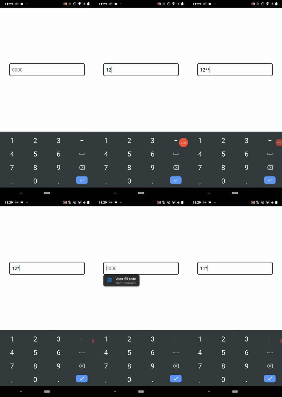
You may already notice that these two alternative libraries show invalid character inputs for a while and erase them instantly. The reason for this is that both libraries handle masking in the JavaScript context, so we cannot expect a near-native performance from these alternative libraries, as we can with react-native-text-input-mask.
In this tutorial, we learned how to use react-native-text-input-mask in React Native applications with various practical examples. Additionally, we discussed two alternative input masking libraries.
I suggest picking one masking library according to your preferences and requirements. However, from the feature and performance perspectives, the react-native-text-input-mask library is the best input masking library overall for implementing input masks in React Native apps.
Input masks help users to understand the expected input formats in a more user-friendly approach than static placeholders, tooltips, or help texts. Input masks typically support copy/pasting too, so we don’t need to worry about how the user enters a value for a masked input.

LogRocket's Galileo AI watches sessions for you and and surfaces the technical and usability issues holding back your React Native apps.
LogRocket also helps you increase conversion rates and product usage by showing you exactly how users are interacting with your app. LogRocket's product analytics features surface the reasons why users don't complete a particular flow or don't adopt a new feature.
Start proactively monitoring your React Native apps — try LogRocket for free.

Learn how Vite+ unifies Vite, Vitest, Oxlint, Oxfmt, Rolldown, and Node.js management in one CLI.

AI companies are buying developer tools as coding agents turn runtimes, package managers, and linters into strategic infrastructure.

Learn how AI-assisted development governance uses rules, agents, hooks, and protocols to help AI coding tools produce safer, more consistent code.

A step-by-step guide to building your first MCP server using Node.js, covering core concepts, tool design, and upgrading from file storage to MySQL.
Hey there, want to help make our blog better?
Join LogRocket’s Content Advisory Board. You’ll help inform the type of content we create and get access to exclusive meetups, social accreditation, and swag.
Sign up now