Form inputs are key components for user input and interaction with the app, from sign up, sign in, content creation, commenting, etc. These are critical parts of any app and ensuring that the user experience on forms is seamless can greatly improve the usability of the app.

In this post, we are going to go through creating a few forms using Formik. Formik is a simple React/React Native form library that helps with handling form state, input validation, formatting, error handling, form submission, amongst other things. Formik keeps everything simple under the hood using react state and pros making it easy to understand, integrate, debug, and test your forms.
We will also sprinkle some Yup into the mix to help with building the schema for validating and parsing the form inputs.
To follow this article you’ll need:
If you don’t have React Native set up, refer to the docs to get started then pick up from there.
We’ll set up our new app using:
npx react-native init formikExample
This will create a folder formikExample with our React Native project in there. Run the project on your simulator or device and make sure it displays the React Native welcome screen.
With the React Native project set up, now let’s get to creating some forms. In this blog we will create three forms:
These three forms should help us cover some of the core features of using Formik and Yup to create forms.
To finalize this section, let’s add the two libraries we will be using:
yarn add formik yup
Starting with the easier of the forms. This should have two inputs for email and password and a login button.
Let’s do some clean up first before we start adding our text inputs. Update App.js as seen here:
// App.js
import React from 'react'
import {
  SafeAreaView,
  StyleSheet,
  ScrollView,
  View,
  Text,
  StatusBar,
  TextInput,
} from 'react-native'

const App = () => {
  return (
    <>
      <StatusBar barStyle="dark-content" />
      <SafeAreaView style={styles.container}>
        <View style={styles.loginContainer}>
          <Text>Login Screen</Text>
        </View>
      </SafeAreaView>
    </>
  )
}

const styles = StyleSheet.create({
  container: {
    flex: 1,
    justifyContent: 'center',
    alignItems: 'center',
  },
  loginContainer: {
    width: '80%',
    alignItems: 'center',
  }
})

export default App

This should change the defaultWelcome screen to “Login Screen” text at the center of our screen.
Now let’s get to adding some inputs.
When adding TextInputs for say email addresses, it requires us to set up state for storing the email value and a handleEmailChange function to handle text changes and update email state.
This can become too much especially when you’re working with a lot of inputs.
This is where Formik comes in to help handle all this repetitive work. So let’s see how to do it with Formik, let’s add the email input form using Formik.
We’ll start by importing the Formik library and then setting up the inputs:
// App.js

import { Formik } from 'formik'

...
        <View style={styles.loginContainer}>
          <Text>Login Screen</Text>
          <Formik
            initialValues={{ email: '', password: '' }}
            onSubmit={values => console.log(values)}
          >
            {({ handleChange, handleBlur, handleSubmit, values }) => (
              <>
                <TextInput
                  name="email"
                  placeholder="Email Address"
                  style={styles.textInput}
                  onChangeText={handleChange('email')}
                  onBlur={handleBlur('email')}
                  value={values.email}
                  keyboardType="email-address"
                />
                <TextInput
                  name="password"
                  placeholder="Password"
                  style={styles.textInput}
                  onChangeText={handleChange('password')}
                  onBlur={handleBlur('password')}
                  value={values.password}
                  secureTextEntry
                />
                <Button onPress={handleSubmit} title="Submit" />
              </>
            )}
          </Formik>
        </View>
A good user interface helps improve user experience, so let’s add a few more styles to help style up our input to look better.
Let’s add the styles below to improve the user interface as shown below:
const styles = StyleSheet.create({

  loginContainer: {
    width: '80%',
    alignItems: 'center',
    backgroundColor: 'white',
    padding: 10,
    elevation: 10,
    backgroundColor: '#e6e6e6'
  },
  textInput: {
    height: 40,
    width: '100%',
    margin: 10,
    backgroundColor: 'white',
    borderColor: 'gray',
    borderWidth: StyleSheet.hairlineWidth,
    borderRadius: 10,
  },
})
Currently, our onSubmit function is a console.log statement for the values passed. This is where our login function will come in and get those values for processing.
Let’s test out our handleSubmit on debug mode, enter some content in the text inputs, and see whether the values get logged in the debugger.
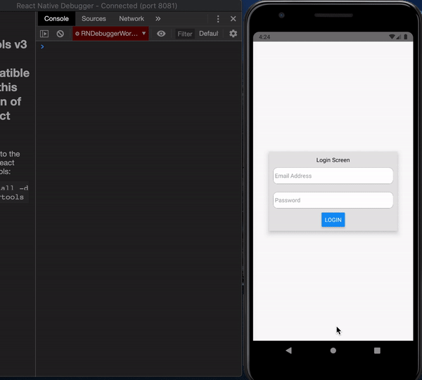
As you might have noticed, however, we can submit without values, with a wrongly formatted email address amongst other defects. We do not want that to be the case, we want the user to only be able to log in when they enter a correctly formatted email and a password. Until then, we’d like the login button to be disabled.
This is where input validation comes in, we would like to create a validation schema that will check if the format of inputs is as expected. As mentioned we will be using Yup to create the validation schema and provide custom error messages for each check.
Let’s create the login validation schema as seen below:
// App.js
import * as yup from 'yup'

const loginValidationSchema = yup.object().shape({
  email: yup
    .string()
    .email("Please enter valid email")
    .required('Email Address is Required'),
  password: yup
    .string()
    .min(8, ({ min }) => `Password must be at least ${min} characters`)
    .required('Password is required'),
})
As seen in the schema, email is supposed to be a string() of formatted email to check whether it’s the correct email format, we are also returning a corresponding error message if a check fails, we’ll display this later on.
For the password field, it is also a required string as seen, we also add another check for the minimum number of characters, min(8) to ensure the password has a minimum of 8 characters.
There are a lot more checks you can add to your inputs, check out the Yup docs for more.
Now let’s add this schema to our Formik form so that we can use it to validate our inputs. We’ll update our Form as seen below:
// App.js

<Formik
   validationSchema={loginValidationSchema}
   initialValues={{ email: '', password: '' }}
   onSubmit={values => console.log(values)}
 >
   {({
     handleChange,
     handleBlur,
     handleSubmit,
     values,
     errors,
     isValid,
   }) => (
     <>
       <TextInput
         name="email"
         placeholder="Email Address"
         style={styles.textInput}
         onChangeText={handleChange('email')}
         onBlur={handleBlur('email')}
         value={values.email}
         keyboardType="email-address"
       />
       {errors.email &&
         <Text style={{ fontSize: 10, color: 'red' }}>{errors.email}</Text>
       }
       <TextInput
         name="password"
         placeholder="Password"
         style={styles.textInput}
         onChangeText={handleChange('password')}
         onBlur={handleBlur('password')}
         value={values.password}
         secureTextEntry
       />
       {errors.password &&
         <Text style={{ fontSize: 10, color: 'red' }}>{errors.password}</Text>
       }
       <Button
         onPress={handleSubmit}
         title="LOGIN"
         disabled={!isValid}
       />
     </>
   )}
 </Formik>
We added our validationSchema as seen above, all our inputs are validated against the schema after every change to ensure they match the expected format.
If they don’t errors are generated for each input depending on the current input.
To display the errors we destructure them from the Formik props as shown above and display them below the corresponding text inputs.
We also access the isValid state which is a boolean value that is used to check if the inputs are valid or not, we’ll use this to set the disabled state of the login button.
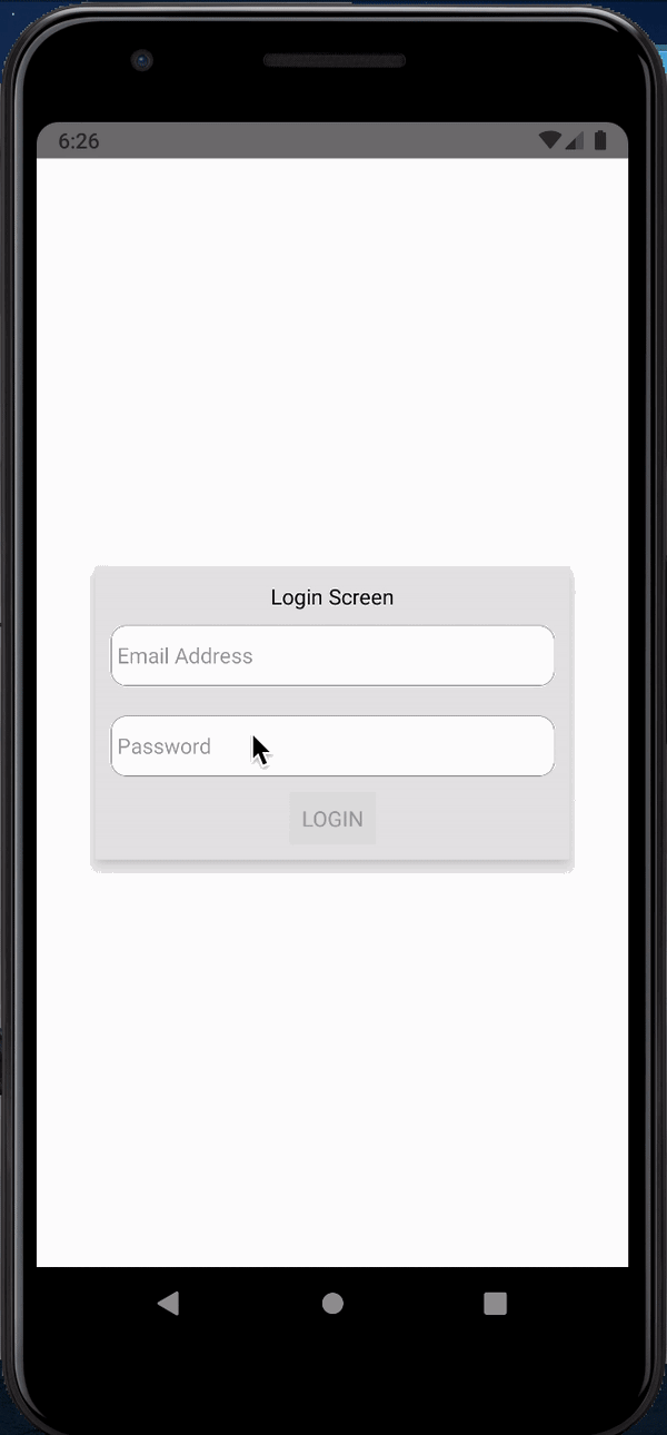
Due to the fact that all inputs are checked after every change, we will have errors getting displayed even when a user hasn’t started interacting with that input.
We do not want that to be the case so we will add a check to ensure errors are shown only after the user touches an input.
            {({
              handleChange,
              handleBlur,
              handleSubmit,
              values,
              errors,
              touched,
              isValid,
            }) => (
...
                {(errors.email && touched.email) &&
                  <Text style={styles.errorText}>{errors.email}</Text>
                }

                {(errors.password && touched.password) &&
                  <Text style={styles.errorText}>{errors.password}</Text>
                }

...
// in stylesheet
  errorText: {
    fontSize: 10,
    color: 'red',
  },
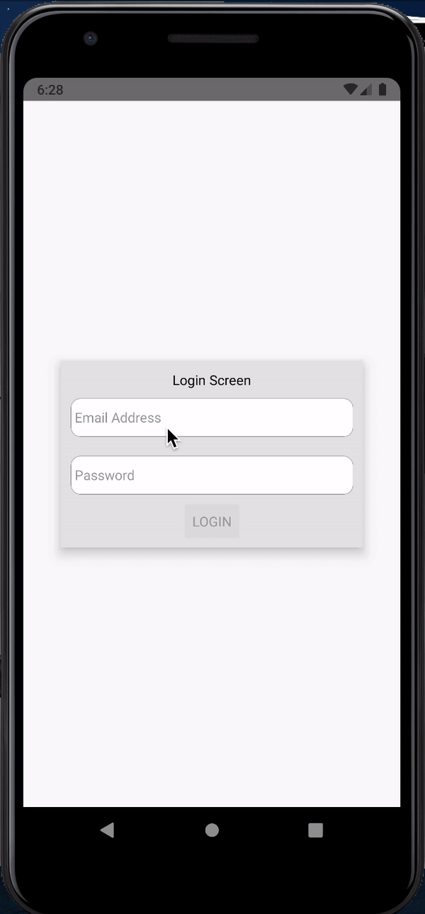
Notice on this second image, the error only appears after the input in question has been touched, as opposed to the first, where the errors appear on all inputs even when only one has been touched.
With that, we have finished up our login form.
Let’s move on to sign up form.
In the previous section on login form, we used Formik to handle our forms but still had to pass the different functions (like handleChange, handleBlur value, etc.) to each TextInput, this can become a lot of work as inputs increase.
Formik provides a component Field that automatically hooks up inputs to Formik for us. In this section, we will explore that.
Let’s start this section by creating a CustomInput component that will be passed into the Field component, get the Formik props, and handle the inputs for us.
We’ll create a file named CustomInput.js and add the following code to it:
// CustomInput.js
import React from 'react'
import { Text, TextInput, StyleSheet } from 'react-native'

const CustomInput = (props) => {
  const {
    field: { name, onBlur, onChange, value },
    form: { errors, touched, setFieldTouched },
    ...inputProps
  } = props

  const hasError = errors[name] && touched[name]

  return (
    <>
      <TextInput
        style={[
          styles.textInput,
          hasError && styles.errorInput
        ]}
        value={value}
        onChangeText={(text) => onChange(name)(text)}
        onBlur={() => {
          setFieldTouched(name)
          onBlur(name)
        }}
        {...inputProps}
      />
      {hasError && <Text style={styles.errorText}>{errors[name]}</Text>}
    </>
  )
}

const styles = StyleSheet.create({
  textInput: {
    height: 40,
    width: '100%',
    margin: 10,
    backgroundColor: 'white',
    borderColor: 'gray',
    borderWidth: StyleSheet.hairlineWidth,
    borderRadius: 10,
  },
  errorText: {
    fontSize: 10,
    color: 'red',
  },
  errorInput: {
    borderColor: 'red',
  }
})

export default CustomInput
As you can see, this CustomInput takes care of a lot of the things we were doing in the login form TextInputs, from handling the input, styling, checking for and rendering errors, etc.
Now let’s create a new file SignUp.js that will house our sign up form. To view the contents, let’s point our index.js to the signup screen.
On index.js update app import to import App from './SignUp'.
Now on the SignUp.js let’s get started with the following code:
// SignUp.js
import React from 'react'
import {
  SafeAreaView,
  StyleSheet,
  View,
  Text,
  StatusBar,
  TextInput,
  Button,
} from 'react-native'
import { Formik, Field } from 'formik'
import * as yup from 'yup'

const SignUp = () => {
  return (
    <>
      <StatusBar barStyle="dark-content" />
      <SafeAreaView style={styles.container}>
        <View style={styles.signupContainer}>
          <Text>Sign Up Screen</Text>

        </View>
      </SafeAreaView>
    </>
  )
}

const styles = StyleSheet.create({
  container: {
    flex: 1,
    justifyContent: 'center',
    alignItems: 'center',
  },
  signupContainer: {
    width: '80%',
    alignItems: 'center',
    backgroundColor: 'white',
    padding: 10,
    elevation: 10,
    backgroundColor: '#e6e6e6'
  },
})
export default SignUp
This should display our initial sign up screen with just the text.
Now let’s import the CustomInput we created and get started with our SignUp form using the Field component as discussed:
// SignUp.js

import CustomInput from './CustomInput'

...
          <Text>Sign Up Screen</Text>

          <Formik
            initialValues={{
              fullName: '',
              email: '',
              phoneNumber: '',
              password: '',
              confirmPassword: '',
            }}
            onSubmit={values => console.log(values)}
          >
            {({ handleSubmit, isValid }) => (
              <>
                <Field
                  component={CustomInput}
                  name="fullName"
                  placeholder="Full Name"
                />
                <Field
                  component={CustomInput}
                  name="email"
                  placeholder="Email Address"
                  keyboardType="email-address"
                />
                <Field
                  component={CustomInput}
                  name="phoneNumber"
                  placeholder="Phone Number"
                  keyboardType="numeric"
                />
                <Field
                  component={CustomInput}
                  name="password"
                  placeholder="Password"
                  secureTextEntry
                />
                <Field
                  component={CustomInput}
                  name="confirmPassword"
                  placeholder="Confirm Password"
                  secureTextEntry
                />

                <Button
                  onPress={handleSubmit}
                  title="SIGN UP"
                  disabled={!isValid}
                />
              </>
            )}
          </Formik>
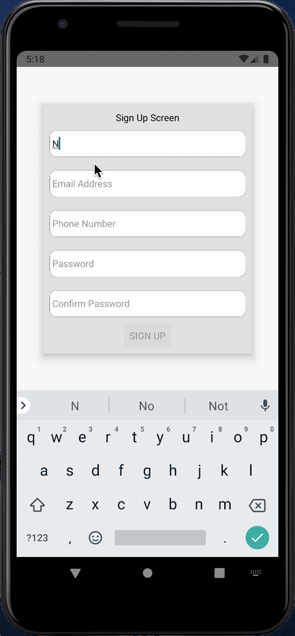
As you may notice, since Field automatically hooks up the input to Formik, we are destructuring way fewer props from Formik since they get passed directly to CustomInput. This creates cleaner and easier to read code.
We also added a few more inputs, full name, phone number, password, and confirm password.
Finally, for our sign up form, let’s add the validationSchema. We will also take this opportunity to flex some yup validation muscle. One of the key benefits of yup is that we can use its vast extensible API to validate different input formats.
We will use the validation schema to:
Alright, let’s add the validation schema:
// SignUp.js
const signUpValidationSchema = yup.object().shape({
  fullName: yup
    .string()
    .matches(/(\w.+\s).+/, 'Enter at least 2 names')
    .required('Full name is required'),
  phoneNumber: yup
    .string()
    .matches(/(01)(\d){8}\b/, 'Enter a valid phone number')
    .required('Phone number is required'),
  email: yup
    .string()
    .email("Please enter valid email")
    .required('Email is required'),
  password: yup
    .string()
    .matches(/\w*[a-z]\w*/,  "Password must have a small letter")
    .matches(/\w*[A-Z]\w*/,  "Password must have a capital letter")
    .matches(/\d/, "Password must have a number")
    .matches(/[!@#$%^&*()\-_"=+{}; :,<.>]/, "Password must have a special character")
    .min(8, ({ min }) => `Password must be at least ${min} characters`)
    .required('Password is required'),
  confirmPassword: yup
    .string()
    .oneOf([yup.ref('password')], 'Passwords do not match')
    .required('Confirm password is required'),
})
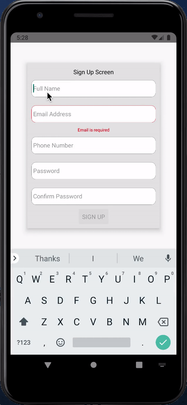
Then pass it to our Formik form validationSchema={signUpValidationSchema}.
For the full name above, we use regex to ensure that the users enter at least two names. We also use regex to check the phone number format, in this case checking if the number is in the format 01xxxxxxxx.
Then finally for the password, we use regex to ensure the user creates a password with at least one small letter, one capital letter, one number, one special character, and at least 8 characters.
We also use Yup to ensure that confirm password matches the password.
And that wraps it up for the signup form.
Finally, let’s jump onto our last form. The content creation form, in this form we will have three fields for title, content, and photo.
As we did earlier let’s create a new file BlogForm.js for our form and update our ppp in index.js to point to it import App from './BlogForm'.
Now let’s jump on our BlogForm and add the following code to get started:
// BlogForm.js
import React from 'react'
import {
  SafeAreaView,
  StyleSheet,
  View,
  Text,
  StatusBar,
  Button,
} from 'react-native'
import { Formik, Field } from 'formik'
import * as yup from 'yup'
import CustomInput from './CustomInput'

const App = () => {
  return (
    <>
      <StatusBar barStyle="dark-content" />
      <SafeAreaView style={styles.container}>
        <View style={styles.signupContainer}>
          <Text>Blog Screen</Text>
          <Formik
            initialValues={{
              title: '',
              post: '',
            }}
            onSubmit={values => console.log(values)}
          >
            {({ handleSubmit, isValid, values }) => (
              <>
                <Field
                  component={CustomInput}
                  name="title"
                  placeholder="Title"
                />
                <Field
                  component={CustomInput}
                  name="post"
                  placeholder="Write post..."
                  multiline
                  numberOfLines={3}
                />
                <Button
                  onPress={handleSubmit}
                  title="POST"
                  disabled={!isValid}
                />
              </>
            )}
          </Formik>
        </View>
      </SafeAreaView>
    </>
  )
}

const styles = StyleSheet.create({
  container: {
    flex: 1,
    justifyContent: 'center',
    alignItems: 'center',
  },
  signupContainer: {
    width: '80%',
    alignItems: 'center',
    backgroundColor: 'white',
    padding: 10,
    elevation: 10,
    backgroundColor: '#e6e6e6'
  },
})
export default App
Notice we added a few properties to the post input, making it multiline and increasing numberOfLines to three.
This is to make our input bigger so let’s make a few tweaks on the CustomInput to make sure that updates well:
// CustomInput.js
    <TextInput
      style={[
        styles.textInput,
        props.multiline && { height: props.numberOfLines * 40 },
        hasError && styles.errorInput
      ]}
And add textAlignVertical: 'top', to the textInput styles, this should keep the text at the top of the multiline input.
This should update the styles to increase the height of our input depending on the numberOfLines.
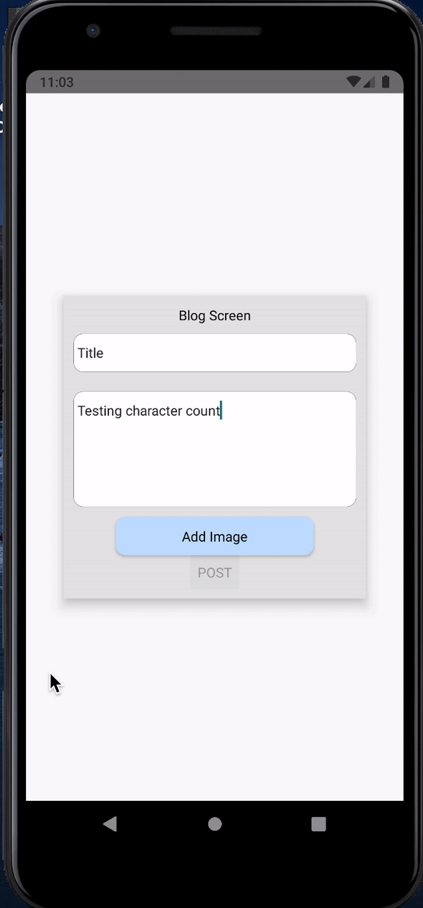
Before we run and see how this looks let’s also add our validation schema.
Earlier, we used .min() to ensure passwords are above 8 characters, we’ll use the same here to ensure the post is long enough (20 character minimum) and show the user a message on the number of characters to go:
// BlogForm.js
    const blogValidationSchema = yup.object().shape({
      title: yup
        .string()
        .required('Title is required'),
      post: yup
        .string()
        .min(20, ({ min, value }) => `${min - value.length} characters to go`)
        .required('Blog post is required'),
    })
And pass that into our Formik form validationSchema={blogValidationSchema}.
Let’s finalize this section by adding an image selector and adding validations for that. We will be using react native image picker for our media selection, check out the docs for more details on set up and usage:
yarn add react-native-image-picker
npx pod-install
With the image picker setup, import the ImagePicker and add a button to select images and pass them to our Formik form:
// BlogForm.js
import ImagePicker from 'react-native-image-picker'

...

                <Field
                  component={CustomInput}
                  name="post"
                  placeholder="Write post..."
                  multiline
                  numberOfLines={3}
                />
                <TouchableOpacity
                  style={styles.photoButton}
                  onPress={() => {
                    ImagePicker.showImagePicker(
                      { title: 'Select Photo' }, (response) => {
                        if (response.uri) setFieldValue('photo', response)
                        setFieldTouched('photo', true)
                    })
                  }}
                >
                  <Text>Add Image</Text>
                </TouchableOpacity>

                {values.photo &&
                  <Text>{`...${values.photo.fileName.substr(values.photo.fileName.length - 10)}`}</Text>
                }

                {(errors.photo && touched.photo) &&
                  <Text style={{ color: 'red' }}>{errors.photo}</Text>
                }
Since this is not a text input, we will need to set touched and value state manually so remember to destructure setFieldValue, setFieldTouched, errors, and touched from Formik props.
We will need this to set the values and touched state, as well as display the error for missing photos.
We will also need to update our validation schema to check for photo objects, to do this add
photo: yup.object().required('Photo is required'), to the validation schema.
You can extend yup object validation further to even check for the shape of the object to ensure all required fields like fileName, path, type, etc.
Formik and Yup offer an easy, understandable, and extensible solution to handling forms in React and React Native, providing us with solutions for input validation, error checking, handling and display, handling submissions, and many more.
There is a lot more you can do with these powerful tools to make your forms much more intuitive and functional, this blog just scratches the surface on that.
You can find all the code covered here on my GitHub.
As always, happy coding.

LogRocket's Galileo AI watches sessions for you and and surfaces the technical and usability issues holding back your React Native apps.
LogRocket also helps you increase conversion rates and product usage by showing you exactly how users are interacting with your app. LogRocket's product analytics features surface the reasons why users don't complete a particular flow or don't adopt a new feature.
Start proactively monitoring your React Native apps — try LogRocket for free.

Learn how to protect full-stack projects from NPM supply chain attacks with a practical security checklist.

Explore 15 essential MCP servers for web developers to enhance AI workflows with tools, data, and automation.

Learn how contrast-color() automatically picks accessible text colors using native CSS, without JavaScript.

Learn how to build a harness-style AI workflow using Claude Code with specialized Dev, QE, and Ops subagents, gated handoffs, MCP telemetry, and LEARNING.md.
Would you be interested in joining LogRocket's developer community?
Join LogRocket’s Content Advisory Board. You’ll help inform the type of content we create and get access to exclusive meetups, social accreditation, and swag.
Sign up now

 Learn more →
