
Product designers are invariably optimists. They’re bringing something new into the world, whether an entire platform or just a feature, which requires a determined focus on ideal usage scenarios so that key aspects of a product perform as well as possible.
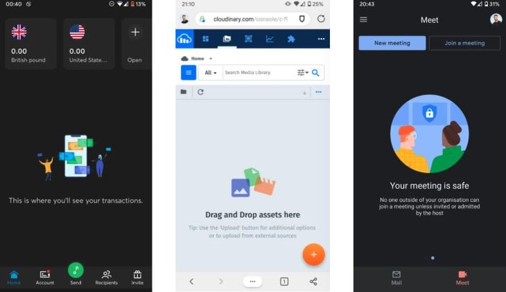
This optimism keeps them — and their teams — motivated when they encounter the inevitable challenges that arise in product work. Yet it can also prevent designers from accounting for all of the ways in which a product can fail its users: interactions that don’t fire, content that doesn’t load, mistakes a user might make, or even simply accounting for all possible empty states, an often overlooked aspect of UI design.
While developers inherit a history of robust error-testing practices, there isn’t much of an analog in design. Designers often critique their work mainly for design issues (e.g., “this color combination doesn’t pass accessibility”) without digging into potential implementation issues (e.g., “what happens if this table doesn’t load?”). Designers are biased toward best-case scenarios, whereas developers instinctively consider all the ways something could go wrong, then test for it.
Yet products earn trust and retain users by the ways in which they gracefully fail. A product is only as good as its most error-prone interaction (insert quote about how failure reveals character).
As important as the perceived quality of a product is, error handling design and copy are often an afterthought, written on the spot when a developer identifies a potential erroneous scenario in an interface. This isn’t a knock on developers — they’re the ones doing the needed work of anticipating feature failures — but rather a recognition that designers may not take the initiative to make thoughtful, thorough, and consistent error messages across entire interfaces. I’m including myself here, too.
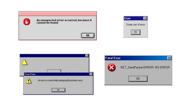
There are a few reasons why designers may neglect error handling UI. For one, designers often aren’t aware of the potential error states of their designs, so they need to have an intentional conversation with their developers.
Second, design tools haven’t historically been friendly to state management. Designing error states meant duplicating artboards in order to document all possible permutations, resulting in unwieldy files with arcane naming systems.
With the advent of improved component design features, designing numerous states for the same element or screen has become quicker and easier. Each issue concerns communication: designers and developers identifying and documenting error states together, and designers making and sharing error handling UI in a more manageable way. Below, I’ll describe some ways to handle both.
The Replay is a weekly newsletter for dev and engineering leaders.
Delivered once a week, it's your curated guide to the most important conversations around frontend dev, emerging AI tools, and the state of modern software.
Not all error states can be anticipated at the start, of course. Yet it’s helpful to document types of error states for components before designing them, updating designs as additional error states are discovered.
Generally speaking, there are two types of errors:
Auditing and designing for all possible states ensures that design consideration permeates the nooks and crannies of product interfaces, that no opportunity for thoughtful microcopy or loading animations or affirming illustrations is overlooked. It’s up to designers to consistently seek developers’ input on all of the product-side errors that can occur in the product they are designing.
As for user-side errors, usability testing prototypes is a necessary practice for discovering actual and potential issues. Keeping a database of user research observations in a tool like Airtable provides designers not only with general and feature-specific areas for improvement but can also reveal needed states for pages and components. Small improvements can go a long way toward affirming users throughout their use of the product. Maybe that information-dense dashboard needs a skeleton screen after all.
For the past five years, Figma has incrementally established itself as a leading tool for designing for the web. They’ve developed a feature set that has a clear, implicit strategy of facilitating collaboration between designers and developers. While many of Figma’s features (e.g., styles and components) aren’t unique to the tool, recent additions like smart animate, auto layout, and variants are a leap forward for designers working on robust, interaction-rich products.
Variants allow designers to define multiple properties for a single component, which simplifies page design and brings the work of design closer to the work of development. For example, a single button can contain variations for size, state, icon placement, split (whether the button contains a flyout menu), etc. A standard button component might contain properties for:
| Type | Primary, Secondary, Tertiary |
| State | Default, Hover, Active, Focus, Disabled |
| Size | Large, Medium, Small |
| Icon | Left, Right, None |
| Split | On, Off |
Prior to variants, designers dealt with unwieldy collections of components, one for each state. Now, once defined, these properties can be adjusted on the fly for the component. To learn how to set component properties, check out the Figma tutorial.
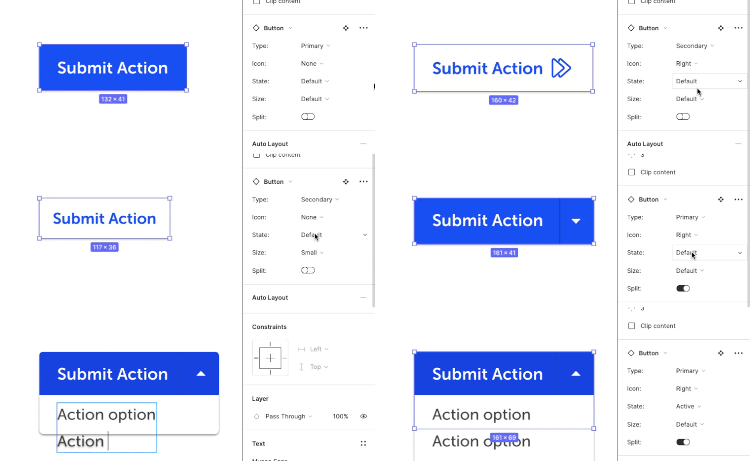
Combined with auto-layout, variants can be used to create more versatile components, like secondary navigation that can alternate primary and secondary actions depending on the context.
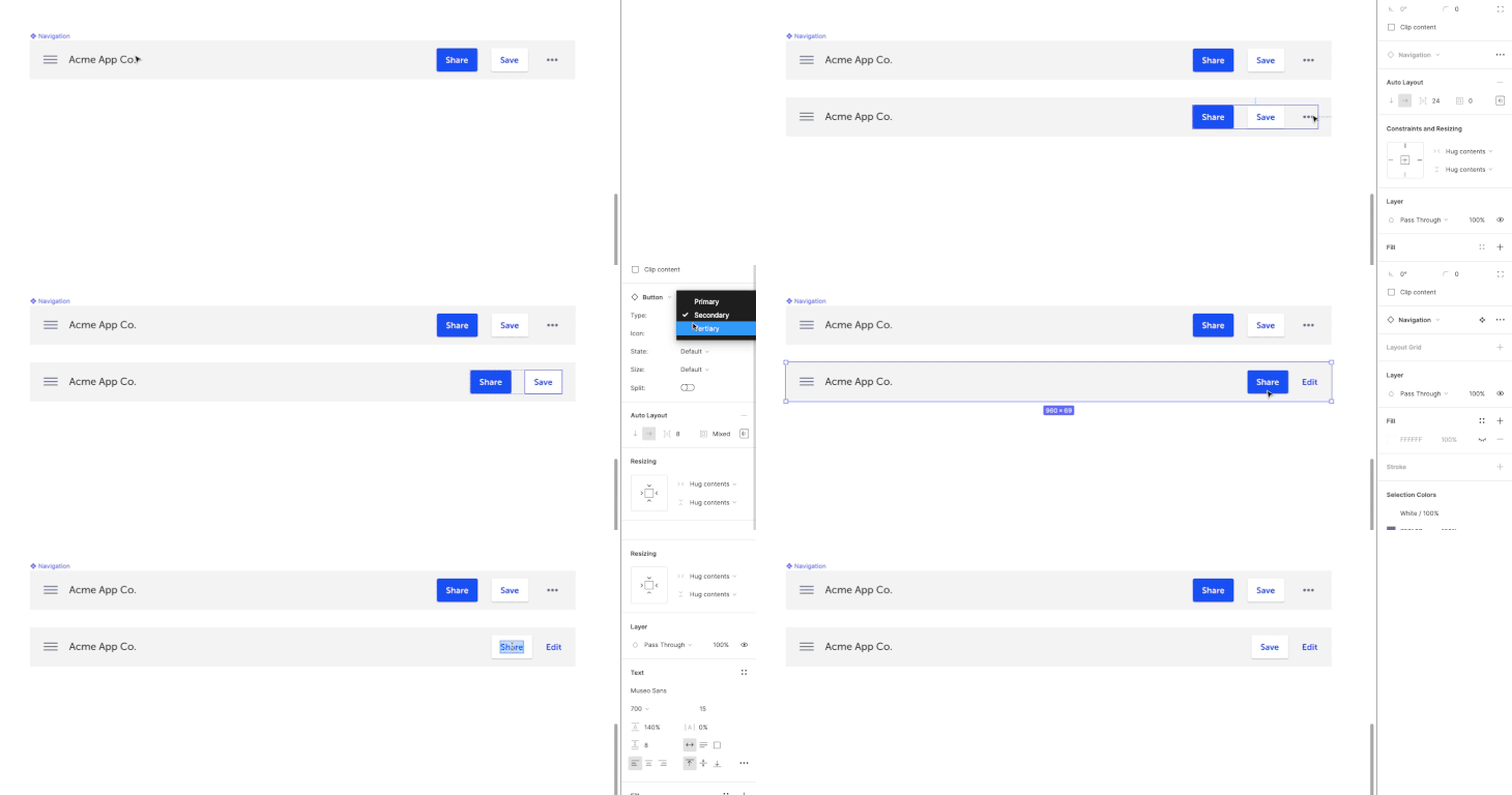
Even with variants, designers still have to design each and every state. However, states can now be contained within components, much the same way developers define properties for UI elements. And oftentimes, designers can simply adjust certain properties of a component to define a new variant for it. Designing error states becomes that much easier.
Say a team is working on a dynamic, multi-field form set that updates as a user fills it in. Multiple states can be defined for individual form elements (default, focus, loading, disabled, error, etc.):
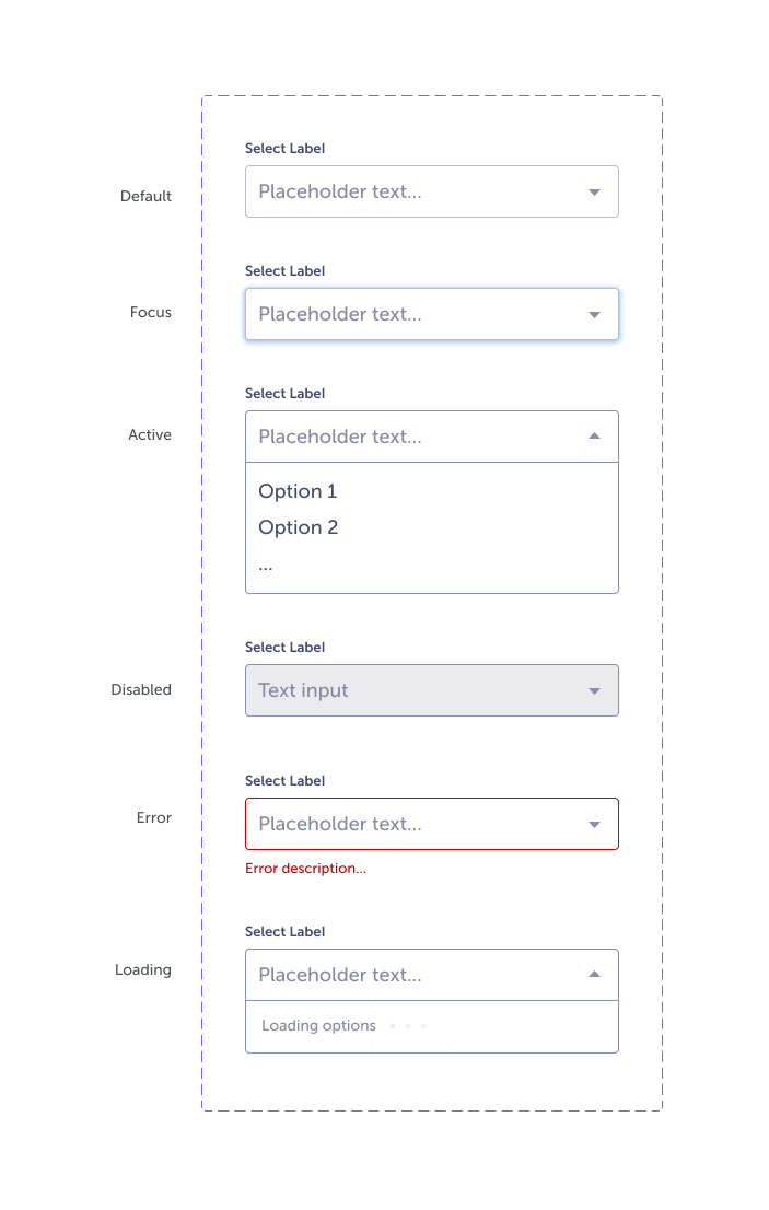
But we can take this a step further and define properties for the form set. The set component might contain a loading state, default state, various states for different types of form interactions, error states for individual forms, and an error state for the set overall.
Variants also enable conditional logic to be displayed more easily, as conditions can be defined as properties. Taken together, these features streamline the creation of clickable prototypes in Figma, useful for both usability testing and more clearly conveying design intent.

The definition of variants can appear unwieldy, with sometimes 40+ permutations defined for a single button component. Yet, once defined, accessing component states prototypes is far less onerous than it once was (and still is, in other tools), and variants are easily added and modified at the source. You can explore this example here. This is a relatively basic example, but hopefully, it’s evident how variants can be used to design states for more complex components.
The evolution of digital design tools can be seen as the effort to clarify the conversation between design and development. Ten years ago, websites were designed in Photoshop, as designers pushed the limits of the photo editing tool to create images that looked like websites.
Today, with design tools like Webflow, Figma, and Adobe XD, the boundary between design and development is fading, and to good effect. Modern design and prototyping tools have turned what used to be an error-prone telephone game on project teams (“turn this PSD file into a responsive webpage!”) into a face-to-face conversation, everyone speaking the same language and picking up on important nuances.
Yet, the handoff between design and development will never be perfectly seamless, and better tooling won’t change product designers’ processes of its own accord. To learn to look at a product with developers’ eyes, designers need to work closely and often with developers.
But we’re reaching a point with modern design tools where the work of design is able to parallel the work of development such that designers can support the myriad permutations of a product UI without the cumbersome file management once required.
It’s not difficult to imagine a future where static design prototypes resemble their functional counterparts even more closely; nuanced state transitions have always been a limiting element. Call me overly optimistic, but it feels like we’re entering a golden age for design tools.
Install LogRocket via npm or script tag. LogRocket.init() must be called client-side, not
server-side
$ npm i --save logrocket

// Code:

import LogRocket from 'logrocket';
LogRocket.init('app/id');
// Add to your HTML:

<script src="https://cdn.lr-ingest.com/LogRocket.min.js"></script>
<script>window.LogRocket && window.LogRocket.init('app/id');</script>

A step-by-step guide to building your first MCP server using Node.js, covering core concepts, tool design, and upgrading from file storage to MySQL.

Using security headers in your Next.js apps is a highly effective way to secure websites from common security threats.

A deep dive into May 2026’s AI model and tool rankings. We break down performance, usability, pricing, and real-world capabilities across 50+ features to help you pick the right tools for your development workflow.

A practical guide to Agent Browser CLI. Learn how AI agents navigate, snapshot, and interact with web pages using stable references, enabling efficient automation and exploratory testing.
Hey there, want to help make our blog better?
Join LogRocket’s Content Advisory Board. You’ll help inform the type of content we create and get access to exclusive meetups, social accreditation, and swag.
Sign up now