There is a diverse range of hearing, sight, and cognitive abilities among those who access the internet. This is why accessibility has become an essential part of how web applications are built.

Developers are tasked with removing the communication and interaction barriers that many people face in the physical world. The goal is to design solutions and tools that work for everyone regardless of their language, location, ability, or the hardware or software they use.
Unfortunately, despite its importance, accessibility is still a rather complicated aspect of web development. So, many developers shy away from incorporating accessibility into their projects. Instead, they end up building poorly designed applications that create barriers (instead of removing them), unintentionally excluding certain people from using the web.
In this article, we’ll introduce Ariakit, an open source, low-level component toolkit for building accessible web applications in React. We’ll demonstrate how we can use Ariakit’s components to build accessible web applications easily and efficiently.
Jump ahead:
To follow along with this tutorial, you’ll need the following:
Ariakit provides a variety of UI components, such as Form, Dialog, Tab, Tooltip, and more, that can be used to rapidly build accessibility-driven web applications, UI libraries, and design systems.
If accessibility is one of your top priorities, you’ll find Ariakit useful; its components follow WAI-ARIA recommendations and come with inbuilt accessibility.
Before we get into how Ariakit works and how to use it, let’s see how we can install and integrate it into a React application.
The first step is to open up your command-line tool, cd into a project folder, and run the following command to install Ariakit:
npm i ariakit
If you don’t have an existing project and would like to follow along with this tutorial, you can go ahead and install React using the Vite CLI:
npm create vite@latest
This command will prompt you to choose your preference for the project. Select the below options to proceed:

Once the installation is completed, run the following code to cd into the project folder, install the necessary dependencies, and start the development server:
  cd ariakit-example
  npm install
  npm run dev
We’re set; now we can start importing Ariakit components into our project.
Ariakit is a collection of components and hooks. Each component accepts three kinds of props: options, attribute, and state.
Let’s take a closer look.
options propsoptions props are custom properties that affect the internal component’s behavior. They translate to actual HTML attributes during build time:
import { Button } from "ariakit";
import "./App.css";

function App() {
  return (
    <div className="App">
      <div>
        <Button hidden>Click</Button>
      </div>
    </div>
  );
}

export default App;
In the example above, the hidden prop is an options prop; it will hide an otherwise visible component from the view. In this case, it will hide the Button component from the browser.
attribute propsattribute props are actual HTML attributes; you’re most likely already familiar with this type of prop. The className prop in the below example is an attribute prop:
<Button hidden className=”btn”>Click</Button>
state propsThe state prop attaches stateful hooks and variables to a component. Ariakit provides inbuilt state hooks; you can either use them or create your own:
import { Checkbox, useCheckboxState } from "ariakit";
import "./App.css";

function App() {
  const checked = useCheckboxState({ defaultValue: true });
  return (
    <div className="App">
      <div>
        <h1>hello</h1>
        <label className="label">
          <Checkbox className="checkbox" state={checked} /> I have read and
          agree to the terms and conditions
        </label>
      </div>
    </div>
  );
}
In the above example, the useCheckboxState function is a state hook and we’re passing it to the Checkbox component via the state prop.
We’ll learn more about state hooks later in this article.
as propsIn addition to options, attribute, and state props, components can accept an as prop. This prop is used to augment components by injecting other components or tags (e.g., children) into an existing one. In simpler terms, it is used to change the component type.
For example, say you have a Button component that you want to behave like a link element. All you need to do is pass an as prop with an a tag value to the component, like so:
function App() {
  return (
    <div className="App">
      <div>
        <Button as="a" href="#">
          Click
        </Button>
      </div>
    </div>
  );
}
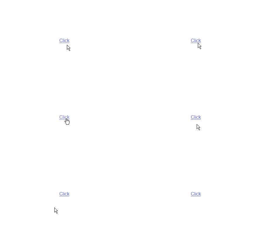
Here’s the Button component before the as prop was added:

Here’s the Button component after the as prop was added; it looks and behaves like a link element:
state hooksAs mentioned previously, Ariakit provides a variety of state hooks that we can use to manage the state of components in our applications. These state hooks are tailored to the specific use of their respective components, meaning each component is assigned a specific state hook.
For example, if we want to handle state logic for a checkbox component, we’d use the useCheckboxState hook. Likewise, we’d use the useFormState hook to handle state logic for a form component.
Ariakit state hooks accept an object as an initial value and return an object with options that their respective components will need:
const combobox = useComboboxState({ gutter: 8, sameWidth: true });
In the example above, the gutter and sameWidth object properties are the initial values of the useComboboxState hook. The combobox component can access the returned object options via the combobox variable:
<Combobox state={combobox} placeholder="e.g., Apple" className="combobox" />;
Because some states require more complex logic, Ariakit also provides the option to plug your own states.
Ariakit does not rely on any CSS library. As a result, it doesn’t ship with pre-styled components by default. This means that we can use any approach for styling the components. This could include using inline styles, modules, styled-components, or external UI libraries such as Tailwind.
Since each component returns an HTML element that accepts attribute props, we can use the style attribute to add inline styles to a component and use the className attribute to add classes that can be referenced in an external CSS file:
<Button className="button" style={{backgroundColor: "orange"}}>Button</Button>
Now that we understand the concept of Ariakit and how its components work, let’s see how we can use them in our projects.
Although Ariakit is a low-level library, its components are exported by a high-level API. This makes them less verbose than other low-level libraries and easy to use.
Earlier in the article, we demonstrated how to use simple components such as the Button or CheckBox. Now, let’s see how we can use complex components such as form, tab, select, and more.
formAriakit’s form component doesn’t only come with inbuilt accessibility, it also provides some level of validation, so you don’t have to worry about wasting time on validation.
To use Ariakit’s form component, first import the below components into your project:
import {
  Form,
  FormError,
  FormInput,
  FormLabel,
  FormSubmit,
  useFormState,
} from "ariakit";
Here, we’re importing the Form component and other components that we’ll use for the input fields, labels, submit button, validation error, and a form state hook.
Next, assign the useFormState hook to a variable and pass a default value to it, like so:
  const form = useFormState({
    defaultValues: { name: "", number: 0 },
  });
Now, create the form with the Form component, and use the FormLabel and FormInput components to add as many fields as you‘d like. In our case, we will add a name field and a number field.
function App() {
  const form = useFormState({
    defaultValues: { name: "", number: 0 },
  });
  return (
    <div className="App">
      <Form state={form}>
        <div className="field name">
          <FormLabel name={form.names.name}>Name</FormLabel>
          <FormInput name={form.names.name} required placeholder="name" />
          <FormError name={form.names.name} className="error" />
        </div>
        <div className="field number">
          <FormLabel name={form.names.number}>Number</FormLabel>
          <FormInput
            name={form.names.number}
            type="number"
            required
            placeholder="number"
          />
          <FormError name={form.names.number} className="error" />
        </div>
        <FormSubmit>Submit</FormSubmit>
      </Form>
    </div>
  );
}
As you can see, each input field and its corresponding components are encapsulated in their respective div element.
We used the name prop to link each FormInput component to the useFormState hook. This way, the hook will have access to the input field’s state and values.
We did the same for the FormError components, but unlike the FormInput components, the FormError will check the useFormState hook for errors in the input field it’s linked to.
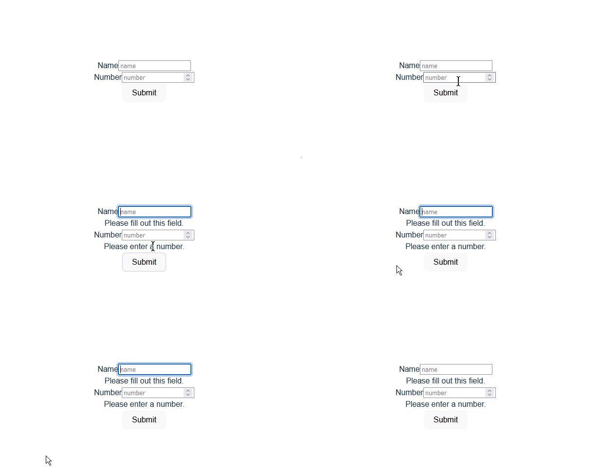
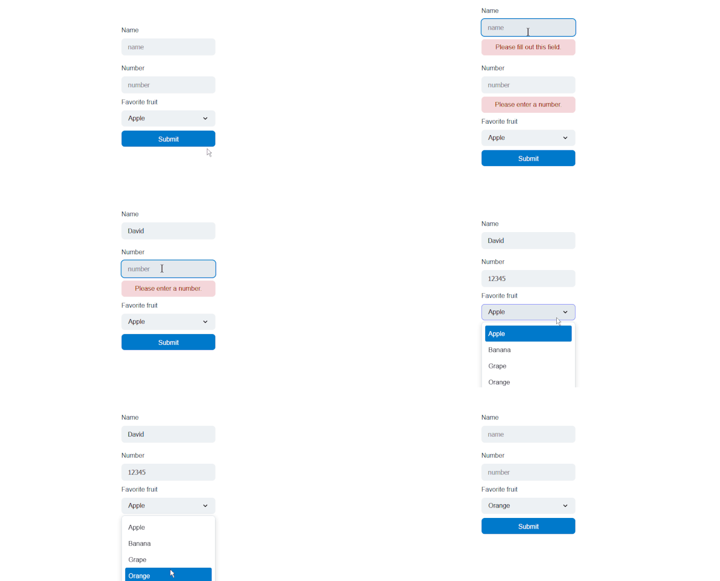
If you save your changes at this point, you should get an error message when you try to submit the form without populating the input fields:
Getting the form data is likewise straightforward, all we have to do is chain a values method to the form variable:
form.values
Ideally, we’d only need the form’s data at the time of submission, so we need to create a function that will fire when the form is submitted.
Fortunately, the useFormState hook provides a useSubmit function that accepts a callback function, which gets fired when the form is submitted.
  form.useSubmit(() => {
    ...
  });
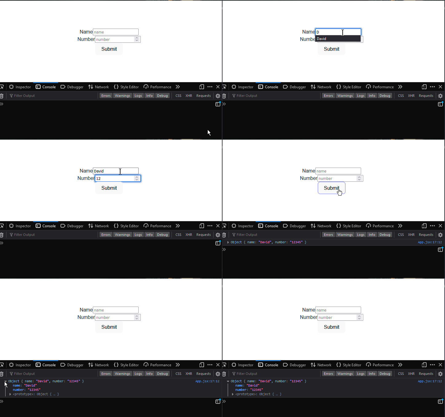
If we want to log the form’s data to the console when the form is submitted, here’s how we’d go about it:
  form.useSubmit(() => {
    console.log(form.values);
  });
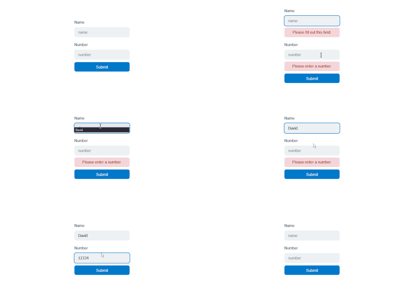
Next, we’ll look at the select component and how we can add it to our form. But first, let’s style our form to look more appealing.
We’ll handle this the same way we usually would with regular JSX elements, by adding a className attribute to the components:
<Form state={form} className="form">
        <div className="field">
          <FormLabel name={form.names.name} className="label">
            Name
          </FormLabel>
          <FormInput
            name={form.names.name}
            required
            placeholder="name"
            className="name"
          />
          <FormError name={form.names.name} className="error" />
        </div>
        <div className="field">
          <FormLabel name={form.names.number} className="label">
            >Number
          </FormLabel>
          <FormInput
            name={form.names.number}
            type="number"
            required
            placeholder="number"
            className="number"
          />
          <FormError name={form.names.number} className="error" />
        </div>
        <FormSubmit className="button"
>Submit</FormSubmit>
      </Form>
Next, we’ll style the components in the CSS file:
.form {
  width: 280px;
  min-height: 320px;
  display: flex;
  flex-direction: column;
  gap: 1rem;
  padding-top: 2.5rem;
  padding-bottom: 2.5rem;
}

.field {
  display: flex;
  flex-direction: column;
  gap: 0.5rem;
  align-items: flex-start;
}

.field input {
  height: 2.5rem;
  width: 100%;
  border-radius: 0.5rem;
  border-style: none;
  background-color: hsl(204, 20%, 94%);
  padding-left: 1rem;
  padding-right: 1rem;
  font-size: 1rem;
  line-height: 1.5rem;
  color: hsl(204, 10%, 10%);
}

.field input:hover {
  background-color: hsl(204, 20%, 91%);
}

.field input:focus-visible,
.field input[data-focus-visible] {
  outline: 2px solid hsl(204, 100%, 40%);
}

.field:nth-child(1){
  margin-bottom: 20px;
}

.field:nth-child(2){
  margin-bottom: 10px;
}

.button {
  height: 2.5rem;
  width: 100%;
  cursor: pointer;
  align-items: center;
  justify-content: center;
  gap: 0.25rem;
  white-space: nowrap;
  border-radius: 0.5rem;
  border-style: none;
  background-color: hsl(204, 100%, 40%);
  padding-left: 1rem;
  padding-right: 1rem;
  font-size: 1rem;
  line-height: 1.5rem;
  color: hsl(0, 0%, 100%);
}

.error:empty {
  position: absolute;
}

.error:not(:empty) {
  border-radius: 0.5rem;
  border-width: 1px;
  border-color: hsl(357, 56%, 72%);
  background-color: hsl(357, 56%, 90%);
  padding-top: 0.5rem;
  padding-bottom: 0.5rem;
  padding-left: 1rem;
  padding-right: 1rem;
  color: hsl(357, 100%, 30%);
}

.number {
  -moz-appearance: textfield;
}

.number::-webkit-outer-spin-button,
.number::-webkit-inner-spin-button {
  -webkit-appearance: none;
  margin: 0;
}
selectTo add a select component to the form, we’ll first import it and its corresponding components:
import {
  ...
  Select,
  SelectItem,
  SelectLabel,
  SelectPopover,
  useSelectState,
} from "ariakit";
We’ll use the Select, selectItem, and SelectLabel components to create select, options, and label elements, respectively.
Also, we’ll use the useSelecteState hook to set the select element’s default values and pass it to the component via the state prop. The selectPopover component will serve as a dropdown for the select options.
Next, let’s assign the useSelecteState hook to a variable and pass the default values to it, like so:
const select = useSelectState({
  defaultValue: "Apple",
  sameWidth: true,
  gutter: 4,
});
As you can see, we’re not only setting the default value but also the default width and gutter size of the select options.
Next, go to the form and add the Select component and its corresponding components and pass the state to them:
<div className="select">
  <SelectLabel state={select}>Favorite fruit</SelectLabel>
  <Select state={select} className="select" />
  <SelectPopover state={select} className="popover">
    <SelectItem className="select-item" value="Apple" />
    <SelectItem className="select-item" value="Banana" />
    <SelectItem className="select-item" value="Grape" disabled />
    <SelectItem className="select-item" value="Orange" />
  </SelectPopover>
</div>
What we’re doing here is simple, we link the Select component to the state hook and then nest several options within it using the SelectItem.
Moving along, open your CSS file and update it with the following styles:
.wrapper {
  display: flex;
  flex-direction: column;
  gap: 0.5rem;
  align-items: flex-start;
}

.select {
  width: 116%;
  display: flex;
  height: 2.5rem;
  cursor: default;
  align-items: center;
  justify-content: space-between;
  gap: 0.25rem;
  white-space: nowrap;
  border-radius: 0.5rem;
  background-color: hsl(204, 20%, 94%);
  padding-left: 1rem;
  padding-right: 1rem;
  font-size: 1rem;
  line-height: 1.5rem;
  margin-bottom: 10px;
}

.select:hover {
  background-color: hsl(204, 20%, 91%);
}

.popover {
  max-height: min(var(--popover-available-height, 300px), 300px);
  z-index: 50;
  display: flex;
  flex-direction: column;
  overflow: auto;
  overscroll-behavior: contain;
  border-radius: 0.5rem;
  border-width: 1px;
  border-style: solid;
  border-color: hsl(204, 20%, 88%);
  background-color: hsl(204, 20%, 100%);
  padding: 0.5rem;
  color: hsl(204, 10%, 10%);
  filter: drop-shadow(0 4px 6px rgba(0, 0, 0, 15%));
}

.select:focus-visible,
.select[data-focus-visible],
.popover:focus-visible,
.popover[data-focus-visible] {
  outline: 2px solid hsl(204, 100%, 40%);
}

.select-item {
  outline: none !important;
  display: flex;
  cursor: default;
  scroll-margin: 0.5rem;
  align-items: center;
  gap: 0.5rem;
  border-radius: 0.25rem;
  padding: 0.5rem;
}
Now, if you save your progress and go back to the browser, you should see something similar to this:
This article showcased Ariakit’s button, checkbox, form, and select components and demonstrated how they function. These are just some of the components that Ariakit provides.
Ariakit has a component to meet most requirements for building full-fledged web applications. Ariakit’s documentation is incomplete at the time of this writing, but the website does provide a large collection of component examples.
Install LogRocket via npm or script tag. LogRocket.init() must be called client-side, not
server-side
$ npm i --save logrocket

// Code:

import LogRocket from 'logrocket';
LogRocket.init('app/id');
// Add to your HTML:

<script src="https://cdn.lr-ingest.com/LogRocket.min.js"></script>
<script>window.LogRocket && window.LogRocket.init('app/id');</script>
Hey there, want to help make our blog better?
Join LogRocket’s Content Advisory Board. You’ll help inform the type of content we create and get access to exclusive meetups, social accreditation, and swag.
Sign up now
A breakdown of the wrapper and container CSS classes, how they’re used in real-world code, and when it makes sense to use one over the other.

This guide walks you through creating a web UI for an AI agent that browses, clicks, and extracts info from websites powered by Stagehand and Gemini.

This guide explores how to use Anthropic’s Claude 4 models, including Opus 4 and Sonnet 4, to build AI-powered applications.

Which AI frontend dev tool reigns supreme in July 2025? Check out our power rankings and use our interactive comparison tool to find out.