
The 2023 State of CSS survey revealed that the feature most respondents added to their reading lists was anchor positioning, and in particular, the layout feature was what most participants knew the least about and had the least practical experience with.

Thus, this article’s goal is to introduce this new layout technique to frontend developers.
The Replay is a weekly newsletter for dev and engineering leaders.
Delivered once a week, it's your curated guide to the most important conversations around frontend dev, emerging AI tools, and the state of modern software.
The introduction of the official W3C specification, currently in an experimental stage, strongly suggests that this API was proposed because of the limitations associated with absolute positioning.
Anchor positioning is based on the existing CSS concept of absolute positioning. It adds to the idea of tethering elements together by placing one element, A, relative to another element, B. Throughout this article, I refer to B as the “anchor element” and A as the “anchor target element.”
Anchor positioning will enable more flexible element tethering, which was previously only possible with a combination of absolute positioning and JavaScript. With this new approach, your tethering code stays within the CSS layer and no longer requires JavaScript code, which may improve performance.
As of November 2023, this feature is still a draft and browser support is not yet widespread. Chrome Canary provides the most support behind a feature flag — visit chrome://flags and then go to Experimental Web Platform features to enable this flag:
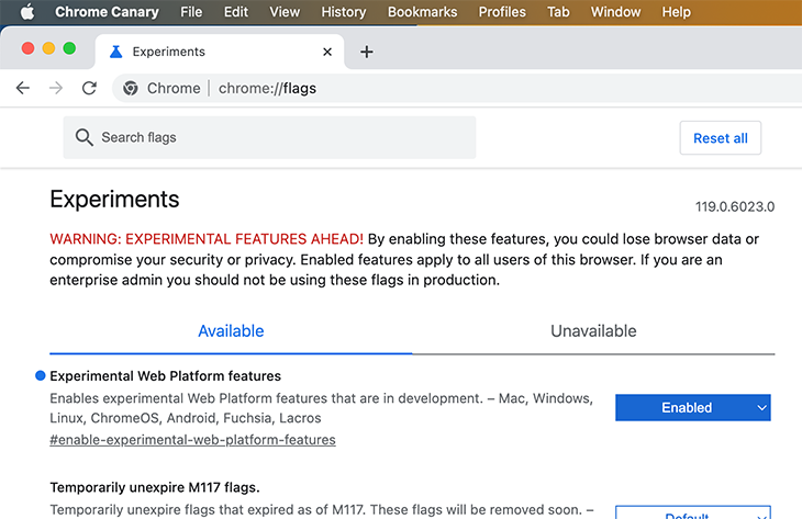
If you do not enable this flag, you may not be able to view all examples correctly in later sections!
To check browser support, you can use the following @supports rule:
@supports(anchor-name: --foo) { /* ... */}
Speaking of browser support, CanIUse does not feature anchor positioning yet.
Even with limited native browser support, you already have good options to use it with a polyfill. All CodePens in this article use this polyfill to upgrade browser support.
Unfortunately, not all examples in this article work well with this polyfill, but do work with Chrome Canary when the feature flag is activated. Check the list of the polyfill’s limitations before getting started. You can also browse the supported scenarios in the polyfill’s demo page.
In this article, you’ll learn how to tether elements to anchor elements with different techniques. Since anchor positioning is still a work in progress, API functions might change or get removed over time. As an example, other articles have showcased an anchor-scroll function, but I couldn’t get this function to work even with the most recent Chrome Canary version. We’ll mainly focus on the functions that do work as a result.
All examples we provide are CodePens using polyfills for anchor positioning and the Popover API by embedding shared CSS and JS from this base CodePen. You will learn later that anchor positioning and the Popover API make a pretty powerful duo.
Here is an overview of all examples:
The most obvious difference between anchor and absolute positioning is that you don’t have to nest your anchor target element into the child tree of the anchor element (i.e., the element with position: relative). On the contrary, you can place your anchor target element anywhere in the DOM.
Another advantage of this sophisticated CSS API is that it allows us to develop more robust designs that won’t “break” the tether between elements when the user interacts with the page.
For example, let’s say we place a tooltip above an element that serves as an anchor. The tooltip will keep that position as long as it isn’t clipped by viewport bounds. Otherwise, a fallback mechanism takes over and shifts the tooltip below the anchor to make sure it is completely in sight of the user.
In contrast to absolute positioning, where an absolutely positioned anchor target element is tethered to a relatively positioned ancestor element, anchor positioning provides more flexibility:
As an additional benefit, developers get more tools to alter the position and size of elements relative to these new anchor elements.
The focus of this section is to describe the conceptual steps for using anchor-based positioning. In later sections, I’ll cover different aspects and facets of the API in more detail.
The following CodePen shows different methods of tethering elements together. The first approach is to use an implicit anchor element with an anchor attribute:
<!-- anchor target element using anchor attribute -->
<div anchor="ref1 class="implicit-crossref">...</div>
<!-- anchor element -->
<sup id="ref1">1</sup>
An anchor element defines an ID that the anchor target element refers to, with the help of the anchor attribute.
The next step is to define anchor-based positioning. Therefore, we make use of the anchor() API function to glue the anchor target element to its anchor element:
.implicit-crossref {
 position: absolute;
 top: anchor(implicit start);
 /* ... */
}
First, we need to position the element absolutely. With that, we use the anchor() function to create the link between the anchor target element (referenced by the .implicit-crossref selector) and the anchor element that specifies the ID ref1. The implicit keyword does the trick.
With top: anchor(implicit start), we tell the browser to place the top position of the anchor target element to the position of the anchor element calculated by the anchor() function. start is one of many options we have to define the connection position of the anchor element, as the next diagram reveals:
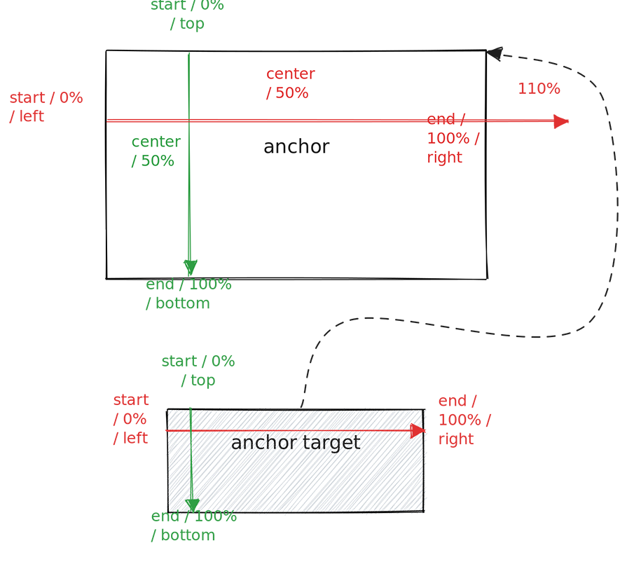
You can refer to different positions in the x- and y-axes with physical keywords (top, left, etc.), logical keywords (start, center, etc.), or percentages. From a terminology perspective, we should distinguish between the inset properties of the target element and the anchor-side properties of the anchor element.
Let’s take a look at the next diagram, which illustrates how to position the anchor target element at the top right of the anchor element:
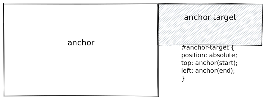
The anchor target specifies the physical inset properties top and left, and uses logical anchor-side properties.
The #anchor-target selector reveals another interesting aspect. The first argument of the anchor() function, anchor-element, is optional. Above, we used the implicit keyword, but in the previous example, we employed the concept of default anchors. Later, we’ll see an example where we define such an anchor with the anchor-default property.
To make your CSS design more semantic, but especially prepared for changed writing modes, you have to understand logical inset properties and anchor-side properties. If you change the writing direction with the HTML dir attribute, you can use logical properties described in the next diagram:
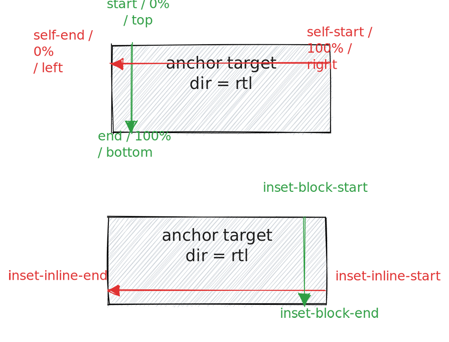
The upper part of the diagram shows that self-end and self-start refer to the anchor target element in the anchor() function. So, anchor(self-end) would refer to the “left” side of the target element due to the right-to-left writing mode. But, anchor(left) would also refer to the left side of the anchor element.
You can think of self-start and self-end like Flexbox’s property justify-self, which allows a flex item to relatively align to itself. The example clarifies that the logical properties are semantic, since self-end refers always to the “arrow side” of the axis, whereas the physical representations (left and right) are not meaningful with a changed writing mode and might add to confusion.
The lower part of the diagram emphasizes how to use logical inset properties to define the x and y coordinates of the target element that gets tethered to the anchor element. This example uses a RTL writing mode to show that the inset properties inset-inline-start and inset-inline-end get mapped logically to the x-axis. For the y-axis, you can use inset-block-start and inset-block-end.
Here is what it looks like to tether an anchor target to the lower left of the anchor element with logical values only:
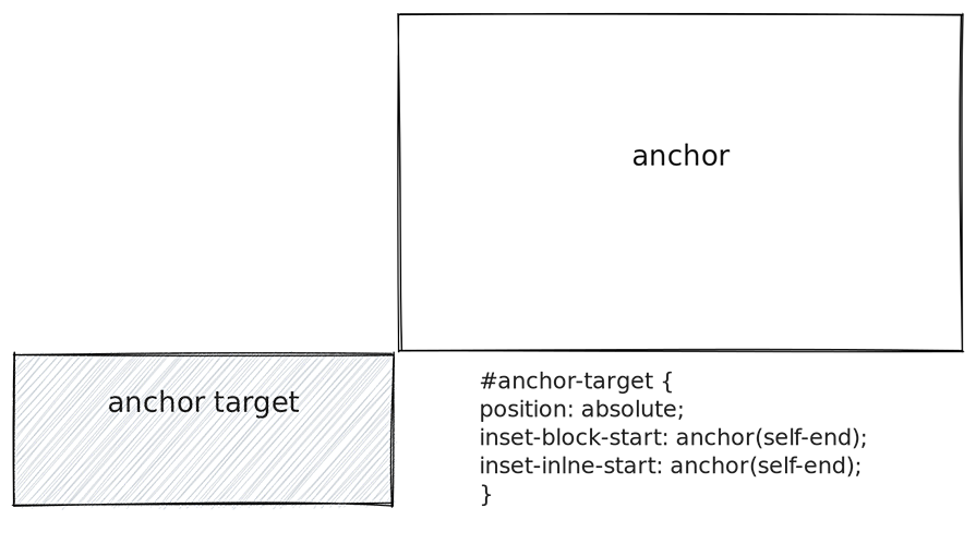
Let’s conclude the learnings of this section briefly before we look at the API in more detail:
position: absolute (or fixed, as we’ll see later)anchor attribute, and then has to use the implicit keyword in the anchor() function as the first argument
top and left) with the help of the anchor() functionThe following are some crucial Anchor Positioning API properties and functions:
anchor-name or the anchor HTML attribute--my-anchor), implicit keyword, or indirectly with anchor-defaultanchor() to tether elements togetheranchor-size() to calculate the width and height of the target element with respect to the anchor’s dimensions@position-fallback to change the size and position of the target element when viewport boundaries clip the target elementAs described above, you can use a combination of an id attribute and an anchor attribute with the anchor element and the anchor target element, respectively. Then, you can use the implicit keyword as the first argument of anchor().
An alternative would be to use the anchor-name property to create an anchor element:
See the Pen
CSS Anchor Positioning – Covering by Sebastian Weber (@doppelmutzi)
on CodePen.
In the example, an overlay (the anchor target element) is positioned on top of an image element (the anchor element). With the following code, the anchor target element spans the dimensions of the image:
#img {
 /* create an anchor named --cover */
 anchor-name: --cover;
}
#overlay {
 /* enable anchor positioning */
 position: absolute;
  /*
    tether the top left corner of the target
    to the top left corner of the anchor, etc.
 */
 top: anchor(--cover top);
 bottom: anchor(--cover bottom);
 left: anchor(--cover left);
 right: anchor(--cover right);
}
With the #img selector, we create an anchor with the name --cover. It’s important to use this dashed-ident naming convention, which should be familiar if you use custom properties. Omitting these double dashes breaks the connection.
The target element selected by #overlay uses the anchor name as the first argument of every invocation of anchor(). You can also do this more concisely with the auto-same anchor-side keyword:
#overlay-autosame {
 position: absolute;
 inset: anchor(--cover-autosame auto-same);
}
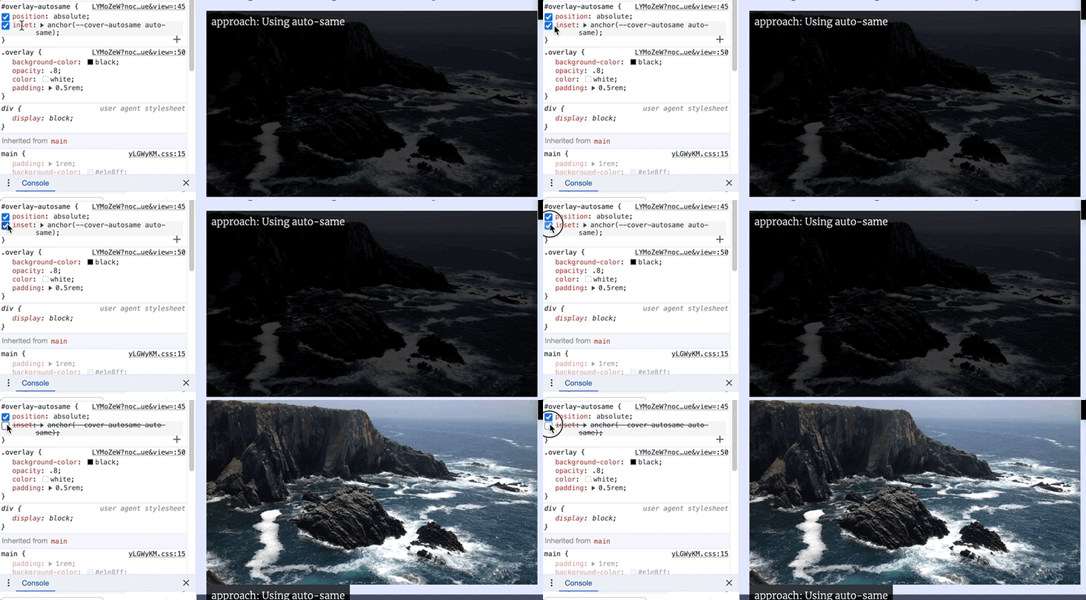
auto-sameAs you see, you can reduce four lines into one using the inset shorthand.
I’ve already indicated that the first argument of anchor(), the anchor-element specifier, is optional:
See the Pen
CSS Anchor Positioning – swap positions with anchor(auto) by Sebastian Weber (@doppelmutzi)
on CodePen.
The CodePen above shows an example of anchor-default. This property defines the default anchor element for all invocations of anchor() on the anchor target element:
/*
anchor target element that specifies
--hero-image-1 as default anchor for all
calls of anchor()
*/
figcaption {
 /* ... */
 anchor-default: --hero-image-1;
 bottom: anchor(auto);
 left: anchor(left);
}
You might be wondering what the keyword auto means. We will take a look at it in the next section when I talk about fallback position scenarios.
anchor-size() is a function with the same signature as anchor(). There are physical (width and height), logical (e.g., block), and anchor-side keywords that refer to the width and height of the anchor element. The return value of anchor-size() is a length value:
See the Pen
CSS Anchor Positioning – vertical centered overlays by Sebastian Weber (@doppelmutzi)
on CodePen.
The following code calculates the width of the target element in relation to the anchor element. The width is half of the width of the anchor element. It also shows that you can use custom properties with API functions, too:
  /*
    The name of the anchor element is provided with a custom property.
  */
 width: calc(anchor-size(var(--anchor-inset) width) / 2);
The rest of the article shows different, somewhat advanced use cases for leveraging the Anchor Positioning API and how to combine its different functions and properties.
In this scenario, we:
auto keyword of anchor()@position-fallback ruleThe following recording shows a major advantage of anchor positioning over absolute positioning. Using pure CSS, it’s now possible to add hints to the browser to change the positions of anchor target elements if they no longer fit into the viewport during user interaction (i.e., resizing or scrolling):
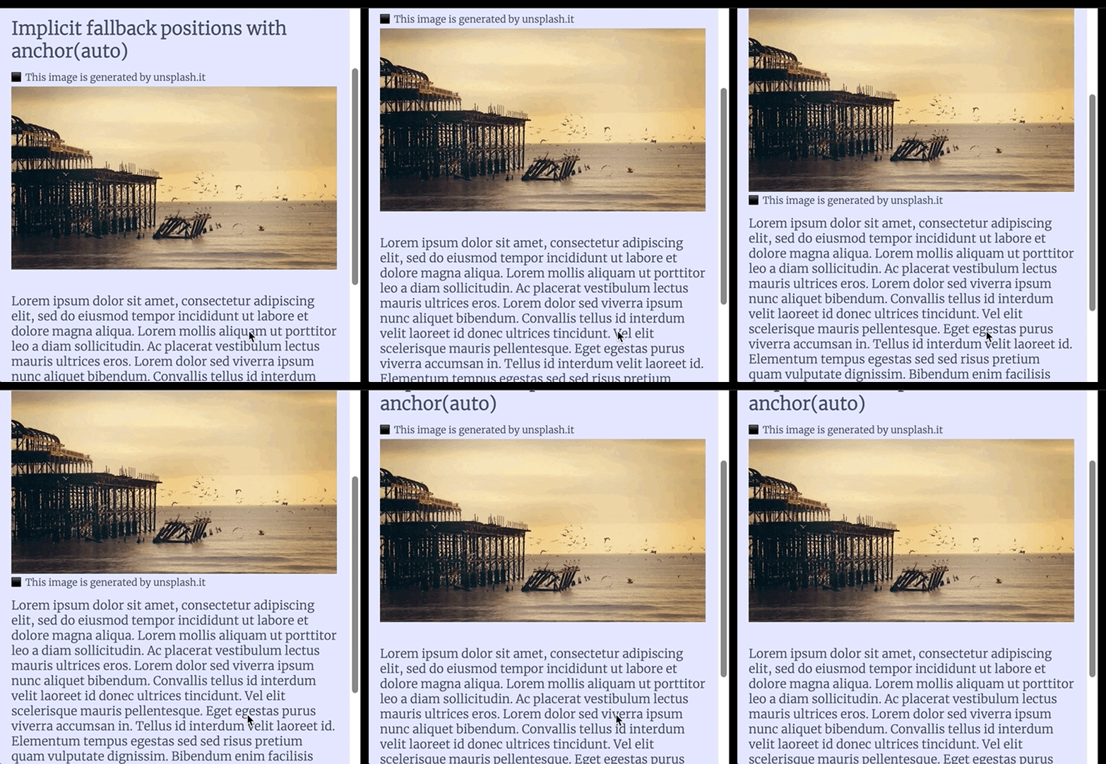
The figcaption switches between being above or below the image, dependent on the available space. Here is the code:
See the Pen
CSS Anchor Positioning – swap positions with anchor(auto) by Sebastian Weber (@doppelmutzi)
on CodePen.
#caption-auto-swap img {
 anchor-name: --hero-image-1;
}
#caption-auto-swap figcaption {
 position: fixed;
 anchor-default: --hero-image-1;
 bottom: anchor(auto);
 left: anchor(left);
 padding: .25em 0;
The figcaption has a fixed position, which makes it so that the anchor target element can live anywhere in the DOM. Our example makes use of auto for the bottom inset property and leaves it to the browser to determine vertical positioning.
The auto-swap takes place in the corresponding axis; in this case, the y-axis. For the left target position, no auto-swap mechanism is used.
position-fallback propertyThere is also a more advanced fallback mechanism with the position-fallback property. With this approach, you can provide more flexible guidance to the browser when it determines the position for different scenarios:
#caption-with-fallback img {
  anchor-name: --hero-image-fallback;
}
#caption-with-fallback figcaption {
 position: fixed;
 anchor-default: --hero-image-fallback;
 position-fallback: --fallback1;
}
@position-fallback --fallback1 {
 @try {
   top: anchor(bottom);
   left: anchor(left);
}
 @try {
   bottom: anchor(top);
   left: anchor(left);
 }
}
Inside of a @position-fallback rule, you can specify multiple @try rules that are processed in the order of declaration. The above example is the counterpart of the auto-swap example. In other use cases, you can also define fallback positions for other inset properties.
In this scenario, we:
anchor() function with calc() to determine the inset properties of target elementsanchor()See the Pen
CSS Anchor Positioning – cross references with inline styles and custom properties by Sebastian Weber (@doppelmutzi)
on CodePen.
This CodePen showcases different options for creating anchor elements and superscript numbers, with cross-references positioned at the same vertical height in the dark sidebar area:
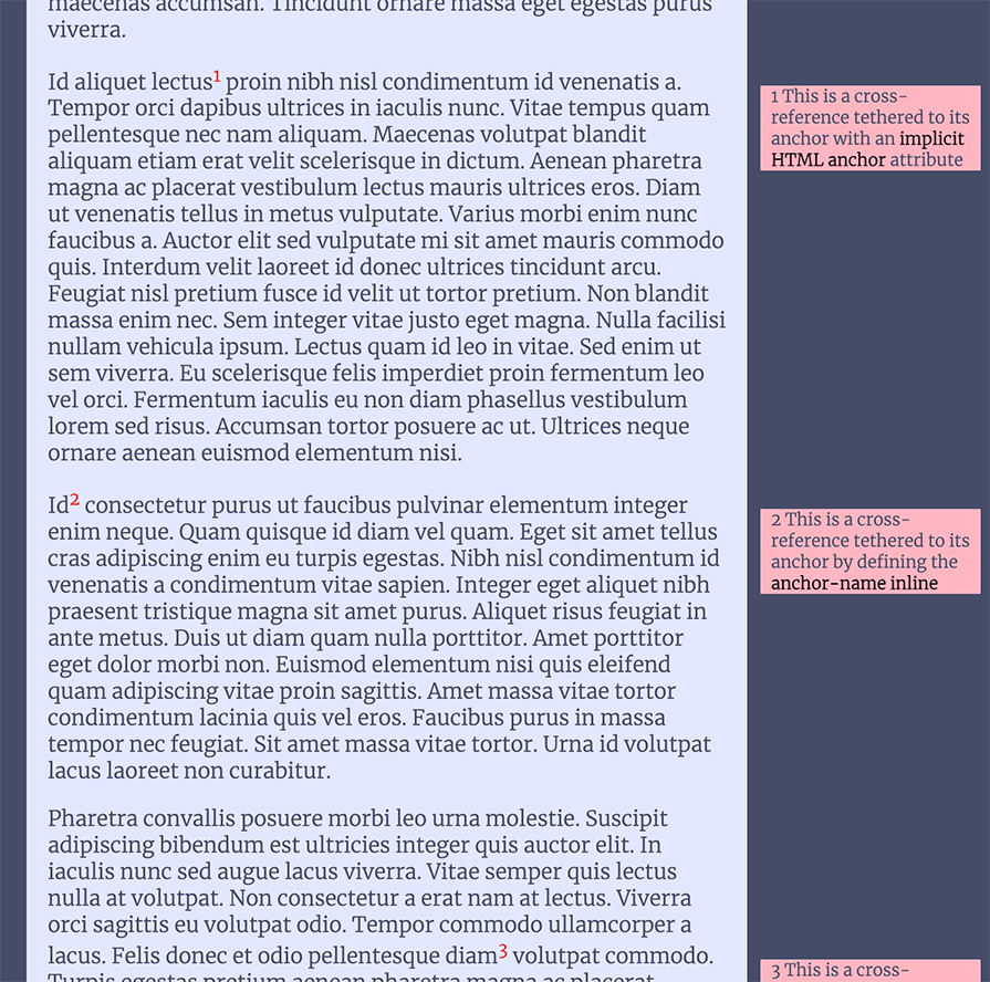
The first example uses the implicit anchor attribute:
<!-- anchor target element -->
<div anchor="ref1" class="implicit-crossref">1 This is a cross-reference tethered to its anchor with an <em>implicit HTML anchor</em> attribute</div>
<!-- ... -->
<!-- elsewhere in the DOM -->
<sup id="ref1">1</sup>
Since we tether the anchor element with id="ref1" to the anchor target element with the anchor attribute at the HTML level, there is no more CSS code needed for this concern. The anchor target element, selected with .implicit-crossref uses the implicit keyword in the anchor() function used with top:
.implicit-crossref {
  position: absolute;
 --ref-left-pos: calc(anchor(--content-container end) + 10px);
 top: anchor(implicit start);
 left: var(--ref-left-pos);
}
The code above also shows that the cross-reference is tethered to another anchor named --content-container, which refers to the main element:
main {
  anchor-name: --content-container;
}
The main tag is the content container, and with anchor(--content-container end), a cross-reference’s left position is placed in relation to it.
As you can see, it is also possible to use anchor() functions inside of mathematical functions, such as calc(). It’s also fine to store the result of such a calculation in a custom property (--ref-left-pos).
With the above code in place, cross-references are moved to the top position of the reference source part of the running text. Horizontally, the cross-references are positioned at the end of the main container with an additional 10px to create a nice gap between it and the content column.
Let’s look at another pattern to create and find anchors. The markup shows that we make use of inline styles. It shows that the anchor elements define their names with anchor-name as inline styles. The target element defines a custom property as an inline style that stores the anchor’s name (--ref2):
  <!-- anchor target element -->
  <div class="crossref-inline" style="--anchor-target: --ref2">2 This is a cross-reference tethered to its anchor by defining the <em>anchor-name inline</em> </div>
  <!-- ... -->
  <!-- anchor element -->
  <sup style="anchor-name: --ref2">2</sup>
With that HTML in place, calculating the top position of the target element with the anchor() function can be done with the custom property in scope: top: anchor(var(--anchor-target) start):
.crossref-inline {
 position: absolute;
 --ref-left-pos: calc(anchor(--content-container end) + 10px);
 top: anchor(var(--anchor-target) start);
 left: var(--ref-left-pos);
}
The following example demonstrates a slightly different variant:
<!-- anchor target element -->
<div class="crossref-inline" style="--anchor-target: --ref3">3 This is a cross-reference tethered to its anchor utilizing <em>inline styles and custom properties</em></div>
<!-- ... -->
<!-- anchor element -->
<sup style="--anchor-name: --ref3">3</sup>
The difference is that the sup element specifies a custom property named --anchor-name, which is used in the following CSS to define the anchor-name value:
sup[style*="--anchor-name:"] {
  anchor-name: var(--anchor-name);
}
This is probably the coolest example because it uses the Popover API too. Here, we’ll cover:
See the Pen
CSS Anchor Positioning – Tooltips (on hover and click) with position fallback variants by Sebastian Weber (@doppelmutzi)
on CodePen.
The following recording displays how our tooltip (the anchor target element) will appear on hover over the anchor element:
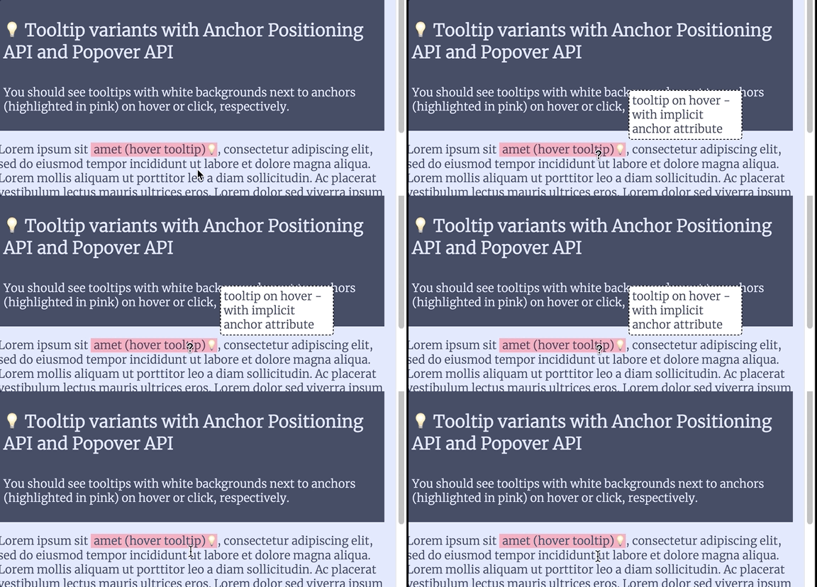
With the following markup, no JavaScript is needed to achieve our goal. The anchor target is nested into the anchor element:
<span id="tip-1" class="tooltip-anchor">amet (hover tooltip)<span anchor="tip-1" class="tooltip">tooltip on hover - with implicit anchor attribute</span></span>
As we already learned, we can tether one element to an anchor element using the anchor attribute and the implicit keyword:
.tooltip {
  display: none;

  position: absolute;
  left: calc(anchor(implicit right) + .25em);
 bottom: calc(anchor(implicit top) + .25em);
}
.tooltip-anchor:hover > .tooltip {
 display: initial;
}
Initially, the tooltip is not displayed (display: none). When a user hovers over the anchor element, the display property changes to show the tooltip.
The above code is another example that calc() and anchor() are a good combo: in this case, it is used to add some horizontal and vertical spacing so that the anchor’s upper right edge does not “touch” the target’s bottom left edge.
When we want to show a tooltip on click, we need to incorporate the Popover API to keep a pure CSS approach. The recording also shows that we can position the popover (i.e., the tooltip) according to a fallback strategy, as we covered in a previous section:
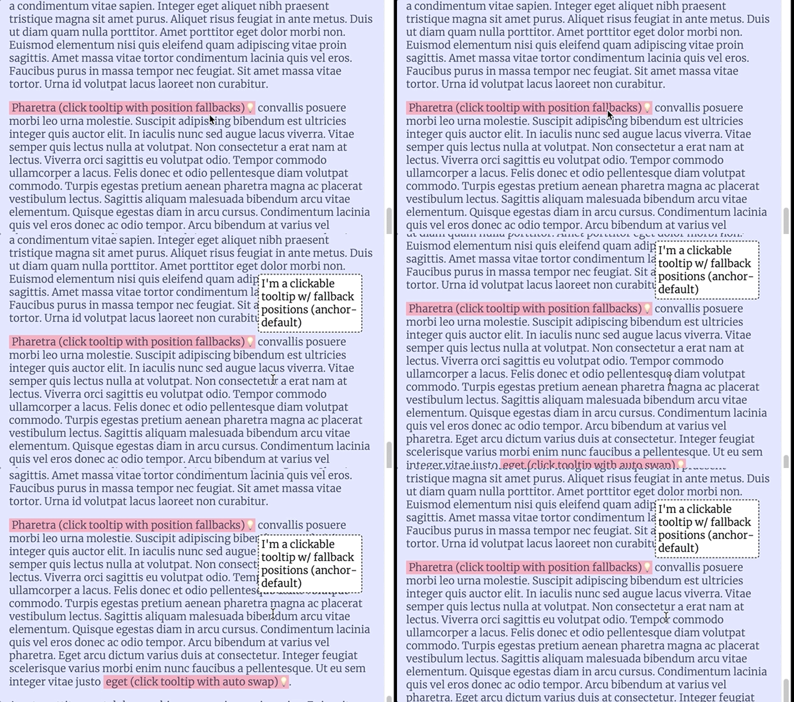
Let’s look at the markup first:
<!-- the anchor element and popover target -->
<button class="tooltip-anchor" id="tip-3" popovertarget="popover-1">Fermentum (click tooltip)</button>
<!-- ... -->
<!-- anchor target element and popover element
somewhere in the DOM -->
<div popover="auto"
 id="popover-1"
 anchor="tip-3"
>
 I'm a clickable tooltip w/o fallback positions (implicit anchor)
</div>
From an anchor positioning perspective, this approach tethers the anchor element (button) to the target tooltip element (div) with the anchor attribute.
To use the Popover API, the tooltip uses the popover attribute and defines an id. The anchor element is the popover target element at the same time and, therefore, has to specify the popovertarget attribute with a matching value.
In contrast to the hover approach, the target element does not have to be a child element of its anchor element. As far as CSS is concerned, we don’t need any more code to make the popover work. Just position the popover element, which represents the anchor target element simultaneously:
#popover-1 {
  position: absolute;
  left: calc(anchor(implicit right) + .25em);
  bottom: calc(anchor(implicit top) + .25em);
}
The second popover example specifies a fallback strategy:
#popover-2 {
 position: fixed;
 position-fallback: --fallback1;
}
@position-fallback --fallback1 {
   @try {
     bottom: calc(anchor(--tip4 top) + .25em);
     left: calc(anchor(--tip4 right) + .25em);
   }
   @try {
     top: calc(anchor(--tip4 bottom) + .25em);
     left: calc(anchor(--tip4 right) + .25em);
   }
}
Remember in some browsers, you need a polyfill to use the Popover API as of late 2023. The above CodePen does this by using shared styles and JavaScript.
This scenario focuses on:
anchor-size() to size a target element relative to its anchor elementinset property to save some lines of CSSanchor() in combination with and without translate and transform for vertical centeringThe goal of this section is to place vertically-centered overlays on top of anchor elements:
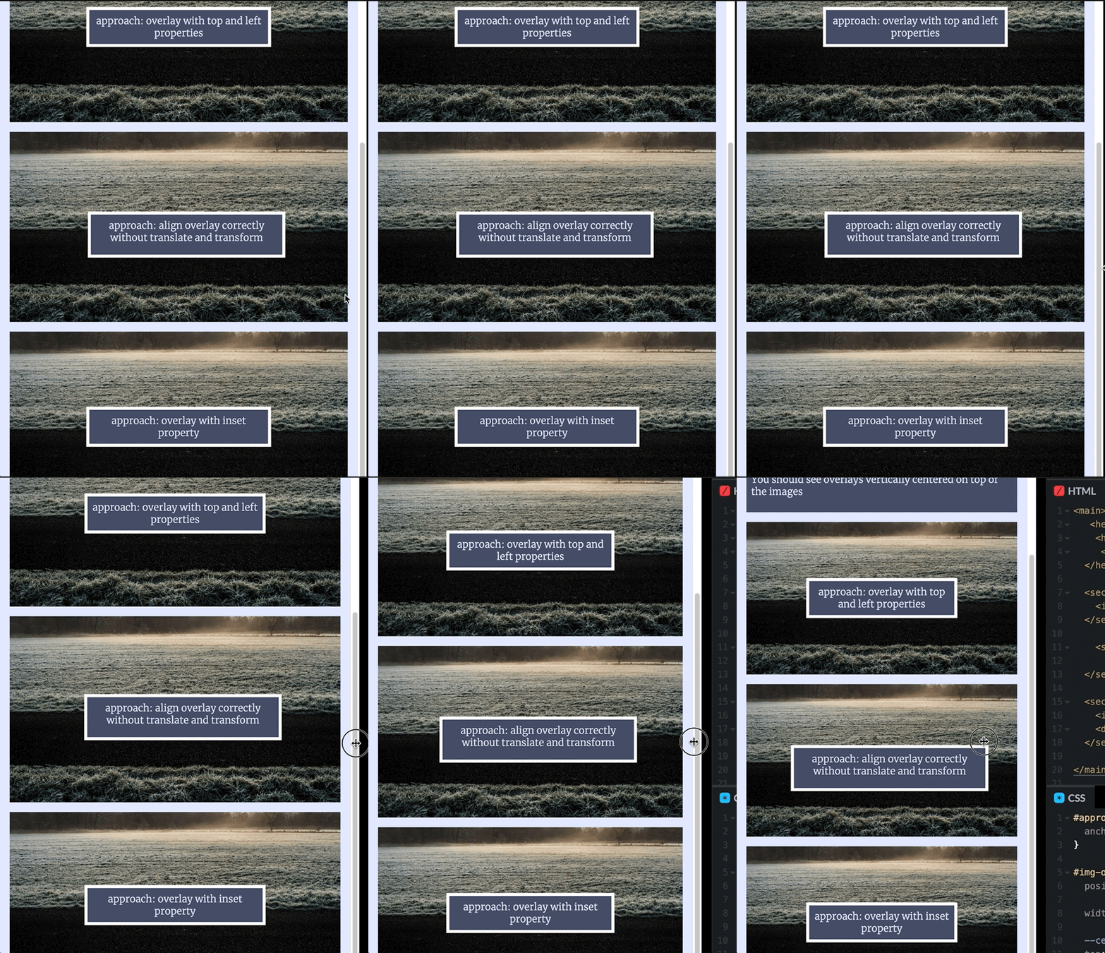
The CodePen demonstrates different methods of achieving the same goal:
See the Pen
CSS Anchor Positioning – vertical centered overlays by Sebastian Weber (@doppelmutzi)
on CodePen.
For every example, an img tag represents the anchor element. In previous sections, we’ve seen multiple examples of creating anchors, so here, we’ll just look at the CSS code for the anchor target elements.
The following shows how to use the inset shorthand to define the top and left position with a one-liner. In order to stay DRY, we calculate the horizontal and vertical center of the anchor element with the anchor() and store it in the custom property --center:
#img-overlay-inset {
 position: absolute;

 width: calc(anchor-size(var(--anchor-inset) width) / 2);
   --center: anchor(var(--anchor-inset) 50%);
   inset: var(--center) auto auto var(--center);

   translate: -50%;
   transform: translateY(-50%);
}
The example also shows that we calculate the width of the overlay with the help of the anchor-size() function.
The anchor name is stored in the custom property --anchor-inset. With calc(anchor-size(var(--anchor-inset) width) / 2), we make sure that the width of the overlay is always half the width of the anchor.
Why do we need the last two lines? Without translate and transform, the overlay wouldn’t be perfectly vertically centered:

We need to shift the overlay by 50 percent of its width to the left (translate: -50%) and 50 percent of its height to the top (transform: translateY(-50%)). Both CSS functions, translate() and translateY(), refer to the element where they are specified at, which comes in handy for our use case.
The selector #img-overlay-calc demonstrates an example without relying on the above-mentioned CSS functions:
#img-overlay-calc {
  position: absolute;
  --width: 300px;
  width: var(--width);
  --height: 50px;
  height: var(--height);

  top: calc(anchor(--picture-calc center) - var(--height) / 2);
  left: calc(anchor(--picture-calc 50%) - var(--width) / 2);
}
Different from implementing tooltips on hover, in this section, we’ll:
The recording below shows how we can use anchor positioning to hover over an element to highlight another element on the page with a border:
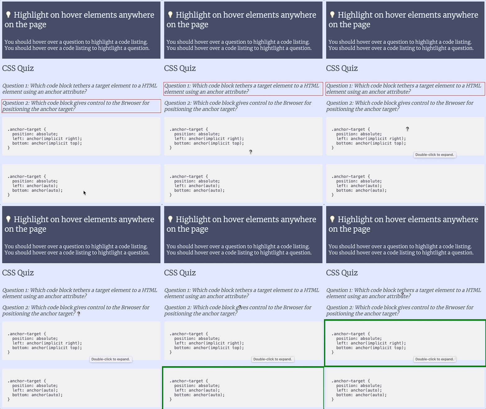
The following CodePen represents a simple quiz, where you can hover over the questions to highlight the correct answer or to hover over the answers to highlight the corresponding questions:
See the Pen
CSS Anchor Positioning – Using anchors to highlight elements bi-directionally by Sebastian Weber (@doppelmutzi)
on CodePen.
The markup makes use of inline styles that define custom properties to create the relationships between questions and code listings. Every question and code listing defines --is and --for custom properties:
<section id="questions">
 <p style="--is: --example1">
   <em style="--for: --code1">Question 1: Which code block tethers a target element to an HTML element using an anchor attribute?</em>
 </p>
 <!-- second question -->
</section>
<section id="code-listings">
 <pre style="--is: --code1; --for: --example1;">

       .anchor-target {
         position: absolute;
         left: anchor(implicit right);
         bottom: anchor(implicit top);
       }
        </pre> <!-- second answer / code listing --> </section>
The following CSS tethers questions and answers bi-directionally, together:
/* ... */
[style*="--is:"] {
 anchor-name: var(--is);
 cursor: help;
}
[style*="--for:"]:is(:hover, :focus-visible)::after {
 content: "";
 position: absolute;
 top: calc(anchor(var(--for) top) - var(--box-margin));
 right: calc(anchor(var(--for) right) - var(--box-margin));
 bottom: calc(anchor(var(--for) bottom) - var(--box-margin));
 left: calc(anchor(var(--for) left) - var(--box-margin));

 border: var(--box-border);
}
The above selectors target elements with style attributes, starting with a particular string. With [style*="--is:"], we create anchor elements. With [style*="--for:"], we select the anchor target elements that have stored the anchor name in the passed custom property --for.
With [style*="--for:"]:is(:hover, :focus-visible)::after, we make use of a pseudo-element with empty content. However, we creatively built a box with a border by specifying the inset properties based on the anchor-side elements. By doing so, we position the bordered box on top of the anchor element creating an illusion of showing the border of the anchor element.
Even though anchor positioning has not shipped in any browser by late 2023, you can use it today with a polyfill for some quite powerful use cases. Make sure to check the limitations, which will certainly become shorter over time. There is also some hope that this API can be used natively in 2024 — at least Chrome Canary offers very good support right now behind a feature flag.
The advantages over absolute positioning are obvious:
Of course, it’s still valid to use absolute positioning for its intended use cases.
As web frontends get increasingly complex, resource-greedy features demand more and more from the browser. If you’re interested in monitoring and tracking client-side CPU usage, memory usage, and more for all of your users in production, try LogRocket.

LogRocket lets you replay user sessions, eliminating guesswork around why bugs happen by showing exactly what users experienced. It captures console logs, errors, network requests, and pixel-perfect DOM recordings — compatible with all frameworks.
LogRocket's Galileo AI watches sessions for you, instantly identifying and explaining user struggles with automated monitoring of your entire product experience.
Modernize how you debug web and mobile apps — start monitoring for free.

AI companies are buying developer tools as coding agents turn runtimes, package managers, and linters into strategic infrastructure.

Learn how AI-assisted development governance uses rules, agents, hooks, and protocols to help AI coding tools produce safer, more consistent code.

A step-by-step guide to building your first MCP server using Node.js, covering core concepts, tool design, and upgrading from file storage to MySQL.

Using security headers in your Next.js apps is a highly effective way to secure websites from common security threats.
Would you be interested in joining LogRocket's developer community?
Join LogRocket’s Content Advisory Board. You’ll help inform the type of content we create and get access to exclusive meetups, social accreditation, and swag.
Sign up now