A dictionary will define animation as the illusion of motion. Like cartoons, animations are multiple drawings filmed in succession to create the illusion of movement. Animations are used to make websites more engaging and can be used to draw the user’s attention, oftentimes showing that a button is clickable.

Animations can be subtle or elaborate — you decide. In this post, we’ll look at timing functions. Timing functions help control how animations behave over a specified duration. Before we go further, let’s look at the CSS properties responsible for creating animations in the first place.
There are two ways to animate web elements in CSS: the animation and transition properties.
The animation property allows you to change the properties of an element over a specific duration, while transition defines how an element changes over a specific duration.
You might be wondering, what’s the difference? I’ll tell you. animation needs @keyframes, meaning a start and endpoint must be specified. Keyframes are used for multistep animations.
Simpler web animations can be created using transition. The animation must be triggered by something, like a click or :hover.
animation and transition are shorthands for an array of properties that control duration, delay, iteration, etc. But, as stated earlier, this post will focus solely on timing functions.
Timing functions define how web elements behave at each frame of an animation. The animation-timing-function and transition-timing-function can stand alone as separate CSS properties or be included as a value in the animation or transition shorthand property.
So, you could have your animation like this:
animation: <name> <duration> <timing-function>;
Or like this:
animation-name: name;
animation-duration: 500ms;
animation-timing-function: ease;
The same with transition:
transition: <property> <duration> <timing-function>;
Or:
transition-property: transform;
transition-duration: 500ms;
transition-timing-function: ease;
transition-timing-functionThe transition-timing-function specifies the speed curve of a transition effect. A curve, graphically, is a connection of multiple points. Each transition period is divided into points that make up the speed curve.
There are six transition-timing-functions in CSS, and they include:
lineareaseease-inease-outease-in-outcubic-bezier()/li>These are also called easing functions.
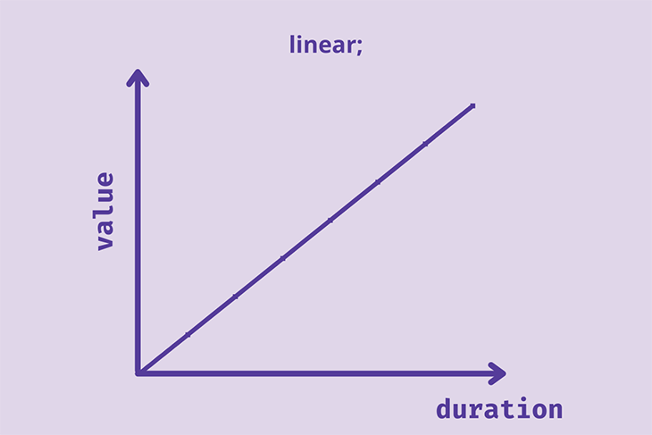
linear timing functionlinear animations move at a constant speed. This function isn’t exactly an easing function, as there’s no variation from start to finish. The speed curve will be a straight line graph.
ease timing functionAnimations with the ease function start slowly, speed up, and then end slowly. This is the default timing function used if no timing function is added to the animation.
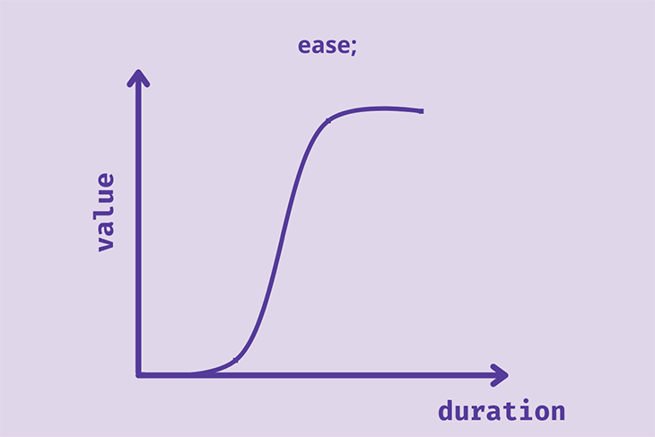
The speed of the animation at the end is slower than at the start.
Let’s demonstrate these two timing functions. We’re going to have a race across the stars!
Meet our racers, ease and linear:

Let’s use a simple HTML markup:
<body>
  <div class="container">
    <div class="rockets rocket-1"><img src="Rocket1.png"></div>
    <div class="rockets rocket-2"><img src="Rocket2.png"></div>
  </div>
</body>
Then some basic CSS:
body {
  margin: 0px;
  padding: 0px;
}
*{
  box-sizing: border-box;
}
.container{
  width: 100%;
  height: 300px;
  background: rgba(224,214,233, 0.5)
}
.rockets{
  width: 500px;
  height: 100px;
  transition-duration: 2s;
  transition-property: transform;
  display: flex;
  align-items: center;
}
.rockets img{
  height: 100px;
  border-right: 1px solid red;/*To track the speed easily*/
}
Now, we’ll add the animation property; the trigger is going to be :hover.
.container:hover .rockets{
  transform: translateX(500px);
}
.rocket-1{
  transition-timing-function: linear;
}
.rocket-2{
  transition-timing-function: ease;
}
The resulting animations:
See the Pen
Linear vs Ease timing function by Oscar-Jite (@oscar-jite)
on CodePen.
At first glance, it looks like ease is faster than linear, but they both have the same animation-duration. When you watch closely, you’ll see that they both end at the same point. It seems we have a tie!
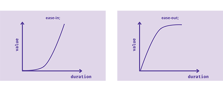
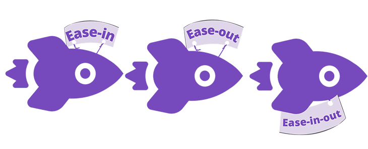
ease-in, ease-out, and ease-in-out timing functionsAnimations with the ease-in timing function start slow and speed up towards the end. ease-out is the opposite, with a fast start and slow end.
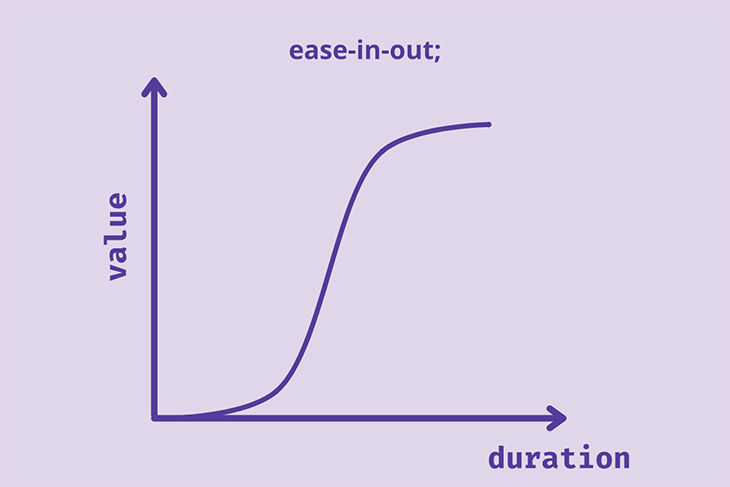
ease-in-out animations start slow, speed up in the middle, and end slow. This is similar to the ease timing function, but here the curve is symmetrical. The speed of the animation at the start is equal to the speed at the end.
Ready for the second race?
.rocket-1{
  transition-timing-function: ease-in;
}
.rocket-2{
  transition-timing-function: ease-out;
}
.rocket-3{
  transition-timing-function: ease-in-out
}
Ready, set, :hover, and go!
See the Pen
Ease-in, Ease-out and Ease-in-out by Oscar-Jite (@oscar-jite)
on CodePen.
cubic-bezier()timing functionThe cubic Bezier curve is defined by control points that draw a smooth curve. All easing functions have Bezier curves.
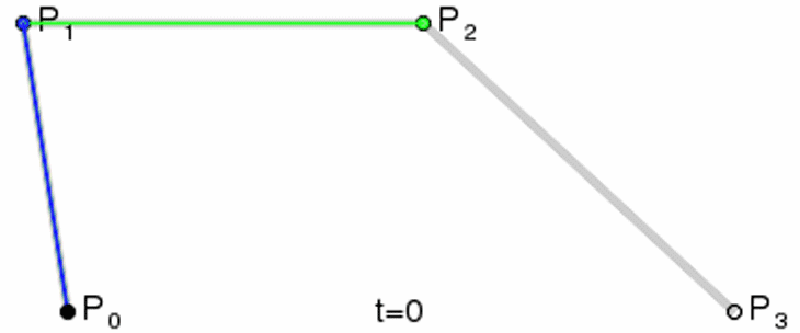
The linear timing function is a Bezier curve with only two control points. It can also be a quadratic curve, with three control points.
cubic-bezier(P1,P2,P3,P4)
P1 and P3 must be within 0 and 1. P2 and P4 can be as high as possible and can also hold negative values. It’s best to keep all control points between -1 and 1 to avoid super jerky and bouncy animations.
Let’s demonstrate. We’ll go with random values for the control points.
.rocket-1{
  transition-timing-function: cubic-bezier(.66,.39,.21,.67);
}
.rocket-2{
  transition-timing-function: cubic-bezier(1,-0.42,.42,-0.39);
}
.rocket-3{
  transition-timing-function: cubic-bezier(.57,1.34,.21,0);
}
Hover on the rockets to see the result:
See the Pen
Cubic-bezier timing function by Oscar-Jite (@oscar-jite)
on CodePen.
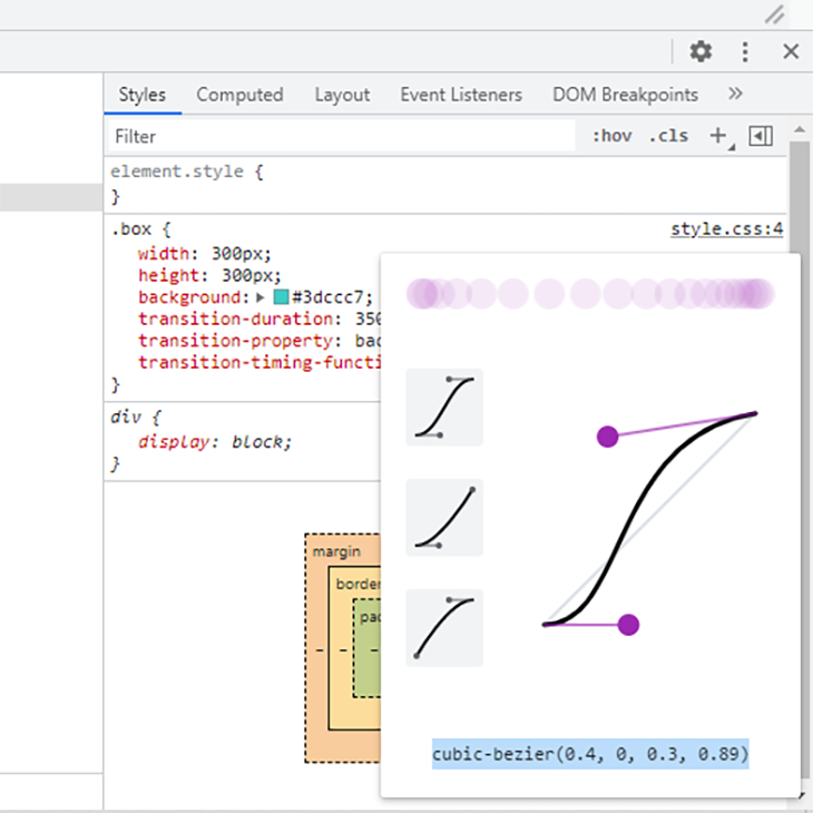
You can choose to manually enter the values for the control points, but it might take time to find the right easing for your animation. There are two ways you can choose the perfect cubic-bezier() speed: using the inspector tool or using a cubic Bezier generator.
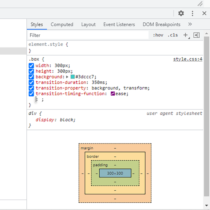
First, the animated element should be given any timing function. Access the dev tools by right clicking on the web element and selecting Inspect or Inspect element, depending on the browser.
If you’re using the animation or transition shorthand keyword, there will be a dropdown icon beside the property name. Click that to reveal a list of multiple property values that include the timing function. Otherwise, you have it as a separate property.
You’ll find a curve icon beside the name of the timing function that opens up a cubic Bezier editor. You can compare the default easing functions.
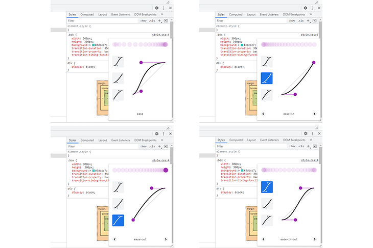
Or cycle through their variations. Click on and adjust the handles to get the cubic-bezier(). There’s a visualizer to help you decide.
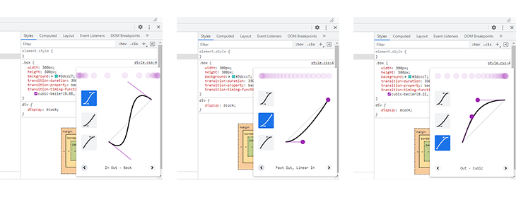
When you find a suitable speed curve, copy the cubic-bezier() and paste it into your project.
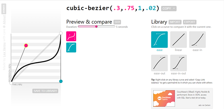
Head over to cubic-bezier.com and you’ll find a great tool that helps you create Bezier speed curves. Play with the handles until you get a curve you like. Preview and compare with the default easing functions. Copy and paste into your project and you’re all set!
animation-timing-functionThe animation-timing-function specifies the speed curve of an animation. Déjà vu. The animation property is divided into @keyframes, like the FPS (frames per second) of a camera. The animation-timing-function can work with any of the easing functions, as well as three other timing functions: step-end, step-start, and steps.
When an easing function is used with the animation property it must have @keyframes with a start and end point. Since we already know how the easing functions work, let’s look at a more practical example to demonstrate how an easing function could be used with the animation property.
We’re going to create some scroll animations. The elements will come into view as you scroll down the page.
See the Pen
scroll animation timing function by Oscar-Jite (@oscar-jite)
on CodePen.
Here, you can see all the easing functions in action as you scroll down. The HTML is straightforward.
We start with a simple setup:
<section class="container">
     <h2>Ease-in, Ease-out, and Ease-in-out</h2>
        <div class="text-container">
          <div class="text-box reveal box-3">
            <h3>Ease-in</h3>
            <p>Random text</p>
          </div>
          <div class="text-box reveal box-4">
            <h3>Ease-out</h3>
            <p>Random text</p>
          </div>
          <div class="text-box reveal box-5">
            <h3>Ease-in-out</h3>
            <p>Random text</p>
          </div>
        </div>
</section>
After some basic styling, each element is given its own animation:
.active.box-1 {
  animation: box-1 1s ease;
}
.active.box-2 {
  animation: box-2 1s linear;
}
.active.box-3 {
  animation: box-3 1s ease-in;
}
.active.box-4 {
  animation: box-4 1s ease-out;
}
.active.box-5 {
  animation: box-5 1s ease-in-out;
}
.active.box-6 {
  animation: box-6 1s cubic-bezier(.66,.39,.21,.67);
}
.active.box-7 {
  animation: box-7 1s cubic-bezier(1,-0.42,.42,-0.39);
}
.active.box-8 {
  animation: box-8 1s cubic-bezier(.57,1.34,.21,0);
}
All elements that will be animated have the reveal class, which will hide the elements until the animation is triggered. You can give it any name you like.
.reveal {
  position: relative;
  opacity: 0;
}
.reveal.active {
  opacity: 1;
}
The scroll animation is controlled with this JavaScript function:
  function reveal() {
        var reveals = document.querySelectorAll(".reveal");
        for (var i = 0; i < reveals.length; i++) {
          var windowHeight = window.innerHeight;
          var elementTop = reveals[i].getBoundingClientRect().top;
          var elementVisible = 150;
          if (elementTop < windowHeight - elementVisible) {
            reveals[i].classList.add("active");
          } else {
            reveals[i].classList.remove("active");
          }
        }
      }
      window.addEventListener("scroll", reveal);
The condition for triggering the animation is when the elements come into view as you scroll down. This function tracks the distance the element has scrolled on the page, elementTop, until it reaches the predefined distance where it should be made visible, elementVisible.
getBoundingClientRect().top is the distance from the top of the viewport, and window.innerHeight is the height of the viewport.
Next up, the @keyframes:
@keyframes box-1 {
  0% {
    transform: translateY(100px);
    opacity: 0;
  }
  100% {
    transform: translateY(0);
    opacity: 1;
  }
}
@keyframes box-2 {
  0% {
    transform: translateY(100px);
    opacity: 0;
  }
  100% {
    transform: translateY(0);
    opacity: 1;
  }
}
@keyframes box-3 {
  0% {
    transform: translateY(100px);
    opacity: 0;
  }
  100% {
    transform: translateY(0);
    opacity: 1;
  }
}
@keyframes box-4 {
  0% {
    transform: translateY(100px);
    opacity: 0;
  }
  100% {
    transform: translateY(0);
    opacity: 1;
  }
}
@keyframes box-5 {
  0% {
    transform: translateY(100px);
    opacity: 0;
  }
  100% {
    transform: translateY(0);
    opacity: 1;
  }
}
@keyframes box-6 {
  0% {
    transform: translateY(100px);
    opacity: 0;
  }
  100% {
    transform: translateY(0);
    opacity: 1;
  }
}
@keyframes box-7 {
  0% {
    transform: translateY(100px);
    opacity: 0;
  }
  100% {
    transform: translateY(0);
    opacity: 1;
  }
}
@keyframes box-8 {
  0% {
    transform: translateY(100px);
    opacity: 0;
  }
  100% {
    transform: translateY(0);
    opacity: 1;
  }
}
step-end, step-start, and steps() timing functionsThese timing functions break animations into equal sections or steps.
The step-end timing function starts the animation after the first @keyframe and skips a step at the end. step-start is the opposite: the steps start as soon as the animation begins.
Let’s demonstrate how it works:
.rockets{
  width: 500px;
  height: 100px;
  animation-duration: 2s;
  animation-name: flight;
  animation-iteration-count: infinite;
  animation-direction: alternate-reverse;
  display: flex;
  align-items: center;
}
.rocket-1{
  animation-timing-function: step-end;
}
.rocket-2{
  animation-timing-function: step-start;
}
@keyframes flight{
  0%{transform: none;}
  25%{transform: translateX(125px);}
  50%{transform: translateX(250px);}
  75%{transform: translateX(375px);}
  100%{transform: translateX(500px);}
}
The result:
See the Pen
step-end vs step-start by Oscar-Jite (@oscar-jite)
on CodePen.
The step-start rocket is a step ahead because it jumps to the first @keyframe as soon as the animation begins.
If you want to be a bit more intricate, you can use steps() to specify the number of steps or sections you want in your animation. For instance:
.rocket-1{
  animation-timing-function: steps(5);
}
.rocket-2{
  animation-timing-function: steps(10);
}
.rocket-3{
  animation-timing-function: steps(20);
}
@keyframes flight{
  0%{transform: none;}
  100%{transform: translateX(500px);}
}
See the result here:
See the Pen
Steps() timing-function by Oscar-Jite (@oscar-jite)
on CodePen.
There are keywords you can use with the steps() timing function in addition to the number of steps:
jump-startjump-endjump-bothjump-nonejump-start and jump-end work the same way as step-start and step-end. jump-both means the animation skips a step at both ends. jump-none means the animation doesn’t skip a step, and each step is evenly spaced throughout the duration.
.rocket-1{
  animation-timing-function: steps(5,jump-end);
}
.rocket-2{
  animation-timing-function: steps(5,jump-start);
}
.rocket-3{
  animation-timing-function: steps(5,jump-both);
}
.rocket-4{
  animation-timing-function: steps(5,jump-none);
}
@keyframes flight{
  0%{transform: none;}
  100%{transform: translateX(500px);}
}
The result is here:
See the Pen
Step jump by Oscar-Jite (@oscar-jite)
on CodePen.
These global properties work for every CSS property. They include:
inherit: This gives a child element the same properties of the parent if they can be inherited. If the properties aren’t inherited, they revert back to initialinitial: You might think using initial is just another way of using the default value of the CSS property, but that’s not always the case. With timing functions, initial is the same as the default value easerevert: This sets the properties of an element to the default CSS values of the browserunset: This keyword works like revert but with a twist. It affects both inherited and non-inherited propertiesThe above elements are CSS inheritance properties. Unfortunately, animation-timing-function and transition-timing-function are non-inherited properties, so we won’t see anything new, but let’s look at them one after the other.
So, if the property is inherited, unset gives it the inherit value. And if it is non-inherited, the property is set to its initial value.
The following properties and functions are supported on all modern browsers:
Safari 4–5 doesn’t support any of the step timing functions. The jump keywords are supported on every browser except Internet Explorer, Microsoft Edge 12–18, Firefox 2–64, Chrome 4–76, Safari 3.1–13.1 and Opera 10–63.
animation-delay and transition-delay)Since we’re dealing with timing, there’s a property that can be used alongside the timing functions: -delay.
animation-delay and transition-delay make animations wait for a moment before they start.
You can include it with the shorthand:
animation: <name> <duration> <timing-function> <delay>;

transition: <property> <duration> <timing-function> <delay>;
No matter the order of the properties, the second time value in the declaration will always be the delay property. So, if we had a declaration like this:
transition: transform 2s 1s ease;
The transition-delay is 1s. This also applies to animation.
Let’s demonstrate with the rockets:
.rocket-1{
   transition-timing-function: cubic-bezier(.66,.39,.21,.67);
   transition-delay: 500ms;
}
.rocket-2{
   transition-timing-function: cubic-bezier(.66,.39,.21,.67);
   transition-delay: 700ms;
}
.rocket-3{
  transition-timing-function: cubic-bezier(.66,.39,.21,.67);
  transition-delay: 1s;
}
See the Pen
Delayed animation by Oscar-Jite (@oscar-jite)
on CodePen.
This could be used to load different sections of a webpage without having to define a different animation or transition for each section.
Animations are a great way to interact with visitors and deliver engaging content. It is important that they are kept to a minimum, however, as animating too many properties on the same webpage or at the same time can have a detrimental effect on performance. Also, I recommend keeping the duration short. One second is longer than you think, and animations should ideally be in milliseconds.
We’ve looked at how timing functions control the speed and behavior of web animations. From easing to step functions, can you see them in practical scenarios? Buttons, progress bars, text cards, and so much more can be animated. Try them out and create something great!
As web frontends get increasingly complex, resource-greedy features demand more and more from the browser. If you’re interested in monitoring and tracking client-side CPU usage, memory usage, and more for all of your users in production, try LogRocket.

LogRocket lets you replay user sessions, eliminating guesswork around why bugs happen by showing exactly what users experienced. It captures console logs, errors, network requests, and pixel-perfect DOM recordings — compatible with all frameworks.
LogRocket's Galileo AI watches sessions for you, instantly identifying and explaining user struggles with automated monitoring of your entire product experience.
Modernize how you debug web and mobile apps — start monitoring for free.

A guide for using JWT authentication to prevent basic security issues while understanding the shortcomings of JWTs.

Discover how to build, render, and automate product demo videos with Remotion, replacing traditional screen recordings with reusable React code.

Chrome’s Modern Web Guidance embeds modern web platform skills into AI coding agents, helping them choose native HTML, CSS, and browser APIs over legacy patterns.

Learn how to use Fallow to analyze AI-generated code, detect dead code, duplicate logic, and complexity issues, and integrate automated code quality checks into your AI-assisted development workflow.
Hey there, want to help make our blog better?
Join LogRocket’s Content Advisory Board. You’ll help inform the type of content we create and get access to exclusive meetups, social accreditation, and swag.
Sign up now

 Learn more →
