As humans, we are wired to fear the unknown. When we can’t see what’s happening or how long something will take, our minds suddenly default to the worst-case scenario. It’s the same instinct that makes people afraid of the dark or anxious when waiting for test results.
This same sense of uncertainty can be triggered in software products. Many digital experiences consist of background tasks, file imports, system updates, and other long-running processes that run quietly and invisibly, leaving users with no indications of progress or feedback. The user initiates an action, like a sync, a publish, or a bulk update, and is responsible for the outcome, while the system does all the work out of sight. Without having reassurance that things are on track, users can end up feeling anxious, confused, or worried.
Great UI design fills that gap. It turns invisible work into a visible, predictable, and trustworthy experience. In this article, we’ll break down how to design intuitive UIs for background jobs and task pipelines, how to communicate progress and partial failures, and how to reduce uncertainty through thoughtful microcopy and proper testing.
Background jobs often fail users, not because the system is broken, but because the experience is. When users can’t see what’s happening behind the scenes or are made aware of progress, their mental model breaks down, and uncertainty takes over.
Unlike quick synchronous actions, users can’t rely on immediate feedback. In an asynchronous workflow, that experience breaks if there is no feedback from the system about the status of the action that they executed. For example, if a user tries to import a file and clicks on “Run import”, but nothing happens, they might create their own assumptions about what they just did. Most likely, they might think that the system is down, or an error occurred, and they’ll try importing again.
This can be very confusing as the system has successfully started the import, but did not notify the user of its status.
A common UI pattern used for showing progress is the traditional spinner, also nicknamed the “spinning wheel of death”. While it is a step above not having any UI feedback at all, it doesn’t really tell users anything about how long something will take, whether or not a task is still progressing or encountering errors, or if the system is stuck and showing an indefinite spinner. Users become unsure of whether to continue waiting, return later, or close the app altogether and restart. This lack of predictability causes uncertainty, which leads to frustration.
Even a long task feels faster when the UI communicates progress meaningfully.
Another aspect of background jobs that can be potentially confusing to users is their sense of control over the job. Without clear indications in the UI, users might have questions around whether refreshing the page will affect their running jobs, if it’s safe to cancel a running job, if they can run another job in parallel, or whether or not the system has updated their data yet. Users might be afraid to navigate away in fear of losing their progress. Now, they feel like they have fallen under the control of the system, rather than having control over it.
To design a good experience for background jobs, you need to understand the actual journey a job goes through behind the scenes. Most systems follow a predictable set of states, but users rarely see this clearly. When the UI exposes these states in a human-friendly way, everything feels more understandable and less stressful.
Here’s how each stage works and what users need to see in each one:
Not every job starts immediately after a user clicks “Run.” Sometimes systems that handle heavy workloads, shared resources, or multiple parallel tasks often queue jobs first. A good queuing system should show queued or pending statuses, have indications of how many jobs are ahead, and even an estimated start time. This alerts the user that the job is just waiting for its turn and that everything is still on track.
To go one step further, communicate why the job is pending, so that users know why they are waiting and won’t assume that something is broken.
Once the job starts, this is the state where anxiety starts to build if the UI isn’t helpful. Users want to know that real progress is happening, not just that a spinner is spinning. A multi-step job should show real-time updates, if possible, to inform the user of the current step that the system is on.
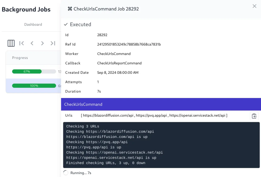
For jobs that process batches, such as rows of data or updates, display the number that has been processed so far, such as “124 of 500 rows processed,” to give the user a clear sense of progress and how much more the job has to run. These small cues turn an opaque backend process into understandable actions. Even if the job takes several minutes, users feel informed and reassured.
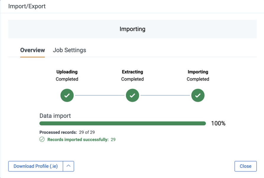
Once a job has been completed, the success state shouldn’t just simply say “Completed.” The job may have modified data, created new records, or triggered downstream actions. Users should have a clear summary of what changed. A strong success message should include a concise description of the task, as well as a count of any processed, updated, or created items.
If any items were skipped, the summary should also include the reason why they were skipped so that the user knows to review those items afterwards. Finally, provide a link to view results or next steps. This creates closure and helps users trust that the system behaved predictably.
Cancelling a background job introduces complexity because cancellation isn’t always instant or clean. Some systems stop immediately, while others finish the current step before shutting down. If cancelling a job could result in things breaking, warn the user before proceeding.
In extreme cases where cancelling could lead to disastrous results, consider disallowing cancellation or informing users that the job is non-cancellable before they start it.
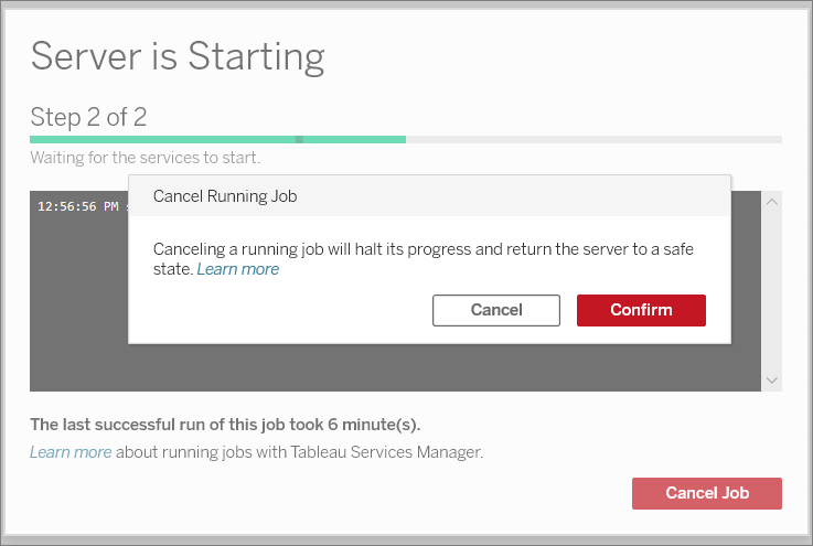
Once a job is canceled, show a summary of which parts of the job were completed before cancellation, and whether any partial data or changes were saved. Then, clarify what the user can safely do next, such as review the partial results, fix any issues that occurred, or start a new job. Clear communication of what happened, remains, and next steps can help keep users’ trust and reassure them that they didn’t corrupt the system by cancelling a job.
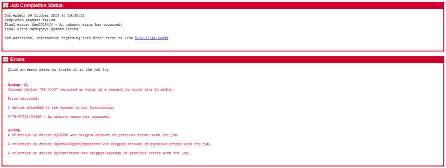
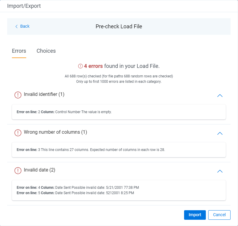
A background job can fail due to a multitude of reasons that shouldn’t be treated the same. A job could fail due to user errors, such as uploading an invalid file format or missing required fields. Sometimes, system errors such as timeouts, network issues, or server exceptions could occur, causing it to be unable to finish the job. Other reasons include not having the proper user permissions to run the job or external integrations failing upstream.
In any case, the UI should clearly communicate the failure and explanation to the user, so that they have an understanding and guidance to resolve it. If there are multiple errors, group or summarize them to avoid listing every single detail.
You can always link the user to a dedicated error log, where they can view the full error message. Once the user understands the problem, guide how to fix the problem, whether it’s by including the missing required fields or reaching out to an administrator to grant them proper permissions. This turns failure from a dead end into something recoverable. Users should never feel like they’re guessing what went wrong.
It’s not uncommon for systems to automatically retry failed jobs, but if the UI doesn’t mention this, users might think the job is looping, stuck, or behaving unpredictably. If your system tries to re-run a failed job automatically, make it apparent how many attempts were made, when each retry happened, and whether it applied to the whole job or just certain parts of it. Finally, let the user know which attempt eventually succeeded, so that they are clear about the status of their job.
This level of transparency will make the system feel both smarter and more trustworthy.
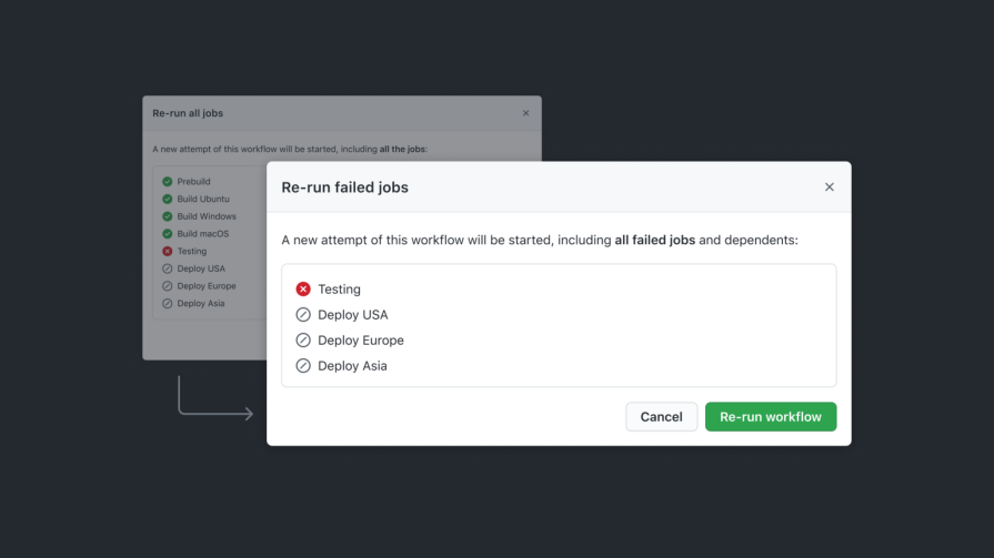
Designers shouldn’t forget about edge cases where jobs might result in mixed states. In real workflows, a job can consist of dozens or thousands of individual items moving through a pipeline, with some succeeding and some failing or skipped. Treating this as an overall success or failure can be misleading and an oversimplification of what really happened.
A typical run might look like 20 succeeded, 3 failed, 5 skipped. Calling this run a total failure hides the fact that most of the work was completed. On the other hand, calling it a success ignores the issues the user still needs to fix. A quick breakdown of outcomes gives users an honest snapshot of what happened and sets the right expectations immediately.
Once a job produces mixed results, users need clarity on which items failed and why. You should include an item-level breakdown of the jobs that succeeded, failed, or were skipped, similar to an itemized receipt. This way, users have more visibility into exactly what happened and which parts they might need to retry. Keeping failed items pinned at the top also makes it easy to spot what needs attention, so group any errors together and link to an error log for even more detail if necessary.
Once the user understands what went wrong, always give them flexible ways to recover. In many mixed-state scenarios, one of the most useful options is to allow users to retry failed items only. This works great when most of the work has already succeeded, and only a few items are left. Re-running the entire job can be useful if it partially failed due to a data issue or configuration that was later fixed by the user. If the errors are not critical, consider giving users the option to skip the failed items and just continue on.
Providing these options can turn a partial failure into something more manageable instead of a dead end.
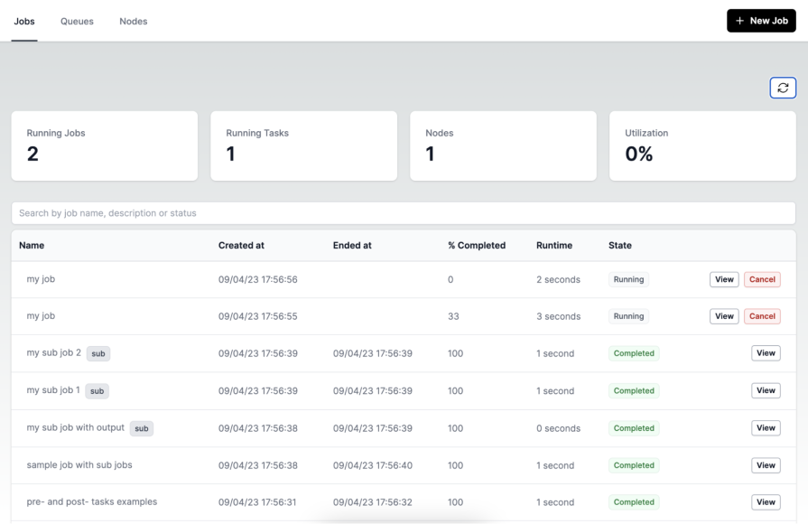
Oftentimes, background jobs aren’t a single task, but instead pipelines made up of multiple steps, dependencies, and sometimes parallel processes. When the UI reflects the pipeline clearly, users understand what’s happening behind the scenes and feel more confident that the system is doing the right work in the right order.
Background jobs rarely run as a single atomic task. They often move through multiple backend phases that users never see unless the UI exposes them. A realistic file import job might go through upload, scan, field mapping, validation, data processing, and publishing results. Exposing each phase to the user creates a more predictable experience that they can follow from start to finish.
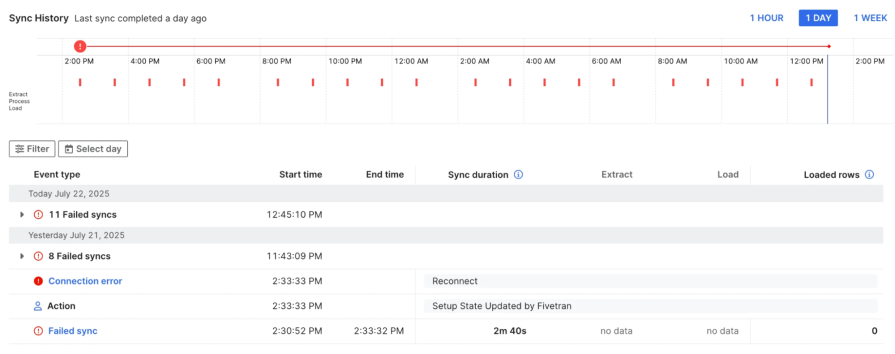
A solid UI pattern that designers can use is a job timeline panel, like in Fivetran’s Sync History pipeline timeline. Each sync attempt appears as a marker plotted across a 24-hour range. The job detail table below breaks each run into phases like extract and load, showing start and end times, durations, and error types. It’s a clean example of using time-based visualization and phase breakdown to help users understand how a background job ran, where it failed, and how the pipeline behaved throughout the day.
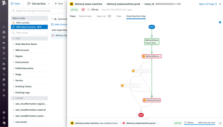
Another UI pattern that you can use to illustrate a task pipeline is a workflow graph.
Datadog uses it to visualize a background pipeline. Each step in the workflow is displayed as a connected node, with color-coded states showing what succeeded, failed, or was skipped. This pattern is effective because it makes a complex, branching workflow easy to follow at a glance. Users can instantly see the parent task, the sub-tasks it spawned, and the exact path the job took through the pipeline.
Once users understand the structure of a pipeline, the next challenge is helping them feel confident that each step is actually progressing. Background jobs can run for seconds, minutes, or hours, so the UI needs to provide steady signals that the system is alive. The best cues don’t overwhelm the user with logs, but they make progress obvious and visible.
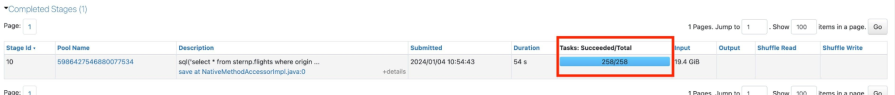
A common pattern is to show a progress counter directly within the pipeline. For example, in Databricks, during a background job, the UI displays the number of tasks succeeded out of the total number of tasks. This number updates in real time as the system completes the tasks.
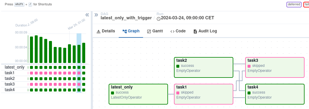
Another useful cue is an active step highlight, where task states are color-coded. In Airflow’s DAG graph view, the active and recently executed steps are easy to spot. Green boxes indicate successful tasks, while pink boxes show tasks that were skipped. The highlighted task boxes in the graph let users instantly see which steps have been completed and which were bypassed.
Background jobs already create uncertainty, being invisible, asynchronous, and often long-running. The words used in these moments matter just as much as the UI patterns. Using generic words in messaging like “Processing…” or “Loading…” leaves users guessing and waiting with no idea of when the job will complete or what’s happening behind the scenes.
Instead, use clear, calm, and specific microcopy to reduce user anxiety and help people feel in control. Give context and detail so that users understand what the system is doing, such as “Validating 300 records” or “Publishing activity file (step 4 of 6)”. Even a short phrase showing the current step or number of remaining items builds confidence that real progress is happening.
When jobs fail, avoid blaming the user or using alarming microcopy. “Something went wrong” is vague and unhelpful because it tells users nothing and only increases worry. A better way to communicate the error is to describe the issue clearly and show how to resolve it. Instead, you could say “3 items failed due to missing IDs. Ensure that each item has a unique ID and try again.” This changes the tone from alarming to actionable.
Success messages should feel just as trustworthy. A simple, specific confirmation reinforces that the system completed the job as expected, such as “Import complete. 5 items updated.” When users receive a clear summary of the outcome, they feel confident knowing that the system actually did what they asked.
Even great background job designs can fall apart if they’re only tested when everything goes smoothly. In the real world, users run into slow networks, long delays, dropped connections, and jobs that only half succeed. Designers shouldn’t forget about these edge cases and remember that async workflows need to be tested in unpredictable conditions.
To properly test workflows, designers may need to work closely with engineers to throttle the network or add intentional delays to see how the UI behaves when progress is not instant. The interface should continue to provide clear updates through step progress, item counts, or estimated time remaining. This ensures that users never feel like the system is stuck or crashing. If a slow job looks broken, then users will assume it is.
When users execute a long-running task, they are likely to want to leave and do something else in the meantime. They will close tabs, switch pages and come back later, or possibly lose connection. The UI must restore the job’s latest status correctly when they return and not restart from scratch or show stale information. Restarting a job or losing track of it is one of the quickest ways to destroy user trust.
Jobs don’t always fully succeed or fail, as some items may pass while others don’t. Test the outcome of a partial success to ensure the UI accurately summarizes what succeeded, what failed, and what users can fix or retry. If the interface only handles the happy paths, it won’t hold up once it runs into more complex cases.
Background job UX is a fundamental part of enterprise design. These workflows run constantly, and when users trigger tasks they can’t see, uncertainty and anxiety follow. The best systems fight that by giving users visibility, control, and confidence even while work happens behind the scenes.
Designers should focus on clearly communicating progress, handling partial failures in a recoverable way, and using thoughtful microcopy to turn complex flows into a clear direction. And by partnering with engineering to test these experiences under real-world conditions, you can catch issues before users do. Doing this well will make every background process an opportunity to build user trust.

LogRocket's Galileo AI watches sessions and understands user feedback for you, automating the most time-intensive parts of your job and giving you more time to focus on great design.
See how design choices, interactions, and issues affect your users — get a demo of LogRocket today.

AI tools can generate beautiful UI concepts in minutes, but most teams struggle to integrate those outputs into real design systems. This guide explores why AI drifts toward generic patterns and how to build governed workflows that keep speed without sacrificing brand consistency.

Adaptive interfaces personalize experiences using behavioral signals and machine learning. But when personalization becomes autonomous, systems can reinforce patterns, limit discovery, and shape user behavior in ways designers didn’t intend.

Security requirements shouldn’t come at the cost of usability. This guide outlines 10 practical heuristics to design 2FA flows that protect users while minimizing friction, confusion, and recovery failures.

2FA failures shouldn’t mean permanent lockout. This guide breaks down recovery methods, failure handling, progressive disclosure, and UX strategies to balance security with accessibility.


