Editor’s note: This article was reviewed by Isaac Okoro on 20 February 2024 to update stats and feature information for the React Image Crop, react-avatar-editor, react-easy-crop, and react-cropper libraries. The update also added react-perspective-cropper and React Advanced Cropper to the list. To reflect and summarize all the new and updated information, a new comparison table is available at the end of the article.

When adding images to an application, reducing the image’s surrounding noise can help direct user attention to a specific part of the image. Image cropping is one way you can manipulate images to remove any unwanted elements.
Changing the aspect ratio or orientation of the images we use in our projects enables us to draw users’ eyes to the photograph’s main subject and improve the overall composition. Use cases for image croppers in web apps include setting profile pictures or uploading images with specific dimensions.
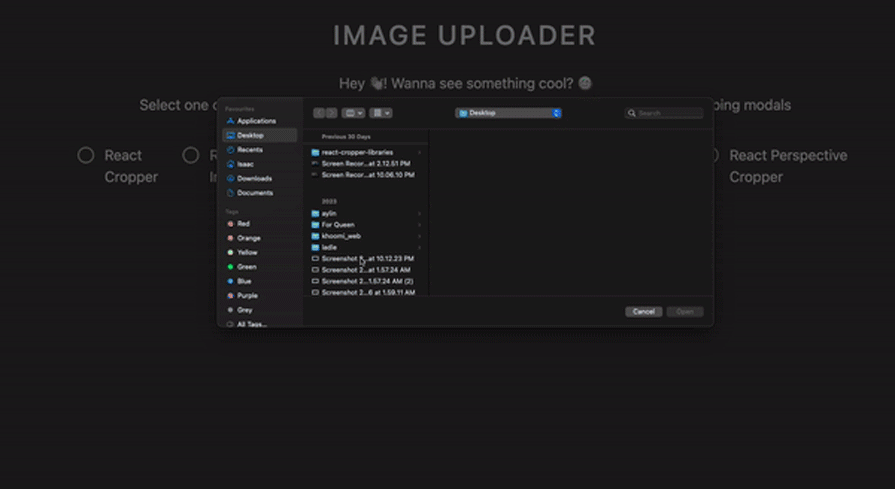
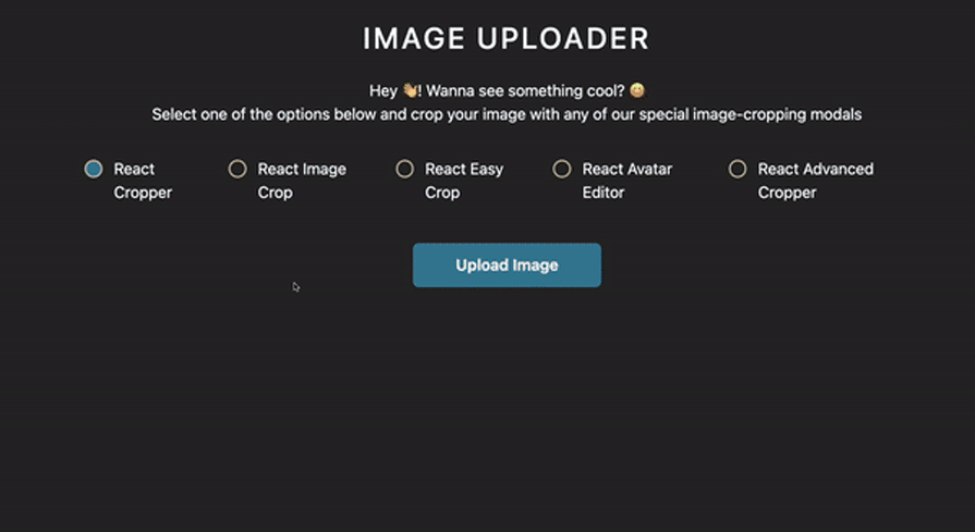
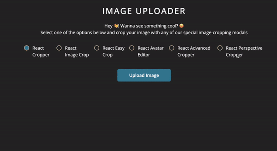
In this article, we’ll compare six of the top React image cropping libraries, evaluating each in terms of performance, popularity, and developer experience. To better understand and compare the features and experience provided by each library, we’ll build an image uploader application in React:
By the end of this tutorial, you should be able to choose the right fit for your project. To follow along with this tutorial, you’ll need:
Let’s get started! You can follow along by accessing the project’s code.
We’ll start by initializing a new React app and bootstrapping it with Create React App. Run the command below in your terminal to create a new React application:
npx create-react-app image uploader
Next, we’ll navigate to our project directory and run the following command to start our development server:
cd image uploader && yarn start
The command above will open a tab in our browser and display the application’s default boilerplate. Next, we’ll install dependencies, which we’ll include in our three cropper libraries.
We’ll install the following dependencies in our application:
cropperjs as a React componentNext, we’ll build components for our components. In our application, we’ll need a button component to upload images and a modals component to upload, save, and dismiss images from our uploader. Lastly, for each of our croppers, we’ll need a modalWrapper.
Button componentThe Button component is a skeleton component for all the buttons in our application.
First, we’ll use the style component to create a style guide for our buttons. Let’s create a components folder in our application’s src directory. Inside of your components folder, create a new directory called Button. There, create a Button.jsx file and add the code below:
import styled from "styled-components";
const Button = ({ children, className, ...props }) => {
    return (
        <StyledButton
            style={{
                background: "skyblue",
                color: "#000",
            }}
            className={`${className} block text-black px-6 rounded-md font-semibold hover:opacity-75 transition-opacity duration-500 ease-in`}
            type="button"
            {...props}
        >
            {children}
        </StyledButton>
    );
};
In the code block above, we created a Button component and passed children, className, and props. Now, we’ll add styles to our button with styled-components:
const StyledButton = styled.button`
    background-color: #2eff7b;
    border: none;
    outline: none;
    height: 45px;
    &:focus {
        border: none;
        outline: none;
    }
    &:disabled {
        opacity: 1;
        cursor: not-allowed;
    }
`;
export default Button;
Checkbox component
Now, we’ll build a Checkbox component that links each image cropper. First, create a new folder called Checkbox in our components directory. Inside, we’ll create a new file called Checkbox.jsx and add the following code:
import styled from "styled-components";
const Checkbox = ({ label, onChange, id, isChecked }) => {
    return (
        <Wrapper>
            <label htmlFor={id}>{label}</label>
            <input
                id={id}
                type="checkbox"
                name={label}
                onChange={() => {
                    onChange(!isChecked ? label : null);
                }}
                value={isChecked ? label : ""}
                checked={isChecked}
            />
            <span className="rounded-full" />
        </Wrapper>
    );
};
In the code block above, we created a Checkbox component that has a label and an ID inside, which we’ll use to select our cropper library. Next, we’ll build a modal component for opening and closing a particular cropper library.
modal componentOur modal component will feature props like onModalClose, showModal, and onSaveHandler. We’ll also add a button for uploading and saving our cropped images.
In our components directory, let’s create a new folder called Modal. Inside, create a new file called Modal.jsx and add the code block below:
import { createPortal } from "react-dom";
import styled from "styled-components";
import Button from "../Button/Button";
const Modal = ({ children, onModalClose, showModal, onSaveHandler }) => {
    return createPortal(
        <Wrapper
            style={{
                opacity: showModal ? 1 : 0,
                pointerEvents: showModal ? "all" : "none",
            }}
        >
            <div
                onClick={onModalClose}
                role="button"
                className="iu-modal-backdrop"
                style={{
                    display: showModal ? "flex" : "none",
                }}
            />
            <div className="iu-modal-content">
                {children}
                <footer className="px-12 md:sticky absolute bottom-0 bg-white w-full left-0 py-4 border-t border-black flex items-center justify-between">
                    <Button onClick={onModalClose}>Dismiss</Button>
                    <Button
                        onClick={() => {
                            onSaveHandler();
                            onModalClose();
                        }}
                    >
                        Save
                    </Button>
                </footer>
            </div>
        </Wrapper>,
        document.getElementById("modal")
    );
};
In the code block above, we initialized a modal component and created a Wrapper component, where we added a function to upload and save an image.
react-avatar-editor is an avatar and image cropper for React applications. With an intuitive UI, react-avatar-editor can easily crop, resize, and rotate images.
With 85k weekly downloads on npm and 2.3k stars on GitHub, react-avatar-editor is one of the most popular cropper libraries for React applications. To see react-avatar-editor in action, first, we’ll need to install it in our app with the command below:
//Yarn

yarn add react-avatar-editor

//npm

npm install --save react-avatar-editor
Next, create a new folder called ReactAvatarEditor. Inside, create a new file called ReactAvatarEditor.jsx and add the code below:
import { useRef } from "react";
import AvatarEditor from "react-avatar-editor";
import styled from "styled-components";
import Modal from "../../Modal/Modal";

const ReactAvatarEditor = ({
    showModal,
    onModalClose,
    imgURL,
    onSaveHandler,
}) => {
    const EditorRef = useRef(null);
    const showCroppedImage = async () => {
        if (EditorRef.current) {
            const img = EditorRef.current.getImage().toDataURL();
            return img;
        }
    };

    return (
        <Modal
            showModal={showModal}
            onSaveHandler={async () => onSaveHandler(await showCroppedImage())}
            onModalClose={onModalClose}
        >
            <Wrapper className="w-full h-full flex flex-col items-center justify-center">
                <AvatarEditor
                    ref={EditorRef}
                    image={imgURL}
                    width={250}
                    height={250}
                    border={0}
                    scale={1.2}
                    color={[255, 255, 255, 0.6]}
                />
            </Wrapper>
        </Modal>
    );
};
In the code above, we imported the useRef Hook, initialized our cropper package as AvatarEditor, and imported styled-components to add styles to our application.
Then, we initialized a functional component with AvatarEditor and passed some methods from our modal component. Finally, we assigned the ref to our AvatarEditor to get our image, convert it to a URL, and parse it for cropping.
To render our cropped images, we created a wrapper component and added props like image, which is the URL of the image we want to crop. Note that width, height, border, and color refer to the editor’s attributes.
react-image-crop is an open source library that allows us to crop images. One thing to know is that it has no dependency, meaning it’s lightweight. To begin, let’s install react-image-crop:
//Using yarn
yarn add react-image-crop

//using npm
npm i react-image-crop
Next, in our component, let’s import the ReactCrop component from react-image-crop:
import { useState } from "react";
import ReactCrop from "react-image-crop";
import "react-image-crop/dist/ReactCrop.css";
Then we’ll create variables with useState Hooks:
 const [image, setImage] = useState(null);
    const [crop, setCrop] = useState({ unit: "%", width: 30, aspect: 16 / 9 });
    const [croppedImageUrl, setCroppedImageUrl] = useState("");
crop contains our dimensions, image contains our image file, and croppedImageUrl contains the final cropped image.
We’re now going to add two functions — makeClientCrop and getCroppedImg — that will help us return our cropped image with setCroppedImageUrl():
const Cropper = ({ imgURL }) => {
const makeClientCrop = async (crop) => {
        if ((image, crop.width && crop.height)) {
            const croppedImg = await getCroppedImg(image, crop, "newFile.jpeg");
            setCroppedImageUrl(croppedImg);
        }
    };


    const getCroppedImg = (sourceImage, crop, fileName) => {
    const canvas = document.createElement("canvas");
  const scaleX = sourceImage.naturalWidth / sourceImage.width;
  const scaleY = sourceImage.naturalHeight / sourceImage.height;
  canvas.width = crop.width;
  canvas.height = crop.height;
  const ctx = canvas.getContext("2d");
  ctx.drawImage(
    sourceImage,
    crop.x * scaleX,
    crop.y * scaleY,
    crop.width * scaleX,
    crop.height * scaleY,
    0,
    0,
    crop.width,
    crop.height
  );
    try {
      return new Promise((resolve) => {
        canvas.toBlob((file) => {
          resolve(URL.createObjectURL(file));
        }, "image/jpeg");
      });
    } catch (error) {
      console.log(error);
      return null;
    }
  };
}
Let’s add ReactCrop to our component:
            <ReactCrop
                src={imgURL}
                crop={crop}
                ruleOfThirds
                onImageLoaded={ (img) => {
                    console.log(img);
                    setImage(img);
                }}
                onComplete={(crop) => image? makeClientCrop(crop): console.log("wait")}
                onChange={(cropData) => setCrop(cropData)}
            />
On initial load, we feed the src with our imgUrl. Once ReactCrop loads the image, it assigns it into our variable using setImage. When there are any dimension changes, it assigns the data using setCrop.
Also, onComplete checks if the image exists. If it does, it’ll trigger our makeClientCrop function with the cropped image: cropData.
react-cropper is an open source React wrapper component for Cropper.js, a JavaScript library that includes a photo editor and an image cropper. react-cropper has more than 63k weekly downloads on npm and 2k stars on GitHub. To use react-cropper in your application, first, install it with the command below:
// Using yarn
yarn add react-cropper

// Using npm
npm install --save react-cropper
Next, add the following code block to crop an image using our image uploader application:
import { useRef, useState } from "react";
import Cropper from "react-cropper";
import "cropperjs/dist/cropper.css";
import Modal from "../../Modal/Modal";

const ReactCropper = ({ showModal, onModalClose, imgURL, onSaveHandler }) => {
    const cropperRef = useRef(null);
    const [croppedImg, setCroppedImg] = useState("");
    const onCrop = () => {
        const imageElement = cropperRef?.current;
        const cropper = imageElement?.cropper;
        setCroppedImg(cropper.getCroppedCanvas().toDataURL());
    };

    return (
        <Modal
            showModal={showModal}
            onSaveHandler={() => onSaveHandler(croppedImg)}
            onModalClose={onModalClose}
        >
            <Cropper
                src={imgURL}
                style={{ height: 500, width: "732px" }}
                initialAspectRatio={16 / 9}
                guides={false}
                crop={onCrop}
                ref={cropperRef}
                viewMode={1}
                // guides={true}
                minCropBoxHeight={10}
                minCropBoxWidth={10}
                // background={false}
                responsive={true}
                autoCropArea={1}
                aspectRatio={4 / 3}
                checkOrientation={false}
            />
        </Modal>
    );
};
export default ReactCropper;
Similar to react-avatar-editor, we imported the useRef and useState Hooks from React. Next, we initialized a functional component,ReactCropper, which takes in a number of props like the image URL and modal.
To crop our image, we connected to the image cropper properties, like the image URL, then parsed it. Using React’s useState Hook, we created a state for our cropped image.
To render our image, we initialized a Cropper component and passed a few props from Cropper.js, including src for parsing the image URL. Finally, we pass styles to the style prop.
react-easy-crop is an open source React component that features a clean UI for cropping images and videos. react-easy-crop is mobile-friendly, offering crop dimensions in pixels and percentages and interactions for dragging and zooming.
On npm, react-easy-crop is currently downloaded more than 125k times a week. On GitHub, react-easy-crop has 1.7k stars. You can get started with react-easy-crop by installing the library using a package manager, as shown in the code block below:
//Yarn
yarn add react-easy-crop

// npm
npm install react-easy-crop --save
To use react-easy-crop, you’ll need to wrap it in a Cropper component tag. Let’s build a cropper component using the library below:
import { useCallback, useState } from "react";
import Cropper from "react-easy-crop";
import Modal from "../../Modal/Modal";

const ReactEasyCrop = ({ showModal, onModalClose, imgURL, onSaveHandler }) => {
    const [crop, setCrop] = useState({ x: 2, y: 2 });
    const [zoom, setZoom] = useState(1);
    const [croppedArea, setCroppedArea] = useState("");

    const onCropComplete = useCallback((croppedArea, croppedAreaPixels) => {
        setCroppedArea(croppedAreaPixels);
    }, []);
    const showCroppedImage = useCallback(async () => {
        try {
            const croppedImage = await getCroppedImg(imgURL, croppedArea, 0);
            return croppedImage;
        } catch (error) {
            console.error(error);
        }
    }, [croppedArea, imgURL]);
In the code block above, we created a component called ReactEasyCrop, which contains props like showModal, onModalClose, imgURL, onSaveHandler, and showModal.
Like other image croppers, the showModal and onModalClose props are used for uploading an image, while the imgUrl provides the URL of the image we are uploading. onCropComplete allows us to save a cropped area of an image and specify the pixel or percentage size of the cropped image.
Next, we’ll render our application using the Modal wrapper component, as shown below:
return (
                <Modal
                        showModal={showModal}
                        onSaveHandler={async () => onSaveHandler(await showCroppedImage())}
                        onModalClose={onModalClose}
                >
                        <div className="relative w-full">
                                <Cropper
                                        image={imgURL}
                                        crop={crop}
                                        zoom={zoom}
                                        aspect={4 / 3}
                                        onCropChange={setCrop}
                                        onCropComplete={onCropComplete}
                                        onZoomChange={setZoom}
                                />
                        </div>
                </Modal>
        );
};

export default ReactEazyCrop;
In the code block above, we wrapped our entire application in a Modal component, allowing us to upload our images. Next, we initialized the Cropper component, where we passed the URL of our cropped images.
We also added the crop prop, which is used to determine the position of the image to be cropped. zoom is used to zoom in on the image, and the default is set to 1.
onCropChange is used to update our application’s crop state. onCropComplete is called when a user stops zooming on an image.
react-advanced-cropper is a React library that allows you to create customizable image croppers for your web applications. It is based on the Advanced Cropper core library, which provides a powerful and flexible API for image cropping.
With features like full mobile and desktop support, customizable appearance, and zooming, it is no wonder that the react-advanced-cropper library is growing in popularity. This is made evident from its 10k weekly downloads on NPM.
Let’s install the package using the command below:
npm i react-advanced-cropper
Next, copy the code below and paste it into your file:
import { useRef } from "react";
import { Cropper } from "react-advanced-cropper";
import "react-advanced-cropper/dist/style.css";
import Modal from "../../Modal/Modal";
const Example = ({ showModal, onModalClose, imgURL, onSaveHandler }) => {
  const cropperRef = useRef(null);
  const onCrop = () => {
    const cropper = cropperRef.current;
    if (cropper) {
      const canvas = cropper.getCanvas();
      return canvas.toDataURL();
    }
  };
  return (
    <Modal
      showModal={showModal}
      onSaveHandler={() => onSaveHandler(onCrop())}
      onModalClose={onModalClose}
    >
      <div className="example">
        <div className="example__cropper-wrapper">
          <Cropper ref={cropperRef} src={imgURL} />
        </div>
      </div>
    </Modal>
  );
};
export default Example;
First, we imported the Cropper component from react-advanced-cropper and wrapped it inside our Modal component. After that, we created our functionality to show our desired cropped image on the screen after we were done cropping. See the results below:
react-perspective-cropper is a relatively new library compared to the other cropping libraries that we have talked about in this article. With less than 50 stars on Github and 120 weekly downloads on NPM, it is also the least popular.
To use this library, we first have to install it using the commands below:
//npm
npm i react-perspective-cropper

//Yarn
yarn add react-perspective-cropper
Next, copy the code below and paste it into your file:
import { useRef } from "react";
import Cropper from "react-perspective-cropper";
import Modal from "../../Modal/Modal";
export default function ReactPerspectiveCropper({
  showModal,
  onModalClose,
  imgURL,
  onSaveHandler,
}) {
  const cropperRef = useRef();
  return (
    <Modal
      showModal={showModal}
      onModalClose={onModalClose}
    >
      <Cropper ref={cropperRef} image={imgURL} maxWidth={500} />
    </Modal>
  );
}
We imported the Cropper component from the react-perspective-cropper library, as shown in the code block above. Next, we passed our image to it and wrapped it in the Modal component. The result in the browser should should look like the GIF below:
Below is a comparison table summarizing all the libraries we’ve covered in this listicle:
| Library | Popularity (stars on GitHub) | Support | Features | Best for | Other metrics |
|---|---|---|---|---|---|
| react-image-crop | 3.7k | Active with regular updates | Basic cropping, aspect ratio control, zoom, drag and drop | Simple cropping tasks | Lightweight, minimal dependencies |
| react-avatar-editor | 2.3k | Active with some contributions | Avatar cropping, circular and rectangular selection, image editing tools | Avatar or profile picture cropping | Easy image editing tools, lightweight |
| react-easy-crop | 1.7k | Active with regular updates | Basic cropping, aspect ratio control, zoom, drag and drop | Simple cropping tasks | Easy to use, beginner-friendly API |
| react-cropper | 2k | Semi-active with some ongoing updates | Full-featured cropping, zoom, rotation, flip, aspect ratio control | General-purpose image cropping | Extensive documentation and community support |
| react-advanced-cropper | 1k | Low activity but with ongoing updates | Full-featured cropping with free-form selection, mobile support, transitions | Advanced cropping scenarios, mobile compatibility | Many customization options |
| react-perspective-cropper | 50 | Low activity | Perspective cropping, 3D manipulation, zoom, rotation | Simple cropping tasks | Unique feature set, limited documentation |
This table can help you weigh some important considerations when choosing an image cropping library for your React application.
No matter what type of project you’re working on, a cropper library can help you improve your overall UI by removing unwanted areas from a photograph. The libraries featured in this tutorial have thorough built-in features and are easily customizable for any React project.
Now, you should be able to choose the right cropper library for your application. I hope you enjoyed this tutorial!
Install LogRocket via npm or script tag. LogRocket.init() must be called client-side, not
server-side
$ npm i --save logrocket

// Code:

import LogRocket from 'logrocket';
LogRocket.init('app/id');
// Add to your HTML:

<script src="https://cdn.lr-ingest.com/LogRocket.min.js"></script>
<script>window.LogRocket && window.LogRocket.init('app/id');</script>

Learn how to protect full-stack projects from NPM supply chain attacks with a practical security checklist.

Explore 15 essential MCP servers for web developers to enhance AI workflows with tools, data, and automation.

Learn how contrast-color() automatically picks accessible text colors using native CSS, without JavaScript.

Learn how to build a harness-style AI workflow using Claude Code with specialized Dev, QE, and Ops subagents, gated handoffs, MCP telemetry, and LEARNING.md.
Would you be interested in joining LogRocket's developer community?
Join LogRocket’s Content Advisory Board. You’ll help inform the type of content we create and get access to exclusive meetups, social accreditation, and swag.
Sign up now

 Learn more →
