A React UI library or React component library is a software system that comes with a collection of pre-built and reusable components — tables, charts, modals, navbars, cards, buttons, and maps that are ready to use in React applications. These components are out-of-the-box, and beautifully and uniquely styled.

These built-in React components and ready-to-use design elements reduce the need to build UI components from scratch. They can play a major role in improving your development experience, and reducing time to production.
There are countless React UI kits and libraries available today. Your choice of a particular React component library largely depends on your project and design requirements. However, you need to also consider the library’s popularity, pricing, support, community, maintenance, and licensing requirements.
In this guide, we’ll highlight 16 of the most useful kits and libraries and show how to use them in your next React app. A few of them are popular, and some are more obscure. All of them can help address the unique needs of your next React project.
Editor’s note: This article was last updated by Joseph Mawa in March 2025 to add information on Headless UI for React and Hero UI, as well as provide pros/cons for each library.
Building UI components from scratch can be tedious and sometimes futile. This is why component libraries exist; they provide ready-to-use design elements, thereby allowing developers to focus on building the UI without building everything from scratch.
While building from scratch gives you complete control, it comes with a cost: maintainability.
Using UI library makes more sense in most cases and it brings with it the following benefits:
By providing beautiful components or design elements, UI libraries ensure that developers focus on implementing the functionality of an app, thereby speeding up the development process.
Faster development time doesn’t mean developers should compromise on the look of their application. This is why UI libraries come with beautifully designed, ready-to-use components that act as the building blocks of an application.
Because the web is accessed by different people with different devices and needs, it is a huge task to build components from scratch that address your users’ accessibility needs and have the correct styles on multiple devices. UI libraries take care of these and also handle the support of older browsers.
In some cases — usually involving the use of a relatively new CSS property or browser tool — developing CSS that works with all browsers can be tricky. This can negatively affect your user’s experience. UI libraries are an effective solution for this because they have cross-browser compatibility; your application will work on all modern browsers.
In this section, we will compare the top React component libraries by summarizing their functionalities and highlighting their GitHub stars, weekly npm downloads, and newness. This comparison will help you quickly pick those that meet your project requirements.
You need to be aware that GitHub stars are similar to social media likes. They in no way reflect the quality of the software. Similarly, the weekly npm downloads are far from accurate because they include downloads from automated build servers and bots.
On the other hand, you can quickly skim through the functionality of each library, pricing, and licensing requirements so that you can identify those libraries that meet your project requirements:
| React UI library | GitHub stars | Licensing | Pricing | Functions | Weekly npm downloads | Newness |
|---|---|---|---|---|---|---|
| React Bootstrap | 22.5K | MIT | Free | jQuery-free, ready-to-use React components styled with Bootstrap | 1,070,903 | 11 years |
| Core UI | 787 | MIT and Commercial Licenses | Free and Paid versions | jQuery-free, customizable, easy to learn React.js UI components, and React.js Admin Templates. | 146,306 | 7 years |
| PrimeReact | 7.4K | MIT | Free | Rich set of open source UI components for React | 151,116 | 8 years |
| Grommet | 8.4K | Apache License 2.0 | Free | Accessibility, modularity, responsiveness, and theming | 33,808 | 10 years |
| Onsen UI | 8.8K | Apache License 2.0 | Free | Native-feeling progressive web apps (PWAs) and hybrid apps | 20,392 | 9 years |
| MUI | 94.8K | MIT and Commercial Licenses | Free and Paid versions | Ready-to-use foundational React components styled with Google’s Material Design | 4,971,142 | 11 years |
| Chakra UI | 38.5K | MIT | Free | Simple, modular, and accessible UI Components | 668,703 | 5 years |
| Ant Design | 93.6K | MIT | Free | A set of high-quality React components for building enterprise-class UI designed for web applications | 1,705,267 | 10 years |
| Semantic UI React | 13.3K | MIT | Free | jQuery-free, declarative API, beautifully styled React components for enterprise-class UI | 274,350 | 10 years |
| Blueprint UI | 20.9K | Apache License 2.0 | Free | Optimized for building complex, data-dense interfaces for desktop applications | 167,600 | 9 years |
| Visx | 19.7K | MIT | Free | Consists of low-level visualization primitives for React | 664,000 | 7 years |
| Fluent UI | 18.8K | MIT | Free | Robust React-based frontend framework/components for building web experiences | 115,139 | 5 years |
| Evergreen | 12.4K | MIT | Free | Works out of the box, offers server-side rendering, flexible, composable, enterprise-grade | 15,935 | 7 years |
| Mantine | 27.7K | MIT | Free | Free and open source, usable in any project, customizable, responsive, and adaptive | 243,303 | 5 years |
| Headless UI for React | 26.8K | MIT | Free | Free and open source. It provides unstyled and fully accessible React components you can style using Tailwind Css | 2,372,740 | 4 years |
| Hero UI | 23.1K | MIT | Free | Built on top of Tailwind CSS and React Aria. You can use it to build accessible and aesthetically pleasing React applications | 4,223 | 4 years |
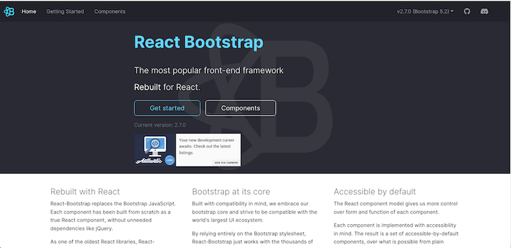
React Bootstrap rebuilds Bootstrap — the most popular frontend framework for React — removing the unnecessary jQuery dependency.
Although the jQuery dependency is removed, React Bootstrap embraces its Bootstrap core and works with the entire Bootstrap stylesheet. Consequently, it is compatible with many Bootstrap themes.
As one of the oldest React frameworks, React Bootstrap has evolved and matured linearly with React. Additionally, each component is implemented with accessibility in mind, so it offers a set of accessible-by-default design elements.
Run the following code to install React Bootstrap:
sh
npm install react-bootstrap bootstrap
You can easily import and use components like this:
js
import Button from 'react-bootstrap/Button';

// or less ideally
import { Button } from 'react-bootstrap';

<Stack direction="horizontal" gap={2}>
  <Button as="a" variant="primary">
    Button as link
  </Button>
  <Button as="a" variant="success">
    Button as link
  </Button>
</Stack>
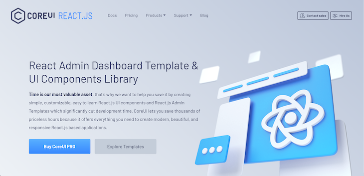
Core UI is one of the most powerful React UI component libraries. It provides a robust collection of simple, customizable, easy-to-use React UI components and React Admin Templates. Consequently, Core UI provides all the design elements needed to build modern, beautiful, and responsive React applications, thereby cutting development time significantly.
In addition to speeding up your development time, Core UI provides beautifully handcrafted design elements that are Bootstrap-compatible. These design elements are true React components built from scratch with Bootstrap but without the jQuery dependency.
Furthermore, Core UI provides both mobile and cross-browser compatibility. It also supports most of the other popular frameworks like Angular and Vue
To use Core UI, install it by running the following command:
sh
npm install @coreui/react
Then you can import and use any of the built-in React components like so:
js
import React from 'react'
import { CButton } from '@coreui/react'

export const ButtonExample = () => {
  return (
    <>
      <CButton color="primary">Primary</CButton>
    </>
  )
}
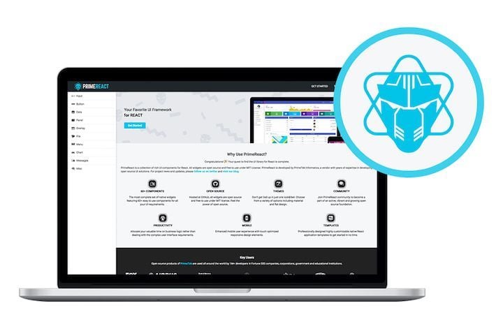
PrimeReact, built by PrimeTek Informatics, is one of the most extraordinary React UI kits that accelerates frontend design and development, featuring a collection of more than 70 components to choose from.
In addition to a wide variety of components, PrimeReact features custom themes, premium application templates, a11y, and responsive and touch-enabled UI components to deliver an excellent UI experience on any device.
For more details, check out PrimeReact on GitHub.
The kit is easy to install and use:
sh
npm i primereact --save
For icons, you can download the primeicons library:
sh
npm i primeicons --save
After installation, you can import and use a component like this:
js
import { Button } from "primereact/button";

function PrimeButtonEx() {
  return (
    <div>
      <Button>Button</Button>
    </div>
  );
}
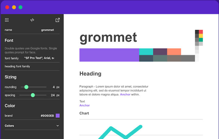
Part design, part framework, Grommet is a UI library based in React. It features a great set of components that make it easy to get started. The library also provides powerful theming tools that allow you to tailor the component library to align with your desired layout, color, and type.
The Grommet Design Kit is a drag-and-drop tool that makes designing your layout and components a breeze. It features sticker sheets, app templates, and plenty of icons:
To set up Grommet, run the following command in your React app:
sh
npm i grommet
To use a component such as Button, import it from the "grommet" package:
js
import { Grommet, Button } from "grommet"

function GrommetButtonEx() {
  return (
    <Grommet className="App">
      <Button label="Button" />
    </Grommet>
  );
}
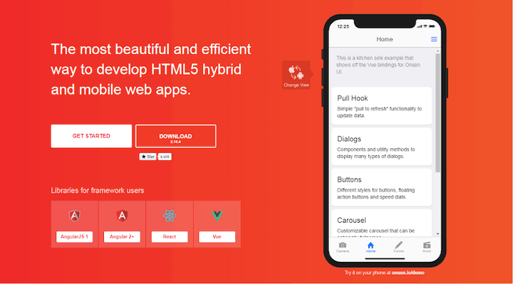
If you want your web app to feel native, Onsen UI is the library for you. Onsen UI is designed to enrich the user experience with a mobile-like feel. It’s packed with features that provide the UI experience of native iOS and Android devices.
Onsen UI’s elements and components are natively designed and perfect for developing hybrid apps and web apps. The library enables you to simulate page transitions, animations, ripple effects, and popup models — basically, any effect you would find in native Android and iOS devices:
To use Onsen in a React app, first install the npm packages:
sh
npm i onsenui react-onsenui --save
onsenui contains the Onsen UI core instance. react-onsenui contains the React components:
js
import { Page, Button } from "react-onsenui";

function OnsenButtonEx() {
  return (
    <Page>
      <Button> Click Me!!</Button>
    </Page>
  );
}
Then, import the Onsen CSS:
js
import "onsenui/css/onsenui.css"
import "onsenui/css/onsen-css-components.css"
I fondly refer to Onsen UI as the native CSS of the web.
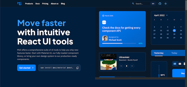
MUI is one of the popular React component libraries. It is based on Google’s Material Design. It is feature-rich with an extensive collection of ready-to-use components.
To install, run the following command:
sh
# with npm
npm install @mui/material @emotion/react @emotion/styled

# with yarn
yarn add @mui/material @emotion/react @emotion/styled
Next, import the component you want to use from the @mui/material:
js
import Button from "@mui/material/Button";

function MatButtonEx() {
  return (
    <div>
      <Button color="primary">Button</Button>
    </div>
  );
}
MUI also provides beautiful premium themes and templates you can purchase to jumpstart your project. Check out this article for a deeper dive into MUI.

I am so proud of my fellow Nigerian, Segun Adebayo, for developing Chakra UI. It has a clean and neat UI and is one of the most complete React UI kits I have ever seen. Its APIs are simple but composable, and the accessibility is great.
Chakra UI has over 30.8K GitHub stars, and is very extensible and customizable.
Inside your React project, run the following command to install Chakra UI:
sh
npm i @chakra-ui/react @emotion/react@^11 @emotion/styled@^11 framer-motion@^4
# OR
yarn add @chakra-ui/react @emotion/react@^11 @emotion/styled@^11 framer-motion@^4
Chakra UI has a ChakraProvider that we must provide at the root of our application when we want to use Chakra components:
js
import * as React from "react";

// 1. import `ChakraProvider` component
import { ChakraProvider } from "@chakra-ui/react";

function App({ Component }) {
  // 2. Use at the root of your app
  return (
    <ChakraProvider>
      <Component />
    </ChakraProvider>
  );
}
To use a component — for example, Button — we have to import it from @chakra-ui/react:
js
import { Button, ButtonGroup } from "@chakra-ui/react";
Then we can render Button like so:
js
function ChakraUIButtonEx() {
  return (
    <div>
      <Button>Click Me</Button>
    </div>
  );
}
For more information about Chakra UI and its components, visit the official docs.
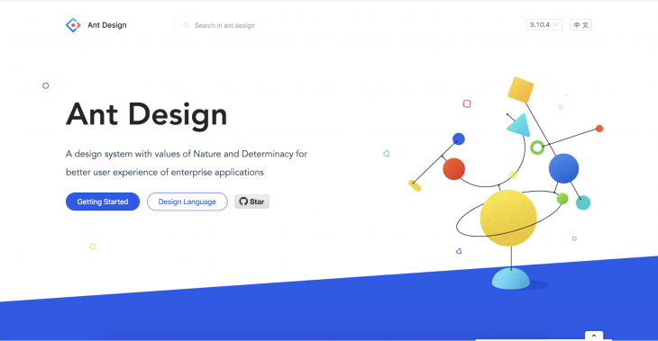
Ant Design is regarded as one of the best React UI kits in the world. With over 88K stars on GitHub, it tops the list as one of the most used and downloaded React UI kits.
Ant Design incorporates and promotes global design patterns and offers features like powerful theme customization, high-quality React components, and internationalization support.
Install Ant Design like so:
sh
# npm
npm install antd
# yarn
yarn add antd
We can import the style sheets manually:
js
import 'antd/dist/antd.css';
We can import any component we want to use from antd. For example, to use Button, we would do this:
js
import { Button } from "antd";

function AntdEx() {
  return <Button type="primary">Primary Button</Button>;
}
Visit this page to see all the components in Ant Design. Ant Design also has a spin-off for Angular and a spin-off for Vue.js.
Semantic UI React is the official Semantic UI integration for React. It is a complete React UI kit that is built on top of the Semantic UI CSS framework.
This Semantic UI React boasts over 100 components and offers the following robust features:
<Button type="primary" />, we can write <Button primary />. A prop can translate to many values. For example, the icon props can be an icon name, an <Icon /> instance, or an icon props objectas props; a Header may be rendered as an h3 element in the DOMSemantic UI React is easy to install:
sh
# yarn
yarn add semantic-ui-react semantic-ui-css

# npm
npm install semantic-ui-react semantic-ui-css
After installation, we can then import the minified CSS file:
js
import "semantic-ui-css/semantic.min.css";
Now, let’s see how we can use an inbuilt Semantic UI component. Let’s use the Button component:
js
import React from "react";
import { Button } from "semantic-ui-react";

const ButtonExampleButton = () => <Button>Click Here</Button>;

export default ButtonExampleButton;
To see all components in Semantic UI React, visit the official docs.
Blueprint UI is a React-based UI kit for the web with over 20K stars on GitHub. It is optimized for building complex interfaces for desktop applications.
Installing Blueprint UI is very simple:
sh
yarn add @blueprintjs/core react react-dom
@blueprintjs/core is the core of the Blueprint UI kit. It contains over 40 components we can use. The react-dom and react packages are required for Blueprint UI to work. Additional components can be obtained from:
@blueprintjs/icons@blueprintjs/select@blueprintjs/datetime@blueprintjs/table@blueprintjs/timezoneTo use a component from Blueprint UI, we’ll have to import it from @blueprintjs/core. For example, to use the Button component, we will have to import it from @blueprintjs/core:
js
import { Button } from "@blueprintjs/core";
Then we can render the Button like so:
js
function BlueprintUIButtonEx() {
  return (
    <div>
      <Button intent="success" text="button content">
        Click Me
      </Button>
    </div>
  );
}
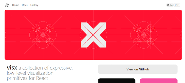
Visx stands for Visual Components and is a collection of reusable, low-level visualization components developed by Airbnb. It consists of several standalone packages for building flexible visual interfaces with React.
Visx is open source and designed to make creating complex and interactive data visualizations easier using React components. Visx provides a set of modular, low-level building blocks for creating custom visualizations, allowing developers to have fine-grained control over the appearance and behavior of their UI.
You can install Visx with npm or yarn:
sh
# npm
npm install @visx/shape @visx/scale @visx/axis @visx/group @visx/text

# yarn
yarn add @visx/shape @visx/scale @visx/axis @visx/group @visx/text

Fluent UI, formerly Office UI Fabric, is a set of open source, cross-platform design and user interface (UI) components and libraries developed by Microsoft. It is designed to help developers create consistent, visually appealing, and accessible user interfaces for their web and mobile applications. Fluent UI provides a comprehensive set of UI components that follow the Fluent Design System principles, such as buttons, forms, menus, and more.
To install Fluent UI, run the following code:
sh
# with npm
npm install @fluentui/react

# with yarn
yarn add @fluentui/react
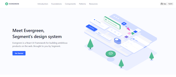
Evergreen is a design system and set of open source, React-based UI components created by Segment, a customer data platform company. Evergreen UI is designed to help developers build modern and elegant user interfaces for web applications. It provides a collection of reusable, customizable components that follow a minimalist design philosophy.
Evergreen can be installed by running the code below:
sh
# yarn
yarn add evergreen-ui
# npm
npm install --save evergreen-ui
You can import and use components as seen below:
js
import { Button } from "evergreen-ui";

function App() {
  return (
    <>
      <Button marginLeft={10} marginRight={10}>
        Default
      </Button>
      <Button marginRight={10} appearance="primary">
        Primary
      </Button>
      <Button marginRight={10} appearance="minimal">
        Minimal
      </Button>
    </>
  );
}
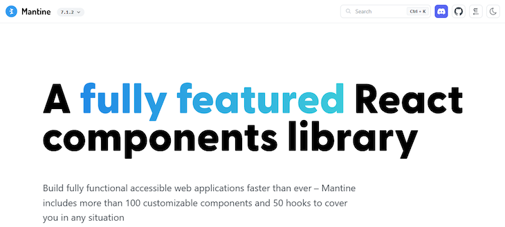
Mantine is an open source React component library that provides a wide range of high-quality, customizable, and accessible UI components for building modern web applications. Mantine is designed to simplify building user interfaces in React by offering a comprehensive set of React components and utilities.
Install Mantine by running any of the code below:
sh
# npm
npm install @mantine/core @mantine/hooks
# yarn
yarn add @mantine/core @mantine/hooks
You can import and use components from Mantine like so:
js
import { Button } from "@mantine/core";

function Demo() {
  return <Button fullWidth>Full width button</Button>;
}
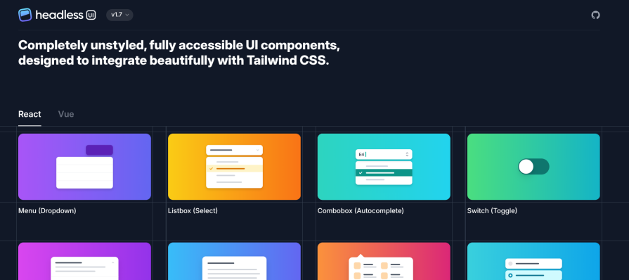
Headless UI is one of the React component libraries. It provides tons of unstyled and fully accessible React components. It is developed and maintained by Tailwind Labs, the developers of Tailwind CSS. Therefore, you can easily integrate it with Tailwind CSS, one of the leading CSS frameworks.
Getting started with the latest version of Headless UI for React is simple and straightforward. You need to install it from the npm package registry like so:
sh
npm install @headlessui/react@latest
After successfully installing it, you can import and use its built-in components as in the example below. If you’re using it with Tailwind CSS, be sure to set it up as well.
js
import { Button } from '@headlessui/react'

export default function Example() {
  return (
    <Button className="rounded-md bg-gray-600 py-1.5 px-3">
      Save changes
    </Button>
  )
}
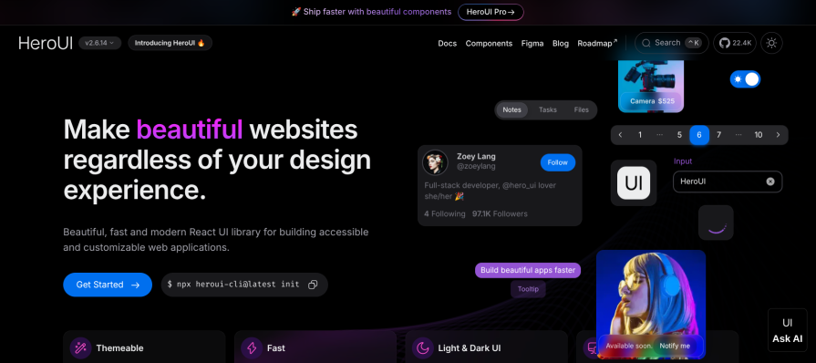
Hero UI, which was previously known as Next UI, is one of the fully-featured React component libraries. It was built on top of Tailwind CSS and React Aria. Under the hood, it uses Framer Motion for animation.
Hero UI is one of the React component libraries to look out for if you want to build accessible and aesthetically pleasing React applications. It comes with a built-in theme functionality that you can easily customize to meet your design requirements.
Getting started with Hero UI is fairly straightforward. You can install the Hero UI command line tool and use it to bootstrap a React project:
sh
# Install the command line tool
npm install -g heroui-cli

# Create a project using the command line tool
heroui init hero-ui-app
Hero UI has tons of React component libraries distributed as separate npm packages. You install each React component you want to use separately:
sh
npm install @heroui/button
After installation, you can import and use a component like so:
js
import { Button } from "@heroui/react";

export default function App() {
  return <Button color="primary">Button</Button>;
}
If you’re interested in other React UI libraries, check out the following:
In this guide, we reviewed a comprehensive list of React UI kits — everything from innovative newcomers to popular stalwarts. We also shared other React UI kits that are not quite popular but still pack a punch.
Now you should have the basic, foundational knowledge you need to select the right UI kit for your next React project.

Learn how to protect full-stack projects from NPM supply chain attacks with a practical security checklist.

Explore 15 essential MCP servers for web developers to enhance AI workflows with tools, data, and automation.

Learn how contrast-color() automatically picks accessible text colors using native CSS, without JavaScript.

Learn how to build a harness-style AI workflow using Claude Code with specialized Dev, QE, and Ops subagents, gated handoffs, MCP telemetry, and LEARNING.md.
Hey there, want to help make our blog better?
Join LogRocket’s Content Advisory Board. You’ll help inform the type of content we create and get access to exclusive meetups, social accreditation, and swag.
Sign up now

 Learn more →
