
Trust me, this is how UX really converts. I break down how companies like Airbnb and PayPal engineer trust into their UX — and how you can too.

Discover how the Chakra UI MCP server integrates AI into your editor, reducing context switching and accelerating development by fetching real-time documentation, component data, and code insights directly in-app.

Clean, fast interfaces are great for usability. But when it comes to emotion, trust, and memorability, slower UX has its own magic. Discover how to pace your design to tell a story that users connect with, not just use.

I thought trimming fields and adding tooltips would solve our order form problems. They didn’t. What finally worked was starting over with nine UX changes that made the process clear, simple, and frustration-free.

Empty states don’t have to be dead ends. See how Slack, Pinterest, Dropbox, and Duolingo turned blank screens into engaging UX moments and learn how you can too.
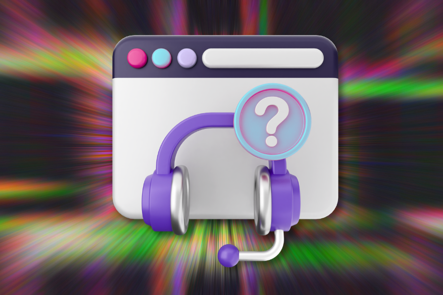
Support pages should actually support people. Here’s how Dropbox, Zoom, and more redesigned theirs to work better for real users.

The problem with templates isn’t that they exist; it’s that teams rely on them blindly. Learn how to turn templates into flexible tools that drive better UX outcomes.

Learn how top companies and smart UX strategies overcome notification blindness to boost engagement without annoying users.
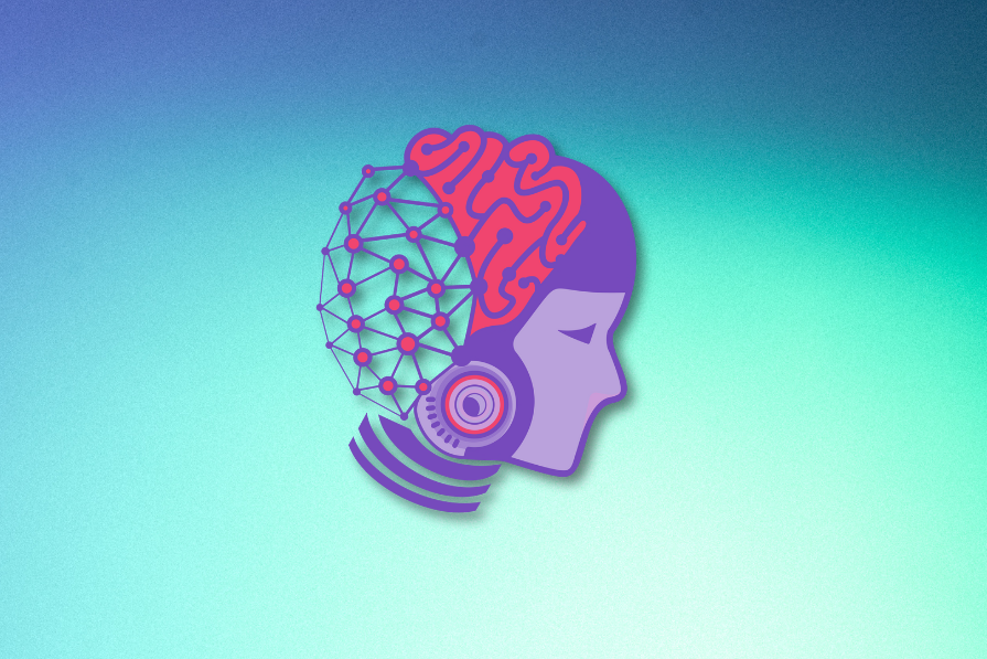
Designing AI products isn’t just about users; it’s also about trust. Here’s what I learned about balancing usability with governance in enterprise UX.

Working with GenUI tools like v0 changed how I prototype. It’s faster, messier, and way closer to real code — and it’s reshaped how I think about UX.

We’ve all made silly mistakes in apps — clicked the wrong thing, deleted a file too soon. This guide walks through 12 real UX examples that help users avoid those moments entirely.

Users rarely welcome change, even when it improves their experience. Learn how to communicate updates, handle pushback, and keep users from jumping ship.