We use swipe gestures for everything these days. It just feels intuitive to leave grubby smudge marks across our screens. Whether you’re looking for a date, browsing for a takeaway, or checking your bank balance — whatever you’re doing on your phone, you know the routine: swipe, swipe, click!

In this tutorial, we’ll build five different React Native swiper components for various use cases using Expo. We’ll cover the following:
FlatListDATAmaterial-top-tabsreact-native-snap-carouselreact-native-swipe-list-viewIf you’d like to follow along, I’ve created a branch for each component we’re covering:
react-native-app-intro-sliderFlatList@react-navigation/material-top-tabsreact-native-snap-carouselreact-native-swipe-list-viewHere’s a sneak peek at what we’ll be making. As always, you can find the full code on my GitHub.
The Replay is a weekly newsletter for dev and engineering leaders.
Delivered once a week, it's your curated guide to the most important conversations around frontend dev, emerging AI tools, and the state of modern software.
Initialize your project and select tabs (TypeScript) (you can remove the type definitions from the code examples if you’d like to follow along with JavaScript):
expo init RN-swiper-components && cd RN-swiper-components
Now you just need to fire up your preferred IDE, and we can get going. If you’re using VS Code, you can open the project with:
code .
First impressions count, so let’s build an intro screen that blows the user’s socks off. React Native App Intro Slider is an easy-to-use library for app introductions that uses React Native FlatList:
expo install react-native-app-intro-slider
Our intro slides use four random images. You can add your own and rename them or download the examples here, then add them to assets/images.
Inside your screens folder, create a file called Intro.tsx and add the following:
// Intro.tsx
import { StackNavigationProp } from "@react-navigation/stack";
import React, { useRef } from "react";
import {
View,
SafeAreaView,
Text,
Image,
StyleSheet,
StatusBar,
Pressable,
} from "react-native";
import AppIntroSlider from "react-native-app-intro-slider";
import { RootStackParamList } from "../types";
const data = [
{
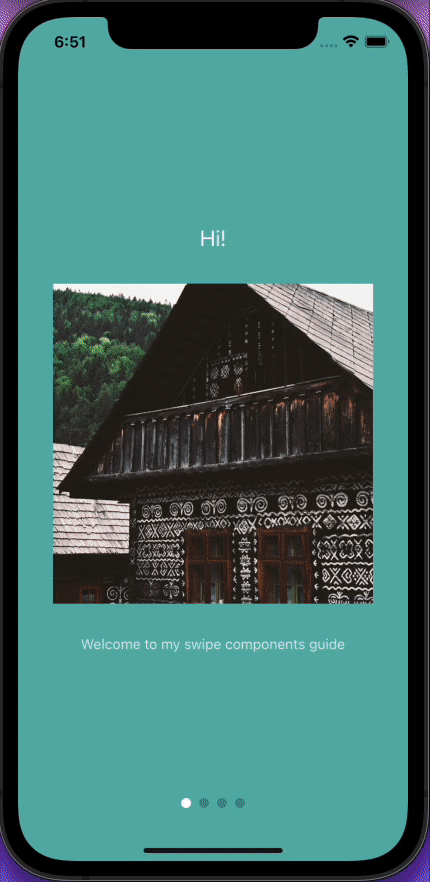
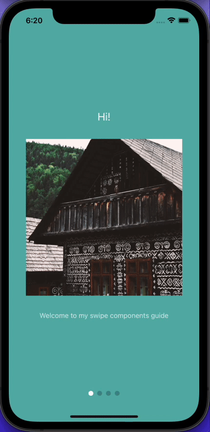
title: "Hi!",
text: "Welcome to my swipe components guide",
image: require("../assets/images/1.jpg"),
bg: "#59b2ab",
},
{
title: "Coming up...",
text: "Lot's of cool libraries!",
image: require("../assets/images/2.jpg"),
bg: "#febe29",
},
{
title: "Guess what!?",
text: "This is the first swipe component!",
image: require("../assets/images/3.jpg"),
bg: "#22bcb5",
},
{
title: "Time to gimme your data",
text: "Joking!",
image: require("../assets/images/4.jpg"),
bg: "#febe29",
},
];
type Item = typeof data[0];
type RenderPaginationProps = {
data: any[];
activeIndex: number;
slider: AppIntroSlider | null;
onIntroCompleted: () => void;
};
type IntroNavigationProps = StackNavigationProp<RootStackParamList, "Intro">;
interface IntroProps {
navigation: IntroNavigationProps;
}
const styles = StyleSheet.create({
slide: {
flex: 1,
alignItems: "center",
justifyContent: "center",
backgroundColor: "blue",
},
image: {
width: 320,
height: 320,
marginVertical: 32,
},
text: {
color: "rgba(255, 255, 255, 0.8)",
textAlign: "center",
},
title: {
fontSize: 22,
color: "white",
textAlign: "center",
},
paginationContainer: {
position: "absolute",
bottom: 16,
left: 16,
right: 16,
},
paginationDots: {
height: 16,
margin: 16,
flexDirection: "row",
justifyContent: "center",
alignItems: "center",
},
dot: {
width: 10,
height: 10,
borderRadius: 5,
marginHorizontal: 4,
},
buttonContainer: {
flexDirection: "row",
marginHorizontal: 24,
},
button: {
flex: 1,
paddingVertical: 20,
marginHorizontal: 8,
borderRadius: 24,
backgroundColor: "#1cb278",
},
buttonText: {
color: "white",
fontWeight: "600",
textAlign: "center",
},
});
const renderItem = ({ item }: { item: Item }) => (
<View
style={[
styles.slide,
{
backgroundColor: item.bg,
},
]}>
<Text style={styles.title}>{item.title}</Text>
<Image source={item.image} style={styles.image} />
<Text style={styles.text}>{item.text}</Text>
</View>
);
const RenderPagination = ({
activeIndex,
slider,
data,
onIntroCompleted,
}: RenderPaginationProps) => {
const handleIntroCompleted = () => {
onIntroCompleted();
};
return (
<View style={styles.paginationContainer}>
<SafeAreaView>
<View style={styles.paginationDots}>
{data.length > 1 &&
data.map((_, i) => (
<Pressable
key={i}
style={[
styles.dot,
i === activeIndex
? { backgroundColor: "white" }
: { backgroundColor: "rgba(0, 0, 0, 0.2)" },
]}
onPress={() => slider?.goToSlide(i, true)}
/>
))}
</View>
{activeIndex === data.length - 1 && (
<View style={styles.buttonContainer}>
<Pressable
onPress={handleIntroCompleted}
style={[styles.button, { backgroundColor: "#023e3f" }]}>
<Text style={styles.buttonText}>Log in</Text>
</Pressable>
<Pressable onPress={handleIntroCompleted} style={styles.button}>
<Text style={styles.buttonText}>Sign up</Text>
</Pressable>
</View>
)}
</SafeAreaView>
</View>
);
};
export const Intro = ({ navigation }: IntroProps) => {
const sliderEl = useRef(null);
const keyExtractor = (item: Item) => item.title;
const onIntroCompleted = () => {
navigation.navigate("Root");
};
return (
<View style={{ flex: 1 }}>
<StatusBar translucent backgroundColor="transparent" />
<AppIntroSlider
keyExtractor={keyExtractor}
renderItem={renderItem}
renderPagination={(activeIndex) => (
<RenderPagination
data={data}
activeIndex={activeIndex}
slider={sliderEl.current}
onIntroCompleted={onIntroCompleted}
/>
)}
data={data}
ref={sliderEl}
/>
</View>
);
};
<AppIntroSlider /> is where all the magic happens, so let’s dig deeper. renderItem takes an item from data and renders it into the list:
<AppIntroSlider
        keyExtractor={keyExtractor}
        renderItem={renderItem}
        renderPagination={(activeIndex) => (
          <RenderPagination
            data={data}
            activeIndex={activeIndex}
            slider={sliderEl.current}
            onIntroCompleted={onIntroCompleted}
          />
        )}
        data={data}
        ref={sliderEl}
      />
renderPagination uses the same data array to track the current item on the list. We provide the activeIndex and current value from the mutable useRef object, along with a callback function.
The renderPagination function contains the logic for the sign up and sign in buttons at the end of the slides and provides the little navigation dots at the bottom of the screen. This tutorial is all about swiping, but it’s worth noting that the dots are clickable.
When the activeIndex matches the length of the array, the buttons are displayed:
 {activeIndex === data.length - 1 && (
         ...
        )}
To ensure that the intro screen shows up as the first screen, open index.tsx in the navigation folder and paste the following:
import {
  NavigationContainer,
  DefaultTheme,
  DarkTheme,
} from "@react-navigation/native";
import { createStackNavigator } from "@react-navigation/stack";
import * as React from "react";
import { ColorSchemeName } from "react-native";
import { Intro } from "../screens/Intro";
import NotFoundScreen from "../screens/NotFoundScreen";
import { RootStackParamList } from "../types";
import BottomTabNavigator from "./BottomTabNavigator";
import LinkingConfiguration from "./LinkingConfiguration";
export default function Navigation({
  colorScheme,
}: {
  colorScheme: ColorSchemeName;
}) {
  return (
    <NavigationContainer
      linking={LinkingConfiguration}
      theme={colorScheme === "dark" ? DarkTheme : DefaultTheme}>
      <RootNavigator />
    </NavigationContainer>
  );
}

const Stack = createStackNavigator<RootStackParamList>();
function RootNavigator() {
  return (
    <Stack.Navigator screenOptions={{ headerShown: false }}>
      <Stack.Screen name="Intro" component={Intro} />
      <Stack.Screen name="Root" component={BottomTabNavigator} />
      <Stack.Screen
        name="NotFound"
        component={NotFoundScreen}
        options={{ title: "Oops!" }}
      />
    </Stack.Navigator>
  );
}
Open types.tsx in the root project folder and edit the RootStackParamList to look like this (skip this step if you’re using JavaScript):
export type RootStackParamList = {
  Intro: undefined;
  Root: undefined;
  NotFound: undefined;
};
Now restart your app and you have your intro slides. At this point, you can implement your sign up/sign in logic and navigate to the relevant screen. But we’re here to swipe, not type. So onward and upward to the next component!
FlatList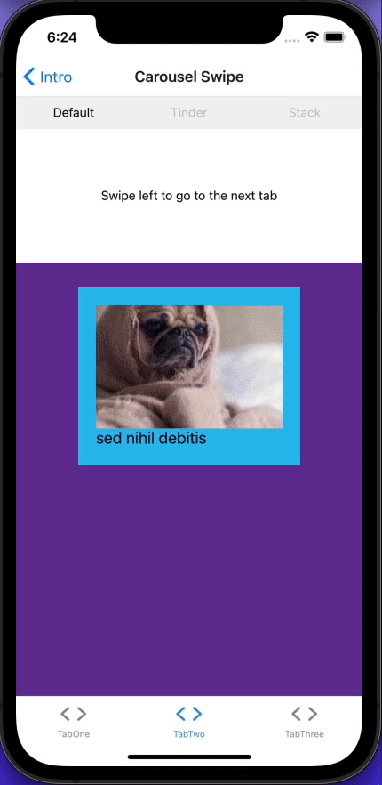
FlatList is used under the hood for many swiper libraries, so it’s a good place to start to get our bearings.
In the components folder, create a file called FlatList.tsx and paste the following:
import React from "react";
import {
  SafeAreaView,
  View,
  FlatList,
  StyleSheet,
  Text,
  Image,
} from "react-native";
import { DATA } from "../utils";
type ItemProps = typeof DATA[0];
const Item = ({ title, image, id }: ItemProps) => (
  <View key={id} style={styles.item}>
    <Image style={styles.image} source={{ uri: image }} />
    <Text style={styles.title}>{title}</Text>
  </View>
);
export const FlatListComponent = () => {
  const renderItem = ({ item }: { item: ItemProps }) => (
    <Item id={item.id} image={item.image} title={item.title} />
  );
  return (
    <SafeAreaView style={styles.container}>
      <FlatList
        data={DATA}
        renderItem={renderItem}
        keyExtractor={(item) => item.id}
        horizontal
      />
    </SafeAreaView>
  );
};
const styles = StyleSheet.create({
  container: {
    flex: 1,
  },
  item: {
    backgroundColor: "#2dbded",
    padding: 20,
    marginVertical: 8,
    marginHorizontal: 16,
    height: 200,
    width: 150,
  },
  title: {
    fontSize: 18,
  },
  image: {
    flex: 1,
  },
});
FlatList has a property called horizontal, which turns our standard scrollable FlatList into a swipeable (left/right) component:
<FlatList
        data={DATA}
        renderItem={renderItem}
        keyExtractor={(item) => item.id}
        horizontal
      />
DATATo provide familiarity across components, I’ve created a mock data function to provide data for the rest of our components. Pop back over to your terminal and install Faker:
expo install faker && yarn add -D @types/faker
In the root of your project folder, create a folder called utils, then add the following two files:
index.ts:
export { DATA } from "./GenerateImages";
GenerateImages.tsx:
import faker from "faker";
const generateImage = () => ({
  id: faker.datatype.uuid(),
  title: faker.lorem.words(3),
  image: "https://picsum.photos/200/300?random",
});
const generateImages = (numberOfImages: number) =>
  Array.from({ length: numberOfImages }, () => generateImage());
export const DATA = generateImages(20);
Faker provides random data — in our case, three words for our title and a random id. The generateImages function generates an array of 20 objects for us to play with. Each object has an id, title, and image property.
Let’s see what we’ve got. Go to TabOneScreen.tsx in the screens folder and add the following:
import * as React from "react";
import { StyleSheet } from "react-native";
import { FlatListComponent } from "../components/FlatList";
import { View } from "../components/Themed";
export default function TabOneScreen() {
  return (
    <View style={styles.container}>
      <FlatListComponent />
    </View>
  );
}
const styles = StyleSheet.create({
  container: {
    flex: 1,
  },
});
material-top-tabs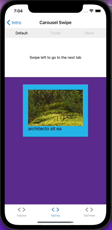
React Navigation was configured when we initialized the project. It has a great top tabs component that facilitates a smooth swiping experience between tabs. To install material-top-tabs:
expo install @react-navigation/material-top-tabs react-native-tab-view@^2.16.0
Create a new file in the components folder called TopTabsBar.tsx:
import { MaterialTopTabBarProps } from "@react-navigation/material-top-tabs";
import React, { FC } from "react";
import { Pressable, View } from "react-native";
import Animated from "react-native-reanimated";

interface TopTabsBarProps extends MaterialTopTabBarProps {}

export const TopTabsBar = ({
  state,
  descriptors,
  navigation,
  position,
}: TopTabsBarProps) => (
  <View
    style={{
      flexDirection: "row",
    }}>
    {state.routes.map((route, index) => {
      const { options } = descriptors[route.key];
      const label = options.title !== undefined ? options.title : route.name;
      const isFocused = state.index === index;
      const onPress = () => {
        const event = navigation.emit({
          type: "tabPress",
          target: route.key,
          canPreventDefault: true,
        });
        if (!isFocused && !event.defaultPrevented) {
          navigation.navigate(route.name);
        }
      };
      const onLongPress = () => {
        navigation.emit({
          type: "tabLongPress",
          target: route.key,
        });
      };
      const inputRange = state.routes.map((_: any, i: number) => i);
      const opacity = Animated.interpolateNode(position, {
        inputRange,
        outputRange: inputRange.map((i: number) => (i === index ? 1 : 0.2)),
      });
      return (
        <Pressable
          style={{
            flex: 1,
            padding: 10,
          }}
          key={index}
          onPress={onPress}
          onLongPress={onLongPress}>
          <Animated.Text style={{ opacity, textAlign: "center" }}>
            {label}
          </Animated.Text>
        </Pressable>
      );
    })}
  </View>
);
Notice how the opacity for the title of the unselected screen is reduced. The effect where the opacity gradually changes as you swipe is created by animating the style of the Text component opacity — taking the active index from 1 (full opacity) to 0.2.
For now, we’ll create two placeholder screens to test our TopTabBar component. In your screens folder, create the following two files:
Carousel.tsx:
import * as React from "react";
import { StyleSheet, Text } from "react-native";
import { View } from "../components/Themed";
export const Carousel = () => {
  return (
    <View style={styles.container}>
      <View style={styles.separator} />
      <Text>Swipe left to go to the next tab</Text>
    </View>
  );
};
const styles = StyleSheet.create({
  container: {
    flex: 1,
  },
  separator: {
    marginVertical: 5,
    height: 30,
    width: "80%",
  },
});
SwipeList.tsx:
import * as React from "react";
import { StyleSheet, Text } from "react-native";
import { View } from "../components/Themed";
export const SwipeList = () => {
  return (
    <View style={styles.container}>
      <View style={styles.separator} />
      <Text style={styles.text}>Swipe right to go back to the first tab</Text>
    </View>
  );
};
const styles = StyleSheet.create({
  container: {
    flex: 1,
  },
  separator: {
    marginVertical: 5,
    height: 30,
    width: "80%",
  },
  text: {
    textAlign: "center",
  },
});
In your navigation folder, create a file called TopTabNavigator.tsx:
import React from "react";
import { createMaterialTopTabNavigator } from "@react-navigation/material-top-tabs";
import { TopTabsBar } from "../components/TopTabsBar";
import { Carousel } from "../screens/Carousel";
import { SwipeList } from "../screens/SwipeList";
export type TopTabParamList = {
  Carousel: undefined;
  SwipeList: undefined;
};
const { Navigator, Screen } = createMaterialTopTabNavigator<TopTabParamList>();
export const TopTabNavigator = () => (
  <Navigator
    tabBar={(props) => <TopTabsBar {...props} />}
    initialRouteName="Carousel">
    <Screen
      name="Carousel"
      component={Carousel}
      options={{ title: "Carousel" }}
    />
    <Screen
      name="SwipeList"
      component={SwipeList}
      options={{ title: "Swipe List" }}
    />
  </Navigator>
);
Update types.tsx with:
export type RootStackParamList = {
  Intro: undefined;
  Root: undefined;
  NotFound: undefined;
};
export type BottomTabParamList = {
  TabOne: undefined;
  TabTwo: undefined;
};
export type TabOneParamList = {
  TabOneScreen: undefined;
};
export type TabTwoParamList = {
  TopTabNavigator: undefined;
};
To display our TopTabNavigator on TabTwo, edit BottomTabNavigator.tsx with the following:
import { Ionicons } from "@expo/vector-icons";
import { createBottomTabNavigator } from "@react-navigation/bottom-tabs";
import { createStackNavigator } from "@react-navigation/stack";
import * as React from "react";
import Colors from "../constants/Colors";
import useColorScheme from "../hooks/useColorScheme";
import TabOneScreen from "../screens/TabOneScreen";
import TabTwoScreen from "../screens/TabTwoScreen";
import { BottomTabParamList, TabOneParamList, TabTwoParamList } from "../types";
import { TopTabNavigator } from "./TopTabNavigator";
const BottomTab = createBottomTabNavigator<BottomTabParamList>();
export default function BottomTabNavigator() {
  const colorScheme = useColorScheme();
  return (
    <BottomTab.Navigator
      initialRouteName="TabOne"
      tabBarOptions={{ activeTintColor: Colors[colorScheme].tint }}>
      <BottomTab.Screen
        name="TabOne"
        component={TabOneNavigator}
        options={{
          tabBarIcon: ({ color }) => (
            <TabBarIcon name="ios-code" color={color} />
          ),
        }}
      />
      <BottomTab.Screen
        name="TabTwo"
        component={TabTwoNavigator}
        options={{
          tabBarIcon: ({ color }) => (
            <TabBarIcon name="ios-code" color={color} />
          ),
        }}
      />
    </BottomTab.Navigator>
  );
}

function TabBarIcon(props: {
  name: React.ComponentProps<typeof Ionicons>["name"];
  color: string;
}) {
  return <Ionicons size={30} style={{ marginBottom: -3 }} {...props} />;
}

const TabOneStack = createStackNavigator<TabOneParamList>();
function TabOneNavigator() {
  return (
    <TabOneStack.Navigator>
      <TabOneStack.Screen
        name="TabOneScreen"
        component={TabOneScreen}
        options={{ headerTitle: "Swipe-able FlatList" }}
      />
    </TabOneStack.Navigator>
  );
}
const TabTwoStack = createStackNavigator<TabTwoParamList>();
function TabTwoNavigator() {
  return (
    <TabTwoStack.Navigator>
      <TabTwoStack.Screen
        name="TopTabNavigator"
        component={TopTabNavigator}
      />
    </TabTwoStack.Navigator>
  );
}
react-native-snap-carousel
With 8.6K GitHub stars and over half a million downloads per month, react-native-snap-carousel is a very popular library. It has three built-in layouts — default, stack, and tinder — all of which we will explore. But if that isn’t enough, you can create your own custom interpolations.
We’ll create three screens, then render them in our previously created top tabs component. If this is the one you’ve been waiting for, wait no more:
expo install react-native-snap-carousel && yarn add -D @types/react-native-snap-carousel
When we created the FlatList component, we built a component called Item. Since it returns a card with a title and image, now might be a good time to refactor the code and create a reusable Card component.
Create components/Card.tsx:
import React from "react";
import { View, Text, StyleSheet, Image } from "react-native";
import { DATA } from "../utils";
export type CardProps = typeof DATA[0];
export const Card = ({ title, image, id }: CardProps) => (
  <View key={id} style={styles.container}>
    <View key={id} style={styles.item}>
      <Image style={styles.image} source={{ uri: image }} />
      <Text style={styles.title}>{title}</Text>
    </View>
  </View>
);
const styles = StyleSheet.create({
  container: {
    flex: 1,
    alignItems: "center",
  },
  item: {
    backgroundColor: "#2dbded",
    padding: 20,
    marginVertical: 8,
    marginHorizontal: 16,
    height: 200,
    width: 250,
  },
  title: {
    fontSize: 18,
  },
  image: {
    flex: 1,
  },
});
Edit FlatList.tsx to use the new Card component:
import React from "react";
import { SafeAreaView, FlatList, StyleSheet } from "react-native";
import { DATA } from "../utils";
import { CardProps, Card } from "./Card";
export const FlatListComponent = () => {
  const renderItem = ({ item }: { item: CardProps }) => (
    <Card id={item.id} image={item.image} title={item.title} />
  );
  return (
    <SafeAreaView style={styles.container}>
      <FlatList
        data={DATA}
        renderItem={renderItem}
        keyExtractor={(item) => item.id}
        horizontal
      />
    </SafeAreaView>
  );
};
const styles = StyleSheet.create({
  container: {
    flex: 1,
  },
});
Now we’ll create a reusable Carousel component and three screens to display different built-in layouts. In your components folder, create a file called Carousel.tsx and add the following:
import React, { useState, useRef } from "react";
import { View } from "react-native";
import Carousel from "react-native-snap-carousel";
import { DATA } from "../utils";
import { CardProps, Card } from "./Card";
type LayoutProps = { layout?: "default" | "stack" | "tinder" | undefined };
export const CarouselComponent = ({ layout }: LayoutProps) => {
  const [_, setActiveIndex] = useState<number>(0);
  const carouselEl = useRef(null);
  const handleSnapToItem = (index: number) => {
    setActiveIndex(index);
  };
  const renderItem = ({ item, index }: { item: CardProps; index: number }) => (
    <Card key={index} id={item.id} image={item.image} title={item.title} />
  );
  return (
    <View style={{ flex: 1, alignItems: "center" }}>
      <View
        style={{
          paddingTop: 20,
        }}>
        <Carousel
          layout={layout}
          ref={carouselEl}
          data={DATA}
          sliderWidth={300}
          itemWidth={300}
          renderItem={renderItem}
          onSnapToItem={(index) => handleSnapToItem(index)}
          layoutCardOffset={18}
          inactiveSlideScale={0.94}
          inactiveSlideOpacity={0.7}
          initialNumToRender={3}
        />
      </View>
    </View>
  );
};
The Carousel component uses the same Card component we created earlier, so it should look familiar. If you’d like to add pagination like in the Intro slides, it’s pretty straightforward:
// #1 Add activeIndex to useState
 const [activeIndex, setActiveIndex] = useState<number>(0);
// #2 create pagination function
const pagination = () => (
    <Pagination
      dotsLength={DATA.length}
      activeDotIndex={activeIndex}
      containerStyle={{ backgroundColor: "rgba(0, 0, 0, 0.75)" }}
      dotStyle={{
        width: 10,
        height: 10,
        borderRadius: 5,
        marginHorizontal: 8,
        backgroundColor: "rgba(255, 255, 255, 0.92)",
      }}
      inactiveDotStyle={
        {
          // Define styles for inactive dots here
        }
      }
      inactiveDotOpacity={0.4}
      inactiveDotScale={0.6}
    />
  );

// #3 Return it below your Carousel component.

return (
    <View style={{ flex: 1, alignItems: "center" }}>
      <View
        style={{
          paddingTop: 20,
        }}>
        <Carousel
          {...}
        />
        {pagination()}
      </View>
    </View>
  );
Now that the Carousel component is all set up, it’s time to consume it. Create three new files in the screens folder and add the following code:
DefaultCarousel.tsx:
import * as React from "react";
import { StyleSheet, Text } from "react-native";
import { CarouselComponent } from "../components/Carousel";
import { View } from "../components/Themed";
export const DefaultCarousel = () => {
  return (
    <View style={styles.container}>
      <View style={styles.separator}>
        <Text style={styles.text}>Swipe left to go to the next tab</Text>
      </View>
      <CarouselComponent layout="default" />
    </View>
  );
};
const styles = StyleSheet.create({
  container: {
    flex: 1,
    alignItems: "center",
    backgroundColor: "rebeccapurple",
  },
  separator: {
    width: "100%",
    height: 150,
    justifyContent: "center",
  },
  text: {
    textAlign: "center",
  },
});
StackCarousel.tsx:
import * as React from "react";
import { StyleSheet, Text } from "react-native";
import { CarouselComponent } from "../components/Carousel";
import { View } from "../components/Themed";
export const StackCarousel = () => {
  return (
    <View style={styles.container}>
      <View style={styles.separator}>
        <Text style={styles.text}>Swipe right to go to go back</Text>
      </View>
      <CarouselComponent layout="stack" />
    </View>
  );
};
const styles = StyleSheet.create({
  container: {
    flex: 1,
    alignItems: "center",
    backgroundColor: "rebeccapurple",
  },
  separator: {
    width: "100%",
    height: 150,
    justifyContent: "center",
  },
  text: {
    textAlign: "center",
  },
});
TinderCarousel.tsx:
import React from "react";
import { StyleSheet, Text } from "react-native";
import { CarouselComponent } from "../components/Carousel";
import { View } from "../components/Themed";
export const TinderCarousel = () => {
  return (
    <View style={styles.container}>
      <View style={styles.separator}>
        <Text style={styles.text}>Swipe left or right</Text>
      </View>
      <CarouselComponent layout="tinder" />
    </View>
  );
};
const styles = StyleSheet.create({
  container: {
    flex: 1,
    alignItems: "center",
    backgroundColor: "rebeccapurple",
  },
  separator: {
    width: "100%",
    height: 150,
    justifyContent: "center",
  },
  text: {
    textAlign: "center",
  },
});
Go to TopTabNavigator in your navigation folder and edit it to this:
import React from "react";
import { createMaterialTopTabNavigator } from "@react-navigation/material-top-tabs";
import { TopTabsBar } from "../components/TopTabsBar";
import { DefaultCarousel } from "../screens/DefaultCarousel";
import { TinderCarousel } from "../screens/TinderCarousel";
import { StackCarousel } from "../screens/StackCarousel";
export type TopTabParamList = {
  Default: undefined;
  Tinder: undefined;
  Stack: undefined;
};
const { Navigator, Screen } = createMaterialTopTabNavigator<TopTabParamList>();
export const TopTabNavigator = () => (
  <Navigator
    tabBar={(props) => <TopTabsBar {...props} />}
    initialRouteName="Default">
    <Screen
      name="Default"
      component={DefaultCarousel}
      options={{ title: "Default " }}
    />
    <Screen
      name="Tinder"
      component={TinderCarousel}
      options={{ title: "Tinder" }}
    />
    <Screen
      name="Stack"
      component={StackCarousel}
      options={{ title: "Stack" }}
    />
  </Navigator>
);
Head over to BottomTabNavigator and update it with the following:
import { Ionicons } from "@expo/vector-icons";
import { createBottomTabNavigator } from "@react-navigation/bottom-tabs";
import { createStackNavigator } from "@react-navigation/stack";
import * as React from "react";
import Colors from "../constants/Colors";
import useColorScheme from "../hooks/useColorScheme";
import TabOneScreen from "../screens/TabOneScreen";
import { BottomTabParamList, TabOneParamList, TabTwoParamList } from "../types";
import { TopTabNavigator } from "./TopTabNavigator";
const BottomTab = createBottomTabNavigator<BottomTabParamList>();
export default function BottomTabNavigator() {
  const colorScheme = useColorScheme();
  return (
    <BottomTab.Navigator
      initialRouteName="TabOne"
      tabBarOptions={{ activeTintColor: Colors[colorScheme].tint }}>
      <BottomTab.Screen
        name="TabOne"
        component={TabOneNavigator}
        options={{
          tabBarIcon: ({ color }) => (
            <TabBarIcon name="ios-code" color={color} />
          ),
        }}
      />
      <BottomTab.Screen
        name="TabTwo"
        component={TabTwoNavigator}
        options={{
          tabBarIcon: ({ color }) => (
            <TabBarIcon name="ios-code" color={color} />
          ),
        }}
      />
    </BottomTab.Navigator>
  );
}
function TabBarIcon(props: {
  name: React.ComponentProps<typeof Ionicons>["name"];
  color: string;
}) {
  return <Ionicons size={30} style={{ marginBottom: -3 }} {...props} />;
}
const TabOneStack = createStackNavigator<TabOneParamList>();
function TabOneNavigator() {
  return (
    <TabOneStack.Navigator>
      <TabOneStack.Screen
        name="TabOneScreen"
        component={TabOneScreen}
        options={{ headerTitle: "Swipe-able FlatList" }}
      />
    </TabOneStack.Navigator>
  );
}
const TabTwoStack = createStackNavigator<TabTwoParamList>();
function TabTwoNavigator() {
  return (
    <TabTwoStack.Navigator>
      <TabTwoStack.Screen
        name="TopTabNavigator"
        component={TopTabNavigator}
        options={{ headerTitle: "Carousel Swipe" }}
      />
    </TabTwoStack.Navigator>
  );
}
react-native-swipe-list-view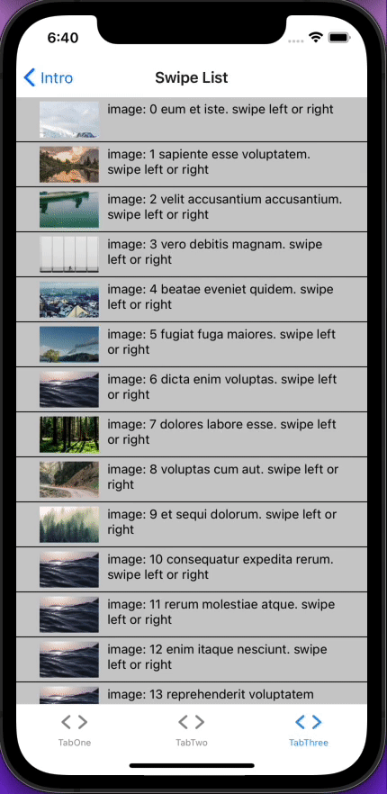
If you’re building an app with swipeable lists, this library for you. react-native-snap-carousel is a vertical ListView with animated swipeable rows.
Without further ado, let’s install it and get going:
expo install react-native-swipe-list-view
You’re going to need the trash can image for the next bit. Download it from GitHub and add it to assets/images.
In your components folder, create a file called SwipeList.tsx and add the following:
import React, { useState } from "react";
import {
  Image,
  StyleSheet,
  Text,
  TouchableHighlight,
  View,
  TouchableOpacity,
  Alert,
} from "react-native";
import Animated from "react-native-reanimated";
import { SwipeListView } from "react-native-swipe-list-view";
import { DATA } from "../utils";
const initialList = DATA.map((data, index) => ({ ...data, key: `${index}` }));
const rowSwipeAnimatedValues: any = {};
initialList.forEach((_, i) => {
  rowSwipeAnimatedValues[`${i}`] = new Animated.Value(0);
});
type Item = typeof initialList[0];
const renderItem = ({ item }: { item: Item }) => (
  <TouchableHighlight
    onPress={() => console.log("You touched me")}
    style={styles.rowFront}
    underlayColor={"#AAA"}>
    <View style={styles.item}>
      <Image style={styles.image} source={{ uri: item.image }} />
      <Text style={styles.text}>
        image: {item.key} {item.title}. swipe left or right
      </Text>
    </View>
  </TouchableHighlight>
);
export const SwipeList = () => {
  const [listData, setListData] = useState(initialList);
  const closeRow = (rowMap: any, rowKey: string) => {
    console.log("this is the rowMap: ", rowMap);
    if (rowMap[rowKey]) {
      rowMap[rowKey].closeRow();
    }
  };
  const deleteRow = (rowMap: Map<string, Object>, rowKey: string) => {
    closeRow(rowMap, rowKey);
    const newData = [...listData];
    const prevIndex = listData.findIndex((item) => item.key === rowKey);
    newData.splice(prevIndex, 1);
    setListData(newData);
  };
  const alertRow = (rowMap: Map<string, Object>, rowKey: string) => {
    closeRow(rowMap, rowKey);
    const indexOfFilm: number = listData.findIndex(
      (item) => item.key === rowKey
    );
    Alert.alert("do something else with this item:", listData[indexOfFilm].key);
  };
  const onRowDidOpen = (rowKey: string) => {
    console.log("This row opened", rowKey);
  };
  const onSwipeValueChange = ({
    key,
    value,
  }: {
    key: string;
    value: number;
  }) => {
    rowSwipeAnimatedValues[key].setValue(Math.abs(value));
  };
  const renderHiddenItem = ({ item }: { item: Item }, rowMap: any) => (
    <View style={styles.rowBack}>
      <TouchableOpacity onPress={() => alertRow(rowMap, item.key)}>
        <Text>Click</Text>
      </TouchableOpacity>
      <TouchableOpacity
        style={[styles.backRightBtn, styles.backRightBtnLeft]}
        onPress={() => closeRow(rowMap, item.key)}>
        <Text style={styles.backTextWhite}>Close</Text>
      </TouchableOpacity>
      <TouchableOpacity
        style={[styles.backRightBtn, styles.backRightBtnRight]}
        onPress={() => deleteRow(rowMap, item.key)}>
        <Animated.View
          style={[
            styles.trash,
            {
              transform: [
                {
                  scale: rowSwipeAnimatedValues[item.key].interpolate({
                    inputRange: [45, 90],
                    outputRange: [0, 1],
                    extrapolate: "clamp",
                  }),
                },
              ],
            },
          ]}>
          <Image
            source={require("../assets/images/trash.png")}
            style={styles.trash}
          />
        </Animated.View>
      </TouchableOpacity>
    </View>
  );
  return (
    <View style={styles.container}>
      <SwipeListView
        data={listData}
        renderItem={renderItem}
        renderHiddenItem={renderHiddenItem}
        leftOpenValue={75}
        rightOpenValue={-150}
        previewRowKey={"0"}
        previewOpenValue={-40}
        previewOpenDelay={3000}
        onRowDidOpen={onRowDidOpen}
        onSwipeValueChange={onSwipeValueChange}
      />
    </View>
  );
};
const styles = StyleSheet.create({
  container: {
    backgroundColor: "white",
    flex: 1,
  },
  backTextWhite: {
    color: "#FFF",
  },
  rowFront: {
    alignItems: "center",
    backgroundColor: "#CCC",
    borderBottomColor: "black",
    borderBottomWidth: 1,
    justifyContent: "center",
    height: 50,
  },
  rowBack: {
    alignItems: "center",
    backgroundColor: "#DDD",
    flex: 1,
    flexDirection: "row",
    justifyContent: "space-between",
    paddingLeft: 15,
  },
  backRightBtn: {
    alignItems: "center",
    bottom: 0,
    justifyContent: "center",
    position: "absolute",
    top: 0,
    width: 75,
  },
  backRightBtnLeft: {
    backgroundColor: "blue",
    right: 75,
  },
  backRightBtnRight: {
    backgroundColor: "red",
    right: 0,
  },
  trash: {
    height: 25,
    width: 25,
  },
  item: {
    padding: 10,
    marginVertical: 8,
    marginHorizontal: 16,
    flexDirection: "row",
  },
  image: {
    flex: 1,
    alignContent: "flex-start",
    height: 40,
    width: 50,
  },
  text: {
    flex: 4,
    paddingLeft: 10,
  },
});
Wow, that’s a lot of code! Let’s break it down.
First, we added a new key property to our original DATA array object. This is because React Native Scroll List View requires your DATA array object to contain a key property. Otherwise, you must pass a keyExtractor to the SwipeListView:
const initialList = DATA.map((data, index) => ({ ...data, key: `${index}` }));
We initialized rowSwipeAnimatedValues and created a new Animated Value for each object in our initialList array object:
const rowSwipeAnimatedValues: any = {};
initialList.forEach((_, i) => {
  rowSwipeAnimatedValues[`${i}`] = new Animated.Value(0);
We used initialList to initialize the state that is passed to the SwipeListView component (data={listData}).
closeRow, deleteRow, and alertRow are helper functions for renderHiddenItem. This is the meat and potatoes of React Native Scroll List View.
Swiping right exposes a button on the left of the row. You could do anything with it via the onPress prop, but for this tutorial, it opens an alert for that row. If you swipe left, you see two more hidden buttons: a close button to close the exposed buttons and an animated trash can that get larger as you swipe. This effect is achieved by wrapping the Image in an animated View:
<Animated.View
          style={[
            styles.trash,
            {
              transform: [
                {
                  scale: rowSwipeAnimatedValues[item.key].interpolate({
                    inputRange: [45, 90],
                    outputRange: [0, 1],
                    extrapolate: "clamp",
                  }),
                },
              ],
            },
          ]}>
          <Image
            source={require("../assets/images/trash.png")}
            style={styles.trash}
          />
        </Animated.View>
Now that we have built the component, it’s time to get your screen nice and grubby. A couple more steps and you can get back to your swipe, swipe, click routine.
In the screens folder, create a file called SwipeListView.tsx and paste this in:
import React from "react";
import { StyleSheet, View } from "react-native";
import { SwipeList } from "../components/SwipeList";
export const SwipeListViewScreen = () => {
  return (
    <View style={styles.container}>
      <SwipeList />
    </View>
  );
};
const styles = StyleSheet.create({
  container: {
    backgroundColor: "white",
    flex: 1,
  },
});
Change BottomTabNavigator.tsx to:
import { Ionicons } from "@expo/vector-icons";
import { createBottomTabNavigator } from "@react-navigation/bottom-tabs";
import { createStackNavigator } from "@react-navigation/stack";
import * as React from "react";
import Colors from "../constants/Colors";
import useColorScheme from "../hooks/useColorScheme";
import { SwipeListViewScreen } from "../screens/SwipeListView";
import TabOneScreen from "../screens/TabOneScreen";
import {
  BottomTabParamList,
  TabOneParamList,
  TabTwoParamList,
} from "../types";
import { TopTabNavigator } from "./TopTabNavigator";
export type TabThreeParamList = {
  SwipeListView: undefined;
};
const BottomTab = createBottomTabNavigator<BottomTabParamList>();
export default function BottomTabNavigator() {
  const colorScheme = useColorScheme();
  return (
    <BottomTab.Navigator
      initialRouteName="TabOne"
      tabBarOptions={{ activeTintColor: Colors[colorScheme].tint }}>
      <BottomTab.Screen
        name="TabOne"
        component={TabOneNavigator}
        options={{
          tabBarIcon: ({ color }) => (
            <TabBarIcon name="ios-code" color={color} />
          ),
        }}
      />
      <BottomTab.Screen
        name="TabTwo"
        component={TabTwoNavigator}
        options={{
          tabBarIcon: ({ color }) => (
            <TabBarIcon name="ios-code" color={color} />
          ),
        }}
      />
      <BottomTab.Screen
        name="TabThree"
        component={TabThreeNavigator}
        options={{
          tabBarIcon: ({ color }) => (
            <TabBarIcon name="ios-code" color={color} />
          ),
        }}
      />
    </BottomTab.Navigator>
  );
}
function TabBarIcon(props: {
  name: React.ComponentProps<typeof Ionicons>["name"];
  color: string;
}) {
  return <Ionicons size={30} style={{ marginBottom: -3 }} {...props} />;
}
const TabOneStack = createStackNavigator<TabOneParamList>();
function TabOneNavigator() {
  return (
    <TabOneStack.Navigator>
      <TabOneStack.Screen
        name="TabOneScreen"
        component={TabOneScreen}
        options={{ headerTitle: "Swipe-able FlatList" }}
      />
    </TabOneStack.Navigator>
  );
}
const TabTwoStack = createStackNavigator<TabTwoParamList>();
function TabTwoNavigator() {
  return (
    <TabTwoStack.Navigator>
      <TabTwoStack.Screen
        name="TopTabNavigator"
        component={TopTabNavigator}
        options={{ headerTitle: "Carousel Swipe" }}
      />
    </TabTwoStack.Navigator>
  );
}
const TabThreeStack = createStackNavigator<TabThreeParamList>();
function TabThreeNavigator() {
  return (
    <TabThreeStack.Navigator>
      <TabThreeStack.Screen
        name="SwipeListView"
        component={SwipeListViewScreen}
        options={{ headerTitle: "Swipe List" }}
      />
    </TabThreeStack.Navigator>
  );
}
We’ve covered React Native App Intro Slider, React Native’s FlatList component, React Navigation Material Top Tabs, React Native Snap Carousel, and React Native Swipe List View. By now, you should be feeling very comfortable creating animated swiper components with libraries that use React Native FlatList.

LogRocket's Galileo AI watches sessions for you and and surfaces the technical and usability issues holding back your React Native apps.
LogRocket also helps you increase conversion rates and product usage by showing you exactly how users are interacting with your app. LogRocket's product analytics features surface the reasons why users don't complete a particular flow or don't adopt a new feature.
Start proactively monitoring your React Native apps — try LogRocket for free.

When should you move API logic out of Next.js? Learn when Route Handlers stop scaling and how ElysiaJS helps.

Explore how Dokploy streamlines app deployment with Docker, automated builds, and simpler infrastructure compared to traditional CI/CD workflows.

A side-by-side look at Astro and Next.js for content-heavy sites, breaking down performance, JavaScript payload, and when each framework actually makes sense.

AI-generated tests can speed up React testing, but they also create hidden risks. Here’s what broke in a real app.re
Hey there, want to help make our blog better?
Join LogRocket’s Content Advisory Board. You’ll help inform the type of content we create and get access to exclusive meetups, social accreditation, and swag.
Sign up now

 Learn more →
