The ultimate goals of Sakura CSS are to speed up prototyping and give websites a more modern look without doing any tedious work. In this article, we will demonstrate how to use a classless framework like Sakura CSS to build a portfolio page with seven different themes to style a webpage.

The final result will look like this:
Jump ahead:
We will first create a new folder on our machine and open our app with a code editor. Next, we will create three folders: images, script, and styles. We will also create the index.html file.
The images folder will contain four images, while the script will contain index.js. The styles folder will contain the seven Sakura CSS themes and two extra CSS files: custom.css and normalize.css. Sakura CSS themes can be found in this GitHub repository, and the complete folder and files we will be using for this article can be found here.
Now, add the following code inside the index.html file to initialize the app:
// HTML
<!DOCTYPE html>
<html lang="en">
<head>
  <meta charset="UTF-8" />
  <meta http-equiv="X-UA-Compatible" content="IE=edge" />
  <meta name="viewport" content="width=device-width, initial-scale=1.0" />
  <title>Portfolio Site</title>
  <link id="page-theme" rel="stylesheet" href="/styles/sakura.css" />
  <link rel="stylesheet" href="/styles/custom.css" />
</head>
<body>

<script src="/script/index.js"></script>
</body>
</html>
Note: We have two
linktags that contain Sakura CSS and our custom CSS. Thelinktag containing Sakura CSS has anIDattribute that we will use to change our theme.
Sakura CSS is a lightweight CSS framework. It doesn’t use classes and special components and generally contains styles for only specific tags. It comes with seven different inbuilt themes: dark solarized, dark, earthly, ink, pink, vader, and default/light. Let’s style our webpage with Sakura CSS.
The theme selector will be the dropdown that we can use to change between our Sakura CSS themes of choice. It will be made up of some markups and some JavaScript:
// HTML - index.html
    <aside style="text-align: right">
      <select name="theme" id="theme">
        <option value="sakura">Sakura Default</option>
        <option value="sakura-dark">Sakura Dark</option>
        <option value="sakura-dark-solarized">Sakura Dark Solarized</option>
        <option value="sakura-earthly">Sakura Earthly</option>
        <option value="sakura-ink">Sakura Ink</option>
        <option value="sakura-pink">Sakura Pink</option>
        <option value="sakura-vader">Sakura Vader</option>
      </select>
    </aside>
It will also contain the following code:
// JavaScript - script/index.js
const themeSelect = document.getElementById('theme');
const pageTheme = document.getElementById('page-theme');

themeSelect.addEventListener('change', (e) => {
  const selectedTheme = e.target.value;
  pageTheme.setAttribute('href', `/styles/${selectedTheme}.css`);
});
In the code blocks above, the aside tag has a text-align style and contains a select element with a name and ID attribute. These attributes also contain different options with their respective values.
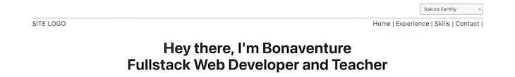
In the script above, we begin by selecting the select and link. After that, we attached a change event listener to the select and then took the option value and set the href attribute of the link. With this functionality in place, we can now change a webpage theme from a dropdown menu. Here’s what our theme selector will look like:
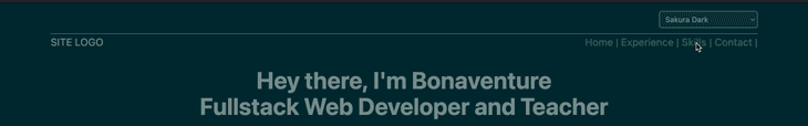
Now, let’s move on to creating the site navigation bar. The navigation bar will have some links and a portion for our logo. It should look similar to this:
// HTML -- index.html

   <header>
      <nav>
        <div>SITE LOGO</div>

        <div>
          <a href="">Home |</a>

          <a href="#experience">Experience |</a>
          <a href="#skills">Skills |</a>
          <a href="#contact">Contact |</a>
        </div>
      </nav>
    </header>
The markup above contains a header that wraps nav. The a tags contain links pointing to specific sections of the page we will build. The result should look like this:
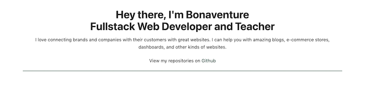
The hero section is generally a portion of the webpage where we put essential information about the site. It is usually the first part a user sees when they visit a website. Ours will look like this:
// HTML -- index.html

    <main>
      <!-- Hero Section -->
      <section>
        <h1>
          Hey there, I'm Bonaventure <br />
          Fullstack Web Developer and Teacher
        </h1>

        <p>
          I love connecting brands and companies with their customers with great
          websites. I can help you with amazing blogs, e-commerce stores,
          dashboards, and other kinds of websites.
        </p>
        <p>
          View my repositories on
          <a href="https://github.com/bonarhyme">Github</a>
        </p>
      </section>

      <hr />
      <br />
      <br />
      <!-- End Hero Section -->

      </main>
In the markup above, we have an h1 and two p tags. We also have hr and br tags. Essentially, the second p tag contains an a tag. The hero section will look like this:
This is the section where we will create a table that contains our experience and allow Sakura CSS to handle the styling. Start by adding the code below:
// HTML - index.html

      <!-- Experience Section -->
      <section id="experience">
        <h2>Experience</h2>
        <table>
          <thead>
            <tr>
              <th>#</th>
              <th>Company</th>
              <th>Role</th>
              <th>Language</th>
              <th>Duration</th>
            </tr>
          </thead>

          <tbody>
            <tr>
              <td>1.</td>
              <td>ABC and DC</td>
              <td>Frontend Developer</td>
              <td>HTML, CSS, JS</td>
              <td>6 Months</td>
            </tr>
            <tr>
              <td>2.</td>
              <td>Urg and Turg</td>
              <td>Junior Frontend</td>
              <td>Php, HTML, CSS, Jquery</td>
              <td>4 Months</td>
            </tr>
            <tr>
              <td>3.</td>
              <td>Urg and Turg</td>
              <td>Frontend Intern</td>
              <td>Php, HTML, CSS, Jquery</td>
              <td>2 Months</td>
            </tr>
            <tr>
              <td>4.</td>
              <td>Freelance</td>
              <td>Fullstack Developer</td>
              <td>React, Php, Bootstrap</td>
              <td>8 Months</td>
            </tr>
          </tbody>
        </table>
      </section>
      <br />
      <br />
      <br />

      <!-- End Experience Section -->
In the code above, the styles for table, tr, th, and td tags have been handled by Sakura CSS. However, the markup above contains a section with a table. The table contains thead and tbody tags. We used tr to make our th or td situated on the horizontal axis. We ended the markup with some br tags to provide spacing below the table.
Now, we need to list our skills using an ordered list. This is where the skills section comes into play. We will have three categories for our skills and a blockquote. Here’s the code:
// HTML -- index.html

      <!-- Skills Section -->
      <section id="skills">
        <h2>Skills</h2>
        <p>These are some of the technologies I have used.</p>

        <div>
          <h4>Programming Languages:</h4>

          <ol>
            <li>JavaScript</li>
            <li>PHP</li>
            <li>Ruby</li>
            <li>TypeScript</li>
          </ol>
        </div>

        <div>
          <h4>Frameworks:</h4>

          <ol>
            <li>Express.js</li>
            <li>React.js</li>
            <li>Liquid</li>
            <li>Blade</li>
            <li>Laravel</li>
          </ol>
        </div>

        <div>
          <h4>Others:</h4>

          <ol>
            <li>Photoshop</li>
            <li>Figma</li>
            <li>Sketch XD</li>
            <li>Microsoft Excel</li>
            <li>Microsoft Word</li>
          </ol>
        </div>

        <blockquote>
          Wisdom is not a product of schooling but of the lifelong attempt to
          acquire it. <br />
          <cite>-Albert Einstein</cite>
        </blockquote>
      </section>
      <br />
      <hr />
      <br />

      <!-- End Skills Section -->
This section contains an h2, a p, and three divs. Each div represents a collection of skills and contains the h4 and ol tag with li list item tags. It looks decent enough and requires no extra styles aside from the h2 and p we will add the styles/custom.css file. The result will look like this:
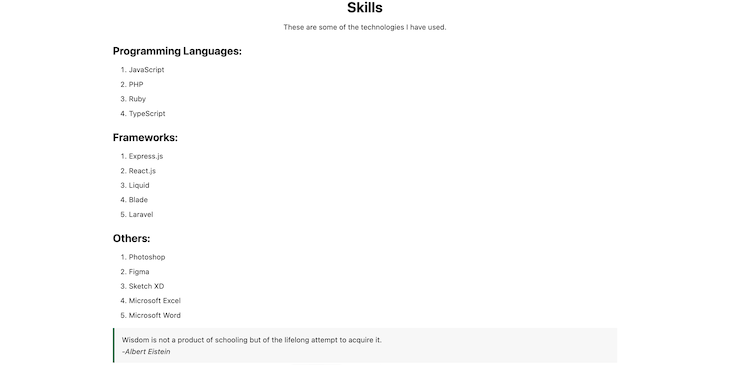
Don’t worry; Sakura CSS also comes with styles for blockquotes.
The contact section will contain a form users can fill out to contact us. Although Sakura CSS has provided some styles for inputs, we will add some custom CSS to make it look more appealing. Here’s the code:
// HTML -- style.css
      <!-- Contact Section -->
      <br />
      <section id="contact">
        <h2>Get In Touch</h2>
        <form method="post">
          <div>
            <label for="name">Name</label>
            <input
              type="name"
              name="name"
              placeholder="Enter your name"
              required="true"
            />
          </div>
          <div>
            <label for="email">Email</label>
            <input
              type="email"
              name="email"
              placeholder="Enter your email"
              required="true"
            />
          </div>
          <div>
            <label for="message">Message</label>
            <textarea
              name="message"
              rows="10"
              placeholder="Enter your message"
              required="true"
            ></textarea>
          </div>

          <div>
            <button type="reset">Clear</button>
            <button type="submit">Submit</button>
          </div>
        </form>
      </section>
      <br />
      <br />
      <!-- End Contact Section -->

// JavaScript -- script/index.js

const name = document.querySelector("input[name='name']");
const email = document.querySelector("input[name='email']");
const message = document.querySelector("textarea[name='message']");
const form = document.querySelector('form');

form.addEventListener('submit', (e) => {
  e.preventDefault();

  console.log({
    name: name.value,
    email: email.value,
    message: message.value,
  });
});
Let’s break that code down. Our form section contains a form and four divs inside the section. Each div contains a label, input, or textarea (except the div that contains the reset and submit buttons).
The script above contains a code to extract the value from each text input and print them to the console on submission of the form.
Note: Each
inputfield has aname,required, andplaceholderattribute. Thetextareacontains therowsattribute for specifying the initial height of thetextarea, and thescriptcan be enhanced to enable form submission to a remote server.
Here’s what it will look like:

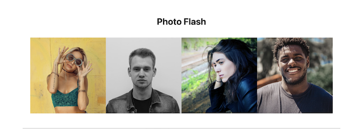
This photo flash section is where we put our images, accomplishments, or text. Although Sakura CSS provides styles for images, we will enhance how they look with some inline CSS. Here’s what our code will look like:
// HTML -- index.html
      <!-- Photo Flash -->
      <section>
        <h2>Photo Flash</h2>
        <br />
        <div style="display: flex; flex-wrap: wrap; justify-content: center">
          <div style="width: 100%; max-width: 300px; height: 300px">
            <img
              src="/images/person1.jpg"
              alt=""
              width="300"
              height="300"
              style="object-fit: cover; height: 100%"
            />
          </div>
          <div style="width: 100%; max-width: 300px; height: 300px">
            <img
              src="/images/person2.jpg"
              alt=""
              width="300"
              height="300"
              style="object-fit: cover; height: 100%"
            />
          </div>
          <div style="width: 100%; max-width: 300px; height: 300px">
            <img
              src="/images/person3.jpg"
              alt=""
              width="300"
              height="300"
              style="object-fit: cover; height: 100%"
            />
          </div>
          <div style="width: 100%; max-width: 300px; height: 300px">
            <img
              src="/images/person4.jpg"
              alt=""
              width="300"
              height="300"
              style="object-fit: cover; height: 100%"
            />
          </div>
        </div>
      </section>

      <!-- End Photo Flash -->
The images above contain inline CSS to make them responsive. Each was wrapped with a div with inline CSS. And, finally, the image containers were wrapped with a CSS flexbox div. Here’s what our photo flash section will look like:
If you’ve followed along this far, great news! We’re almost done. So, once the markup in the main tag is complete, we can add the following code for the footer:
// HTML -- index.html
    <footer>
      <br />
      <p>
        Created By
        <a href="https://github.com/bonarhyme">Bonaventure Chukwudi</a>
      </p>
    </footer>
The custom CSS we have will be used to enhance some portions of the site. Inside styles/custom.css, add the following code:
// CSS -- custom/styles.css
body {
  max-width: 70em;
}

nav {
  display: flex;
  justify-content: space-between;
}

aside {
  border-bottom: 1px solid gray;
}

h1,
p,
h2 {
  text-align: center;
}

#contact {
  margin: 0 auto;
  max-width: 400px;
}

input {
  width: 100%;
}

footer {
  border-top: 1px solid gray;
}
And that’s it!
Sakura CSS is a minimalistic framework that helps users build websites quickly. This was demonstrated with the portfolio site we have just built. It looks stylish and contains the important parts of a portfolio site.
Therefore, I recommend using Sakura CSS for quick prototyping and demonstration purposes. Thank you for reading through. I hope you enjoyed this article, and be sure to leave a comment if you have any questions. Happy coding!
As web frontends get increasingly complex, resource-greedy features demand more and more from the browser. If you’re interested in monitoring and tracking client-side CPU usage, memory usage, and more for all of your users in production, try LogRocket.

LogRocket lets you replay user sessions, eliminating guesswork around why bugs happen by showing exactly what users experienced. It captures console logs, errors, network requests, and pixel-perfect DOM recordings — compatible with all frameworks.
LogRocket's Galileo AI watches sessions for you, instantly identifying and explaining user struggles with automated monitoring of your entire product experience.
Modernize how you debug web and mobile apps — start monitoring for free.
Would you be interested in joining LogRocket's developer community?
Join LogRocket’s Content Advisory Board. You’ll help inform the type of content we create and get access to exclusive meetups, social accreditation, and swag.
Sign up now
Not sure if low-code is right for your next project? This guide breaks down when to use it, when to avoid it, and how to make the right call.

Compare Firebase Studio, Lovable, and Replit for AI-powered app building. Find the best tool for your project needs.

Discover how to use Gemini CLI, Google’s new open-source AI agent that brings Gemini directly to your terminal.

This article explores several proven patterns for writing safer, cleaner, and more readable code in React and TypeScript.

