
In today’s frontend landscape, Storybook has emerged as a must-have library for component development, documentation, and UI testing.

In this guide, we’ll explore everything you need to know about Storybook, including its features, drawbacks, how it works with a number of popular frameworks, and how Storybook compares with some widely used alternatives.
The purpose of this overview is to help you fully understand why Storybook has become such an important tool for frontend development and why you should use it in your next project.
You can explore all the code samples used in this guide in this GitHub repo.
The Replay is a weekly newsletter for dev and engineering leaders.
Delivered once a week, it's your curated guide to the most important conversations around frontend dev, emerging AI tools, and the state of modern software.
Storybook is an open source tool for developing UI components in isolation for various JavaScript frameworks. It was initially conceived to simplify the complex process of UI development, giving developers a structured environment to build and test components independently.
Before Storybook, building UI components often felt like a juggling act. You’d have to manually set up environments to test each component, ensure it worked well with others, and then document it — all while hoping you didn’t break anything else in the process.
This approach was not just time-consuming, but also prone to errors. Storybook eliminates these pain points by offering a standardized environment where you can develop, test, and document components in isolation — in other words, separately from your main application:
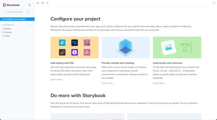
Under the hood, Storybook functions as a standalone application that intercepts your project’s components and renders them in various states according to your “stories.”
These stories are simple JavaScript modules that describe different scenarios for your components, serving as both documentation and test cases.
Now that we’ve seen the pain points that Storybook solves, let’s discuss some compelling reasons to incorporate it into your development workflow:
In addition to its core features, Storybook stands out in several other aspects.
For example, the Storybook environment delivers excellent performance and an intuitive user experience. Furthermore, the ecosystem around Storybook is robust, offering additional support and extensions that enhance its functionality.
While Storybook offers a plethora of advantages, it’s only fair to consider some of its drawbacks as well:
Despite these potential drawbacks, Storybook’s extensive features — such as its customization options and robust ecosystem — often outweigh the challenges, making it an invaluable tool for frontend development.
Integrating Storybook into your project is a straightforward process, no matter which framework you’re using. To get started, simply run the following command in your terminal:
npx storybook@latest init
This command automatically detects the framework you’re using and installs the required dependencies and configurations.
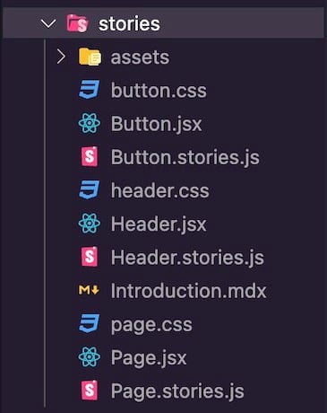
It also creates a new /stories directory filled with sample stories and a .storybook folder containing main.js and preview.js files, allowing you to configure add-ons and extend the Storybook environment:
Once the initialization process is complete, starting the Storybook environment is as simple as running this command:
npm run storybook
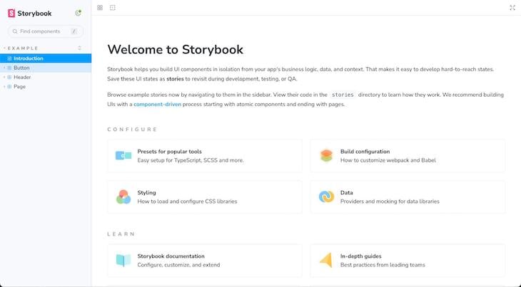
This will launch the Storybook UI, where you can start developing, documenting, and testing your components:
While the core functionality of Storybook remains consistent across different frameworks, each framework has its own distinct set of features, add-ons, or configurations that you can leverage within Storybook.
Storybook offers a rich set of features for component development and documentation. Here’s a quick overview of key aspects you should know.
At the core of Storybook are its stories, which are visual test cases created as ComponentName.stories.js files that showcase various states of your components.
Each story is essentially a JavaScript or TypeScript function that returns a rendered element. Storybook executes these functions and displays the results in its UI, allowing for easy visualization of a component’s various states.
For example, in a React project, creating stories for a Button component would look something like this:
// Button.stories.js
import { Button } from "./Button";

export default {
  title: "Example/Button",
  component: Button,
  tags: ["autodocs"],
  argTypes: {
    backgroundColor: { control: "color" },
  },
};

export const Primary = {
  args: {
    primary: true,
    label: "Button",
  },
};

export const Success = {
  args: {
    primary: true,
    label: "Button",
    backgroundColor: "green",
  },
};

export const Danger = {
  args: {
    primary: true,
    label: "Button",
    backgroundColor: "red",
  },
};
Here, we define three different stories — Primary, Success, and Danger — for the Button component. When previewing this in the Storybook development environment, you should see an output similar to the one below:
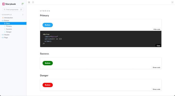
Exactly what you see will depend on how your original Button component is designed. As shown above, each story demonstrates the Button component with varying prop configurations, giving us a snapshot of the component’s appearance and behavior under specific conditions.
It’s also worth noting that all your stories are accompanied by a DocsPage by default. This DocsPage not only aggregates your stories but also includes other useful information like text descriptions and prop tables.
Additionally, in the story preview section, you can view the actual code for the component, providing an insightful look into its implementation details.
Essentially, stories act as a comprehensive catalog for components, showcasing the different ways a component can function under various testing conditions.
Storybook also includes support for MDX, offering you greater control over your documentation. This format cleverly combines Markdown for long-form documentation and JSX for embedding live components, all within the same file.
Creating an MDX document in Storybook involves generating a new .mdx file within your Storybook directory. Below is a sample code snippet that demonstrates how to blend Markdown and JSX:
// Buttons.mdx
import { Meta, Story, Canvas } from "@storybook/blocks";

import * as ButtonStories from "./Button.stories";

<Meta title="Example/Buttons" />

# Button Component

The button component is used to trigger an action.

## Props

- `label` - String
- `backgroundColor` - String

## Usage

```jsx
<button></button>
```

<Canvas>
  <Story of={ButtonStories.Success} />
</Canvas>
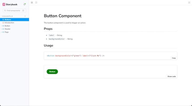
In this example, the <Meta> tag establishes your component’s metadata, such as its location in the Storybook UI. Following that, the Markdown headers and text offer thorough documentation. The <Canvas> and <Story> elements embed a live, interactive example of our Button component.
When this is displayed in Storybook, you’ll see Example as a primary item in the sidebar navigation menu with a secondary Buttons item. Upon opening Example>Buttons, you’ll see descriptive text and a live component example neatly presented within a canvas:
By default, Storybook lets you preview the source code showing the prop for each story. However, this code preview is limited. Story Source takes this a step further by providing a comprehensive view of the code that powers each story, offering invaluable insights into a component’s implementation. To activate Story Source, you’ll first need to install the add-on like so:
npm install --dev @storybook/addon-storysource
# OR
yarn add @storybook/addon-storysource --dev
Next, you’ll need to register the add-on in your .storybook/main.js file:
// .storybook/main.js
module.exports = {
  addons: ['@storybook/addon-storysource'],
};
Once enabled, a new tab will appear in your Storybook interface for each story:

As shown above, this new tab displays the actual code that is being run to generate the story. This includes the JSX or template syntax, the props being passed, and any additional logic within the story function.
Story Source serves as both an invaluable learning resource and a point of reference, simplifying the process of understanding, reusing, and collaborating on components.
When you’re building components that rely on API calls, having a way to mock those API responses can be incredibly useful for testing and development. This is where Storybook’s ability to integrate with tools like Mock Service Worker (MSW) truly shines:
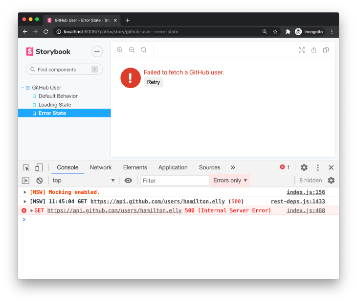
To start mocking API responses, you would typically set up MSW in your Storybook configuration. Once set up, MSW intercepts requests made by your components and returns the responses you’ve defined.
Using Storybook with MSW enables you to fully control the data your component receives, making your stories more accurate and useful. You can also even mimic various scenarios, such as loading states, error responses, and successful data retrieval.
Accessibility is a critical aspect of web development. Storybook addresses accessibility by offering built-in checks through its A11Y add-on.
The @storybook/addon-a11y feature integrates with Axe-Core, a leading accessibility testing engine, to automatically scan your components for a wide range of accessibility issues. You can install the add-on in your Storybook project by running the command below:
npm install --dev @storybook/addon-a11y
# OR
yarn add @storybook/addon-a11y --dev
Next, you’ll need to register the add-on in your .storybook/main.js file:
export default {
  addons: ['@storybook/addon-a11y'],
};
Once installed, a new tab labeled Accessibility will appear in the Storybook interface for each of your stories, as shown in the image below:
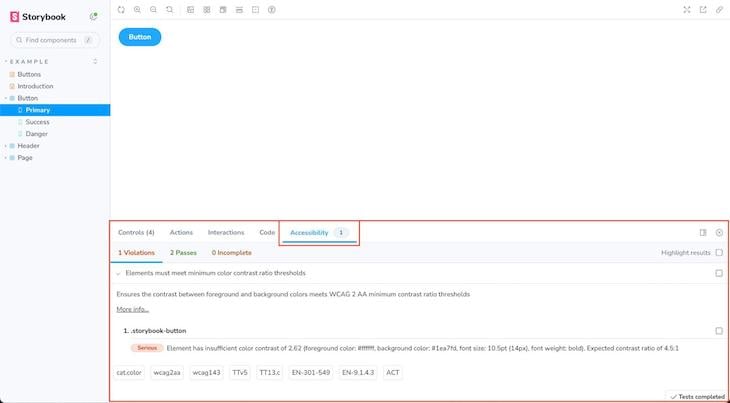
This tab will automatically perform an accessibility audit on the active component and display any violations. These violations could range from missing alt text on images to improper ARIA roles, and they’re categorized by severity, making it easier to prioritize fixes.
Incorporating accessibility checks into your development workflow helps to ensure that your components meet established accessibility standards, such as WCAG, making your application more inclusive.
Add-ons are plugins that extend Storybook’s core capabilities with extra features and functionalities to make your development workflow smoother and more efficient.
We’ve already explored add-ons like Story Source for code visibility and the A11Y add-on for automated accessibility checks. There’s also a plethora of other add-ons available to add layers of utility like:
Each add-on addresses a specific need and integrates seamlessly into the Storybook environment, often appearing as additional tabs next to your stories.
Furthermore, most add-ons are framework-agnostic, which means you can use them whether you’re working in React, Vue, Angular, or any other supported framework. The possibilities are endless and will continue to expand as the community grows.
Introduced in Storybook 7, the Framework API is another game-changing feature that automates Storybook integration with Vite-based projects and popular frameworks like Next.js or SvelteKit.
The Storybook Framework API works by reading your app’s settings and then configuring Storybook to mimic your build and rendering environment. It even optionally handles features like routing or data fetching.
To leverage the Framework API, simply add one line to your .storybook/main.js file specifying your framework. For example, in a Next.js project, you would add the following:
export default {
  /* stories: [ ... ], addons: [ ... ], etc. */
  framework: '@storybook/nextjs',
}
Integrating Storybook with popular frameworks like Next.js or SvelteKit is already pretty straightforward. However, the Framework API makes this even easier by automating the configuration process so you can spend less time fiddling with settings and more time actually developing.
Additionally, as frameworks evolve, so do their configurations and best practices. The Framework API is designed to adapt to these changes, providing a layer of abstraction that keeps your Storybook setup up-to-date without manual intervention.
Storybook isn’t just a UI component sandbox. It serves multiple roles across different phases of a project. Let’s dive into some of Storybook’s primary uses below.
A standout advantage of using Storybook is its dynamic documentation generation.
For each component, Storybook automatically creates a documentation page that showcases its various states, prop types, and default values. On top of that, you can leverage MDX for more detailed, interactive docs.
Testing is another area where Storybook excels. With add-ons like StoryShots, Storybook turns your stories into automated visual tests.
The StoryShots add-on enables you to automatically capture all of your component’s states as described in your stories into snapshot tests. These snapshots serve as a historical record, allowing you to identify unintended changes or bugs in your components over time.
Additionally, as we saw earlier, Storybook also offers built-in accessibility checks. This allows you to test that your components aren’t just visually correct but also accessible, adhering to important web accessibility guidelines.
Storybook also shines as a tool for building design systems, where it can serve as the central repository for your components, complete with their various states and accompanying documentation.
What makes Storybook particularly powerful is its compatibility with other UI libraries and tools. For example, you can integrate Grommet with Storybook to combine the reusable Grommet components with your own custom components, all documented and interactive within your project.
Deploying your Storybook project can be an essential step, especially if you want to share your component documentation with a broader audience. Thankfully, Storybook makes this process straightforward.
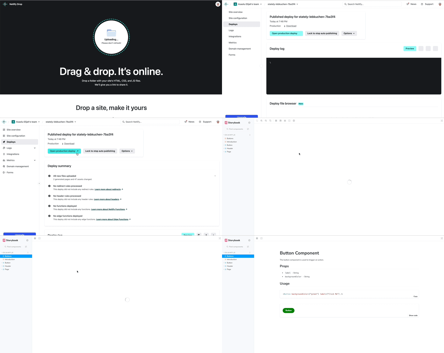
One of the simplest ways to do this is to export your Storybook project as a static web app. This makes it possible to serve the static exports using any static file hosting service, such as Netlify, Vercel, or GitHub Pages.
Running the command below will generate a new /storybook-static directory containing all the files you need to deploy:
npm run build-storybook
# OR
yarn build-storybook
Then, for example, you could easily drag the generated folder to Netlify Drop, and you’d have your component documentation, design system, or whatever way you’ve leveraged Storybook ready to go. See this in action below:
Additionally, the Storybook maintainers provide a free publishing service called Chromatic. It provides another place where you can host your static exports.
Chromatic includes a powerful version control system that is designed specifically for UI components. It provides an interactive interface for reviewing UI component changes, commenting on specific states, and ensuring that everyone is on the same page in terms of design and functionality.
When it comes to UI component development and documentation, Storybook isn’t the only game in town. There are several alternatives to React Storybook, each with its own set of features and strengths. For example:
Additionally, in terms of performance and documentation, Storybook generally holds its own. The active community and extensive documentation make it easier to find help when you hit a roadblock.
Given its comprehensive features and strong community and documentation, Storybook stands out above other tools as a well-rounded, extensible option. Here’s a comparison table summarizing how Storybook stacks up against its top alternatives:
| Tool | Markdown support | Methods to create docs | Design system support | Styling | Add-ons | Community | Resources |
|---|---|---|---|---|---|---|---|
| Storybook | ✅ | Stories, MDX | ✅ | CSS, SCSS, Styled-components | ✅ | Strong | Extensive |
| Atelier | ❌ | Code | ❌ | CSS | ❌ | Moderate | Moderate |
| React Cosmos | ✅ | Code | ❌ | CSS | ❌ | Moderate | Moderate |
| Docz | ✅ | MDX | ✅ | CSS, SCSS | ✅ | Strong | Extensive |
| Carte Blanche | ❌ | Code | ❌ | CSS | ❌ | Weak | Limited |
| React Styleguide Generator | ✅ | Markdown | ❌ | CSS | ❌ | Weak | Limited |
| React Bluekit | ❌ | Code | ❌ | CSS | ❌ | Weak | Limited |
Storybook is a powerful tool for building, testing, and documenting UI components across various JavaScript frameworks. Over the years, it has consistently adapted to address evolving challenges and needs in frontend development.
For example, Storybook 6 introduced features like zero-config setup, args for stories, live-editing capabilities, and more. Meanwhile, its latest 7.0 update brings enhanced performance, better web component support, and a more user-friendly interface.
In this guide, we delved into Storybook’s key features, benefits, and even some drawbacks to give you a comprehensive view of what this frontend workshop has to offer. You can revisit the code samples used in this tutorial in this GitHub repo.
Install LogRocket via npm or script tag. LogRocket.init() must be called client-side, not
server-side
$ npm i --save logrocket

// Code:

import LogRocket from 'logrocket';
LogRocket.init('app/id');
// Add to your HTML:

<script src="https://cdn.lr-ingest.com/LogRocket.min.js"></script>
<script>window.LogRocket && window.LogRocket.init('app/id');</script>

Write agent-friendly API documentation with OpenAPI, clear schemas, workflow guidance, and llms.txt for safer AI automation.

Local AI proxy tutorial for detecting, masking, and rehydrating PII before prompts reach cloud LLMs.

Learn how Graph RAG uses connected knowledge structures to improve retrieval beyond simple text similarity.

Learn how sibling-index() enables clean, JavaScript-free stagger animations using native CSS.
Hey there, want to help make our blog better?
Join LogRocket’s Content Advisory Board. You’ll help inform the type of content we create and get access to exclusive meetups, social accreditation, and swag.
Sign up now