Editor’s note: This article was last updated 14 October 2022 to include information about Vue 3 and reflect updates made to Tailwind CSS.

Storefront UI is a Vue component library that offers a well-thought-out design system of ecommerce components and follows atomic design principles, which are great for building scalable and maintainable frontend applications. Storefront UI is also compatible with the Google UX Playbook for retail.
At the time of writing, Storefront UI is in stable beta, but it doesn’t work on Vue 3 yet. In this article, we’ll build a storefront with Storefront UI and Tailwind CSS. To follow along, you can access the code from the GitHub repo. Let’s get started!
Storefront UI offers great options for customization; you can easily customize Storefront UI components like atoms, molecules, and organisms using props, slots, and CSS variables. You can also customize how your components look with Tailwind CSS, which we’ll cover in this tutorial.
Components in Storefront UI are responsive, so you can rest assured knowing that your components are mobile-friendly. Storefront UI lets you import only the necessary components, bundling them to maintain high performance.
Storefront UI ships the raw source, meaning you can benefit from build-time optimizations like tree shaking or grouping common chunks. Dedicated to ecommerce, Storefront UI has all the components necessary for building a modern online store. Based on the Google UX Playbook, Storefront UI components are also accessible.
Tailwind CSS is an awesome utility-first CSS framework that makes styling components simple and fast. For styling, you can add classes like flex, pt-4, and text-center in the class attribute of your markup.
For example, mb-0 means margin-bottom is set to 0, and pt-0 means padding-top is set to 0. It’s also easy to stay consistent with color choices, spacing, typography, shadows, and everything else that makes up a well-engineered design system. You define classes only once, and these classes are used throughout the application.
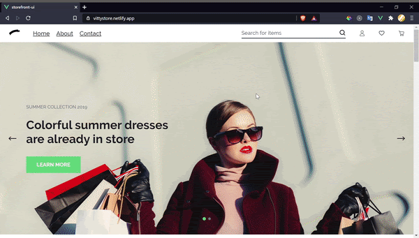
To better understand Storefront UI, we’ll build a storefront like the one shown below:
To create a new application, we’ll install the Vue CLI; run the command below:
npm install -g @vue/cli
Then, generate the new application:
vue create storefront-app
Navigate into the application’s directory and start the development server with the commands below:
cd storefront-app
npm install
npm run dev
The commands above will serve the application on localhost:8080. Upon navigating to that URL, we see the live application:

Now, run the command below to install Storefront UI:
npm install --save @storefront-ui/vue
Import the stylesheet, which contains global styles and SCSS variables, into the application’s main.js file:
import "@storefront-ui/vue/styles.scss";
Next, install Tailwind CSS by running the following command:
npm install -D tailwindcss postcss autoprefixer
Generate your tailwind.config.js and postcss.config.js files:
npx tailwindcss init -p
Open the tailwind.config.js file and configure the template paths:
/** @type {import('tailwindcss').Config} */
module.exports = {
  content: [
    "./index.html",
    "./src/**/*.{js,ts,jsx,tsx}",
  ],
  theme: {
    extend: {},
  },
  plugins: [],
}
Create a src/index.css file and add the following code to import Tailwind’s base, components, and utility styles:
@tailwind base;
@tailwind components;
@tailwind utilities;
Import the index.css file to your root main.js file:
import './index.css'
You can check that your installation works by starting up the Vue project and importing a Storefront UI link atom into your App.vue file:
// App.vue file
<template>
  <div>
        <SfLink link="/">Home</SfLink>
  </div>
</template>
 <script>
  import { SfLink} from "@storefront-ui/vue";
  export default {
    components: {
    SfLink,
    },
  };
</script>
<style></style>
If everything worked, you should see a link; you can adjust the font size of the link using Tailwind’s font size classes. Add a class attribute to the SfLink component and give it a value of text-lg. If you save the file and check your browser, you should see that the font size has changed.
You can also use and access Storefront UI CSS variables with Tailwind CSS. To access the CSS variables, your tailwind.config.js file should look like the code below:
module.exports = {
  purge: [],
  important: true,
  theme: {
    extend: {
      fontSize: {
        "sf-xs": "var(--font-size--xs)", //12px
        "sf-sm": "var(--font-size--sm)", //14px
        "sf-base": "var(--font-size--base)", //16px
        "sf-lg": "var(--font-size--lg)", //18px
    },
      fontWeight: {
        "sf-light": "var(--font-weight--light)", //300
        "sf-normal": "var(--font-weight--normal)", //400
        "sf-medium": "var(--font-weight--medium)", //500
        "sf-semibold": "var(--font-weight--semibold)", //600
        "sf-bold": "var(--font-weight--bold)", //700
    },
    colors: {
        "sf-c-black": "var(--c-black)", // #1d1f22
        "sf-c-black-base": "var(--c-black-base)", // #1d1f22
       "sf-c-black-lighten": "var(--c-black-lighten)", // #292c30
        "sf-c-black-darken": "var( --c-black-darken)", // #111214
        "sf-c-white": "var(--c-white)", // #ffffff
        "sf-c-body": "var(--c-body)", // #ffffff
        "sf-c-text": "var(--c-text)", // #1d1f22
        "sf-c-text-muted": "var(--c-text-muted)", // #72757E
        "sf-c-text-disabled": "var(--c-text-disabled)", // #e0e0e1
        "sf-c-link": "var(--c-link)", // #43464E
        "sf-c-link-hover": "var(--c-link-hover)", // // #1d1f22
        "sf-c-primary": "var(--c-primary)", // #5ece7b
        "sf-c-primary-base": "var(--c-primary-base)", // #5ece7b
        "sf-c-primary-lighten": "var(--c-primary-lighten)", // #72d48b
        "sf-c-primary-darken": "var(--c-primary-darken)", // #4ac86b
        "sf-c-primary-variant": "var(--c-primary-variant)", // #9ee2b0
        "sf-c-on-primary": "var(--c-on-primary)", // #ffffff
        "sf-c-secondary": "var( --c-secondary)", // #1d1f22
        "sf-c-secondary-base": "var(--c-secondary-base)", // #1d1f22
        "sf-c-secondary-lighten": "var(--c-secondary-lighten)", // #292c30
        "sf-c-secondary-darken": "var(--c-secondary-darken)", // #111214
        "sf-c-secondary-variant": "var(--c-secondary-variant)", // #43464E
        "sf-c-on-secondary": "var(--c-on-secondary)", //  #ffffff
        "sf-c-light": "var(--c-light)", // #f1f2f3
        "sf-c-light-base": "var(--c-light-base)", // #f1f2f3
        "sf-c-light-lighten": "var(--c-light-lighten)", // #ffffff
        "sf-c-light-darken": "var(--c-light-darken)", // #e3e5e7
        "sf-c-light-variant": "var(--c-light-variant)", //  #ffffff
        "sf-c-on-light": "var(--c-on-light)", // #1d1f22
        "sf-c-gray": "var(--c-gray)", // #72757E
        "sf-c-gray-base": "var(--c-gray-base)", // #72757E
        "sf-c-gray-lighten": "var(--c-gray-lighten)", // #7f828b
        "sf-c-gray-darken": "var(--c-gray-darken)", // #666971
        "sf-c-gray-variant": "var(--c-gray-variant)", // #8D8F9A
        "sf-c-on-gray": "var(--c-on-gray)", // #1d1f22
        "sf-c-dark": "var(--c-dark)", // #1d1f22
        "sf-c-dark-base": "var(--c-dark-base)", // #1d1f22
        "sf-c-dark-lighten": "var(--c-dark-lighten)", // #292c30
        "sf-c-dark-darken": "var(--c-dark-darken)", // #111214
        "sf-c-dark-variant": "var(--c-dark-variant)", // #43464E
        "sf-c-on-dark": "var(--c-on-dark)", //  #ffffff
        "sf-c-info": "var(--c-info)", //  #0468DB
        "sf-c-info-base": "var(--c-info-base)", //  #0468DB
        "sf-c-info-lighten": "var(--c-info-lighten)", // #0474f4
        "sf-c-info-darken": "var(--c-info-darken)", // #045cc2
        "sf-c-info-variant": "var(--c-info-variant)", // #e1f4fe
        "sf-c-on-info": "var(--c-on-info)", //  #ffffff
        "sf-c-success": "var(--c-success)", // #5ece7b
        "sf-c-success-base": "var(--c-success-base)", // #5ece7b
        "sf-c-success-lighten": "var(--c-success-lighten)", // #72d48b
        "sf-c-success-darken": "var(--c-success-darken)", // #4ac86b
        "sf-c-success-variant": "var(--c-success-variant)", // #9ee2b0
        "sf-c-on-success": "var(--c-on-success)", //  #ffffff
        "sf-c-warning": "var(--c-warning)", // #ecc713
        "sf-c-warning-base": "var(--c-warning-base)", // #ecc713
        "sf-c-warning-lighten": "var(--c-warning-lighten)", //  #eecd2b
        "sf-c-warning-darken": "var(--c-warning-darken)", // #d4b311
        "sf-c-warning-variant": "var(--c-warning-variant)", // #f6e389
        "sf-c-on-warning": "var(--c-on-warning)", //  #ffffff
        "sf-c-danger": "var(--c-danger)", //  #d12727
        "sf-c-danger-base": "var(--c-danger-base)", //  #d12727
        "sf-c-danger-lighten": "var(--c-danger-lighten)", // #da3838
        "sf-c-danger-darken": "var(--c-danger-darken)", //  #bc2323
        "sf-c-danger-variant": "var(--c-danger-variant)", // #fcede8
        "sf-c-on-danger": "var(--c-on-danger)", // #ffffff
    },
      spacing: {
        "sf-2xs": "var(--spacer-2xs)", // 4px
        "sf-xs": "var( --spacer-xs)", // 8px
        "sf-sm": "var(--spacer-sm)", // 16px
        "sf-base": "var(--spacer-base)", // 24px
        "sf-lg": "var(--spacer-lg)", // 32px
        "sf-xl": "var(--spacer-xl)", // 40px
        "sf-2xl": "var(--spacer-2xl)", // 80px
        "sf-3xl": "var(--spacer-3xl)", // 160px
    },
      fontFamily: {
        "sf-primary": "var(--font-family--primary)", // "Roboto", serif
        "sf-secondary": `var(--font-family--secondary)`, // "Raleway", sans-serif
    },
    },
  },
  variants: {},
  plugins: [],
};
Paste the code above into your tailwind.config.js file and save. Go back to your App.vue file and change the class value in the SfInput component to text-sf-lg. You’re now using Storefront UI’s CSS variables through Tailwind CSS to style components.
To build the navbar for our storefront, create a header file in the components directory and add the following code to it:
//VittyHeader.vue
<template>
<div>
<SfHeader
logo="https://www.svgrepo.com/show/9395/ribbon-banner-silhouette.svg"
title="Storefront UI"
cartIcon="empty_cart"
wishlistIcon="heart"
accountIcon="profile"
searchPlaceholder="Search for items"
searchValue=""
wishlistItemsQty="0"
cartItemsQty="0"
>
<template v-slot:navigation>
<navigation-links />
</template>
</SfHeader>
</div>
</template>
<script>
import { SfHeader } from "@storefront-ui/vue";
import NavigationLinks from "./NavigationLinks.vue";
export default {
components: {
SfHeader,
NavigationLinks,
},
};
</script>
<style></style>
In the code above, we import the SfHeader organism. This component uses named slots, one of which is navigation. We’ll use this slot to add navigation links to the SfHeader component:
//NavigationLinks.vue
<template>
  <ul class="flex gap-x-5">
    <li><SfLink class="text-sf-lg" link="/">Home</SfLink></li>
    <li><SfLink class="text-sf-lg" link="/about">About</SfLink></li>
    <li><SfLink class="text-sf-lg" link="/contact">Contact</SfLink></li>
  </ul>
</template>
<script>
  import { SfLink } from "@storefront-ui/vue";
  export default {
    components: {
      SfLink,
    },
  };
</script>
<style></style>
Remember to clear out your App.vue file and import your header component to see how it looks in the browser.
Storefront UI uses Glide.js, a slider and carousel that includes options for customization like the perView property, which controls the number of slides that are visible at once. We‘ll use SfHero to create sliders in the storefront, but if you need to use the options provided by Glide.js, you can use the carousel component:
// VittyHero.vue
<template>
  <SfHero>
    <SfHeroItem
      title="Colorful summer dresses are already in store"
      subtitle="Summer Collection 2019"
      buttonText="Learn more"
      background="#ECEFF1"
      image="https://images.unsplash.com/photo-1483985988355-763728e1935b?ixlib=rb-1.2.1&ixid=MXwxMjA3fDB8MHxwaG90by1wYWdlfHx8fGVufDB8fHw%3D&auto=format&fit=crop&w=1950&q=80"
    />
    <SfHeroItem
      buttonText="Learn more"
      background="#ECEFF1"
      image="https://images.unsplash.com/photo-1596149615678-8488f200b301?ixid=MXwxMjA3fDB8MHxwaG90by1wYWdlfHx8fGVufDB8fHw%3D&ixlib=rb-1.2.1&auto=format&fit=crop&w=1189&q=80"
    >
      <template v-slot:subtitle>
        <h1 class="sf-hero-item__subtitle text-white">Summer Collection 2019</h1>
      </template>
      <template v-slot:title>
        <h1 class="sf-hero-item__title text-white">Colorful summer dresses are already in store</h1>
      </template>
    </SfHeroItem>
  </SfHero>
</template>
<script>
  import { SfHero } from "@storefront-ui/vue";
  export default {
    data: () => ({}),
    components: {
      SfHero,
    },
  };
</script>
<style></style>
The SfHeroItem component is auto-imported as a child component of SfHero. In the code snippet above, we use the subtitle and title named slots to change the default color of the text so that it is more visible on the hero image.
To build the home product section, we’ll use the SfSection component to create a section in the storefront. The SfCarousel component will accept a settings property for carousel customization, and the SfProductCard component will render product information.
We use the titleHeading property in the SfSection component to set the section header text, and the levelHeading property determines the size of this text heading:
<template>
  <div>
    <SfSection :titleHeading="title" :levelHeading="2">
      <SfCarousel :settings="settings">
        <SfCarouselItem v-for="(n, index) in new Array(6)" :key="index">
          <SfProductCard
            image="https://img.rawpixel.com/s3fs-private/rawpixel_images/website_content/363-mj-3796-ae-a-l.jpg?w=800&dpr=1&fit=default&crop=default&q=65&vib=3&con=3&usm=15&bg=F4F4F3&ixlib=js-2.2.1&s=67561fcc6e2a6442637577f7abb7ad68"
            :imageWidth="216"
            :imageHeight="326"
            title="Cotton Sweater"
            :scoreRating="4"
            :reviewsCount="7"
            :maxRating="5"
            wishlistIcon="heart"
            isOnWishlistIcon="heart_fill"
            showAddToCartButton
          />
        </SfCarouselItem>
      </SfCarousel>
    </SfSection>
  </div>
</template>

<script>
  import { SfProductCard, SfCarousel, SfSection } from "@storefront-ui/vue";
  export default {
    data: () => ({
      settings: { perView: 3 },
    }),
    components: {
      SfProductCard,
      SfCarousel,
      SfSection,
    },
    props: {
      title: {
        type: String,
        required: true,
    },
    },
  };
</script>
<style></style>
We’ll use Storefront UI’s SfBanner to build the banner section. It has a slot named call-to-action where we can use the SfButton component:
<template>
<div class="container w-full mx-auto" style="max-width:1100px">
<SfBanner
title="Eco Sandals"
subtitle="Summer shoes"
description="The collection features formal and casual comfort shoes with a Danish design focus. Made from premium leathers and comfort."
image="https://images.unsplash.com/photo-1572206443494-b07cc12d6921?ixlib=rb-1.2.1&ixid=MXwxMjA3fDB8MHxwaG90by1wYWdlfHx8fGVufDB8fHw%3D&auto=format&fit=crop&w=633&q=80"
>
<template v-slot:call-to-action>
<SfButton>
Shop Now
</SfButton>
</template>
</SfBanner>
</div>
</template>
<script>
import { SfBanner, SfButton } from "@storefront-ui/vue";
export default {
components: {
SfBanner,
SfButton,
},
};
</script>
<style></style>
To build the showcase section, we’ll use the SfSection component and the SfImage component. The SfImage component casts a dark overlay on an image and displays text that was passed as a child, which you can see in the first three images:
<template>
  <SfSection titleHeading="Be In Tune" subtitleHeading="#OppOpgOpk" :levelHeading="2">
    <div class="px-14 grid w-full">
      <div class="a p-2">
        <SfImage          src="https://images.unsplash.com/photo-1556905055-8f358a7a47b2?ixid=MXwxMjA3fDB8MHxwaG90by1wYWdlfHx8fGVufDB8fHw%3D&ixlib=rb-1.2.1&auto=format&fit=crop&w=1050&q=80"
          :srcsets="[]"
          alt="Vila stripe maxi shirt dress"
          width=""
          height=""
        >
          A
        </SfImage>
      </div>
      <div class="b p-2">
        <SfImage
          class="object-cover"         src="https://images.unsplash.com/photo-1562157873-818bc0726f68?ixid=MXwxMjA3fDB8MHxwaG90by1wYWdlfHx8fGVufDB8fHw%3D&ixlib=rb-1.2.1&auto=format&fit=crop&w=564&q=80"
         :srcsets="[]"
          alt="Vila stripe maxi shirt dress"
          width=""
          height="100%"
        >
          B
        </SfImage>
      </div>
      <div class="c p-2">
        <SfImage
          class="object-cover"        src="https://images.unsplash.com/photo-1562157873-818bc0726f68?ixid=MXwxMjA3fDB8MHxwaG90by1wYWdlfHx8fGVufDB8fHw%3D&ixlib=rb-1.2.1&auto=format&fit=crop&w=564&q=80"
          :srcsets="[]"
          alt="Vila stripe maxi shirt dress"
          width=""
          height="100%"
        >
          C
        </SfImage>
      </div>
      <div class="d p-2">
        <SfImage       src="https://images.unsplash.com/photo-1556905055-8f358a7a47b2?ixid=MXwxMjA3fDB8MHxwaG90by1wYWdlfHx8fGVufDB8fHw%3D&ixlib=rb-1.2.1&auto=format&fit=crop&w=1050&q=80"
          :srcsets="[]"
          alt="Vila stripe maxi shirt dress"
          width=""
          height=""
        />
      </div>
    </div>
  </SfSection>
</template>
<script>
  import { SfSection, SfImage } from "@storefront-ui/vue";
  export default {
    components: {
      SfSection,
      SfImage,
    },
  };
</script>
<style>
  .a {
    grid-column: 1;
    grid-row: 1;
  }
  .b {
    grid-column: 1;
    grid-row: 2 / span 2;
  }
  .c {
    grid-column: 2;
    grid-row: 1 / span 2;
  }
  .d {
    grid-column: 2;
    grid-row: 3;
  }
</style>
In this article, we learned what Storefront UI is, how to set it up, and how to use Tailwind CSS to add visual customization. Although it is in stable beta at the time of writing, Storefront UI provides numerous benefits for your project, like responsive components and build time optimizations.
I hope you enjoyed this article, and be sure to leave a comment if you have any questions. Happy coding!
LogRocket lets you replay user sessions, eliminating guesswork around why users don't convert by showing exactly what users experienced. It captures console logs, errors, network requests, and pixel-perfect DOM recordings — compatible with all frameworks.
LogRocket's Galileo AI watches sessions for you, instantly identifying and explaining user struggles with automated monitoring of your entire product experience.
Start proactively monitoring your ecommerce apps — try LogRocket for free.

Learn how to use Fallow to analyze AI-generated code, detect dead code, duplicate logic, and complexity issues, and integrate automated code quality checks into your AI-assisted development workflow.

Learn how to protect full-stack projects from NPM supply chain attacks with a practical security checklist.

Explore 15 essential MCP servers for web developers to enhance AI workflows with tools, data, and automation.

Learn how contrast-color() automatically picks accessible text colors using native CSS, without JavaScript.
Hey there, want to help make our blog better?
Join LogRocket’s Content Advisory Board. You’ll help inform the type of content we create and get access to exclusive meetups, social accreditation, and swag.
Sign up now

 Learn more →
