Browser support for various CSS features has gone a long way in the last couple of years. While vertically centering a div is something we execute fairly easily this way, there are still a couple of crucial features we are missing.

You are probably already familiar with media-queries, which apply styling based on the browser viewport or the screen resolution, but sometimes we might need container-queries, which are still only available under feature flags for some browsers.
Today we will implement the Fab Four technique to apply a border-radius to an element depending on its container dimension, rather than the screen width.
Author’s note: I have recently stumbled upon this technique on Twitter where Frank Yan (a Facebook engineer) further explained its implication. In the thread it was suggested that this piece of code should not be “human-written,” so I’ve got you covered by the end of this blog post.
The Fab Four technique can be implemented through the usage of various CSS functions like min, max, calc, and clamp to calculate if a specific CSS rule should be applied, while comparing it to the dimension of the container element instead of the device viewport.
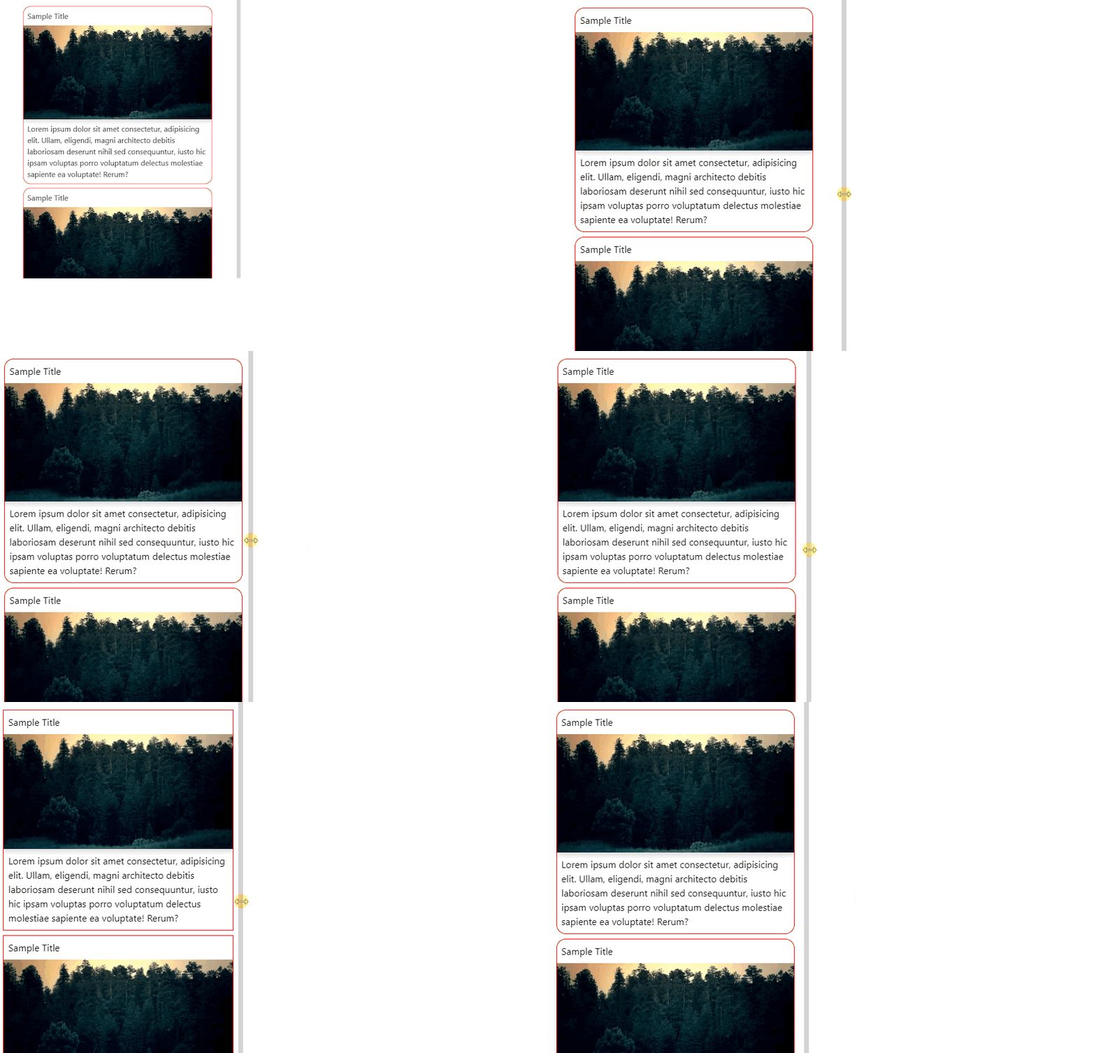
Let’s take a look at the following demo with a couple of card components wrapped in a resizable container:
See the Pen
Untitled by Kiril Peyanski (@kspeyanski)
on CodePen.
The specific requirement we want to implement here is to remove the border-radius of the cards whenever their container is less than 400px wide.

Author’s note: The CSS equivalent to debugging with
console.logisborder: 1px solid red, and you should not feel bad about using it!
Taking a deeper look at our code, we can observe the following border-radius calculation:
css
.dynamic-card {
  border-radius: max(0px, min(16px, (100% - 400px + 1px) * 9999)) / 16px;
}
It might look strange at first sight, but we will go over each calculation and explain it further. We want to identify the following variables in the code:
border-radiusbreakpointcss
.dynamic-card {
border-radius: max(0px, min(DESIRED_BORDER_RADIUS, (100% - WIDTH_BREAKPOINT + 1px) * 9999)) / DESIRED_BORDER_RADIUS;
}
In order to deep-dive into the above CSS rule, we would have to split it into three different calculations:
min calculationmax calculationdivision by pixelsmin calculationcss min(DESIRED_BORDER_RADIUS, (100% - WIDTH_BREAKPOINT + 1px) * 9999)
What is happening here? Well, first we have to think of what the 100% is doing. Setting width: 100% to a CSS element will (in most cases) expand the element to its full container width, meaning that when the 100% is used in a min function, it will always return the width of our container.
This means that if our container is 480px wide and we’ve defined a WIDTH_BREAKPOINT of 400px, the calculation would be:
css
  /* 480px - 400px + 1px = 81px * 9999 = a really big POSITIVE number */
  min(DESIRED_BORDER_RADIUS, (480px - 400px + 1px) * 9999)
The * 9999 part of the calculation is just to be sure we’re always either way above the max value or way below the min value. Otherwise, we might end up with something in between.
Take a look at the alternative scenario where the container width is less than our predefined breakpoint:
css
  /* 320px - 400px + 1px = -79px * 9999 = a really big NEGATIVE number */
  min(DESIRED_BORDER_RADIUS, (320px - 400px + 1px) * 9999)
Since we have a min function, we have the following result from the calculation:
container width is above the breakpoint, the final result would be DESIRED_BORDER_RADIUS (or 16px in our example)container width is below the breakpoint, we have a negative number (or -789,921 in our example)The max calculation
This is the next function that would be called in our complex set of calculations:
css
  max(0px, RESULT_FROM_MIN)
We already know that we would receive either a positive border radius or a negative number. By applying the result from the min calculation, we get the following:
container width is above the breakpoint: RESULT_FROM_MIN (or 16px in our case)container width is below the breakpoint: 0px/ DESIRED_BORDER_RADIUS calculationcss border-radius: RESULT_FROM_MAX / DESIRED_BORDER_RADIUS;
This is not a division operator, but an extended syntax to apply border-radius to an element. The code above will be evaluated (notice the missing / character):
css
  border-top-left-radius:     RESULT_FROM_MAX DESIRED_BORDER_RADIUS;
  border-top-right-radius:    RESULT_FROM_MAX DESIRED_BORDER_RADIUS;
  border-bottom-right-radius: RESULT_FROM_MAX DESIRED_BORDER_RADIUS;
  border-bottom-left-radius:  RESULT_FROM_MAX DESIRED_BORDER_RADIUS;
This is important, as the CSS parsing engine is not particularly happy with how we try to define the border radius with the min and max functions, so we use this neat little trick.
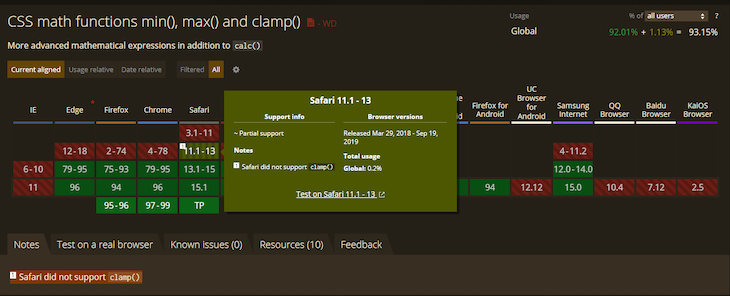
We can use the clamp function as an alternative, but we avoid doing so since it’s not supported in Safari 12.

media-queriesThis technique relies on our CSS parsing engine to account for the 100% in the calculation. This percentage would evaluate to the width of our container as opposed to the screen width, which we can use in media-queries.
The following code would work in most scenarios, but would fail when we have a resizable container as in the example above:
css
.dynamic-card {
    border-radius: 0;
}
@media screen and (min-width: 400px) {
  .dynamic-card {
    border-radius: 16px;
  }
}
The Fab Four technique could be applied in multiple scenarios depending on the application requirements. Sometimes a specific rule should be applied whenever the container width is less than a specific breakpoint. In such cases, we can invert the logic:
From:
(100% - WIDTH_BREAKPOINT + 1px) * 9999))
To:
(WIDTH_BREAKPOINT - 1px - 100%) * 9999))
This would apply the desired value only when the width is below the breakpoint.
Let’s face the fact that this calculation is not straightforward and hard to read, even when you are familiar with the technique. Luckily for us, we can extract SASS mixins, or utility functions for various CSS-in-JS libraries (like styled-components).
css
  .dynamic-card {
    --border-radius: 16px;
    --breakpoint: 400px;
  }
  .dynamic-border {
    border-radius: max(0px, min(var(--border-radius), (100% - var(--breakpoint) + 1px) * 9999)) / var(--border-radius);
  }
The following SASS mixin helps us implement the Fab Four technique in SASS based projects:
scss
@mixin dynamic-border-radius($value, $breakpoint) {
  & {
    border-radius: #{"max(0px, min(#{$value}, 100% - #{$breakpoint} + 1px) * 9999) / #{$value}"};
  }
}
.dynamic-card {
  @include dynamic-border-radius(16px, 400px);
}
import styled, { css } from 'styled-components';
const dynamicBorderRadius = (value, breakpoint) => css`
  border-radius: max(0px, min(${value}px, 100% - ${breakpoint}px + 1px) * 9999) /
    ${value}px;
`;
const Card = styled('div')`
    ${dynamicBorderRadius(16, 400)};
`;
With the web moving forward, we will be seeing more features like container-queries implemented in most web browsers. Until this day comes, we can use techniques like the Fab Four to implement specific application requirements, which don’t always look straightforward.
As web frontends get increasingly complex, resource-greedy features demand more and more from the browser. If you’re interested in monitoring and tracking client-side CPU usage, memory usage, and more for all of your users in production, try LogRocket.

LogRocket lets you replay user sessions, eliminating guesswork around why bugs happen by showing exactly what users experienced. It captures console logs, errors, network requests, and pixel-perfect DOM recordings — compatible with all frameworks.
LogRocket's Galileo AI watches sessions for you, instantly identifying and explaining user struggles with automated monitoring of your entire product experience.
Modernize how you debug web and mobile apps — start monitoring for free.
Hey there, want to help make our blog better?
Join LogRocket’s Content Advisory Board. You’ll help inform the type of content we create and get access to exclusive meetups, social accreditation, and swag.
Sign up now
Learn how OpenAPI can automate API client generation to save time, reduce bugs, and streamline how your frontend app talks to backend APIs.

Discover how the Interface Segregation Principle (ISP) keeps your code lean, modular, and maintainable using real-world analogies and practical examples.

<selectedcontent> element improves dropdowns

Learn how to implement an advanced caching layer in a Node.js app using Valkey, a high-performance, Redis-compatible in-memory datastore.
One Reply to "Responsive CSS border radius with the Fab Four technique"
480 – 400 + 1 is 81 not 79